Viewport
A viewport is the screen area where the browser displays the contents of the page.
Viewports can be divided into layout viewports, visual viewports, and ideal viewports.
- Layout viewport layout viewport
- visual viewport
- Ideal viewport ideal viewport changes the width of the layout viewport to a visual viewport, which is the ideal viewport.
Layout viewport layout viewport
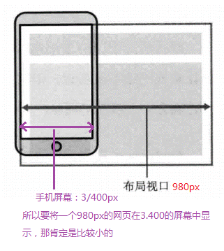
A layout viewport is set by default in the browsers of general mobile devices, which is used to solve the problem of displaying early PC pages on mobile phones.
IOS and Android basically set the viewport resolution to 980px, so most web pages on PC can be rendered on mobile phones, but the elements look very small. Generally, by default, you can manually zoom the web pages.
Summary:
- Why is the layout viewport set to 980px? Because our PC web page is generally about 1000, it can almost be displayed.
- The disadvantage of layout viewport is that the content of real pc web pages will be relatively small.
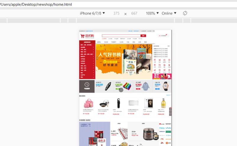
- The following figure shows the previously processed PC web page. We check it through an analog mobile phone and find that it is very small:
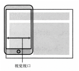
visual viewport
A visual viewport is an area of the web site that the user is seeing. Note: This is the area of the site.
We can manipulate the visual viewport by zooming, but it will not affect the layout viewport. The layout viewport still maintains its original width.
Thinking: for a larger layout viewport, what should I do if I want to display a complete and appropriate size in a smaller visual viewport?
Answer: use the ideal viewport.
ideal viewport
The ideal viewport is set to make the website have the most ideal browsing and reading width on the mobile end.
-
The ideal viewport is the most ideal viewport size for the device
-
You need to manually add a meta viewport label to notify the browser of the operation
-
The main purpose of meta viewport label: the width of the layout viewport should be consistent with the width of the ideal viewport. A simple understanding is to set the width of the layout to be consistent with the width of the mobile phone screen
Summary: our development will eventually use the ideal viewport, which is to change the width of the layout viewport to a visual viewport
meta tag
Syntax:
<meta name="viewport"
      content="width=device-width,
      user-scalable=no,
      initial-scale=1.0,
      maximum-scale=1.0,
      minimum-scale=1.0"
>
| attribute | interpretative statement |
|---|---|
| width | Width sets the width of the viewport. You can set a special value of device width. (width equal to equipment width) |
| initial-scale | Initial zoom ratio, a number greater than 0 |
| maximum-scale | Maximum zoom ratio, number greater than 0 |
| minimum-scale | Minimum zoom ratio, number greater than 0 |
| user-scalable | Users can zoom, yes/no. (1/0) |
The most standard viewport settings
- The viewport width is consistent with the device
- The default scale for viewports is 1.0
- Users are not allowed to scale themselves
- The maximum allowed scale is 1.0
- Minimum allowed scale 1.0
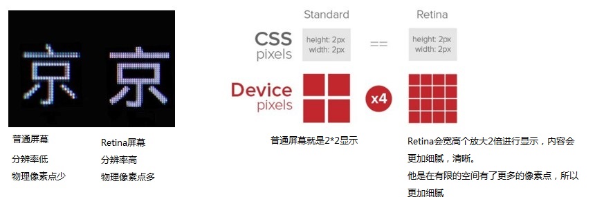
Double graph
Physical pixel & Physical pixel ratio
- Physical pixels refer to the smallest particles displayed on the screen, which are physically real. This is set by the manufacturer at the factory. For example, Apple 6 is 750 * 1334.
- Physical pixels are actually our resolution. The resolution is 750 * 1344, so 750 pixels can be placed in a row
- The number of physical pixels that can be displayed in a px is called physical pixel ratio or screen pixel ratio
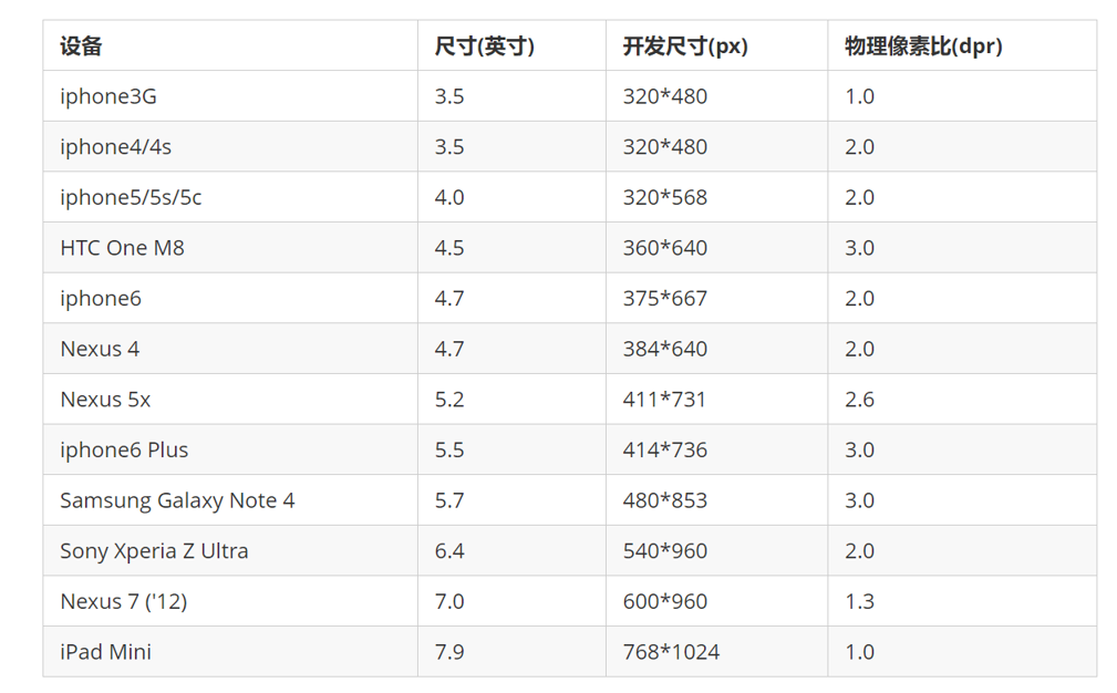
The development size and physical pixel ratio of each mobile phone are as follows:
Double graph
The pixel ratio of PC terminal and previous mobile phone screen / ordinary mobile phone screen is 1CSS pixel = 1 Physical pixel
Retina (retina screen) is a display technology, which can compress more physical pixels into one screen, so as to achieve higher resolution and improve the fineness of screen display.
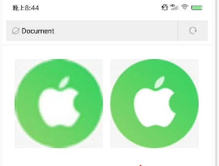
- For a 50px * 50px picture, open it in the mobile phone or Retina screen. It will be magnified according to the physical pixel ratio just now, which will cause the picture to be blurred
- In the standard viewport settings, the image magnification is used to improve the image quality and solve the blur problem in HD devices
- A double plot is usually used because of the impact of iPhone 6. However, there are still three times the figure and four times the figure. This depends on the actual needs of the development company
Example code:
<!DOCTYPE html>
<html lang="en">

<head>
    <meta charset="UTF-8">
    <meta name="viewport" content="width=device-width, initial-scale=1.0">
    <meta http-equiv="X-UA-Compatible" content="ie=edge">
    <title>Document</title>
    <style>
        /* We need a 50 * 50 pixel (css pixel) image directly into our iPhone 8, which will be magnified twice and blurred by 100 * 100 */
        /* What we do is put a 100 * 100 picture, and then manually reduce the picture to 50 * 50 (css pixels) */
        /* The size of the picture we prepared is twice as large as what we actually need. This is the way to double the picture */

        img:nth-child(2) {
            width: 50px;
            height: 50px;
        }
    </style>
</head>

<body>
    <!-- Vague -->
    <img src="images/apple50.jpg" alt="">
    <!-- We take a 2-fold graph -->
    <img src="images/apple100.jpg" alt="">
</body>

</html>
Effect: this needs to be viewed on a real mobile phone, not through a Google analog mobile phone:
Double sprite diagram
- Scale the sprite map to half of the original scale in firewall
- Then measure the coordinates according to the size
- Note that the background size in the code should also be written: half the original width of the wizard diagram
Background scale background size
The background size property specifies the size of the background image
background-size: Background picture width background picture height;
Company: length | percentage | cover | contain;
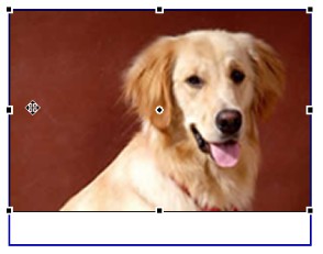
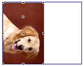
Cover expands the background image to be large enough so that the background image completely covers the background area. (stretch in equal proportion, cover completely, and one side will exceed) [ some background pictures may not be fully displayed ]
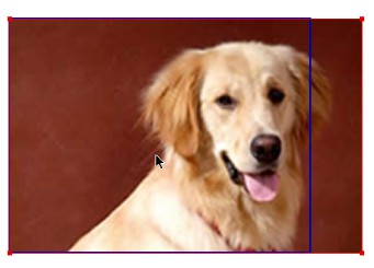
contain expands the image to its maximum size so that its width or height fully fits the content area. (stretch in equal proportion, and either side can coincide with the box first) [there may be some blank areas]
Example code:
<!DOCTYPE html>
<html lang="en">

<head>
    <meta charset="UTF-8">
    <meta name="viewport" content="width=device-width, initial-scale=1.0">
    <meta http-equiv="X-UA-Compatible" content="ie=edge">
    <title>Document</title>
    <style>
        div {
            width: 500px;
            height: 500px;
            border: 2px solid red;
            background: url(images/dog.jpg) no-repeat;
            /* background-size: The width of the picture and the height of the picture; */
            /* background-size: 500px 200px; */
            /* 1.If only one parameter is written, the width and height must be omitted. It will be scaled equally */
            /*background-size: 500px;*/
            /* 2. The units inside can be compared with% relative to the parent box */
            /* background-size: 50%; */
            /* 3. cover Proportional stretching should completely cover the div box, and some background pictures may not be fully displayed */
            /* background-size: cover; */
            /* 4. contain Stretch in proportion to height and width. When the width or height is covered with the div box, it will not be stretched. There may be some blank areas */
             background-size: contain;
        }
    </style>
</head>

<body>
    <div></div>
    <p></p>
</body>

</html>
Background double
The insertion diagram needs to use the double diagram, and so does the background diagram. The principle is the same.
Example code:
<!DOCTYPE html>
<html lang="en">

<head>
    <meta charset="UTF-8">
    <meta name="viewport" content="width=device-width, initial-scale=1.0">
    <meta http-equiv="X-UA-Compatible" content="ie=edge">
    <title>Document</title>

    <style>
        /* 1. We have a 50 * 50 box and need a background picture, but according to the analysis, this picture still needs to be prepared twice, 100 * 100 */
        /* 2. We need to scale the picture in half, that is, 50 * 50 background size*/

        div {
            width: 50px;
            height: 50px;
            border: 1px solid red;
            background: url(images/apple100.jpg) no-repeat;
            background-size: 50px 50px;
        }
    </style>
</head>

<body>
    <div></div>
</body>
</html>
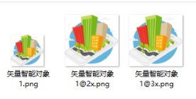
Multiple tangent
When we develop on the mobile terminal, we need the original image, double image, and sometimes triple image. How can we deal with it quickly?
Cutter man can help us quickly cut out pictures with different multiples.
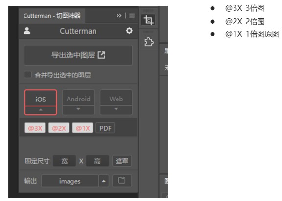
use:
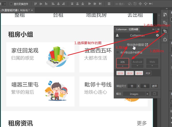
result:
Mobile development options and technology solutions
Mainstream mobile solutions
1. Make mobile terminal page separately (mainstream)
Usually, the mobile terminal can be opened by adding m(mobile) in front of the website domain name.
By judging the device, if the mobile device is opened, skip to the mobile terminal page.
The PC terminal and the mobile terminal are two sets of websites. The PC terminal is the style of the PC terminal. The mobile terminal is writing a set of websites specially adapted for the mobile terminal
2. Responsive pages are compatible with mobile terminals (second)
Responsive website: pc and mobile share the same website, but the style will automatically adapt under different screens. Change the style by judging the screen width to adapt to different terminals.
Disadvantages: the production is troublesome and requires a lot of effort to adjust the compatibility problem
Mobile terminal technology solutions
1. Mobile browser compatibility
Mobile browsers are basically based on webkit kernel, so we consider webkit compatibility.
We can safely use H5 tags and CSS3 styles.
At the same time, we only need to consider adding webkit to the private prefix of our browser
2. Mobile terminal public style
It is recommended to use normalize for mobile CSS initialization css/
Normalize.css: protects valuable defaults
Normalize.css: fixed a bug in the browser
Normalize.css: is modular
Normalize.css: detailed documentation
Official website address: http://necolas.github.io/normalize.css/
CSS3 box model box sizing is widely used in the mobile terminal
-
Traditional mode width calculation: width of box = width + border + padding set in CSS
-
CSS3 box model width calculation: box width = width set in CSS. Width includes border and padding
-
In other words, the box model in CSS3, padding and border will not support the big box
Example code:
/*CSS3 Box model: border box, border box, understanding: calculate the size of the box from the border (including all contents inside the border, border, inner margin and content)*/
box-sizing: border-box;
/*Traditional box model: content box, content box, understanding: calculate the box size from the content (including only the content)*/
box-sizing: content-box;
-
The mobile terminal can all CSS3 box models
-
If the PC side completely needs compatibility, we will use the traditional mode. If compatibility is not considered, we will choose CSS3 box model
Special style of mobile terminal
/*CSS3 Box model*/
box-sizing: border-box;
-webkit-box-sizing: border-box;
/*Click to highlight that we need to clear the setting to transparent to complete transparency*/
-webkit-tap-highlight-color: transparent;
/*The default appearance of the browser on the mobile terminal is to add this attribute to iOS to customize the style of buttons and input boxes*/
-webkit-appearance: none;
/*Disable the pop-up menu when long pressing the page*/
img,a { -webkit-touch-callout: none; }
Common layout of mobile terminal
1. The mobile terminal is made separately
- Streaming layout (percentage layout)
- flex flexible layout (highly recommended)
- less+rem + media query layout
- Hybrid layout
2. Responsive
- Media query
- bootstarp
3. Flow layout
Streaming layout is percentage layout, also known as non fixed pixel layout.
The width of the box is set as a percentage to scale according to the width of the screen, which is not limited by fixed pixels, and the content is filled on both sides.
Streaming layout is a common layout used in mobile web development.
<max-width>Maximum width    <max-height>Maximum height
<min-width>Minimum width    <min-height>Minimum height
Example code:
<!DOCTYPE html>
<html lang="en">

<head>
    <meta charset="UTF-8">
    <meta name="viewport" content="width=device-width, initial-scale=1.0">
    <meta http-equiv="X-UA-Compatible" content="ie=edge">
    <title>Document</title>
    <style>
        * {
            margin: 0;
            padding: 0;
        }

        section {
            width: 100%;
            max-width: 980px;
            /* min-width: 320px; */
            margin: 0 auto;
        }

        section div {
            float: left;
            width: 50%;
            height: 400px;
        }

        section div:nth-child(1) {
            background-color: pink;
        }

        section div:nth-child(2) {
            background-color: purple;
        }
    </style>
</head>

<body>
    <section>
        <div></div>
        <div></div>
    </section>
</body>

</html>
effect:
