Catalogue of series articles
Mobile web first day
Mobile web day 2
Mobile web day 3
Mobile web day 4
Mobile web day 5
Mobile web day 6
Mobile web day 7
Tip: after writing the article, the directory can be generated automatically. For how to generate it, please refer to the help document on the right
Article catalog
preface
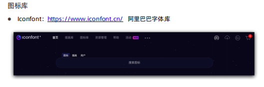
1, Font Icon
(1) What is a font icon?
(2) What are the advantages of font icons?
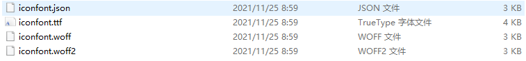
(3) How to use font icons?
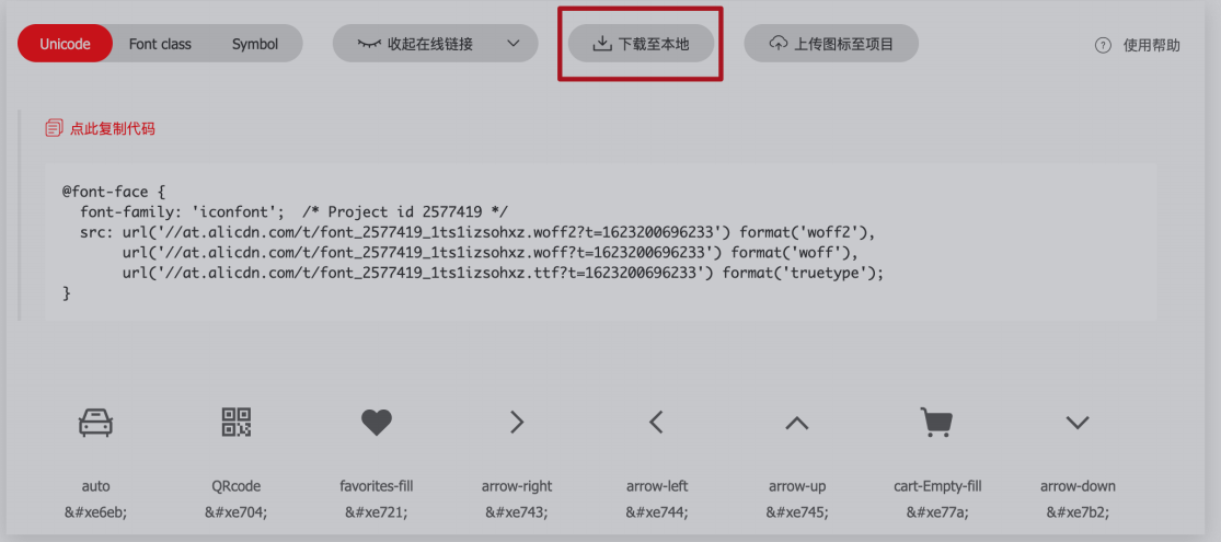
2. Copy relevant files to the fonts folder.
3. Introduce the css file in the fonts folder into your html file
<link rel="stylesheet" href="./fonts/iconfont.css">
4. If a label is used to use the font file, it can take the form of two class names. (emphasis)
<span class="iconfont icon-daohangdizhi"></span>
-
The first class name iconfont is to tell that the text in the box is a font icon. It is not ordinary text.
-
The second class name, icon daohangdizhi, tells the box which small icon to use.
5. If unicode encoding is used (understand)
<strong>  </strong>
css
 strong {
      font-family: 'iconfont';
}
6. If it is a pseudo element:
<div class="car1">Shopping Cart</div>
css
.car1::before {
    content: '\e8c6';
    color: blue;
    margin-right: 5px;
    font-family: "iconfont" !important;
}
.car1::after {
    content: '\e665';
    font-family: "iconfont" !important;
}
2, Plane conversion
(1) What is plane conversion?
(2) Displacement
transform: translate(x, y);
transform: translateX(x);
transform: translateY(y);
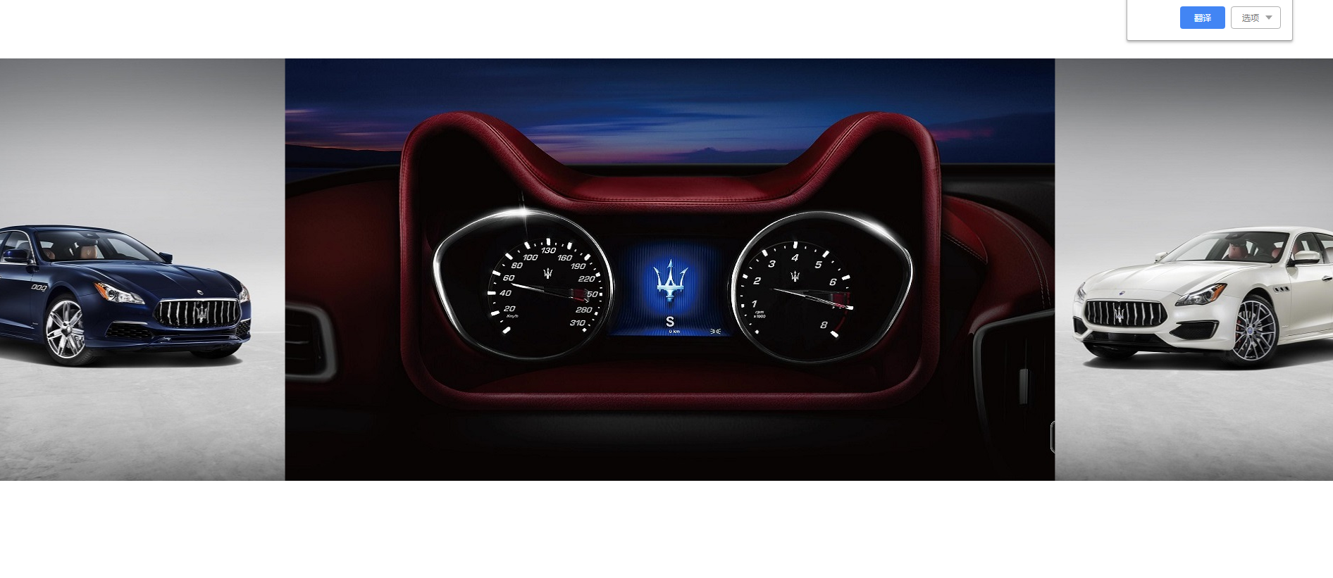
4. The box can be horizontally and vertically centered with absolute positioning
.father {
    position: relative;
    width: 500px;
    height: 500px;
    background-color: pink;
    margin: 100px auto;
}

.son {
    position: absolute;
    top: 50%;
    left: 50%;
    /* Percentage, go up half the height of the box and go left half the width of the box */
    transform: translate(-50%, -50%);
    width: 199px;
    height: 199px;
    background-color: skyblue;
}
5. What's the difference with margin?
-
Moving the box will affect the rest of the box. Squeeze others away
-
Displacement translate moving the box will not affect other boxes.
Here is a case for you
<!DOCTYPE html>
<html lang="en">
<head>
    <meta charset="UTF-8">
    <meta http-equiv="X-UA-Compatible" content="IE=edge">
    <meta name="viewport" content="width=device-width, initial-scale=1.0">
    <title>Document</title>
    <style>
        *{
            margin: 0;padding: 0;
            box-sizing: border-box;
        }
        .box{
            width: 1366px;
            height: 600px;
            margin: 100px auto;
            background: url(../images/bg.jpg) no-repeat;
        }
        .box::before,
        .box::after{
            content: '';
            width: 50%;
            height: 600px;
            background: url(../images/fm.jpg) no-repeat;
            transition: all .5s;

        }
        .box::before{
            content: '';
            float: left;
        }
        .box::after{
            content: '';
            float: right;
            background: url(../images/fm.jpg) no-repeat 100% 0;
        }
        .box:hover.box::before{
transform: translate(-80%, 0);
        }
        .box:hover.box::after{
            transform: translate(80%, 0);
        }
    </style>
</head>
<body>
<div class="box"></div>
</body>
</html>
(3) Spin
4. Here are some examples
Let the windmill spin

<!DOCTYPE html>
<html lang="en">
<head>
    <meta charset="UTF-8">
    <meta http-equiv="X-UA-Compatible" content="IE=edge">
    <meta name="viewport" content="width=device-width, initial-scale=1.0">
    <title>Document</title>
    <style>
        img{
            transition: all 8s;
        }
        img:hover{
            transform: rotate(360deg);
            /* Change the center point of rotation */
            transform-origin: right bottom;
        }
    </style>
</head>
<body>
    <img src="../images/rotate.png" alt="">
</body>
</html>
(4) Zoom
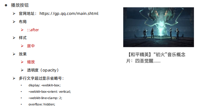
1. Syntax transform: scale(x-axis scaling multiple, y-axis scaling multiple);
two skill
<!DOCTYPE html>
<html lang="en">
<head>
    <meta charset="UTF-8">
    <meta http-equiv="X-UA-Compatible" content="IE=edge">
    <meta name="viewport" content="width=device-width, initial-scale=1.0">
    <title>Document</title>
    <style>
        *{
            margin: 0;
            padding: 0;
        }
        .box{
            width: 249px;
            height: 186px;
            margin: 100px auto;
            /* background-color: pink; */

        }
        .box .pic{
            overflow: hidden;
            position: relative;
            height: 135px;
        }
        .pic img:first-child{
            width: 100%;
            height: 100%;
        }
        .pic .piay{
            position: absolute;
            top: 50%;
            left: 50%;
            transform: translate(-50%,-50%) scale(5);
            opacity: 0;
            transition: all .5s;
        }
        .box:hover .piay{
            transform: translate(-50%,-50%) scale(1);
            opacity: 1;
        }
        .box p{
            display: -webkit-box;
      -webkit-box-orient: vertical;
      -webkit-line-clamp: 2;
      overflow: hidden;
        }
        .box p a{
            font-size: 18px;
            text-decoration: none;
            color: #000;
        }
        .box:hover a{
            color: orange;
        }
    </style>
</head>
<body>
   <div class="box">
       <div class="pic"><img src="../images/1.jpg" alt="">
    <img src="../images/play.png" alt="" class="piay"></div>
       <p><a href="">Game for Peace×Wooderful life Joint Bluetooth player to open the wonderful adventure of peace light and shadow factory</a></p>
   </div>
</body>
</html>
3, Gradual change
Objective: to achieve a gradient background effect using the background image attribute
background-image: linear-gradient(rgba(0, 0, 0, 0), rgba(0, 0, 0, .5));
4, Comprehensive case
(1) Huawei official website module

https://www.huawei.com/cn/
source code
<!DOCTYPE html>
<html lang="en">

<head>
    <meta charset="UTF-8">
    <meta http-equiv="X-UA-Compatible" content="IE=edge">
    <meta name="viewport" content="width=device-width, initial-scale=1.0">
    <title>Document</title>
    <link rel="stylesheet" href="./font/iconfont.css">
    <style>
        * {
            margin: 0;
            padding: 0;
            box-sizing: border-box;
        }

        li {
            list-style: none;
        }

        .box {
            width: 1400px;
            height: 320px;
            /* background-color: pink; */
            margin: 100px auto;
        }

        .box ul li {
            overflow: hidden;
            position: relative;
            float: left;
            width: 450px;
            height: 320px;
            /* background-color: green; */
        }

        .box ul li:nth-child(2) {
            margin: 0 25px;
        }

        .box ul li img {
            width: 100%;
            height: 100%;
            transition: all .5s;
        }

        .box li:nth-child(1):hover img {
            transform: scale(1.05);
            background: linear-gradient(rgba(0, 0, 0, 0), rgba(0, 0, 0, 1));
        }

        .box li:hover .text {
            bottom: 0;
        }

        .box li:nth-child(2):hover img {
            transform: scale(1.05);
        }

        .box li:nth-child(3):hover img {
            transform: scale(1.05);
        }

        .text {
            position: absolute;
            left: 0;
            bottom: -60px;
            padding: 25px 30px;
            font-size: 18px;
            color: #fff;
            transition: all .5s;
        }

        .text h4 {
            font-weight: 700;
            font-size: 24px;
            margin: 5px 0;
        }

        .text .more {
            margin-top: 20px;
            opacity: 0;
        }

        .box li:hover .more {
            opacity: 1;
        }

        .text .more span {
            color: red;
        }

        .text .yanse {
            color: #999;
        }

        .box li:nth-child(1):hover span {
            margin-right: 8px;
        }
        a::before{
            z-index: 1;
            content: '';
            position: absolute;
            top: 0;
            left: 0;
            width: 450px;
            height: 320px;
            background-image: linear-gradient(rgba(0,0,0,0),rgba(0,0,0,1));
            opacity: 0;
        }
        .box li:hover a::before{
            background-image: linear-gradient(rgba(0,0,0,0),rgba(0,0,0,1));
            opacity: 1;
        }
    </style>
</head>

<body>
    <div class="box">
        <ul>
            <li>
                <a href="#">
                    <img src="../images/1.jpg" alt="">
                    <div class="text">
                        <p>Industry trend</p>
                        <h4>Ten industry trends of wireless network in the next decade</h4>
                        <p class="yanse">The white paper puts forward 10 industrial trends for 2030 wireless networks</p>
                        <p class="more">Learn more <span class="iconfont icon-arrow-right"></span> </p>
                    </div>
                </a>
            </li>
            <li>
                <a href="#"><img src="../images/2.jpg" alt="">
                    <div class="text">
                        <p>Success story</p>
                        <h4>Rebuild Qinghai in the name of "Qinghai Lake"</h4>
                        <p class="yanse">
                            See how the world's largest renewable energy base gives the answer
                        </p>
                        <p class="more">Learn more <span class="iconfont icon-arrow-right"></span> </p>
                    </div>
                </a>
            </li>
            <li>
                <a href="#"> <img src="../images/3.jpg" alt="">
                    <div class="text">
                        <p>Global Industry Outlook</p>
                        <h4>Huawei Releases Smart world 2030 Report</h4>
                        <p class="yanse">
                            Boundless exploration, open the future
                        </p>
                        <p class="more">Learn more <span class="iconfont icon-arrow-right"></span> </p>
                    </div>
                </a>
            </li>
        </ul>
    </div>
</body>

</html>
(2) Case of King glory official website module
<!DOCTYPE html>
<html lang="en">

<head>
    <meta charset="UTF-8">
    <meta http-equiv="X-UA-Compatible" content="IE=edge">
    <meta name="viewport" content="width=device-width, initial-scale=1.0">
    <title>Document</title>
    <style>
        * {
            margin: 0;
            padding: 0;
            box-sizing: border-box;
        }

        li {
            list-style: none;
        }

        .box {
            width: 1310px;
            height: 180px;
            /* background-color: pink; */
            margin: 100px auto;
        }

        .box li {
            overflow: hidden;
            position: relative;
            float: left;
            width: 320px;
            height: 180px;
            margin-right: 10px;

            /* background-color: blue; */

        }

        .box li:last-child {
            margin-right: 0;
        }

        .box li img {
            width: 100%;
            height: 100%;
        }

        .box li:hover img {
            transition: all .2s;
            transform: scale(1.1);
        }

        .box1 {
            position: absolute;
            top: 0;
            left: 0;
            width: 320px;
            height: 180px;
            text-align: center;
            opacity: 0;
            transition: all .5s;
        }

        .box1 p {
            font-size: 14px;
            color: #999;

        }

        .box h3 {
            font-weight: 400;
            font-size: 26px;
            color: orange;
            padding-top: 50px;
        }

        .box2 {
            position: absolute;
            left: 0;
            bottom: 0;
            width: 320px;
            height: 180px;
            opacity: 1;
            color: #fff;
            text-align: center;
        }

        .box2 p {
            margin-top: 150px;
        }

        .box li:hover .box1 {
            opacity: 1;
        }

        .box li:hover .box2 {
            opacity: 0;
        }

        .box li:hover {
            border: 2px solid orange;
        }

        .box a::before {
            z-index: 1;
            content: '';
            position: absolute;
            top: 0;
            left: 0;
            width: 320px;
            height: 180px;
            background-image: linear-gradient(rgba(0, 0, 0, 0), rgba(0, 0, 0, 1));
            opacity: 0;
        }

        .box li:hover a::before {
            background-image: linear-gradient(rgba(0, 0, 0, 0), rgba(0, 0, 0, 1));
            opacity: 1;
        }
    </style>
</head>

<body>
    <div class="box">
        <ul>
            <li>
                <a href="#">
                    <img src="../images/16341073227688.jpg" alt="">
                    <div class="box1">
                        <h3>Violet oath-Daji</h3>
                        <p>master</p>
                        <p>Online time: 2021-10-15</p>
                    </div>
                    <div class="box2">
                        <p>Violet oath-Daji</p>
                    </div>
                </a>
            </li>
            <li><a href="#"><img src="../images/16345411339259.jpg" alt="">
                <div class="box1">
                    <h3>Violet oath-Daji</h3>
                    <p>master</p>
                    <p>Online time: 2021-10-15</p>
                </div>
                <div class="box2">
                    <p>Violet oath-Daji</p>
                </div></a></li>
            <li><a href="#"><img src="../images/16346207722387.jpg" alt="">
                <div class="box1">
                    <h3>Violet oath-Daji</h3>
                    <p>master</p>
                    <p>Online time: 2021-10-15</p>
                </div>
                <div class="box2">
                    <p>Violet oath-Daji</p>
                </div></a></li>
            <li><a href="#"><img src="../images/16363601642842.jpg" alt="">
                <div class="box1">
                    <h3>Violet oath-Daji</h3>
                    <p>master</p>
                    <p>Online time: 2021-10-15</p>
                </div>
                <div class="box2">
                    <p>Violet oath-Daji</p>
                </div></a></li>
        </ul>
    </div>
</body>

</html>
summary
The keyboard is broken, and the salary is over 10000