catalogue
1.1 two dimensional coordinate system
3. Center a box horizontally and vertically
3. Rotate the case and write the triangle with code:
1.4 transform origin of 2D conversion center point
1.6 2D conversion comprehensive writing method and sequence problems
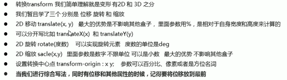
Transformation is one of the subversive features in CSS3, which can realize the effects of element displacement, rotation, scaling and so on
Transformation can be simply understood as deformation
- Moving: translate
- Rotation: rotate
- Scaling: scale
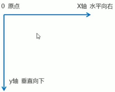
1.1 two dimensional coordinate system
2D conversion is a technology to change the position and shape of labels on a two-dimensional plane
1.2 movement of 2D conversion
2D movement is a function of 2D conversion, which can change the position of elements in the page, similar to positioning.
1. Syntax:
transform: translate(x,y); Or write it separately
transform: translateX(n);
transform: translateY(n);
Code interpretation of syntax:
<style>
        /* Move the position of the box: position the outer edge of the box and move it by 2D conversion */

        div {
            width: 200px;
            height: 200px;
            background-color: pink;
            /* x Is the moving position on the x axis, and y is the moving position on the y axis, separated by commas */
            /* transform: translate(x,y); */
            /* transform: translate(100px,100px); */
            /* 1.If you only move the coordinates of x */
            /* transform: translate(100px,0); */
            transform: translateX(100px);
            /* 2.If you only move the coordinates of y */
            /* transform: translate(0,100px); */
            transform: translateY(100px);
        }
    </style>
</head>
<body>
    <div></div>
</body>
2. Key points:
- Defines the movement in 2D conversion, moving elements along the X and Y axes
- The biggest advantage of translate: it will not affect the position of other elements
- The percentage unit in translate is the translate relative to its own element (the width or height of the box itself): (50%, 50%);
- translate has no effect on inline labels eg:span
3. Center a box horizontally and vertically
    <style>
        div {
            position: relative;
            width: 500px;
            height: 500px;
            background-color: pink;
        }

        p {
            position: absolute;
            top: 50%;
            left: 50%;
            width: 200px;
            height: 200px;
            background-color: purple;
            /* Previous practice */
            /* margin-top: -100px;
            margin-left: -100px; */
            /* translate(-50%,-50%)The box goes up half its height and half its width */
            transform:translate(-50%,-50%);
        }
        span{
            /* translate Invalid for inline element */
            transform: translate(300px,300px);
        }
    </style>
</head>

<body>
    <div>
        <p></p>
    </div>
    <span></span>
</body>
1.3 rotation of 2D conversion
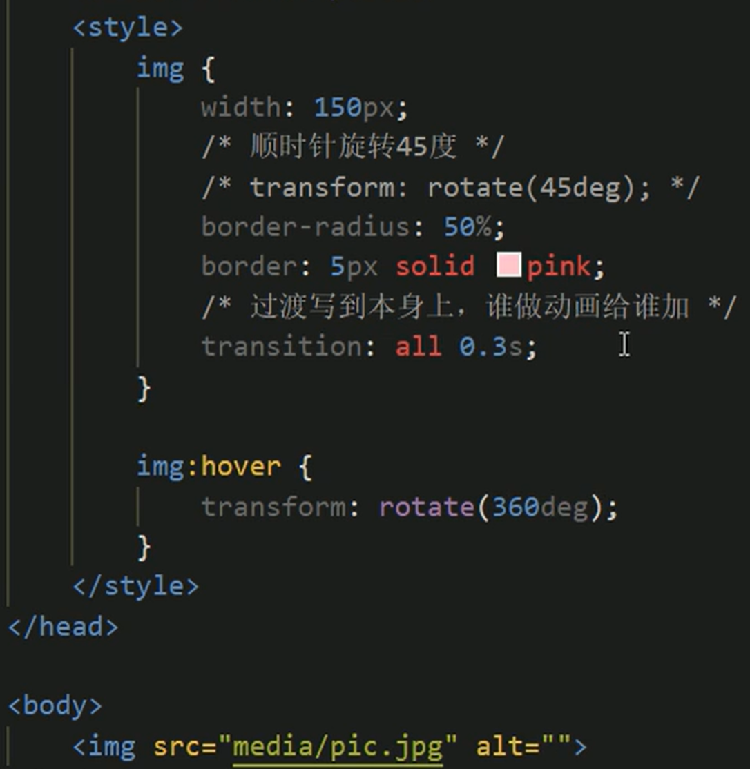
2D rotation refers to rotating an element clockwise or counterclockwise in a 2D plane
1. Syntax:
transform: rotate (degrees)
2. Key points:
- Rotate is followed by degrees. The unit is deg, such as rotate(45deg)
- The angle is positive, clockwise; When the angle is negative, counterclockwise
- The default center point of rotation is the midpoint of the element
3. Rotate the case and write the triangle with code:
<style>
div {
position: relative;
width: 249px;
height: 35px;
border: 1px solid #000;
}
div::after {
content: "";
position: absolute;
top: 8px;
right: 15px;
width: 10px;
height: 10px;
border-right: 1px solid #000;
border-bottom: 1px solid #000;
transform:rotate(45deg);
transition: all 0.5s;
}
/* The mouse rotates through the triangle inside the div */
div:hover::after{
/* The arrow that turned right turned up */
transform: rotate(225deg);
}
</style>
</head>
<body>
<div></div>
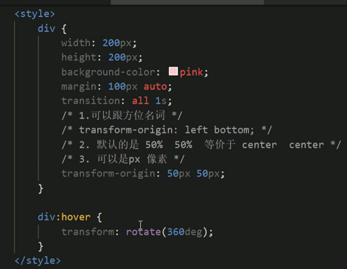
</body>1.4 2D conversion center point transform origin
You can set the conversion center point, for example, you can set the rotation around the lower left corner
1. Syntax:
transform-origin: x y;
2. Key points:
- Note that the following parameters x and y are separated by spaces
- The center point of x y default conversion is the center point of the element (50%)
- You can also set pixels or top bottom left right center for X and y
3. Rotation center point case: remember that pseudo elements belong to in-line elements and cannot be sized (converted to block level elements)
<!DOCTYPE html>
<html lang="en">
<head>
<meta charset="UTF-8">
<meta http-equiv="X-UA-Compatible" content="IE=edge">
<meta name="viewport" content="width=device-width, initial-scale=1.0">
<title>Document</title>
<!-- Just started inside hotpink The box is displayed inside, rotate 180 at the beginning, and then set the rotation center point in the lower left corner,
Then set it to hide and display it as soon as the mouse passes -->
<style>
div{
overflow:hidden;
width: 200px;
height: 200px;
border: 1px solid pink;
/* When there is only one box, the block level elements are horizontally centered */
/* margin: 100px auto; */
/* Multiple boxes are arranged by floating */
margin: 10px;
float:left;
}
/* before Pseudo elements are inline elements and cannot be set in width or height. They need to be converted first */
div::before{
content: "Bai Jingting";
display: block;
width: 100%;
height: 100%;
background-color: hotpink;
transform: rotate(180deg);
/* Rotate in the lower left corner */
transform-origin: left bottom;
/* It will look good if it has a transition effect */
transition: all .5s;
}
/* The mouse is restored after before in div */
div:hover::before{
transform: rotate(0deg);
}
</style>
</head>
<body>
<div></div>
<div></div>
<div></div>
</body>
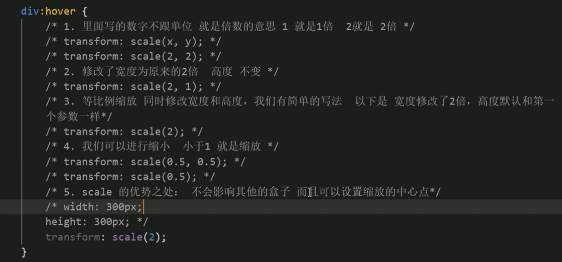
</html>1.5 scaling of 2D conversion
1. Syntax:
transform: scale(x,y);
2. Key points:
- Where x and y are separated by commas
- transform: scale(1,1): double the width and height, which is equivalent to no magnification
- transform: scale(2,2): enlarge both width and height by 2 times
- transform: scale(2): write only one parameter. The second parameter is the same as the first parameter, which is equivalent to scale(2,2)
- transform: scale(0.5,0.5): zoom out
- The biggest advantage of sacle scaling: you can set the conversion center point scaling, which is scaled by the center point by default, and does not affect other boxes
eg: in the following code: 5 when setting the zoom center point, add, for example, transform origin: left bottom in the div box;
Expand: shift+alt can be inserted vertically
The picture can be enlarged by div img: hover {transform: scale(1.1);}
Hide the part you want to exceed: add overflow: hidden to the parent element;
3. Pagination button case:
<!DOCTYPE html>
<html lang="en">
<head>
    <meta charset="UTF-8">
    <meta http-equiv="X-UA-Compatible" content="IE=edge">
    <meta name="viewport" content="width=device-width, initial-scale=1.0">
    <title>Document</title>
    <style>
        /* First set the style for li. Once the mouse is zoomed in, it's OK */
        li{
            float:left;
            width: 30px;
            height: 30px;
            border: 1px solid pink;
            margin: 10px;
            text-align: center;
            line-height: 30px;
            /* li There are no dots in front; */
            list-style:none;
            border-radius: 50%;
            cursor: pointer;
            transition: all .4s;
        }
         li:hover{
             transform: scale(1.2);
         }
    </style>
</head>
<body>
    <ul>
        <li>1</li>
        <li>2</li>
        <li>3</li>
        <li>4</li>
        <li>5</li>
        <li>6</li>
        <li>7</li>
    </ul>
</body>
</html>
1.6 2D conversion comprehensive writing method and sequence problems
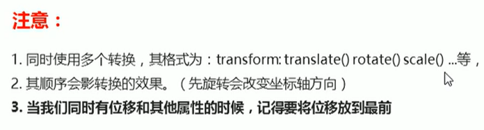
Multiple attributes are separated by spaces
1.7 2D conversion summary