1 Introduction
As the most popular data visualization framework in Python ecology, matplotlib has very powerful functions, but the default style is relatively simple. If you want to make charts with simple business style, you often need to write a lot of code to adjust various parameters.
The dufte to be introduced today is a Python library used to automatically transform the default matplotlib chart style through short code:
2 using dufte to automatically transform matplotlib chart
After pip install dufte is installed, we can insert several key API s of dufte into the drawing process of conventional matplotlib charts. At present, it mainly has the following functions:
2.1 theme setting
The most important function of dufte is its own theme style. There are two ways to set themes in matplotlib. One is to use PLT style. Use (topic) to set global settings. This method is generally not recommended.
Another way is to use topics locally within the scope of with in the following ways:
# Local theme settings
with plt.style.context(theme):
    # Drawing code
    ...
We will use the second method today. First, import the dependent libraries required for the demonstration, and register Siyuan Song typeface locally:
import dufte
import numpy as np
import matplotlib.pyplot as plt
from matplotlib import font_manager

# Register local Siyuan Song typeface
fontproperties = font_manager.FontProperties(fname='NotoSerifSC-Regular.otf')
Next, let's take line chart and histogram as examples:
- Line chart
# Line chart example
with plt.style.context(dufte.style):
    x = range(100)
    y = np.random.standard_normal(100).cumsum()

    fig, ax = plt.subplots(figsize=(10, 5), facecolor='white', edgecolor='white')

    ax.plot(x, y, linestyle='-.', color='#607d8b')

    ax.set_xlabel('x Shaft example', fontproperties=fontproperties, fontsize=16)
    ax.set_ylabel('y Shaft example', fontproperties=fontproperties, fontsize=16)

    ax.set_title('Line chart example', fontproperties=fontproperties, fontsize=20)

    fig.savefig('Figure 2.png', dpi=300, bbox_inches='tight')
Histogram
# Histogram example
with plt.style.context(dufte.style):
    x = range(25)
    y = np.random.standard_normal(25)

    fig, ax = plt.subplots(figsize=(10, 5), facecolor='white', edgecolor='white')

    ax.bar(x, y)

    ax.set_xlabel('x Shaft example', fontproperties=fontproperties, fontsize=16)
    ax.set_ylabel('y Shaft example', fontproperties=fontproperties, fontsize=16)

    ax.set_title('Histogram example', fontproperties=fontproperties, fontsize=20)

    fig.savefig('Figure 3.png', dpi=300, bbox_inches='tight')

It can be seen that dufte has its own concise drawing style, which advocates removing redundant axes and retaining only necessary reference lines, which is suitable for the general drawing requirements in our daily work.
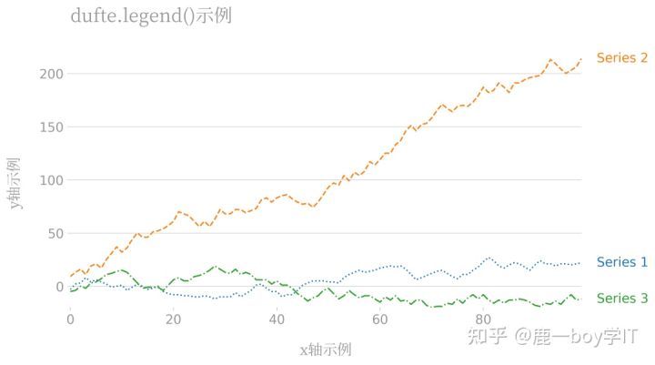
2.2 automatic legend beautification
In addition to the overall theme style described above, dufte also comes with a set of legend stylization strategy, which only needs to use dufte in the drawing process Legend() can replace the original legend() of matplotlib. Take the following broken line diagram as an example:
# Line chart example
with plt.style.context(dufte.style):
    x = range(100)
    y1 = np.random.randint(-5, 6, 100).cumsum()
    y2 = np.random.randint(-5, 10, 100).cumsum()
    y3 = np.random.randint(-5, 6, 100).cumsum()

    fig, ax = plt.subplots(figsize=(10, 5), facecolor='white', edgecolor='white')

    ax.plot(x, y1, linestyle='dotted', label='Series 1')
    ax.plot(x, y2, linestyle='dashed', label='Series 2')
    ax.plot(x, y3, linestyle='dashdot', label='Series 3')

    ax.set_xlabel('x Shaft example', fontproperties=fontproperties, fontsize=16)
    ax.set_ylabel('y Shaft example', fontproperties=fontproperties, fontsize=16)

    dufte.legend()

    ax.set_title('dufte.legend()Example', fontproperties=fontproperties, fontsize=20)

    fig.savefig('Figure 4.png', dpi=300, bbox_inches='tight')
As you can see, for multi series charts, only one line dufte is required Legend() can automatically add the following unique legend descriptions:
2.3 automatic annotation of histogram
Many times, when drawing a histogram, we want to mark the y value corresponding to each column on the column, and through dufte show_ bar_ Values (), as long as xticks is set in the previous drawing process, it will help us automatically mark information on the column:
# Histogram example
with plt.style.context(dufte.style):
    x = range(15)
    y = np.random.randint(5, 15, 15)

    fig, ax = plt.subplots(figsize=(10, 5), facecolor='white', edgecolor='white')

    ax.bar(x, y)

    ax.set_xticks(x)
    ax.set_xticklabels([f'project{i}' for i in x], fontproperties=fontproperties, fontsize=10)
    dufte.show_bar_values()

    ax.set_xlabel('x Shaft example', fontproperties=fontproperties, fontsize=16)
    ax.set_ylabel('y Shaft example', fontproperties=fontproperties, fontsize=16)

    ax.set_title('Histogram example', fontproperties=fontproperties, fontsize=20)

    fig.savefig('Figure 5.png', dpi=300, bbox_inches='tight')
As a library in the early stage of development, dufte is bound to add more practical functions in the future. Interested friends can continue to pay attention to it.
Thank everyone who is willing to read my article. I am also a beginner and learning about new media creation. Creation is a very worthwhile thing to continue to invest in, because your support every time is a great affirmation to me!
In order to facilitate my friends who want to learn python, I set up an exchange group and uploaded it
Many python learning materials can be obtained for free by small partners in need.
