Before, Xiaobian recommended an interactive graphics library Plotly that supports R language. I don't know if you have tried to draw with it. If you think the code provided by Plotly is still a little lengthy, you can take a look at today's R package - autoplotly[1], which can help you visualize one line of code.
brief introduction
Usually, we are more concerned about the process of building statistical models, and we hope to complete the visual model results quickly. Although some packages provide default visualization for the generated data and models. However, they look outdated, and these components need additional transformation and cleaning before they are used in ggplot2. When others want to generate similar charts in the analysis, they must copy these transformation steps.
The autoplotly() function allows users to use one line of code to visualize the statistical results of many popular R packages. It is used to draw many statistical data and functions of machine learning packages, so as to help users achieve the goal of reproducibility with minimal effort, which greatly improves our work efficiency. The generated visualization can also be easily extended using ggplot2 and plotly syntax while maintaining the interactive nature.
Drawing practice
The following is a demonstration of how to use the autoplotly() function to draw. First, install and load the autoplotly package.
install.packages('autoplotly')
library(autoplotly)
The autoplotly() function is applicable to two basic object classes in the stats package: prcomp and principal, which are obtained by principal component analysis. The first four columns of iris data set are extracted as a matrix for principal component analysis, and the results are visually displayed:
p <- autoplotly(prcomp(iris[c(1, 2, 3, 4)]), data = iris,
  colour = 'Species', frame = TRUE)
p
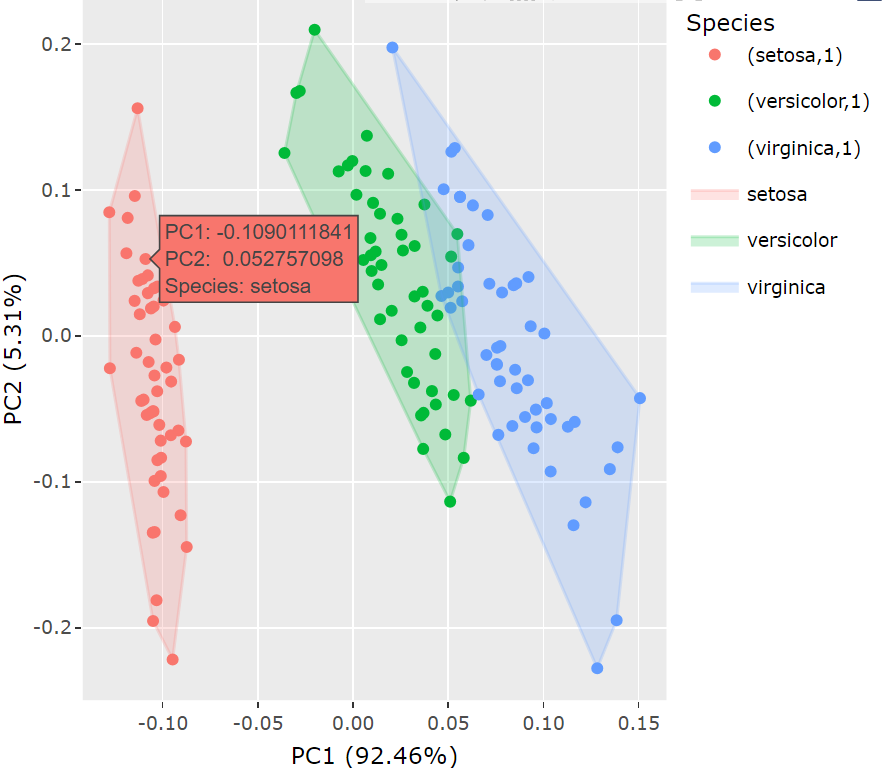
It can be seen that the results drawn with autoplotly are more beautiful and interactive. Without additional data processing, autoplotly can directly visualize the object generated by the function.
Graphic beautification
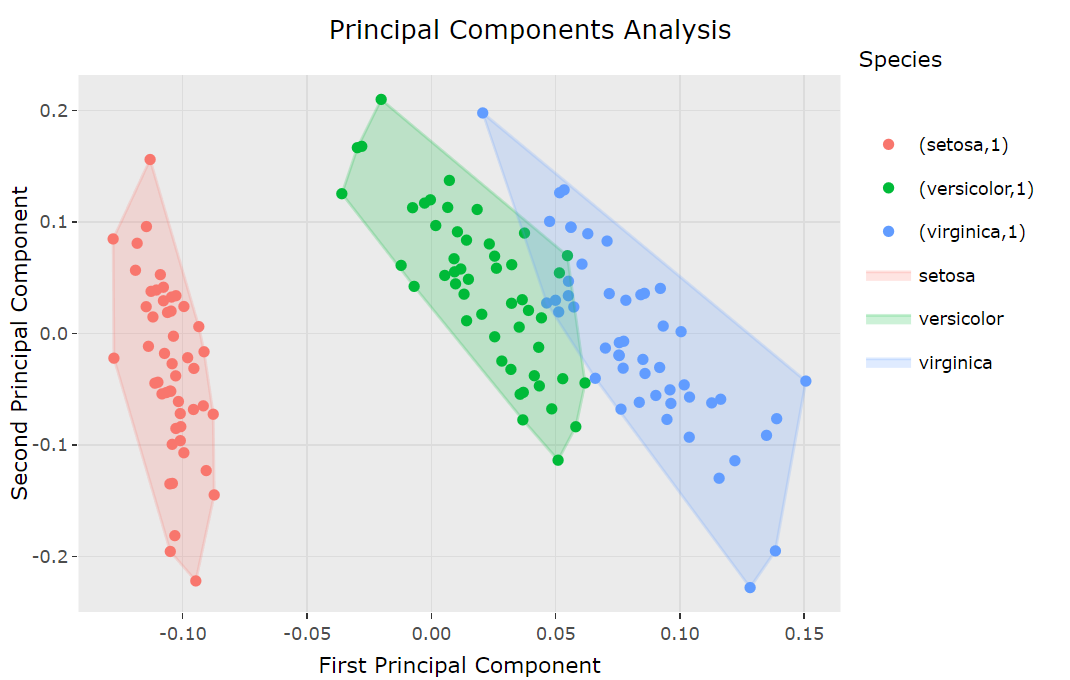
By applying additional ggplot2 elements or components, you can easily extend the graphics generated using the autoplotly() function. For example, we can use ggtitle and labs to add titles and axis labels to the original generated graphics.
autoplotly(
  prcomp(iris[c(1, 2, 3, 4)]), data = iris, colour = 'Species', frame = TRUE) +
  ggplot2::ggtitle("Principal Components Analysis") +
  ggplot2::labs(y = "Second Principal Component", x = "First Principal Component")
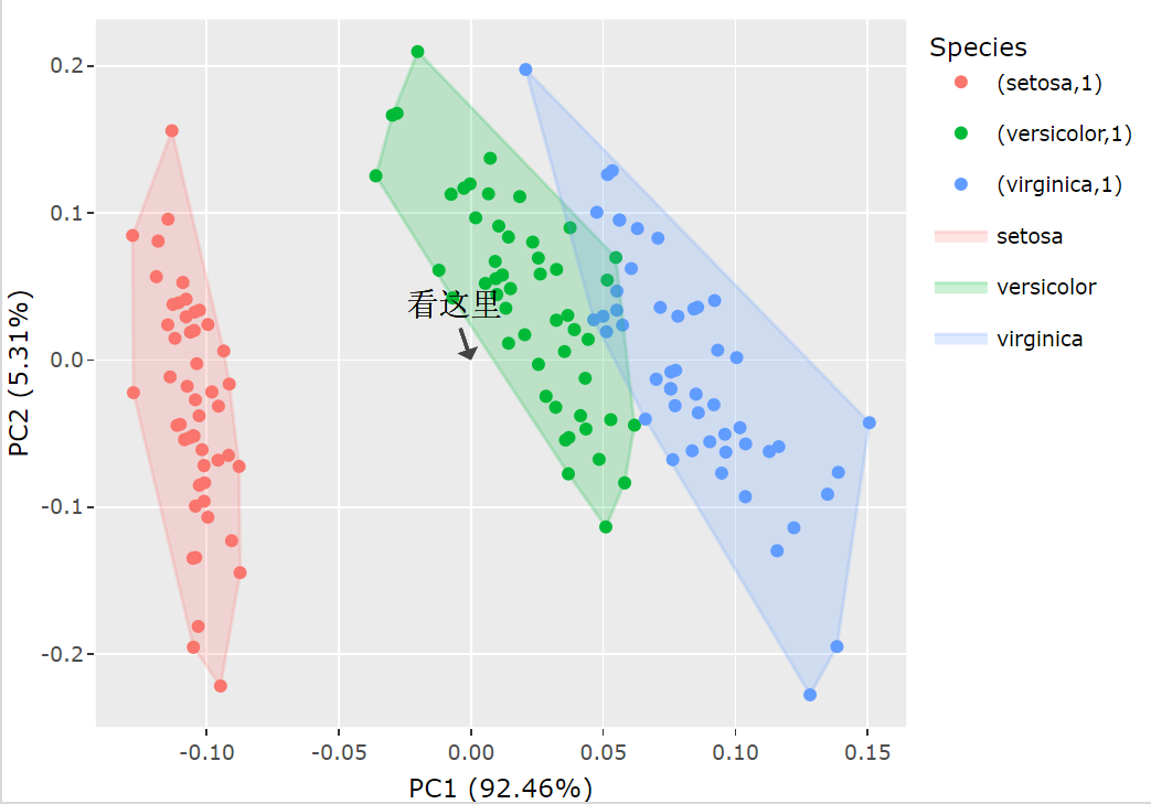
Similarly, we can use the plot package to add additional interaction components. The following example will add an arrow and comment text at the center of the original image:
p <- autoplotly(prcomp(iris[c(1, 2, 3, 4)]), data = iris,
  colour = 'Species', frame = TRUE)

p %>% plotly::layout(annotations = list(
  text = "Look here",
  font = list(
    family = "Courier New, monospace",
    size = 18,
    color = "black"),
  x = 0,
  y = 0,
  showarrow = TRUE))
More examples
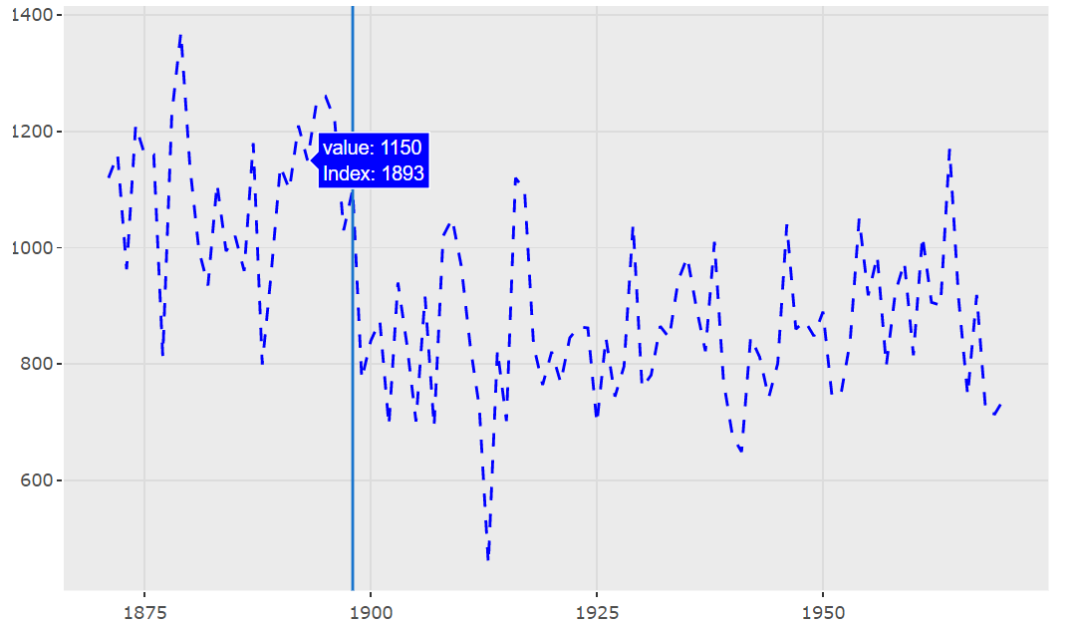
- In the regression model built by strucchange::breakpoints, the best breakpoints with possible structural changes are visualized:
library(strucchange)
autoplotly(breakpoints(Nile ~ 1), ts.colour = "blue", ts.linetype = "dashed",
           cpt.colour = "dodgerblue3", cpt.linetype = "solid")
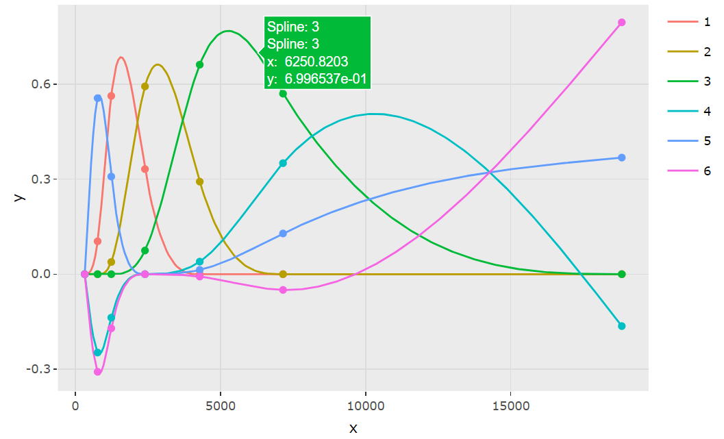
- Visualization of b-spline base points of natural cubic splines with boundary nodes
library(splines)
autoplotly(ns(ggplot2::diamonds$price, df = 6))
Knowledge supplement
At present, autoplotly only supports the visualization of some objects. This list lists all objects, which can be viewed by clicking the link:
- https://github.com/sinhrks/ggfortify#coverage[2]
epilogue
With this package, we can reduce the time spent on learning ggplot2 syntax or interactive visualization package similar to plot. Let's try it quickly~
reference material
[1]autoplotly: https://terrytangyuan.github.io/2018/02/12/autoplotly-intro/
[2]https://github.com/sinhrks/ggfortify#coverage: https://github.com/sinhrks/ggfortify#coverage