Article directory
- Seaborn
- 1. Seaborn
- 2. Overall layout style setting
- 3. Style details
- 4. palette
- 5. Single variable analysis drawing
- 5.1 data distribution
- 5.2 data generation based on mean and covariance
- 5.3 scatter chart is the best way to observe the distribution relationship between two variables
- 6. Regression analysis drawing
- 7. Multivariate analysis drawing
Seaborn
1. Seaborn
import seaborn as sns
import numpy as np
import matplotlib as mpl
import matplotlib.pyplot as plt
%matplotlib inline
2. Overall layout style setting
def sinplot(flip=1):
    x = np.linspace(0, 14, 100)
    for i in range(1, 7):
        plt.plot(x, np.sin(x + i * .5) * (7 - i) * flip)

sinplot()
sns.set()#Using seaborn default parameter combination
sinplot()
5 themes
- darkgrid
- whitegrid
- dark
- white
- ticks
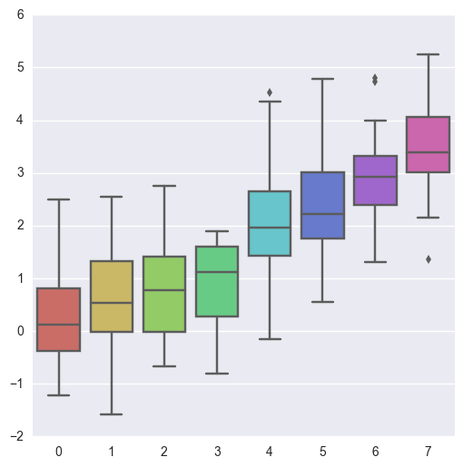
sns.set_style("whitegrid")
data = np.random.normal(size=(20, 6)) + np.arange(6) / 2
sns.boxplot(data=data)
3. Style details
#f, ax = plt.subplots()
sns.violinplot(data)
sns.despine(offset=10)#offset: distance between figure and axis
sns.set_style("whitegrid")
sns.boxplot(data=data, palette="deep")
sns.despine(left=True)#Left axis hiding
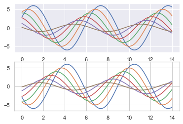
with sns.axes_style("darkgrid"):#With open style, with darkgrid style
    plt.subplot(211)
    sinplot()
plt.subplot(212)
sinplot(-1)
sns.set()
sns.set_context("paper")# paper, talk,poster
plt.figure(figsize=(8, 6))
sinplot()

sns.set_context("notebook", font_scale=1.5, rc={"lines.linewidth": 2.5})#Specify coordinate font size
sinplot()
4. palette
import numpy as np
import seaborn as sns
import matplotlib.pyplot as plt
%matplotlib inline
sns.set(rc={"figure.figsize": (6, 6)})
4.1 palette
- Color matters
- Color? Palette() can pass in any color supported by Matplotlib
- Color ﹐ palette() default color if no parameter is written
- Set? Palette() to set the color of all graphs
4.2 classification color board
current_palette = sns.color_palette()
sns.palplot(current_palette)

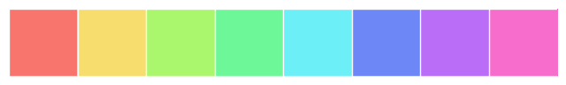
6 default color cycle themes: deep, muted, pastel, bright, dark, colorblind
4.3 circular drawing board
When you have more than six categories to distinguish, the easiest way is to draw evenly spaced colors in a circular color space (such colors will keep brightness and saturation unchanged). This is the default solution for most when they need to use more colors than set in the current default color cycle.
The most common method is to use hls color space, which is a simple conversion of RGB values.
sns.palplot(sns.color_palette("hls", 8))#Eight colors came out

data = np.random.normal(size=(20, 8)) + np.arange(8) / 2
sns.boxplot(data=data,palette=sns.color_palette("hls", 8))
HLS ou palette() function to control the brightness and saturation of colors
l-brightness
s-saturation
sns.palplot(sns.hls_palette(8, l=.7, s=.9))
sns.palplot(sns.color_palette("Paired",8))#Pairwise color proximity palette

4.4 palette color settings
4.4.1 use xkcd color to name color
kcd includes a crowdsourcing effort to name random RGB colors. There are 954 naming colors that can be invoked at any time through the xdcd_rgb dictionary.
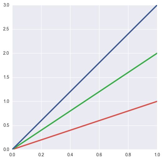
plt.plot([0, 1], [0, 1], sns.xkcd_rgb["pale red"], lw=3)
plt.plot([0, 1], [0, 2], sns.xkcd_rgb["medium green"], lw=3)
plt.plot([0, 1], [0, 3], sns.xkcd_rgb["denim blue"], lw=3)
colors = ["windows blue", "amber", "greyish", "faded green", "dusty purple"]
sns.palplot(sns.xkcd_palette(colors))

4.4.2 continuous color board
The color changes with the data, for example, the more important the data, the darker the color
sns.palplot(sns.color_palette("Blues"))

If you want to flip the g r adient, you can add a suffix to the panel name
sns.palplot(sns.color_palette("BuGn_r"))

4.4.3 cubehelix? Palette()
Tonal linear transformation
sns.palplot(sns.color_palette("cubehelix", 8))

sns.palplot(sns.cubehelix_palette(8, start=.5, rot=-.75))

sns.palplot(sns.cubehelix_palette(8, start=.75, rot=-.150))

4.4.4 call the custom continuous palette by light ﹣ palette() and dark ﹣ palette()
sns.palplot(sns.light_palette("green"))

sns.palplot(sns.dark_palette("purple"))

sns.palplot(sns.light_palette("navy", reverse=True))

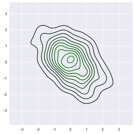
x, y = np.random.multivariate_normal([0, 0], [[1, -.5], [-.5, 1]], size=300).T
pal = sns.dark_palette("green", as_cmap=True)
sns.kdeplot(x, y, cmap=pal);
sns.palplot(sns.light_palette((210, 90, 60), input="husl"))

5. Single variable analysis drawing
%matplotlib inline
import numpy as np
import pandas as pd
from scipy import stats, integrate
import matplotlib.pyplot as plt

import seaborn as sns
sns.set(color_codes=True)
np.random.seed(sum(map(ord, "distributions")))
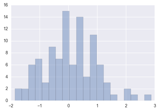
x = np.random.normal(size=100)
sns.distplot(x,kde=False)
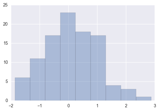
sns.distplot(x, bins=20, kde=False)
5.1 data distribution
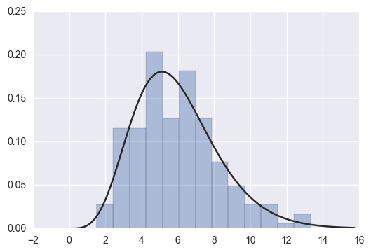
x = np.random.gamma(6, size=200)
sns.distplot(x, kde=False, fit=stats.gamma)
5.2 data generation based on mean and covariance
mean, cov = [0, 1], [(1, .5), (.5, 1)]
data = np.random.multivariate_normal(mean, cov, 200)
df = pd.DataFrame(data, columns=["x", "y"])
df
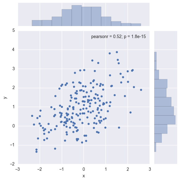
5.3 scatter chart is the best way to observe the distribution relationship between two variables
sns.jointplot(x="x", y="y", data=df);
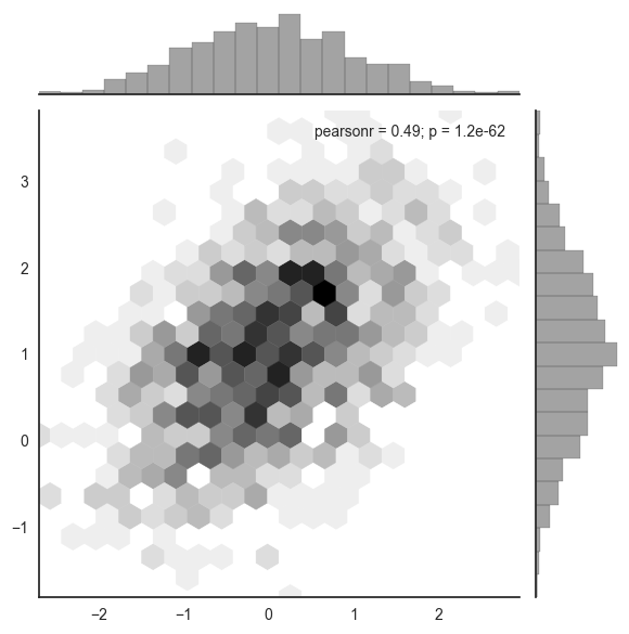
x, y = np.random.multivariate_normal(mean, cov, 1000).T
with sns.axes_style("white"):
    sns.jointplot(x=x, y=y, kind="hex", color="k")
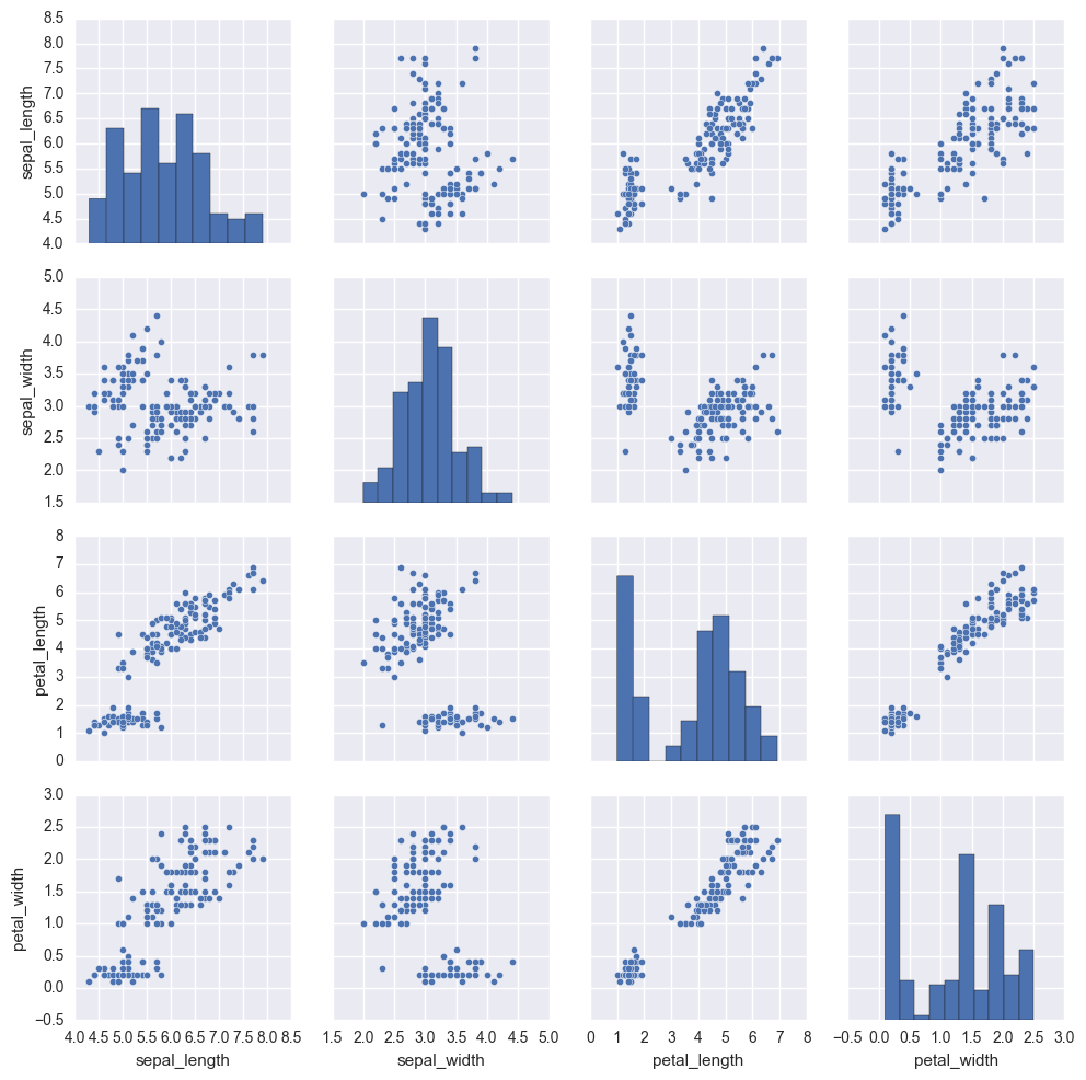
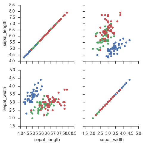
iris = sns.load_dataset("iris")
sns.pairplot(iris)
6. Regression analysis drawing
%matplotlib inline
import numpy as np
import pandas as pd
import matplotlib as mpl
import matplotlib.pyplot as plt

import seaborn as sns
sns.set(color_codes=True)

np.random.seed(sum(map(ord, "regression")))

tips = sns.load_dataset("tips")

tips.head()
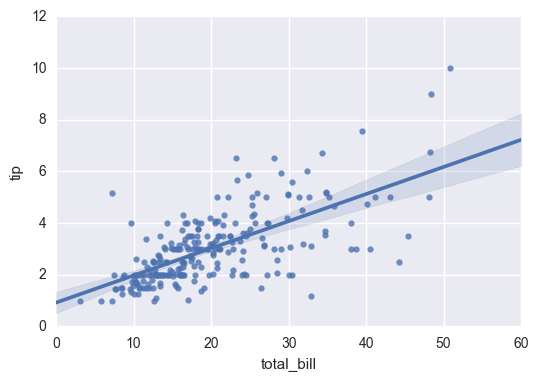
Both regplot() and lmplot() can draw regression relationship. Regplot() is recommended
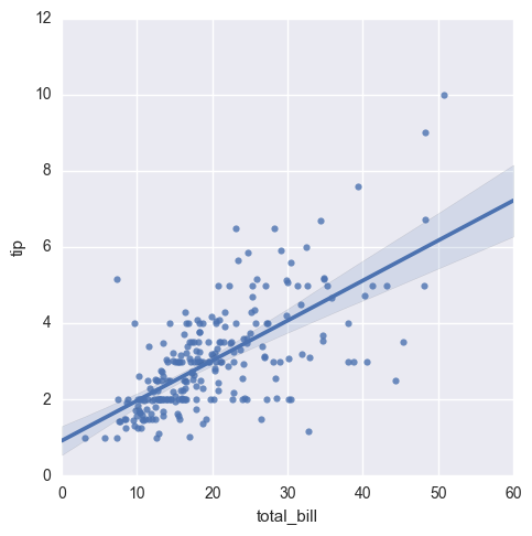
sns.regplot(x="total_bill", y="tip", data=tips)
sns.lmplot(x="total_bill", y="tip", data=tips);
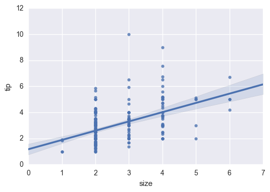
sns.regplot(data=tips,x="size",y="tip")
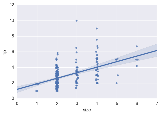
Data plus jitter (data floating in a small range)
sns.regplot(x="size", y="tip", data=tips, x_jitter=.05)
7. Multivariate analysis drawing
%matplotlib inline
import numpy as np
import pandas as pd
import matplotlib as mpl
import matplotlib.pyplot as plt
import seaborn as sns
sns.set(style="whitegrid", color_codes=True)

np.random.seed(sum(map(ord, "categorical")))
titanic = sns.load_dataset("titanic")
tips = sns.load_dataset("tips")
iris = sns.load_dataset("iris")
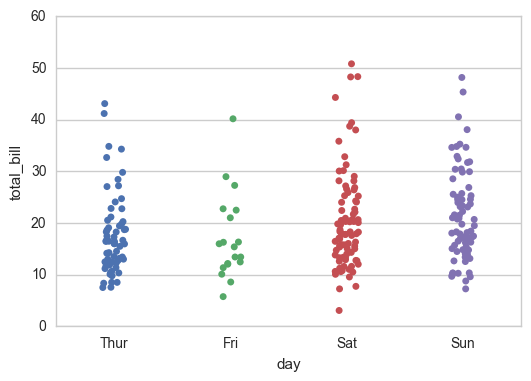
sns.stripplot(x="day", y="total_bill", data=tips);
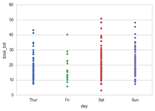
Overlap is a common phenomenon, but it affects the amount of data I observe
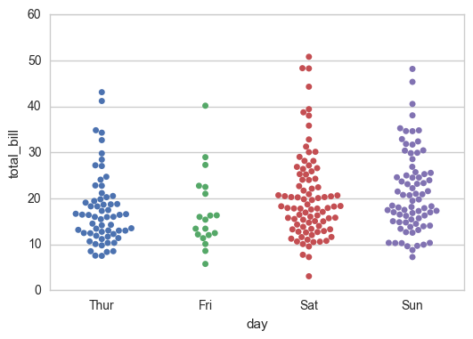
sns.stripplot(x="day", y="total_bill", data=tips, jitter=True)
sns.swarmplot(x="day", y="total_bill", data=tips)
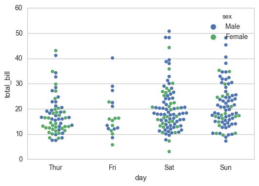
sns.swarmplot(x="day", y="total_bill", hue="sex",data=tips)
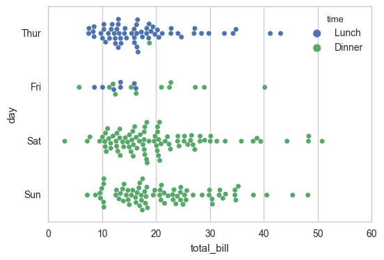
sns.swarmplot(x="total_bill", y="day", hue="time", data=tips);
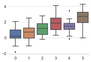
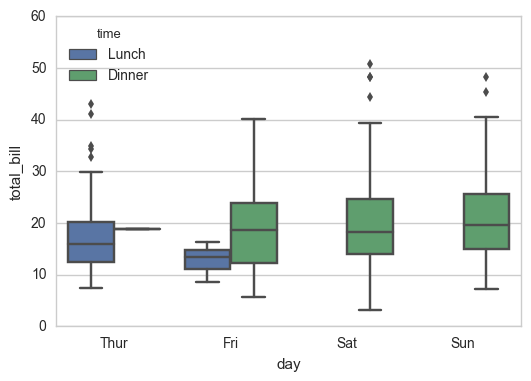
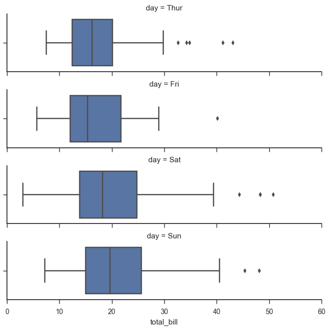
7.1 box diagrams
IQR is the statistical concept quartile distance, the distance between the first quartile and the third quartile
N = 1.5IQR an outlier if a value > Q3 + n or < q1-n
sns.boxplot(x="day", y="total_bill", hue="time", data=tips);
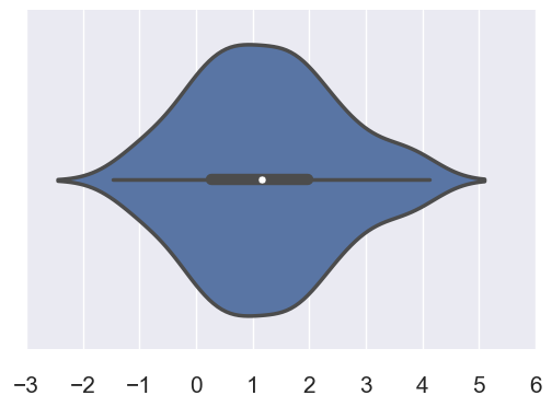
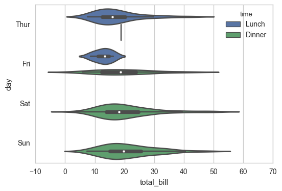
7.2 violin chart
sns.violinplot(x="total_bill", y="day", hue="time", data=tips);
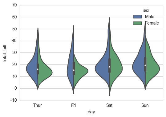
sns.violinplot(x="day", y="total_bill", hue="sex", data=tips, split=True);
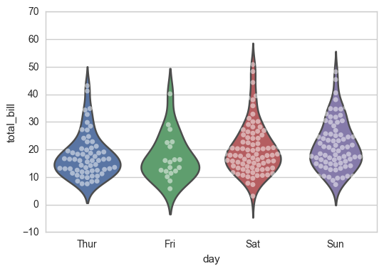
sns.violinplot(x="day", y="total_bill", data=tips, inner=None)
sns.swarmplot(x="day", y="total_bill", data=tips, color="w", alpha=.5)
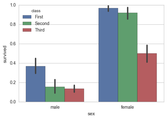
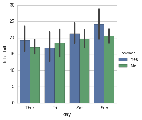
7.3 bar chart can be used to display the centralized trend of values
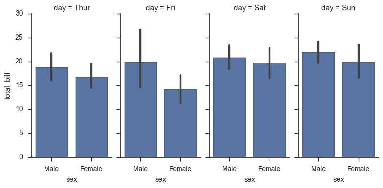
sns.barplot(x="sex", y="survived", hue="class", data=titanic);
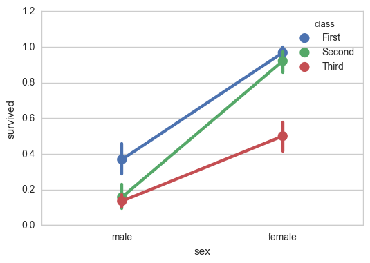
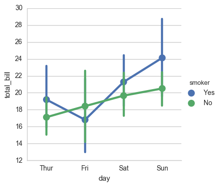
7.4 point map can better describe the change difference
sns.pointplot(x="sex", y="survived", hue="class", data=titanic);
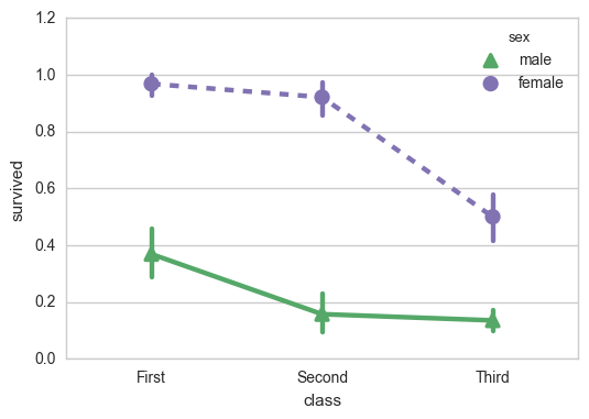
sns.pointplot(x="class", y="survived", hue="sex", data=titanic,
              palette={"male": "g", "female": "m"},
              markers=["^", "o"], linestyles=["-", "--"]);
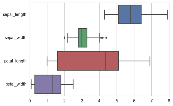
7.5 wide data
sns.boxplot(data=iris,orient="h");
7.6 classification diagram of multi-layer panel
sns.factorplot(x="day", y="total_bill", hue="smoker", data=tips)
sns.factorplot(x="day", y="total_bill", hue="smoker", data=tips, kind="bar")
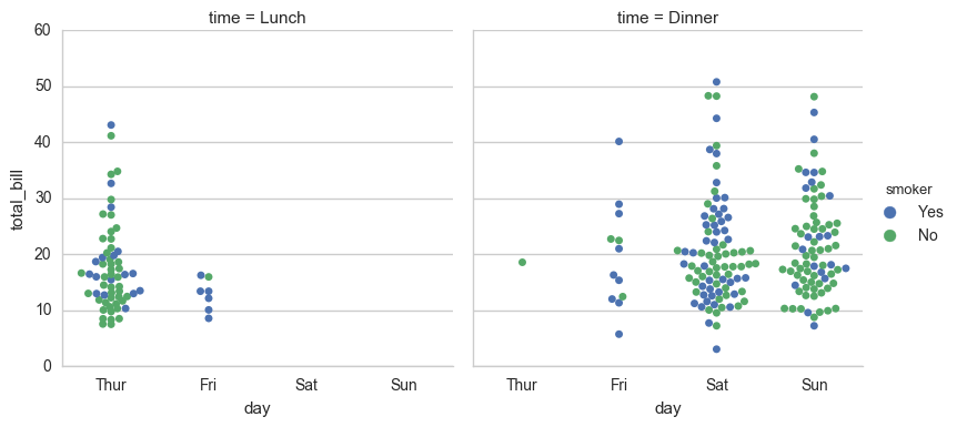
sns.factorplot(x="day", y="total_bill", hue="smoker",
               col="time", data=tips, kind="swarm")
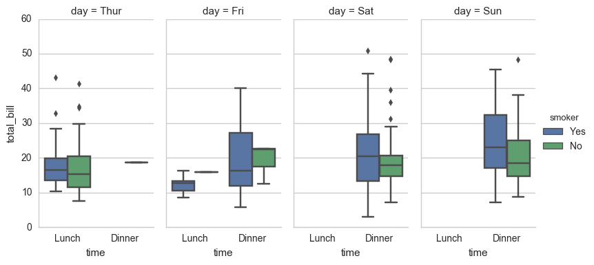
sns.factorplot(x="time", y="total_bill", hue="smoker",
               col="day", data=tips, kind="box", size=4, aspect=.5)
Parameters:
x. Y, the variable name of the hue dataset
date dataset dataset name
row,col more classification variables to tile variable names
Col? Wrap the integer of the highest number of tiles per row
estimator maps vector to scalar in each classification
ci confidence interval floating point or None
The integer of the number of boot iterations used when calculating the confidence interval
Identifier of units sampling unit, used to perform multi-level guidance and repeated measurement of design data variables or vector data
Order, the string list of the corresponding sort list
Row [order, col [order] corresponding sort list string list
kind: optional: point default, bar histogram, count frequency, box box, violin, strip scatter, swarm scatter size the height (inches) of each face scalar aspect aspect aspect scalar origin direction "v" / "h" color matplotlib color palette seaborn color palette or dictionary legend hue's information panel True/False legend_out whether to extend the graph, and draw the information box in the center right True/False share{x,y} Shared grid True/False
7.7 usage of facetgrid
%matplotlib inline
import numpy as np
import pandas as pd
import seaborn as sns
from scipy import stats
import matplotlib as mpl
import matplotlib.pyplot as plt

sns.set(style="ticks")
np.random.seed(sum(map(ord, "axis_grids")))
tips = sns.load_dataset("tips")
tips.head()
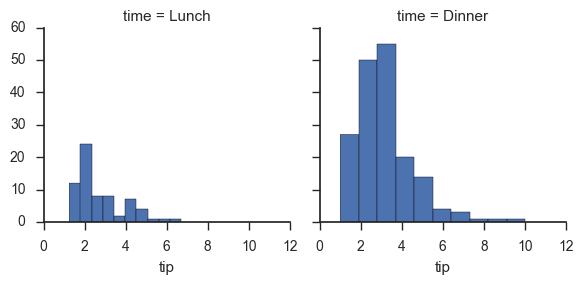
g = sns.FacetGrid(tips, col="time")
g = sns.FacetGrid(tips, col="time")
g.map(plt.hist, "tip");
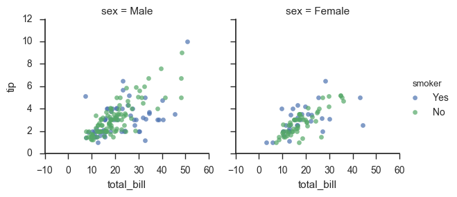
g = sns.FacetGrid(tips, col="sex", hue="smoker")
g.map(plt.scatter, "total_bill", "tip", alpha=.7)
g.add_legend();
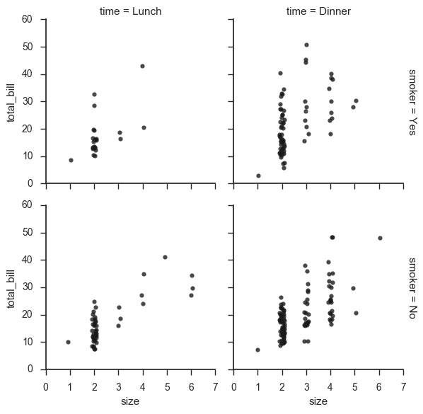
g = sns.FacetGrid(tips, row="smoker", col="time", margin_titles=True)
g.map(sns.regplot, "size", "total_bill", color=".1", fit_reg=False, x_jitter=.1);
g = sns.FacetGrid(tips, col="day", size=4, aspect=.5)
g.map(sns.barplot, "sex", "total_bill");
from pandas import Categorical
ordered_days = tips.day.value_counts().index
print (ordered_days)
ordered_days = Categorical(['Thur', 'Fri', 'Sat', 'Sun'])
g = sns.FacetGrid(tips, row="day", row_order=ordered_days,
                  size=1.7, aspect=4,)
g.map(sns.boxplot, "total_bill");
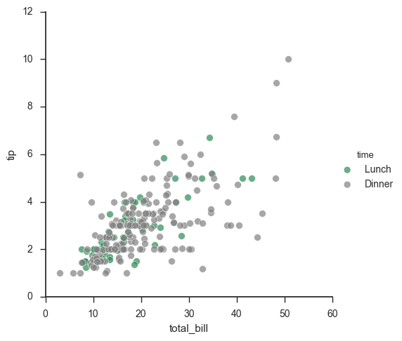
pal = dict(Lunch="seagreen", Dinner="gray")
g = sns.FacetGrid(tips, hue="time", palette=pal, size=5)
g.map(plt.scatter, "total_bill", "tip", s=50, alpha=.7, linewidth=.5, edgecolor="white")
g.add_legend();
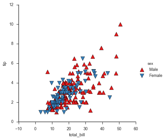
g = sns.FacetGrid(tips, hue="sex", palette="Set1", size=5, hue_kws={"marker": ["^", "v"]})
g.map(plt.scatter, "total_bill", "tip", s=100, linewidth=.5, edgecolor="white")
g.add_legend();
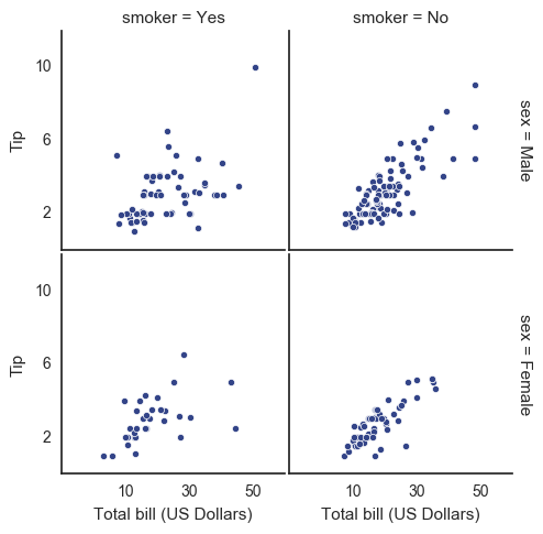
with sns.axes_style("white"):
    g = sns.FacetGrid(tips, row="sex", col="smoker", margin_titles=True, size=2.5)
g.map(plt.scatter, "total_bill", "tip", color="#334488", edgecolor="white", lw=.5);
g.set_axis_labels("Total bill (US Dollars)", "Tip");
g.set(xticks=[10, 30, 50], yticks=[2, 6, 10]);
g.fig.subplots_adjust(wspace=.02, hspace=.02);
#g.fig.subplots_adjust(left  = 0.125,right = 0.5,bottom = 0.1,top = 0.9, wspace=.02, hspace=.02)
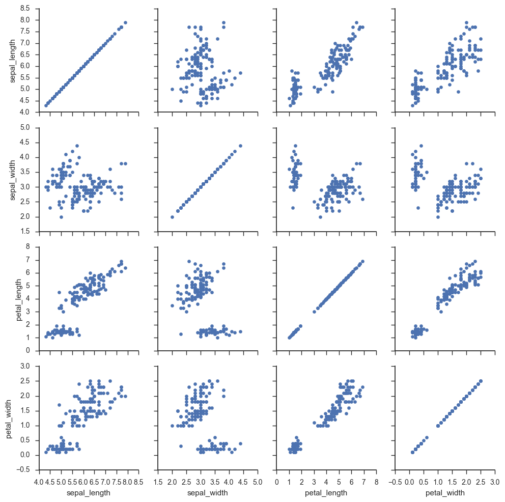
iris = sns.load_dataset("iris")
g = sns.PairGrid(iris)
g.map(plt.scatter);
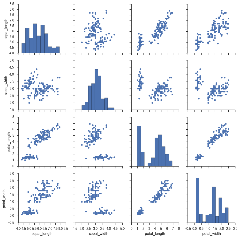
g = sns.PairGrid(iris)
g.map_diag(plt.hist)
g.map_offdiag(plt.scatter);
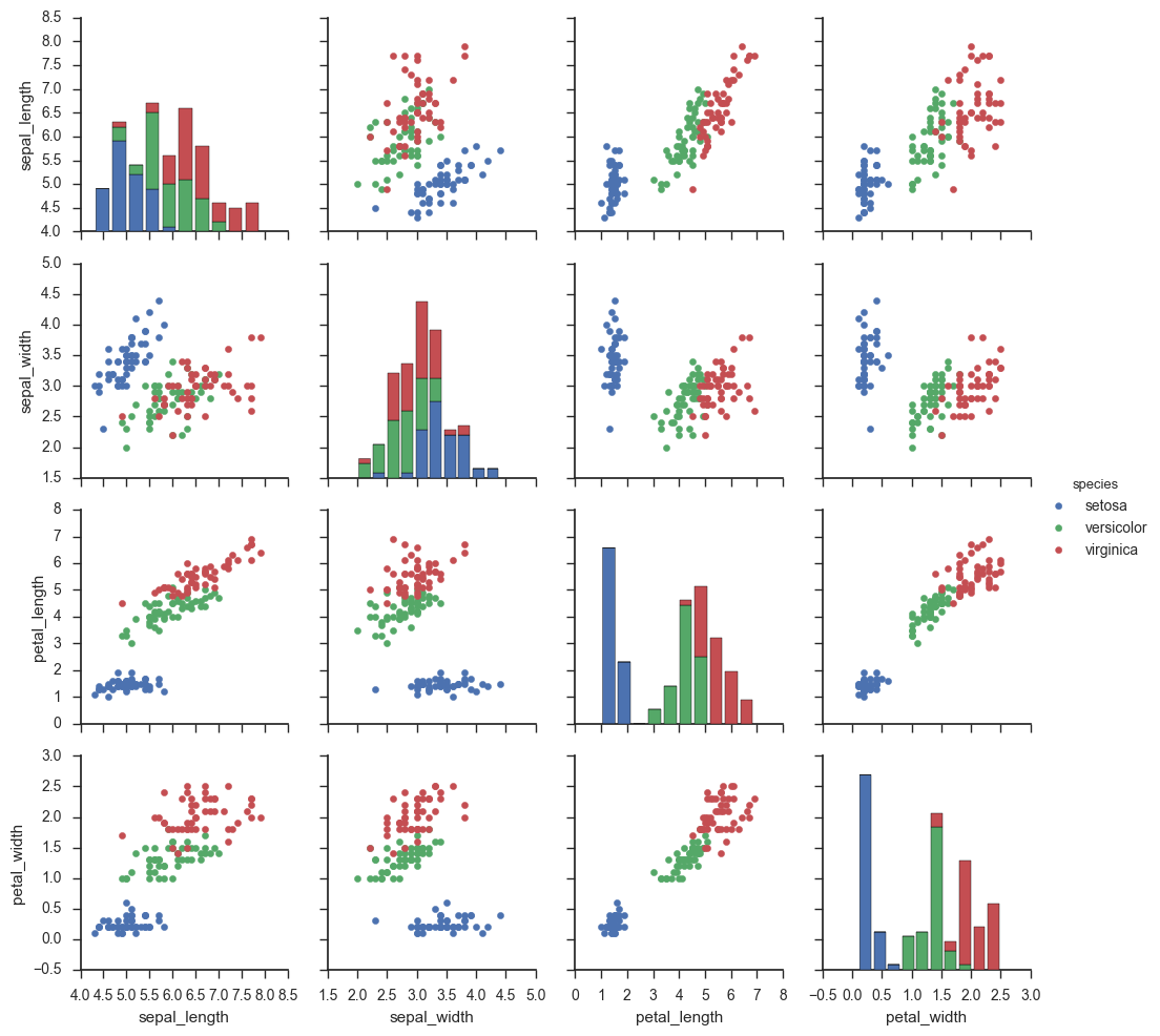
g = sns.PairGrid(iris, hue="species")
g.map_diag(plt.hist)
g.map_offdiag(plt.scatter)
g.add_legend();
g = sns.PairGrid(iris, vars=["sepal_length", "sepal_width"], hue="species")
g.map(plt.scatter);
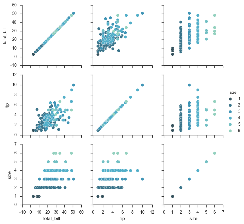
g = sns.PairGrid(tips, hue="size", palette="GnBu_d")
g.map(plt.scatter, s=50, edgecolor="white")
g.add_legend();
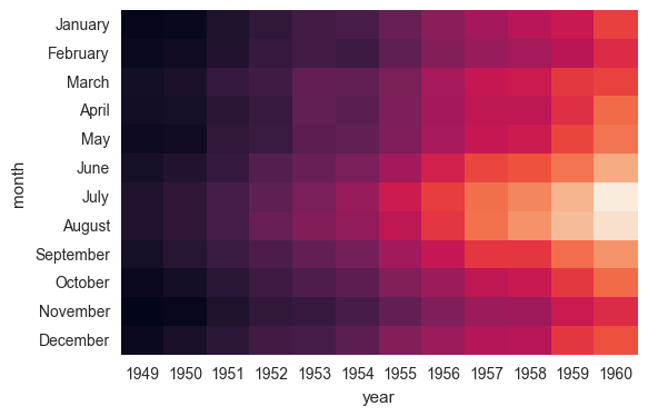
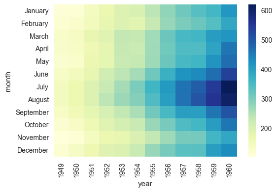
7.8 heat map
%matplotlib inline
import matplotlib.pyplot as plt
import numpy as np;
np.random.seed(0)
import seaborn as sns;
sns.set()
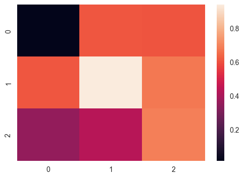
uniform_data = np.random.rand(3, 3)
print (uniform_data)
heatmap = sns.heatmap(uniform_data)
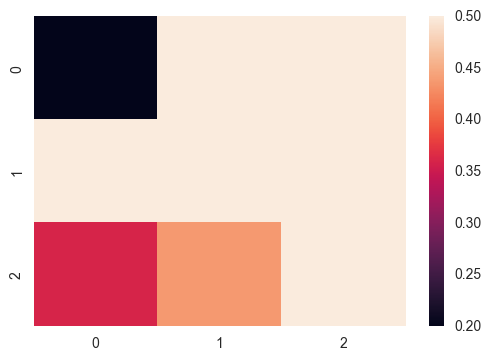
ax = sns.heatmap(uniform_data, vmin=0.2, vmax=0.5)
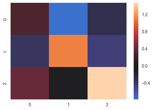
normal_data = np.random.randn(3, 3)
print (normal_data)
ax = sns.heatmap(normal_data, center=0)
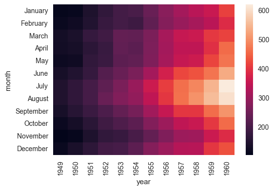
flights = sns.load_dataset("flights")
flights.head()
flights = flights.pivot("month", "year", "passengers")
print (flights)
ax = sns.heatmap(flights)
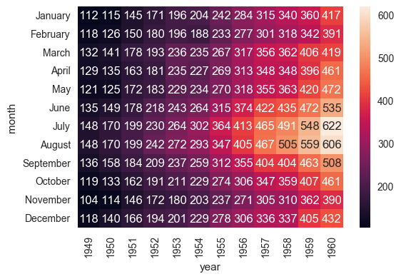
ax = sns.heatmap(flights, annot=True,fmt="d")
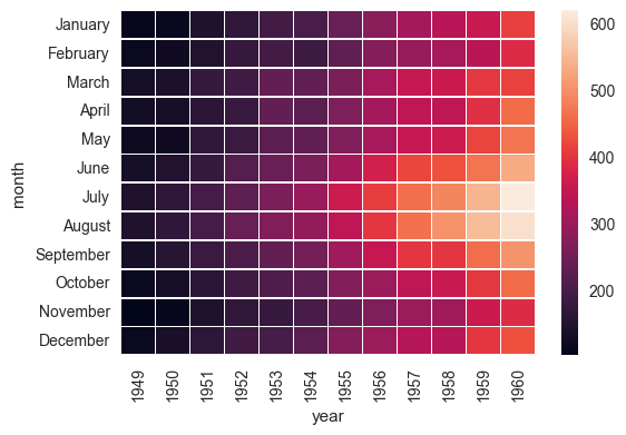
ax = sns.heatmap(flights, linewidths=.5)
ax = sns.heatmap(flights, cmap="YlGnBu")
ax = sns.heatmap(flights, cbar=False)