Author: Peter Editor: Peter
Hello, I'm Peter~
Today, I'd like to share a new kaggle case: prediction and classification of cardiac patients based on random forest model. The knowledge points involved in this paper mainly include:
- Data preprocessing and type conversion
- Establishment and interpretation of Stochastic Forest Model
- Visualization of decision tree
- Drawing and interpretation of partial dependence diagram PDP
- Use and interpretation of AutoML machine learning SHAP Library (individual to be promoted)

<!--MORE-->
Reading guide
Of all the applications of machine-learning, diagnosing any serious disease using a black box is always going to be a hard sell. If the output from a model is the particular course of treatment (potentially with side-effects), or surgery, or the absence of treatment, people are going to want to know why. In all applications of machine learning, it is always difficult to use the black box to diagnose any serious disease. If the output of the model is a specific treatment process (which may have side effects), surgery, or whether it is effective, people will want to know why. This dataset gives a number of variables along with a target condition of having or not having heart disease. Below, the data is first used in a simple random forest model, and then the model is investigated using ML explainability tools and techniques. The dataset provides many variables and target conditions with or without heart disease. Next, the data is first used in a simple random forest model, and then the model is studied using ML interpretability tools and techniques.
If you are interested, please refer to the original text. The notebook address is: https://www.kaggle.com/tentotheminus9/what-causes-heart-disease-explaining-the-model
Import library
This case involves several libraries in different directions:
- Data preprocessing
- Various visual drawings; Especially the visualization of shap and the use of model interpretability (this library will be written later)
- Stochastic forest model
- Model evaluation, etc
import numpy as np
import pandas as pd
import matplotlib.pyplot as plt
import seaborn as sns
from sklearn.ensemble import RandomForestClassifier
from sklearn.tree import DecisionTreeClassifier
from sklearn.tree import export_graphviz
from sklearn.metrics import roc_curve, auc
from sklearn.metrics import classification_report
from sklearn.metrics import confusion_matrix
from sklearn.model_selection import train_test_split
import eli5
from eli5.sklearn import PermutationImportance
import shap
from pdpbox import pdp, info_plots
np.random.seed(123)

pd.options.mode.chained_assignment = None
Data exploration EDA
1. Import data
2. Missing value
The data is perfect without any missing value!
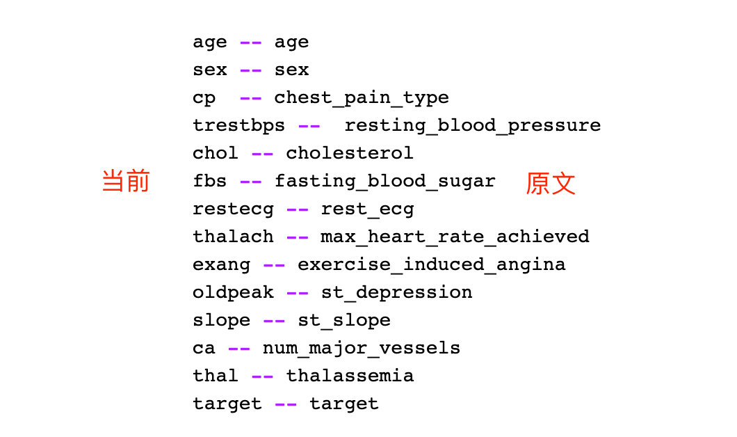
Field meaning
Here we will focus on the meaning of each field. Peter's recently exported data set has slightly different names from those in the original notebook (due to time). Fortunately, Peter has made a one-to-one correspondence for you. The following is the specific Chinese meaning:
- Age: age
- Sex sex 1 = male 0 = female
- Type of cp chest pain; 4 values
- 1: Typical angina pectoris
- 2: Atypical angina pectoris
- 3: Non angina pectoris
- 4: Asymptomatic
- Restbps resting blood pressure
- chol serum cholesterol
- fbs fasting blood glucose > 120mg / dl: 1=true; 0=false
- restecg resting ECG (values 0,1,2)
- Maximum heart rate thalach
- exang exercise-induced angina pectoris (1=yes;0=no)
- ST value caused by exercise relative to rest (ST value is related to the position on ECG)
- Slope of ST segment at the peak of slope movement
- 1: upsloping tilt up
- 2: Flat flat
- 3: Downslope down
- CA the number of major vessels (0-3)
- That a blood disorder called thalassemia (3 = normal; 6 = fixed defect; 7 = reversible defect)
- target is not sick (0=no; 1=yes)
The English meaning of the original notebook;

The following is the correspondence sorted by Peter. This article takes the current version as the standard:
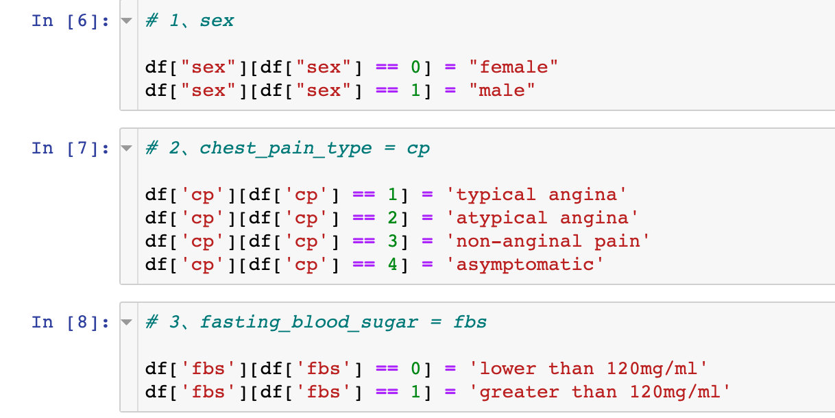
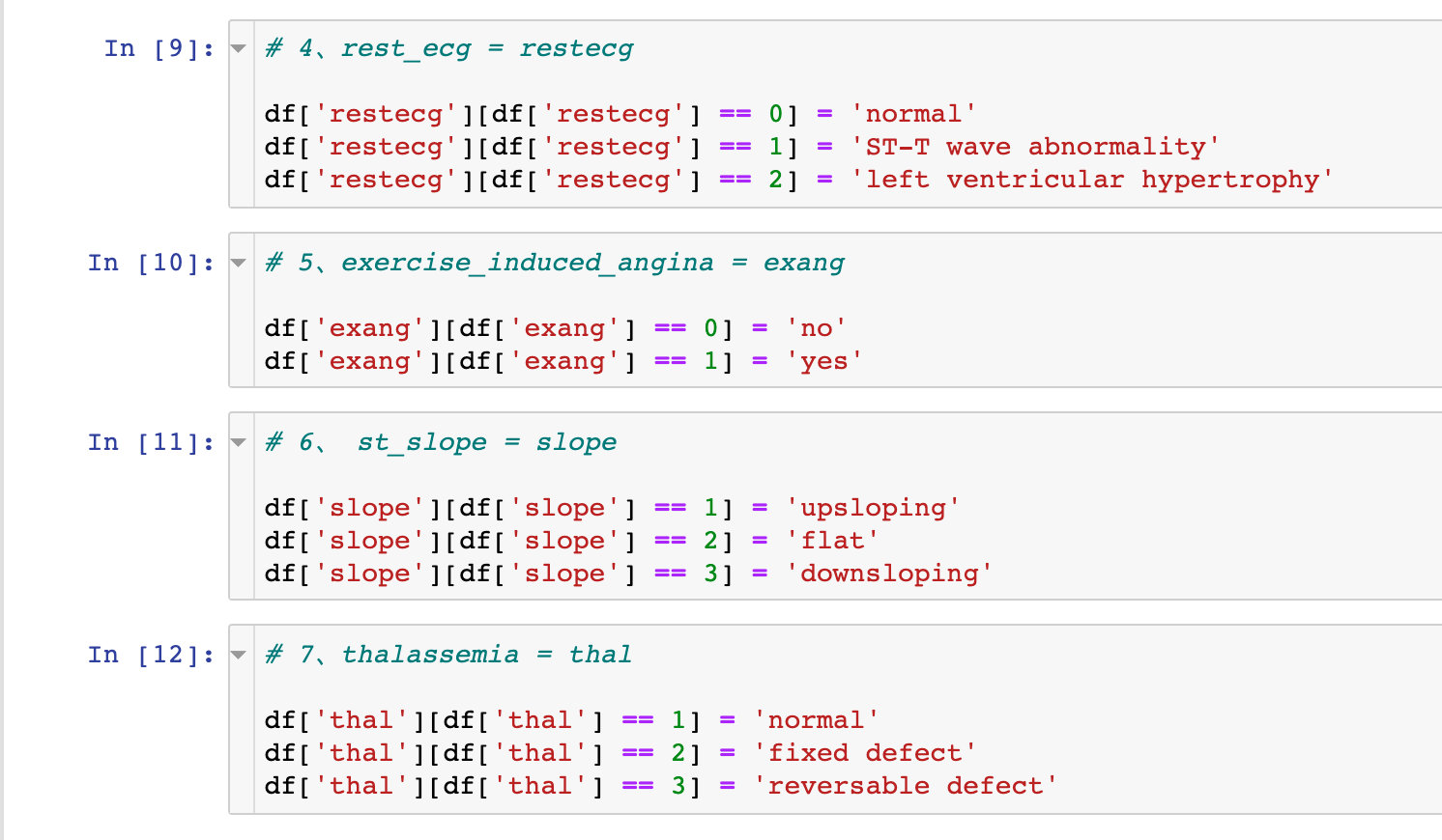
Field conversion
Transformation coding
Convert some fields one by one. Take the sex field as an example: change 0 into female and 1 into female in the data
# 1,sex

df["sex"][df["sex"] == 0] = "female"
df["sex"][df["sex"] == 1] = "male"
Field type conversion
# Specify data type
df["sex"] = df["sex"].astype("object")
df["cp"] = df["cp"].astype("object")
df["fbs"] = df["fbs"].astype("object")
df["restecg"] = df["restecg"].astype("object")
df["exang"] = df["exang"].astype("object")
df["slope"] = df["slope"].astype("object")
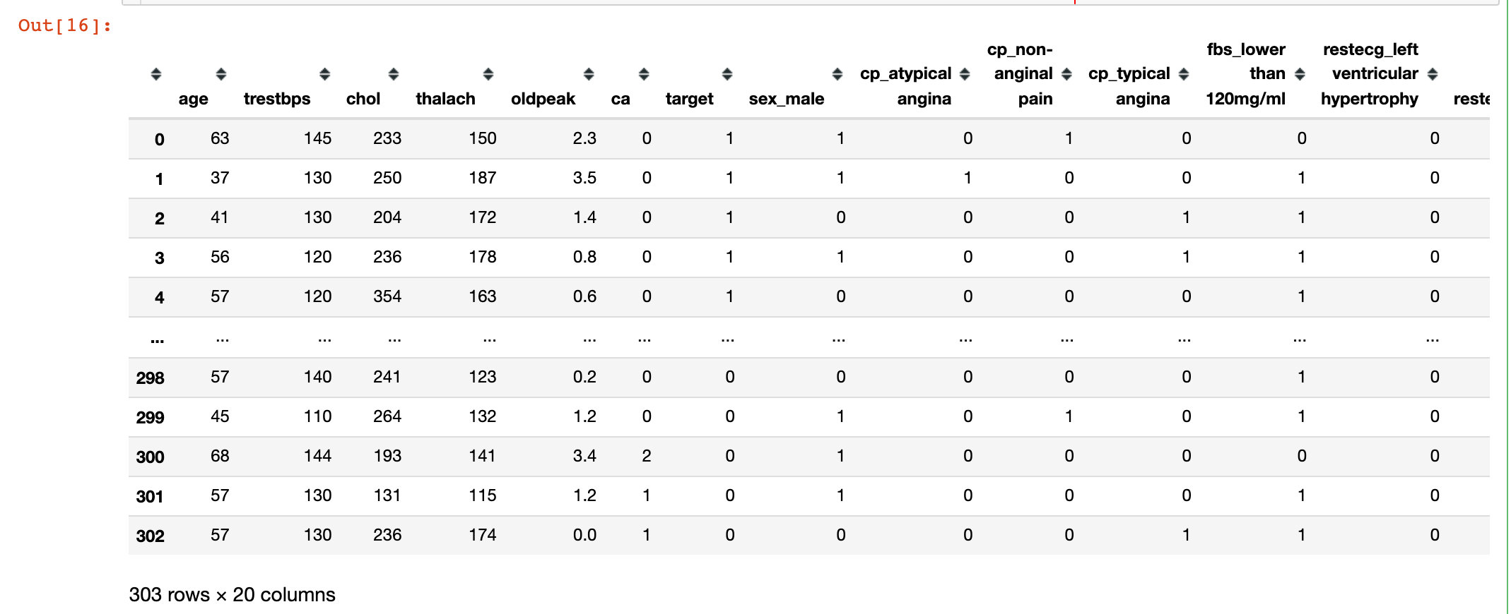
df["thal"] = df["thal"].astype("object")Generate dummy variable
# Generate dummy variable
df = pd.get_dummies(df,drop_first=True)
df
Random forest
Segmentation data
# Generate characteristic variable dataset and dependent variable dataset
X = df.drop("target",1)
y = df["target"]

# The segmentation ratio is 8:2
X_train, X_test, y_train, y_test = train_test_split(X,y,test_size=0.2,random_state=10)

X_train
modeling
rf = RandomForestClassifier(max_depth=5)
rf.fit(X_train, y_train)
3 important attributes
Three important attributes in random forest:
- View the condition of trees in the forest: estimators_
- Out of bag estimation accuracy score: oobscore, must be OOB_ The score parameter is available only when True is selected
- Importance of variables: feature imports
Decision tree visualization
Here we choose the visualization process of the second tree:
# Check the condition of the second tree
estimator = rf.estimators_[1]

# All attributes
feature_names = [i for i in X_train.columns]
#print(feature_names)
# Specify data type
y_train_str = y_train.astype('str')
# 0-no 1-disease
y_train_str[y_train_str == '0'] = 'no disease'
y_train_str[y_train_str == '1'] = 'disease'
# Value of training data
y_train_str = y_train_str.values
y_train_str[:5]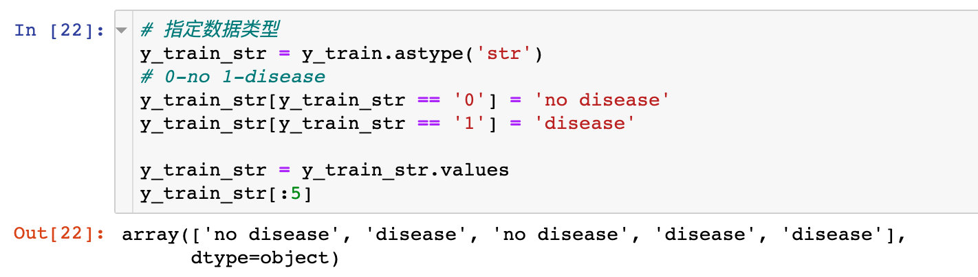
The specific code of the drawing is:
# Drawing display

export_graphviz(
    estimator,   # Incoming second tree
    out_file='tree.dot',   # Export file name
    feature_names = feature_names,  # Attribute name
    class_names = y_train_str,  # Final classification data
    rounded = True,
    proportion = True,
    label='root',
    precision = 2,
    filled = True
)

from subprocess import call
call(['dot', '-Tpng', 'tree.dot', '-o', 'tree.png', '-Gdpi=600'])

from IPython.display import Image
Image(filename = 'tree.png')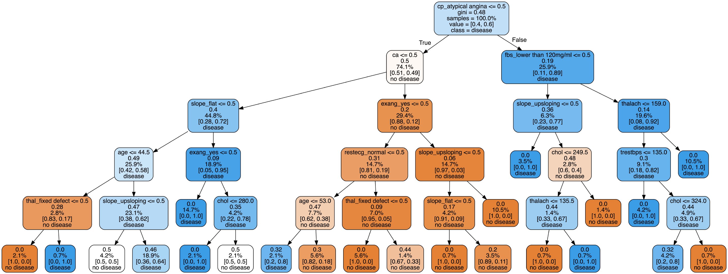
The visualization process of decision tree can let us see the specific classification process, but it can not solve which features or attributes are more important. Later, we will explore the characteristic importance of some attributes
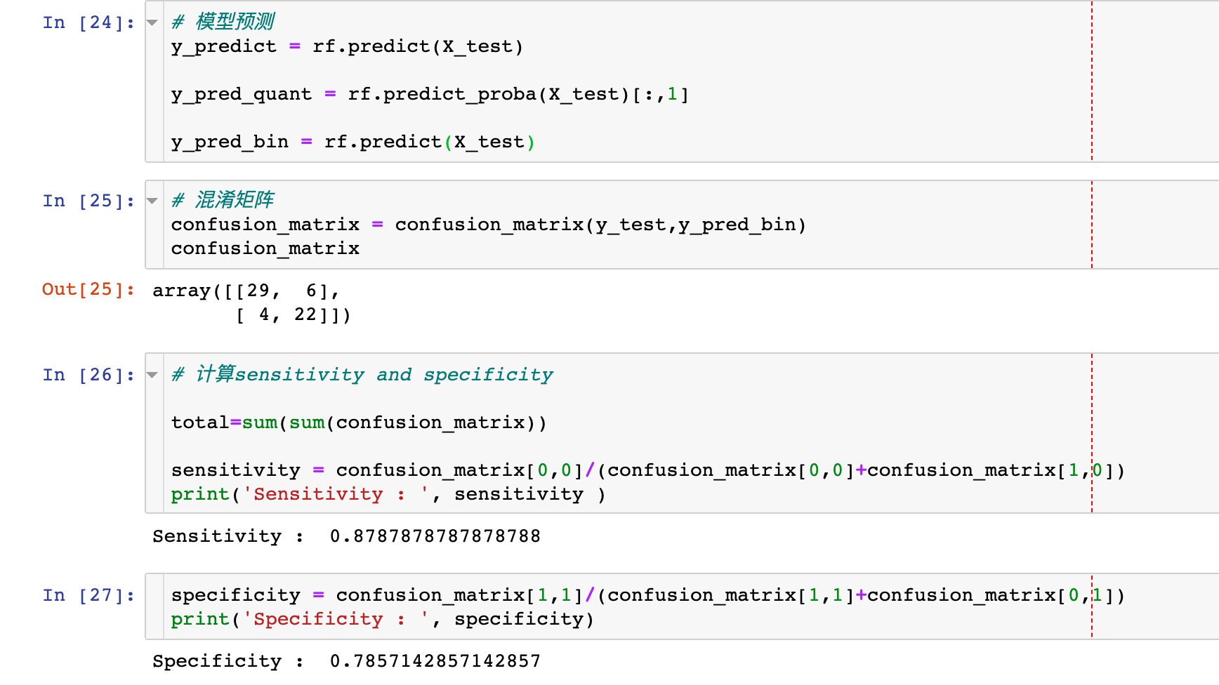
Model score verification
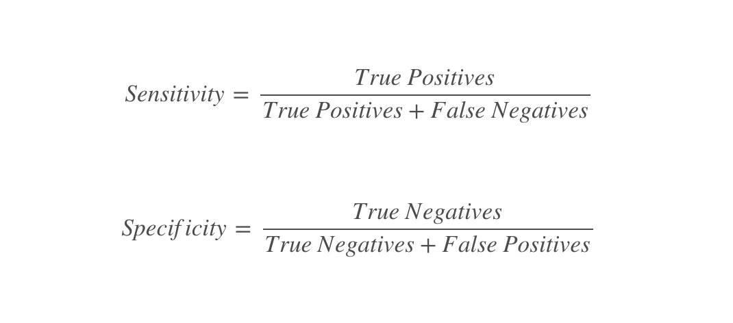
The confusion matrix and the two indicators of specificity and sensitivity are used to describe the performance of the classifier:
# model prediction
y_predict = rf.predict(X_test)
y_pred_quant = rf.predict_proba(X_test)[:,1]
y_pred_bin = rf.predict(X_test)

# Confusion matrix
confusion_matrix = confusion_matrix(y_test,y_pred_bin)
confusion_matrix

# Calculate sensitivity and specificity
total=sum(sum(confusion_matrix))
sensitivity = confusion_matrix[0,0]/(confusion_matrix[0,0]+confusion_matrix[1,0])
specificity = confusion_matrix[1,1]/(confusion_matrix[1,1]+confusion_matrix[0,1])
Draw ROC curve
fpr, tpr, thresholds = roc_curve(y_test, y_pred_quant)

fig, ax = plt.subplots()
ax.plot(fpr, tpr)

ax.plot([0,1],[0,1],
        transform = ax.transAxes,
        ls = "--",
        c = ".3"
       )

plt.xlim([0.0, 1.0])
plt.ylim([0.0, 1.0])

plt.rcParams['font.size'] = 12

# title
plt.title('ROC Curve')
# Name of both axes
plt.xlabel('False Positive Rate (1 - Specificity)')
plt.ylabel('True Positive Rate (Sensitivity)')
# Grid line
plt.grid(True)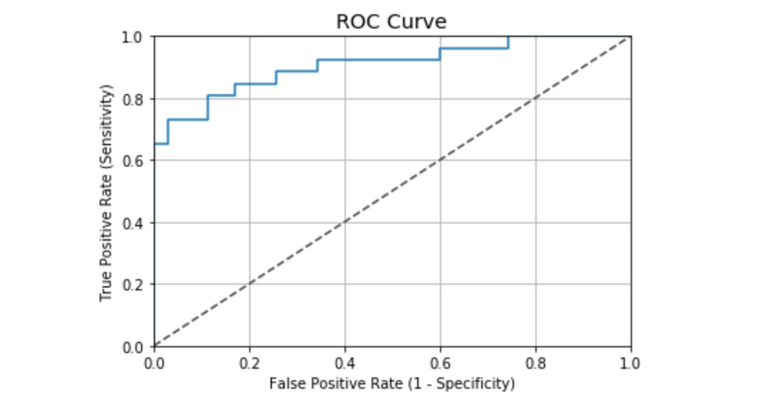
ROC curve value in this case:
auc(fpr, tpr)
# result
0.9076923076923078
According to the evaluation standard of general ROC curve, the performance result of the case is good:
- 0.90 - 1.00 = excellent
- 0.80 - 0.90 = good
- 0.70 - 0.80 = fair
- 0.60 - 0.70 = poor
- 0.50 - 0.60 = fail
Supplementary knowledge: evaluation index of classifier
Considering a binary classification, the categories are 1 and 0. We regard 1 and 0 as positive and negative respectively. According to the actual results and predicted results, there are four final results. The table is as follows:

Common evaluation indicators:
1. ACC: classification accuracy, which describes the classification accuracy of the classifier
The calculation formula is: ACC=(TP+TN)/(TP+FP+FN+TN)
2,BER: balanced error rate
The calculation formula is: BER=1/2*(FPR+FN/(FN+TP))
3. TPR: true positive rate, which describes the proportion of all positive cases identified in all positive cases
The calculation formula is: TPR=TP/ (TP+ FN)
4. FPR: false positive rate, which describes the proportion of identifying negative cases as positive cases in all negative cases
The calculation formula is: FPR= FP / (FP + TN)
5. TNR: true negative rate, which describes the proportion of identified negative cases in all negative cases
The calculation formula is: TNR= TN / (FP + TN)
6,PPV: Positive predictive value
The calculation formula is: PPV=TP / (TP + FP)
7,NPV: Negative predictive value
Calculation formula: NPV=TN / (FN + TN)
Where TPR is sensitivity and TNR is specificity.
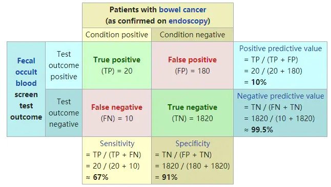
Classic graphics from Wikipedia:
Interpretability
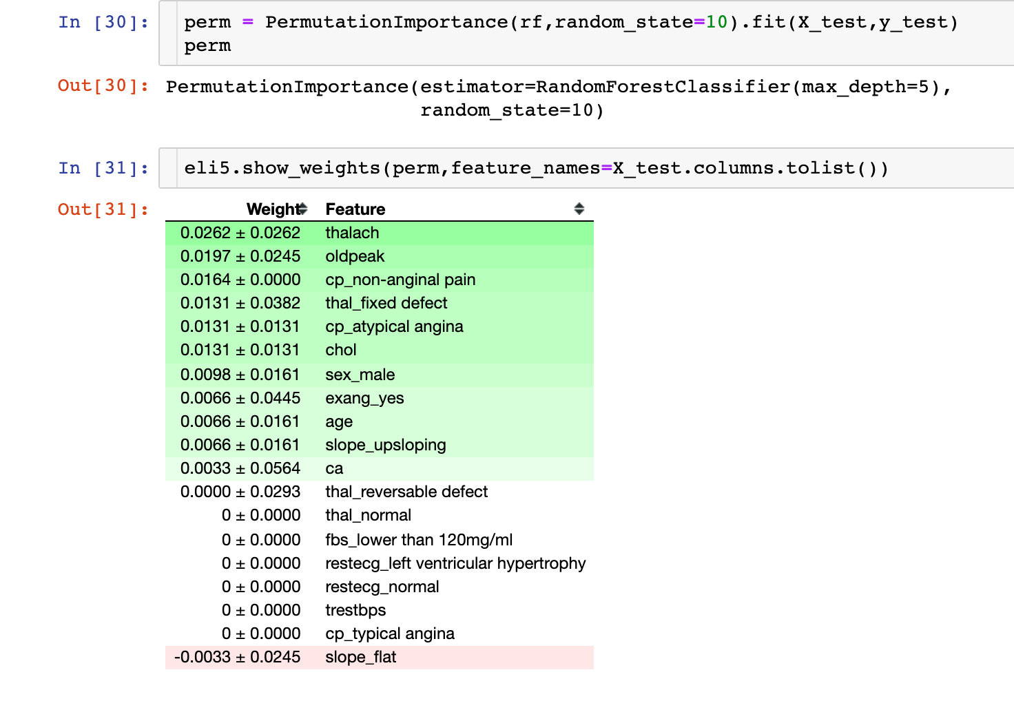
Permutation Importance
The following is about the interpretability of the results of the machine learning model. The first is the importance of each variable to the model. Permutation Importance:
Partial dependency plots (PDP)
One dimensional PDP
Partial dependency is used to explain the relationship between a feature and the target value y, which is generally reflected by drawing a partial dependency plot (PDP). In other words, the value of PDP in X1 is the average value predicted by the original model after changing the first variable in the training set to x1.
Key: view the relationship between individual features and target values
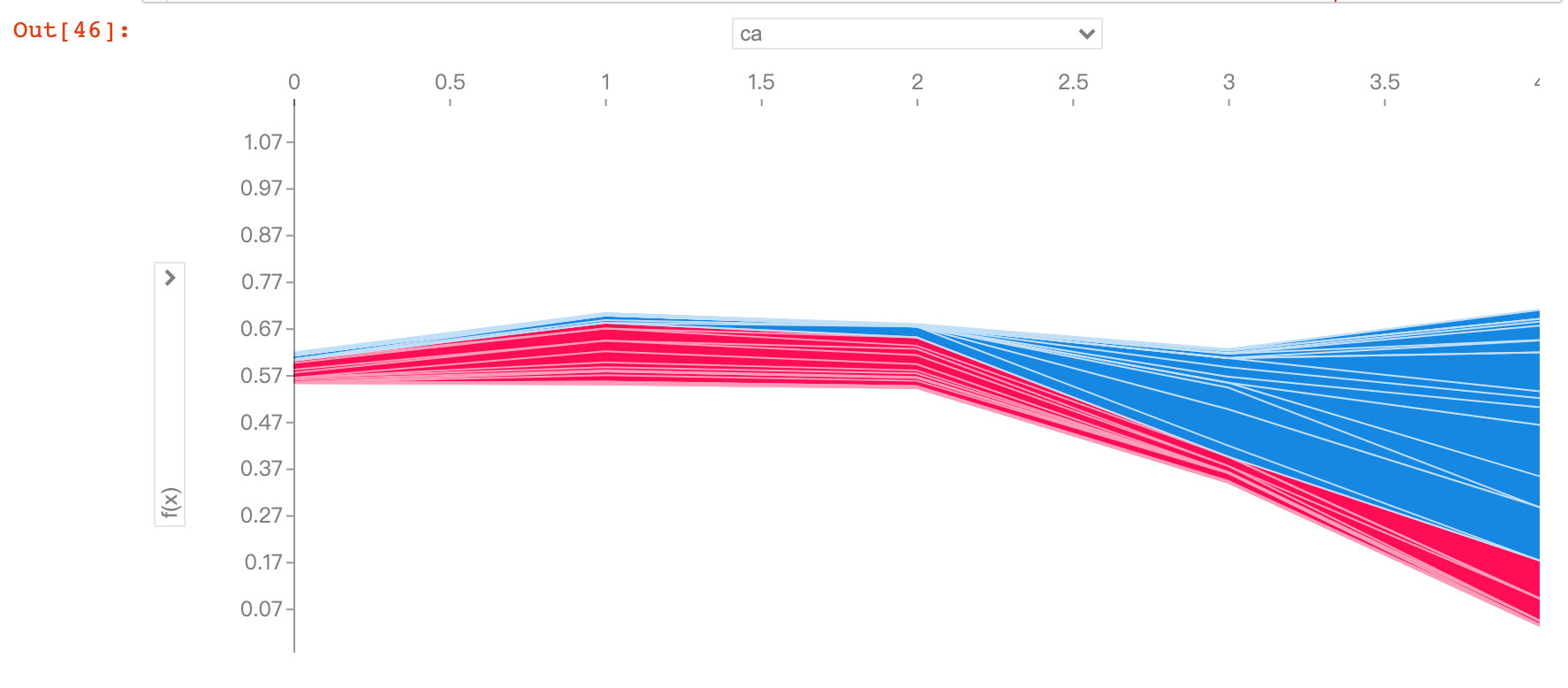
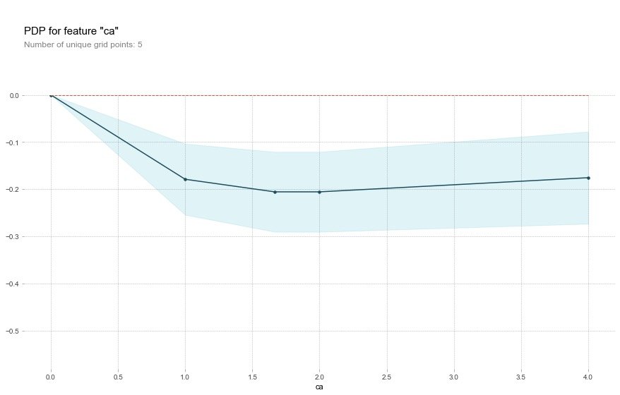
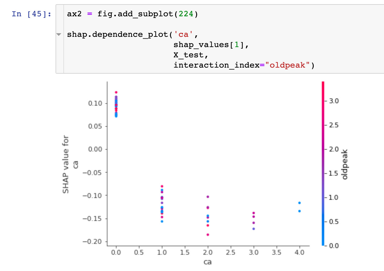
Field ca
base_features = df.columns.values.tolist()
base_features.remove("target")

feat_name = 'ca'  # ca-num_major_vessels original
pdp_dist = pdp.pdp_isolate(
    model=rf,  # Model
    dataset=X_test,  # Test set
    model_features=base_features,  # Characteristic variables; Remove target value
    feature=feat_name  # Specify a single field
)

pdp.pdp_plot(pdp_dist, feat_name)  # Pass in two parameters
plt.show()
Through the following graph, we observed that when the ca field increased, the risk of disease decreased. The meaning of ca field is num_major_vessels, which means that when the number of vessels increases, the prevalence decreases
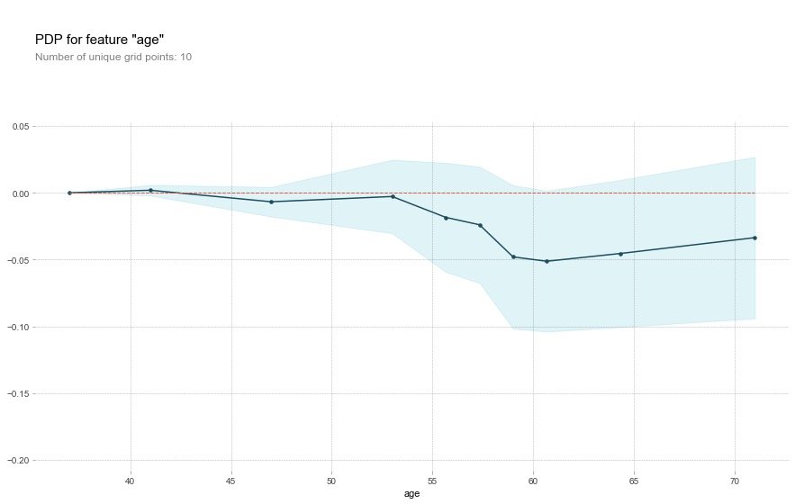
Field age
feat_name = 'age'

pdp_dist = pdp.pdp_isolate(
    model=rf,
    dataset=X_test,
    model_features=base_features,
    feature=feat_name)

pdp.pdp_plot(pdp_dist, feat_name)
plt.show()
For the age field, the description of the original text:
That's a bit odd. The higher the age, the lower the chance of heart disease? Althought the blue confidence regions show that this might not be true (the red baseline is within the blue zone).
This is a little strange. The older you are, the lower your risk of heart disease? Although the blue confidence interval indicates that this may not be true (the red baseline is in the blue area)
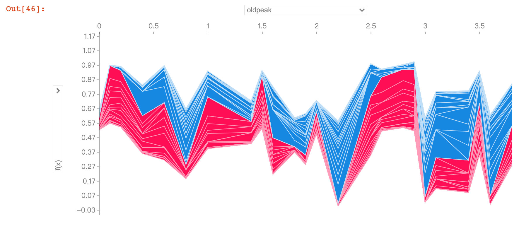
Field oldpack
feat_name = 'oldpeak'

pdp_dist = pdp.pdp_isolate(
    model=rf,
    dataset=X_test,
    model_features=base_features,
    feature=feat_name)

pdp.pdp_plot(pdp_dist, feat_name)
plt.show()
The oldpack field also indicates that the higher the value, the lower the risk of disease.
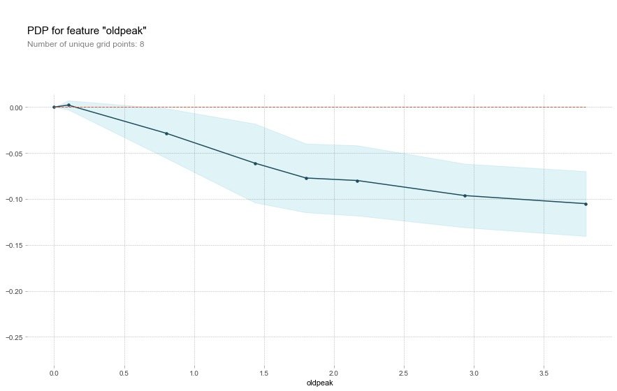
This variable is called "ST depression caused by relative rest exercise". Under normal conditions, the higher the value, the higher the risk of disease. But the image above shows the opposite result.
The author infers that the reason for this result may be related to slope type in addition to the depression amount. The original text is excerpted as follows, so the author draws 2D-PDP graphics
Perhaps it's not just the depression amount that's important, but the interaction with the slope type? Let's check with a 2D PDP
2D-PDP diagram
The view is slope_upsloping ,slope_ Relationship between flat and oldpack:
inter1  =  pdp.pdp_interact(
    model=rf,  # Model
    dataset=X_test,  # Feature data set
    model_features=base_features,  # features
    features=['slope_upsloping', 'oldpeak'])

pdp.pdp_interact_plot(
    pdp_interact_out=inter1,
    feature_names=['slope_upsloping', 'oldpeak'],
    plot_type='contour')
plt.show()

## ------------

inter1  =  pdp.pdp_interact(
    model=rf,
    dataset=X_test,
    model_features=base_features,
    features=['slope_flat', 'oldpeak']
)

pdp.pdp_interact_plot(
    pdp_interact_out=inter1,
    feature_names=['slope_flat', 'oldpeak'],
    plot_type='contour')
plt.show()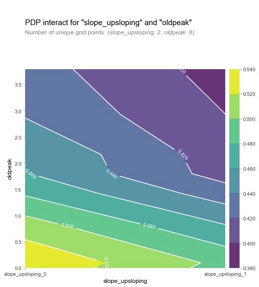

From the two figures, we can observe that when the oldpeak value is low, the disease probability is relatively high (yellow), which is a strange phenomenon. So the author makes the following visual exploration of SHAP: analyze a single variable.
SHAP visualization
For the introduction of shake, please refer to the article: https://zhuanlan.zhihu.com/p/83412330 and https://blog.csdn.net/sinat_26917383/article/details/115400327
SHAP is a "model interpretation" package developed by Python, which can interpret the output of any machine learning model. The following are some of the functions used by SHAP:
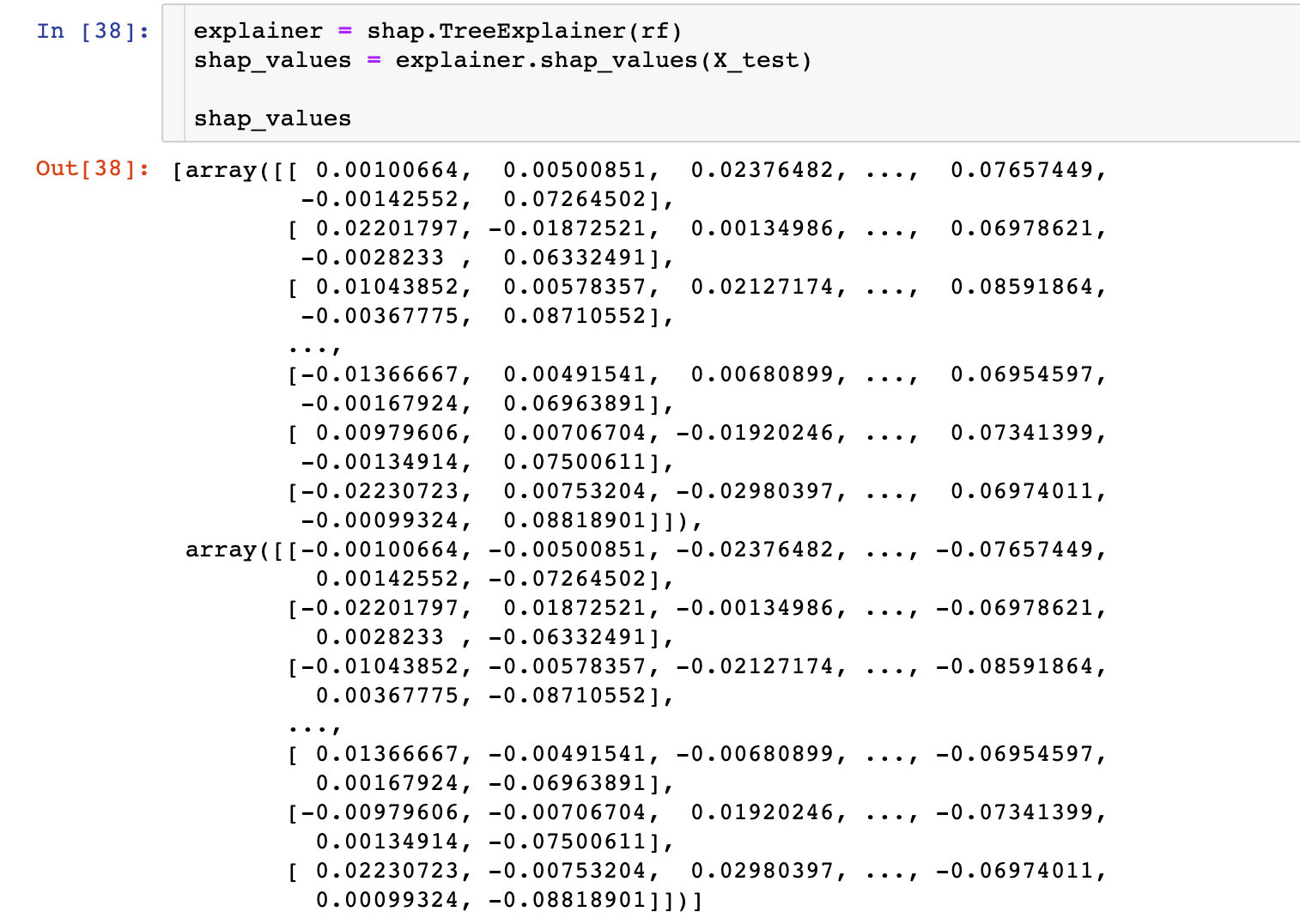
Explainer
An interpreter needs to be created before model interpretation in SHAP. SHAP supports many types of interpreters, such as deep, gradient, kernel, linear, tree and sampling. In this case, we take tree as an example:
# Incoming random forest model rf
explainer = shap.TreeExplainer(rf)
# Input the data of characteristic value in the interpreter to calculate the shap value
shap_values = explainer.shap_values(X_test)
shap_values
Feature Importance
Take the average value of the absolute value of each feature's slap value as the importance of the feature to obtain a standard bar graph (multi class generates a stacked bar graph:

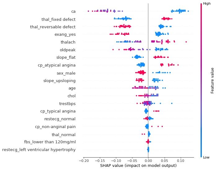
Conclusion: it can be observed intuitively that the SHAP value of ca field is the highest
summary_plot
summary plot plots the snap values for each feature of each sample, which can better understand the overall pattern and allow the discovery of predicted outliers.
- Each row represents a feature, and the abscissa is the SHAP value
- A point represents a sample, and the color represents the height of the eigenvalue (red high, blue low)
individual difference
To view the influence of different characteristic attributes of a single patient on its results, the original description is as follows:
Next, let's pick out individual patients and see how the different variables are affecting their outcomes
def heart_disease_risk_factors(model, patient):

    explainer = shap.TreeExplainer(model)  # Establish explainer
    shap_values = explainer.shap_values(patient)  # Calculate shape value
    shap.initjs()
    return shap.force_plot(
      explainer.expected_value[1],
      shap_values[1],
      patient)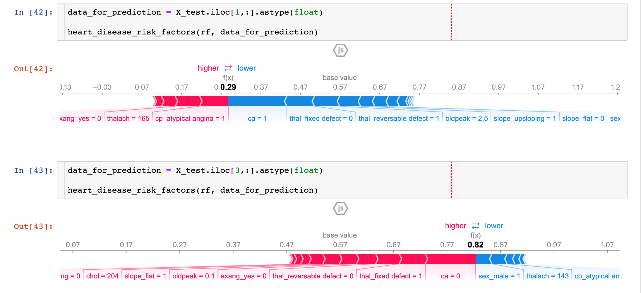
From the results of two patients:
- P1: the prediction accuracy is as high as 29% (baseline is 57%), and more factors focus on ca and thal_fixed_defect, oldpack and other blue parts.
- P3: the prediction accuracy is as high as 82%, and more influencing factors are in sel_male=0, thalach=143, etc
By comparing different patients, we can observe the prediction rate and main influencing factors among different patients.
dependence_plot
In order to understand how a single feature affects the output of the model, we can compare the snap value of the feature with the feature values of all samples in the dataset:
Visual exploration of diversified books
The following figure is an exploration of the prediction and influencing factors for multiple patients. Under the interactive action of Jupiter notebook, we can observe the influence of different feature attributes on the first 50 patients:
shap_values = explainer.shap_values(X_train.iloc[:50])
shap.force_plot(explainer.expected_value[1],
                shap_values[1],
                X_test.iloc[:50])