Proficient in CSS Chapter 8 responsive layout learning cases
There are three responsive learning cases, one is flex responsive, and the other two will be Proficient in CSS Chapter 7 learning notes (Part 1) and Proficient in CSS Chapter 7 learning notes (Part 2) The two cases done in are transformed into response.
Response of flexbox
Flexbox seems to have no media query - at least that's what the book says. However, flexbox itself has adaptive special effects. It is more friendly to many contents that are not sensitive to the screen size and are more sensitive to the element box size.
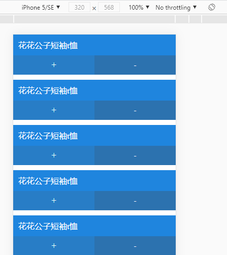
The example in this article is similar to the commodity mode in shopping cart. You can click + / - to modify the quantity of commodities, as follows:
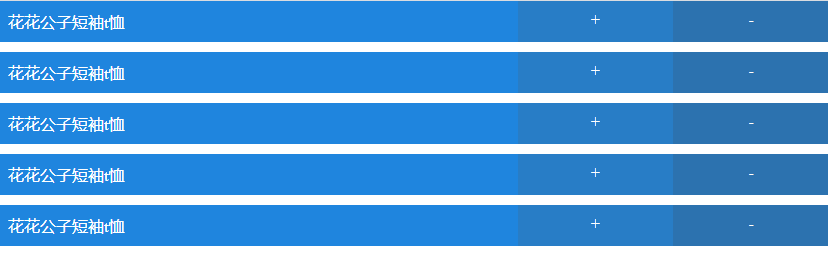
Under normal circumstances, there are only two requirements: put the box on the same line when the width is enough, and fold it when the width is not enough:
The code is as follows:
<!DOCTYPE html>
<html lang="en">
  <head>
    <meta charset="UTF-8" />
    <meta http-equiv="X-UA-Compatible" content="IE=edge" />
    <meta name="viewport" content="width=device-width, initial-scale=1.0" />
    <title>Document</title>
    <style>
      * {
        margin: 0;
        padding: 0;
      }
      .cart-item {
        display: flex;
        flex-wrap: wrap;
        margin-bottom: 10px;
      }
      .product-name,
      .control-items {
        box-sizing: border-box;
        color: #fff;
      }
      .product-name {
        padding: 10px;
        flex: 1 0 17em;
        background-color: #1f85de;
      }
      .control-items {
        flex: 1 0 4em;
        display: flex;
        background-color: #1f85de;
      }
      .control-item {
        flex: 1;
        padding: 10px;
        text-align: center;
      }
      .increse-quantity {
        background-color: #287dc6;
      }
      .decrease-quantity {
        background-color: #2c72af;
      }
    </style>
  </head>
  <body>
    <ul class="cart-items">
      <li class="cart-item">
        <div class="product-name">Playboy short sleeve t Shirt</div>
        <div class="control-items">
          <span class="control-item increse-quantity">+</span>
          <span class="control-item decrease-quantity">-</span>
        </div>
      </li>
      <li class="cart-item">
        <div class="product-name">Playboy short sleeve t Shirt</div>
        <div class="control-items">
          <span class="control-item increse-quantity">+</span>
          <span class="control-item decrease-quantity">-</span>
        </div>
      </li>
      <li class="cart-item">
        <div class="product-name">Playboy short sleeve t Shirt</div>
        <div class="control-items">
          <span class="control-item increse-quantity">+</span>
          <span class="control-item decrease-quantity">-</span>
        </div>
      </li>
      <li class="cart-item">
        <div class="product-name">Playboy short sleeve t Shirt</div>
        <div class="control-items">
          <span class="control-item increse-quantity">+</span>
          <span class="control-item decrease-quantity">-</span>
        </div>
      </li>
      <li class="cart-item">
        <div class="product-name">Playboy short sleeve t Shirt</div>
        <div class="control-items">
          <span class="control-item increse-quantity">+</span>
          <span class="control-item decrease-quantity">-</span>
        </div>
      </li>
    </ul>
  </body>
</html>
The difficulty or pain point of Flexbox folding lies in the need to understand flex: 1 0 4em; This syntax is flex grow, flex shrink, and flex basis.
In most cases, the response formula obtained is used
That is, the layout method based on non flexbox and non grid layout is used.
The HTML part remains consistent without any modification. The change is in the CSS part, which once again shows the importance of separating structure and style - even if the layout is modified, the HTML part doesn't need to be moved, just modify the CSS.
A total of three parts are adapted: small screen / mobile phone, medium screen / tablet, large screen / PC or high pixel tablet.
Mobile priority is still used. Start from the small screen:
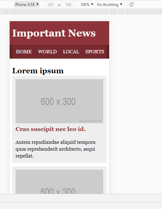
In this case, the effect looks good without additional adaptation - after all, the screen is small and there are few things to put.
Then advance to the middle screen:
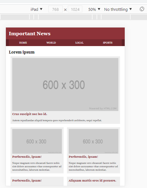
For the layout of the middle screen, articles with smaller pictures can be merged to save space.
On the big screen, I put the title above the content:
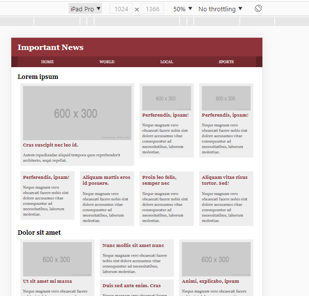
After this is the full version of CSS:
* {
  margin: 0;
  padding: 0;
}
li {
  list-style: none;
}
a {
  text-decoration: none;
}
body {
  line-height: 1.375;
  font-family: Georgia, Times New Roman, Times, serif;
}
.wrapper {
  width: 95%;
  max-width: 76em;
  margin: 0 auto;
}
.clearfix::after,
.clearfix::before {
  content: "";
  display: block;
}
.clearfix::after {
  clear: both;
}

.masthead {
  background-color: #8e3339;
}
.masthead h1 {
  margin: 0;
  padding: 0.5em 0;
  color: #fff;
}
.navbar {
  background-color: #5e2126;
  margin-bottom: 1.375em;
}
.navlist {
  display: flex;
  background-color: #752a2f;
}
.navlist li {
  flex: 1;
  text-transform: uppercase;
  text-align: center;
  box-sizing: border-box;
}
.navlist li a {
  display: block;
  line-height: 1.75em;
  padding: 0.5em;
  color: #fff;
}

.story {
  min-height: 100px;
}
.story h3 {
  margin-bottom: 1em;
}
.story h3 a {
  color: #8e3339;
}
.story {
  margin-bottom: 0.6875em;
  padding: 0.6875em;
  background-color: #eee;
}
.story img {
  width: 100%;
}

@media (min-width: 35em) {
  .row-quartet > * {
    float: left;
    width: 50%;
  }
  .row-trio > * {
    float: left;
    width: 33.333%;
  }
  .story {
    margin: 0.6875em;
  }
  .subcategory-featured {
    width: 100%;
  }
}

@media (min-width: 50em) {
  .row-quartet > * {
    width: 25%;
  }
  .subcategory-featured {
    width: 50%;
  }
}
Responsive grid layout
The implementation idea of grid layout is the same. In common layout, the width is modified, and in grid layout, the template can be modified directly, as follows:
/* Omit the style of the head and other parts */
.content-area1,
.content-area2 {
  margin-right: -10px;
}
.story {
  padding: 5px;
  margin: 0 10px 20px;
  background-color: #eee;
}
.story img {
  width: 100%;
}
.hd {
  grid-area: hd;
}
.st1 {
  grid-area: st1;
}
.st2 {
  grid-area: st2;
}

@media (min-width: 37.5em) {
  .content-area1,
  .content-area2 {
    display: grid;
  }
  .content-area1 {
    grid-template-areas:
      "hd hd"
      "st1 st1";
  }
  .content-area2 {
    grid-template-areas:
      "hd hd hd"
      "st2 . st1"
      "st2 . st1";
  }
}
@media (min-width: 55em) {
  .content-area1 {
    grid-template-columns: 20% repeat(4, 1fr);
    grid-template-areas:
      "hd st1 st1 . ."
      "hd . . . .";
  }
  .content-area2 {
    grid-template-columns: 20% repeat(3, 1fr);
    grid-template-areas:
      "hd st1 . st2"
      "hd st1 . st2";
  }
}