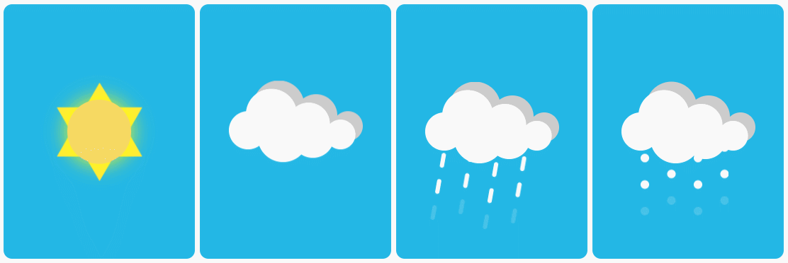
Share how to use CSS3 only to realize single label dynamic sunshine, rain and snow. The key points of technology are "single label" and "pure CSS". Look at the final results first:

Look at the HTML code again:
<! - Sunny - >
<div class="weather sunny"></div>
<! - Yin - >
<div class="weather cloudy"></div>
<! - Rain - >
<div class="weather rainy"></div>
<! - Snow - >
<div class="weather snowy"></div>
web front-end development learning Q-q-u-n:767273102, sharing development tools, zero-based, advanced video tutorials, hope novices take less turns
Yes, it's so capricious. Every motion picture has a label, and no picture has no JS! The following is a detailed description of the technical implementation.
Key CSS3 attributes involved:
- transform: for shift, rotation, scaling effects
- box-shadow: Image reproduction using projection (key! )
- clip-path: masking elements based on drawn shapes
- Animation: animation for setting elements
And the key to realize single label: before,: after pseudo-element use.
What can I learn from this issue?
The biggest one is box-shadow's alternative way of playing -- "shadow separation".
Let's start with one by one.
2 Basic Background
The blue background area in the picture is very basic, needless to say.
The width and height of the area, background color and rounded corner effect are set.
.weather {
    position: relative;
    display: inline-block;
    width: 180px;
    height: 240px;
    background: #23b7e5;
    border-radius: 8px;
}
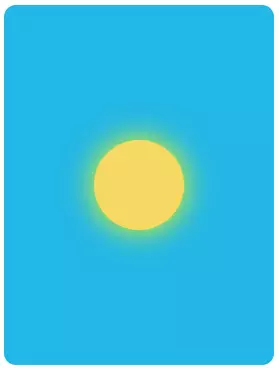
3 sunny days
The sunny day icon consists of two elements: the sun and the inner hexagonal sunlight.
before and after pseudo-elements can "add" one element inside the element, which happens to be used.
3.1 Drawing the Sun
First, we use: before to realize the sun.
.sunny:before {
    content: "";
    position: absolute;
    top: 50%;
    left: 50%;
    transform: translate(-50%, -50%);
    width: 60px;
    height: 60px;
    background: #F6D963;
    border-radius: 50%;
    box-shadow: 0 0 20px #ff0;
    z-index: 2;
}
content is used to generate an element.
position, top, left, and transform are used to achieve centrality.
Box-shadow realizes external luminescence effect, which is only the most basic and commonly used way of box-shadow.
3.2 Drawing Inner Hexagon
Use: after to realize the inner hexagon.
The key to this is the use of masks. Draw an inner hexagon by clip-path. This becomes a simple geometric problem in junior high school.
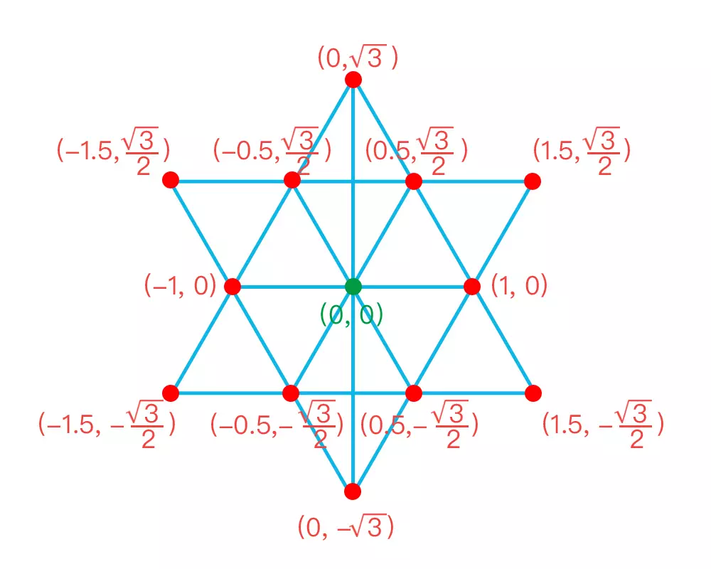
The inner hexagon is composed of two equilateral triangles.
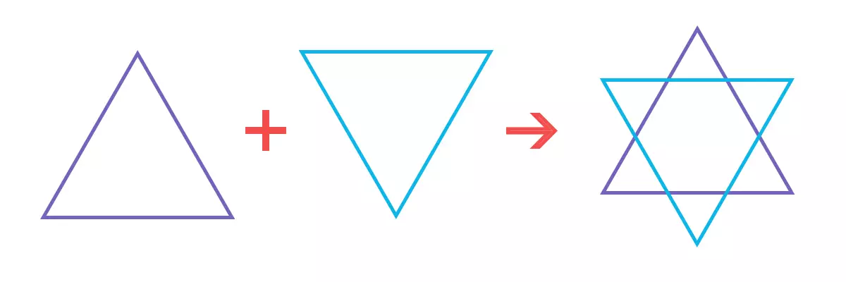
After merging, we can divide the whole into several identical small equilateral triangles.

Make an auxiliary line in the vertical direction, connecting the top and bottom of the middle. It is not difficult to find that the "maximum length in vertical direction" is larger than the "maximum length in horizontal direction".

Assuming that the edge length of the small equilateral triangle is 1 and the center of the inner hexagon is the origin of the coordinates, the coordinates of each point can be calculated as follows:
In order to use clip-path percentage positioning to draw an image, the next step is to convert the length coordinate to the percentage coordinate.
Let the maximum length of the vertical direction be 100% and the center of the inner hexagon be the origin of the coordinates. The coordinate values of each point are converted as follows:
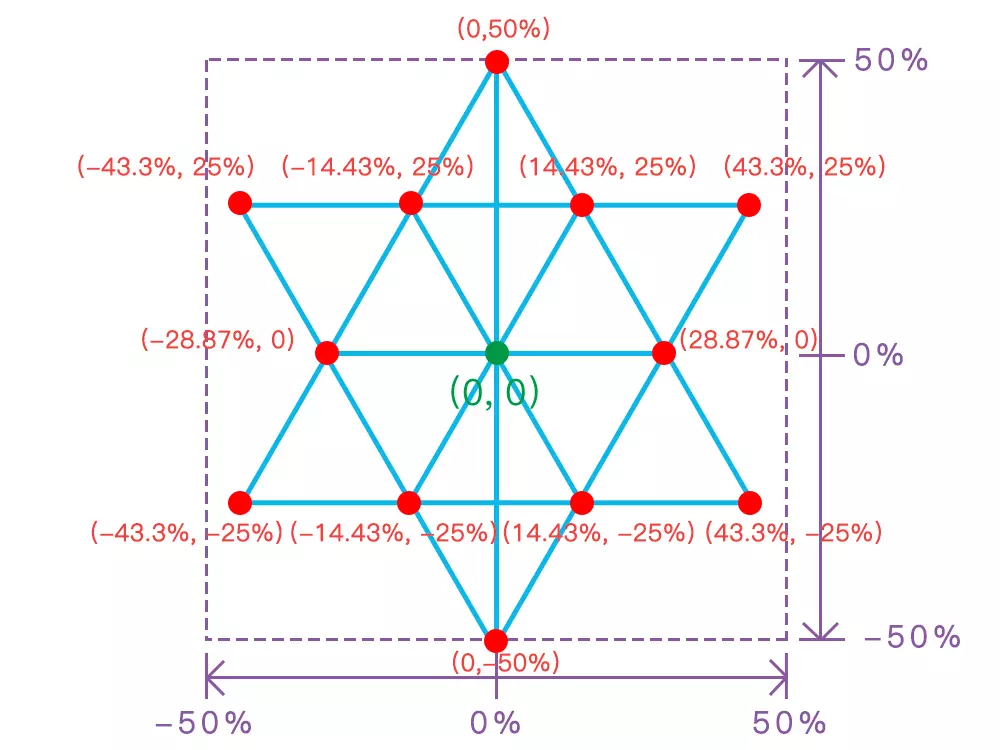
Because clip-path plots the origin at the upper left corner, the right side of the x axis is positive, and the bottom of the y axis is positive. Need to do the coordinate system conversion. Namely:
New x-axis coordinate value = old x-axis coordinate value + 50%
New y axis coordinate value = (old y axis coordinate value - 50%) * - 1
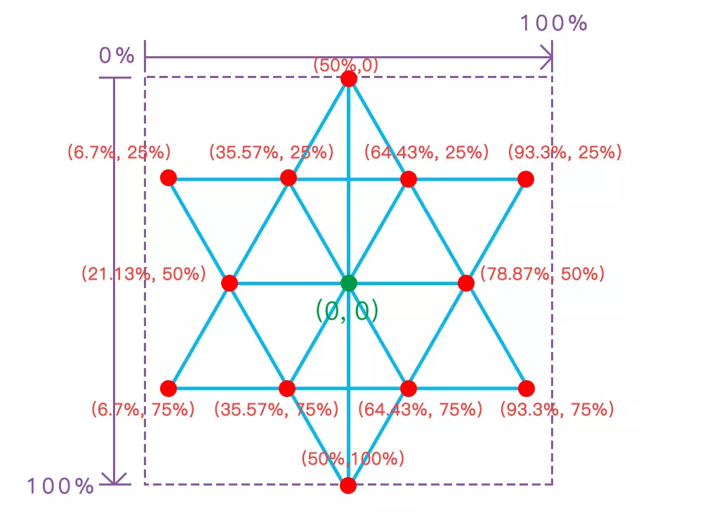
The polygon method of clip-path is used to draw the inner hexagon. The coordinates have been calculated by the above steps.
The style code is as follows:
.sunny:after {
    content: "";
    position: absolute;
    top: 50%;
    left: 50%;
    margin: -45px 0 0 -45px;
    width: 90px;
    height: 90px;
    background: #FFEB3B;
    clip-path: polygon(
    	50% 0%,
        65.43% 25%,
        93.3% 25%,
        78.87% 50%,
        93.3% 75%,
        64.43% 75%,
        50% 100%,
        35.57% 75%,
        6.7% 75%,
        21.13% 50%,
        6.7% 25%,
        35.57% 25%);
    z-index: 1;
    animation: sunScale 2s linear infinite;
}
@keyframes sunScale {
    0% {
        transform: scale(1);
    }
    50% {
    	transform: scale(1.1);
    }
    100% {
        transform: scale(1);
    }
}
web Front-end development learning Q-q-u-n:  767273102 ,Sharing Development Tools, Zero Foundation, Advanced Video Tutorials, Hope Novice Less Bend
Note: safari needs to change clip-path to-webkit-clip-path. Because the code takes up too much space, I won't repeat it here twice.
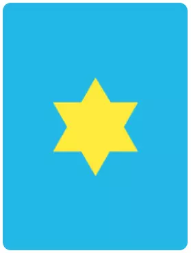
The principle is to draw an inner hexagonal mask by clip-path, and turn the yellow background into the final inner hexagonal through the mask.
Animation achieves "zoom in and zoom out" alternately through key frame animation.
The ultimate effect:

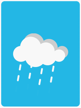
4 cloudy days
Looking at the figure, we found two clouds: the white clouds in front and the dark clouds behind. It seems that it needs to be implemented with: before and: after, respectively. If this is done, there will be no excess pseudo-elements available for rain and snow elements in subsequent chapters. So only one pseudo-element can be used to implement two clouds. Here's the box-shadow avatar!
Because the rain and snow in the following chapters reuse the cloud style, so write together, the code is as follows:
.cloudy:before,
.rainy:before,
.snowy:before {
    content: "";
    position: absolute;
    top: 50%;
    left: 25%;
    transform: translate(-50%, -50%);
    width: 36px;
    height: 36px;
    background: #fff;
    border-radius: 50%;
    z-index: 2;
}
The real element is a circle. Through box-show, projection is regarded as "separation".
Let's first look at the properties of box-shadow:
box-shadow: h-shadow v-shadow blur spread color inset;
Detailed parameters:
h-shadow: Horizontal offset of shadows.
v-shadow: Vertical offset of shadows.
blur: Fuzzy distance (that is, the gradual distance, set to zero, there is no gradual change).
spread: The size of the projection, which controls the size of the shadow.
Color: Projection color, through which the dark clouds behind can be achieved.
Insert: Change to Inner Shadow. It's not needed here.
First try to duplicate a shadow identity:
box-shadow: #fff 22px -15px 0 6px;

Continue to copy multiple shadow avatars. The complete code with all shadow avatars is as follows:
.cloudy:before,
.rainy:before,
.snowy:before {
    content: "";
    position: absolute;
    top: 50%;
    left: 25%;
    transform: translate(-50%, -50%);
    width: 36px;
    height: 36px;
    background: #fff;
    border-radius: 50%;
    box-shadow:
    	#fff 22px -15px 0 6px,
    	#fff 57px -6px 0 2px,
    	#fff 87px 4px 0 -4px,
    	#fff 33px 6px 0 6px,
    	#fff 61px 6px 0 2px,
    	#ccc 29px -23px 0 6px,
    	#ccc 64px -14px 0 2px,
    	#ccc 94px -4px 0 -4px;
    z-index: 2;
}
Five separate white circles (#fff) and three separate grey circles (#ccc) form two clouds.
Add the effect of "floating up and down" to the cloud:
.cloudy:before {
    animation: cloudMove 2s linear infinite;
}
@keyframes cloudMove {
    0% {
        transform: translate(-50%, -50%);
    }
    50% {
        transform: translate(-50%, -60%);
    }
    100% {
        transform: translate(-50%, -50%);
    }
}

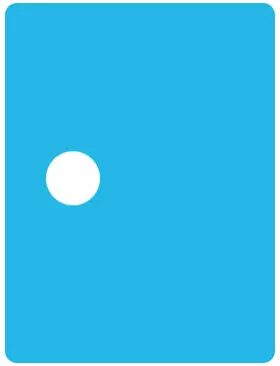
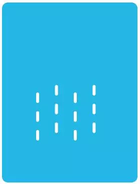
5 rainy days
Cloud code directly multiplexes the cloudy days of Chapter 4. Here we use: after pseudo elements to achieve raindrops.
Realize a raindrop (temporarily hiding clouds for easy viewing):
.rainy:after {
	content: "";
    position: absolute;
    top:50%;
    left: 25%;
    width: 4px;
    height: 14px;
    background: #fff;
    border-radius: 2px;
}
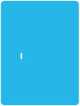
Then through box-shadow "shadow identity":
    .rainy:after {
	    content: "";
        position: absolute;
        top:50%;
        left: 25%;
        width: 4px;
        height: 14px;
        background: #fff;
        border-radius: 2px;
+       box-shadow:
+    	    #fff 25px -10px 0,
+    	    #fff 50px 0 0,
+    	    #fff 75px -10px 0,
+    	    #fff 0 25px 0,
+    	    #fff 25px 15px 0,
+    	    #fff 50px 25px 0,
+    	    #fff 75px 15px 0,
+    	    #fff 0 50px 0,
+    	    #fff 25px 40px 0,
+    	    #fff 50px 50px 0,
+    	    #fff 75px 40px 0;
    }
web Front-end development learning Q-q-u-n:  767273102 ,Sharing Development Tools, Zero Foundation, Advanced Video Tutorials, Hope Novice Less Bend
Add the moving effect of rain and modify it as follows:
    .rainy:after {
        ...(slightly)
+        animation: rainDrop 2s linear infinite;
    }
+   @keyframes rainDrop {
+       0% {
+           transform: translate(0, 0) rotate(10deg);
+       }
+       100% {
+           transform: translate(-4px, 24px) rotate(10deg);
+           box-shadow:
+           #fff 25px -10px 0,
+           #fff 50px 0 0,
+           #fff 75px -10px 0,
+           #fff 0 25px 0,
+           #fff 25px 15px 0,
+           #fff 50px 25px 0,
+           #fff 75px 15px 0,
+           rgba(255, 255, 255, 0) 0 50px 0,
+           rgba(255, 255, 255, 0) 25px 40px 0,
+           rgba(255, 255, 255, 0) 50px 50px 0,
+           rgba(255, 255, 255, 0) 75px 40px 0;
+       }
+   }
The animation adds a 10-degree rotation to tilt the raindrops and move them vertically.
The key here is: although the essence is vertical movement, in order to appear "circular" effect, the lowest raindrops need to be transparent gradient, while adjusting the values of X and Y axis, so that the final position coincides with the initial position, it will not appear "disconnected".
We generate three rows of raindrops. The first row is blocked by clouds. What we can actually see is the following two rows. When the first line moves to the second line position, the original third line is already transparent and invisible, just like the initial state, seamless circular stitching is realized.
6 snowy days
The difference between a snowy day and a rainy day is to change the raindrop into a circle and cancel the rotation angle. The code is as follows:
.snowy:after {
    content: "";
    position: absolute;
    top:50%;
    left: 25%;
    width: 8px;
    height: 8px;
    background: #fff;
    border-radius: 50%;
    box-shadow:
        #fff 25px -10px 0,
        #fff 50px 0 0,
        #fff 75px -10px 0,
        #fff 0 25px 0,
        #fff 25px 15px 0,
        #fff 50px 25px 0,
        #fff 75px 15px 0,
        #fff 0 50px 0,
        #fff 25px 40px 0,
        #fff 50px 50px 0,
        #fff 75px 40px 0;
    animation: snowDrop 2s linear infinite;
}
@keyframes snowDrop {
    0% {
        transform: translateY(0);
    }
    100% {
        transform: translateY(25px);
        box-shadow:
        #fff 25px -10px 0,
        #fff 50px 0 0,
        #fff 75px -10px 0,
        #fff 0 25px 0,
        #fff 25px 15px 0,
        #fff 50px 25px 0,
        #fff 75px 15px 0,
        rgba(255, 255, 255, 0) 0 50px 0,
        rgba(255, 255, 255, 0) 25px 40px 0,
        rgba(255, 255, 255, 0) 50px 50px 0,
        rgba(255, 255, 255, 0) 75px 40px 0;
    }
}

7 All Source Codes
The source code is as follows, easy to paste and save as html:
<!DOCTYPE html>
<html lang="en">
<head>
    <meta charset="UTF-8">
    <title>Single label! pure CSS Realize dynamic sunshine, rain and snow</title>
</head>

<body>
    <div class="weather sunny"></div>
    <div class="weather cloudy"></div>
    <div class="weather rainy"></div>
    <div class="weather snowy"></div>
</body>
<style>
.weather {
    position: relative;
    display: inline-block;
    width: 180px;
    height: 240px;
    background: #23b7e5;
    border-radius: 8px;
}
.sunny:before {
    content: "";
    position: absolute;
    top: 50%;
    left: 50%;
    transform: translate(-50%, -50%);
    width: 60px;
    height: 60px;
    background: #F6D963;
    border-radius: 50%;
    box-shadow: 0 0 20px #ff0;
    z-index: 2;
}
.sunny:after {
    content: "";
    position: absolute;
    top: 50%;
    left: 50%;
    margin: -45px 0 0 -45px;
    width: 90px;
    height: 90px;
    background: #FFEB3B;
    clip-path: polygon(
    	50% 0%,
        65.43% 25%,
        93.3% 25%,
        78.87% 50%,
        93.3% 75%,
        64.43% 75%,
        50% 100%,
        35.57% 75%,
        6.7% 75%,
        21.13% 50%,
        6.7% 25%,
        35.57% 25%);
    z-index: 1;
    animation: sunScale 2s linear infinite;
}
@keyframes sunScale {
    0% {
        transform: scale(1);
    }
    50% {
    	transform: scale(1.1);
    }
    100% {
        transform: scale(1);
    }
}
.cloudy:before,
.rainy:before,
.snowy:before {
    content: "";
    position: absolute;
    top: 50%;
    left: 25%;
    transform: translate(-50%, -50%);
    width: 36px;
    height: 36px;
    background: #fff;
    border-radius: 50%;
    box-shadow:
    	#fff 22px -15px 0 6px,
    	#fff 57px -6px 0 2px,
    	#fff 87px 4px 0 -4px,
    	#fff 33px 6px 0 6px,
    	#fff 61px 6px 0 2px,
    	#ccc 29px -23px 0 6px,
    	#ccc 64px -14px 0 2px,
    	#ccc 94px -4px 0 -4px;
    z-index: 2;
}
.cloudy:before {
    animation: cloudMove 2s linear infinite;
}
@keyframes cloudMove {
    0% {
        transform: translate(-50%, -50%);
    }
    50% {
        transform: translate(-50%, -60%);
    }
    100% {
        transform: translate(-50%, -50%);
    }
}
.rainy:after {
	content: "";
    position: absolute;
    top:50%;
    left: 25%;
    width: 4px;
    height: 14px;
    background: #fff;
    border-radius: 2px;
    box-shadow:
    	#fff 25px -10px 0,
    	#fff 50px 0 0,
    	#fff 75px -10px 0,
    	#fff 0 25px 0,
    	#fff 25px 15px 0,
    	#fff 50px 25px 0,
    	#fff 75px 15px 0,
    	#fff 0 50px 0,
    	#fff 25px 40px 0,
    	#fff 50px 50px 0,
    	#fff 75px 40px 0;
    animation: rainDrop 2s linear infinite;
}
@keyframes rainDrop {
    0% {
        transform: translate(0, 0) rotate(10deg);
    }
    100% {
        transform: translate(-4px, 24px) rotate(10deg);
        box-shadow:
        #fff 25px -10px 0,
        #fff 50px 0 0,
        #fff 75px -10px 0,
        #fff 0 25px 0,
        #fff 25px 15px 0,
        #fff 50px 25px 0,
        #fff 75px 15px 0,
        rgba(255, 255, 255, 0) 0 50px 0,
        rgba(255, 255, 255, 0) 25px 40px 0,
        rgba(255, 255, 255, 0) 50px 50px 0,
        rgba(255, 255, 255, 0) 75px 40px 0;
    }
}
.snowy:after {
    content: "";
    position: absolute;
    top:50%;
    left: 25%;
    width: 8px;
    height: 8px;
    background: #fff;
    border-radius: 50%;
    box-shadow:
        #fff 25px -10px 0,
        #fff 50px 0 0,
        #fff 75px -10px 0,
        #fff 0 25px 0,
        #fff 25px 15px 0,
        #fff 50px 25px 0,
        #fff 75px 15px 0,
        #fff 0 50px 0,
        #fff 25px 40px 0,
        #fff 50px 50px 0,
        #fff 75px 40px 0;
    animation: snowDrop 2s linear infinite;
}
@keyframes snowDrop {
    0% {
        transform: translateY(0);
    }
    100% {
        transform: translateY(25px);
        box-shadow:
        #fff 25px -10px 0,
        #fff 50px 0 0,
        #fff 75px -10px 0,
        #fff 0 25px 0,
        #fff 25px 15px 0,
        #fff 50px 25px 0,
        #fff 75px 15px 0,
        rgba(255, 255, 255, 0) 0 50px 0,
        rgba(255, 255, 255, 0) 25px 40px 0,
        rgba(255, 255, 255, 0) 50px 50px 0,
        rgba(255, 255, 255, 0) 75px 40px 0;
    }
}
</style>
</html>
web Front-end development learning Q-q-u-n:  767273102 ,Sharing Development Tools, Zero Foundation, Advanced Video Tutorials, Hope Novice Less Bend
This is the current issue of high-end CSS game sharing, welcome to forward exchanges and share.