1, First acquaintance with Pyecharts
Introduction to pyecharts
Pyecarts is a class library for generating ecarts charts. Ecarts is a data visualization open source by Baidu. With good interactivity and exquisite chart design, it has been recognized by many developers. Python is an expressive language, which is very suitable for data processing. When data analysis meets data visualization, pyecarts is born.
Pyecharts official website
https://pyecharts.org/#/zh-cn/intro
Pyecarts installation
pip install pyecharts
2, Pyecharts visualization
Using pyecharts, you can draw the following chart:
Scatter | Scatter diagram | Funnel | Funnel diagram |
|---|---|---|---|
Bar | Histogram | Gauge | Dashboard |
Pie | Pie chart | Graph | Diagram |
Line | Broken line / area diagram | Liquid | Water polo diagram |
Radar | Radar chart | Parallel | Parallel coordinate system |
Sankey | Sankey | Polar | Polar coordinate system |
WordCloud | Word cloud picture | HeatMap | Thermodynamic diagram |
Here we introduce the API of common charts:
2.0 initialization settings
Import related libraries:
from pyecharts.charts import *
import pyecharts.options as opts
- From pyecarts. Charts import *: functions corresponding to all charts can be used;
- Use the Options configuration item. In pyecharts, all Options are used to set parameters;
General description:
- .render_notebook () renders charts anytime, anywhere;
- . render() does not directly generate charts, but forms a render.html file, which can be opened in the browser to view charts;
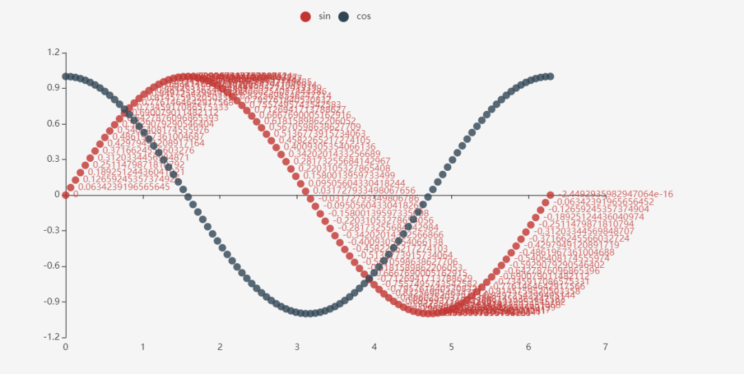
2.1,scatter()
Here we draw a scatter plot of sine and cosine
x = np.linspace(0, 2*np.pi, 100)
y = np.sin(x)
y2 = np.cos(x)

# Parameter setting
(Scatter() # Graphic type
 .add_xaxis(xaxis_data=x) # Set x-axis sequence
 .add_yaxis(series_name='sin', y_axis=y) # Set y-axis sequence
 .add_yaxis(series_name='cos', y_axis=y2, label_opts=opts.LabelOpts(is_show=False)) # is_show = False: indicates that the numerical part is not displayed
).render_notebook()
The results are as follows:
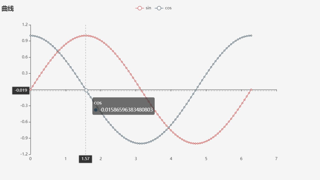
2.2,line()
from pyecharts.charts import Line
import pyecharts.options as opts

x = np.linspace(0, 2*np.pi, 100)
y = np.sin(x)

(
    Line()
    .add_xaxis(xaxis_data=x)
    .add_yaxis(series_name='sin', y_axis=y, label_opts=opts.LabelOpts(is_show=False))
    .add_yaxis(series_name='cos', y_axis=np.cos(x), label_opts=opts.LabelOpts(is_show=False))
    .set_global_opts(title_opts=opts.TitleOpts(title='curve'),
                     tooltip_opts=opts.TooltipOpts(axis_pointer_type='cross')
                    )
).render_notebook()
The results are as follows:
2.3,Bar()
Drawing of histogram:
from pyecharts.charts import Bar

bar = (
    Bar()
    .add_xaxis(["shirt", "cardigan", "Chiffon shirt", "trousers", "high-heeled shoes", "Socks"])
    .add_yaxis("business A", [5, 20, 36, 10, 75, 90])
)
bar.render_notebook()
The results are as follows:
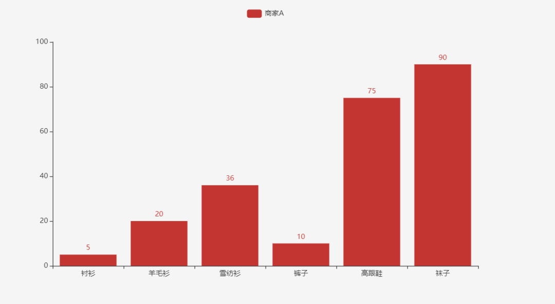
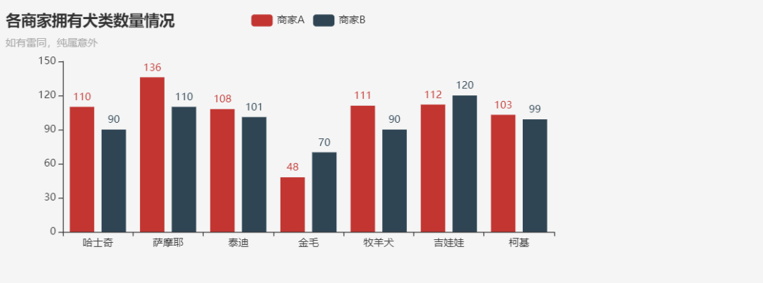
Of course, this is only the most basic column diagram; We can also draw mixed column diagrams;
from pyecharts.charts import Bar
import pyecharts.options as opts

num = [110, 136, 108, 48, 111, 112, 103]
num2 = [90, 110, 101, 70, 90, 120, 99]
lab = ['Siberian Husky', 'Samoye', 'poodle', 'Golden hair', 'Shepherd Dog', 'Ji Wawa', 'Koki']

(
    Bar(init_opts=opts.InitOpts(width='720px', height='320px'))
    .add_xaxis(xaxis_data=lab)
    .add_yaxis(series_name='business A', yaxis_data=num)
    .add_yaxis(series_name='business B', yaxis_data=num2)
    .set_global_opts(
        title_opts=opts.TitleOpts(title='Number of dogs owned by each business', subtitle='If there is any similarity, it is purely an accident')
    )
).render_notebook()
The results are as follows:
2.4,Pie()
Ordinary pie chart:
from pyecharts.charts import Pie
import pyecharts.options as opts

num = [110, 136, 108, 48, 111, 112, 103]
lab = ['Siberian Husky', 'Samoye', 'poodle', 'Golden hair', 'Shepherd Dog', 'Ji Wawa', 'Koki']

(
    Pie(init_opts=opts.InitOpts(width='720px', height='320px'))
    .add(series_name='',
         data_pair=[(j, i) for i, j in zip(num, lab)]
        )
).render_notebook()
The results are as follows:

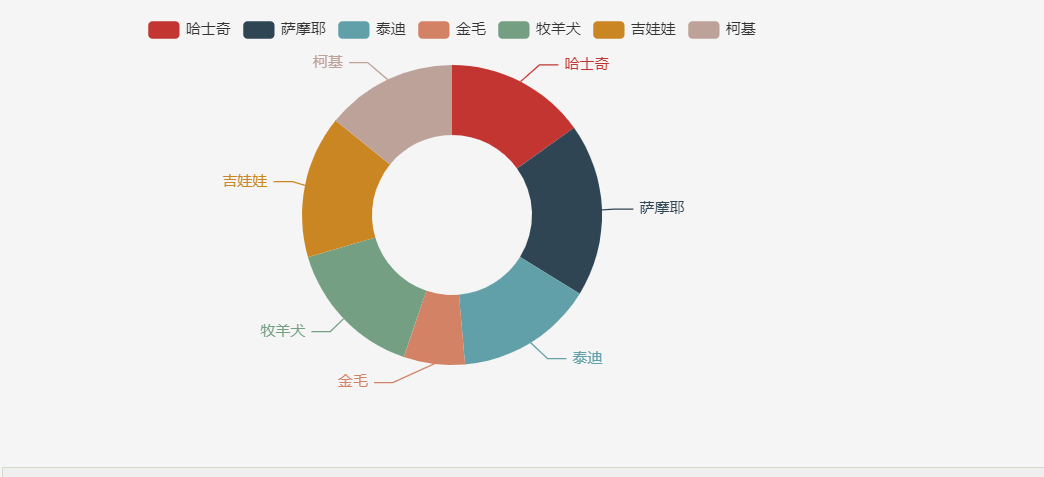
Pie chart:
from pyecharts.charts import Pie
import pyecharts.options as opts

num = [110, 136, 108, 48, 111, 112, 103]
lab = ['Siberian Husky', 'Samoye', 'poodle', 'Golden hair', 'Shepherd Dog', 'Ji Wawa', 'Koki']

(
    Pie(init_opts=opts.InitOpts(width='720px', height='320px'))
    .add(series_name='',
         radius=['40%', '75%'],
         data_pair=[(j, i) for i, j in zip(num, lab)]
        )
).render_notebook()
As shown in the figure:
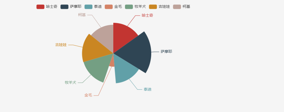
Rose pie chart:
from pyecharts.charts import Pie
import pyecharts.options as opts

num = [110, 136, 108, 48, 111, 112, 103]
lab = ['Siberian Husky', 'Samoye', 'poodle', 'Golden hair', 'Shepherd Dog', 'Ji Wawa', 'Koki']

(
    Pie(init_opts=opts.InitOpts(width='720px', height='320px'))
    .add(series_name='',
#          radius=['40%', '75%'],
#          center=['25%', '50%'],
         rosetype='radius',
         data_pair=[(j, i) for i, j in zip(num, lab)]
        )
).render_notebook()
As shown in the figure:
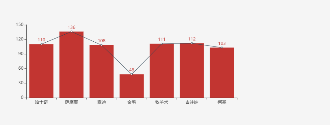
2.5 combined use of charts
from pyecharts.charts import Bar, Line

num = [110, 136, 108, 48, 111, 112, 103]
lab = ['Siberian Husky', 'Samoye', 'poodle', 'Golden hair', 'Shepherd Dog', 'Ji Wawa', 'Koki']

bar = (
    Bar(init_opts=opts.InitOpts(width='720px', height='320px'))
    .add_xaxis(xaxis_data=lab)
    .add_yaxis(series_name='', yaxis_data=num)
)

lines = (
    Line()
    .add_xaxis(xaxis_data=lab)
    .add_yaxis(series_name='', y_axis=num, label_opts=opts.LabelOpts(is_show=False))
)

bar.overlap(lines).render_notebook()
As shown in the figure:
3, Summary
Pyechards can draw a variety of charts. It is a mainstream data visualization library. Compared with matplotlib,seaborn and other data visualization libraries, it has better interactivity and clearer and beautiful graphics, so it is widely used. This paper mainly makes a simple summary of commonly used graphics. Of course, it can also draw geographic graphics, Please refer to related API s on the official website for details.