catalogue
(2) directly generate pictures
2. Generate the national python average salary distribution map
When I first saw pyecharts, I found that it is a very powerful drawing tool. Compared with matplotlib, it is not only dynamic, but also has many kinds of drawing, such as pie chart, line chart, box chart, map, word cloud chart and so on. You can preview it on the official website first, Click to enter the official website
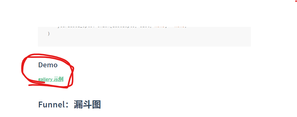
Find the example here, and you can see that there are many graphics. You can also see the power of pyecharts.
When learning, you can learn on the official website, which has a lot of code.
So cut the crap and start installing pyecarts.
1, Installing pyecarts
1. Installing pyecarts
There are many versions of pyecarts, including the new version 1 ×× And old version 0.5 × And the two versions are incompatible, and the old version is not maintained, but now many of csdn are old versions of pyecarts.
You can see that this is the way the old and new versions introduce the same library.
#from pyecharts import Bar               #Old version
from pyecharts.charts import Bar         #How to write the new version
I personally recommend using the new version. The following is how to download the new version,
pip install pyecharts==0.1.9.4
2. Generation mode
Less than half of pyecarts is completed after pyecarts is installed. There are two ways for pyecarts to generate images: generating html files and directly generating graphs.
(1) generate html file
# Draw histogram
from pyecharts.charts import Bar

y1 = [1,4,5,8,15,6]
y2 = [2,9,6,5,1,4]

bar = Bar()
bar.add_xaxis(['1','2','3','4','5','6'])
bar.add_yaxis('1',y1)
bar.add_yaxis('2',y2)

bar.render('Example 1.html')        # Be sure to add html suffix, or you can't click into the browser
The result is an html file instance 1 html, open the file and you will get the picture.

(2) directly generate pictures
Pyecarts output is generally html files. When directly generating pictures (static pictures), you need to install the rendering package snapshot_selenium: convert html files into png file format.
pip install snapshot-selenium
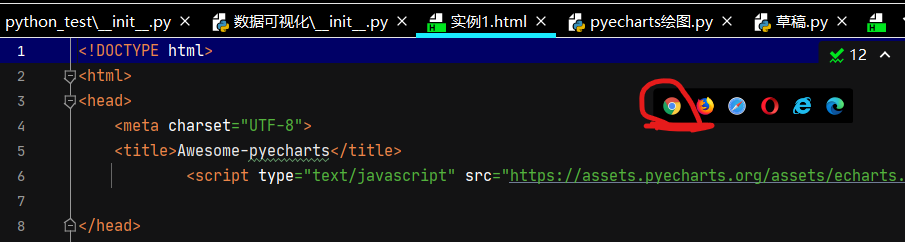
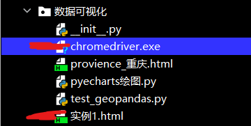
Of course, just install the snapshot_selenium is not enough. You also need to install the browser driver chrome driver Exe, which I installed in the last phase, you can go back and have a look. Chrome driver was installed in the previous phase exe
After installation, be sure to install chrome driver Exe is located in the same package as the running file, for example,
# Draw histogram
from pyecharts.charts import Bar
from snapshot_selenium import snapshot
from pyecharts.render import make_snapshot

y1 = [1,4,5,8,15,6]
y2 = [2,9,6,5,1,4]

bar = Bar()
bar.add_xaxis(['1','2','3','4','5','6'])
bar.add_yaxis('1',y1)
bar.add_yaxis('2',y2)

make_snapshot(snapshot, bar.render(), r"C:\Users\86178\Desktop\Example 1.png")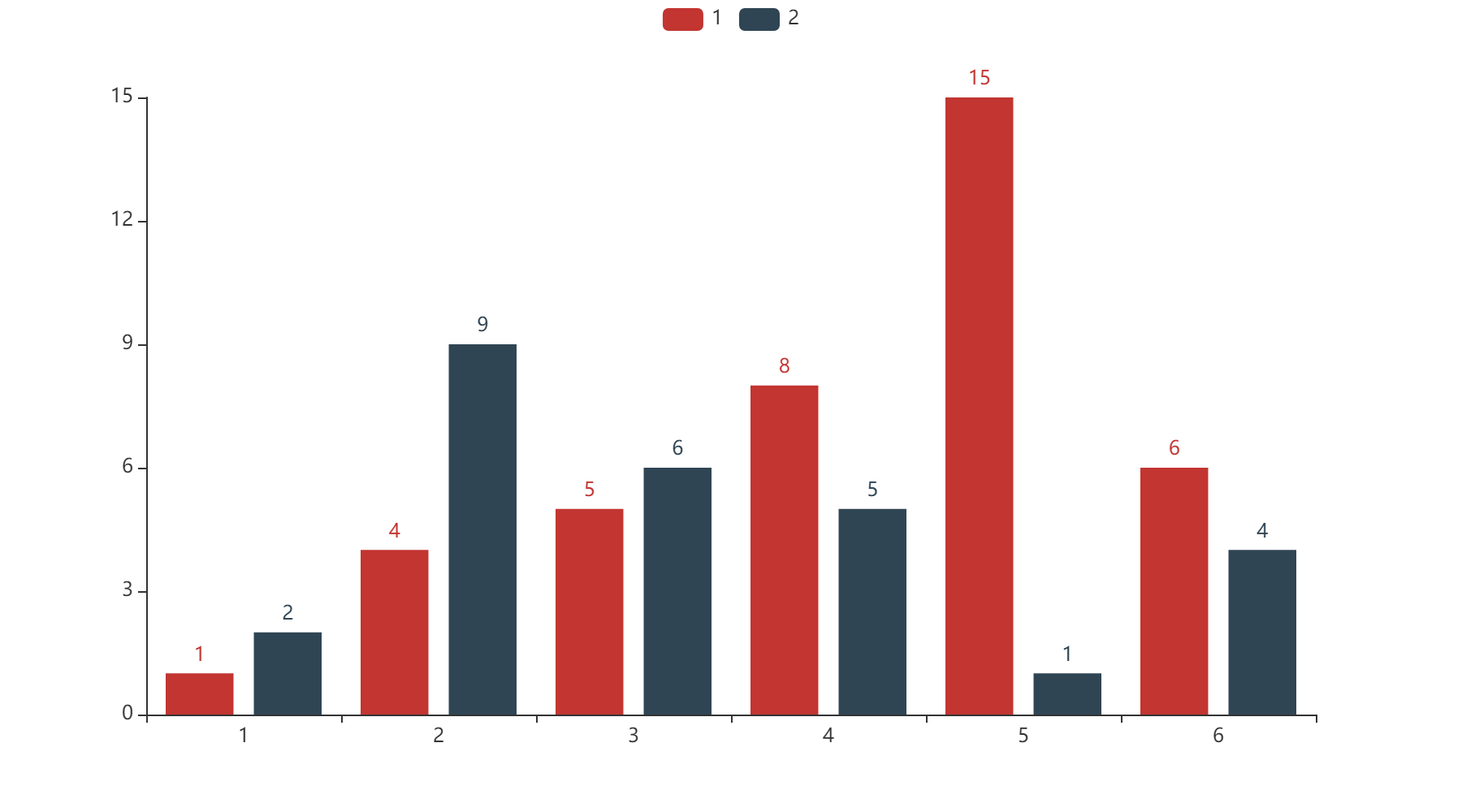
2, Actual operation
1. Generate working map
To generate a map, you also need to download the following Library of map information.
pip install echarts-countries-pypkg             Global country map
pip install echarts-china-provinces-pypkg       Map of provinces in China
pip install echarts-china-cities-pypkg          City map of China
pip install echarts-china-counties-pypkg
pip install echarts-china-misc-pypkg
pip install echarts-united-kingdom-pypkg
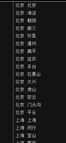
You also need to have a list of cities across the country. For example, when crawling the National Recruitment Information, the address information it gives is the city of a province. To count the recruitment information of all provinces across the country, you need to convert the city to the province.
(you send me a private letter in the comment area, leave a QQ email, and I will send it to you in time). The format is like the following.
Directly give the code, mainly to convert the city into the province and city where it is located, and then draw the map to import a list. The elements in the list are (city, number of jobs)
In fact, you don't have to write your own code at all. You can directly quote the code on the official website. I just do a good job in the data set.
# Replace the names of some regions with their corresponding provinces
fo =open('Chinese cities.txt','r')
fd = fo.readlines()
dict_city = {}
for i in fd:
    line = i.strip().split(' ')
    dict_city[line[0]] = dict_city.get(line[0],[]) + [line[1]]
dict_local_new = {}
for i in dict_city.items():
    for j in list_local:
        if j[0] in i[1]:
            dict_local_new[i[0]] = dict_local_new.get(i[0],0) + j[1]
list_local_new = list(dict_local_new.items())


# Color matching
pieces=[
    {'max':1,'color':'#FFFFF0'},
    {'min':1,'max':9,'color':'#FFE0E0'},
    {'min':10,'max':99,'color':'#FEC0C0'},
    {'min':100,'max':499,'color':'#FD9090'},
    {'min':500,'max':999,'color':'#FC6060'},
    {'min':1000,'max':9999,'color':'#FB3030'},
    {'min':10000,'color':'#DD0000'}]


def use_pyecharts(city_string,true_city,data_info):
    provience_city = (
        Map(init_opts=opts.InitOpts(width="1000px", height="900px", page_title=city_string))
            .add(
            city_string,
            data_info,
            maptype=true_city,           # Switch to another place
        )
            .set_global_opts(
            title_opts=opts.TitleOpts(title='{}'.format(city_string),
                                      title_target="blank",  # A new window opens
                                      subtitle='{}'.format(city_string),  # Subtitle
                                      subtitle_target="self"),  # The current window is open

            visualmap_opts=opts.VisualMapOpts(is_show=True,  # Visual mapping configuration
                                              max_=200,
                                              is_calculable=True,  # Whether to display the handle for dragging
                                              is_piecewise=True,  # Is it segmented
                                              range_text=["High", "Low"],
                                              border_color="#000",
                                              pieces=pieces),  # Text at both ends


            tooltip_opts=opts.TooltipOpts(trigger="item",  # Trigger type
                                          trigger_on="mousemove|click",  # Trigger condition of prompt box
                                          formatter="{b}:{c}A job")  # Tag content format, the string template used here
        )
            .set_series_opts(
            label_opts=opts.LabelOpts(is_show=True)
        )
            .render('provience_{}.html'.format(city_string))
    )

use_pyecharts('whole country python Work distribution diagram','china',list_local_new)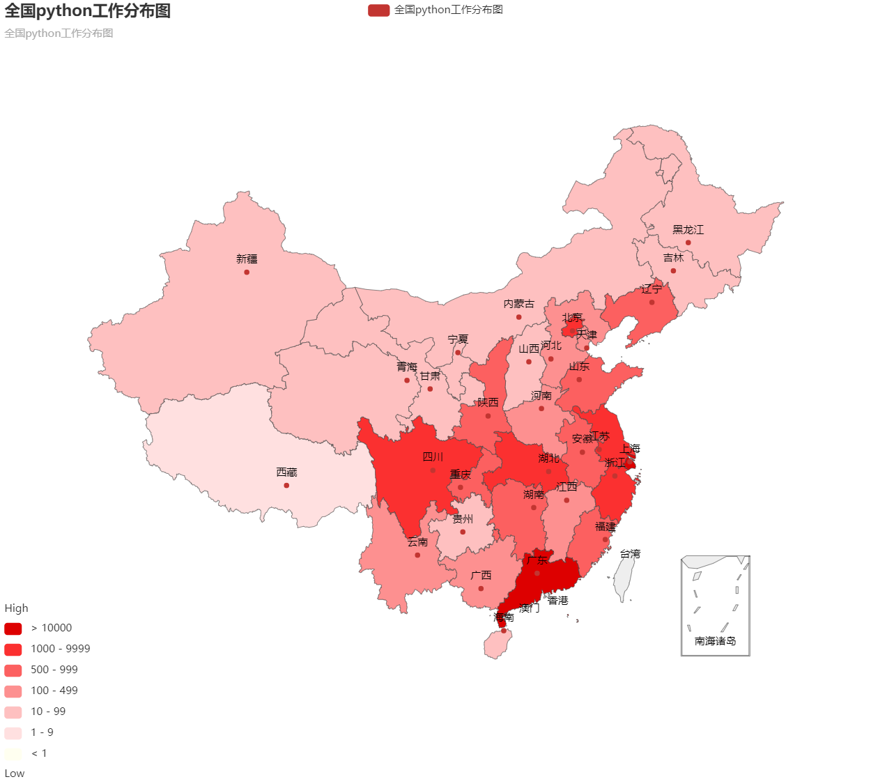
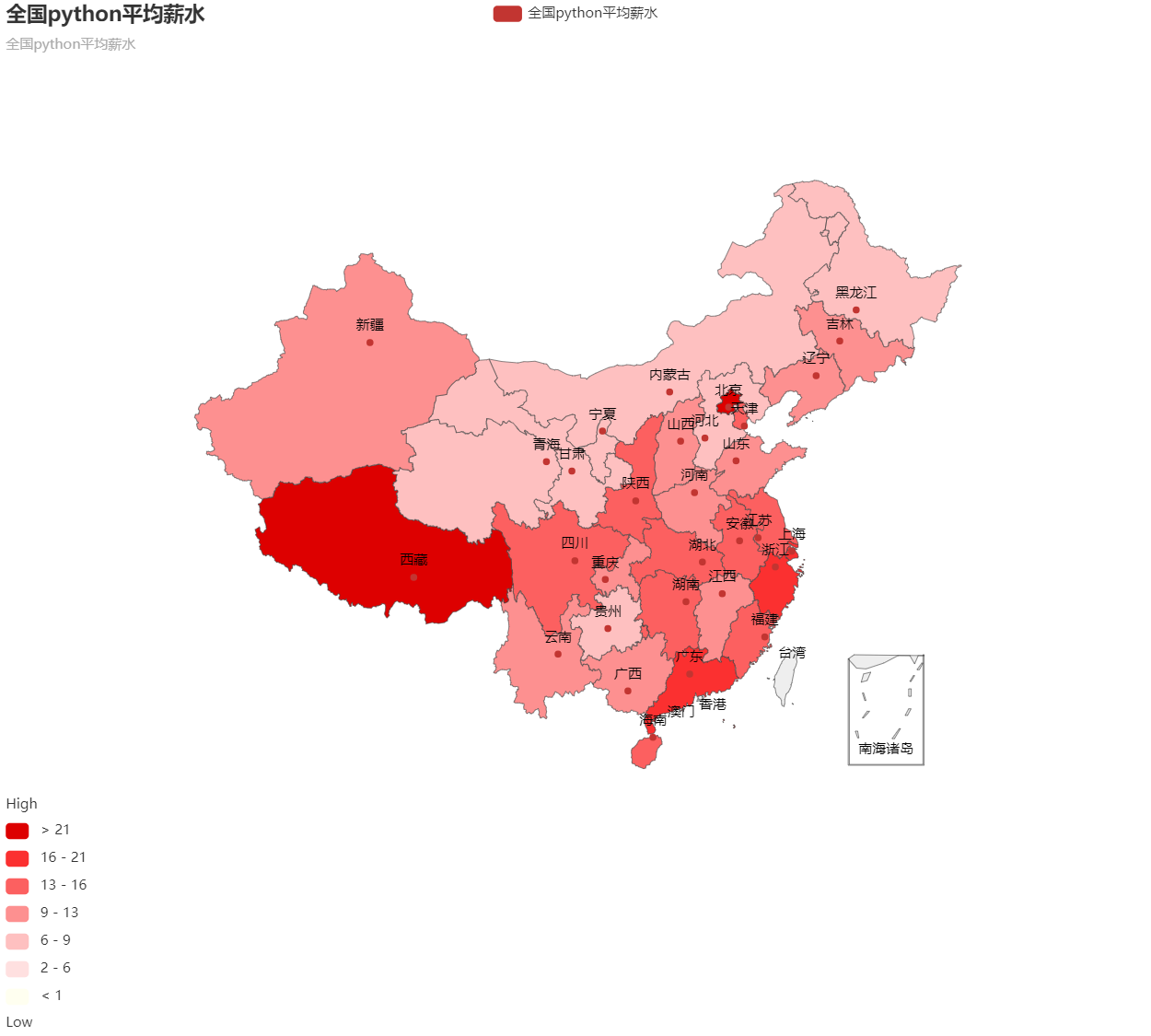
2. Generate the national python average salary distribution map
# Processing salary in thousands per month
def change_sal(string,old_sal,num_m):
    sal = old_sal.replace(string, '')
    min, max = sal.split('-')
    min , max = eval(min),eval(max)
    min *= num_m      # Change unit
    max *= num_m
    new_sal = (min+max)/2       # Calculate average salary
    return new_sal

dict_loc_sal = {}       # Salary corresponding to location
for i in range(len(data_job['salary'])):
    sal = str(data_job['salary'][i])

    if 'ten thousand/month' in sal:
        sal = change_sal('ten thousand/month', sal, 10)
    elif 'element/day' in sal:
        o_sal = sal.replace('element/day', '')
        sal = eval(o_sal) * (30 / 1000)

    elif 'ten thousand/year' in sal:
        sal = change_sal('ten thousand/year', sal, 10 / 12)
    elif 'thousand/month' in sal:
        sal = change_sal('thousand/month', sal, 1)
    else:
        sal = None
    city = data_job['Company location'][i]
    if '-' in city:
        ls_city = city.strip().split('-')
        city = ls_city[0]
    else:
        city = city

    for c in dict_city.items():
        if city in c[1]:
            city = c[0]
    if sal !=None:
        dict_loc_sal[city] = dict_loc_sal.get(city,[]) + [sal]
    else:
        continue

for loc_sal in dict_loc_sal.items():        # Calculate all averages
    avg_sal = sum(loc_sal[1])/len(loc_sal[1])
    dict_loc_sal[loc_sal[0]] = avg_sal

# Color matching
pieces=[
    {'max':1,'color':'#FFFFF0'},
    {'min':2,'max':5.999999,'color':'#FFE0E0'},
    {'min':6,'max':8.999999,'color':'#FEC0C0'},
    {'min':9,'max':12.999999,'color':'#FD9090'},
    {'min':12,'max':15.999999,'color':'#FC6060'},
    {'min':16,'max':20.999999,'color':'#FB3030'},
    {'min':21,'color':'#DD0000'}]

list_loc_sal = list(dict_loc_sal.items())
use_pyecharts('whole country python average wages','china',list_loc_sal)
3, Summary
When drawing with pyecarts, you can use the code on the official website, and there are many pictures above. If you master it all, it is still difficult. In addition, matplotlib can be used for some simple diagrams.