Inspiration for this article: https://blog.csdn.net/qq_43613793/article/details/104268536
Thank the blogger for providing learning articles!
brief introduction
Echarts is a data visualization open source by Baidu. With good interactivity and exquisite chart design, echarts has been recognized by many developers. Python is an expressive language, which is very suitable for data processing. When data analysis meets data visualization, pyecarts is born
design sketch
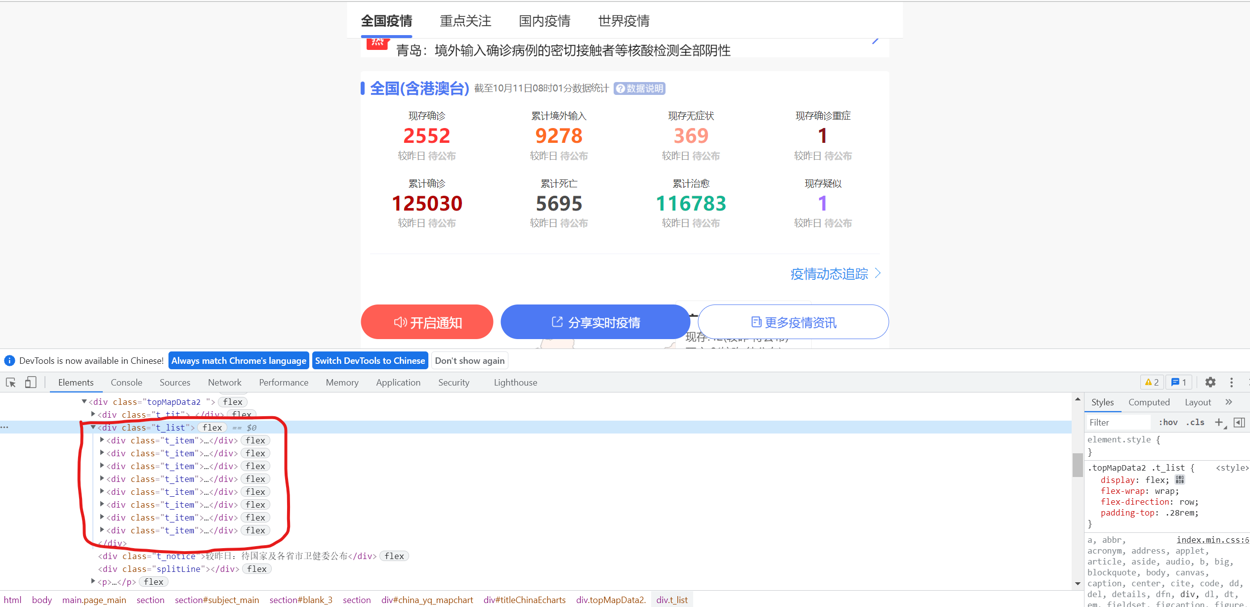
First, analyze the web page. Here is the national summary data. Under this node ↓
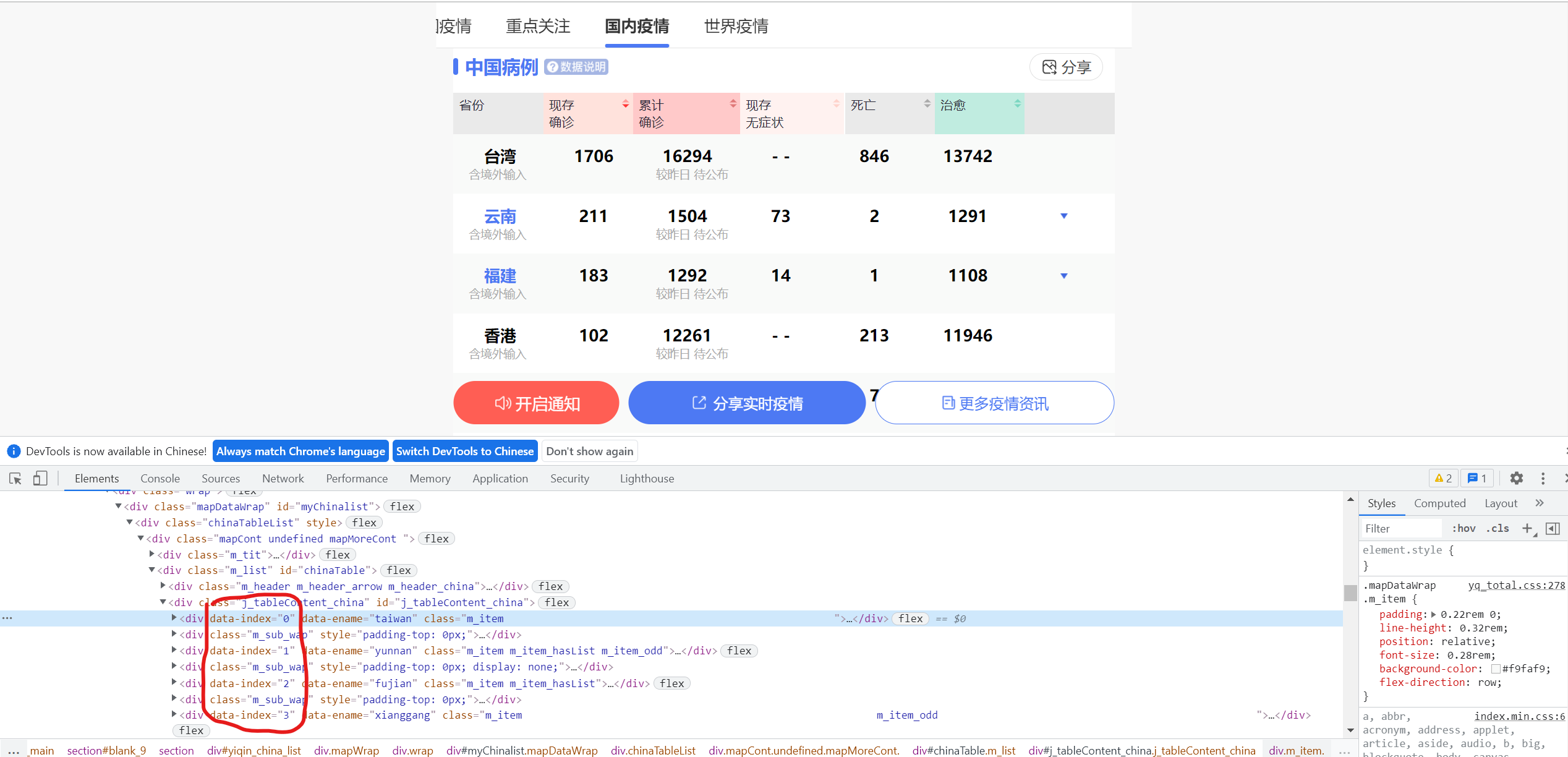
Then, find the data of all provinces in the country and click ↓
Then, find the historical data of a province and find that the data is very similar ↓
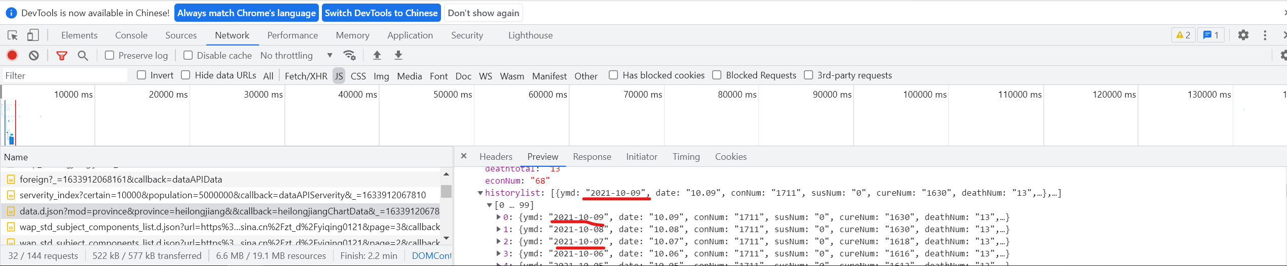
By comparison, it is found that this is the historical data of a province ↓
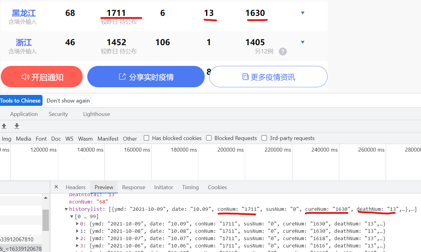
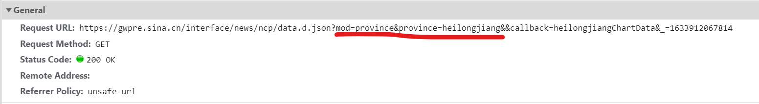
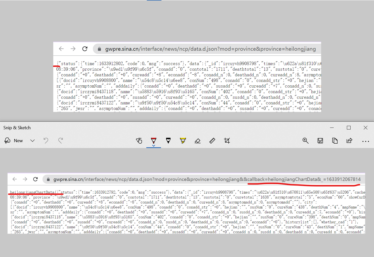
Then find its corresponding URL and find that you can get the historical data of other provinces by changing the Pinyin of province=heilongjiang into that of other provinces.
By comparison, it is found that with and without callback, there will be an additional string and parentheses, so it is not in the form of a pure dictionary, and it is not so easy to process data with json (I don't know if it is really not easy, anyway, I think so)
Then find the data of countries all over the world ↓

(I haven't found any json files covering all the data I want, so I can only find them one by one. If any partners find them, please leave a message and share them)
After finding all the data you want, you start writing code for crawling, processing and analysis
Load Library
# Preload all possible libraries
import re
import json
import time
import requests
import pandas as pd
from pyecharts.charts import *
from pyecharts import options as opts
from pyecharts.commons.utils import JsCode
from pyecharts.globals import ThemeType, ChartType
from bs4 import BeautifulSoup
from selenium import webdriver
selenium website analysis
https://news.sina.cn/zt_d/yiqing0121
Reference article: https://www.cnblogs.com/stin/p/7929601.html
url = 'https://news.sina.cn/zt_d/yiqing0121'

try:
    # Browser driven parameter object
    chrome_options = webdriver.ChromeOptions()
    # Don't load pictures
    prefs = {"profile.managed_default_content_settings.images": 2}
    chrome_options.add_experimental_option("prefs", prefs)
    # Use headless no interface browser mode
    chrome_options.add_argument('--headless')
    chrome_options.add_argument('--disable-gpu')
    # Load Google browser driver and fill in the actual path of your browser driver
    driver = webdriver.Chrome(options=chrome_options,
                              executable_path='C:\Program Files\Google\Chrome\Application\chromedriver'
                             )
    driver.get(url)           # Send network request
    html = driver.page_source  # Get page html source code
    html = BeautifulSoup(html, "html.parser")  # Parsing html code

    driver.quit()                              # Exit browser driver

except Exception as e:
    print('The exception information is:',e)
Obtain data of domestic provinces
(because the child node labels are complex, I don't know how to deal with not crawling the grandson node. Please leave a message and share it with my friends. Thank you!)
p_list = []
def provinces(html):
    for i in range(34):
        hi = []
        for ht in html.find('div', attrs={'data-index':i}).find_all('span', recursive=False):
            if ht.em is not None:
            # Process crawled grandchildren
                h2 = ht.em.text
                ht = ht.text.replace(h2,'').replace(' ','')
                hi.append(ht)
            else:
                ht = ht.text.replace('- -','0')
                hi.append(ht)
        p_list.append(hi)
    return p_list

provinces(html)
Domestic data processing
Personally, I feel that English is more convenient for subsequent pandas data processing, so I add English attribute tags to the crawled data
n_data = pd.DataFrame(p_list)
n_data.drop(columns=[3,7], inplace=True)

n_data['p_name'] = n_data[0]
n_data['econNum'] = n_data[1]
n_data['value'] = n_data[2]
n_data['asymptomNum'] = n_data[4]
n_data['deathNum'] = n_data[5]
n_data['cureNum'] = n_data[6]
del n_data[0]
del n_data[1]
del n_data[2]
del n_data[4]
del n_data[5]
del n_data[6]
n_data
Access to data from countries around the world
worldlist: https://news.sina.com.cn/project/fymap/ncp2020_full_data.json
urL = 'https://news.sina.com.cn/project/fymap/ncp2020_full_data.json'
headers = {
# Fill in the headers of your browser
}
reponse = requests.get(urL, headers=headers)
f_data = json.loads(re.match(".*?({.*}).*", reponse.text)[1])['data']
worldlist = f_data['worldlist']
worldlist[:2];
The data attributes of China in the worldlist are different from those of other countries and regions, so they are processed separately to make their corresponding data attributes the same
w_list = []

cn = worldlist[0]['name']

cn_values = f_data['gntotal']
cn_cureNum = f_data['curetotal']
cn_deathNum = f_data['deathtotal']

cn_conadd = f_data['add_daily']['addcon']
cn_cureadd = f_data['add_daily']['addcure']
cn_deathadd = f_data['add_daily']['adddeath']

cn_dict = {'country':cn, 'value':cn_values, 'cureNum':cn_cureNum,
           'deathNum':cn_deathNum, 'conadd':cn_conadd, 'cureadd':cn_cureadd, 'deathadd':cn_deathadd
          }

w_list.append(cn_dict)
for x in range(1,len(worldlist)):
    country = worldlist[x]['name']
    values = worldlist[x]['value']
    cureNum = worldlist[x]['cureNum']
    deathNum = worldlist[x]['deathNum']
    conadd = worldlist[x]['conadd']
    cureadd = worldlist[x]['cureadd']
    deathadd = worldlist[x]['deathadd']
    f_dict = {'country':country, 'value':values, 'cureNum':cureNum,
              'deathNum':deathNum, 'conadd':conadd, 'cureadd':cureadd, 'deathadd':deathadd
             }
    w_list.append(f_dict)
Convert to DataFrame
w_data = pd.DataFrame(w_list)
w_data
In order to correspond in the subsequent visual map, the data is preprocessed (if not preprocessed, the later world map will not be displayed, and the data contains tuples of non-national regions such as Ruby Princess). The cross reference table is the list of countries in pyecarts
name_en = pd.read_excel('National Chinese and English.xlsx')
w_data = pd.merge(w_data, name_en, left_on='country', right_on='c_name', how='inner')
w_data = w_data[['name','country','value','cureNum','deathNum','conadd','cureadd','deathadd']]
w_data
Obtain historical data of Guangdong
historylist: https://gwpre.sina.cn/interface/news/ncp/data.d.jsonmod=province&province=guangdong
response = requests.get('https://gwpre.sina.cn/interface/news/ncp/data.d.json?mod=province&province=guangdong').json()
gddata = response['data']
gdlist = gddata['historylist']
gdlist[:2];
gd_list = []
for y in range(len(gdlist)):
    ymd = gdlist[y]['ymd']
    gd_conNum = gdlist[y]['conNum']
    gd_cureNum = gdlist[y]['cureNum']
    gd_deathNum = gdlist[y]['deathNum']
    gd_econNum = gdlist[y]['econNum']
    gd_conadd = gdlist[y]['conadd']

    gd_dict = {
        'ymd':ymd, 'gd_conNum':gd_conNum, 'gd_cureNum':gd_cureNum, 'gd_deathNum':gd_deathNum, 'gd_econNum':gd_econNum, 'gd_conadd':gd_conadd
    }
    gd_list.append(gd_dict)

gd_list;
gd_data = pd.DataFrame(gd_list)
gd_data.head()
Data saving
with pd.ExcelWriter(r'Sina epidemic data.xlsx') as writer:
    n_data.to_excel(writer, sheet_name='China', index=False)  #Save data
    w_data.to_excel(writer, sheet_name='World', index=False)  #Save data
    gd_data.to_excel(writer, sheet_name='Guangdong', index=False)
National Statistics
dc_name = ['New overseas input', 'New asymptomatic','New diagnosis', 'New death', 'New cure']
d_comp = []
total_dict = dict()
comp_dict = dict()
for zong_shu in html.find('div', attrs={'class':'t_list'}).find_all('div'):
    total_dict[zong_shu.h5.text] = zong_shu.b.text

for xin_zeng in html.find('div', attrs={'class':'t_list'}).find_all('h4'):
#     d_comp.append(xin_zeng.code.text.replace('+','').replace('-',''))
    d_comp.append(xin_zeng.code.text.replace('+',''))

d_comp = [d_comp[1], d_comp[2], d_comp[4], d_comp[5], d_comp[6]]
for i in range(len(d_comp)):
    comp_dict[dc_name[i]] = d_comp[i]
# total_dict
comp_dict
Data sorting
t_list = [total_dict]
comp_list = [comp_dict]

total = pd.DataFrame(t_list)
comp = pd.DataFrame(comp_list)
total = total.unstack(level=0)
total = total.reset_index(drop=True, level=-1)
# total
comp = comp.unstack(level=0)
comp = comp.reset_index(drop=True, level=-1)
comp
Get time
subtime = html.find('div', attrs={'class':'t_tit'}).find('span')
subtime = subtime.text
subtime
After crawling the data, start reading, sorting and visualizing the data
Read domestic data
data_n = pd.read_excel('Sina epidemic data.xlsx', 'China', index_col=0)
data_n.fillna(0, inplace=True)
data_n['deathNum'] = data_n['deathNum'].astype('int64')
data_n.head()
Read world data
data_w = pd.read_excel('Sina epidemic data.xlsx', 'World', index_col=0)
data_w.fillna(0, inplace=True)
data_w
Read Guangdong data
data_gd = pd.read_excel('Sina epidemic data.xlsx', 'Guangdong', parse_dates = ['ymd'], index_col=0)
data_gd.fillna(0, inplace=True)
data_gd['gd_deathNum'] = data_gd['gd_deathNum'].astype('int64')
data_gd['gd_cureNum'] = data_gd['gd_cureNum'].astype('int64')
data_gd
2021 daily data
gd_2021 = data_gd['2021']
gd_2021.index = gd_2021.index.strftime('%m-%d')
gd_2021
2020 daily data
gd_2020 = data_gd['2020']
gd_2020.index = gd_2020.index.strftime('%m-%d')
gd_2020
After sorting out the data you need, you can visualize the data!
Pyecarts load Library
#Load Jupyter lab and set pyecarts global display parameters
from pyecharts.globals import CurrentConfig, NotebookType, SymbolType
CurrentConfig.NOTEBOOK_TYPE = NotebookType.JUPYTER_LAB
import pyecharts.options as opts                                     #And load the pyecarts option
from pyecharts.charts import *
from pyecharts.components import *
from pyecharts.faker import Faker
figsize=opts.InitOpts(bg_color='rgb(5, 46, 112, 0.5)') #Set graphic size and background color rgb(225, 225, 225, 0.5)
# width='1200px',height='600px',
Bar().load_javascript();           #JavaScript functions need to be loaded once before drawing!!
Line().load_javascript();
Map().load_javascript();
Page().load_javascript();
Pie().load_javascript();
WordCloud().load_javascript();
Table().load_javascript();
HeatMap().load_javascript()
Test it
no problem!
#Dashboard
from pyecharts.charts import Gauge
Gauge().load_javascript()
Gauge().add("",[("Completion rate\n\n\n",99)]).render_notebook()
Epidemic situation in China
I don't know how to deal with the color of the form here. If you know, share it with me. Thank you!
table = (
         Table()
         .add(headers=['Epidemic situation in China','data'],
              rows = [['Cumulative diagnosis', data_w.iloc[0][1]],
                      ['Cumulative cure', data_w.iloc[0][2]],
                      ['Cumulative death', data_w.iloc[0][3]],
                      ['New diagnosis', data_w.iloc[0][4]],
                      ['New cure', data_w.iloc[0][5]],
                      ['New death', data_w.iloc[0][6]],
                     ],
              attributes = {"class": "fl-table"}
             )
)

table.render_notebook()
# table.render('tables.html')
National data pie chart
outer_data_pair = [list(z) for z in zip(total.index.tolist(), total.values.tolist())]
inner_data_pair = [list(z) for z in zip(comp.index.tolist(), comp.values.tolist())]

# Draw pie chart
pie1 = Pie(figsize)
pie1.add(' ', outer_data_pair, radius=['60%','80%'])
pie1.add(' ', inner_data_pair, radius=[0,'40%'])
pie1.set_global_opts(title_opts=opts.TitleOpts(title='National data pie chart', pos_right='1%', title_textstyle_opts=opts.TextStyleOpts(color='#FFFF99')),
                     legend_opts=opts.LegendOpts(orient='vertical', pos_top='10%', pos_right='1%', textstyle_opts=opts.TextStyleOpts(color='#FFFF99')))
pie1.set_series_opts(label_opts=opts.LabelOpts(position="outside",
                                               formatter=" {per|{b}: {c}}",
                                               background_color="#eee",
                                               border_color="#aaa",
                                               border_width=1,
                                               border_radius=4,
                                               rich={
                                                     "per": {
                                                             "color": "#eee",
                                                             "backgroundColor": "#334455",
                                                             "padding": [2, 4],
                                                             "borderRadius": 2,
                                                            },
                                                    },
                                              ))
pie1.set_colors(['#EF9050', '#3B7BA9', '#6FB27C', '#FFAF34', '#D8BFD8', '#00BFFF', '#FF2400'])
pie1.render_notebook()
National data map
Cumulative diagnosis
map1 = Map(figsize)
map1.add('', [list(z) for z in zip(data_n.index.tolist(),data_n.value.tolist())],
         maptype='china')
map1.set_global_opts(
            title_opts = opts.TitleOpts(title='National cumulative diagnosis', pos_right='1%', title_textstyle_opts=opts.TextStyleOpts(color='#FFFF99')),
            visualmap_opts = opts.VisualMapOpts(max_=4000, textstyle_opts=opts.TextStyleOpts(color='#FFFF99'), pos_left='left'),
            legend_opts=opts.LegendOpts(textstyle_opts=opts.TextStyleOpts(color='#FFFF99'))
    )
map1.load_javascript();
map1.render('map1.html')
Existing diagnosis
map2 = Map(figsize)
map2.add('', [list(z) for z in zip(data_n.index.tolist(),data_n.econNum.tolist())],
         maptype='china')
map2.set_global_opts(
            title_opts = opts.TitleOpts(title='National existing diagnosis', title_textstyle_opts=opts.TextStyleOpts(color='#FFFF99')),
            visualmap_opts = opts.VisualMapOpts(max_=1000, is_piecewise=True,
                                                textstyle_opts=opts.TextStyleOpts(color='#FFFF99'),
                                                pos_left='right',
                                                pieces=[
                                                    {'min':1001, 'label':'>1000', "color": "#E3170D"},
                                                    {'min':501, 'max':1000, 'label':'501~1000', "color": "#ff585e"},
                                                    {'min':101, 'max':500, 'label':'101~500', "color": "#FF9912"},
                                                    {'min':11, 'max':100, 'label':'11~100', "color": "#FFE384"},
                                                    {'min':0, 'max':10, 'label':'0~10', "color": "#FFFAF0"},
                                                ]),
            legend_opts=opts.LegendOpts(textstyle_opts=opts.TextStyleOpts(color='#FFFF99'))
    )
map2.load_javascript();
map2.render('map2.html')
Provincial Data heat map
heatmap = HeatMap(figsize)

value = [[i, j, int(data_n.iloc[i][j])] for i in range(34) for j in range(5)]
heatmap.add_xaxis(data_n.index.tolist())
heatmap.add_yaxis('', ['Existing diagnosis', 'Cumulative diagnosis', 'Existing asymptomatic', 'Cumulative death', 'Cumulative cure'], value)
heatmap.set_global_opts(title_opts=opts.TitleOpts(title="Provincial Data HeatMap", pos_right='40%', title_textstyle_opts=opts.TextStyleOpts(color='#FFFF99')),
                        xaxis_opts=opts.AxisOpts(axisline_opts=opts.AxisLineOpts(linestyle_opts=opts.LineStyleOpts(color='#FFFF99'))),
                        yaxis_opts=opts.AxisOpts(axisline_opts=opts.AxisLineOpts(linestyle_opts=opts.LineStyleOpts(color='#FFFF99'))),
                        visualmap_opts=opts.VisualMapOpts(max_=2000, pos_right='right', textstyle_opts=opts.TextStyleOpts(color='#FFFF99')),
                        datazoom_opts=[opts.DataZoomOpts(), opts.DataZoomOpts(type_="inside")],
                       )

heatmap.render_notebook()
World data map
map3 = Map(figsize)
map3.add('', [list(z) for z in zip(data_w.index.tolist(), data_w.value.tolist())], is_map_symbol_show=False,
         maptype='world')
map3.set_global_opts(
            title_opts = opts.TitleOpts(title='World cumulative diagnosis', pos_right='40%', title_textstyle_opts=opts.TextStyleOpts(color='#FFFF99')),
            visualmap_opts = opts.VisualMapOpts(max_=5000000, textstyle_opts=opts.TextStyleOpts(color='#FFFF99'), pos_left='left'),
            legend_opts=opts.LegendOpts(textstyle_opts=opts.TextStyleOpts(color='#FFFF99'))
    )
map3.set_series_opts(label_opts=opts.LabelOpts(is_show=False))

map3.load_javascript();
map3.render('map3.html')
World epidemic data sheet
d_w = data_w.iloc[:,1:]
d_w = d_w.sum()
d_w

table1 = (
         Table(figsize)
         .add(headers=['World epidemic','data'],
              rows = [['Cumulative diagnosis', d_w.value],
                      ['Cumulative cure', d_w.cureNum],
                      ['Cumulative death', d_w.deathNum],
                      ['New diagnosis', d_w.conadd],
                      ['New cure', d_w.cureadd],
                      ['New death', d_w.deathadd],
                     ],

             )
)

table1.render_notebook()
Guangdong data map
2021 data histogram
bar1 = Bar(figsize)
bar1.add_xaxis(gd_2021.index.tolist())

bar1.add_yaxis('New diagnosis', gd_2021.gd_conadd.tolist(), yaxis_index=1, color='#E3170D')
bar1.add_yaxis('Existing diagnosis', gd_2021.gd_econNum.tolist(), yaxis_index=1, color='#F0FFFF')
bar1.add_yaxis('Cumulative diagnosis', gd_2021.gd_conNum.tolist(), yaxis_index=0, color='#8A2BE2')
bar1.add_yaxis('Cumulative cure', gd_2021.gd_cureNum.tolist(), yaxis_index=0, color='#FFFF00')
bar1.add_yaxis('Cumulative death', gd_2021.gd_deathNum.tolist(), yaxis_index=1, color='#00FF00')

bar1.set_series_opts(label_opts=opts.LabelOpts(is_show=False))

bar1.extend_axis(yaxis=opts.AxisOpts( axisline_opts=opts.AxisLineOpts(linestyle_opts=opts.LineStyleOpts(color='#FFFF99'))))
bar1.set_global_opts(title_opts=opts.TitleOpts(title='2021 Epidemic data in Guangdong', pos_left = 'left', padding=[1,5], title_textstyle_opts=opts.TextStyleOpts(color='#FFFF99')),
                     xaxis_opts=opts.AxisOpts(axisline_opts=opts.AxisLineOpts(linestyle_opts=opts.LineStyleOpts(color='#FFFF99'))),
                     yaxis_opts=opts.AxisOpts(axisline_opts=opts.AxisLineOpts(linestyle_opts=opts.LineStyleOpts(color='#FFFF99'))),
                     datazoom_opts=[opts.DataZoomOpts(), opts.DataZoomOpts(type_="inside")],
                     legend_opts=opts.LegendOpts(textstyle_opts=opts.TextStyleOpts(color='#FFFF99')),
                     tooltip_opts=opts.TooltipOpts(is_show=True, trigger="axis", textstyle_opts=opts.TextStyleOpts(color='#FFFF99')),

                    )

bar1.render_notebook()
2020 data line chart
line1 = Line(figsize)
line1.add_xaxis(gd_2020.index.tolist())

line1.add_yaxis('New diagnosis', gd_2020.gd_conadd.tolist(), yaxis_index=1, color='#E3170D', is_smooth=True, symbol="none")
line1.add_yaxis('Cumulative diagnosis', gd_2020.gd_conNum.tolist(), yaxis_index=0, color='#FFFF00', is_smooth=True, symbol="none")
line1.add_yaxis('Cumulative cure', gd_2020.gd_cureNum.tolist(), yaxis_index=0, color='#00FF00', is_smooth=True, symbol="none")
line1.add_yaxis('Cumulative death', gd_2020.gd_deathNum.tolist(), yaxis_index=1, color='#F0FFFF', is_smooth=True, symbol="none")
line1.add_yaxis('Existing diagnosis', gd_2020.gd_econNum.tolist(), yaxis_index=1, color='#8A2BE2', is_smooth=True, symbol="none")

line1.set_series_opts(label_opts=opts.LabelOpts(is_show=False))
line1.extend_axis(yaxis=opts.AxisOpts( axisline_opts=opts.AxisLineOpts(linestyle_opts=opts.LineStyleOpts(color='#FFFF99'))))
line1.set_global_opts(title_opts=opts.TitleOpts(title='2020 Epidemic data in Guangdong', pos_left = 'right', padding=[1,5], title_textstyle_opts=opts.TextStyleOpts(color='#FFFF99')),
                     xaxis_opts=opts.AxisOpts(axisline_opts=opts.AxisLineOpts(linestyle_opts=opts.LineStyleOpts(color='#FFFF99'))),
                     yaxis_opts=opts.AxisOpts(axisline_opts=opts.AxisLineOpts(linestyle_opts=opts.LineStyleOpts(color='#FFFF99'))),
                     legend_opts=opts.LegendOpts(textstyle_opts=opts.TextStyleOpts(color='#FFFF99')),
                     tooltip_opts=opts.TooltipOpts(is_show=True, trigger="axis", textstyle_opts=opts.TextStyleOpts(color='#FFFF99')),
                     datazoom_opts=[opts.DataZoomOpts(), opts.DataZoomOpts(type_="inside")],
                    )

line1.render_notebook()
Word cloud processing
wc = (
    WordCloud()
        .add("", [list(z) for z in zip(list(data_w.country), list(data_w["value"]))],
             word_gap=0)
)
wc.render('wc.html')
Make title
title = Pie().set_global_opts(title_opts=opts.TitleOpts(title="2021 Epidemic data screen", title_textstyle_opts=opts.TextStyleOpts(font_size=40, color='#FFFF99'), pos_top=0))
title.render_notebook()

subtitle = Pie().set_global_opts(title_opts=opts.TitleOpts(subtitle=(subtime),
                                                           subtitle_textstyle_opts=opts.TextStyleOpts(font_size=15, color='#FFFF99'),
                                                           pos_top=0
                                                          )
                                )
subtitle.render_notebook()
Large screen splicing
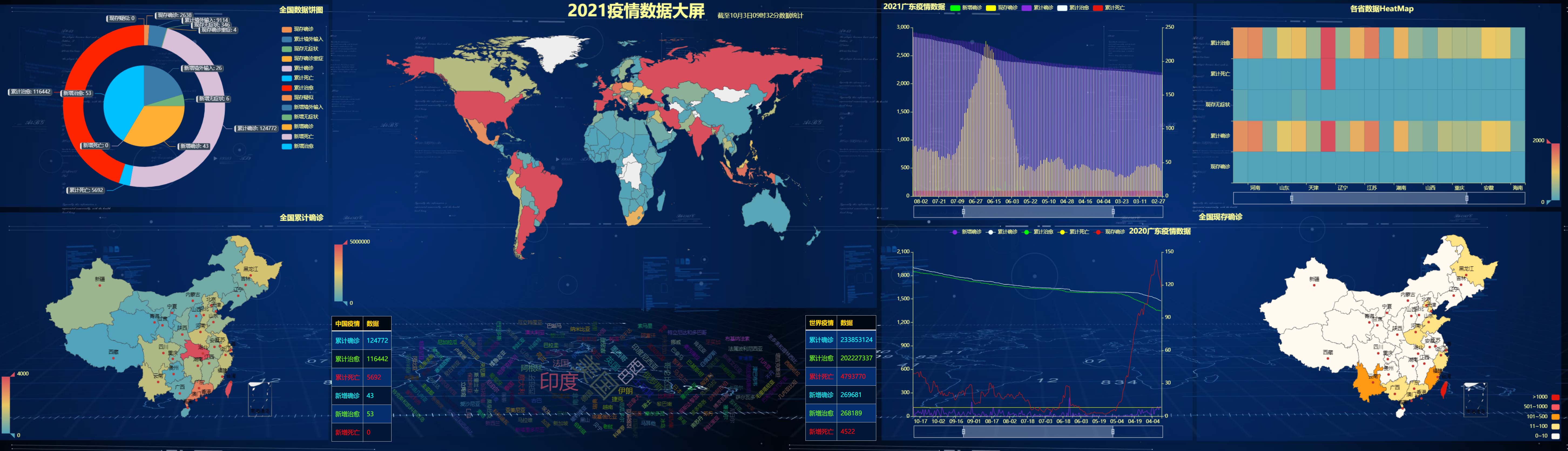
page = Page(layout=Page.DraggablePageLayout, page_title='2021 Epidemic data screen')
page.add(
         table,
         pie1,
         map1,
         map2,
         heatmap,
         map3,
         table1,
         bar1,
         line1,
         wc,
         title,
         subtitle

        )
page.render()
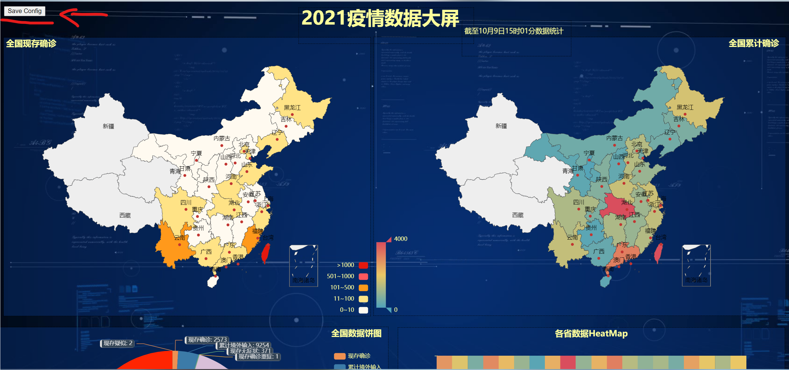
After running render.html, you will see a control in the upper left corner, and each small figure is movable. According to your favorite layout settings, click the control to save a. json file

Get the. json file and then run the following code to get the data screen you want
Page.save_resize_html("render.html", cfg_file=r"chart_config.json", dest="my_new_charts.html");
The effect of the final treatment

If you know the specific location of each small diagram, you can use this code directly, and then run the above line of code again
from bs4 import BeautifulSoup
with open("render.html", "r+", encoding='utf-8') as html:
    html_bf = BeautifulSoup(html, 'lxml')
    divs = html_bf.select('.chart-container')
    divs[0]["style"] = "width:25px;height:350px;position:absolute;top:1197px;left:234px;"
    divs[1]["style"] = "width:925px;height:500px;position:absolute;top:696.6666870117188px;left:-95px;"
    divs[2]["style"] = "width:882px;height:596px;position:absolute;top:75.33333587646484px;left:800px;"
    divs[3]["style"] = "width:786px;height:596px;position:absolute;top:76px;left:6px;"
    divs[4]["style"] = "width:828px;height:500px;position:absolute;top:697.6666870117188px;left:852px;"
    divs[5]["style"] = "width:1646px;height:773px;position:absolute;top:1576.3333740234375px;left:21px;"
    divs[6]["style"] = "width:48px;height:351px;position:absolute;top:1197px;left:1244px;"
    divs[7]["style"] = "width:815px;height:500px;position:absolute;top:2369.666748046875px;left:20px;"
    divs[8]["style"] = "width:811px;height:500px;position:absolute;top:2369.33349609375px;left:856px;"
    divs[9]["style"] = "width:1565px;height:580px;position:absolute;top:1089px;left:46px;"
    divs[10]["style"] = "width:374px;height:76px;position:absolute;top:12.666666984558105px;left:639px;"
    divs[11]["style"] = "width:233px;height:75px;position:absolute;top:40.333335876464844px;left:989px;"
    body = html_bf.find("body")
    body["background"] = ""  # background color
    html_new = str(html_bf)
    html.seek(0, 0)
    html.truncate()
    html.write(html_new)
    html.close()
The code in the article has reference to other articles, but I have forgotten which articles. Please forgive me and attach the source of your article in the comment area. Thank you! If there is infringement, the contact must be deleted! Thanks again!
Welcome to discuss, share and improve the code!
Original article, reprint, please indicate the source, this article address: https://blog.csdn.net/qq_25834057/article/details/120687310