catalogue
1. Two main features: 2D scatter diagram
1.1 two dimensional scatter diagram
1.2 two dimensional classified scatter diagram
2. Three main features: three-dimensional scatter diagram
2.1 three dimensional scatter diagram
2.2 three dimensional classified scatter diagram
3. Multi principal features: 2D scatter matrix
3.1 two dimensional scatter matrix
3.2 two dimensional classified scatter matrix
Take the iris data of python as an example to import the required packages and data.
Note: in addition to this step, the code segment of each figure below can be used separately, and you can directly jump to the required figure.
#Download and import required libraries
pip install numpy
pip install scipy

import os
import pandas as pd
import numpy as np
import matplotlib.pyplot as plt
1. Two main features: 2D scatter diagram
1.1 two dimensional scatter diagram
Take python's own iris data as an example.
#Import iris data and reconstruct the data frame
from sklearn.datasets import load_iris
iris = load_iris()
df = pd.DataFrame(iris.data[:],columns=iris.feature_names[:])

#Draw a two-dimensional scatter diagram of the first two features
plt.scatter(df['sepal length (cm)'], df['sepal width (cm)'], alpha=0.8)
plt.xlabel('sepal length (cm)')  # Abscissa title
plt.ylabel('sepal width (cm)')  # Ordinate axis title
plt.show()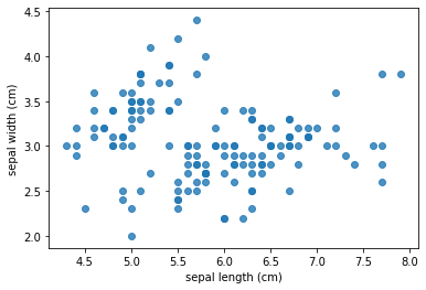
1.2 two dimensional classified scatter diagram
According to the first two characteristics of iris data set, K-means clustering is carried out. After clustering into four categories, these four categories are distinguished in the scatter diagram on the basis of the above.
#Import iris data and reconstruct the data frame
from sklearn.datasets import load_iris
iris = load_iris()
df = pd.DataFrame(iris.data[:],columns=iris.feature_names[:])

#On the two-dimensional scatter diagram, some features are distinguished
#According to the first two characteristics: K-means clustering is used to cluster the data into four categories
pip install sklearn
from sklearn.cluster import KMeans
estimator = KMeans(n_clusters=4)   #Construct cluster
estimator.fit(df.iloc[:,0:2])      #clustering
label_pred = estimator.labels_     #Get cluster tag
df['label'] = label_pred           #Display cluster labels in the original data table

#Draw k-means results
x0 = df[label_pred == 0]
x1 = df[label_pred == 1]
x2 = df[label_pred == 2]
x3 = df[label_pred == 3]
plt.scatter(x0.iloc[:, 0], x0.iloc[:, 1], c = "red", marker='o', label='label0')
plt.scatter(x1.iloc[:, 0], x1.iloc[:, 1], c = "green", marker='*', label='label1')
plt.scatter(x2.iloc[:, 0], x2.iloc[:, 1], c = "blue", marker='+', label='label2')
plt.scatter(x3.iloc[:, 0], x3.iloc[:, 1], c = "yellow", marker='^', label='label3')
plt.xlabel('sepal length (cm)')
plt.ylabel('sepal width (cm)')
plt.legend(loc=2)
plt.show()

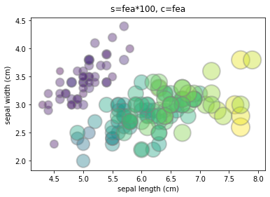
1.3 bubble chart
The two-dimensional classification scatter diagram superimposes one classification feature on the basis of two main features
If you want to show another continuous feature based on the two main features, you can use a bubble chart.
Here, it is assumed that the third feature of iris is another continuous feature to be displayed (only for method display. In practice, the third feature of iris is similar to the first two features, and it is not suitable to use bubble diagram. It is more suitable to use the three-dimensional scatter diagram or scatter diagram matrix described below.)
#Import iris data and reconstruct the data frame
from sklearn.datasets import load_iris
iris = load_iris()
df = pd.DataFrame(iris.data[:],columns=iris.feature_names[:])

#Suppose the third feature of iris is shown as bubble size
fea = df['petal length (cm)']
plt.scatter(df['sepal length (cm)'], df['sepal width (cm)'], s=fea*100, c='purple', alpha=0.4, edgecolors="grey", linewidth=2)
plt.xlabel('sepal length (cm)')  # Abscissa title
plt.ylabel('sepal width (cm)')  # Ordinate axis title
plt.title('s=fea*100, c=purple',verticalalignment='bottom')
plt.show()
#Parameter description
    # s: Variables characterizing bubble size
    # c: Color. If you want color bubbles, you can assign a value to C, such as c=fea
    # alpha: opacity
    # edgecolors: the color of the bubble stroke
    # linewidth: bubble stroke size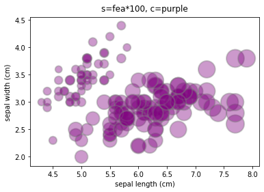
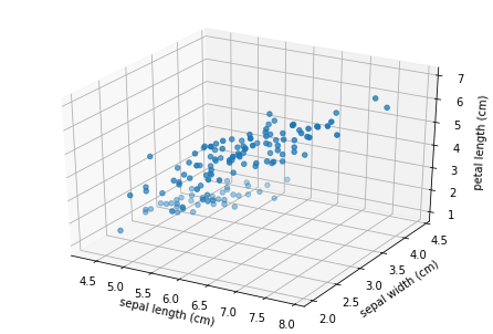
2. Three main features: three-dimensional scatter diagram
2.1 three dimensional scatter diagram
Considering the first three features of iris dataset, a three-dimensional scatter diagram is drawn.
#Import iris data and reconstruct the data frame
from sklearn.datasets import load_iris
iris = load_iris()
df = pd.DataFrame(iris.data[:],columns=iris.feature_names[:])

#According to the first three characteristics of iris data, draw a three-dimensional scatter diagram
import matplotlib.pyplot as plt
from mpl_toolkits.mplot3d import Axes3D # Spatial 3D drawing
#Set x, y, z axes
x=df['sepal length (cm)']
y=df['sepal width (cm)']
z=df['petal length (cm)']
#mapping
fig = plt.figure()
ax = Axes3D(fig)
ax.scatter(x, y, z)
# Add axis
ax.set_xlabel('sepal length (cm)', fontdict={'size': 10, 'color': 'black'})
ax.set_ylabel('sepal width (cm)', fontdict={'size': 10, 'color': 'black'})
ax.set_zlabel('petal length (cm)', fontdict={'size': 10, 'color': 'black'})
plt.show()
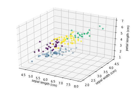
2.2 three dimensional classified scatter diagram
According to the first three features of iris data set, K-means clustering is carried out. After clustering into four categories, these four categories are distinguished in the scatter diagram on the basis of the above.
#Import iris data and reconstruct the data frame
from sklearn.datasets import load_iris
iris = load_iris()
df = pd.DataFrame(iris.data[:],columns=iris.feature_names[:])

#According to the first three characteristics: K-means clustering is used to cluster the data into four categories
pip install sklearn
from sklearn.cluster import KMeans
estimator = KMeans(n_clusters=4)   #Construct cluster
estimator.fit(df.iloc[:,0:3])      #clustering
label_pred = estimator.labels_     #Get cluster tag
df['label'] = label_pred           #Display cluster labels in the original data table

#According to the first three features of iris data, a three-dimensional classification scatter map is drawn
import matplotlib.pyplot as plt
from mpl_toolkits.mplot3d import Axes3D # Spatial 3D drawing
#Set x, y, z axes
x=df['sepal length (cm)']
y=df['sepal width (cm)']
z=df['petal length (cm)']
#mapping
fig = plt.figure()
ax = Axes3D(fig)
ax.scatter(x, y, z, c=label_pred)  #c refers to color, c=label_pred just four categories and four colors. Compared with ordinary three-dimensional scatter diagram, only here is changed!!!
# Add axis
ax.set_xlabel('sepal length (cm)', fontdict={'size': 10, 'color': 'black'})
ax.set_ylabel('sepal width (cm)', fontdict={'size': 10, 'color': 'black'})
ax.set_zlabel('petal length (cm)', fontdict={'size': 10, 'color': 'black'})
plt.show()
3. Multi principal features: 2D scatter matrix
3.1 two dimensional scatter matrix
If there are multiple features to draw, for example, iris has four features, you can draw a two-dimensional scatter matrix.
#Import iris data and reconstruct the data frame
from sklearn.datasets import load_iris
iris = load_iris()
df = pd.DataFrame(iris.data[:],columns=iris.feature_names[:])

#Scatter matrix
import seaborn as sns
fig = plt.figure(figsize=(15, 25))
sns.pairplot(data=df, vars=df.iloc[:,0:4], diag_kind="kde", markers="+")
plt.show()
# Parameter Description:
    # Data specifies the data source to be used by pairplot()
    # hue specifies the basis for distinguishing the data in data
    # vars specifies the data in data to be plotted as a scatter matrix
    # diag_kind refers to the type of diagonal graph {'auto', 'hist', 'kde'}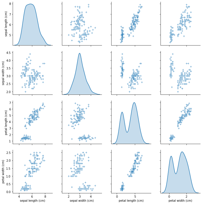
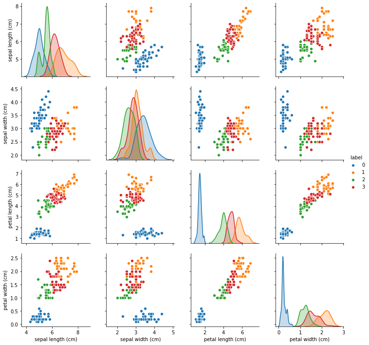
3.2 two dimensional classified scatter matrix
If further classification is carried out, a two-dimensional classification scatter diagram matrix can be drawn.
#Import iris data and reconstruct the data frame
from sklearn.datasets import load_iris
iris = load_iris()
df = pd.DataFrame(iris.data[:],columns=iris.feature_names[:])

#According to the first four characteristics: K-means clustering is used to cluster the data into four categories
pip install sklearn
from sklearn.cluster import KMeans
estimator = KMeans(n_clusters=4)   #Construct cluster
estimator.fit(df.iloc[:,0:4])      #clustering
label_pred = estimator.labels_     #Get cluster tag
df['label'] = label_pred           #Display cluster labels in the original data table

#Draw two-dimensional classified scatter matrix
import seaborn as sns
fig = plt.figure(figsize=(15, 25))
sns.pairplot(data=df, hue='label', vars=df.iloc[:,0:4])
plt.show()
# Parameter Description:
    # Data specifies the data source to be used by pairplot(), and hue specifies the basis for distinguishing and displaying the data in data
    # vars specifies the data in data to be plotted as a scatter matrix“