(1) I. background of the topic
In the past two years, under the attack of the new coronavirus, all countries are facing great challenges. Some have taken measures to seal off the country, and the economic level of some countries has declined. However, China has not only maintained a non declining economy, but also made progress. Through the analysis of total import and export trade, I want to know that in the past two years, in the face of the difficulties of the epidemic, the total import and export volume of our country is compared with that before. Through data visualization, we can see the difference between our country's total import and export volume in recent years.
(2) Theme web crawler design scheme
1. Topic crawler name
Crawler analysis of total domestic import and export trade
2. Content and data feature analysis of topic web crawler
Climb the total domestic import and export trade of the website and analyze the amount of import and export volume of the current month (US $100 million), year-on-year growth, month on month growth, cumulative import and export volume (US $100 million) and year-on-year growth.
3. Overview of thematic web crawler design scheme (including implementation ideas and technical difficulties)
Crawl the total domestic import and export trade of the current website and the analysis of the amount of import and export volume of the current month (US $100 million), year-on-year growth, month on month growth, the amount of cumulative import and export volume (US $100 million) and year-on-year growth, find the link under the label, jump, crawl the relevant data of the next page, clean the data and visualize the data.
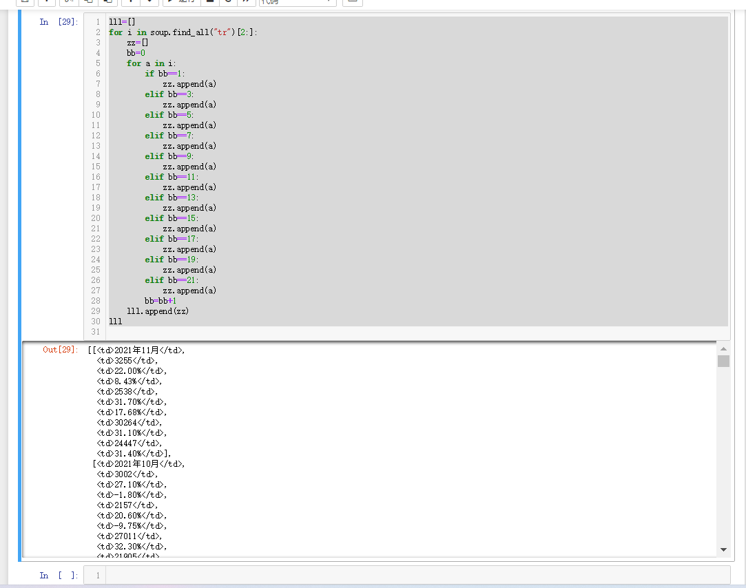
The gradual crawling of page labels will lead to errors due to the slicing of data, cleaning and processing of data, and visual processing of available data.
The specific ideas and analysis are shown through the following codes and pictures.
(3) Analysis of structural characteristics of theme pages
1. Structure and feature analysis of theme page

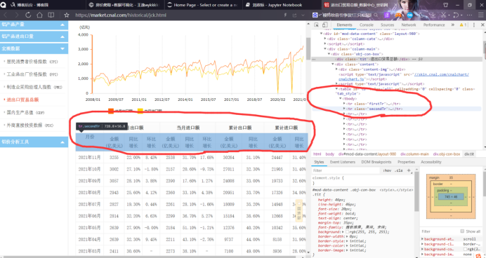
2. HTML page parsing
In the first picture, we can find that we need to find the total amount of import and export trade, and then look below. In the second picture, we can find that the data we need to crawl is located in the tr of the tobody tag, and the first two lines are subtitles, The third line starts with the specific data of total import and export trade (US $100 million), year-on-year growth and month on month growth in November 2021, and so on, October and September
3. Node (label) search method and traversal method
Traverse the tr tag with a double loop. Then traverse the td tag under the tr tag to get the data.
(4) Web crawler program design
The main body of the crawler program shall include the following parts, with source code and detailed notes attached, and after each part of the program
Face provides a screenshot of the output result.
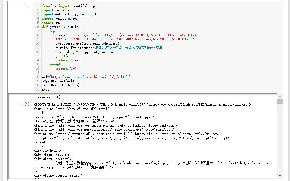
1. Data crawling and acquisition
 1 from bs4 import BeautifulSoup
 2 import requests
 3 import matplotlib.pyplot as plt
 4 import pandas as pd
 5 import csv
 6 def getHTMLText(url):
 7     try:
 8         headers={"User-Agent":"Mozilla/5.0 (Windows NT 10.0; Win64; x64) AppleWebKit/\
 9         537.36 (KHTML, like Gecko) Chrome/96.0.4664.55 Safari/537.36 Edg/96.0.1054.34"}
10         r=requests.get(url,headers=headers)
11         r.raise_for_status()#If the status is not 200, an HTTPError exception is thrown
12         r.encoding = r.apparent_encoding
13         print(r)
14         return r.text
15     except:
16         return "no"
17
18 url="https://market.cnal.com/historical/jck.html"
19 a=getHTMLText(url)
20 soup=BeautifulSoup(a)
2. Clean and process the data
 1 lll=[]
 2 for i in soup.find_all("tr")[2:]:
 3     zz=[]
 4     bb=0
 5     for a in i:
 6         if bb==1:
 7             zz.append(a)
 8         elif bb==3:
 9             zz.append(a)
10         elif bb==5:
11             zz.append(a)
12         elif bb==7:
13             zz.append(a)
14         elif bb==9:
15             zz.append(a)
16         elif bb==11:
17             zz.append(a)
18         elif bb==13:
19             zz.append(a)
20         elif bb==15:
21             zz.append(a)
22         elif bb==17:
23             zz.append(a)
24         elif bb==19:
25             zz.append(a)
26         elif bb==21:
27             zz.append(a)
28         bb=bb+1
29     lll.append(zz)
30 lll
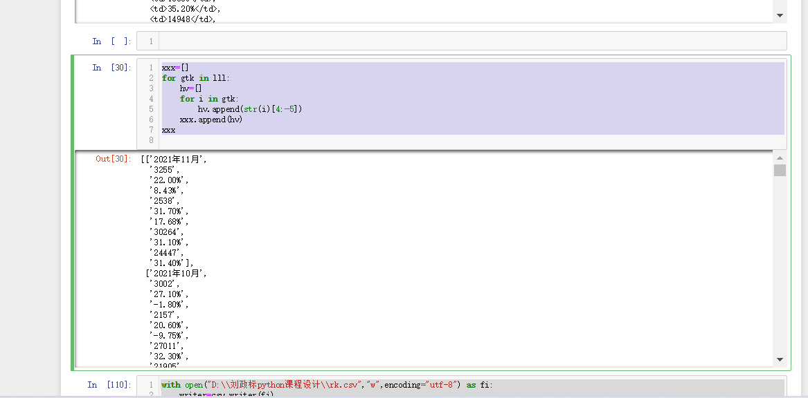
1 xxx=[]
2 for gtk in lll:
3     hv=[]
4     for i in gtk:
5         hv.append(str(i)[4:-5])
6     xxx.append(hv)
7 xxx
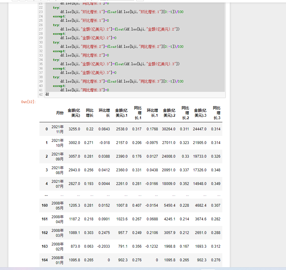
 1 for hji in range(len(df["month"])):
 2     try:
 3         df.loc[hji,"amount of money(USD100mn)"]=float(df.loc[hji,"amount of money(USD100mn)"])
 4     except:
 5         df.loc[hji,"amount of money(USD100mn)"]=0
 6     try:
 7         df.loc[hji,"Year on year growth"]=float(df.loc[hji,"Year on year growth"][0:-1])/100
 8     except:
 9         df.loc[hji,"Year on year growth"]=0
10     try:
11         df.loc[hji,"Month on month growth"]=float(df.loc[hji,"Month on month growth"][0:-1])/100
12     except:
13         df.loc[hji,"Month on month growth"]=0
14     try:
15         df.loc[hji,"amount of money(USD100mn).1"]=float(df.loc[hji,"amount of money(USD100mn).1"])
16     except:
17         df.loc[hji,"amount of money(USD100mn).1"]=0
18     try:
19         df.loc[hji,"Year on year growth.1"]=float(df.loc[hji,"Year on year growth.1"][0:-1])/100
20     except:
21         df.loc[hji,"Year on year growth.1"]=0
22     try:
23         df.loc[hji,"Month on month growth.1"]=float(df.loc[hji,"Month on month growth.1"][0:-1])/100
24     except:
25         df.loc[hji,"Month on month growth.1"]=0
26     try:
27         df.loc[hji,"amount of money(USD100mn).2"]=float(df.loc[hji,"amount of money(USD100mn).2"])
28     except:
29         df.loc[hji,"amount of money(USD100mn).2"]=0
30     try:
31         df.loc[hji,"Year on year growth.2"]=float(df.loc[hji,"Year on year growth.2"][0:-1])/100
32     except:
33         df.loc[hji,"Year on year growth.2"]=0
34     try:
35         df.loc[hji,"amount of money(USD100mn).3"]=float(df.loc[hji,"amount of money(USD100mn).3"])
36     except:
37         df.loc[hji,"amount of money(USD100mn).3"]=0
38     try:
39         df.loc[hji,"Year on year growth.3"]=float(df.loc[hji,"Year on year growth.3"][0:-1])/100
40     except:
41         df.loc[hji,"Year on year growth.3"]=0
42 df
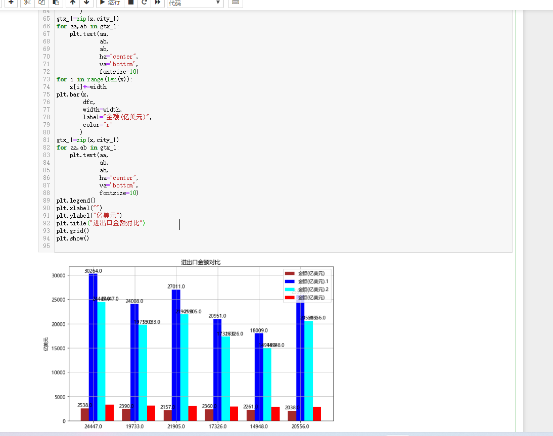
3. Data analysis and visualization (e.g. data column diagram, histogram, scatter diagram, box diagram, distribution diagram)
 1 import requests
 2 from bs4 import BeautifulSoup
 3 import matplotlib.pyplot as plt
 4 import seaborn as sns
 5 import pandas as pd
 6 #df=pd.read_csv("C:\\Users\\wei\\data.csv")
 7 ggf=df.sort_values(by="amount of money(USD100mn)",
 8                         axis=0,
 9                         ascending=False,)
10 bk=ggf["amount of money(USD100mn).1"][0:6]
11 dfc=ggf["amount of money(USD100mn)"][0:6]
12 zk=ggf["amount of money(USD100mn).2"][0:6]
13 city_1=ggf["amount of money(USD100mn).3"][0:6]
14 #Display Chinese tags and deal with Chinese garbled code
15 plt.rcParams['font.sans-serif']=['Microsoft YaHei']
16 plt.rcParams['axes.unicode_minus']=False
17 plt.figure(figsize=(10,6))
18 x=list(range(len(zk)))
19 #Set spacing for pictures
20 total_width=0.8
21 n=4
22 width=total_width/n
23 for i in range(len(x)):
24     x[i]-=width
25 plt.bar(x,
26         bk,
27         width=width,
28         label="amount of money(USD100mn)",
29         color="brown"
30        )
31 gtx_3=zip(x,bk)
32 for aa,ab in gtx_3:
33     plt.text(aa,
34              ab,
35              ab,
36              ha="center",
37              va='bottom',
38              fontsize=10)
39 for i in range(len(x)):
40     x[i]+=width
41 plt.bar(x,
42         zk,
43         width=width,#width
44         label="amount of money(USD100mn).1",
45         tick_label=city_1,
46         color="b"
47        )
48 gtx_2=zip(x,zk)
49 for aa,ab in gtx_2:
50     plt.text(aa,
51              ab,
52              ab,
53              ha="center",
54              va='bottom',
55              fontsize=10)
56
57 for i in range(len(x)):
58     x[i]+=width
59 plt.bar(x,
60         city_1,
61         width=width,
62         label="amount of money(USD100mn).2",
63         color="cyan"
64        )
65 gtx_1=zip(x,city_1)
66 for aa,ab in gtx_1:
67     plt.text(aa,
68              ab,
69              ab,
70              ha="center",
71              va='bottom',
72              fontsize=10)
73 for i in range(len(x)):
74     x[i]+=width
75 plt.bar(x,
76         dfc,
77         width=width,
78         label="amount of money(USD100mn)",
79         color="r"
80        )
81 gtx_1=zip(x,city_1)
82 for aa,ab in gtx_1:
83     plt.text(aa,
84              ab,
85              ab,
86              ha="center",
87              va='bottom',
88              fontsize=10)
89 plt.legend()
90 plt.xlabel("")
91 plt.ylabel("USD100mn")
92 plt.title("Comparison of import and export amount")
93 plt.grid()
94 plt.show()
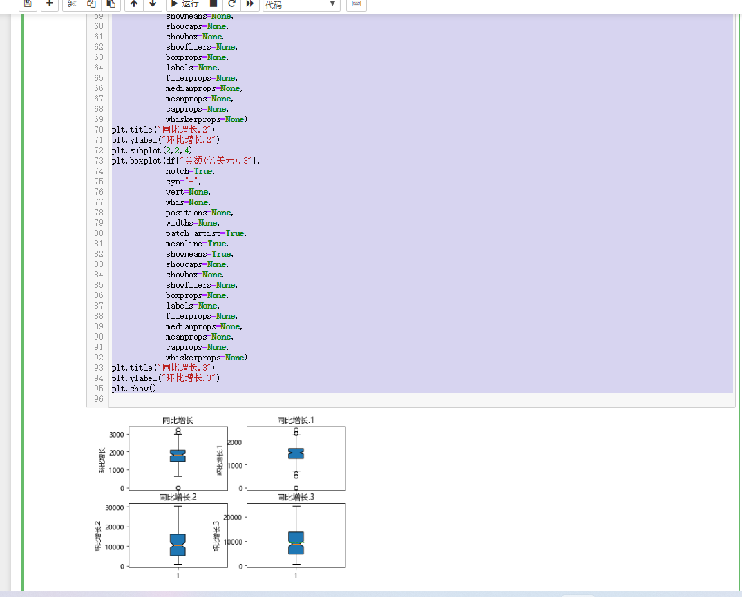
 1 #Find out where the average import and export amount is and the amount distribution through the box chart
 2 plt.subplot(2,2,1)
 3 plt.boxplot(df["amount of money(USD100mn)"],
 4             notch=True,
 5             sym=None,
 6             vert=None,
 7             whis=None,
 8             positions=None,
 9             widths=None,
10             patch_artist=True,
11             meanline=None,
12             showmeans=None,
13             showcaps=None,
14             showbox=None,
15             showfliers=None,
16             boxprops=None,
17             labels=None,
18             flierprops=None,
19             medianprops=None,
20             meanprops=None,
21             capprops=None,
22             whiskerprops=None)
23 plt.title("Year on year growth")
24 plt.ylabel("Month on month growth")
25 plt.subplot(2,2,2)
26 plt.boxplot(df["amount of money(USD100mn).1"],
27             notch=True,
28             sym=None,
29             vert=None,
30             whis=None,
31             positions=None,
32             widths=None,
33             patch_artist=True,
34             meanline=None,
35             showmeans=None,
36             showcaps=None,
37             showbox=None,
38             showfliers=None,
39             boxprops=None,
40             labels=None,
41             flierprops=None,
42             medianprops=None,
43             meanprops=None,
44             capprops=None,
45             whiskerprops=None)
46 plt.title("Year on year growth.1")
47 plt.ylabel("Month on month growth.1")
48 plt.subplot(2,2,3)
49
50 plt.boxplot(df["amount of money(USD100mn).2"],
51             notch=True,
52             sym=">",
53             vert=None,
54             whis=None,
55             positions=None,
56             widths=None,
57             patch_artist=True,
58             meanline=None,
59             showmeans=None,
60             showcaps=None,
61             showbox=None,
62             showfliers=None,
63             boxprops=None,
64             labels=None,
65             flierprops=None,
66             medianprops=None,
67             meanprops=None,
68             capprops=None,
69             whiskerprops=None)
70 plt.title("Year on year growth.2")
71 plt.ylabel("Month on month growth.2")
72 plt.subplot(2,2,4)
73 plt.boxplot(df["amount of money(USD100mn).3"],
74             notch=True,
75             sym="+",
76             vert=None,
77             whis=None,
78             positions=None,
79             widths=None,
80             patch_artist=True,
81             meanline=True,
82             showmeans=True,
83             showcaps=None,
84             showbox=None,
85             showfliers=None,
86             boxprops=None,
87             labels=None,
88             flierprops=None,
89             medianprops=None,
90             meanprops=None,
91             capprops=None,
92             whiskerprops=None)
93 plt.title("Year on year growth.3")
94 plt.ylabel("Month on month growth.3")
95 plt.show()
4. According to the relationship between the data, analyze the correlation coefficient between the two variables, draw the scatter diagram, and establish the variable
Regression equation between quantities (univariate or multivariate).
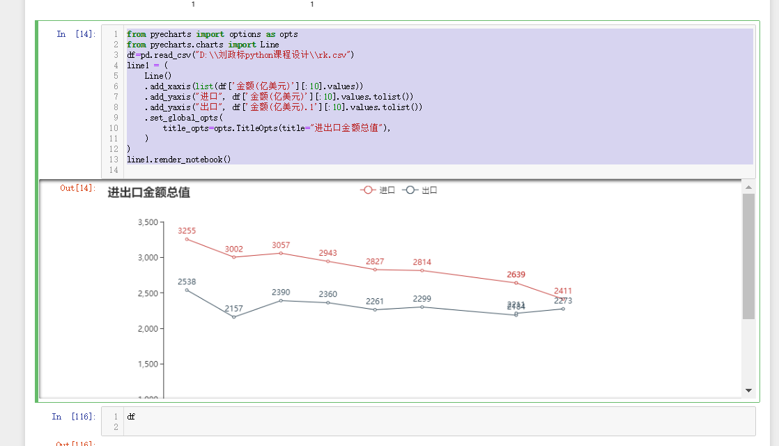
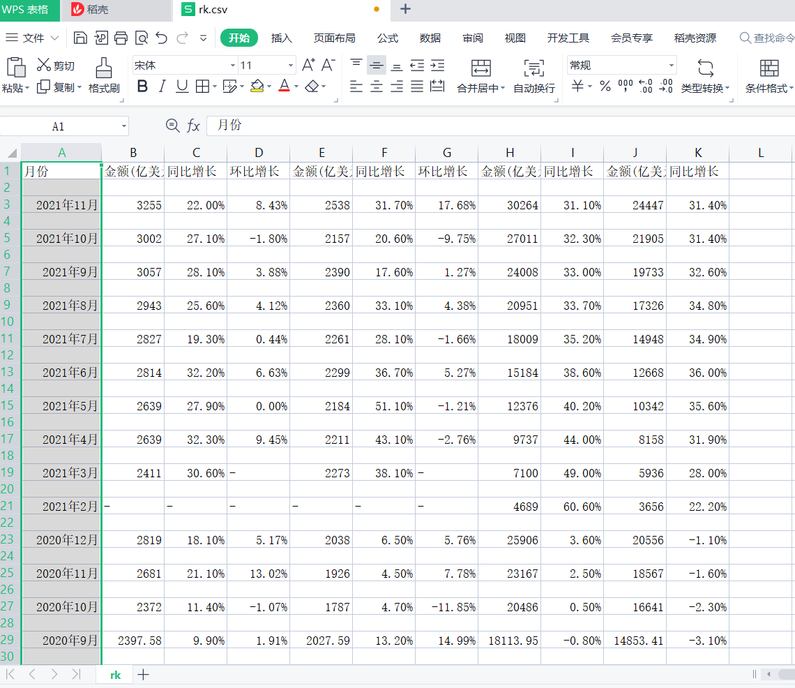
 1 from pyecharts import options as opts
 2 from pyecharts.charts import Line
 3 df=pd.read_csv("D:\\Zheng Biao Liu python curriculum design\\rk.csv")
 4 line1 = (
 5     Line()
 6     .add_xaxis(list(df['amount of money(USD100mn)'][:10].values))
 7     .add_yaxis("Import", df['amount of money(USD100mn)'][:10].values.tolist())
 8     .add_yaxis("Export", df['amount of money(USD100mn).1'][:10].values.tolist())
 9     .set_global_opts(
10         title_opts=opts.TitleOpts(title="Total value of import and export"),
11     )
12 )
13 line1.render_notebook()
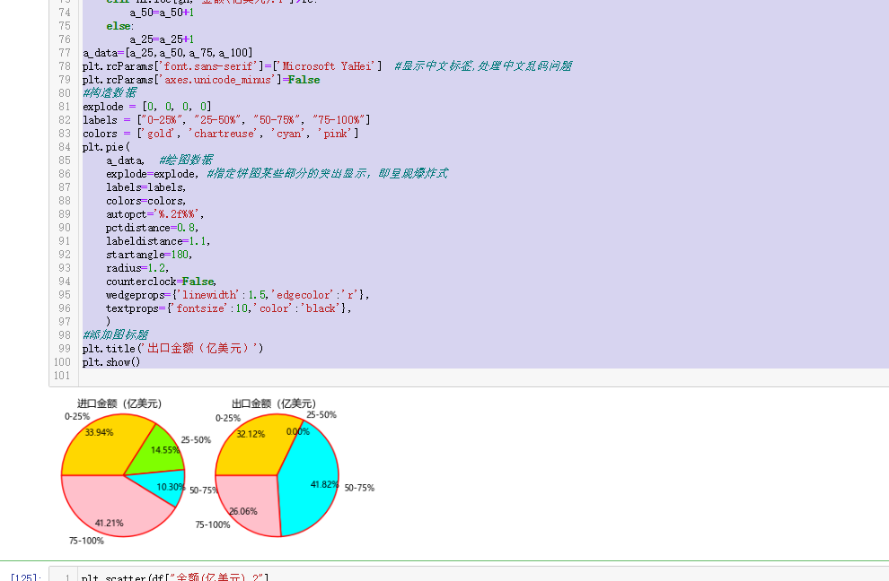
  1 #Organize drawing data
  2 hi=df.sort_values(by="amount of money(USD100mn)",
  3                         axis=0,
  4                         ascending=False,)
  5 for ikl in range(len(df["amount of money(USD100mn)"])):
  6     if ikl==29:
  7         fa=hi.loc[ikl,"amount of money(USD100mn)"]
  8     elif ikl==60:
  9         fb=hi.loc[ikl,"amount of money(USD100mn)"]
 10     elif ikl==90:
 11         fc=hi.loc[ikl,"amount of money(USD100mn)"]
 12 a_25=0
 13 a_50=0
 14 a_75=0
 15 a_100=0
 16 DF=len(hi["amount of money(USD100mn)"])
 17 plt.subplot(1,2,1)
 18 for gh in range(DF):
 19     if hi.loc[gh,"amount of money(USD100mn)"]>fa:
 20         a_100=a_100+1
 21     elif hi.loc[gh,"amount of money(USD100mn)"]>fb:
 22         a_75=a_75+1
 23     elif hi.loc[gh,"amount of money(USD100mn)"]>fc:
 24         a_50=a_50+1
 25     else:
 26         a_25=a_25+1
 27 a_data=[a_25,a_50,a_75,a_100]
 28 plt.rcParams['font.sans-serif']=['Microsoft YaHei']  #Show Chinese labels,Dealing with Chinese garbled code
 29 plt.rcParams['axes.unicode_minus']=False
 30 #Construction data
 31 explode = [0, 0, 0, 0]
 32 labels = ["0-25%", "25-50%", "50-75%", "75-100%"]
 33 colors = ['gold', 'chartreuse', 'cyan', 'pink']
 34 plt.pie(
 35     a_data,  #Drawing data
 36     explode=explode, #Specifies that some parts of the pie chart are highlighted, that is, they appear explosive
 37     labels=labels,
 38     colors=colors,
 39     autopct='%.2f%%',
 40     pctdistance=0.8,
 41     labeldistance=1.1,
 42     startangle=180,
 43     radius=1.2,
 44     counterclock=False,
 45     wedgeprops={'linewidth':1.5,'edgecolor':'r'},
 46     textprops={'fontsize':10,'color':'black'},
 47     )
 48 #Add diagram title
 49 plt.title('Import amount (USD 100 million)')
 50 #----------------------------------------------------------------------------------------------------------------------------------
 51 plt.subplot(1,2,2)
 52 #display graphics
 53 hi=df.sort_values(by="amount of money(USD100mn).1",
 54                         axis=0,
 55                         ascending=False,)
 56 for ikl in range(len(df["amount of money(USD100mn).1"])):
 57     if ikl==29:
 58         fa=hi.loc[ikl,"amount of money(USD100mn).1"]
 59     elif ikl==60:
 60         fb=hi.loc[ikl,"amount of money(USD100mn).1"]
 61     elif ikl==90:
 62         fc=hi.loc[ikl,"amount of money(USD100mn).1"]
 63 a_25=0
 64 a_50=0
 65 a_75=0
 66 a_100=0
 67 DF=len(hi["amount of money(USD100mn).1"])
 68 for gh in range(DF):
 69     if hi.loc[gh,"amount of money(USD100mn).1"]>fa:
 70         a_100=a_100+1
 71     elif hi.loc[gh,"amount of money(USD100mn).1"]>fb:
 72         a_75=a_75+1
 73     elif hi.loc[gh,"amount of money(USD100mn).1"]>fc:
 74         a_50=a_50+1
 75     else:
 76         a_25=a_25+1
 77 a_data=[a_25,a_50,a_75,a_100]
 78 plt.rcParams['font.sans-serif']=['Microsoft YaHei']  #Show Chinese labels,Dealing with Chinese garbled code
 79 plt.rcParams['axes.unicode_minus']=False
 80 #Construction data
 81 explode = [0, 0, 0, 0]
 82 labels = ["0-25%", "25-50%", "50-75%", "75-100%"]
 83 colors = ['gold', 'chartreuse', 'cyan', 'pink']
 84 plt.pie(
 85     a_data,  #Drawing data
 86     explode=explode, #Specifies that some parts of the pie chart are highlighted, that is, they appear explosive
 87     labels=labels,
 88     colors=colors,
 89     autopct='%.2f%%',
 90     pctdistance=0.8,
 91     labeldistance=1.1,
 92     startangle=180,
 93     radius=1.2,
 94     counterclock=False,
 95     wedgeprops={'linewidth':1.5,'edgecolor':'r'},
 96     textprops={'fontsize':10,'color':'black'},
 97     )
 98 #Add diagram title
 99 plt.title('Export amount (USD 100 million)')
100 plt.show()
6. Data persistence
 1 with open("D:\\Zheng Biao Liu python curriculum design\\rk.csv","w",encoding="utf-8") as fi:
 2     writer=csv.writer(fi)
 3     writer.writerow(["month",
 4                      "amount of money(USD100mn)","Year on year growth","Month on month growth",
 5                      "amount of money(USD100mn)","Year on year growth","Month on month growth",
 6                      "amount of money(USD100mn)",
 7                      "Year on year growth",
 8                      "amount of money(USD100mn)","Year on year growth"])#Data column name for each column
 9     for da in xxx:
10         writer.writerow(da)
11 fi.close()
7. Summarize the codes of the above parts and attach the complete program code
  1 from bs4 import BeautifulSoup
  2 import requests
  3 import matplotlib.pyplot as plt
  4 import pandas as pd
  5 import csv
  6 def getHTMLText(url):
  7     try:
  8         headers={"User-Agent":"Mozilla/5.0 (Windows NT 10.0; Win64; x64) AppleWebKit/\
  9         537.36 (KHTML, like Gecko) Chrome/96.0.4664.55 Safari/537.36 Edg/96.0.1054.34"}
 10         r=requests.get(url,headers=headers)
 11         r.raise_for_status()#If the status is not 200, the HTTPError abnormal
 12         r.encoding = r.apparent_encoding
 13         print(r)
 14         return r.text
 15     except:
 16         return "no"
 17
 18 url="https://market.cnal.com/historical/jck.html"
 19 a=getHTMLText(url)
 20 soup=BeautifulSoup(a)
 21 soup
 22 lll=[]
 23 for i in soup.find_all("tr")[2:]:
 24     zz=[]
 25     bb=0
 26     for a in i:
 27         if bb==1:
 28             zz.append(a)
 29         elif bb==3:
 30             zz.append(a)
 31         elif bb==5:
 32             zz.append(a)
 33         elif bb==7:
 34             zz.append(a)
 35         elif bb==9:
 36             zz.append(a)
 37         elif bb==11:
 38             zz.append(a)
 39         elif bb==13:
 40             zz.append(a)
 41         elif bb==15:
 42             zz.append(a)
 43         elif bb==17:
 44             zz.append(a)
 45         elif bb==19:
 46             zz.append(a)
 47         elif bb==21:
 48             zz.append(a)
 49         bb=bb+1
 50     lll.append(zz)
 51 lll
 52 xxx=[]
 53 for gtk in lll:
 54     hv=[]
 55     for i in gtk:
 56         hv.append(str(i)[4:-5])
 57     xxx.append(hv)
 58 xxx
 59 with open("D:\\Zheng Biao Liu python curriculum design\\rk.csv","w",encoding="utf-8") as fi:
 60     writer=csv.writer(fi)
 61     writer.writerow(["month",
 62                      "amount of money(USD100mn)","Year on year growth","Month on month growth",
 63                      "amount of money(USD100mn)","Year on year growth","Month on month growth",
 64                      "amount of money(USD100mn)",
 65                      "Year on year growth",
 66                      "amount of money(USD100mn)","Year on year growth"])#Data column name for each column
 67     for da in xxx:
 68         writer.writerow(da)
 69 fi.close()
 70 for hji in range(len(df["month"])):
 71     try:
 72         df.loc[hji,"amount of money(USD100mn)"]=float(df.loc[hji,"amount of money(USD100mn)"])
 73     except:
 74         df.loc[hji,"amount of money(USD100mn)"]=0
 75     try:
 76         df.loc[hji,"Year on year growth"]=float(df.loc[hji,"Year on year growth"][0:-1])/100
 77     except:
 78         df.loc[hji,"Year on year growth"]=0
 79     try:
 80         df.loc[hji,"Month on month growth"]=float(df.loc[hji,"Month on month growth"][0:-1])/100
 81     except:
 82         df.loc[hji,"Month on month growth"]=0
 83     try:
 84         df.loc[hji,"amount of money(USD100mn).1"]=float(df.loc[hji,"amount of money(USD100mn).1"])
 85     except:
 86         df.loc[hji,"amount of money(USD100mn).1"]=0
 87     try:
 88         df.loc[hji,"Year on year growth.1"]=float(df.loc[hji,"Year on year growth.1"][0:-1])/100
 89     except:
 90         df.loc[hji,"Year on year growth.1"]=0
 91     try:
 92         df.loc[hji,"Month on month growth.1"]=float(df.loc[hji,"Month on month growth.1"][0:-1])/100
 93     except:
 94         df.loc[hji,"Month on month growth.1"]=0
 95     try:
 96         df.loc[hji,"amount of money(USD100mn).2"]=float(df.loc[hji,"amount of money(USD100mn).2"])
 97     except:
 98         df.loc[hji,"amount of money(USD100mn).2"]=0
 99     try:
100         df.loc[hji,"Year on year growth.2"]=float(df.loc[hji,"Year on year growth.2"][0:-1])/100
101     except:
102         df.loc[hji,"Year on year growth.2"]=0
103     try:
104         df.loc[hji,"amount of money(USD100mn).3"]=float(df.loc[hji,"amount of money(USD100mn).3"])
105     except:
106         df.loc[hji,"amount of money(USD100mn).3"]=0
107     try:
108         df.loc[hji,"Year on year growth.3"]=float(df.loc[hji,"Year on year growth.3"][0:-1])/100
109     except:
110         df.loc[hji,"Year on year growth.3"]=0
111 df
112 import requests
113 from bs4 import BeautifulSoup
114 import matplotlib.pyplot as plt
115 import seaborn as sns
116 import pandas as pd
117 #df=pd.read_csv("C:\\Users\\wei\\data.csv")
118 ggf=df.sort_values(by="amount of money(USD100mn)",
119                         axis=0,
120                         ascending=False,)
121 bk=ggf["amount of money(USD100mn).1"][0:6]
122 dfc=ggf["amount of money(USD100mn)"][0:6]
123 zk=ggf["amount of money(USD100mn).2"][0:6]
124 city_1=ggf["amount of money(USD100mn).3"][0:6]
125 #Show Chinese labels,Dealing with Chinese garbled code
126 plt.rcParams['font.sans-serif']=['Microsoft YaHei']
127 plt.rcParams['axes.unicode_minus']=False
128 plt.figure(figsize=(10,6))
129 x=list(range(len(zk)))
130 #Set spacing for pictures
131 total_width=0.8
132 n=4
133 width=total_width/n
134 for i in range(len(x)):
135     x[i]-=width
136 plt.bar(x,
137         bk,
138         width=width,
139         label="amount of money(USD100mn)",
140         color="brown"
141        )
142 gtx_3=zip(x,bk)
143 for aa,ab in gtx_3:
144     plt.text(aa,
145              ab,
146              ab,
147              ha="center",
148              va='bottom',
149              fontsize=10)
150 for i in range(len(x)):
151     x[i]+=width
152 plt.bar(x,
153         zk,
154         width=width,#width
155         label="amount of money(USD100mn).1",
156         tick_label=city_1,
157         color="b"
158        )
159 gtx_2=zip(x,zk)
160 for aa,ab in gtx_2:
161     plt.text(aa,
162              ab,
163              ab,
164              ha="center",
165              va='bottom',
166              fontsize=10)
167
168 for i in range(len(x)):
169     x[i]+=width
170 plt.bar(x,
171         city_1,
172         width=width,
173         label="amount of money(USD100mn).2",
174         color="cyan"
175        )
176 gtx_1=zip(x,city_1)
177 for aa,ab in gtx_1:
178     plt.text(aa,
179              ab,
180              ab,
181              ha="center",
182              va='bottom',
183              fontsize=10)
184 for i in range(len(x)):
185     x[i]+=width
186 plt.bar(x,
187         dfc,
188         width=width,
189         label="amount of money(USD100mn)",
190         color="r"
191        )
192 gtx_1=zip(x,city_1)
193 for aa,ab in gtx_1:
194     plt.text(aa,
195              ab,
196              ab,
197              ha="center",
198              va='bottom',
199              fontsize=10)
200 plt.legend()
201 plt.xlabel("")
202 plt.ylabel("USD100mn")
203 plt.title("Comparison of import and export amount")
204 plt.grid()
205 plt.show()
206 #Find out where the average import and export amount is and the amount distribution through the box chart
207 plt.subplot(2,2,1)
208 plt.boxplot(df["amount of money(USD100mn)"],
209             notch=True,
210             sym=None,
211             vert=None,
212             whis=None,
213             positions=None,
214             widths=None,
215             patch_artist=True,
216             meanline=None,
217             showmeans=None,
218             showcaps=None,
219             showbox=None,
220             showfliers=None,
221             boxprops=None,
222             labels=None,
223             flierprops=None,
224             medianprops=None,
225             meanprops=None,
226             capprops=None,
227             whiskerprops=None)
228 plt.title("Year on year growth")
229 plt.ylabel("Month on month growth")
230 plt.subplot(2,2,2)
231 plt.boxplot(df["amount of money(USD100mn).1"],
232             notch=True,
233             sym=None,
234             vert=None,
235             whis=None,
236             positions=None,
237             widths=None,
238             patch_artist=True,
239             meanline=None,
240             showmeans=None,
241             showcaps=None,
242             showbox=None,
243             showfliers=None,
244             boxprops=None,
245             labels=None,
246             flierprops=None,
247             medianprops=None,
248             meanprops=None,
249             capprops=None,
250             whiskerprops=None)
251 plt.title("Year on year growth.1")
252 plt.ylabel("Month on month growth.1")
253 plt.subplot(2,2,3)
254
255 plt.boxplot(df["amount of money(USD100mn).2"],
256             notch=True,
257             sym=">",
258             vert=None,
259             whis=None,
260             positions=None,
261             widths=None,
262             patch_artist=True,
263             meanline=None,
264             showmeans=None,
265             showcaps=None,
266             showbox=None,
267             showfliers=None,
268             boxprops=None,
269             labels=None,
270             flierprops=None,
271             medianprops=None,
272             meanprops=None,
273             capprops=None,
274             whiskerprops=None)
275 plt.title("Year on year growth.2")
276 plt.ylabel("Month on month growth.2")
277 plt.subplot(2,2,4)
278 plt.boxplot(df["amount of money(USD100mn).3"],
279             notch=True,
280             sym="+",
281             vert=None,
282             whis=None,
283             positions=None,
284             widths=None,
285             patch_artist=True,
286             meanline=True,
287             showmeans=True,
288             showcaps=None,
289             showbox=None,
290             showfliers=None,
291             boxprops=None,
292             labels=None,
293             flierprops=None,
294             medianprops=None,
295             meanprops=None,
296             capprops=None,
297             whiskerprops=None)
298 plt.title("Year on year growth.3")
299 plt.ylabel("Month on month growth.3")
300 plt.show()
301 from pyecharts import options as opts
302 from pyecharts.charts import Line
303 df=pd.read_csv("D:\\Zheng Biao Liu python curriculum design\\rk.csv")
304 line1 = (
305     Line()
306     .add_xaxis(list(df['amount of money(USD100mn)'][:10].values))
307     .add_yaxis("Import", df['amount of money(USD100mn)'][:10].values.tolist())
308     .add_yaxis("Export", df['amount of money(USD100mn).1'][:10].values.tolist())
309     .set_global_opts(
310         title_opts=opts.TitleOpts(title="Total value of import and export"),
311     )
312 )
313 line1.render_notebook()
314 #Organize drawing data
315 hi=df.sort_values(by="amount of money(USD100mn)",
316                         axis=0,
317                         ascending=False,)
318 for ikl in range(len(df["amount of money(USD100mn)"])):
319     if ikl==29:
320         fa=hi.loc[ikl,"amount of money(USD100mn)"]
321     elif ikl==60:
322         fb=hi.loc[ikl,"amount of money(USD100mn)"]
323     elif ikl==90:
324         fc=hi.loc[ikl,"amount of money(USD100mn)"]
325 a_25=0
326 a_50=0
327 a_75=0
328 a_100=0
329 DF=len(hi["amount of money(USD100mn)"])
330 plt.subplot(1,2,1)
331 for gh in range(DF):
332     if hi.loc[gh,"amount of money(USD100mn)"]>fa:
333         a_100=a_100+1
334     elif hi.loc[gh,"amount of money(USD100mn)"]>fb:
335         a_75=a_75+1
336     elif hi.loc[gh,"amount of money(USD100mn)"]>fc:
337         a_50=a_50+1
338     else:
339         a_25=a_25+1
340 a_data=[a_25,a_50,a_75,a_100]
341 plt.rcParams['font.sans-serif']=['Microsoft YaHei']  #Show Chinese labels,Dealing with Chinese garbled code
342 plt.rcParams['axes.unicode_minus']=False
343 #Construction data
344 explode = [0, 0, 0, 0]
345 labels = ["0-25%", "25-50%", "50-75%", "75-100%"]
346 colors = ['gold', 'chartreuse', 'cyan', 'pink']
347 plt.pie(
348     a_data,  #Drawing data
349     explode=explode, #Specifies that some parts of the pie chart are highlighted, that is, they appear explosive
350     labels=labels,
351     colors=colors,
352     autopct='%.2f%%',
353     pctdistance=0.8,
354     labeldistance=1.1,
355     startangle=180,
356     radius=1.2,
357     counterclock=False,
358     wedgeprops={'linewidth':1.5,'edgecolor':'r'},
359     textprops={'fontsize':10,'color':'black'},
360     )
361 #Add diagram title
362 plt.title('Import amount (USD 100 million)')
363 #----------------------------------------------------------------------------------------------------------------------------------
364 plt.subplot(1,2,2)
365 #display graphics
366 hi=df.sort_values(by="amount of money(USD100mn).1",
367                         axis=0,
368                         ascending=False,)
369 for ikl in range(len(df["amount of money(USD100mn).1"])):
370     if ikl==29:
371         fa=hi.loc[ikl,"amount of money(USD100mn).1"]
372     elif ikl==60:
373         fb=hi.loc[ikl,"amount of money(USD100mn).1"]
374     elif ikl==90:
375         fc=hi.loc[ikl,"amount of money(USD100mn).1"]
376 a_25=0
377 a_50=0
378 a_75=0
379 a_100=0
380 DF=len(hi["amount of money(USD100mn).1"])
381 for gh in range(DF):
382     if hi.loc[gh,"amount of money(USD100mn).1"]>fa:
383         a_100=a_100+1
384     elif hi.loc[gh,"amount of money(USD100mn).1"]>fb:
385         a_75=a_75+1
386     elif hi.loc[gh,"amount of money(USD100mn).1"]>fc:
387         a_50=a_50+1
388     else:
389         a_25=a_25+1
390 a_data=[a_25,a_50,a_75,a_100]
391 plt.rcParams['font.sans-serif']=['Microsoft YaHei']  #Show Chinese labels,Dealing with Chinese garbled code
392 plt.rcParams['axes.unicode_minus']=False
393 #Construction data
394 explode = [0, 0, 0, 0]
395 labels = ["0-25%", "25-50%", "50-75%", "75-100%"]
396 colors = ['gold', 'chartreuse', 'cyan', 'pink']
397 plt.pie(
398     a_data,  #Drawing data
399     explode=explode, #Specifies that some parts of the pie chart are highlighted, that is, they appear explosive
400     labels=labels,
401     colors=colors,
402     autopct='%.2f%%',
403     pctdistance=0.8,
404     labeldistance=1.1,
405     startangle=180,
406     radius=1.2,
407     counterclock=False,
408     wedgeprops={'linewidth':1.5,'edgecolor':'r'},
409     textprops={'fontsize':10,'color':'black'},
410     )
411 #Add diagram title
412 plt.title('Export amount (USD 100 million)')
413 plt.show()
(5) . summary (10 points)
1. What conclusions can be drawn from the analysis and visualization of subject data? Is the expected goal achieved?
Conclusion: (1) in recent years, the overall change range of total import and export trade affected by the epidemic is not particularly large.
(2) generally speaking, the total export amount of our country is greater than the total import amount, and the total expenditure is less than the total income.
(3) our country's import and export trade is constantly improving.
Achieve the expected goal
2. What are the gains in the process of completing this design? And suggestions for improvement?
In this design process, I have gained a lot from the data screening of data processing species, and have a better understanding of reptile knowledge, that is, how to carry out type conversion, and then achieve my desired effect.
Benefit shallow! What needs to be improved may be that the reaction time of writing programs is too slow! Lack of programming experience.