
Author: Han Xinzi@ShowMeAI
Tutorial address: http://www.showmeai.tech/tutorials/33
Article address: http://www.showmeai.tech/article-detail/150
Notice: All Rights Reserved. Please contact the platform and the author for reprint and indicate the source
In the previous tutorial, we saw the flexible operation of pandas for data analysis, but at the same time, as a powerful universal tool library, it can also easily support data visualization, and most basic image rendering can be realized in one line of code, which greatly speeds up our analysis efficiency, In this paper, we introduce the methods of pandas visualization and drawing various graphics.
1, Basic drawing function plot
The visualization function on Series and DataFrame is just a simple wrapper around the matplotlib library plot() method.
import pandas as pd
import numpy as np
df = pd.DataFrame(np.random.randn(10,4),index=pd.date_range('1/1/2022',
   periods=10), columns=list('ABCD'))
df.plot()
The operation results are as follows:
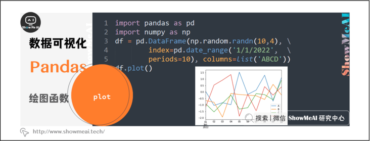
If the index consists of dates, as shown in the above figure, the date will be filled automatically.
In addition to the default line diagram, you can also draw a variety of styles, and you can use dataframe plot. [figure type parameter] method to select different figures.
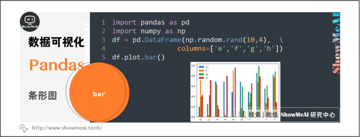
2, Bar chart
import pandas as pd
import numpy as np
df = pd.DataFrame(np.random.rand(10,4),columns=['e','f','g','h'])
df.plot.bar()
The operation results are as follows:
To generate stacked histogram, you can set stacked=True
import pandas as pd
df = pd.DataFrame(np.random.rand(10,4),columns= ['e','f','g','h'])
df.plot.bar(stacked=True)
The operation results are as follows:

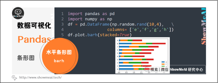
To get a horizontal bar chart, you can use the barh method:
import pandas as pd
import numpy as np
df = pd.DataFrame(np.random.rand(10,4),columns= ['e','f','g','h'])
df.plot.barh(stacked=True)
The operation results are as follows:
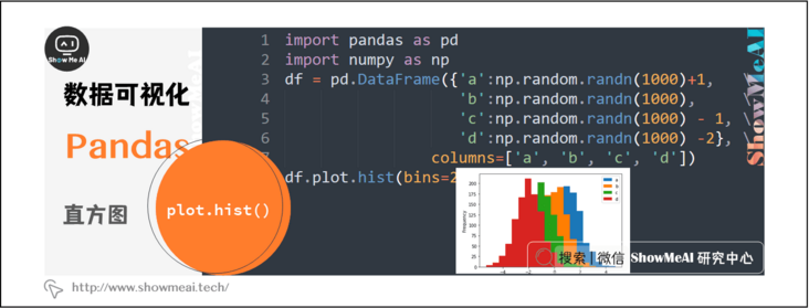
3, Histogram
You can use plot Hist () method draws histogram. We can specify the quantity.
import pandas as pd
import numpy as np
df = pd.DataFrame({'a':np.random.randn(1000)+1,'b':np.random.randn(1000),'c':np.random.randn(1000) - 1, 'd':np.random.randn(1000) -2}, columns=['a', 'b', 'c', 'd'])
df.plot.hist(bins=20)
The operation results are as follows:
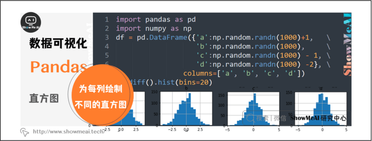
You can draw a different histogram for each column using the following code:
import pandas as pd
import numpy as np
df = pd.DataFrame({'a':np.random.randn(1000)+1,'b':np.random.randn(1000),'c':np.random.randn(1000) - 1, 'd':np.random.randn(1000) -2}, columns=['a', 'b', 'c', 'd'])
df.diff().hist(bins=20)
The operation results are as follows:
4, Box diagram
You can call series box. Plot () and dataframe box. Plot() or dataframe Boxplot() to plot boxplot to visualize the distribution of values in each column.
For example, this is a box plot representing five trials of 10 observations of a random variable on [0,1).
import pandas as pd
import numpy as np
df = pd.DataFrame(np.random.rand(10, 5), columns=['A', 'B', 'C', 'D', 'E'])
df.plot.box()
The operation results are as follows:

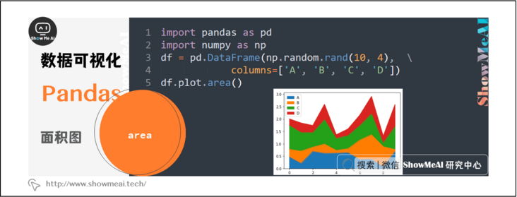
5, Area map
You can use series plot. Area() or dataframe plot. The area () method creates an area map.
import pandas as pd
import numpy as np
df = pd.DataFrame(np.random.rand(10, 4), columns=['A', 'B', 'C', 'D'])
df.plot.area()
The operation results are as follows:
6, Scatter diagram
To create a scatter chart, you can use dataframe plot. Scatter() method.
import pandas as pd
import numpy as np
df = pd.DataFrame(np.random.rand(50, 4), columns=['a', 'b', 'c', 'd'])
df.plot.scatter(x='a', y='b')
The operation results are as follows:

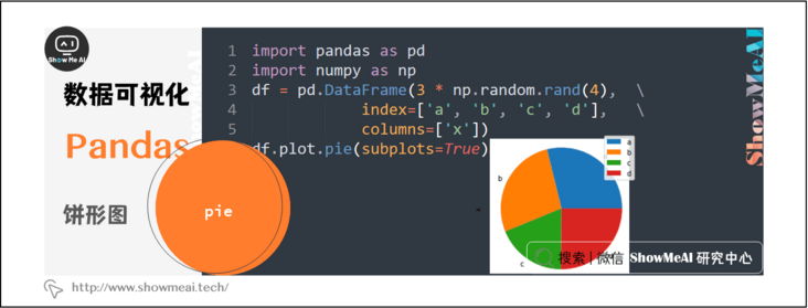
7, Pie chart
To create a pie chart, you can use dataframe plot. Pie() method.
import pandas as pd
import numpy as np
df = pd.DataFrame(3 * np.random.rand(4), index=['a', 'b', 'c', 'd'], columns=['x'])
df.plot.pie(subplots=True)
The operation results are as follows:
Data and code download
The code of this tutorial series can be downloaded from the github corresponding to ShowMeAI, which can be run in the local python environment. Babies who can surf the Internet scientifically can also directly learn through one click operation and interactive operation with the help of Google Lab!
The quick look-up tables involved in this series of tutorials can be downloaded and obtained at the following address:
- Pandas quick reference table
- NumPy quick look-up table
- Matplotlib quick reference table
- Seaborn checklist
Extended references
ShowMeAI related articles recommended
- Introduction to data analysis
- Data analysis thinking
- Mathematical basis of data analysis
- Business cognition and data
- Data cleaning and preprocessing
- Business analysis and data mining
- Data analysis tool map
- Introduction to statistics and data science computing tool library Numpy
- Numpy and 1D array operations
- Numpy and 2D array operation
- Numpy and high dimensional array operation
- Introduction to Pandas data analysis tool library
- Illustrated Pandas core operating functions
- Graphic Pandas data transformation advanced function
- Pandas data grouping and operation
- Principles and methods of data visualization
- Data visualization based on Pandas
- seaborn tool and data visualization
ShowMeAI series tutorial recommendations
- Illustrated Python Programming: a series of tutorials from getting started to mastering
- Graphic data analysis: a series of tutorials from introduction to mastery
- Fundamentals of graphic AI Mathematics: a series of tutorials from introduction to mastery
- Illustrated big data technology: a series of tutorials from introduction to mastery