%matplotlib inline
import numpy as np
import pandas as pd
from scipy import stats, integrate
from warnings import filterwarnings
filterwarnings('ignore')
import matplotlib as mpl
import matplotlib.pyplot as plt
import seaborn as sns

sns.set(color_codes=True)
np.random.seed(sum(map(ord, "distributions")))
Univariate distribution
Grayscale image
The most convenient and fast way~
x = np.random.normal(size=100)
sns.distplot(x, kde=True)
# Kernel density estimation kde is True by default

# Want a more detailed description?
# Adjust bins!
sns.distplot(x, kde=False, bins=30)
# bins=30, thirty columns!

# Want to see it with examples?
sns.distplot(x, kde=False, bins=30, rug=True)
# rug controls whether the observed sliver (marginal blanket) is displayed
# Whether to draw a rugplot on the support axis.
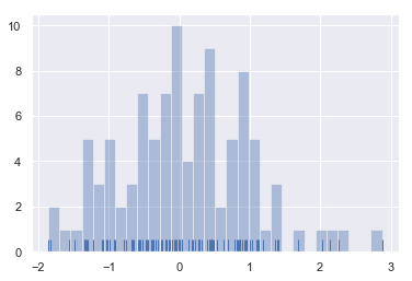
-
What are the advantages of looking at it together with examples?
-
A: guide you to set the appropriate bins.
Note: whether the above kde parameter is enabled or not has a default bandwidth of about 0.3.
Kernel density estimation (KDE)
The shape of the probability density function is estimated by observation. What's the use? Calculation of probability density function by undetermined coefficient method~
Steps of nuclear density estimation:
- A normal distribution curve is used to approximate each observation
- Superimpose the normal distribution curve of all observations
- normalization
How to draw in seaborn?
sns.kdeplot(x)
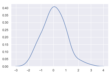
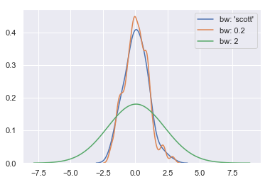
- The concept of bandwidth: the width of the approximate normal distribution curve
- The larger the bandwidth, the smoother the curve
sns.kdeplot(x, label = "bw: 'scott'")
sns.kdeplot(x, bw=.2, label="bw: 0.2")
sns.kdeplot(x, bw=2, label="bw: 2") # Too smooth
plt.legend()
Model parameter fitting
x = np.random.gamma(6, size=200)            # A gamma distribution
sns.distplot(x,
             kde=True,
             fit=stats.gamma
            )  # Our tentative guess is the gamma function
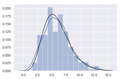
-
The blue line is SNS Results plotted by distplot (x)
-
The black line is SNS Distplot (x, fit = stats. Gamma)
Bivariate distribution
mean, cov = [0, 1], [(1, 0.5), (0.5, 1)]
data = np.random.multivariate_normal(mean, cov, 200)
# np.random.multivariate_normal() multivariate normal distribution, generating data according to the specified mean and covariance
# The mean value is 0 and 1 respectively, the variance is 1, and there is a correlation coefficient of 0.5 between points
df = pd.DataFrame(data, columns=["x", "y"])
df.head()
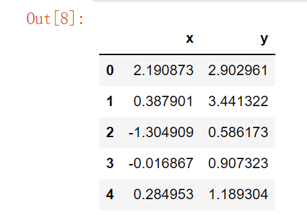
Two correlated normal distributions~
Scatter diagram
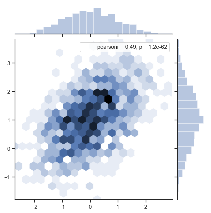
For the two related distributions, there is a strong SNS The jointplot() function can take advantage of:
sns.jointplot(x="x", y="y", data=df).annotate(stats.pearsonr)

Information in the figure: x and y scatter plot / x and y gray scale map / personr correlation coefficient / p value sampling error (the smaller p, the better)
-
About Pearson Correlation Coefficient
-
Related links: Discussion of simulation metrics, zh wikipedia. org
-
pearsonr correlation coefficient calculation:
-
ρ X , Y = c o v ( X , Y ) σ X σ Y \rho_{X,Y} = \frac{cov(X, Y)}{\sigma_X\sigma_Y} ρX,Y=σXσYcov(X,Y)
-
Simple classification of correlation coefficients:
- 0.8-1.0 very strong correlation
- 0.6-0.8 strong correlation
- 0.4-0.6 moderate correlation
- 0.2-0.4 weak correlation
- 0.0-0.2 very weak correlation or no correlation
-
Pearson correlation coefficient game: http://guessthecorrelation.com
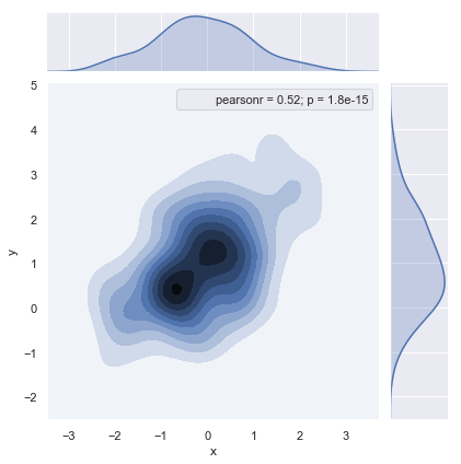
Hexagonal box diagram
x, y = np.random.multivariate_normal(mean, cov, 1000).T
with sns.axes_style("ticks"):
    sns.jointplot(x=x, y=y, kind="hex").annotate(stats.pearsonr)
    # What shape (hex hexagon) can be specified
# np.random.multivariate_normal(mean, cov, 10).T
Kernel density estimation
# Contour type
sns.jointplot(x="x", y="y", data=df, kind="kde").annotate(stats.pearsonr)
f, ax = plt.subplots(figsize=(8, 8)) #  axes
sns.kdeplot(df.x, df.y, ax=ax, shade=False)
# shade=False do not fill, otherwise it will become a contour line
sns.rugplot(df.x, color="b", ax=ax)
sns.rugplot(df.y, vertical=True, ax=ax, color="r")
# sns. Ruglot specializes in drawing rugs; Vertical levelization

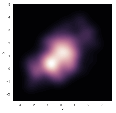
Want to see a more continuous dream effect~
f, ax = plt.subplots(figsize=(6, 6))
# cubehelix color system, brightness proportional to intensity, used for astronomical image rendering. http://www.mrao.cam.ac.uk/~dag/CUBEHELIX/
cmap = sns.cubehelix_palette(as_cmap=True, dark=1, light=0)
# cmap: color map color mapping
sns.kdeplot(df.x, df.y, cmap=cmap, n_levels=60, shade=True)
g = sns.jointplot(x="x", y="y", data=df, kind="kde", color="m")
g.plot_joint(plt.scatter, c="w", s=30, linewidth=1, marker="+")
g.ax_joint.collections[0].set_alpha(0) # Sets the transparency of the middle picture background
g.set_axis_labels("$X$", "$Y$") # Latex

Note: for kde graphs, one-dimensional ones mainly guess the distribution. If you can see that there are several centers in two-dimensional ones, you can do clustering related work.
Pairwise relationships in datasets
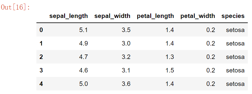
iris =  pd.read_csv("iris.csv") # Iris database
iris.head()
sns.pairplot(iris) # Default diagonal hist, non diagonal scatter

Relationship between attributes + grayscale image of attributes
g = sns.PairGrid(iris)
g.map_diag(sns.kdeplot) # Diagonal single attribute graph
g.map_offdiag(sns.kdeplot, cmap="Blues_d", n_levels=20) # Non diagonal two attribute diagram

Summary
- distplot(bins, rug)
- kdeplot(bw, fit)
- joinplot(kind)
- pairplot
Source code acquisition: focus on WeChat official account "AI reading knowledge map", reply to "Python data visualization" to get all the updated content.