preface
The text and pictures of this article are from the Internet, only for learning and communication, not for any commercial purpose. The copyright belongs to the original author. If you have any questions, please contact us in time for handling.
Python has a lot of map visualization libraries. Although Matplotlib library is very powerful in drawing, it can only make static maps. Today I'm going to talk about the interactive map library, which is pyecharts and folium. Mastering these two libraries can basically solve your map visualization needs.
No matter you are zero foundation or have foundation, you can get the corresponding study gift pack! It includes Python software tools and 2020's latest introduction to actual combat. Add 695185429 for free.
First of all, we must talk about the powerful pyecharts library, which is easy to use and cool, and can make almost any chart. Pyecharts has two versions, v0.5 and v1, which are not compatible. The latest version of v1 supports chain call and uses options configuration chart. Pyecharts includes map, Geo and Bmap in map making. Map class supports world, national, provincial, and district / county level maps, which need to be installed independently before use. so, pip them!
pip install pyecharts
pip install echarts-countries-pypkg
pip install echarts-china-provinces-pypkg
pip install echarts-china-cities-pypkg
pip install echarts-china-counties-pypkg
After pip, check the pyecharts version.
import pyecharts
print(pyecharts.__version__)
No doubt, it must be the latest version. The version number is 1.6.2.
Before making a map, first of all, I need to have data. I have derived the total GDP data of all provinces in China from the Wind database, named as GDP.xlsx , as shown in the following figure.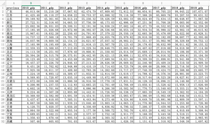
With the data, we can use python to start the operation. First, import the required library.
import pandas as pd  #pandas Is a powerful data processing library
from pyecharts.charts import Map
from pyecharts import options as opts
Read with pandas GDP.xlsx , take the GDP data of each province in 2019 as an example, let's make a map. Note the following zip() function, which takes the iteratable object as a parameter, packages the corresponding elements in the object into tuples, and then returns the object composed of these tuples.
data = pd.read_excel('GDP.xlsx')
province = list(data["province"])
gdp = list(data["2019_gdp"])
list = [list(z) for z in zip(province,gdp)]
Let's print the list as follows: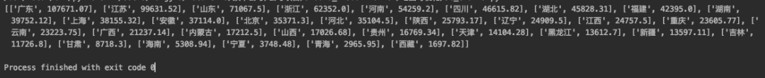 In fact, it is the data structure of nested list in the list. Only this structure can add data to the Map. We use the common methods add and set in the Map class_ global_ Opts and render to configure the Map.
c = (
    Map(init_opts=opts.InitOpts(width="1000px", height="600px"))  #Initialize map size
    .set_global_opts(
        title_opts=opts.TitleOpts(title="2019 Provinces in GDP Distribution unit:100 million yuan"),  #Configuration title
        visualmap_opts=opts.VisualMapOpts(
            type_ = "scatter"   #Scatter type
        )
    )
    .add("GDP",list,maptype="china")  #take list Imported, map type is China Map
    .render("Map1.html")
)
Run the above code and open the generated Map1.html with a browser. The effect is as follows: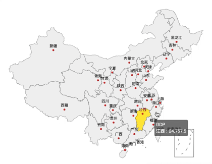
Some friends may ask, there is a map, but you can't distinguish the GDP of different provinces with this map. Don't panic, we will continue to optimize the above codes, and configure different colors for different provinces according to the size of GDP, so that you can see it at a glance.
c = (
    Map(init_opts=opts.InitOpts(width="1000px", height="600px")) #Switchable theme
    .set_global_opts(
        title_opts=opts.TitleOpts(title="2019 Provinces in GDP Distribution unit:100 million yuan"),
        visualmap_opts=opts.VisualMapOpts(
            min_=1000,
            max_=110000,
            range_text = ['GDP Total (100 million) color range:', ''],  #Interzone
            is_piecewise=True,  #Define legend as segmented type, default to continuous legend
            pos_top= "middle",  #Segment location
            pos_left="left",
            orient="vertical",
            split_number=10  #Divided into 10 sections
        )
    )
    .add("GDP",list,maptype="china")
    .render("Map2.html")
)
Run the above code and open the generated Map2.html with a browser. The effect is as follows: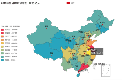
How about the effect? The redder the color, the higher the GDP. What color segment is your province's GDP in 2019? Of course, for some aesthetic friends may not be able to meet your requirements.
In this case, I will optimize the code and add a theme to the map. Adding a theme is simple. Just import themetype and add the theme to the Mpa() method. I use ThemeType.DARK For example, see the effect.
from pyecharts.globals import ThemeType #Introduce a theme
Map(init_opts=opts.InitOpts(width="1000px", height="600px",theme = ThemeType.DARK)) #Add theme ThemeType.DARK
Run it to see the effect: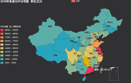
If you are not satisfied with the feeling of B grid rising by n level s, ok, pyecharts has built in more than 10 themes for you to switch. Radish and green vegetables have their own preferences~
Geo is similar to Map. You can select a Map type by setting the maptype parameter. The supported methods are similar to Map. I won't go into details here and paste the code directly.
#Geo Map-Ripple chart
import pandas as pd
from pyecharts import options as opts
from pyecharts.charts import Geo
from pyecharts.globals import ChartType

data = pd.read_excel('GDP.xlsx')
province = list(data["province"])
gdp = list(data["2019_gdp"])
list = [list(z) for z in zip(province,gdp)]
print(list)
c = (
    Geo()
    .add_schema(maptype="china")
    .add(
        "geo",
        list,  #incoming data
        symbol_size=10, large_threshold=110000,  #Set ripple size
        type_=ChartType.EFFECT_SCATTER,   #The map type is ripple
    )
    .set_series_opts(label_opts=opts.LabelOpts(is_show=False))
    .set_global_opts(visualmap_opts=opts.VisualMapOpts(max_=110000),title_opts=opts.TitleOpts(title="2019 Provinces in GDP Ripple chart"))
    .render("Geomap1.html")
)
Run it, the effect is as follows: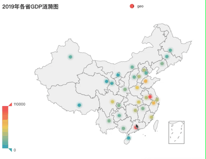
Bmap is an interface of Baidu Map. If you understand Map and Geo, Bmap can be done in minutes. However, it should be noted that you need to register with Baidu Map open platform first to get AK.
Register to get AK, you can make maps happily. Take heat map as an example, the code is as follows.
#Bmap-Scatter, thermodynamic and ripple diagrams
import pandas as pd
from pyecharts.charts import BMap
from pyecharts import options as opts
from pyecharts.globals import ChartType

data = pd.read_excel('GDP.xlsx')
province = list(data["province"])
gdp = list(data["2019_gdp"])
list = [list(z) for z in zip(province,gdp)]
print(list)
c = (
    BMap(init_opts=opts.InitOpts(width="1000px", height="600px"))
    .add_schema(baidu_ak="Your AK", center=[120.13066322374, 30.240018034923])
    .add(
        "GDP",
        list,
        type_="heatmap",  #scatter Is a scatter diagram, heatmap Is a heat map, ChartType.EFFECT_SCATTER Is a ripple chart
        label_opts=opts.LabelOpts(formatter="{b}")
    )
    .set_global_opts(
        title_opts=opts.TitleOpts(title="2019 Provinces in GDP Thermograph"), visualmap_opts=opts.VisualMapOpts(max_=110000)
    )
    .render("Bmap1.html")
)
After running, keep it like this:
You think the above maps can satisfy my brother J's pursuit of data visualization and aesthetic feeling. Then you look down on brother J too much. After research, I found that folium library is the existence of hanging and exploding sky.
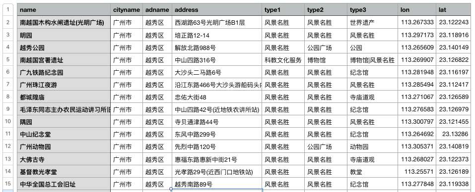
First of all, I used python to access the API interface of Gaode map, and obtained the geographic data of nearly 6000 scenic spots in Guangzhou, which was saved as poi_scenic_spot.csv . Some data are as follows:
Then install the folium library, set the base map of the stimulation battlefield, of course, you can also play with other base maps. The code provides mapbox base map, Gaud base map, etc. you can switch at will.
#folium-Thermograph import pandas as pd import folium from folium import plugins data = pd.read_csv('./poi_scenic_spot.csv',encoding='utf-8') # heatmap1 = folium.Map(location=[23.122373,113.268027], zoom_start=10,control_scale = True) # Draw map, determine focus, default base map (load slowly) heatmap1 = folium.Map(location=[23.122373,113.268027], zoom_start=10,control_scale = True,tiles='stamen Terrain') #Stimulate the battlefield map # heatmap1 = folium.Map(location=[23.122373,113.268027], zoom_start=10,control_scale = True,tiles='Mapbox Bright') #mapbox Base map # heatmap1 = folium.Map(location=[23.122373,113.268027], zoom_start=10,control_scale = True,tiles='stamentoner') #Black and white background # heatmap1 = folium.Map( #Gaud map # location=[23.122373,113.268027], # zoom_start=15, # control_scale = True, # tiles='http://webrd02.is.autonavi.com/appmaptile?lang=zh_cn&size=1&scale=1&style=8&x={x}&y={y}&z={z}', # attr='© <a href="http://ditu.amap.com/ "> Gaud map < / a > ' # ) folium.Marker([23.122373,113.268027],popup='<i>J Brother</i>',icon=folium.Icon(icon='cloud',color='green')).add_to(heatmap1) #Create a center mark heatmap1.add_child(plugins.HeatMap([[row["lat"],row["lon"]] for name, row in data.iterrows()])) #Incoming longitude and latitude heatmap1.save("folium_map1.html") #Generative network
page
Can't wait to run, the effect is as follows: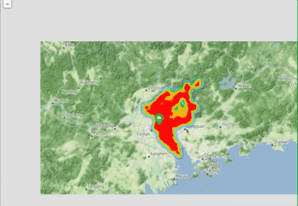
Ha ha ha ha, what a big braised chicken.
It's not useful to see the heat map. It's hard for me to find out the distribution of scenic spots in Guangzhou. Let's try a different picture.
#folium-Aggregate scatter map
import pandas as pd
import folium
from folium import plugins

data = pd.read_csv('./poi_scenic_spot.csv',encoding='utf-8')

plotmap1 = folium.Map(location=[23.122373,113.268027], zoom_start=10,control_scale = True,tiles='stamentoner')

folium.Marker([23.122373,113.268027],popup='<p style="color: green">I am J Brother</p>',icon=folium.Icon(icon='cloud',color='green')).add_to(plotmap1)  #Create a center mark
plotmap1.add_child(plugins.MarkerCluster([[row["lat"],row["lon"]] for name, row in data.iterrows()]))
plotmap1.save('folium_map2.html')
See the effect!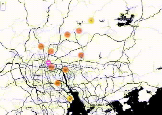
Do you mean cool, cool or not?
Of course, there are many more python Map Libraries, which are worth further exploration. I will write the content of map visualization in the future. Please continue to pay attention to it. It's wonderful!