Video Explanation:
8, Card container
Bootstrap's card provides a flexible content container with a variety of variants and options.
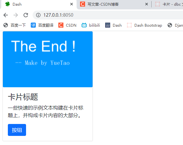
8.1 basic card example
The following is an example of a basic Card with mixed content and fixed width set using the style parameter. By default, the Card has no fixed width, so it naturally fills the entire width of its parent element. This can be easily customized using various size options of Bootstraps, as shown below.
# 1. Import Dash
import dash
import dash_bootstrap_components as dbc
from dash import html
from dash.dependencies import Output, Input, State


# 2. Create a dash instance object
app = dash.Dash(external_stylesheets=[dbc.themes.BOOTSTRAP])

# 3. Add DBC component
card = dbc.Card(
    [
        dbc.CardImg(src="/assets/images/02.png", top=True), # Card image
        dbc.CardBody(   # Card body
            [
                html.H4("Card title", className="card-title"),
                html.P(
                    "Some quick sample text is built on the card title,"
                    "And make up most of the card content.",
                    className="card-text",
                ),
                dbc.Button("Button", color="primary"),
            ]
        ),
    ],
    style={"width": "18rem"},   # Card width
)

# 4. Merge code snippets into the layout
# fluid=True follows the size of the outer container and the width of the outer container
app.layout = dbc.Container(card, fluid=True)

# Callback function


# 5. Start Dash server
if __name__ == "__main__":
    app.run_server()
8.2 content type
Cards support a wide variety of content. Here are some building blocks you can use when creating your own cards.
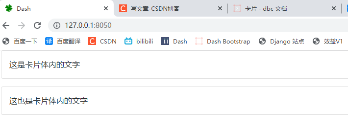
8.2.1 card body
When using CardBody, you need some internal components Card. If all contents are on the Card body, you can set body=True instead.
# 1. Import Dash
import dash
import dash_bootstrap_components as dbc
from dash import html
from dash.dependencies import Output, Input, State


# 2. Create a dash instance object
app = dash.Dash(external_stylesheets=[dbc.themes.BOOTSTRAP])

# 3. Add DBC component
cards = html.Div(
    [
        dbc.Card(
            dbc.CardBody("This is the text in the card"),
            className="mb-3",
        ),
        dbc.Card("This is also the text in the card", body=True),
    ]
)

# 4. Merge code snippets into the layout
# fluid=True follows the size of the outer container and the width of the outer container
app.layout = dbc.Container(cards, fluid=True)

# Callback function


# 5. Start Dash server
if __name__ == "__main__":
    app.run_server()
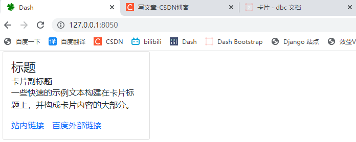
8.2.2 title, text and links
Use card title, card subtitle and card text to add margins and spacing optimized for the card, title, subtitle and body, respectively.
By attaching callbacks to props, the CardLink component can be used as a dash_core_components.Link general hyperlink or button n_clicks. If you assign a relative path to, CardLink will behave like dcc.Link by default, href if you assign an absolute path to, it will behave like hyperlink href. This can be done using external_link parameter override. This is useful, for example, when accessing routes on the underlying Flask server.
# 1. Import Dash
import dash
import dash_bootstrap_components as dbc
from dash import html
from dash.dependencies import Output, Input, State


# 2. Create a dash instance object
app = dash.Dash(external_stylesheets=[dbc.themes.BOOTSTRAP])

# 3. Add DBC component
card = dbc.Card(
    dbc.CardBody(
        [
            html.H4("title", className="card-title"),
            html.H6("Card subtitle", className="card-subtitle"),
            html.P(
                "Some quick sample text is built on the card title,"
                "And make up most of the card content.",
                className="card-text",
            ),
            dbc.CardLink("Site link", href="#"),
            dbc.CardLink("Baidu external link", href="https://www.baidu.com"),
        ]
    ),
    style={"width": "18rem"},
)

# 4. Merge code snippets into the layout
# fluid=True follows the size of the outer container and the width of the outer container
app.layout = dbc.Container(card, fluid=True)

# Callback function


# 5. Start Dash server
if __name__ == "__main__":
    app.run_server()
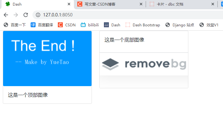
8.2.3 pictures
CardImg is used when adding an image to a card. When the image is at the top of the card, you can use the top parameter to remove the border radius from the bottom corner. Similarly, the bottom parameter can be used when the image is at the bottom of the card.
# 1. Import Dash
import dash
import dash_bootstrap_components as dbc
from dash import html
from dash.dependencies import Output, Input, State


# 2. Create a dash instance object
app = dash.Dash(external_stylesheets=[dbc.themes.BOOTSTRAP])

# 3. Add DBC component
top_card = dbc.Card(
    [
        dbc.CardImg(src="/assets/images/02.png", top=True),     # top=True
        dbc.CardBody(
            html.P("This is a top image", className="card-text")
        ),
    ],
    style={"width": "18rem"},
)

bottom_card = dbc.Card(
    [
        dbc.CardBody(html.P("This is a bottom image", className="card-text")),
        dbc.CardImg(src="/assets/images/03.png", bottom=True),      # bottom=True
    ],
    style={"width": "18rem"},
)

cards = dbc.Row(
    [
        dbc.Col(top_card, width="auto"),
        dbc.Col(bottom_card, width="auto"),
    ]
)

# 4. Merge code snippets into the layout
# fluid=True follows the size of the outer container and the width of the outer container
app.layout = dbc.Container(cards, fluid=True)

# Callback function


# 5. Start Dash server
if __name__ == "__main__":
    app.run_server()
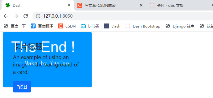
8.2.4 image overlay
Used for CardImgOverlay to display the card content at the top of the card image. Depending on the image, you may or may not need other styles or utilities.
# 1. Import Dash
import dash
import dash_bootstrap_components as dbc
from dash import html
from dash.dependencies import Output, Input, State


# 2. Create a dash instance object
app = dash.Dash(external_stylesheets=[dbc.themes.BOOTSTRAP])

# 3. Add DBC component
card = dbc.Card(
    [
        dbc.CardImg(src="/assets/images/02.png", top=True),
        dbc.CardImgOverlay(     # The image above is superimposed on the card body below
            dbc.CardBody(
                [
                    html.H4("Card title", className="card-title"),
                    html.P(
                        "An example of using an image in the background of "
                        "a card.",
                        className="card-text",
                    ),
                    dbc.Button("Button", color="primary"),
                ],
            ),
        ),
    ],
    style={"width": "18rem"},
)

# 4. Merge code snippets into the layout
# fluid=True follows the size of the outer container and the width of the outer container
app.layout = dbc.Container(card, fluid=True)

# Callback function


# 5. Start Dash server
if __name__ == "__main__":
    app.run_server()
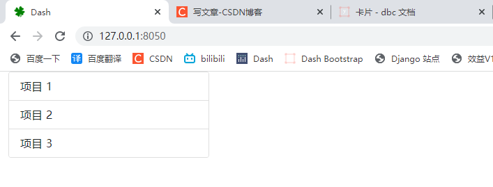
8.2.5 list group
ListGroup creates a content list in cards with components by setting flush=True.
# 1. Import Dash
import dash
import dash_bootstrap_components as dbc
from dash import html
from dash.dependencies import Output, Input, State


# 2. Create a dash instance object
app = dash.Dash(external_stylesheets=[dbc.themes.BOOTSTRAP])

# 3. Add DBC component
card = dbc.Card(
    dbc.ListGroup(  # List group
        [
            dbc.ListGroupItem("Item 1"),
            dbc.ListGroupItem("Item 2"),
            dbc.ListGroupItem("Item 3"),
        ],
        flush=True,     # alignment
    ),
    style={"width": "18rem"},
)

# 4. Merge code snippets into the layout
# fluid=True follows the size of the outer container and the width of the outer container
app.layout = dbc.Container(card, fluid=True)

# Callback function


# 5. Start Dash server
if __name__ == "__main__":
    app.run_server()
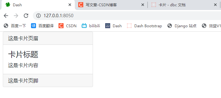
8.2.6 header and footer
Use the CardHeader and CardFooter components to add an optional header or footer to the card.
# 1. Import Dash
import dash
import dash_bootstrap_components as dbc
from dash import html
from dash.dependencies import Output, Input, State


# 2. Create a dash instance object
app = dash.Dash(external_stylesheets=[dbc.themes.BOOTSTRAP])

# 3. Add DBC component
card = dbc.Card(
    [
        dbc.CardHeader("This is the card header"),
        dbc.CardBody(
            [
                html.H4("Card title", className="card-title"),
                html.P("This is the card content", className="card-text"),
            ]
        ),
        dbc.CardFooter("This is the card footer"),
    ],
    style={"width": "18rem"},
)

# 4. Merge code snippets into the layout
# fluid=True follows the size of the outer container and the width of the outer container
app.layout = dbc.Container(card, fluid=True)

# Callback function


# 5. Start Dash server
if __name__ == "__main__":
    app.run_server()
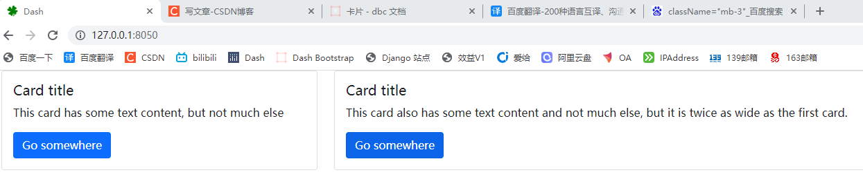
8.2.7 adjusting width using grid components
Wrap the cards in the Row and Col assemblies to control their width and layout. In this example, we use the width parameter ofCol to make the first card occupy one-third of the available width and the second card occupy two-thirds.
# 1. Import Dash
import dash
import dash_bootstrap_components as dbc
from dash import html
from dash.dependencies import Output, Input, State


# 2. Create a dash instance object
app = dash.Dash(external_stylesheets=[dbc.themes.BOOTSTRAP])

# 3. Add DBC component
first_card = dbc.Card(
    dbc.CardBody(
        [
            html.H5("Card title", className="card-title"),
            html.P("This card has some text content, but not much else"),
            dbc.Button("Go somewhere", color="primary"),
        ]
    )
)


second_card = dbc.Card(
    dbc.CardBody(
        [
            html.H5("Card title", className="card-title"),
            html.P(
                "This card also has some text content and not much else, but "
                "it is twice as wide as the first card."
            ),
            dbc.Button("Go somewhere", color="primary"),
        ]
    )
)


cards = dbc.Row(        # Place the card in the row container
    [
        dbc.Col(first_card, width=4),   # 12 column grid system 4 / 12
        dbc.Col(second_card, width=8),  # 12 column grid system 8 / 12
    ]
)

# 4. Merge code snippets into the layout
# fluid=True follows the size of the outer container and the width of the outer container
app.layout = dbc.Container(cards, fluid=True)

# Callback function


# 5. Start Dash server
if __name__ == "__main__":
    app.run_server()
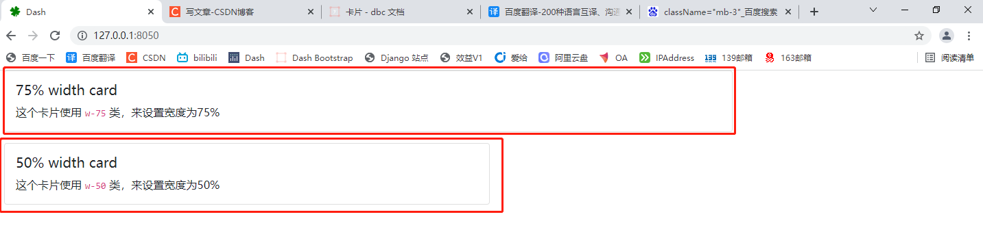
8.2.8 adjusting the width using the Bootstrap utility class
Bootstrap comes with several built-in CSS utility classes, including some for resizing. For example, this class w-50 sets the width:50%. We can apply these classes to quickly set the required width of the card.
# 1. Import Dash
import dash
import dash_bootstrap_components as dbc
from dash import html
from dash.dependencies import Output, Input, State


# 2. Create a dash instance object
app = dash.Dash(external_stylesheets=[dbc.themes.BOOTSTRAP])

# 3. Add DBC component
cards = html.Div(
    [
        dbc.Card(
            dbc.CardBody(
                [
                    html.H5("75% width card", className="card-title"),
                    html.P(
                        [
                            "This card uses ",
                            html.Code("w-75"),
                            " Class to set the width to 75%",
                        ],
                        className="card-text",
                    ),
                ]
            ),
            className="w-75 mb-3",      # # Set 75% width
        ),
        dbc.Card(
            dbc.CardBody(
                [
                    html.H5("50% width card", className="card-title"),
                    html.P(
                        [
                            "This card uses ",
                            html.Code("w-50"),
                            " Class to set the width to 50%",
                        ],
                        className="card-text",
                    ),
                ]
            ),
            className="w-50",   # Set 50% width
        ),
    ]
)

# 4. Merge code snippets into the layout
# fluid=True follows the size of the outer container and the width of the outer container
app.layout = dbc.Container(cards, fluid=True)

# Callback function


# 5. Start Dash server
if __name__ == "__main__":
    app.run_server()
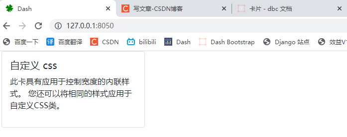
8.2.9 adjusting width using custom CSS
Finally, you can use custom CSS to control the size of the card. In this example, we use the style parameter ofCard to set the inline style parameters. You can also write your own CSS classes, such as width, max width, and so on, and apply them to the card.
# 1. Import Dash
import dash
import dash_bootstrap_components as dbc
from dash import html
from dash.dependencies import Output, Input, State


# 2. Create a dash instance object
app = dash.Dash(external_stylesheets=[dbc.themes.BOOTSTRAP])

# 3. Add DBC component
cards = dbc.Card(
    dbc.CardBody(
        [
            html.H5("custom css", className="card-title"),
            html.P(
                "This card has inline styles applied to control width. "
                "You can also apply the same style to custom CSS Class."
            ),
        ]
    ),
    style={"width": "18rem"},   # Custom css width
)

# 4. Merge code snippets into the layout
# fluid=True follows the size of the outer container and the width of the outer container
app.layout = dbc.Container(cards, fluid=True)

# Callback function


# 5. Start Dash server
if __name__ == "__main__":
    app.run_server()
8.3 card style
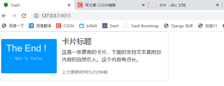
8.3.1 horizontal card
Using a combination of grid and utility classes, cards can be made horizontal in a mobile friendly and responsive manner. In the following example, we. g-0 removed the grid binding lines using the. Col md - * class and leveled the card at the md breakpoint using the class. It may need to be further adjusted according to your card content.
# 1. Import Dash
import dash
import dash_bootstrap_components as dbc
from dash import html
from dash.dependencies import Output, Input, State


# 2. Create a dash instance object
app = dash.Dash(external_stylesheets=[dbc.themes.BOOTSTRAP])

# 3. Add DBC component
card = dbc.Card(
    [
        dbc.Row(        # Row container
            [
                dbc.Col(        # Column container
                    dbc.CardImg(
                        src="/assets/images/02.png",
                        className="img-fluid rounded-start",
                    ),
                    className="col-md-4",   # 4/12
                ),
                dbc.Col(        # Column container
                    dbc.CardBody(   # Card body
                        [
                            html.H4("Card title", className="card-title"),
                            html.P(
                                "This is a wider card,"
                                "The supporting text below is a natural introduction of additional content."
                                "This content is a little long.",
                                className="card-text",
                            ),
                            html.Small(     # Small text label
                                "Last updated 3 minutes ago",
                                className="card-text text-muted",
                            ),
                        ]
                    ),
                    className="col-md-8",   # 8/12
                ),
            ],
            className="g-0 d-flex align-items-center",
        )
    ],
    className="mb-3",
    style={"maxWidth": "540px"},
)

# 4. Merge code snippets into the layout
# fluid=True follows the size of the outer container and the width of the outer container
app.layout = dbc.Container(card, fluid=True)

# Callback function


# 5. Start Dash server
if __name__ == "__main__":
    app.run_server()
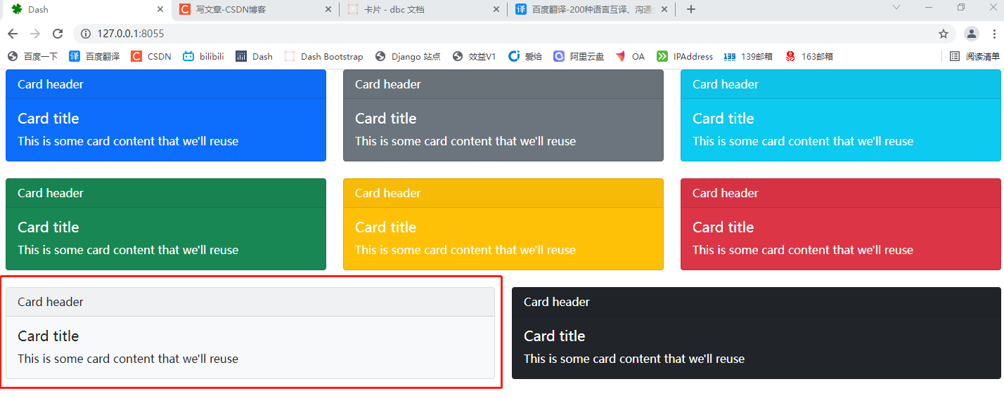
8.3.2 background and color
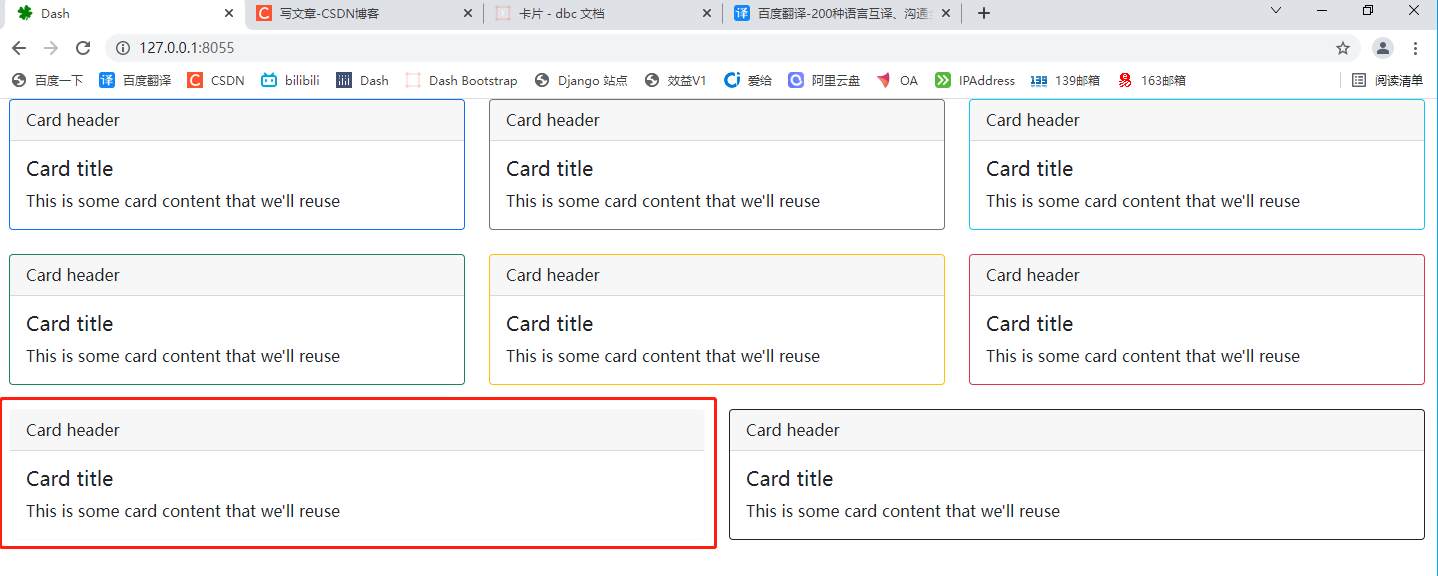
Use the color parameter to set the background and border colors of the Card to one of the context colors of the Bootstrap.
When dark is set, reverse the text color with reverse = true for better contrast.
# 1. Import Dash
import dash
import dash_bootstrap_components as dbc
from dash import html
from dash.dependencies import Output, Input, State


# 2. Create a dash instance object
app = dash.Dash(external_stylesheets=[dbc.themes.BOOTSTRAP])

# 3. Add DBC component
card_content = [
    dbc.CardHeader("Card header"),  # Card head
    dbc.CardBody(       # Card body
        [
            html.H5("Card title", className="card-title"),
            html.P(
                "This is some card content that we'll reuse",
                className="card-text",
            ),
        ]
    ),
]

cards = html.Div(
    [
        dbc.Row(    #Row container
            [
                # Put the card in the column container, invert = true, invert the display text color (black by default, white after inverting)
                dbc.Col(dbc.Card(card_content, color="primary", inverse=True)),
                dbc.Col(
                    dbc.Card(card_content, color="secondary", inverse=True)
                ),
                dbc.Col(dbc.Card(card_content, color="info", inverse=True)),
            ],
            className="mb-4",
        ),
        dbc.Row(
            [
                dbc.Col(dbc.Card(card_content, color="success", inverse=True)),
                dbc.Col(dbc.Card(card_content, color="warning", inverse=True)),
                dbc.Col(dbc.Card(card_content, color="danger", inverse=True)),
            ],
            className="mb-4",
        ),
        dbc.Row(
            [
                dbc.Col(dbc.Card(card_content, color="light")), # Light background does not invert
                dbc.Col(dbc.Card(card_content, color="dark", inverse=True)),
            ]
        ),
    ]
)

# 4. Merge code snippets into the layout
# fluid=True follows the size of the outer container and the width of the outer container
app.layout = dbc.Container(cards, fluid=True)

# Callback function


# 5. Start Dash server
if __name__ == "__main__":
    app.run_server(port=8055)
8.3.3 outline style
Use the parameter outline=True to remove block colors from the background and title.
# 1. Import Dash
import dash
import dash_bootstrap_components as dbc
from dash import html
from dash.dependencies import Output, Input, State


# 2. Create a dash instance object
app = dash.Dash(external_stylesheets=[dbc.themes.BOOTSTRAP])

# 3. Add DBC component
card_content = [
    dbc.CardHeader("Card header"),
    dbc.CardBody(
        [
            html.H5("Card title", className="card-title"),
            html.P(
                "This is some card content that we'll reuse",
                className="card-text",
            ),
        ]
    ),
]

row_1 = dbc.Row(        # Put the column container list in the row container
    [
        # Put the card container in the column container, and outline=True sets the simple outline sample color
        dbc.Col(dbc.Card(card_content, color="primary", outline=True)),
        dbc.Col(dbc.Card(card_content, color="secondary", outline=True)),
        dbc.Col(dbc.Card(card_content, color="info", outline=True)),
    ],
    className="mb-4",
)

row_2 = dbc.Row(
    [
        dbc.Col(dbc.Card(card_content, color="success", outline=True)),
        dbc.Col(dbc.Card(card_content, color="warning", outline=True)),
        dbc.Col(dbc.Card(card_content, color="danger", outline=True)),
    ],
    className="mb-4",
)

row_3 = dbc.Row(    # If className="mb-4" is not set, the page width will be split automatically
    [
        dbc.Col(dbc.Card(card_content, color="light", outline=True)),
        dbc.Col(dbc.Card(card_content, color="dark", outline=True)),
    ]
)

cards = html.Div([row_1, row_2, row_3])

# 4. Merge code snippets into the layout
# fluid=True follows the size of the outer container and the width of the outer container
app.layout = dbc.Container(cards, fluid=True)

# Callback function


# 5. Start Dash server
if __name__ == "__main__":
    app.run_server(port=8055)
8.4 card layout
In addition to styling card content, Bootstrap also includes options for arranging a series of cards.
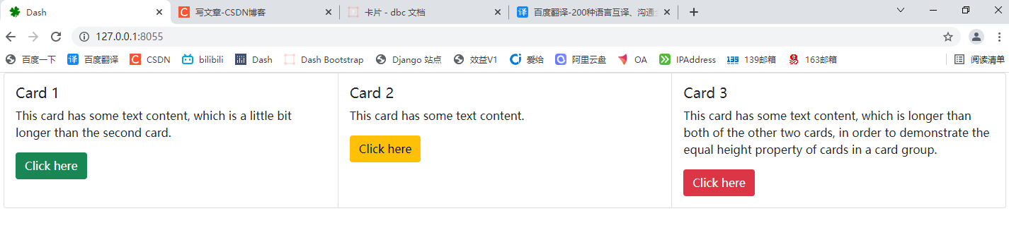
8.4.1 card set
Use this CardGroup component to render the card as a single additional element with columns of equal width and height.
# 1. Import Dash
import dash
import dash_bootstrap_components as dbc
from dash import html
from dash.dependencies import Output, Input, State


# 2. Create a dash instance object
app = dash.Dash(external_stylesheets=[dbc.themes.BOOTSTRAP])

# 3. Add DBC component
cards = dbc.CardGroup(  # Card deck container
    [
        dbc.Card(       # Card 1
            dbc.CardBody(   # Card body
                [
                    html.H5("Card 1", className="card-title"),
                    html.P(
                        "This card has some text content, which is a little "
                        "bit longer than the second card.",
                        className="card-text",
                    ),
                    dbc.Button(
                        "Click here", color="success", className="mt-auto"
                    ),
                ]
            )
        ),
        dbc.Card(   # Card 2
            dbc.CardBody(
                [
                    html.H5("Card 2", className="card-title"),
                    html.P(
                        "This card has some text content.",
                        className="card-text",
                    ),
                    dbc.Button(
                        "Click here", color="warning", className="mt-auto"
                    ),
                ]
            )
        ),
        dbc.Card(   # # Card 3
            dbc.CardBody(
                [
                    html.H5("Card 3", className="card-title"),
                    html.P(
                        "This card has some text content, which is longer "
                        "than both of the other two cards, in order to "
                        "demonstrate the equal height property of cards in a "
                        "card group.",
                        className="card-text",
                    ),
                    dbc.Button(
                        "Click here", color="danger", className="mt-auto"
                    ),
                ]
            )
        ),
    ]
)

# 4. Merge code snippets into the layout
# fluid=True follows the size of the outer container and the width of the outer container
app.layout = dbc.Container(cards, fluid=True)

# Callback function


# 5. Start Dash server
if __name__ == "__main__":
    app.run_server(port=8055)
8.5 keyword parameters of cardgroup
-
children (a list or a single dash component, string or number; optional): a child component of this component.
-
ID (string; optional): the ID of the component, which is used to identify the dash component in the callback. The ID needs to be unique among all components in the application.
-
className (string, optional): class is not recommended_ Name instead. It is often used with CSS to style elements with common properties.
-
class_ Name (string; optional): usually used with CSS to style elements with common attributes.
-
key (string; optional): the unique identifier of the component, which is used to improve the performance of React.js when rendering the component. See https://reactjs.org/docs/lists-and-keys.html Learn more.
-
loading_ State (dict; optional): an object that holds the load state object from dash renderer.
-
loading_state is a dictionary with keys:
-
component_name (string; optional): saves the name of the component being loaded.
-
is_loading (boolean; optional): determines whether the component is loading.
-
prop_name (string; optional): saves the attribute being loaded.
-
-
-
Style (dict; optional): defines the CSS style that will override the previously set style.
-
Tag (string; optional): HTML tag used for card set. Default value: div.
8.6 keyword parameters of card
-
children (a list or a single dash component, string or number; optional): a child component of this component.
-
ID (string; optional): the ID of the component, which is used to identify the dash component in the callback. The ID needs to be unique among all components in the application.
-
Body (Boolean; optional): apply the card body class to the card, so there is no need to include the CardBody component in the child element of the card. Default: false.
-
className (string, optional): class is not recommended_ Name instead. It is often used with CSS to style elements with common properties.
-
class_ Name (string; optional): usually used with CSS to style elements with common attributes.
-
Color (string; optional): card color, options: primary, secondary, success, information, warning, danger, light, dark, or any valid CSS color you choose (for example, hexadecimal code, decimal code, or CSS color name). The default is light.
-
inverse (Boolean; optional): inverts the text color for a darker background.
-
key (string; optional): the unique identifier of the component, which is used to improve the performance of React.js when rendering the component. See https://reactjs.org/docs/lists-and-keys.html Learn more.
-
loading_ State (dict; optional): an object that holds the load state object from dash renderer.
-
loading_state is a dictionary with keys:
-
component_name (string; optional): saves the name of the component being loaded.
-
is_loading (boolean; optional): determines whether the component is loading.
-
prop_name (string; optional): saves the attribute being loaded.
-
-
-
outline (Boolean; optional): applies the color style only to the border of the card.
-
Style (dict; optional): defines the CSS style that will override the previously set style.
8.7 keyword parameters of cardheader
-
children (a list or a single dash component, string or number; optional): a child component of this component.
-
ID (string; optional): the ID of the component, which is used to identify the dash component in the callback. The ID needs to be unique among all components in the application.
-
className (string, optional): class is not recommended_ Name instead. It is often used with CSS to style elements with common properties.
-
class_ Name (string; optional): usually used with CSS to style elements with common attributes.
-
key (string; optional): the unique identifier of the component, which is used to improve the performance of React.js when rendering the component. See https://reactjs.org/docs/lists-and-keys.html Learn more.
-
loading_ State (dict; optional): an object that holds the load state object from dash renderer.
-
loading_state is a dictionary with keys:
-
component_name (string; optional): saves the name of the component being loaded.
-
is_loading (boolean; optional): determines whether the component is loading.
-
prop_name (string; optional): saves the attribute being loaded.
-
-
-
Style (dict; optional): defines the CSS style that will override the previously set style.
-
Tag (string; optional): HTML tag used for card title. Default value: div.
8.8 keyword parameters of cardbody
-
children (a list or a single dash component, string or number; optional): a child component of this component.
-
ID (string; optional): the ID of the component, which is used to identify the dash component in the callback. The ID needs to be unique among all components in the application.
-
className (string, optional): class is not recommended_ Name instead. It is often used with CSS to style elements with common properties.
-
class_ Name (string; optional): usually used with CSS to style elements with common attributes.
-
key (string; optional): the unique identifier of the component, which is used to improve the performance of React.js when rendering the component. See https://reactjs.org/docs/lists-and-keys.html Learn more.
-
loading_ State (dict; optional): an object that holds the load state object from dash renderer.
-
loading_state is a dictionary with keys:
-
component_name (string; optional): saves the name of the component being loaded.
-
is_loading (boolean; optional): determines whether the component is loading.
-
prop_name (string; optional): saves the attribute being loaded.
-
-
-
Style (dict; optional): defines the CSS style that will override the previously set style.
-
Tag (string; optional): HTML tag used for card body. Default value: div.
8.9 keyword parameters of cardfooter
-
children (a list or a single dash component, string or number; optional): a child component of this component.
-
ID (string; optional): the ID of the component, which is used to identify the dash component in the callback. The ID needs to be unique among all components in the application.
-
className (string, optional): class is not recommended_ Name instead. It is often used with CSS to style elements with common properties.
-
class_ Name (string; optional): usually used with CSS to style elements with common attributes.
-
key (string; optional): the unique identifier of the component, which is used to improve the performance of React.js when rendering the component. See https://reactjs.org/docs/lists-and-keys.html Learn more.
-
loading_ State (dict; optional): an object that holds the load state object from dash renderer.
-
loading_state is a dictionary with keys:
-
component_name (string; optional): saves the name of the component being loaded.
-
is_loading (boolean; optional): determines whether the component is loading.
-
prop_name (string; optional): saves the attribute being loaded.
-
-
-
Style (dict; optional): defines the CSS style that will override the previously set style.
-
Tag (string; optional): HTML tag used for card footer. Default value: div.
8.10 keyword parameters of cardlink
-
children (a list or a single dash component, string or number; optional): a child component of this component.
-
ID (string; optional): the ID of the component, which is used to identify the dash component in the callback. The ID needs to be unique among all components in the application.
-
className (string, optional): class is not recommended_ Name instead. It is often used with CSS to style elements with common properties.
-
class_ Name (string; optional): usually used with CSS to style elements with common attributes.
-
external_link (Boolean; optional): if True, the browser treats it as an external link and forces the page to refresh in the new location. If False, this will only change the location without triggering a page refresh. For example, use this option if you are observing dcc.Location. The default is True for absolute URL s, otherwise False.
-
href (string; optional): the URL of the resource to link to.
-
key (string; optional): the unique identifier of the component, which is used to improve the performance of React.js when rendering the component. See https://reactjs.org/docs/lists-and-keys.html Learn more.
-
loading_ State (dict; optional): an object that holds the load state object from dash renderer.
-
loading_state is a dictionary with keys:
-
component_name (string; optional): saves the name of the component being loaded.
-
is_loading (boolean; optional): determines whether the component is loading.
-
prop_name (string; optional): saves the attribute being loaded.
-
-
-
n_ Clicks (number; default 0): an integer indicating the number of times the element is clicked.
-
n_clicks_ Timestamp (number; default - 1): an integer representing n_ The time (in milliseconds) when clicks changed. This can be used to determine which button was recently changed.
-
Style (dict; optional): defines the CSS style that will override the previously set style.
-
Target (string; optional): the target attribute to pass to the link. For external links only.
8.11 keyword parameters of cardimg
-
children (a list or a single dash component, string or number; optional): a child component of this component.
-
ID (string; optional): the ID of the component, which is used to identify the dash component in the callback. The ID needs to be unique among all components in the application.
-
ALT (string; optional): alternate text when the image cannot be displayed.
-
Bottom (Boolean; optional): set to True if the image is at the bottom of the card. This applies the card img bottom class that rounds the bottom corner to match the card corner.
-
className (string, optional): class is not recommended_ Name instead. It is often used with CSS to style elements with common properties.
-
class_ Name (string; optional): usually used with CSS to style elements with common attributes.
-
key (string; optional): the unique identifier of the component, which is used to improve the performance of React.js when rendering the component. See https://reactjs.org/docs/lists-and-keys.html Learn more.
-
loading_ State (dict; optional): an object that holds the load state object from dash renderer.
-
loading_state is a dictionary with keys:
-
component_name (string; optional): saves the name of the component being loaded.
-
is_loading (boolean; optional): determines whether the component is loading.
-
prop_name (string; optional): saves the attribute being loaded.
-
-
-
src (string; optional): URI of embeddable content.
-
Style (dict; optional): defines the CSS style that will override the previously set style.
-
Tag (string; optional): HTML tag used for card body. Default value: div.
-
title (string; optional): text displayed as a tooltip when hovering.
-
Top (Boolean; optional): set to True if the image is at the top of the card. This applies the card img top class, which rounds the top corner to match the corner of the card.
8.12 keyword parameters of cardimgoverlay
-
children (a list or a single dash component, string or number; optional): a child component of this component.
-
ID (string; optional): the ID of the component, which is used to identify the dash component in the callback. The ID needs to be unique among all components in the application.
-
className (string, optional): class is not recommended_ Name instead. It is often used with CSS to style elements with common properties.
-
class_ Name (string; optional): usually used with CSS to style elements with common attributes.
-
key (string; optional): the unique identifier of the component, which is used to improve the performance of React.js when rendering the component. See https://reactjs.org/docs/lists-and-keys.html Learn more.
-
loading_ State (dict; optional): an object that holds the load state object from dash renderer.
-
loading_state is a dictionary with keys:
-
component_name (string; optional): saves the name of the component being loaded.
-
is_loading (boolean; optional): determines whether the component is loading.
-
prop_name (string; optional): saves the attribute being loaded.
-
-
-
Style (dict; optional): defines the CSS style that will override the previously set style.
-
Tag (string; optional): HTML tag used for card image overlay. Default value: div.