I believe that many people with a certain Python foundation should have found that the visual graphics drawn with the matplotlib library are slightly ugly (default) except for the area map! However, the visual graphics created by pyecharts library have strong visual impact!
The following is a group of broken lines that my colleagues dislike that Excel's line chart is not good enough, so let me use Python to draw them. The specific codes and results are as follows:
# Guest list
from pyecharts.charts import Line
from pyecharts import options as opts


cate = ["4 December 12","4 13","4 14","4 15th of","4 16","4 17","4 18","4 19"]
fish = [22,23,24,23,21,23,21,23]
fruit = [21,21,20,21,20,23,18,22]
others = [27,23,24,24,25,29,20,27]
vegetable = [13,12,12,12,12,14,11,13]


line = (Line()
       .add_xaxis(cate)
       .add_yaxis("Fisheries Department", fish,
                  is_smooth=True,
                  markpoint_opts=opts.MarkPointOpts(data=[opts.MarkPointItem(name="Maximum price",
                                                                             coord=[cate[2], fish[2]], value=fish[2])]))

       .add_yaxis("Fruit sector", fruit,
                  is_smooth=True,
                  markpoint_opts=opts.MarkPointOpts(data=[opts.MarkPointItem(name="minimum price",
                                                                             coord=[cate[6], fruit[6]], value=fruit[6])]))

       .add_yaxis("Comprehensive Department", others,
                  is_smooth=True,
                  markpoint_opts=opts.MarkPointOpts(data=[opts.MarkPointItem(name="Maximum price",
                                                                             coord=[cate[5], others[5]], value=others[5])]))

        .add_yaxis("Vegetable sector", vegetable,
                  is_smooth=True,
                  markpoint_opts=opts.MarkPointOpts(data=[opts.MarkPointItem(name="minimum price",
                                                                             coord=[cate[6], vegetable[6]], value=vegetable[6])]))

       .set_global_opts(title_opts=opts.TitleOpts(title="19 Customer unit price before point", subtitle="Qianduoduo store"))
      )

line.render_notebook()
Full picture:
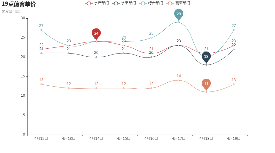
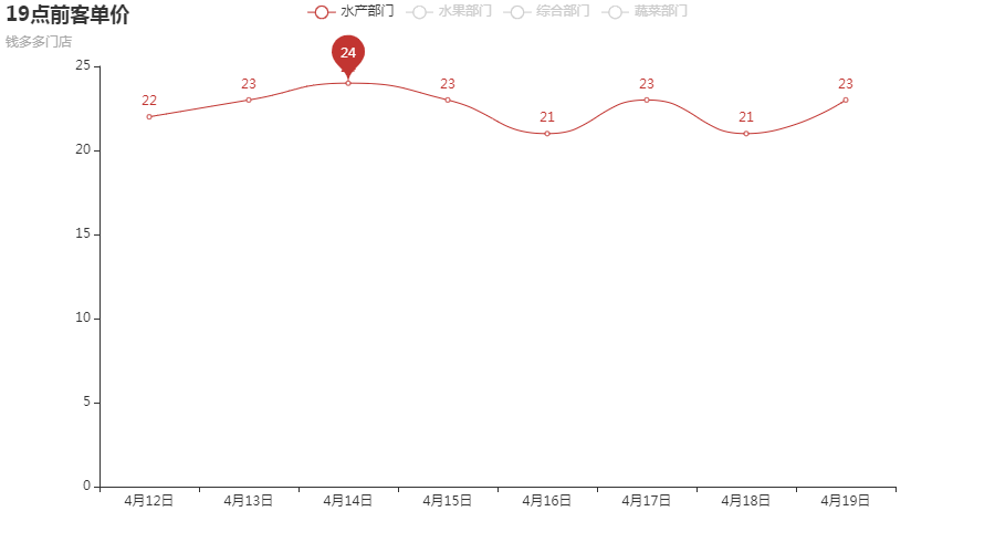
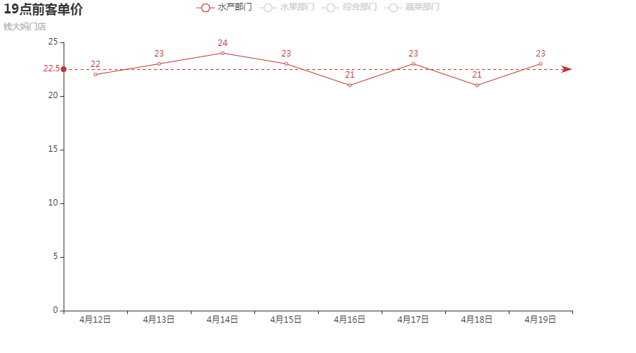
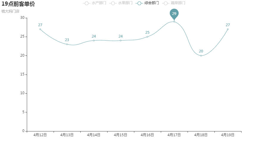
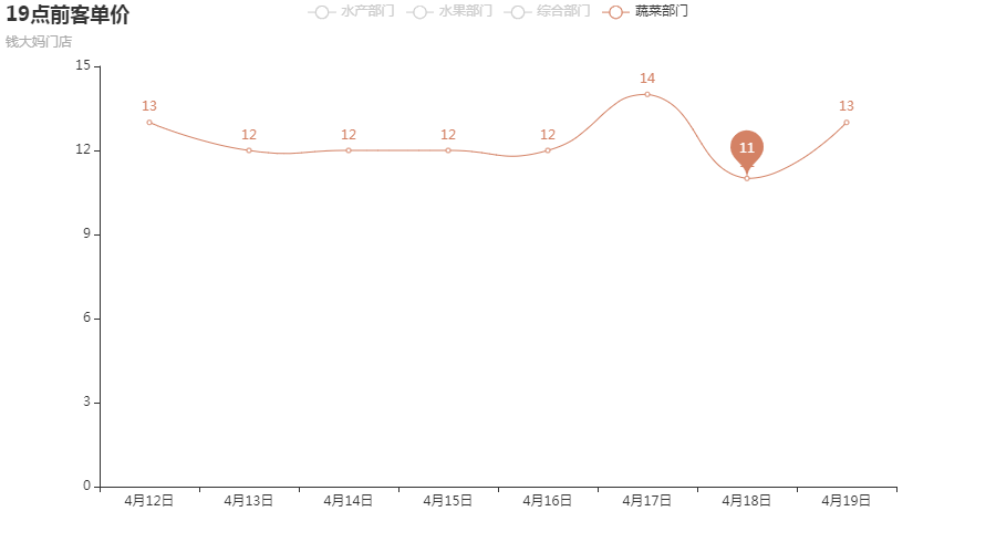
Sub Figure 1:
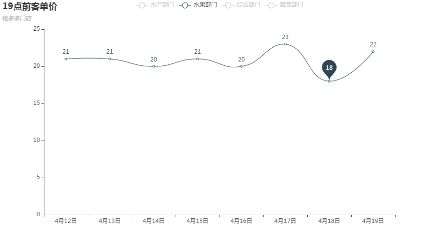
Sub Figure 2:
Sub Figure 3:

Sub Figure 4:

Another mixed graph with both polylines and smooth lines:
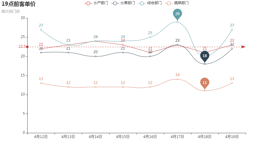
# Guest list
from pyecharts.charts import Line
from pyecharts import options as opts


cate = ["4 December 12","4 13","4 14","4 15th of","4 16","4 17","4 18","4 19"]
fish = [22,23,24,23,21,23,21,23]
fruit = [21,21,20,21,20,23,18,22]
others = [27,23,24,24,25,29,20,27]
vegetable = [13,12,12,12,12,14,11,13]
"""
//Example of line chart:
1. is_smooth Broken line OR Smooth
2. markline_opts Marker line OR Mark point
"""
line = (Line()
       .add_xaxis(cate)
       .add_yaxis("Fisheries Department", fish,
                  markline_opts=opts.MarkLineOpts(data=[opts.MarkLineItem(type_="average")]))

       .add_yaxis("Fruit sector", fruit,
                  is_smooth=True,
                  markpoint_opts=opts.MarkPointOpts(data=[opts.MarkPointItem(name="minimum value",
                                                                             coord=[cate[6], fruit[6]], value=fruit[6])]))

       .add_yaxis("Comprehensive Department", others,
                  is_smooth=True,
                  markpoint_opts=opts.MarkPointOpts(data=[opts.MarkPointItem(name="Maximum",
                                                                             coord=[cate[5], others[5]], value=others[5])]))

        .add_yaxis("Vegetable sector", vegetable,
                  is_smooth=True,
                  markpoint_opts=opts.MarkPointOpts(data=[opts.MarkPointItem(name="Maximum",
                                                                             coord=[cate[6], vegetable[6]], value=vegetable[6])]))

       .set_global_opts(title_opts=opts.TitleOpts(title="19 Customer unit price before point", subtitle="Qian Dama store"))
      )

line.render_notebook()
Full picture:
Sub Figure 1:
Sub Figure 2:

Sub Figure 3:
Sub Figure 4:
It can be seen that mastering pyecharts visualization is more effective than mastering matplotlib visualization!