Recently, "Nightingale rose map" has caught fire all over the Internet due to the people's Daily's report of the epidemic. Used to see pie chart, at first contact with this chart, it is inevitable to be amazed by its visual impact. Since I have been studying Python for the past two years, I am now ready to use Python to make Nightingale rose chart to try my own level.
First go to CSDN for reference.
The case code is as follows:
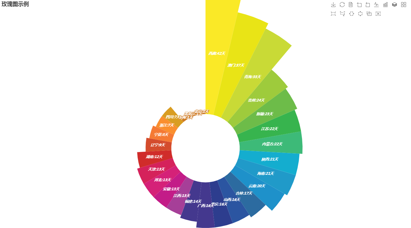
import pandas as pd
from pyecharts.charts import Pie
from pyecharts import options as opts

# Prepare data
provinces = ['Beijing','Shanghai','Heilongjiang','Jilin','Liaoning','Inner Mongolia','Xinjiang','Tibet','Qinghai','Sichuan','Yunnan','Shaanxi','Chongqing',
             'Guizhou','Guangxi','Hainan','Macao','Hunan','Jiangxi','Fujian','Anhui','Zhejiang','Jiangsu','Ningxia','Shanxi','Hebei','Tianjin']
num = [1,1,1,17,9,22,23,42,35,7,20,21,16,24,16,21,37,12,13,14,13,7,22,8,16,13,13]
color_series = ['#FAE927','#E9E416','#C9DA36','#9ECB3C','#6DBC49',
                '#37B44E','#3DBA78','#14ADCF','#209AC9','#1E91CA',
                '#2C6BA0','#2B55A1','#2D3D8E','#44388E','#6A368B'
                '#7D3990','#A63F98','#C31C88','#D52178','#D5225B',
                '#D02C2A','#D44C2D','#F57A34','#FA8F2F','#D99D21',
                '#CF7B25','#CF7B25','#CF7B25']

 # Create data box
df = pd.DataFrame({'provinces': provinces, 'num': num})
# Descending sort
df.sort_values(by='num', ascending=False, inplace=True)

# Extract data
v = df['provinces'].values.tolist()
d = df['num'].values.tolist()

# Instantiate the Pie class
pie1 = Pie(init_opts=opts.InitOpts(width='1350px', height='750px'))
# Set color
pie1.set_colors(color_series)
# Add data, set the radius of pie chart, and show it as Nightingale chart or not
pie1.add("", [list(z) for z in zip(v, d)],
        radius=["30%", "135%"],
        center=["50%", "65%"],
        rosetype="area"
        )
# Set global configuration item
pie1.set_global_opts(title_opts=opts.TitleOpts(title='Rose chart example'),
                     legend_opts=opts.LegendOpts(is_show=False),
                     toolbox_opts=opts.ToolboxOpts())
# Set series configuration items
pie1.set_series_opts(label_opts=opts.LabelOpts(is_show=True, position="inside", font_size=12,
                                               formatter="{b}:{c}day", font_style="italic",
                                               font_weight="bold", font_family="Microsoft YaHei"
                                               ),
                     )
# Generate html document
# pie1.render('nightingale rose. html ')
# Use magic command to display rose chart in notebook
pie1.render_notebook()
Operation result:
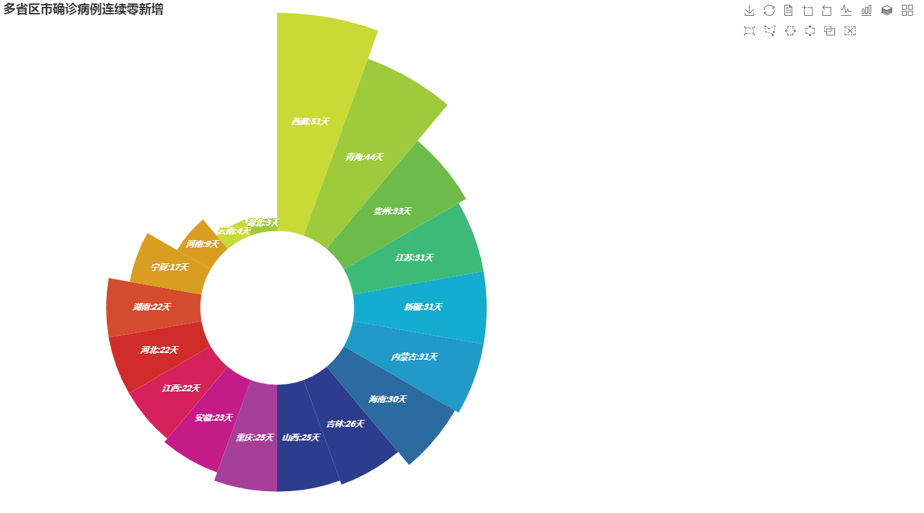
Fine tuning case code:
import pandas as pd
from pyecharts.charts import Pie
from pyecharts import options as opts
provinces = ['Tibet','Qinghai','Guizhou','Jiangsu','Xinjiang','Inner Mongolia','Hainan',
             'Jilin','Chongqing','Shanxi','Anhui','Jiangxi','Hebei','Hunan','Ningxia','Henan','Yunnan','Hubei']
num = [51,44,33,31,31,31,30,26,25,25,23,22,22,22,17,9,4,3]
color_series = ['#C9DA36','#9ECB3C','#6DBC49',
                '#3DBA78','#14ADCF','#209AC9',
                '#2C6BA0','#2D3D8E','#6A368B'
                '#7D3990','#A63F98','#C31C88',
                '#D5225B','#D02C2A','#D44C2D',
                '#D99D21','#CF7B25''#CF7B25']

df = pd.DataFrame({'provinces': provinces, 'num': num})
df.sort_values(by='num', ascending=False, inplace=True)

a = df['provinces'].values.tolist()
b = df['num'].values.tolist()

pie1 = Pie(init_opts=opts.InitOpts(width='1350px', height='750px'))

pie1.set_colors(color_series)
# Add data, set the radius of pie chart, and show it as Nightingale chart or not
pie1.add("", [list(z) for z in zip(a, b)],
        radius=["30%", "115%"],
        center=["30%", "60%"],
        rosetype="area"
        )
# Set global configuration item
pie1.set_global_opts(title_opts=opts.TitleOpts(title='No new confirmed cases in many provinces, districts and cities'),
                     legend_opts=opts.LegendOpts(is_show=False),
                     toolbox_opts=opts.ToolboxOpts())
# Set series configuration items
pie1.set_series_opts(label_opts=opts.LabelOpts(is_show=True, position="inside", font_size=12,
                                               formatter="{b}:{c}day", font_style="italic",
                                               font_weight="bold", font_family="Microsoft YaHei"
                                               ),
                     )
# pie1.render('a.html')
pie1.render_notebook()
Operation result:
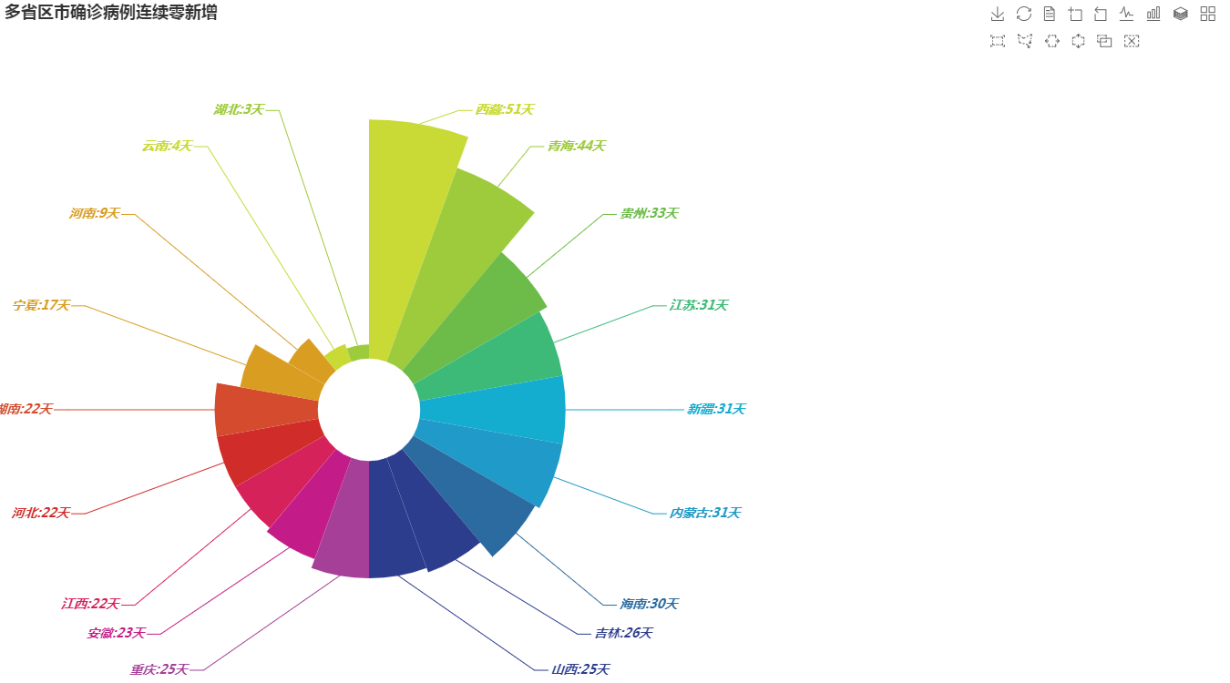
Set the label outside:
import pandas as pd
from pyecharts.charts import Pie
from pyecharts import options as opts
provinces = ['Tibet','Qinghai','Guizhou','Jiangsu','Xinjiang','Inner Mongolia','Hainan',
             'Jilin','Chongqing','Shanxi','Anhui','Jiangxi','Hebei','Hunan','Ningxia','Henan','Yunnan','Hubei']
num = [51,44,33,31,31,31,30,26,25,25,23,22,22,22,17,9,4,3]
color_series = ['#C9DA36','#9ECB3C','#6DBC49',
                '#3DBA78','#14ADCF','#209AC9',
                '#2C6BA0','#2D3D8E','#6A368B'
                '#7D3990','#A63F98','#C31C88',
                '#D5225B','#D02C2A','#D44C2D',
                '#D99D21','#CF7B25''#CF7B25']

df = pd.DataFrame({'provinces': provinces, 'num': num})
df.sort_values(by='num', ascending=False, inplace=True)

a = df['provinces'].values.tolist()
b = df['num'].values.tolist()

pie1 = Pie(init_opts=opts.InitOpts(width='1350px', height='750px'))

pie1.set_colors(color_series)
# Add data, set the radius of pie chart, and show it as Nightingale chart or not
pie1.add("", [list(z) for z in zip(a, b)],
        radius=["15%", "85%"],
        center=["30%", "60%"],
        rosetype="area"
        )
# Set global configuration item
pie1.set_global_opts(title_opts=opts.TitleOpts(title='No new confirmed cases in many provinces, districts and cities'),
                     legend_opts=opts.LegendOpts(is_show=False),
                     toolbox_opts=opts.ToolboxOpts())
# Set the serial configuration item to be labeled outside
pie1.set_series_opts(label_opts=opts.LabelOpts(is_show=True, position="outside", font_size=14,
                                               formatter="{b}:{c}day", font_style="italic",
                                               font_weight="bold", font_family="Microsoft YaHei"
                                               ),
                     )
# pie1.render('a.html')
pie1.render_notebook()
Operation result:
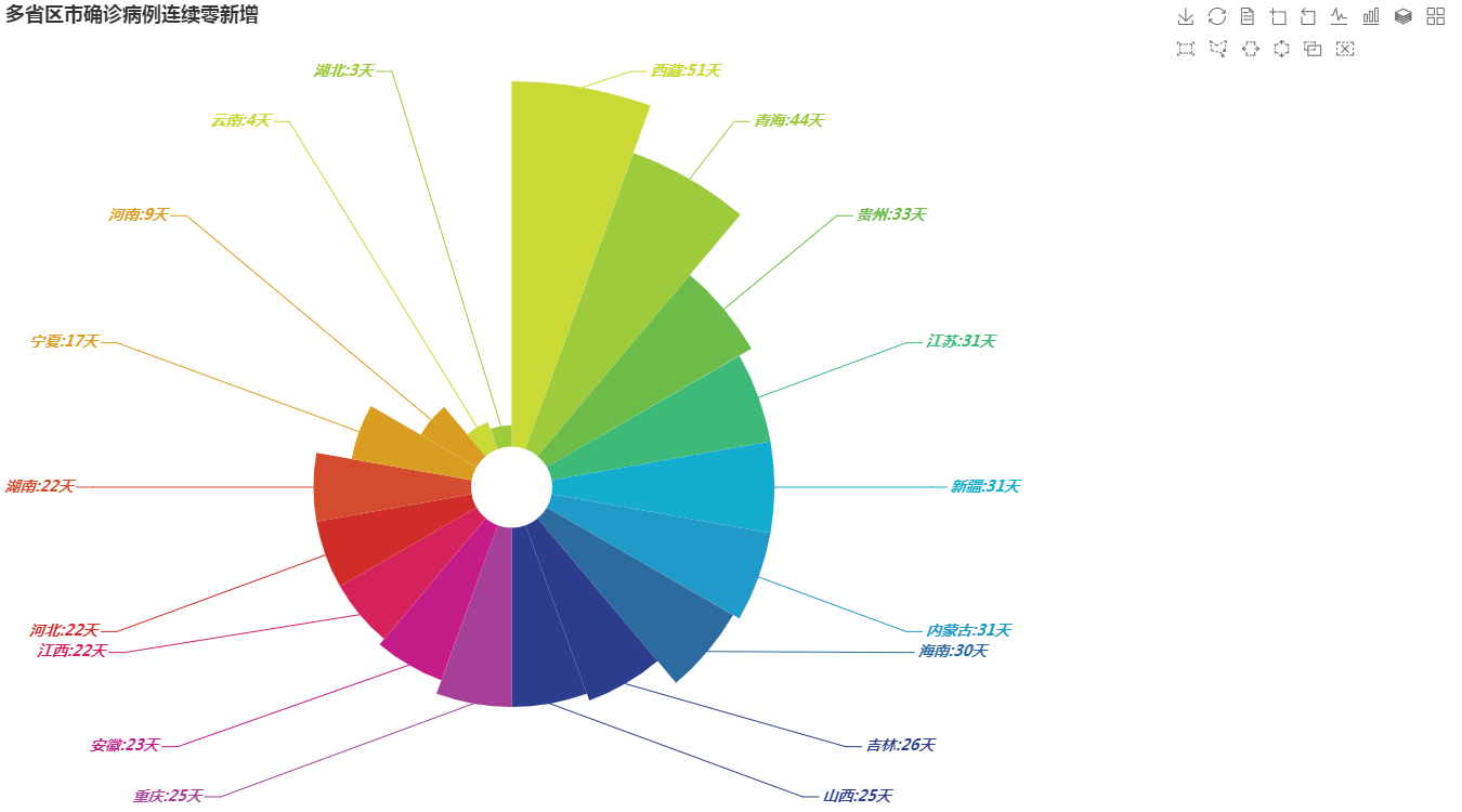
Label external:
import pandas as pd
from pyecharts.charts import Pie
from pyecharts import options as opts
provinces = ['Tibet','Qinghai','Guizhou','Jiangsu','Xinjiang','Inner Mongolia','Hainan',
             'Jilin','Chongqing','Shanxi','Anhui','Jiangxi','Hebei','Hunan','Ningxia','Henan','Yunnan','Hubei']
num = [51,44,33,31,31,31,30,26,25,25,23,22,22,22,17,9,4,3]
color_series = ['#C9DA36','#9ECB3C','#6DBC49',
                '#3DBA78','#14ADCF','#209AC9',
                '#2C6BA0','#2D3D8E','#6A368B'
                '#7D3990','#A63F98','#C31C88',
                '#D5225B','#D02C2A','#D44C2D',
                '#D99D21','#CF7B25''#CF7B25']

df = pd.DataFrame({'provinces': provinces, 'num': num})
df.sort_values(by='num', ascending=False, inplace=True)

a = df['provinces'].values.tolist()
b = df['num'].values.tolist()

pie1 = Pie(init_opts=opts.InitOpts(width='1350px', height='750px'))

pie1.set_colors(color_series)
# Add data, set the radius of pie chart, and show it as Nightingale chart or not
pie1.add("", [list(z) for z in zip(a, b)],
        radius=["10%", "100%"],
        center=["35%", "60%"],
        rosetype="area"
        )
# Set global configuration item
pie1.set_global_opts(title_opts=opts.TitleOpts(title='No new confirmed cases in many provinces, districts and cities'),
                     legend_opts=opts.LegendOpts(is_show=False),
                     toolbox_opts=opts.ToolboxOpts())
# Set series configuration items
pie1.set_series_opts(label_opts=opts.LabelOpts(is_show=True, position="outside", font_size=14,
                                               formatter="{b}:{c}day", font_style="italic",
                                               font_weight="bold", font_family="Microsoft YaHei"
                                               ),
                     )
# pie1.render('a.html')
pie1.render_notebook()
Replace the parameters and apply them to your own practice:
The code is modified as follows:
Note: the contents of numpy can open Excel's clipboard
import pandas as pd
from pyecharts.charts import Pie
from pyecharts import options as opts
provinces = ["Fresh squid(box)","small clam","sweet corn","Chrysanthemum seedling","Aubergine","Pineapple","Imported banana","Carapace meat","South pomfret(box)","Hot pepper seedlings",
           "Lifting barrel(box)","Raking oranges","Pomfret(box)","Wax gourd","Bighead carp fillet in reservoir","Abalone"]
num = [1,1,1,1,1,1,1,1,1,1,1,1,2,2,3,4]
color_series = ['#C9DA36','#9ECB3C','#6DBC49',
                '#3DBA78','#14ADCF','#209AC9',
                '#2C6BA0','#2D3D8E','#6A368B'
                '#7D3990','#A63F98','#C31C88',
                '#D5225B','#D02C2A','#D44C2D',
                '#D99D21','#CF7B25''#CF7B25']

df = pd.DataFrame({'provinces': provinces, 'num': num})
df.sort_values(by='num', ascending=False, inplace=True)

a = df['provinces'].values.tolist()
b = df['num'].values.tolist()

pie1 = Pie(init_opts=opts.InitOpts(width='1350px', height='750px'))

pie1.set_colors(color_series)
# Add data, set the radius of pie chart, and show it as Nightingale chart or not
pie1.add("", [list(z) for z in zip(a, b)],
        radius=["20%", "140%"],
        center=["30%", "70%"],
        rosetype="area"
        )
# Set global configuration item
'''
pie1.set_global_opts(title_opts=opts.TitleOpts(title="5 Number of discount acceptance items in the second week of the month"),
                     legend_opts=opts.LegendOpts(is_show=False),
                     toolbox_opts=opts.ToolboxOpts())
'''

pie1.set_global_opts(title_opts=opts.TitleOpts(title="5 Number of discount acceptance items in the second week of the month"),
                     legend_opts=opts.LegendOpts(is_show=False))


# Set series configuration items
pie1.set_series_opts(label_opts=opts.LabelOpts(is_show=True, position="inside", font_size=12,
                                               formatter="{b}:{c}second", font_style="italic",
                                               font_weight="bold", font_family="Microsoft YaHei"
                                               ),
                     )
# pie1.render('a.html')
pie1.render_notebook()

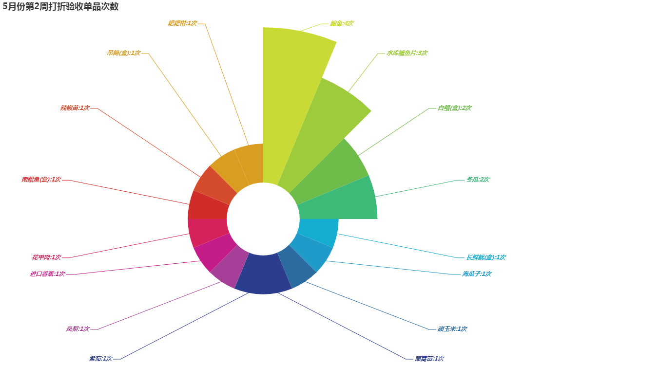
Label out:
import pandas as pd
from pyecharts.charts import Pie
from pyecharts import options as opts
provinces = ["Fresh squid(box)","small clam","sweet corn","Chrysanthemum seedling","Aubergine","Pineapple","Imported banana","Carapace meat","South pomfret(box)","Hot pepper seedlings",
           "Lifting barrel(box)","Raking oranges","Pomfret(box)","Wax gourd","Bighead carp fillet in reservoir","Abalone"]
num = [1,1,1,1,1,1,1,1,1,1,1,1,2,2,3,4]
color_series = ['#C9DA36','#9ECB3C','#6DBC49',
                '#3DBA78','#14ADCF','#209AC9',
                '#2C6BA0','#2D3D8E','#6A368B'
                '#7D3990','#A63F98','#C31C88',
                '#D5225B','#D02C2A','#D44C2D',
                '#D99D21','#CF7B25''#CF7B25']

df = pd.DataFrame({'provinces': provinces, 'num': num})
df.sort_values(by='num', ascending=False, inplace=True)

a = df['provinces'].values.tolist()
b = df['num'].values.tolist()

pie1 = Pie(init_opts=opts.InitOpts(width='1350px', height='750px'))

pie1.set_colors(color_series)
# Add data, set the radius of pie chart, and show it as Nightingale chart or not
pie1.add("", [list(z) for z in zip(a, b)],
        radius=["20%", "105%"],
        center=["40%", "60%"],
        rosetype="area"
        )
# Set global configuration item
'''
pie1.set_global_opts(title_opts=opts.TitleOpts(title="5 Number of discount acceptance items in the second week of the month"),
                     legend_opts=opts.LegendOpts(is_show=False),
                     toolbox_opts=opts.ToolboxOpts())
'''

pie1.set_global_opts(title_opts=opts.TitleOpts(title="5 Number of discount acceptance items in the second week of the month"),
                     legend_opts=opts.LegendOpts(is_show=False))


# Set series configuration items
pie1.set_series_opts(label_opts=opts.LabelOpts(is_show=True, position="outside", font_size=12,
                                               formatter="{b}:{c}second", font_style="italic",
                                               font_weight="bold", font_family="Microsoft YaHei"
                                               ),
                     )
# pie1.render('a.html')
pie1.render_notebook()
Summary: after playing pyecharts for half a month, it's easier to change it and better to play. There's an illusion that you don't need to learn Power bi!