preface
The Collapse plug-in can easily Collapse the page area. If you want to refer to the functions of the plug-in separately, you need to refer to Collapse JS, bootstrap already contains this plug-in. You can directly reference bootstrap JS or compressed version of bootstrap min.js
Collapse
To use the link href with attributes or the button data target with attributes. In both cases, data toggle = "collapse" is required. Click the button below to show and hide another element through class changes:
- . collapse hide content
- . collapsing is applied during the transition
- .collapse.in display content
<!DOCTYPE html>
<html lang="en">
<head>
    <meta charset="utf-8">
    <title>Bootstrap example - Folding panel</title>
    <link rel="stylesheet" href="https://cdn.staticfile.org/twitter-bootstrap/3.3.7/css/bootstrap.min.css">
    <script src="https://cdn.staticfile.org/jquery/2.1.1/jquery.min.js"></script>
    <script src="https://cdn.staticfile.org/twitter-bootstrap/3.3.7/js/bootstrap.min.js"></script>
</head>
<body>

<p>
  <a class="btn btn-primary" data-toggle="collapse" href="#collapseExample" role="button"
     aria-expanded="false" aria-controls="collapseExample">
    href relation id attribute
  </a>
  <button class="btn btn-primary" type="button" data-toggle="collapse"
          data-target="#collapseExample" aria-expanded="false" aria-controls="collapseExample">
    data-target relation id attribute
  </button>
</p>
<div class="collapse" id="collapseExample">
  <div class="card card-body">
     This paragraph of text can be folded and displayed after clicking
  </div>
</div>

</body>
</html>
To achieve the effect, do not expand by default

Click the button to expand the text

If you want to expand by default, you can use collapse.in attribute control
<div class="collapse in" id="collapseExample">
  <div class="card card-body">
     This paragraph of text can be folded and displayed after clicking
  </div>
</div>
Multiple folds
Simply add data toggle = "collapse" and data target to the element to automatically assign control over the collapsible element. The data target attribute accepts a CSS selector to apply the folding. Make sure you add the class collapse to the collapsible element. If you want it to open by default, add the additional class in.
<!DOCTYPE html>
<html lang="en">
<head>
<meta charset="utf-8">
<title>Bootstrap example - Folding panel</title>
<link rel="stylesheet" href="https://cdn.staticfile.org/twitter-bootstrap/3.3.7/css/bootstrap.min.css">
<script src="https://cdn.staticfile.org/jquery/2.1.1/jquery.min.js"></script>
<script src="https://cdn.staticfile.org/twitter-bootstrap/3.3.7/js/bootstrap.min.js"></script>
</head>
<body>
<div class="panel-group" id="accordion" role="tablist" aria-multiselectable="true">
<div class="panel panel-default">
<div class="panel-heading" role="tab" id="headingOne">
<h4 class="panel-title">
<a role="button" data-toggle="collapse" data-parent="#accordion" href="#collapseOne" aria-expanded="true" aria-controls="collapseOne">
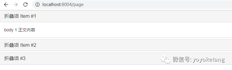
Collapse item Item #1
</a>
</h4>
</div>
<div id="collapseOne" class="panel-collapse collapse in" role="tabpanel" aria-labelledby="headingOne">
<div class="panel-body">
body 1 Text content
</div>
</div>
</div>
<div class="panel panel-default">
<div class="panel-heading" role="tab" id="headingTwo">
<h4 class="panel-title">
<a class="collapsed" role="button" data-toggle="collapse" data-parent="#accordion" href="#collapseTwo" aria-expanded="false" aria-controls="collapseTwo">
Collapse item Item #2
</a>
</h4>
</div>
<div id="collapseTwo" class="panel-collapse collapse" role="tabpanel" aria-labelledby="headingTwo">
<div class="panel-body">
Text content 2
</div>
</div>
</div>
<div class="panel panel-default">
<div class="panel-heading" role="tab" id="headingThree">
<h4 class="panel-title">
<a class="collapsed" role="button" data-toggle="collapse" data-parent="#accordion" href="#collapseThree" aria-expanded="false" aria-controls="collapseThree">
Collapse item #3
</a>
</h4>
</div>
<div id="collapseThree" class="panel-collapse collapse" role="tabpanel" aria-labelledby="headingThree">
<div class="panel-body">
Text content 3
</div>
</div>
</div>
</div>
</body>
</html>Realization effect
Through JavaScript
Manual enable
$('.collapse').collapse(). collapse(options) activates your content as a collapsible element. Accept an optional option object.
$('#myCollapsible').collapse({
  toggle: false
})
. collapse('toggle ') toggles collapsible elements to show or hide. Returns to the caller before the collapsible element is actually displayed or hidden (that is, before the or event occurs). shown.bs.collapse, hidden.bs.collapse `. collapse('show ') displays collapsible elements. Returns to the caller before the collapsible element is actually displayed (that is, before the event occurs). shown.bs.collapse
. collapse('hide ') hides collapsible elements. The collapsible element is returned to the caller before it is actually hidden (that is, before the event occurs). hidden.bs.collapse
The folding class of Bootstrap exposes some events for the hook folding function.
Event type | describe |
|---|---|
show.bs.collapse | This event is triggered immediately when show calls the instance method. |
shown.bs.collapse | This event is triggered when the collapsed element is visible to the user (waiting for the CSS conversion to complete). |
hide.bs.collapse | This event is triggered immediately when hide calls this method. |
hidden.bs.collapse | This event is triggered when the folded element is hidden from the user (waiting for the CSS conversion to complete). |
$('#myCollapsible').on('hidden.bs.collapse', function () {
  // do something...
})