Starting from this chapter, we begin to learn Qt widgets, in which each type of widget is selected as an example to explain their usage. Through the example, you can draw inferences from one instance. This chapter is also pure code programming and does not use Qt Designer graphical interface to develop programs.
In this chapter, we can learn the common control initialization methods, set the size, position, color, text and design creative examples of the form, quickly learn the use methods of various controls, and strive to write practical examples and detailed code comments.
Because there are so many controls, if you feel that learning controls is boring, you can refer to it when you use this control (part). It is not necessary to master it all at once. The purpose of this chapter is to understand the type and use method of Qt controls.
Button:
In Qt, the most commonly used control is the button. With the button, we can click to respond to events and achieve the effect of human-computer interaction. Whether embedded or PC, the interface interaction is inseparable from buttons. Qt button component is one of the commonly used components. Qt has six built-in button components as follows:
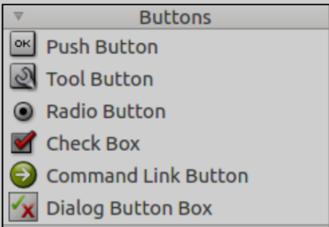
(1) QPushButton: push button
(2) QToolButton: tool button
(3) QRadioButton: Select button
(4) QCheckBox: check box
(5) QCommandLinkButton: command link button
(6) QDialogButtonBox: dialog box button
The functions of these six button components are briefly described as follows:
QPushButton inherits the QAbstractButton class and is inherited by QCommandLinkButton. Usually used to execute commands or trigger events.
QToolButton inherits the QAbstractButton class. It is a quick access button for commands or options, usually in the ToolBar. Tool buttons usually display icons rather than text labels. ToolButton supports automatic floating. In auto float mode, the button draws a three-dimensional frame only when the mouse points to it.
QRadioButton inherits the QAbstractButton class. RadioButton radio buttons (radio boxes) usually appear in groups to provide two or more mutually exclusive options.
QCheckBox inherits QAbstractButton. The difference between the check button (check box) and the RadioButton is the selection mode. The radio button provides multiple choices, and the check button provides multiple choices.
The Chinese name of QCommandLinkButton control is "command link button". QCommandLinkButton inherits QPushButton. The QCommandLinkButton control is similar to the RadioButton and is used to select one of the mutually exclusive options. On the surface, it is the same as the plane button, but in addition to the text description text on the normal button, the CommandLinkButton will also carry an arrow icon by default, indicating that pressing the button will open another window or page.
QDialogButtonBox button box (button box) is wrapped by QDialogButtonBox class. QDialogButtonBox inherits QWidget. It is often used to customize buttons in dialog boxes, such as OK and Cancel buttons.
The available attributes, signals and slots of the six buttons mentioned above can be viewed in Qt help document when needed. Here we will skip their available properties and signals and slots. Let's explain how each button is used through examples and explore what effect they can achieve.
1, QPushButton
1. Introduction to control
We have already touched the QPushButton before. Connect the signal and slot in Qt Designer to realize the function of closing the program. Let's start writing a program again, and use QPushButton to connect signals and slots to realize a small example.
2. Usage examples
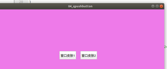
Example 04_ QPushButton window skinning (difficulty: simple). Click different buttons to change the color of the window. Create a new item named 04_qpushbutton. Do not check "Generate form" in the new routine, and inherit QMainWindow class by default. The completion is shown in the figure below.
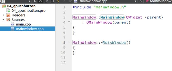
In the header file "mainwindow.h", the specific code is as follows.
1 #ifndef MAINWINDOW_H
2 #define MAINWINDOW_H
3
4 #include <QMainWindow>
5 /* Introduce QPushButton class */
6 #include <QPushButton>
7
8 class MainWindow : public QMainWindow
9 {
10 Q_OBJECT
11
12 public:
13 MainWindow(QWidget *parent = nullptr);
14 ~MainWindow();
15
16 private:
17 /* Declare a QPushButton object pushButton1 */
18 QPushButton *pushButton1;
19 /* Declare a QPushButton object pushButton2 */
20 QPushButton *pushButton2;
21
22 private slots:
23 /* Declare the slot function of the object pushButton1 */
24 void pushButton1_Clicked();
25 /* Declare the slot function of the object pushButton2 */
26 void pushButton2_Clicked();
27 };
28 #endif // MAINWINDOW_H
Line 6, introduce the QPushButton class.
Lines 18 and 20 declare the objects of the two qpushbuttons.
Lines 24 and 26 declare the slot functions of the two QPushButton objects.
In the source file "mainwindow.cpp", the specific code is as follows.
1 #include "mainwindow.h"
2
3 MainWindow::MainWindow(QWidget *parent)
4 : QMainWindow(parent)
5 {
6 /* Set the width and height to 800 × 480, at 0, 0. (0, 0) represents the origin. Qt defaults to the original point at the top left corner
 spot */
7 this->setGeometry(0, 0, 800, 480);
8
9 /* Instantiate two button objects and set their display text to window skin 1 and window skin 2 */
10 pushButton1 = new QPushButton("Window skin 1", this);
11 pushButton2 = new QPushButton("Window skin 2", this);
12
13 /* Sets the position of the two QPushButton objects */
14 pushButton1->setGeometry(300,200,80,40);
15 pushButton2->setGeometry(400,200,80,40);
16
17 /* Signal slot connection */
18 connect(pushButton1, SIGNAL(clicked()), this,
SLOT(pushButton1_Clicked()));
19 connect(pushButton2, SIGNAL(clicked()), this,
SLOT(pushButton2_Clicked()));
20 }
21
22 MainWindow::~MainWindow()
23 {
24 }
25
26 /* Implementation of slot function */
27 void MainWindow::pushButton1_Clicked()
28 {
29 /* Set the style of the main window 1 */
30 this->setStyleSheet("QMainWindow { background-color: rgba(255, 245,
238, 100%); }");
31 }
32
33 /* Implementation of slot function */
34 void MainWindow::pushButton2_Clicked()
35 {
36 /* Set the style of the main window 2 */
37 this->setStyleSheet("QMainWindow { background-color: rgba(238, 122,
233, 100%); }");
38 }
In line 7, set the display position and size of the program window. If it is not set, the running program window may appear in a certain position in Ubuntu, but in the middle in Windows.
Lines 10 and 11, materialize the QPushButton object. During initialization, QString type string can be passed in as the display text of the button.
In line 14, set the size and position of the button. The size of the button cannot be set too small, otherwise the text on the button may not be displayed completely.
Lines 18 and 19 connect the signals and slots of the two QPushButton objects.
From lines 27 to 38, the slot functions of the two qpushbuttons are implemented to set the style sheet of the main form, where
The rgba parameter of background color can change the background color of the form. What is a style sheet and how to set it will be explained in a section later.
3. Operation effect
After the program is compiled and run, click the window skin 1 button, and the display effect of the main window is as follows.
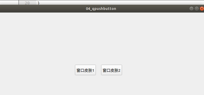
Click the window skin 2 button, and the display effect of the main window is as follows.
2, QToolButton
1. Introduction to control
The difference between a QToolButton and a QPushButton is that a QToolButton can have an icon. Here, the background picture of the icon and the button is different. Usually, we use the QToolBar as a toolbar Set different buttons on the toolbar. If these buttons also have icons and text, QToolButton is a good choice.
2. Usage examples
Example 05_ Qtoolbutton Customize Toolbar (difficulty: simple). Create a new project named 05_qtoolbutton. Do not check "Generate form" in the new routine, and inherit QMainWindow class by default. The completion of project creation is shown in the figure below.
In the header file "mainwindow.h", the specific code is as follows.
1 #ifndef MAINWINDOW_H
2 #define MAINWINDOW_H
3
4 #include <QMainWindow>
5 /* Introduce QToolButton class */
6 #include <QToolButton>
7 /* Introduce QToolBar class */
8 #include <QToolBar>
9
10 class MainWindow : public QMainWindow
11 {
12 Q_OBJECT
13
14 public:
15 MainWindow(QWidget *parent = nullptr);
16 ~MainWindow();
17
18 private:
19 /* Declare a QToolButton object */
20 QToolButton *toolButton;
21 /* Declare a QToolBar object */
22 QToolBar *toolBar;
23 };
24 #endif // MAINWINDOW_H
Lines 20 and 22 declare the QToolButton object and QtoolBar object.
In the source file "mainwindow.cpp", the specific code is as follows.
1 #include "mainwindow.h"
2 #include <QApplication>
3 #include <QStyle>
4
5 MainWindow::MainWindow(QWidget *parent)
6 : QMainWindow(parent)
7 {
8 /* Set the position and size of the main form */
9 this->setGeometry(0, 0, 800, 480);
10
11 /* Instantiate QToolBar object */
12 toolBar = new QToolBar(this);
13 /* Set the location and size of the toolBar */
14 toolBar->setGeometry(0, 0, 800, 100);
15
16 /* Instantiate the qstype class object, which is used to set the style and call the icon of the system class */
17 QStyle *style = QApplication::style();
18
19 /* Using the standard icon provided with Qt, you can search qstype:: standardpixmap in the help document */
20 QIcon icon =
style->standardIcon(QStyle::SP_TitleBarContextHelpButton);
21
22 /* Instantiate QToolButton object */
23 toolButton = new QToolButton();
24
25 /* Settings Icon */
26 toolButton->setIcon(icon);
27 /* Sets the text to display */
28 toolButton->setText("help");
29 /* Call setToolButtonStyle() method to set the style of toolbutton to text
 Below the icon */
30 toolButton->setToolButtonStyle(Qt::ToolButtonTextUnderIcon);
31
32 /* Finally, add the toolButton to the ToolBar */
33 toolBar->addWidget(toolButton);
34 }
35
36 MainWindow::~MainWindow()
37 {
}
The flow of this code is to initialize the toolBar object, then initialize the toolButton object and set the style of the tool button. Finally, add the toolButton to the toolBar. This completes the design of the custom toolBar.
In the source file "main.cpp", the specific code is generated when creating a new project without change.
3. Operation effect
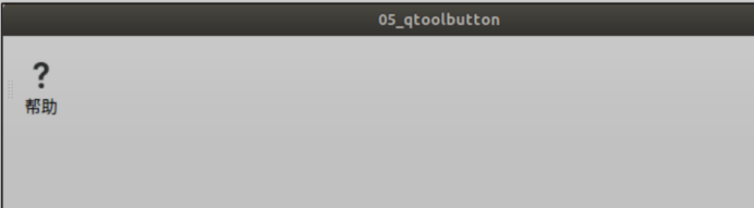
The effect of the final program is as follows. Successfully embed the customized tool button in the toolbar. This design can be seen in many software with toolbar, and Qt can be used to realize similar functions.
3, QRadioButton
1. Introduction to control
The QRadioButton part provides a radio box (radio button) with a text label. The QRadioButton is an option button that can switch the checked or unchecked state. The radio box usually presents the user with a "select one from many" Your choice. That is, in a group of radio boxes, only one radio box can be selected at a time. By default, under the same parent object, clicking them after initialization is mutually exclusive.
2. Usage examples
Example 06_radiobutton imitates the switching effect of mobile phone (difficulty: medium). This example will realize the switching effect of mobile phone. You need to use Qt style sheet, load qss style sheet file, and just write the style sheet to qss file.
Here we are slowly getting in touch with Qt's style sheet. It is precisely because of the style sheet that we can write some practical examples and dazzling examples.
Do not check "Generate form" in the new routine, and inherit QMainWindow class by default. The new project is completed, as shown in the figure below.
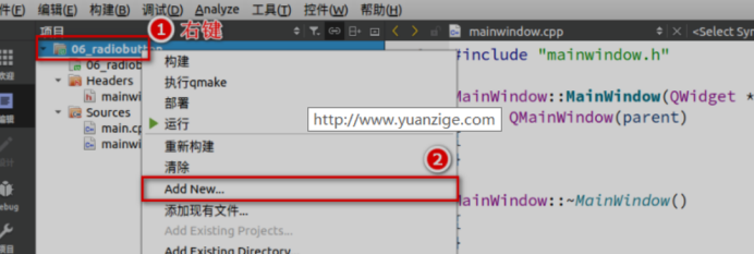
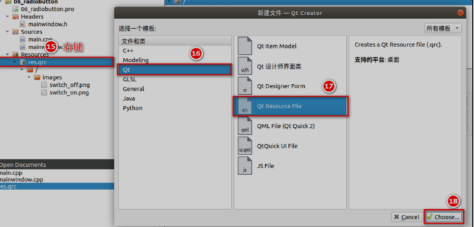
To add a resource file, follow the steps below. Right click the item and select Add New.
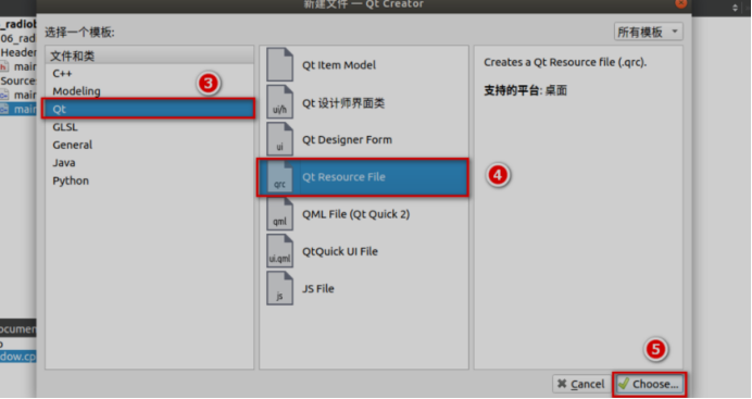
Select a template, Qt template, Qt Resource Files, and click Choose. We won't elaborate on the Qt template here. We'll find out what template we need to use in the future. There is no need to the usage of various templates at once. In fact, we don't often use them.
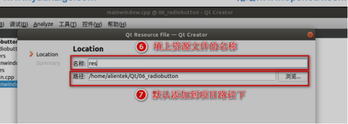
Fill in the name of the resource file (you can write one at will, and the editor's abbreviation is res) and add it to the project path by default. The following steps are OK by default, and click finish.
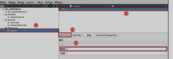
After creating the resource file, By default, it will enter the editing mode of res.qrc file (if it is closed, you can right-click the file and select "Open in Editor") and click Add Prefix to add a prefix. The purpose of adding a prefix is to facilitate classification management of files. For example, we have added the prefix /. "Must be written, otherwise the path will not be found, which is a bit like the root node of Linux
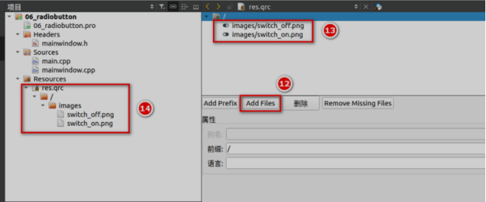
After adding the prefix, we add the resource image and put it under the / images prefix. Here, we have prepared two pictures under the images folder of the project path (the images folder is created manually first). As shown in the following figure, after adding, you need to press "Ctrl+ S" to save res.qrc before you can see the results on the left. The addition is completed, as shown in the following figure.
Add QSS file. QSS files are style sheet files associated with Qt programs. It consists of the appearance and feel of GUI elements, including layout, color, mouse behavior, size and font. Its style can be combined into one UI (user interface). Similar to the CSS of HTML, Qt's style sheet is a plain text format definition. These style definitions can be loaded and parsed when the application runs, so as to make the application interface present different effects.
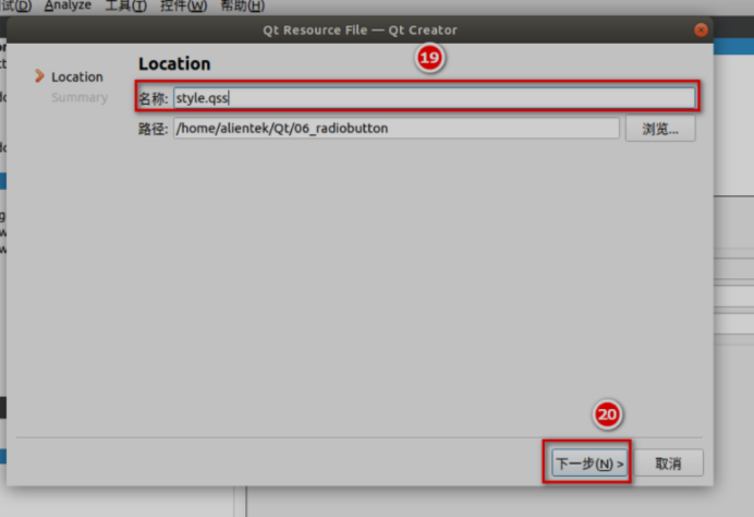
Create a new style The QSS file, as shown in the following figure, is added to the project path by default. The following steps can be completed by default.
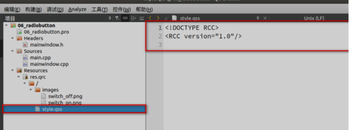
The qss file is added as shown in the following figure.
In the header file "mainwindow.h", the specific code is as follows
1 #ifndef MAINWINDOW_H
2 #define MAINWINDOW_H
3
4 #include <QMainWindow>
5 /* Introducing QRadioButton */
6 #include <QRadioButton>
7
8 class MainWindow : public QMainWindow
9 {
10 Q_OBJECT
11
12 public:
13 MainWindow(QWidget *parent = nullptr);
14 ~MainWindow();
15
16 private:
17 /* Declare two QRadioButton objects */
18 QRadioButton *radioButton1;
19 QRadioButton *radioButton2;
20 };
21 #endif // MAINWINDOW_H
 Declare two on lines 18 and 19 QRadioButton Object.
In source file“ mainwindow.cpp"The specific code is as follows.

1 #include "mainwindow.h"
2
3 MainWindow::MainWindow(QWidget *parent)
4 : QMainWindow(parent)
5 {
6 /* Set the position and display size of the main form */
7 this->setGeometry(0, 0, 800, 480);
8 this->setStyleSheet("QMainWindow {background-color: rgba(200, 50,
100, 100%);}");
9
10 /* Instantiate object */
11 radioButton1 = new QRadioButton(this);
12 radioButton2 = new QRadioButton(this);
13
14 /* Set the position and display size of the two qradiobuttons */
15 radioButton1->setGeometry(300, 200, 100, 50);
16 radioButton2->setGeometry(400, 200, 100, 50);
17
18 /* Set the display text of two qradiobuttons */
19 radioButton1->setText("Switch I");
20 radioButton2->setText("Switch II");
21
22 /* Set the initial state. The Checked of radioButton1 is false and the other is true*/
23 radioButton1->setChecked(false);
24 radioButton2->setChecked(true);
25 }
26
27 MainWindow::~MainWindow()
28 {
29 }
Lines 23 and 24 set the initialization status of the QRadioButton object so that they are mutually exclusive
In the source file "main.cpp", the specific code is as follows. We need to be in main Load qss file in CPP.
1 #include "mainwindow.h"
2
3 #include <QApplication>
4 /* Import QFile */
5 #include <QFile>
6
7 int main(int argc, char *argv[])
8 {
9 QApplication a(argc, argv);
10 /* Specify file */
11 QFile file(":/style.qss");
12
13 /* Determine whether the file exists */
14 if (file.exists() ) {
15 /* Open as read-only */
16 file.open(QFile::ReadOnly);
17 /* Save the read result as a string */
18 QString styleSheet = QLatin1String(file.readAll());
19 /* Set global style */
20 qApp->setStyleSheet(styleSheet);
21 /* Close file */
22 file.close();
23 }
24 MainWindow w;
25 w.show();
26 return a.exec();
27 }
Lines 11 to 23, read style Content of QSS. And set the global style.
In the source file "style.qss", the specific code is as follows, which is similar to the css syntax in HTML. If you can't write the content of qss, you can refer to the content of Qt help document and search for "qt style" in it. Find relevant examples for reference. Here we just have a preliminary understanding of this qt style.
1 QRadioButton{
2 spacing: 2px;
3 color: white;
4 }
5 QRadioButton::indicator {
6 width: 45px;
7 height: 30px;
8 }
9 QRadioButton::indicator:unchecked {
10 image: url(:/images/switch_off.png);
11 }
12 QRadioButton::indicator:checked {
13 image: url(:/images/switch_on.png);
14 }
In lines 10 and 13, set the background picture of the indicator of the QRadioButton. In this way, when they click switch, they will see the effect similar to switch.
3. Operation effect
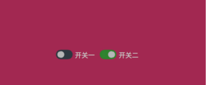
The effect of the compiler is as follows. Click close switch 1 to open switch 2; Click switch 2 and switch 1 will open. Because they are mutually exclusive by default. In some cases, we need to use this effect. For example, we often need to switch lines when watching videos on the Internet. There may be several lines, but only one is active, so we can apply it in this direction.
In this example, we learned how to add resources, and the steps are also detailed. For subsequent routines, you can refer to this routine to add resource files. We won't explain the adding process in detail. We have a preliminary understanding of Qt style sheet files. If we want to make a good-looking interface, Qt style sheet files are indispensable.
Maybe we don't understand the syntax of Qt style sheet and don't know how to start. We can learn while learning. We can refer to the usage in the Qt help document. The function of qss is more than that. The focus now is to learn the QRadioButton control.
4, QCheckBox
1. Introduction to control
QCheckBox inherits QAbstractButton. The difference between the check button (check box) and the RadioButton is the selection mode. The radio button provides multiple choices, and the check button provides multiple choices.
2. Usage examples
Example 07_qcheckbox, three state selection box (difficulty: simple). Using a QCheckBox, users can change the state of the selected selection box by clicking.
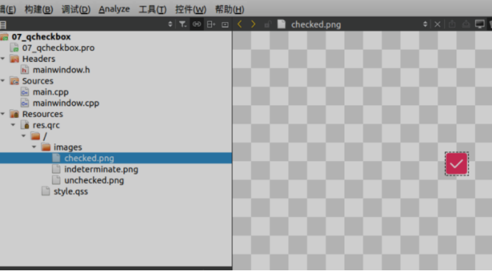
Do not check "Generate form" in the new routine, and inherit QMainWindow class by default. The new project is completed, as shown in the figure below. The editor has added qss files and three resource images.
In the header file "mainwindow.h", the specific code is as follows.
1 #ifndef MAINWINDOW_H
2 #define MAINWINDOW_H
3
4 #include <QMainWindow>
5 /* Introducing QCheckBox */
6 #include <QCheckBox>
7
8 class MainWindow : public QMainWindow
9 {
10 Q_OBJECT
11
12 public:
13 MainWindow(QWidget *parent = nullptr);
14 ~MainWindow();
15
16 private:
17 /* Declare a QCheckBox object */
18 QCheckBox *checkBox;
19 private slots:
20 /* Declare the slot function of QCheckBox, pass it with parameters, and use this parameter to receive the parameters of the signal */
21 void checkBoxStateChanged(int);
22
23 };
24 #endif // MAINWINDOW_H
Declare two QCheckBox objects on lines 18 and 19.
In the source file "mainwindow.cpp", the specific code is as follows.
1 #include "mainwindow.h"
2
3 MainWindow::MainWindow(QWidget *parent)
4 : QMainWindow(parent)
5 {
6 /* Set the position, display size and background color of the main form */
7 this->setGeometry(0, 0, 800, 480);
8 this->setStyleSheet("QMainWindow {background-color: rgba(100, 100,
100, 100%);}");
9
10 /* Instantiate object */
11 checkBox = new QCheckBox(this);
12
13 /* Set QCheckBox position and display size */
14 checkBox->setGeometry(350, 200, 250, 50);
15
16 /* The status of the initialization three state check box is Checked */
17 checkBox->setCheckState(Qt::Checked);
18
19 /* Sets the text to display */
20 checkBox->setText("Initialize as Checked state");
21
22 /* When the three state mode is enabled, it must be enabled, otherwise there are only two states, namely Checked and Unchecked */
23 checkBox->setTristate();
24
25 /* Connect the signal stateChanged(int) of the checkBox with the slot we defined
checkBoxStateChanged(int)connect */
26 connect(checkBox, SIGNAL(stateChanged(int)), this,
SLOT(checkBoxStateChanged(int)));
27 }
28
29 MainWindow::~MainWindow()
30 {
31 }
32
33 /* Implementation of slot function */
34 void MainWindow::checkBoxStateChanged(int state)
35 {
36 /* Judge the state of the checkBox and set the text of the checkBox */
37 switch (state) {
38 case Qt::Checked:
39 /* Selected status */
40 checkBox->setText("Checked state");
41 break;
42 case Qt::Unchecked:
43 /* Unchecked status */
44 checkBox->setText("Unchecked state");
45 break;
46 case Qt::PartiallyChecked:
47 /* Semi selected state */
48 checkBox->setText("PartiallyChecked state");
49 break;
50 default:
51 break;
52 }
53 }
In line 23, it should be noted that the qccheckbox object needs to be set to three state mode.
In the source file "main.cpp", the specific code is as follows. We need to be in main Load qss file in CPP.
1 #include "mainwindow.h"
2
3 #include <QApplication>
4 /* Import QFile */
5 #include <QFile>
6
7 int main(int argc, char *argv[])
8 {
9 QApplication a(argc, argv);
10 /* Specify file */
11 QFile file(":/style.qss");
12
13 /* Determine whether the file exists */
14 if (file.exists() ) {
15 /* Open as read-only */
16 file.open(QFile::ReadOnly);
17 /* Save the read result as a string */
18 QString styleSheet = QLatin1String(file.readAll());
19 /* Set global style */
20 qApp->setStyleSheet(styleSheet);
21 /* Close file */
22 file.close();
23 }
24 MainWindow w;
25 w.show();
26 return a.exec();
27 }
Lines 11 to 23, read style Content of QSS. And set the global style.
In the source file "style.qss", the specific code is as follows.
1 QCheckBox{
2 spacing: 5px;
3 color: white;
4 }
5 QCheckBox::indicator {
6 width: 50px;
7 height: 50px;
8 }
9 QCheckBox::indicator:enabled:unchecked {
10 image: url(:/images/unchecked.png);
11 }
12 QCheckBox::indicator:enabled:checked {
13 image: url(:/images/checked.png);
14 }
15 QCheckBox::indicator:enabled:indeterminate {
16 image: url(:/images/indeterminate.png);
17 }
In lines 10 and 13, set the background picture of the indicator of QCheckBox. In this way, when they click switch, they will see the three selection states of QCheckBox.
3. Operation effect
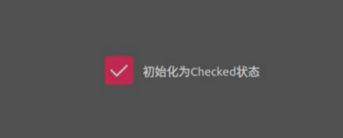
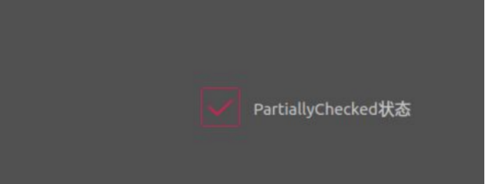
The effect of the compiler running is as follows. Click the checkBox several times to see the three state switching of qccheckbox.
When selected.
Semi selected state.
Unchecked status.

We often see this three state selection box during software installation. If the program we design has multiple options, we can also design this selection box.
5, QCommandLinkButton
1. Introduction to control
The Chinese name of QCommandLinkButton control is "command link button". QCommandLinkButton inherits QPushButton. Similar to RadioButton, CommandLinkButton controls are used to select one of the mutually exclusive options. On the surface, it is the same as the plane button, but in addition to the text description text on the normal button, the CommandLinkButton will also carry an arrow icon by default, indicating that pressing the button will open another window or page.
2. Usage examples
Example 08_qcommandlinkbutton link window (difficulty: simple).
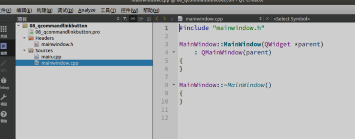
Using a QCommandLinkButton, click to open the system window. Do not check "Generate form" in the new routine, and inherit QMainWindow class by default. Project creation completed
See the figure below.
In the header file "mainwindow.h", the specific code is as follows.
1 #ifndef MAINWINDOW_H
2 #define MAINWINDOW_H
3
4 #include <QMainWindow>
5 /* Introducing QComboBox */
6 #include <QComboBox>
7
8 class MainWindow : public QMainWindow
9 {
10 Q_OBJECT
11
12 public:
13 MainWindow(QWidget *parent = nullptr);
14 ~MainWindow();
15
16 private:
17 /* Declare a QComboBox object */
18 QComboBox *comboBox;
19
20 private slots:
21 /* Declare the slot function of the QComboBox object */
22 void comboBoxIndexChanged(int);
23
24 };
25 #endif // MAINWINDOW_H
On line 21, declare a QComboBox object.
In the source file "mainwindow.cpp", the specific code is as follows.
1 #include "mainwindow.h"
2 /* The desktop service is introduced to open the system folder dialog box */
3 #include <QDesktopServices>
4 /* Introduce QUrl */
5 #include <QUrl>
6
7 MainWindow::MainWindow(QWidget *parent)
8 : QMainWindow(parent)
9 {
10 /* Set the position and display size of the main form */
11 this->setGeometry(0, 0, 800, 480);
12
13 /* Instantiate object */
14 commandLinkButton = new QCommandLinkButton(
15 "open/home catalogue", "Click this button to open the calling system window/home catalogue",this);
16
17 /* Set QCommandLinkButton position and display size */
18 commandLinkButton->setGeometry(300, 200, 250, 60);
19
20 /* Signal slot connection */
21 connect(commandLinkButton, SIGNAL(clicked()), this,
22 SLOT(commandLinkButtonClicked()));
23 }
24
25 MainWindow::~MainWindow()
26 {
27 }
28
29 void MainWindow::commandLinkButtonClicked()
30 {
31 /* Call the system service to open the / home directory */
32 QDesktopServices::openUrl(QUrl("file:home/") );
33 }
In line 14, when instantiating, the prototype is qcommandlinkbutton:: qcommandlinkbutton (const qstring & text,
const QString &description, QWidget *parent = nullptr).
In the source file "main.cpp", the specific code is generated when creating a new project without change.
3. Operation effect
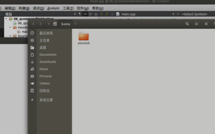
The results of program compilation and operation are as follows. Click the open / home directory button in the middle, and the results are as follows. The system pops up a window and opens it directly to the / home directory.
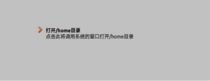
Click to open the / home directory, and the / home directory path window will pop up.
6, QDialogButtonbox
1. Introduction to control
Dialog boxes and message boxes typically present buttons in a layout that conforms to the platform's interface guidelines. Dialog boxes on different platforms always have different layouts. QDialogButtonBox allows developers to add buttons to it and will automatically use a layout suitable for the user's desktop environment. In other words, we can use the built-in dialog buttons of the system or define the dialog buttons ourselves. QDialogButtonBox has the following common buttons. For more, please refer to the Qt help document.
button_Box = new QDialogButtonBox(QDialogButtonBox::Ok
| QDialogButtonBox::Cancel
| QDialogButtonBox::Open
| QDialogButtonBox::Save
| QDialogButtonBox::Close
| QDialogButtonBox::Discard
| QDialogButtonBox::Apply
| QDialogButtonBox::Reset
| QDialogButtonBox::RestoreDefaults
| QDialogButtonBox::Help
| QDialogButtonBox::SaveAll);
2. Usage examples
Example 09_qdialogbuttonbox, customize the buttons in QDialogButtonBox (difficulty: simple).
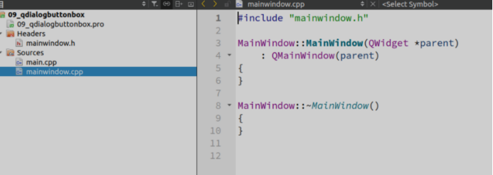
Use a QDialogButtonBox, add the buttons provided by Qt in the QDialogButtonBox, or customize the buttons. Do not check "Generate form" in the new routine, and inherit QMainWindow class by default. The new project is completed, as shown in the figure below.
In the header file "mainwindow.h", the specific code is as follows.
1 #ifndef MAINWINDOW_H
2 #define MAINWINDOW_H
3
4 #include <QMainWindow>
5 /* Introducing QDialogButtonBox */
6 #include <QDialogButtonBox>
7 /* Introducing QPuhsButton */
8 #include <QPushButton>
9
10 class MainWindow : public QMainWindow
11 {
12 Q_OBJECT
13
14 public:
15 MainWindow(QWidget *parent = nullptr);
16 ~MainWindow();
17
18 private:
19 /* Declare a QDialogButtonBox object */
20 QDialogButtonBox *dialogButtonBox;
21
22 /* Declare a QDialogButtonBox object */
23 QPushButton *pushButton;
24
25 private slots:
26 /* Declare the signal slot with QAbstractButton * parameter, which is used to judge which button is clicked */
27 void dialogButtonBoxClicked(QAbstractButton *);
28
29 };
30 #endif // MAINWINDOW_H
Line 18, declare a QDialogButtonBox object.
In the source file "mainwindow.cpp", the specific code is as follows.
1 #include "mainwindow.h"
2 /* Introducing QDebug */
3 #include <QDebug>
4
5 MainWindow::MainWindow(QWidget *parent)
6 : QMainWindow(parent)
7 {
8 /* Set the position and display size of the main form */
9 this->setGeometry(0, 0, 800, 480);
10
11 /* Instantiate and set the size and position of the button's box */
12 dialogButtonBox = new QDialogButtonBox(this);
13 dialogButtonBox->setGeometry(300, 200, 200, 30);
14
15 /*Use Qt's Cancel button*/
16 dialogButtonBox->addButton(QDialogButtonBox::Cancel);
17
18 /*Set the English "Cancel" button to Chinese "Cancel" */
19 dialogButtonBox->button(QDialogButtonBox::Cancel)->setText("cancel
");
20
21 /* Set position and size */
22 pushButton = new QPushButton(tr("custom"));
23
24 /* Add pushButton to dialogButtonBox and set ButtonRole to ActionRole
*/
25 dialogButtonBox->addButton(pushButton,
QDialogButtonBox::ActionRole);
26
27 /* The signal slot is connected with the parameter QAbstractButton *, which is used to judge which key the user clicks */
28 connect(dialogButtonBox, SIGNAL(clicked(QAbstractButton * )),
29 this, SLOT(dialogButtonBoxClicked(QAbstractButton *)));
30 }
31
32 MainWindow::~MainWindow()
33 {
34 }
35
36 void MainWindow::dialogButtonBoxClicked(QAbstractButton *button)
37 {
38 /* Judge whether the clicked object is QDialogButtonBox::Cancel */
39 if(button == dialogButtonBox->button(QDialogButtonBox::Cancel)) {
40 /* Print "cancel clicked" */
41 qDebug() <<"The cancel key was clicked"<<endl;
42 /* Judge whether the clicked object is a pushButton */
43 }else if(button == pushButton) {
44 /* Print "custom key clicked" */
45 qDebug() <<"The custom key was clicked"<<endl;
46 }
47 }
In line 16, when instantiating, the prototype is void QDialogButtonBox::addButton(QAbstractButton *button,
QDialogButtonBox::ButtonRole role).
On lines 41 and 45, we use qdebug () for the first time. Qt debugging is usually printed with qDebug(). This is basically the same as the cout function of C + +. It's just that Qt is customized as qdebug ().
In the source file "main.cpp", the specific code is generated when creating a new project without change.
3. Operation effect
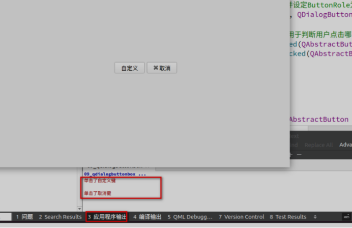
The results of program compilation and operation are as follows. Click the Customize button and cancel button to see the corresponding click event in the application output window.