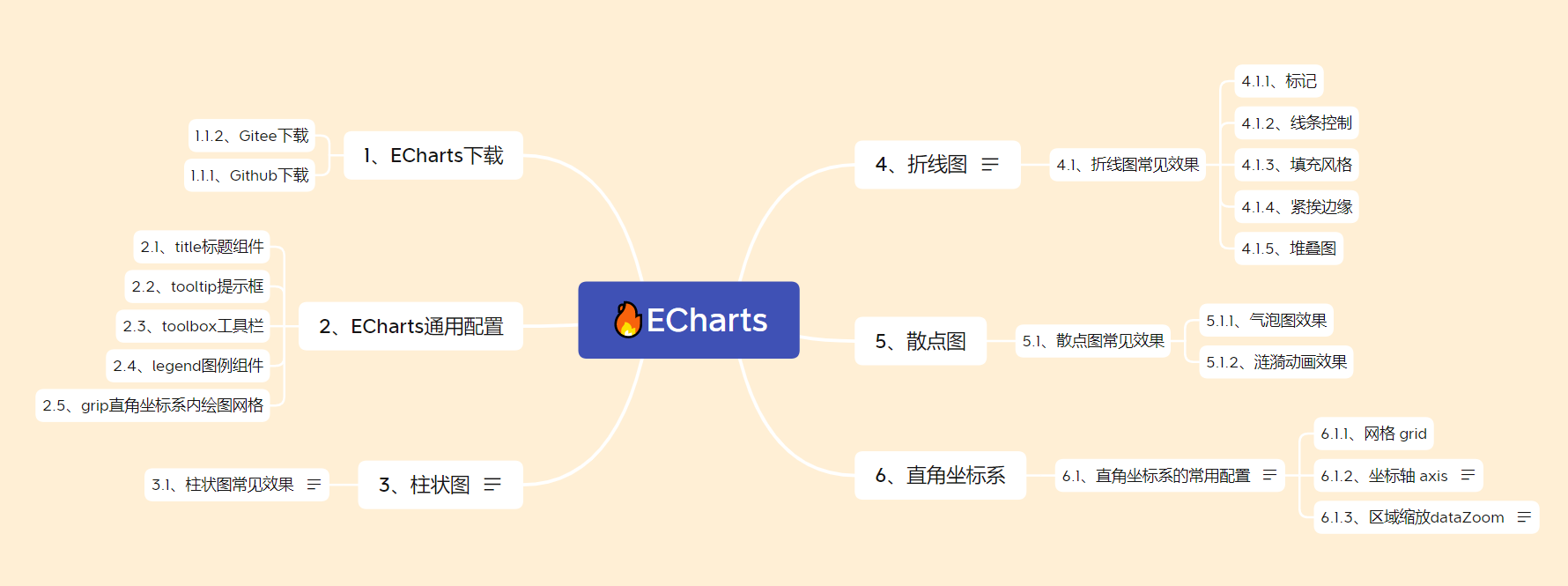
✍ Catalog brain map
- The official documents explain in detail, but they are also cumbersome. This article aims to record the usage and points for attention of common styles
- Reference video:
1,ECharts
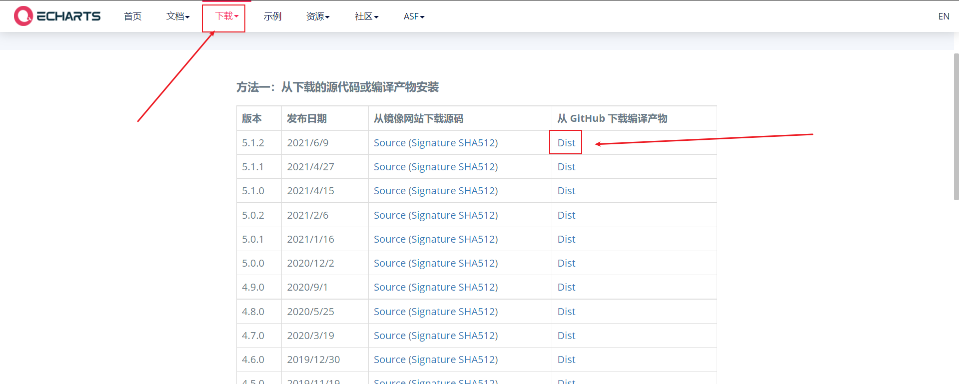
1.1. Ecarts Download
1.1. 1. Github Download
- Download and introduce eckarts js file (the icon depends on this js Library)
Chinese official website: https://echarts.apache.org/zh/index.html
1.1. 2. Gitee Download
- If Github can't get in, we can also go to gitee to download: https://gitee.com/echarts
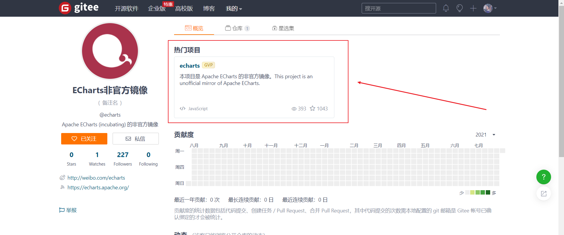
- I'm here at 5.0 Take version 1 as an example
-
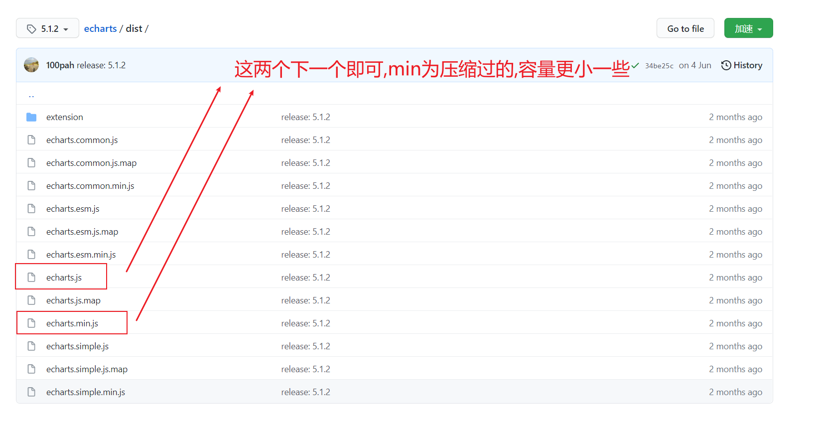
We can click clone / download and download zip
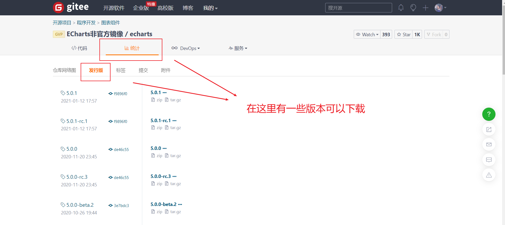
-
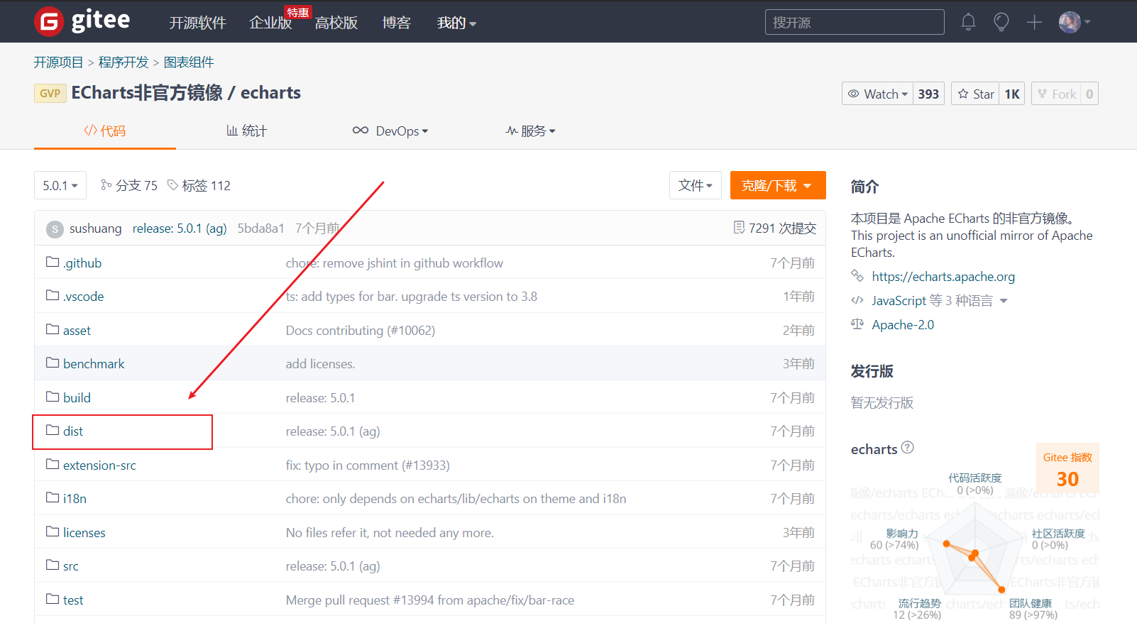
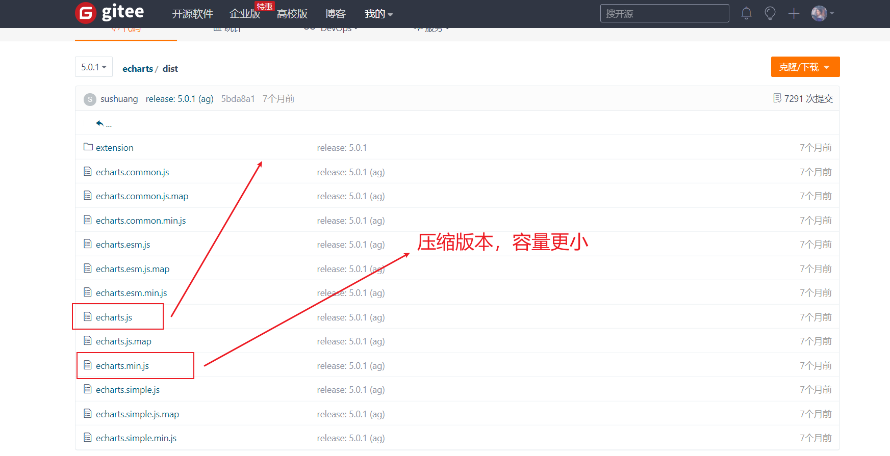
After downloading, unzip the file and find the echorts.com file in the dist folder Copy min.js to our own project structure
-
Then use the script tag to import
1.2 use of ECharts
- Prepare a DOM container with size (the generated icon will be put into this container)
- Initialize the ecarts instance object (instantiate the ecarts object)
- Specify fit item and data (option)
- Set the configuration item to the ecarts instance object
<!DOCTYPE html>
<html lang="en">

<head>
    <meta charset="UTF-8">
    <meta http-equiv="X-UA-Compatible" content="IE=edge">
    <meta name="viewport" content="width=device-width, initial-scale=1.0">
    <script src="../js/echarts.min.js"></script>
    <title>Document</title>
    <style>
        .box {
            width: 400px;
            height: 400px;
            background-color: pink;
        }
    </style>
</head>

<body>
    <!-- 1.Prepare a large and small DOM container -->
    <div class="box"></div>

    <script>
        // 2. Initialize the ecarts instantiation object
        var myChart = echarts.init(document.querySelector('.box'));
        // 3. Specify the configuration items and data of the chart
        var option = {
            title: {
                text: 'ECharts Getting started example'
            },
            tooltip: {},
            legend: {
                data: ['sales volume']
            },
            xAxis: {
                data: ["shirt", "cardigan", "Chiffon shirt", "trousers", "high-heeled shoes", "Socks"]
            },
            yAxis: {},
            series: [{
                name: 'sales volume',
                type: 'bar',
                data: [5, 20, 36, 10, 10, 20]
            }]
        };

        // 4. Use the configuration item and data just specified to display the chart.
        myChart.setOption(option);
    </script>
</body>

</html>
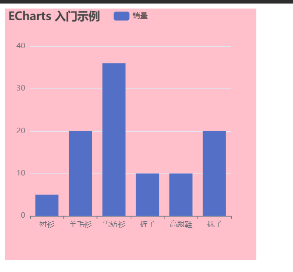
This completes our first example
1.3. Select different charts
- In addition to the column chart, we can also select other charts. The only different step is to specify the configuration items and data of the chart in step 3
- Official website - example. There are many charts in it. We just need to replace the code in step 3. The detailed process is recorded below.
2. ECharts general configuration
- Official website - Document - configuration item manual, you can view all our configurations
- And we can learn the modified code. We can enter any chart in the example to modify it
- Unified description code location
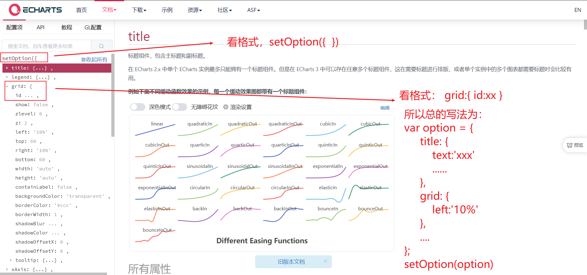
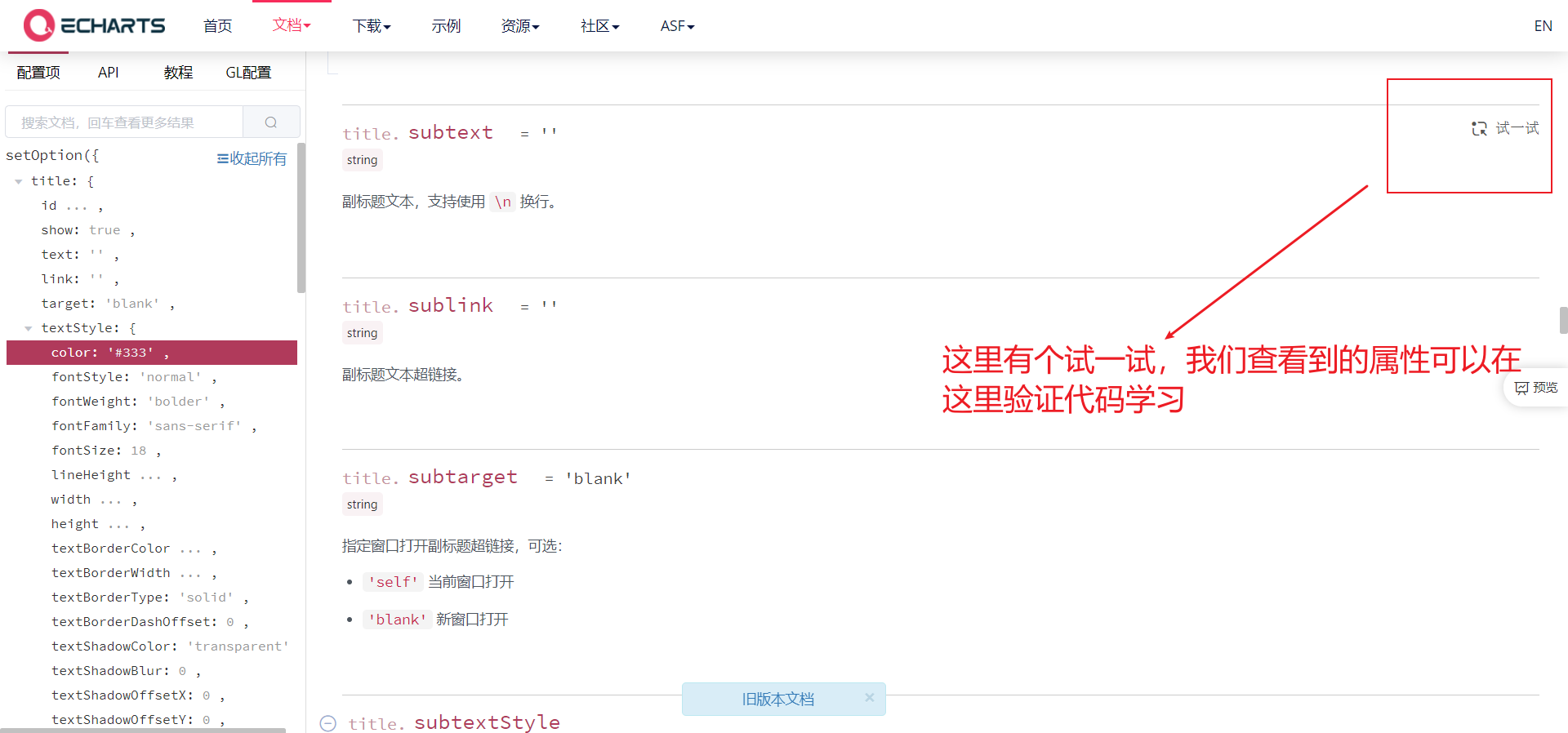
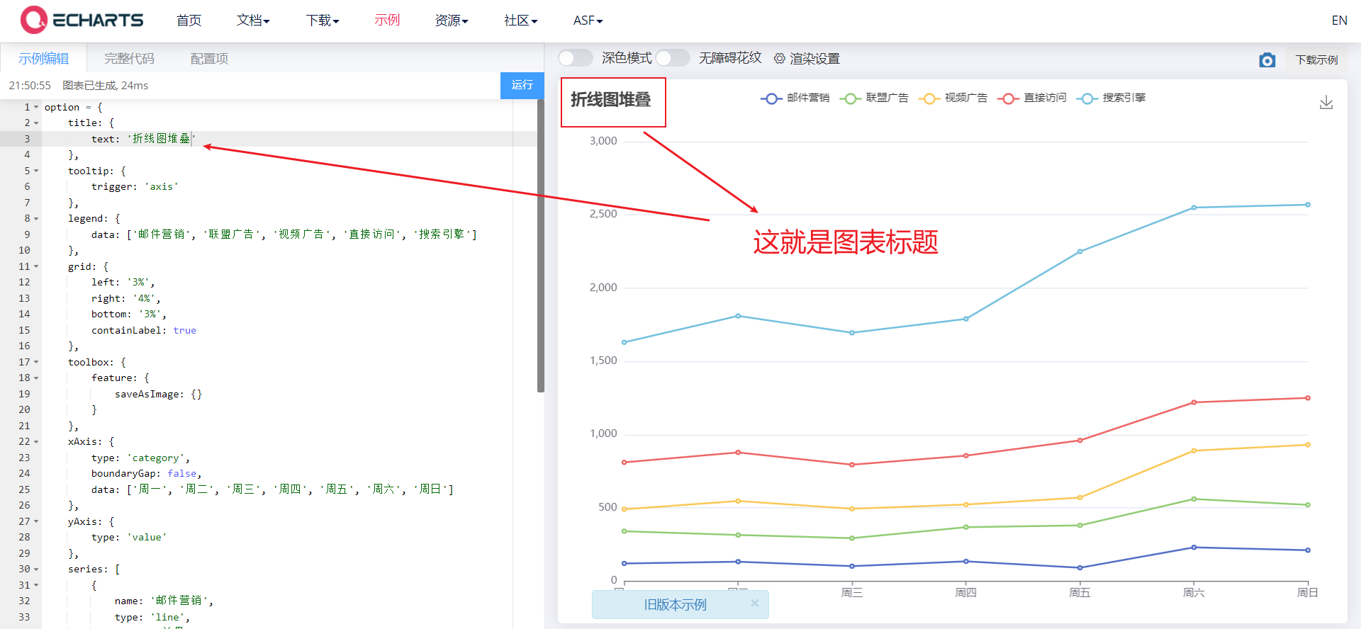
2.1 title Component
- Title component, including main title and subtitle
- Common attributes:
- Text: String type, main title text, supports line feed \ n
- textStyle: Object type, text style
- Title border
- borderWidth: type number, the border line width of the title
- borderRadius: number/Array, fillet radius
- borderColor: the border color of the title
- Title Position
- left,top,right,bottom
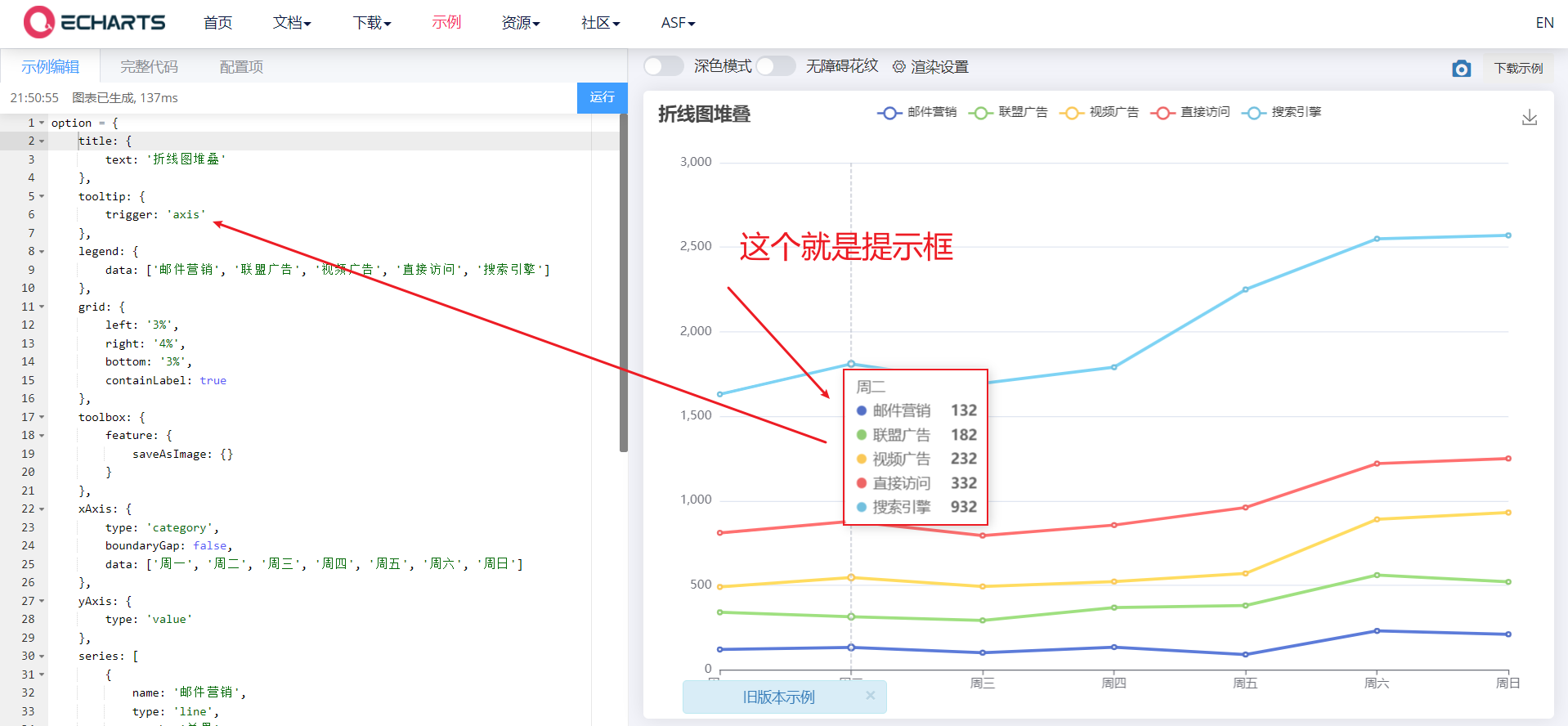
2.2 tooltip prompt box
- The prompt box component is used to configure the display box when the mouse slides over or clicks the chart
- Common attributes:
- Trigger: trigger type, type String, and the following three values are available:
- Item: data item graph trigger, which is mainly used in scatter chart, pie chart and other charts without category axis.
- Axis: coordinate axis trigger, which is mainly used in histogram, line chart and other charts that will use category axis.
- none: nothing triggers.
- Trigger on: trigger timing, type String,
- mousemove: triggered when the mouse moves
- click: triggered when the mouse clicks
- mousemove|click: triggered when the mouse moves and clicks
- Formatter: prompt box floating layer content formatter, which supports two forms: String template and callback function.
- Official documents: https://echarts.apache.org/zh/option.html#tooltip.formatter
- Trigger: trigger type, type String, and the following three values are available:
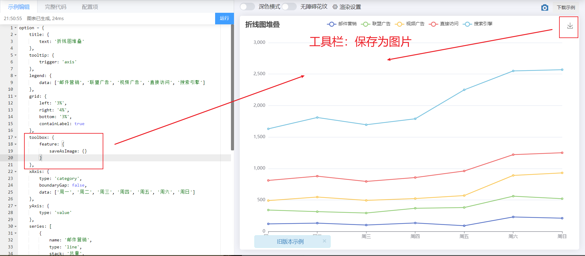
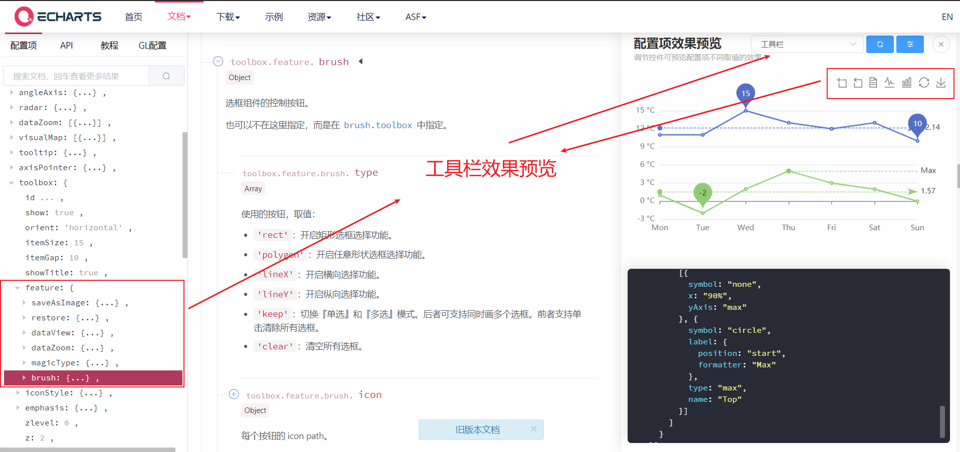
2.3 toolbar
- Toolbar. Built in Export picture,Data view,Dynamic type switching,Data area scaling,Reset Five tools.
- Common attributes are as follows:
- feature, the objects in it can be selected as follows
- saveAsImage {}: save as picture
- Restore {}: configuration item restore
- dataView {}: a data view tool, which can display the data used by the current chart and can be dynamically updated after editing.
- dataZoom {}: data area zoom. At present, only the scaling of rectangular coordinate system is supported.
- magicType {}: dynamic type switching
- feature, the objects in it can be selected as follows
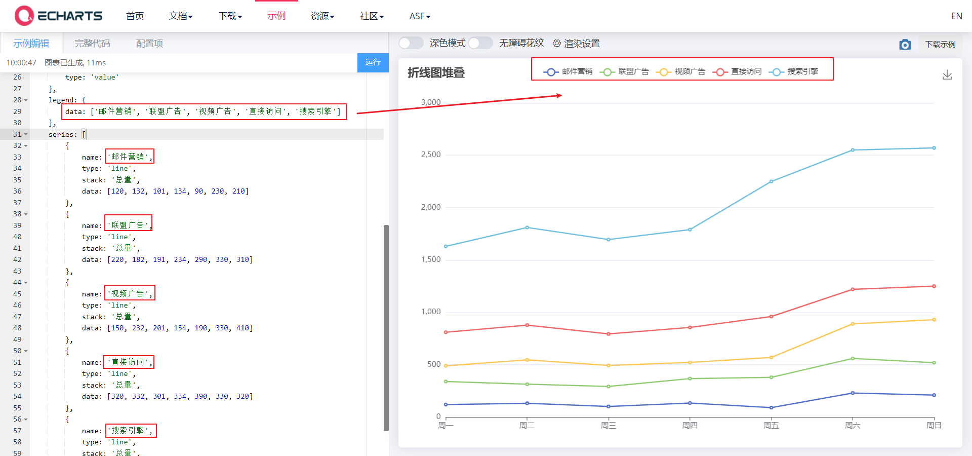
2.4 legend component
- Legend component, used to filter series, needs to be used with series
- Common attributes:
- Data: the data array of the legend, which is an array.
- The value of data in legend must be consistent with the name value of a group of data in the series array.
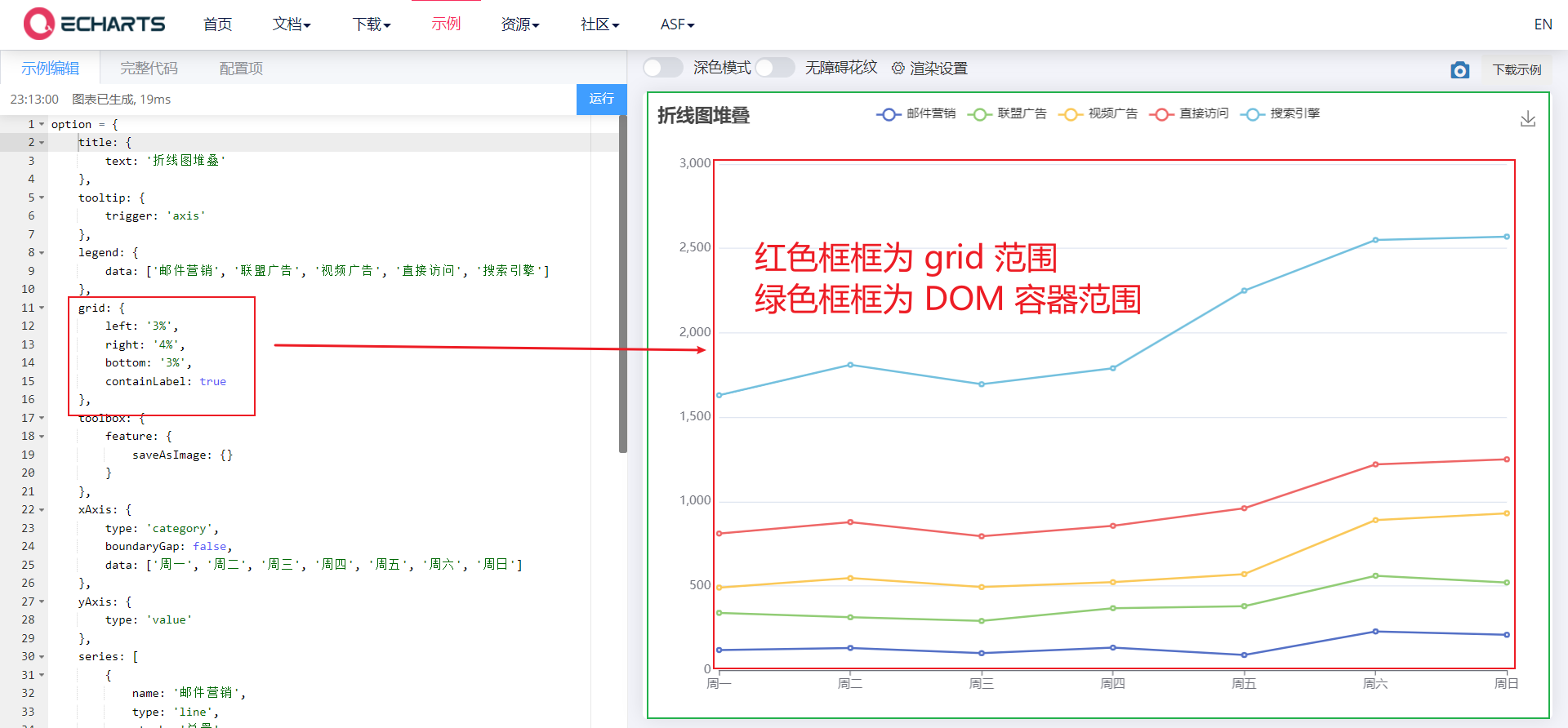
2.5 drawing grid in grid rectangular coordinate system
-
For the drawing grid in the rectangular coordinate system, the upper and lower X axes and the left and right Y axes can be placed in a single grid. You can draw line chart, column chart and scatter chart on the grid
-
Common attributes: https://echarts.apache.org/zh/option.html#grid
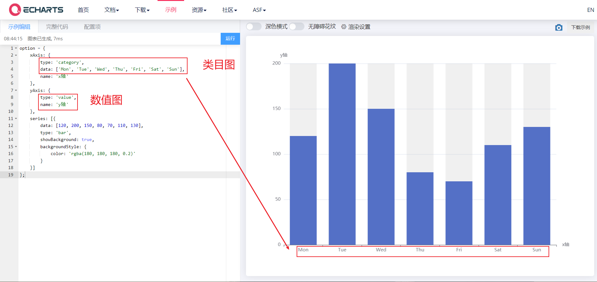
2.5. 1. xAxis and yAxis
-
Official documents: https://echarts.apache.org/zh/option.html#xAxis
-
xAxis is the x axis in the rectangular coordinate system grid, and yAxis is the y axis in the rectangular coordinate system grid
-
Its common attributes are as follows:
- Type: type String, indicating the coordinate axis type. The optional values are as follows:
- Value: value axis, applicable to continuous data
- Category: category axis, applicable to discrete category data. When this type is selected, category data can be automatically retrieved from series.data or dataset.source Medium, or through yAxis.data Set category data.
- Time: time axis, applicable to continuous time series data
- log: for the number axis, it is applicable to logarithmic data
- Name: type String, name of coordinate axis
- Type: type String, indicating the coordinate axis type. The optional values are as follows:
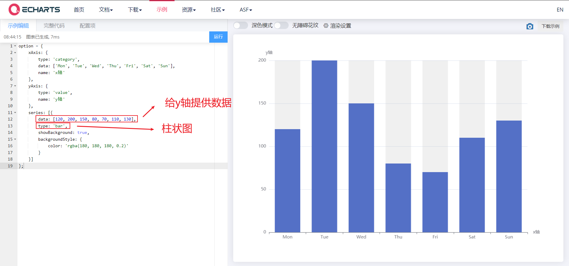
2.5.2,series
-
Official documents: https://echarts.apache.org/zh/option.html#series
-
Series list. Each series determines its own chart type by type, and can provide data for the y-axis
-
Its common attributes are as follows:
- data: https://echarts.apache.org/zh/option.html#series-line.data
- Type: determine your chart type by type
3. Histogram
<body>
    <!-- 1.Prepare a large and small DOM container -->
    <div style="width: 600px;height: 400px"></div>

    <script>
        // 2. Initialize the ecarts instantiation object
        var myChart = echarts.init(document.querySelector('div'));
        // 3. Specify the configuration items and data of the chart

        var xDataArr = ['Zhang San','Li Si','Wang Wu','Intercalated soil','Xiao Ming','Moutai','mushroom-shaped umbrella','Wang fried',];
        var yDataArr = [88,92,63,77,94,80,72,86];
        var option = {
          xAxis: {
              type: 'category',
              data: xDataArr,
          },
          yAxis: {
              type: 'value',
          },
          series: [
            {
                name: 'language',
                type: 'bar',
                data: yDataArr,
            }
        ],
        };

        // 4. Use the configuration item and data just specified to display the chart.
        myChart.setOption(option);
    </script>
</body>
3.1 common effects of histogram
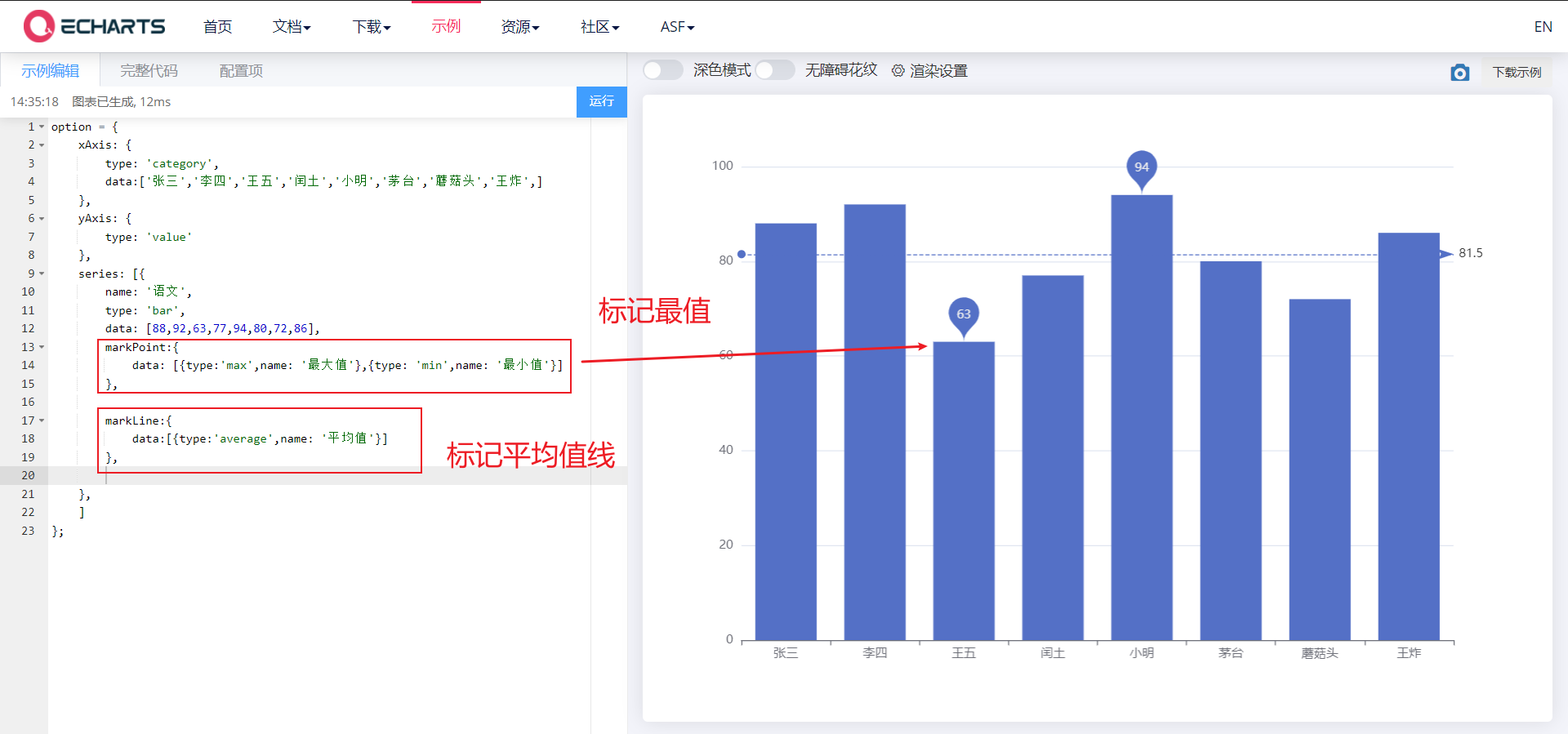
3.1. 1. Mark
- Marking: maximum, minimum, average
- markPoint,markLine,
<body>
    <!-- 1.Prepare a large and small DOM container -->
    <div style="width: 600px;height: 400px"></div>

    <script>
        // 2. Initialize the ecarts instantiation object
        var myChart = echarts.init(document.querySelector('div'));
        // 3. Specify the configuration items and data of the chart

        var xDataArr = ['Zhang San','Li Si','Wang Wu','Intercalated soil','Xiao Ming','Moutai','mushroom-shaped umbrella','Wang fried',];
        var yDataArr = [88,92,63,77,94,80,72,86];
        var option = {
          xAxis: {
              type: 'category',
              data: xDataArr,
          },
          yAxis: {
              type: 'value',
          },
          series: [
            {
                name: 'language',
                type: 'bar',
                markPoint: {
                    data: [{type: 'max',name: 'Maximum'},{type: 'min',name: 'minimum value'}]
                },
                markLine : {
                    data: [{type: 'average',name: 'average value'}]
                },
                data: yDataArr,
            }
        ],
        };

        // 4. Use the configuration item and data just specified to display the chart.
        myChart.setOption(option);
    </script>
</body>
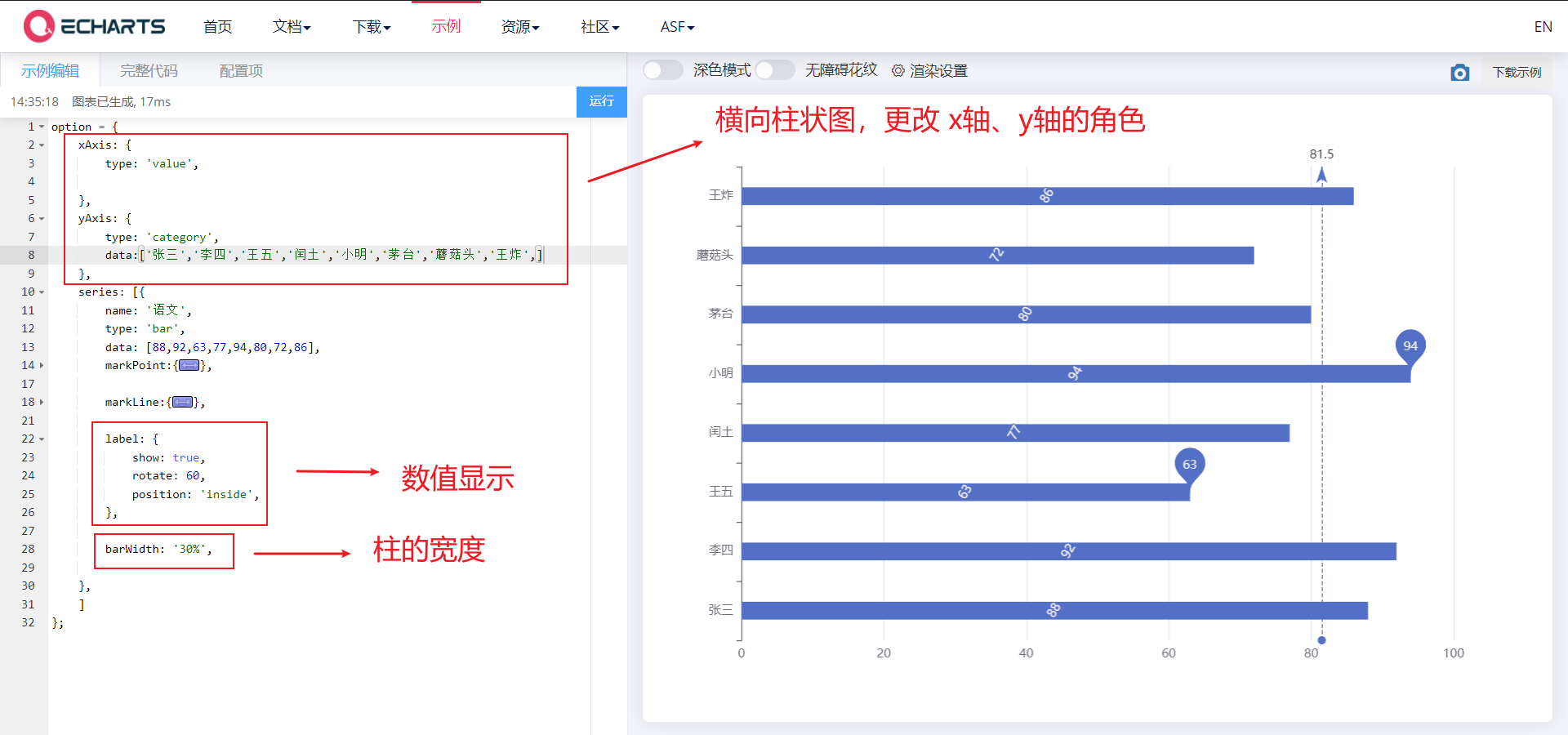
3.1. 2. Show
- Display: numerical display, column width, horizontal histogram
- label, barWidth, changing the role of the x-axis and y-axis
<body>
    <!-- 1.Prepare a large and small DOM container -->
    <div style="width: 600px;height: 400px"></div>

    <script>
        // 2. Initialize the ecarts instantiation object
        var myChart = echarts.init(document.querySelector('div'));
        // 3. Specify the configuration items and data of the chart

        var xDataArr = ['Zhang San','Li Si','Wang Wu','Intercalated soil','Xiao Ming','Moutai','mushroom-shaped umbrella','Wang fried',];
        var yDataArr = [88,92,63,77,94,80,72,86];
        // Transverse histogram
        var option = {
          xAxis: {
              type: 'value',

          },
          yAxis: {
              type: 'category',
              data: xDataArr,
          },
          series: [
            {
                name: 'language',
                type: 'bar',
                markPoint: {
                    data: [{type: 'max',name: 'Maximum'},{type: 'min',name: 'minimum value'}]
                },
                markLine : {
                    data: [{type: 'average',name: 'average value'}]
                },
                // Numerical display
                label: {
                    show: true,
                    rotate: 60,     //Rotate 60 °
                    position: 'inside',
                },
                // Column width
                barWidth: '30%',

                data: yDataArr,
            }
        ],
        };

        // 4. Use the configuration item and data just specified to display the chart.
        myChart.setOption(option);
    </script>
</body>
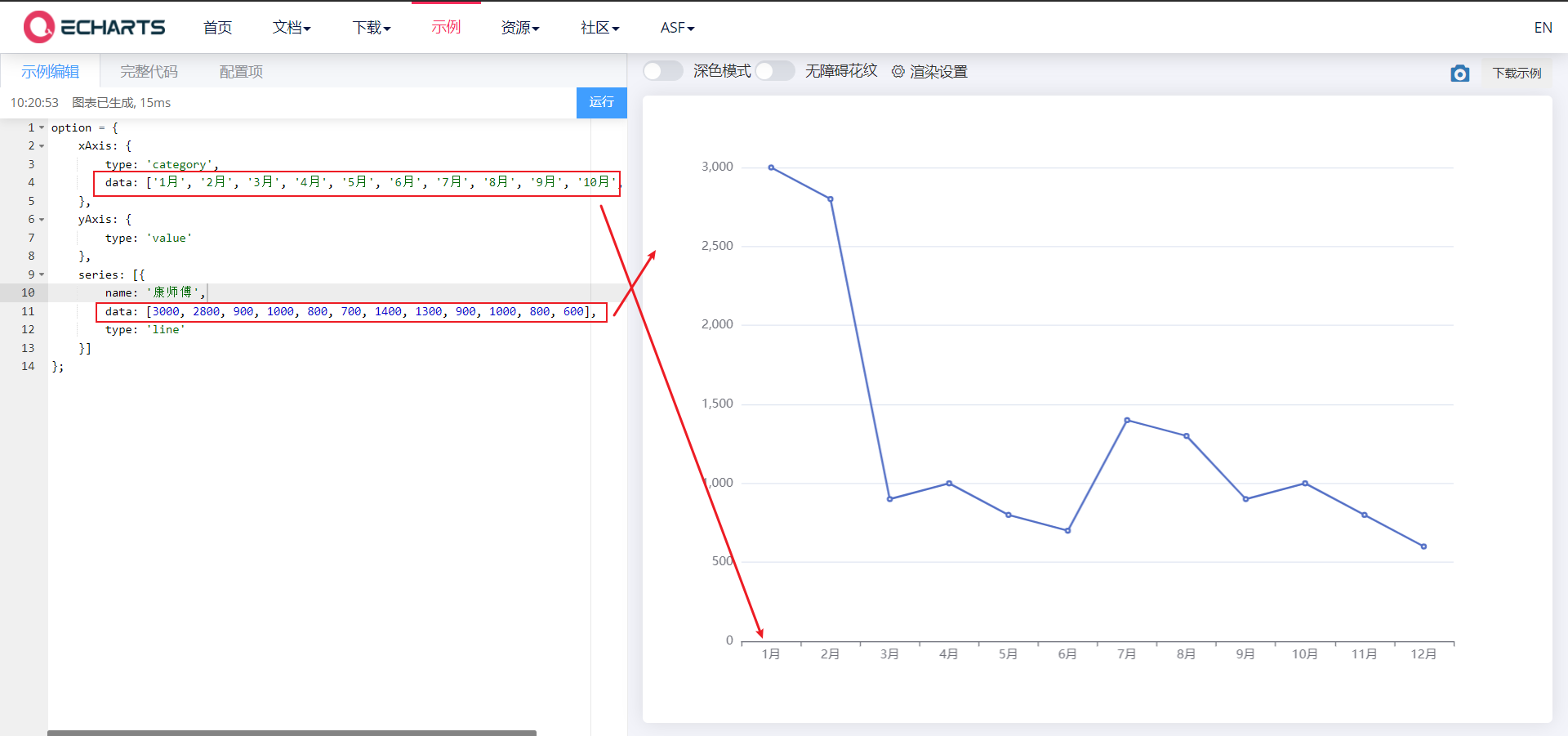
4. Line chart
<body>
    <!-- 1.Prepare a large and small DOM container -->
    <div style="width: 600px;height: 400px"></div>

    <script>
        // 2. Initialize the ecarts instantiation object
        var myChart = echarts.init(document.querySelector('div'));
        // 3. Specify the configuration items and data of the chart
        var xDataArr = ['1 month', '2 month', '3 month', '4 month', '5 month', '6 month', '7 month', '8 month', '9 month', '10 month', '11 month', '12 month'];
        var yDataArr = [3000, 2800, 900, 1000, 800, 700, 1400, 1300, 900, 1000, 800, 600];
        var option = {
            xAxis: {
                type: 'category',
                data: xDataArr
            },
            yAxis: {
                type: 'value'
            },
            series: [{
                name: 'a brand of instant noodles',
                data: yDataArr,
                type: 'line'
            }]
        };

        // 4. Use the configuration item and data just specified to display the chart.
        myChart.setOption(option);
    </script>
</body>
4.1 common effects of line chart
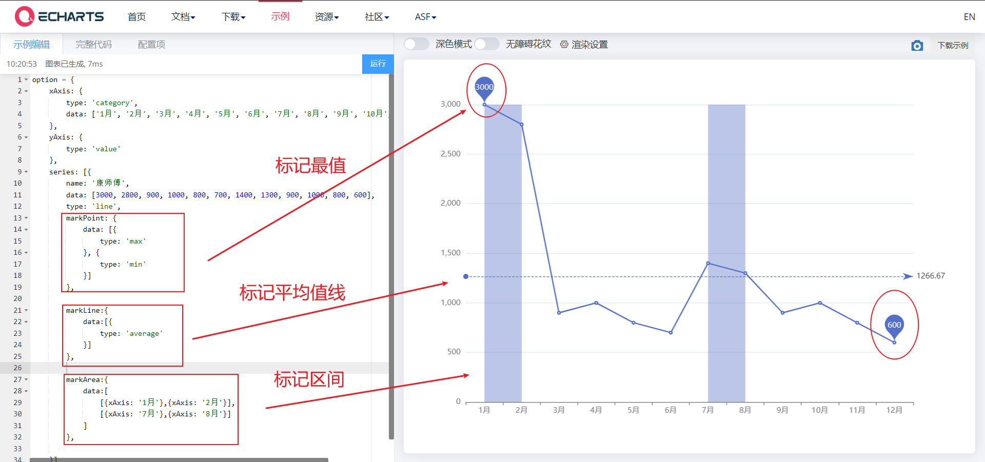
4.1. 1. Mark
- Mark the maximum value, minimum value, average value and marked interval
- markPoint,markLine,markArea
<body>
    <!-- 1.Prepare a large and small DOM container -->
    <div style="width: 600px;height: 400px"></div>

    <script>
        // 2. Initialize the ecarts instantiation object
        var myChart = echarts.init(document.querySelector('div'));
        // 3. Specify the configuration items and data of the chart
        var xDataArr = ['1 month', '2 month', '3 month', '4 month', '5 month', '6 month', '7 month', '8 month', '9 month', '10 month', '11 month', '12 month'];
        var yDataArr = [3000, 2800, 900, 1000, 800, 700, 1400, 1300, 900, 1000, 800, 600];
        var option = {
            xAxis: {
                type: 'category',
                data: xDataArr
            },
            yAxis: {
                type: 'value'
            },
            series: [{
                name: 'a brand of instant noodles',
                data: yDataArr,
                type: 'line',
                // Mark maximum value
                markPoint: {
                    data: [{
                        type: 'max'
                    }, {
                        type: 'min'
                    }]
                },
                // Mark average line
                markLine: {
                    data: [{
                        type: 'average'
                    }]
                },
                // Marker interval
                markArea:{
                    data:[
                        [{xAxis: '1 month'},{xAxis: '2 month'}],
                        [{xAxis: '7 month'},{xAxis: '8 month'}]
                    ]
                },

            }]
        };

        // 4. Use the configuration item and data just specified to display the chart.
        myChart.setOption(option);
    </script>
</body>
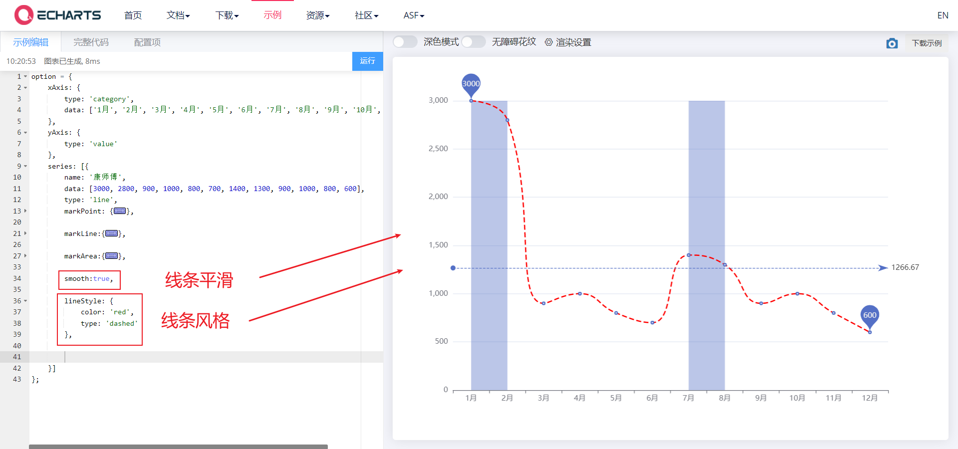
4.1. 2. Line control
- Line control: smoothing style
- smooth,lineStyle
<body>
    <!-- 1.Prepare a large and small DOM container -->
    <div style="width: 600px;height: 400px"></div>

    <script>
        // 2. Initialize the ecarts instantiation object
        var myChart = echarts.init(document.querySelector('div'));
        // 3. Specify the configuration items and data of the chart
        var xDataArr = ['1 month', '2 month', '3 month', '4 month', '5 month', '6 month', '7 month', '8 month', '9 month', '10 month', '11 month', '12 month'];
        var yDataArr = [3000, 2800, 900, 1000, 800, 700, 1400, 1300, 900, 1000, 800, 600];
        var option = {
            xAxis: {
                type: 'category',
                data: xDataArr
            },
            yAxis: {
                type: 'value'
            },
            series: [{
                name: 'a brand of instant noodles',
                data: yDataArr,
                type: 'line',
                markPoint: {
                    data: [{
                        type: 'max'
                    }, {
                        type: 'min'
                    }]
                },
                markLine: {
                    data: [{
                        type: 'average'
                    }]
                },
                markArea:{
                    data:[
                        [{xAxis: '1 month'},{xAxis: '2 month'}],
                        [{xAxis: '7 month'},{xAxis: '8 month'}]
                    ]
                },
                // Line smoothing
                smooth: true,
                // Line style
                lineStyle: {
                    color: 'red',
                    type: 'dashed', // dashed dotted wire solid wire
                }
            }
        ]
        };

        // 4. Use the configuration item and data just specified to display the chart.
        myChart.setOption(option);
    </script>
</body>
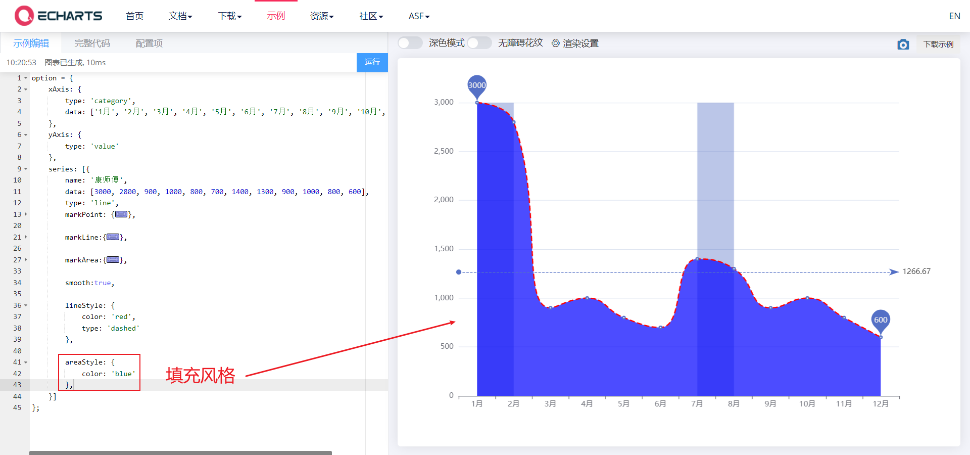
4.1. 3. Fill style
- Fill style
- areaStyle
<body>
    <!-- 1.Prepare a large and small DOM container -->
    <div style="width: 600px;height: 400px"></div>

    <script>
        // 2. Initialize the ecarts instantiation object
        var myChart = echarts.init(document.querySelector('div'));
        // 3. Specify the configuration items and data of the chart
        var xDataArr = ['1 month', '2 month', '3 month', '4 month', '5 month', '6 month', '7 month', '8 month', '9 month', '10 month', '11 month', '12 month'];
        var yDataArr = [3000, 2800, 900, 1000, 800, 700, 1400, 1300, 900, 1000, 800, 600];
        var option = {
            xAxis: {
                type: 'category',
                data: xDataArr
            },
            yAxis: {
                type: 'value'
            },
            series: [{
                name: 'a brand of instant noodles',
                data: yDataArr,
                type: 'line',
                markPoint: {
                    data: [{
                        type: 'max'
                    }, {
                        type: 'min'
                    }]
                },
                markLine: {
                    data: [{
                        type: 'average'
                    }]
                },
                markArea:{
                    data:[
                        [{xAxis: '1 month'},{xAxis: '2 month'}],
                        [{xAxis: '7 month'},{xAxis: '8 month'}]
                    ]
                },
                smooth: true,
                lineStyle: {
                    color: 'red',
                    type: 'dashed', // dashed dotted wire solid wire
                },

                areaStyle: {
                    color: 'blue'
                },
            }
        ]
        };

        // 4. Use the configuration item and data just specified to display the chart.
        myChart.setOption(option);
    </script>
</body>
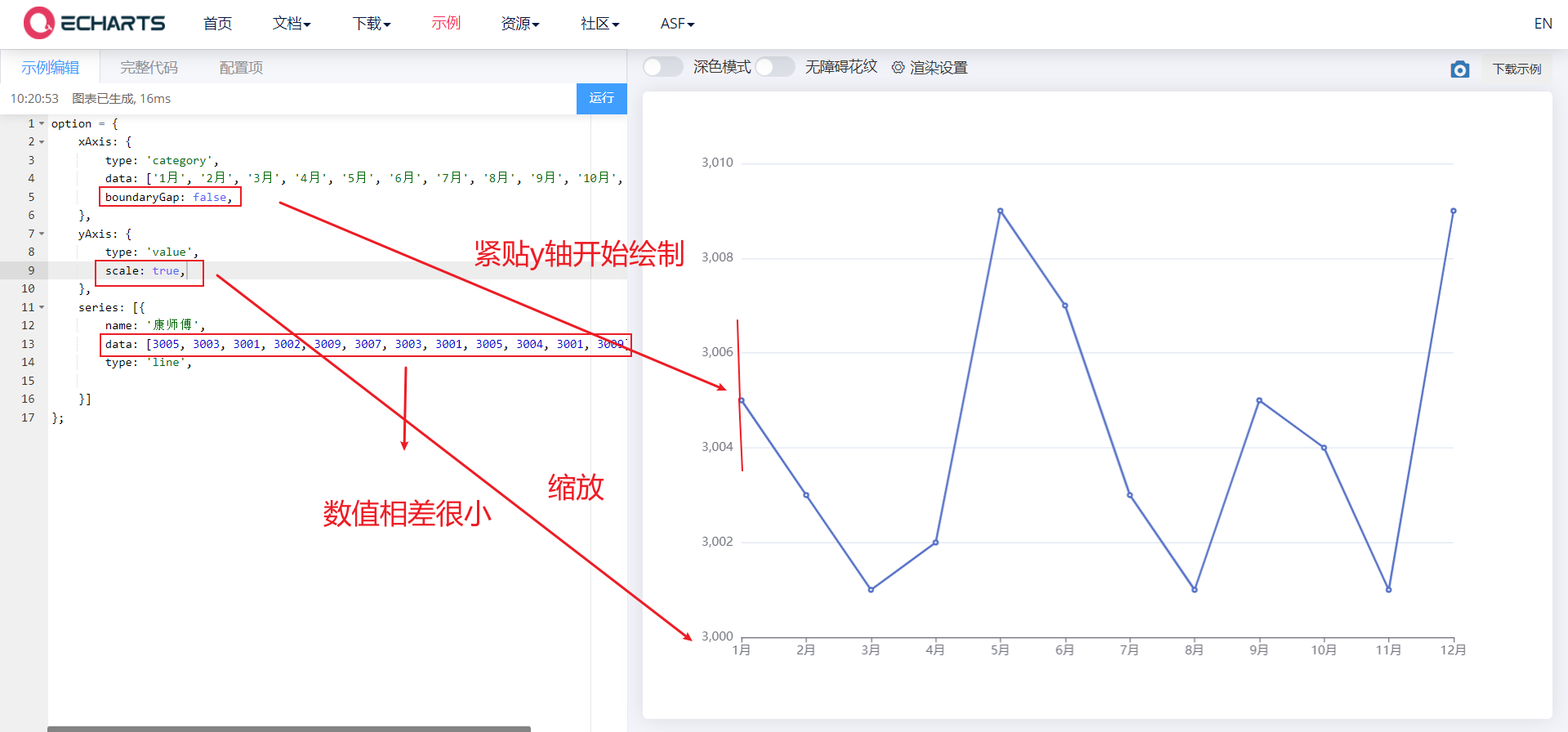
4.1. 4. Next to the edge
- Next to the edge, scale (out of scale of 0 value, that is, don't let the x and y axes start from 0)
- boundaryGap,scale
- Make the line chart close to the left y-axis and start drawing
- If our x and y axes always start from 0, the difference of elements in a column array is very small, and the broken line graph is almost a straight line
<body>
    <!-- 1.Prepare a large and small DOM container -->
    <div style="width: 600px;height: 400px"></div>

    <script>
        // 2. Initialize the ecarts instantiation object
        var myChart = echarts.init(document.querySelector('div'));
        // 3. Specify the configuration items and data of the chart
        var xDataArr = ['1 month', '2 month', '3 month', '4 month', '5 month', '6 month', '7 month', '8 month', '9 month', '10 month', '11 month', '12 month'];
        //var yDataArr = [3000, 2800, 900, 1000, 800, 700, 1400, 1300, 900, 1000, 800, 600];
        var yDataArr = [3005, 3003, 3001, 3002, 3009, 3007, 3003, 3001, 3005, 3004, 3001, 3009];

        var option = {
            xAxis: {
                type: 'category',
                data: xDataArr,
                // Next to the edge
                boundaryGap: false,
            },
            yAxis: {
                type: 'value',
                // zoom
                scale: true,
            },
            series: [{
                name: 'a brand of instant noodles',
                data: yDataArr,
                type: 'line',

            }
        ]
        };

        // 4. Use the configuration item and data just specified to display the chart.
        myChart.setOption(option);
    </script>
</body>
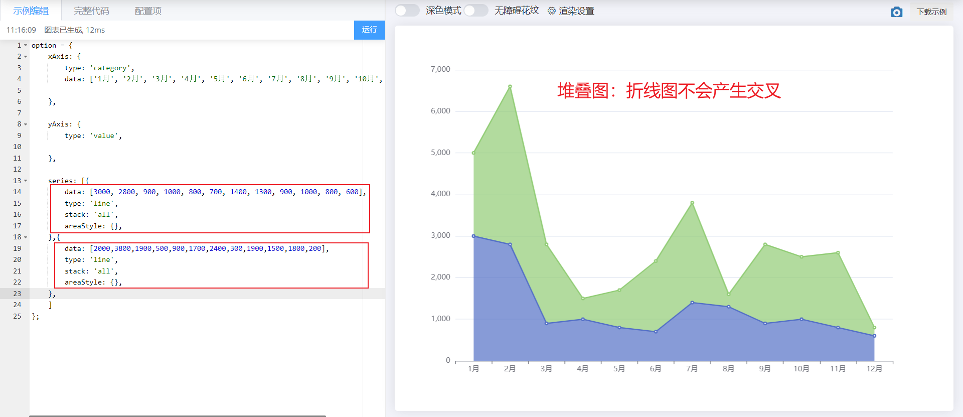
4.1. 5. Stacking diagram
- Stacking diagram
- stack
<body>
    <!-- 1.Prepare a large and small DOM container -->
    <div style="width: 600px;height: 400px"></div>

    <script>
        // 2. Initialize the ecarts instantiation object
        var myChart = echarts.init(document.querySelector('div'));
        // 3. Specify the configuration items and data of the chart
        var xDataArr = ['1 month', '2 month', '3 month', '4 month', '5 month', '6 month', '7 month', '8 month', '9 month', '10 month', '11 month', '12 month'];
        var yDataArr = [3000, 2800, 900, 1000, 800, 700, 1400, 1300, 900, 1000, 800, 600];
        var yDataArr2 = [2000,3800,1900,500,900,1700,2400,300,1900,1500,1800,200];


        var option = {
            xAxis: {
                type: 'category',
                data: xDataArr,
            },
            yAxis: {
                type: 'value',
            },

            series: [{
                data: yDataArr,
                type: 'line',
                stack: 'all',
                areaStyle: {},
            },
            {
                data: yDataArr2,
                type: 'line',
                stack: 'all',
                areaStyle: {},
            }


        ]
        };

        // 4. Use the configuration item and data just specified to display the chart.
        myChart.setOption(option);
    </script>
</body>
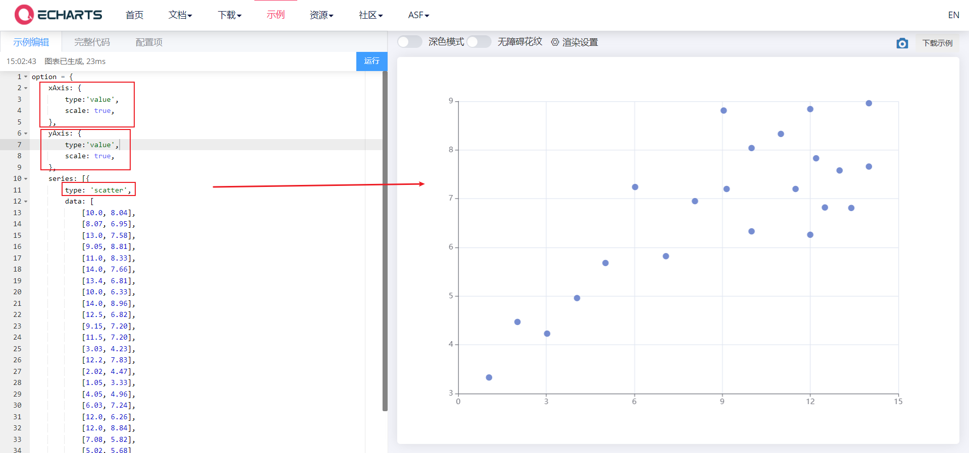
5. Scatter diagram
- X-axis data and Y-axis data: 2D arrays
- Set the type under series: scatter, xaxis and yAxis should be set to value
- Adjust: set the coordinate axes to scale away from the 0 value, scale
<body>
    <!-- 1.Prepare a large and small DOM container -->
    <div style="width: 600px;height: 400px"></div>

    <script>
        // 2. Initialize the ecarts instantiation object
        var myChart = echarts.init(document.querySelector('div'));
        // 3. Specify the configuration items and data of the chart
        var axisData = [
            [10.0, 8.04],
            [8.07, 6.95],
            [13.0, 7.58],
            [9.05, 8.81],
            [11.0, 8.33],
            [14.0, 7.66],
            [13.4, 6.81],
            [10.0, 6.33],
            [14.0, 8.96],
            [12.5, 6.82],
            [9.15, 7.20],
            [11.5, 7.20],
            [3.03, 4.23],
            [12.2, 7.83],
            [2.02, 4.47],
            [1.05, 3.33],
            [4.05, 4.96],
            [6.03, 7.24],
            [12.0, 6.26],
            [12.0, 8.84],
            [7.08, 5.82],
            [5.02, 5.68]
        ];

        var option = {
            xAxis: {
                type: 'value',
                scale: true,
            },
            yAxis: {
                type: 'value',
                scale: true,
            },
            series: [{
                type: 'scatter',
                data: axisData,
            }]

        }

        // 4. Use the configuration item and data just specified to display the chart.
        myChart.setOption(option);
    </script>
</body>
5.1 common effects of scatter diagram
5.1. 1. Bubble chart effect
- The size and color of scatter points are different
- symbolSize ,itemStyle.color
① Different scatter sizes
<body>
    <!-- 1.Prepare a large and small DOM container -->
    <div style="width: 600px;height: 400px"></div>

    <script>
        // 2. Initialize the ecarts instantiation object
        var myChart = echarts.init(document.querySelector('div'));
        // 3. Specify the configuration items and data of the chart
        var axisData = [
            [161.2, 51.6],
            [167.5, 59.0],
            [159.5, 49.2],
            [157.0, 63.0],
            [155.8, 53.6],
            [170.0, 59.0],
            [159.1, 47.6],
            [166.0, 69.8],
            [176.2, 66.8],
            [160.2, 75.2],
            [172.5, 55.2],
            [170.9, 54.2],
            [172.9, 62.5],
            [153.4, 42.0],
            [160.0, 50.0],
            [147.2, 49.8],
            [168.2, 49.2],
            [175.0, 73.2],
            [157.0, 47.8],
            [167.6, 68.8],
            [159.5, 50.6]
        ];

        var option = {
            xAxis: {
                type: 'value',
                scale: true,
            },
            yAxis: {
                type: 'value',
                scale: true,
            },
            series: [{
                type: 'scatter',
                data: axisData,
                // symbolSize: 20
                symbolSize: function(arg) {
                    //console.log(arg);
                    var height = arg[0] / 100;
                    var weight = arg[1];
                    // bmi = weight kg / (height m * height) bmi greater than 28 represents obesity
                    var bmi = weight / (height * height)
                    if (bmi > 28) {
                        return 20;
                    } else {
                        return 5;
                    }

                },
            }]

        }

        // 4. Use the configuration item and data just specified to display the chart.
        myChart.setOption(option);
    </script>
</body>
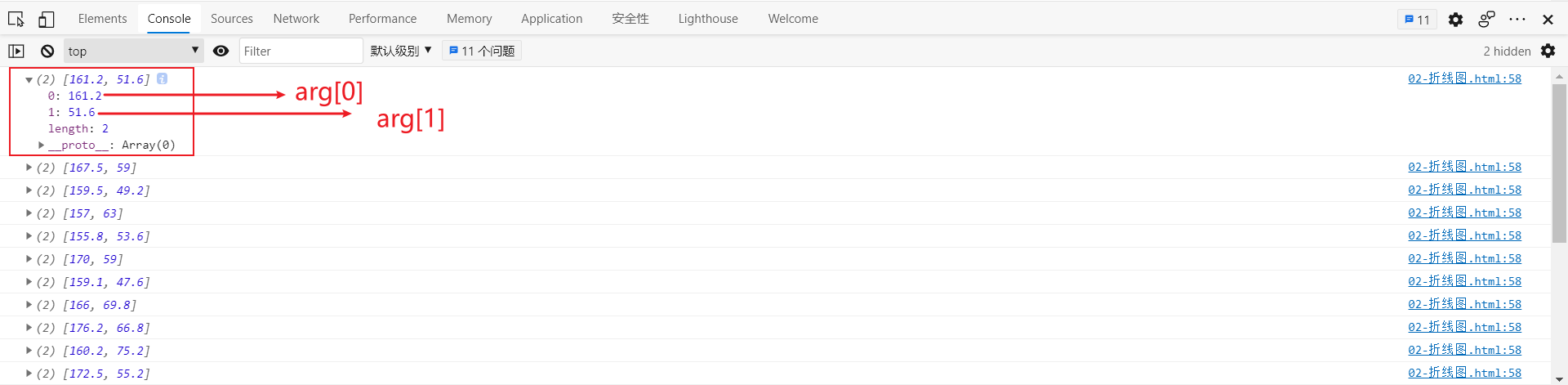
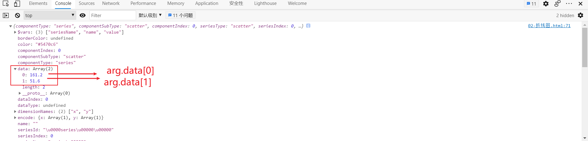
arg is as follows:
② The color of scatter points is different
<body>
    <!-- 1.Prepare a large and small DOM container -->
    <div style="width: 600px;height: 400px"></div>

    <script>
        // 2. Initialize the ecarts instantiation object
        var myChart = echarts.init(document.querySelector('div'));
        // 3. Specify the configuration items and data of the chart
        var axisData = [
            [161.2, 51.6],
            [167.5, 59.0],
            [159.5, 49.2],
            [157.0, 63.0],
            [155.8, 53.6],
            [170.0, 59.0],
            [159.1, 47.6],
            [166.0, 69.8],
            [176.2, 66.8],
            [160.2, 75.2],
            [172.5, 55.2],
            [170.9, 54.2],
            [172.9, 62.5],
            [153.4, 42.0],
            [160.0, 50.0],
            [147.2, 49.8],
            [168.2, 49.2],
            [175.0, 73.2],
            [157.0, 47.8],
            [167.6, 68.8],
            [159.5, 50.6]
        ];

        var option = {
            xAxis: {
                type: 'value',
                scale: true,
            },
            yAxis: {
                type: 'value',
                scale: true,
            },
            series: [{
                type: 'scatter',
                data: axisData,
                // Scatter size
                // symbolSize: 20
                symbolSize: function(arg) {
                    var height = arg[0] / 100;
                    var weight = arg[1];
                    // bmi = weight kg / (height m * height) bmi greater than 28 represents obesity
                    var bmi = weight / (height * height)
                    if (bmi > 28) {
                        return 20;
                    } else {
                        return 5;
                    }
                },
                // Scatter color
                itemStyle: {
                    color: function(arg) {
                        var height = arg.data[0] / 100;
                        var weight = arg.data[1];
                        // bmi = weight kg / (height m * height) bmi greater than 28 represents obesity
                        var bmi = weight / (height * height)
                        if (bmi > 23) {
                            return 'red';
                        } else {
                            return 'green';
                        }
                    }
                }
            }]
        }

        // 4. Use the configuration item and data just specified to display the chart.
        myChart.setOption(option);
    </script>
</body>
arg is an object as follows:
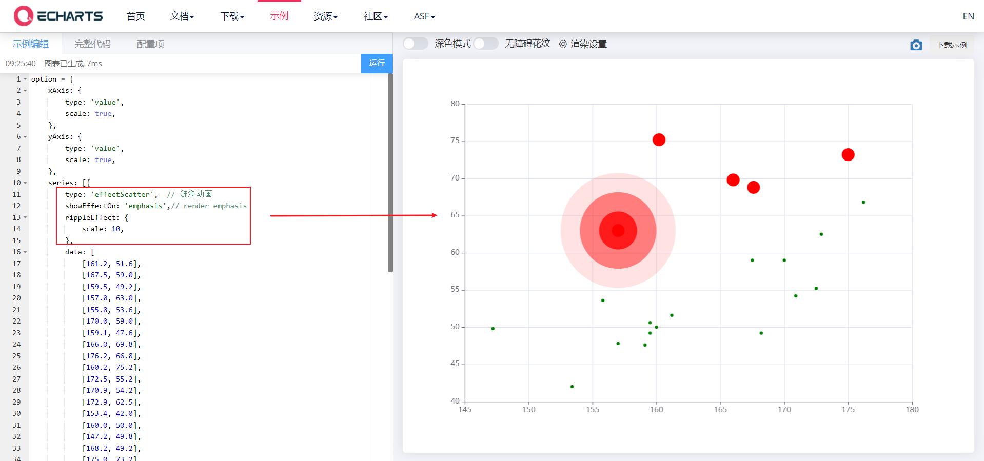
5.1. 2. Ripple animation effect
- type: effectscutter turns on the ripple animation effect
- showEffectOn: 'emphasis' controls the ripple effect when the mouse moves to a scatter point
- rippleEffect: {} controls the ripple animation range
<body>
    <!-- 1.Prepare a large and small DOM container -->
    <div style="width: 600px;height: 400px"></div>

    <script>
        // 2. Initialize the ecarts instantiation object
        var myChart = echarts.init(document.querySelector('div'));
        // 3. Specify the configuration items and data of the chart
        var axisData = [
            [161.2, 51.6],
            [167.5, 59.0],
            [159.5, 49.2],
            [157.0, 63.0],
            [155.8, 53.6],
            [170.0, 59.0],
            [159.1, 47.6],
            [166.0, 69.8],
            [176.2, 66.8],
            [160.2, 75.2],
            [172.5, 55.2],
            [170.9, 54.2],
            [172.9, 62.5],
            [153.4, 42.0],
            [160.0, 50.0],
            [147.2, 49.8],
            [168.2, 49.2],
            [175.0, 73.2],
            [157.0, 47.8],
            [167.6, 68.8],
            [159.5, 50.6]
        ];

        var option = {
            xAxis: {
                type: 'value',
                scale: true,
            },
            yAxis: {
                type: 'value',
                scale: true,
            },
            series: [{
                //type: 'scatter', / / scatter
                type: 'effectScatter',  // Ripple animation
                showEffectOn: 'emphasis',// render emphasis
                rippleEffect: {
                    scale: 5,
                },

                data: axisData,
                // symbolSize: 20
                symbolSize: function(arg) {

                    var height = arg[0] / 100;
                    var weight = arg[1];
                    // bmi = weight kg / (height m * height) bmi greater than 28 represents obesity
                    var bmi = weight / (height * height)
                    if (bmi > 28) {
                        return 20;
                    } else {
                        return 5;
                    }
                },
                itemStyle: {
                    color: function(arg) {
                        var height = arg.data[0] / 100;
                        var weight = arg.data[1];
                        // bmi = weight kg / (height m * height) bmi greater than 28 represents obesity
                        var bmi = weight / (height * height)
                        if (bmi > 23) {
                            return 'red';
                        } else {
                            return 'green';
                        }
                    }
                }
            }]
        }

        // 4. Use the configuration item and data just specified to display the chart.
        myChart.setOption(option);
    </script>
</body>
6. Rectangular coordinate system
- Rectangular coordinate system chart: histogram, broken line chart and scatter chart
6.1 common configuration of rectangular coordinate system
There are three common configurations
- grid Grid
- axis
- Area zoomdatazoom
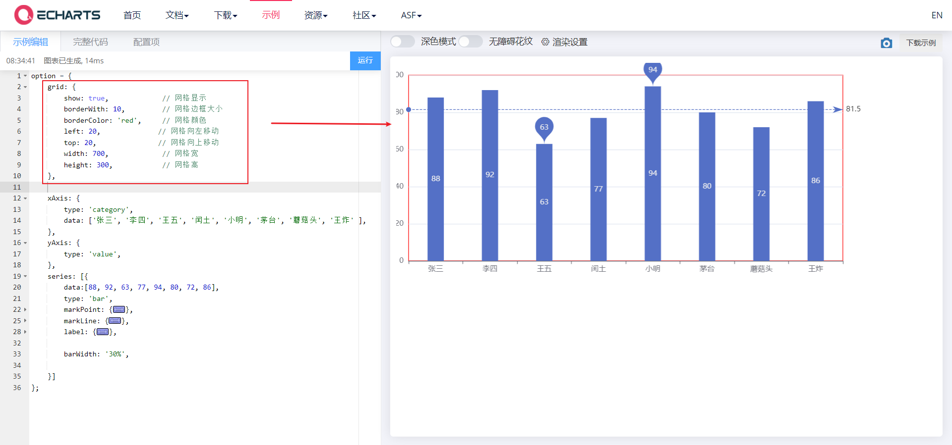
6.1. 1. grid Grid
-
Grid is used to control the layout and size of rectangular coordinate system. x-axis and y-axis are drawn on the basis of grid
-
Display grid
show
-
grid border
borderWidth,borderColor
-
Location and size of grid
left,top,right,bottom | width,height
<body>
    <!-- 1.Prepare a large and small DOM container -->
    <div style="width: 600px;height: 400px"></div>

    <script>
        // 2. Initialize the ecarts instantiation object
        var myChart = echarts.init(document.querySelector('div'));
        // 3. Specify the configuration items and data of the chart

        var xDataArr = ['Zhang San', 'Li Si', 'Wang Wu', 'Intercalated soil', 'Xiao Ming', 'Moutai', 'mushroom-shaped umbrella', 'Wang fried', ];
        var yDataArr = [88, 92, 63, 77, 94, 80, 72, 86];

        var option = {
         grid: {
            show: true,             // Grid display
            borderWith: 10,         // Grid border size
            borderColor: 'red',     // Grid color
            left: 120,              // Move grid left
            top: 120,               // Move grid up
            width: 300,             // Grid width
            height: 150,            // Grid height
       		},

            xAxis: {
                type: 'category',
                data: xDataArr,
            },
            yAxis: {
                type: 'value',

            },
            series: [{
                name: 'language',
                type: 'bar',
                data: yDataArr,
                markPoint: {
                    data: [{
                        type: 'max',
                        name: 'Maximum'
                    }, {
                        type: 'min',
                        name: 'minimum value'
                    }]
                },
                markLine: {
                    data: [{
                        type: 'average',
                        name: 'average value'
                    }]
                },
                // Numerical display
                label: {
                    show: true,
                    rotate: 60, //Rotate 60 °
                    position: 'inside',
                },
                // Column width
                barWidth: '30%',


            }],
        };

        // 4. Use the configuration item and data just specified to display the chart.
        myChart.setOption(option);
    </script>
</body>
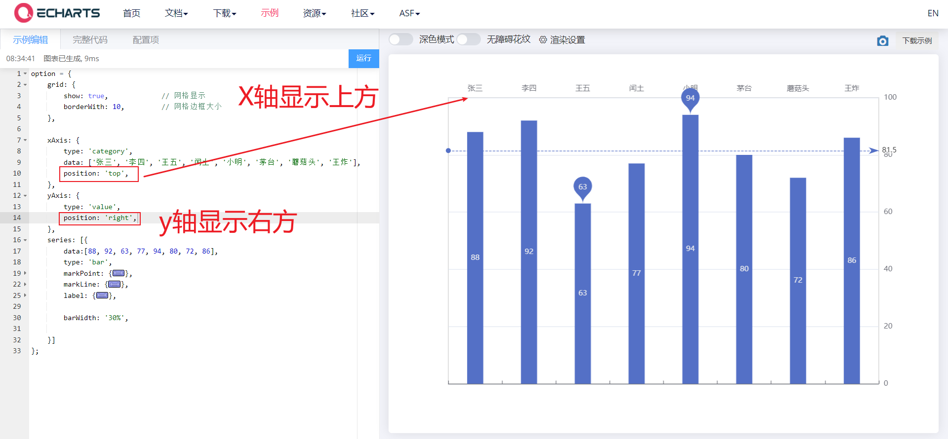
6.1. 2. axis
The coordinate axis is divided into x-axis and y-axis. There are at most two positions of x-axis and y-axis in a grid
- Axis type
- Value: the value axis will be automatically selected from the series Read data from data
- Category: category axis. This type must set category data through data
- Display position
- xAxis: the value can be top or bottom
- yAxis: can be left or right
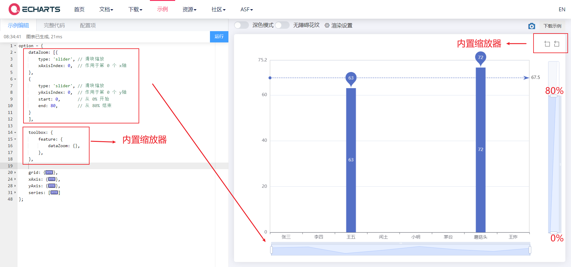
6.1. 3. Area zoomdatazoom
dataZoom is used for area scaling and data range filtering. Both x-axis and y-axis can be used
dataZoom is an array, which means that multiple area scalers can be configured
- Type type
- Slider: slider
- inside: built in, zoom by mouse wheel or two fingers
- Indicates the active axis
- xAxisIndex: set which x-axis is controlled by the scaling component. Generally, write 0
- yAxisIndex: set which y-axis is controlled by the scaling component. Generally, write 0
- Indicates the scaling of the initial state
- start: the starting percentage of the data window range
- End: the end percentage of the data window range
<body>
    <!-- 1.Prepare a large and small DOM container -->
    <div style="width: 600px;height: 400px"></div>

    <script>
        // 2. Initialize the ecarts instantiation object
        var myChart = echarts.init(document.querySelector('div'));
        // 3. Specify the configuration items and data of the chart

        var xDataArr = ['Zhang San', 'Li Si', 'Wang Wu', 'Intercalated soil', 'Xiao Ming', 'Moutai', 'mushroom-shaped umbrella', 'Wang fried', ];
        var yDataArr = [88, 92, 63, 77, 94, 80, 72, 86];

        var option = {
            dataZoom: [
                {
                    // type: 'slider', / / slider scaling
                    type: 'inside',     // Mouse Wheel Zoom
                    xAxisIndex: 0,      // Acting on the 0th x-axis
                },
                {
                    type: 'inside',
                    yAxisIndex: 0,      // Acting on the 0th y-axis
                    start: 0,
                    end: 60,
                }
            ],
            toolbox: {
                feature: {
                    // The built-in area scaler needs to be opened before customizing the area scaler
                    dataZoom: {},
                }
            },
            grid: {
                show: true,             // Grid display
                borderWith: 10,         // Grid border size
            },
            xAxis: {
                type: 'category',
                data: xDataArr,
                position: 'top',
            },
            yAxis: {
                type: 'value',
                position: 'right',
            },
            series: [{
                name: 'language',
                type: 'bar',
                data: yDataArr,
                markPoint: {
                    data: [{
                        type: 'max',
                        name: 'Maximum'
                    }, {
                        type: 'min',
                        name: 'minimum value'
                    }]
                },
                markLine: {
                    data: [{
                        type: 'average',
                        name: 'average value'
                    }]
                },
                // Numerical display
                label: {
                    show: true,
                    rotate: 60, //Rotate 60 °
                    position: 'inside',
                },
                // Column width
                barWidth: '30%',


            }],
        };

        // 4. Use the configuration item and data just specified to display the chart.
        myChart.setOption(option);
    </script>
</body>