Recently, in the development of stock visualization cases, pyecharts visualization tools are used more, mainly the following feelings and share with you:
1. For students who have just learned visualization or data analysis, they can spend a few days to research, start faster, and have a good color match.2. Business Visualization Powerbi, Tablueau, FineBI are better than this if the company is willing to spend money.3. py echarts are still not flexible enough to make exquisite kanban, which requires some front-end capabilities.
The following describes the use of pyecharts (version 1.3.1) in conjunction with the official website, as well as the details of the process (comments in the code)
Reading Route:
- Survey
- Quick Start
- Advanced knowledge
- Save as Picture
1: Overview
Echarts is an open source data visualization by Baidu. With good interactivity and sophisticated chart design, it has been recognized by many developers.Python is an expressive language that is well suited for data processing.When data analysis encounters data visualization, pyecharts are born.
The new version series is currently in use starting with v1.0.0 and only supports Python 3.6+.The older 0.5.x series is no longer maintained.
2: Quick start
2.1 Installation
$ pip install pyecharts
Start in 2.2 5 minutes
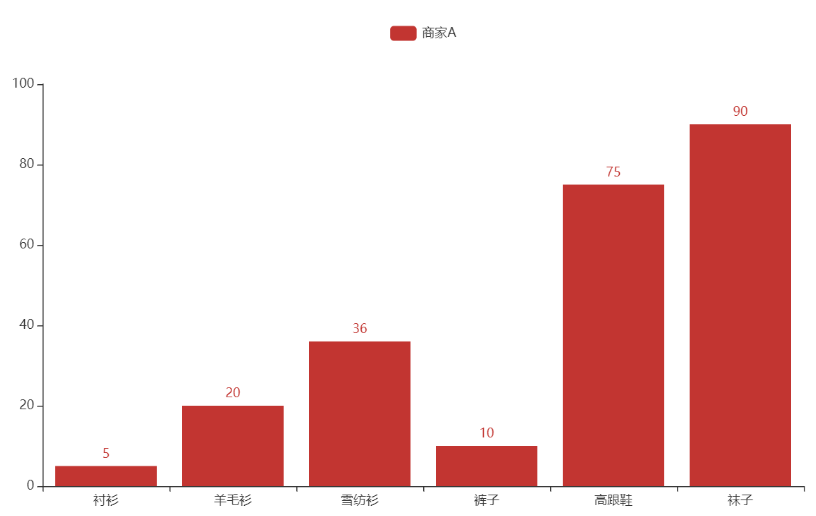
Start by drawing your first chart
from pyecharts.charts import Bar

bar = Bar()
bar.add_xaxis(["shirt", "Cardigan", "Chiffon shirt", "trousers", "High-heeled shoes", "Socks"])
bar.add_yaxis("business A", [5, 20, 36, 10, 75, 90])
# Render generates a local HTML file, which by default generates a render.html file in the current directory
# You can also pass in path parameters, such as bar.render("mycharts.html")
bar.render()
But we still use the chain method more often, as follows:
from pyecharts.charts import Bar

bar = (
    Bar()
    .add_xaxis(["shirt", "Cardigan", "Chiffon shirt", "trousers", "High-heeled shoes", "Socks"])
    .add_yaxis("business A", [5, 20, 36, 10, 75, 90])
)
bar.render()
But the pictures we see above are bare and have no title color matching. Just think about how pyecharts with js at the bottom could not have it?In fact, it is done by configuring items. Let's take a look at the following
2.3 Configuration Items
Configuration items are mainly divided into global and series configuration items. Let's first demon how to use them.
from pyecharts.charts import Bar
from pyecharts import options as opts
# Built-in theme types to see pyecharts.globals.ThemeType
from pyecharts.globals import ThemeType

bar = (
    Bar(init_opts=opts.InitOpts(theme=ThemeType.LIGHT))  #Initialize Configuration Items
    .add_xaxis(["shirt", "Cardigan", "Chiffon shirt", "trousers", "High-heeled shoes", "Socks"])
    .add_yaxis("business A", [5, 20, 36, 10, 75, 90])
    .add_yaxis("business B", [15, 6, 45, 20, 35, 66])
    .set_global_opts(title_opts=opts.TitleOpts(title="Main Title", subtitle="Subtitle"))  #Theme Configuration Items
)
bar.render()
Show the following picture: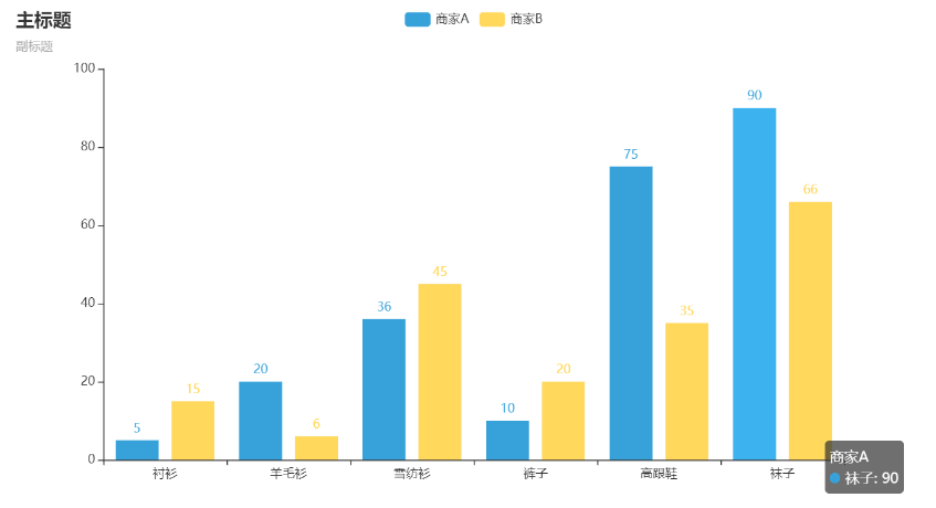
Configuration needs everyone to combine Configuration Document and Official website demon To learn, so that learning will be faster and more fun.
3. Advanced knowledge
3.1 Combinatorial Chart
What we've just seen is a graph showing one by one, so how can we combine the graphs? There are three ways to do this: Grid parallel multigraph, Page sequential multigraph, Timeline timeline rotation multigraph
3.1.1 Grid-Up and Down Layout
from example.commons import Faker #Import Case Dataset
from pyecharts import options as opts
from pyecharts.charts import Bar, Grid, Line,Scatter


def grid_vertical() -> Grid:
    bar = (
        Bar()
        .add_xaxis(Faker.choose())
        .add_yaxis("business A", Faker.values())
        .add_yaxis("business B", Faker.values())
        .set_global_opts(title_opts=opts.TitleOpts(title="Grid-Bar")) #Global Configuration--Title Configuration
    )
    line = (
        Line()
        .add_xaxis(Faker.choose())
        .add_yaxis("business A", Faker.values())
        .add_yaxis("business B", Faker.values())
        .set_global_opts(
            title_opts=opts.TitleOpts(title="Grid-Line", pos_top="48%"), #pos_top ='48%'from the top and 48% of the height of the container.
            legend_opts=opts.LegendOpts(pos_top="48%"),#Legend Configuration Items
        )
    )

    grid = (
        Grid()
        .add(bar, grid_opts=opts.GridOpts(pos_bottom="60%"))
        .add(line, grid_opts=opts.GridOpts(pos_top="60%"))
    )
    return grid
grid_vertical().render()
Show as follows: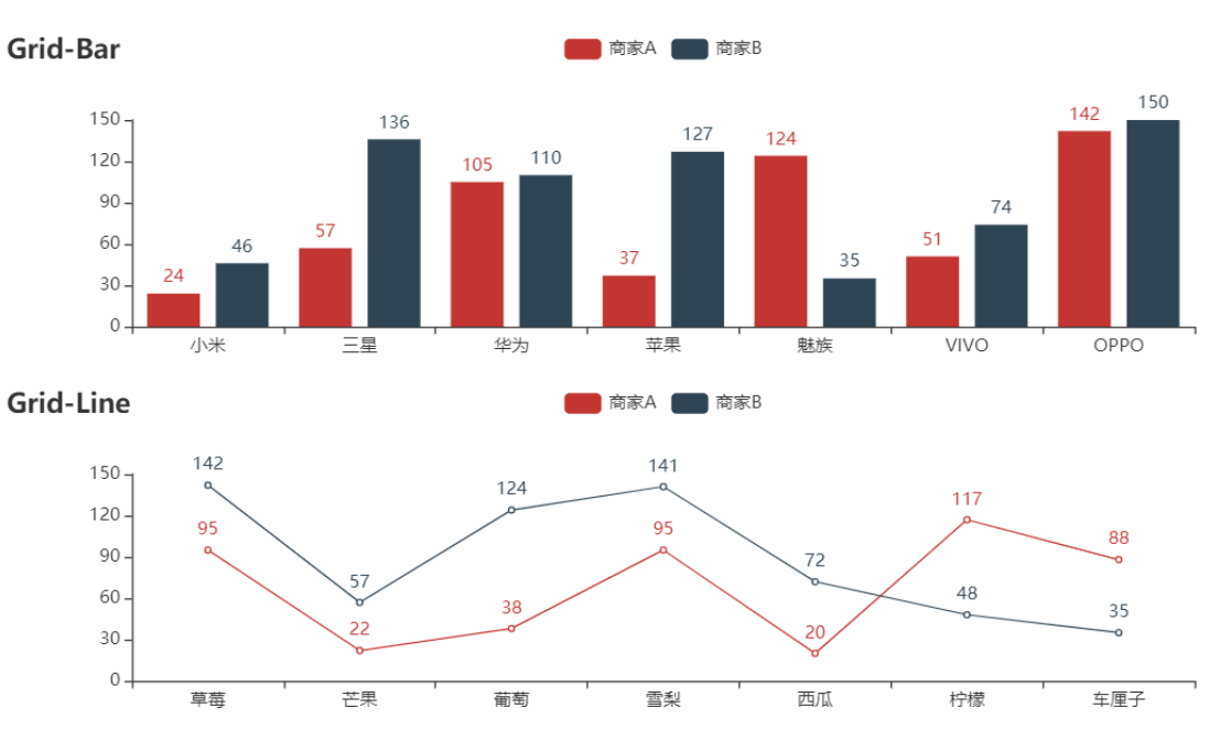
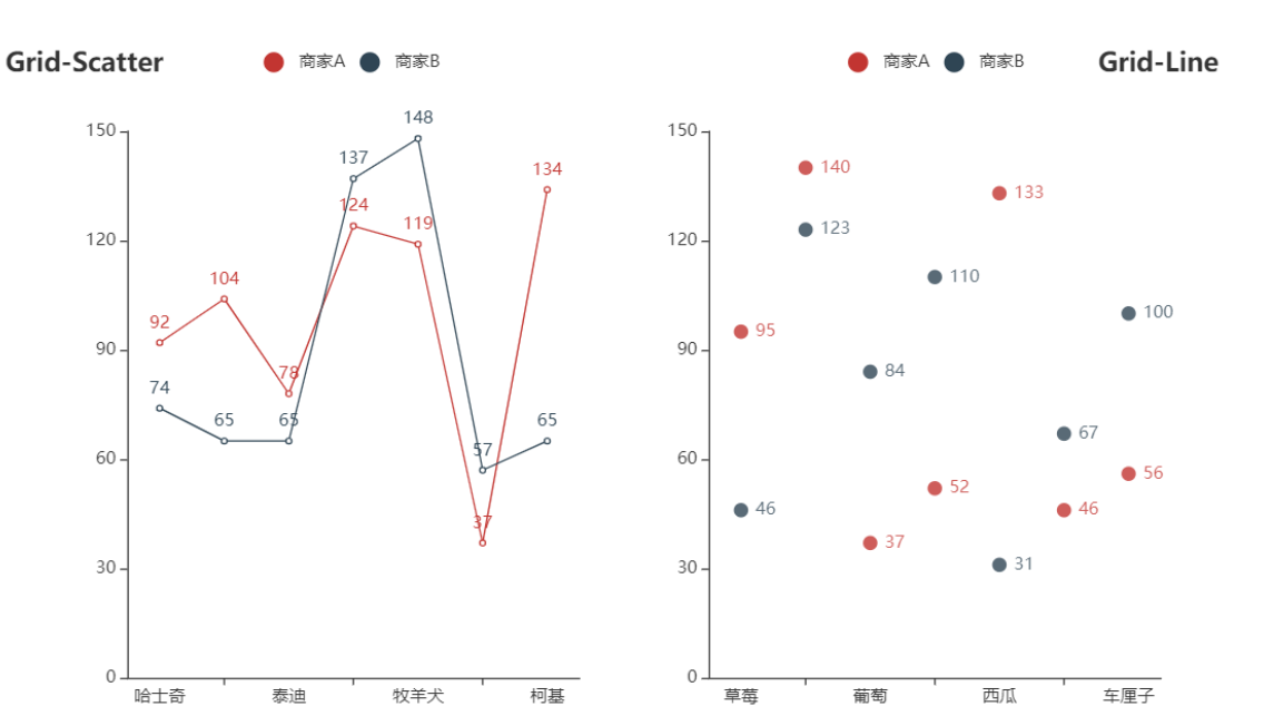
3.1.2 Grid - Left and Right Layout
from example.commons import Faker #Import Case Dataset
from pyecharts import options as opts
from pyecharts.charts import Bar, Grid, Line,Scatter
def grid_horizontal() -> Grid:
    scatter = (
        Scatter()
        .add_xaxis(Faker.choose())
        .add_yaxis("business A", Faker.values())
        .add_yaxis("business B", Faker.values())
        .set_global_opts(
            title_opts=opts.TitleOpts(title="Grid-Scatter"),
            legend_opts=opts.LegendOpts(pos_left="20%"),
        )
    )
    line = (
        Line()
        .add_xaxis(Faker.choose())
        .add_yaxis("business A", Faker.values())
        .add_yaxis("business B", Faker.values())
        .set_global_opts(
            title_opts=opts.TitleOpts(title="Grid-Line", pos_right="5%"),
            legend_opts=opts.LegendOpts(pos_right="20%"),
        )
    )

    grid = (
        Grid()
        .add(scatter, grid_opts=opts.GridOpts(pos_left="55%"))
        .add(line, grid_opts=opts.GridOpts(pos_right="55%"))
    )
    return grid
3.1.3 page sequential multigraph
def grid_mutil_yaxis() -> Grid:
x_data = ["{}month".format(i) for i in range(1, 13)]
bar = (
Bar()
.add_xaxis(x_data)
.add_yaxis(
"Evaporation",
[2.0, 4.9, 7.0, 23.2, 25.6, 76.7, 135.6, 162.2, 32.6, 20.0, 6.4, 3.3],
yaxis_index=0,
color="#d14a61",
)
.add_yaxis(
"Precipitation",
[2.6, 5.9, 9.0, 26.4, 28.7, 70.7, 175.6, 182.2, 48.7, 18.8, 6.0, 2.3],
yaxis_index=1,
color="#5793f3",
)
.extend_axis(
yaxis=opts.AxisOpts(
name="Evaporation",
type_="value",
min_=0,
max_=250,
position="right",
axisline_opts=opts.AxisLineOpts(
linestyle_opts=opts.LineStyleOpts(color="#d14a61")
),
axislabel_opts=opts.LabelOpts(formatter="{value} ml"),
)
)
.extend_axis(
yaxis=opts.AxisOpts(
type_="value",
name="temperature",
min_=0,
max_=25,
position="left",
axisline_opts=opts.AxisLineOpts(
linestyle_opts=opts.LineStyleOpts(color="#675bba")
),
axislabel_opts=opts.LabelOpts(formatter="{value} °C"),
splitline_opts=opts.SplitLineOpts(
is_show=True, linestyle_opts=opts.LineStyleOpts(opacity=1)
),
)
)
.set_global_opts(
yaxis_opts=opts.AxisOpts(
name="Precipitation",
min_=0,
max_=250,
position="right",
offset=80,
axisline_opts=opts.AxisLineOpts(
linestyle_opts=opts.LineStyleOpts(color="#5793f3")
),
axislabel_opts=opts.LabelOpts(formatter="{value} ml"),
),
title_opts=opts.TitleOpts(title="Grid-many Y Axis example"),
tooltip_opts=opts.TooltipOpts(trigger="axis", axis_pointer_type="cross"),
)
)
line = (
Line()
.add_xaxis(x_data)
.add_yaxis(
"average temperature",
[2.0, 2.2, 3.3, 4.5, 6.3, 10.2, 20.3, 23.4, 23.0, 16.5, 12.0, 6.2],
yaxis_index=2,
color="#675bba",
label_opts=opts.LabelOpts(is_show=False),
)
)
bar.overlap(line)
return Grid().add(
bar, opts.GridOpts(pos_left="5%", pos_right="20%"), is_control_axis_index=True
)
# The height/width of each chart needs to be adjusted by itself, and the display may be different on different monitors
page = Page(layout=Page.SimplePageLayout)
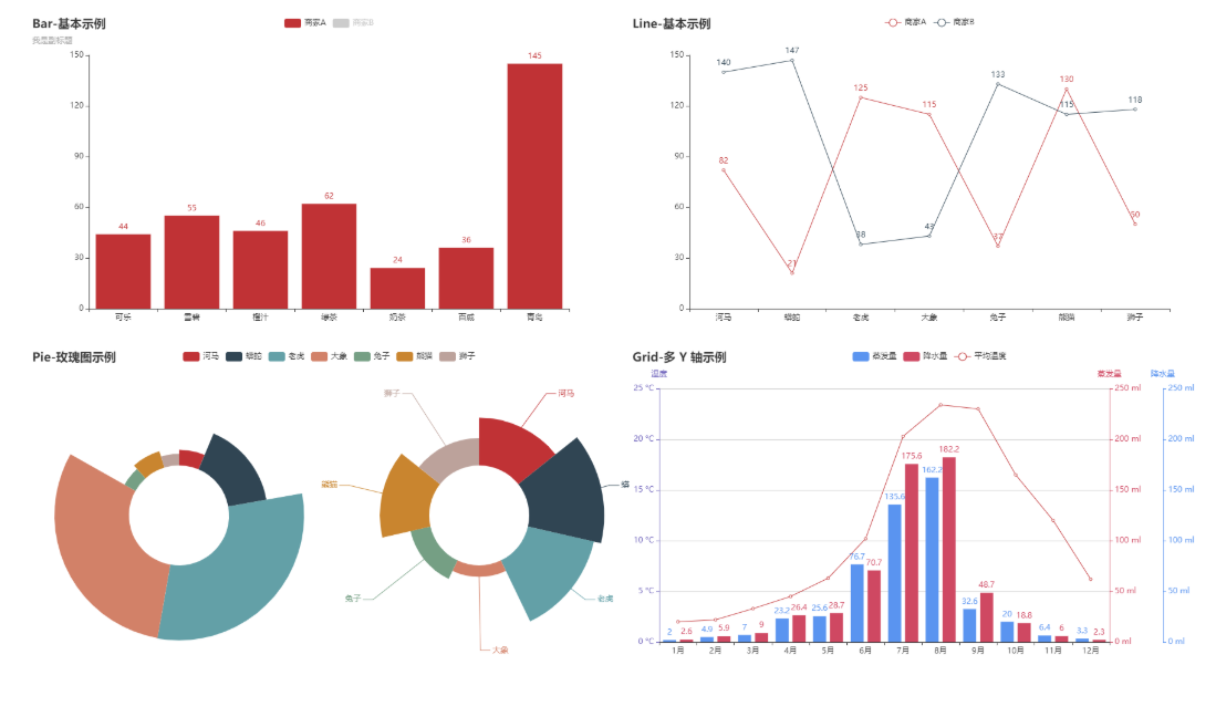
page.add(bar_datazoom_slider(), line_markpoint(), pie_rosetype(), grid_mutil_yaxis())
page.render()
3.2 Save as Picture
- Install phantomjs
Windows Download Address
Run exe file after downloading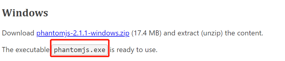
- Configuring phantomjs environment variables
- Save as Picture
After several attempts, it was found that even though phantomjs was configured, it did not work. The method used here was to save the exe file with the following script.
from pyecharts import options as opts
from pyecharts.charts import Bar
from pyecharts.render import make_snapshot

from snapshot_phantomjs import snapshot

def bar_chart() -> Bar:
    c = (
        Bar()
        .add_xaxis(["shirt", "sweater", "necktie", "trousers", "Windbreaker", "High-heeled shoes", "Socks"])
        .add_yaxis("business A", [114, 55, 27, 101, 125, 27, 105])
        .add_yaxis("business B", [57, 134, 137, 129, 145, 60, 49])
        .reversal_axis()
        .set_series_opts(label_opts=opts.LabelOpts(position="right"))
        .set_global_opts(title_opts=opts.TitleOpts(title="Bar-Test Rendered Pictures"))
    )
    return c

make_snapshot(snapshot, bar_chart().render(), "bar0.png")
Note: If you master the above content, it is not enough to develop a good visualization kanban. After that, with the improvement of stock visualization cases, it will continue to be supplemented.