This chapter is the twelfth chapter of ggplot2 scientific research drawing adjustment. Please skip the contents of the first ten chapters:
ggplot nanny tutorial - details of scientific research drawing parameter adjustment
data set
This article uses the air pollution incidence rate and mortality study (NMMAPS). In order to make the chart easy to manage, we limited the data to Chicago and 1997-2000. For more details on this dataset, see Roger Peng's book Statistical Methods in Environmental Epidemiology with R.
Use the import function in the {rio} package to import the data into our R. To access the data later, we use the assignment arrow < - to store it in a variable named chic.
library(tidyverse)
library(ggplot2)
theme_set(theme_bw())
library(rio)
chic <- import("/Users/cpf/Documents/paper/writting_blog/data/chicago-nmmaps.csv")
12. Theme setting
ggplot2 package contains several theme settings as shown in the following figure by default,
12.1 theme pack recommendation
- ggtheme
Several packages offer additional themes, and some even have different default palettes. For example, Jeffrey Arnold combines the library {ggthemes} with several custom themes that mimic popular designs. For a list, you can access ggthemes( https://github.com/jrnold/ggthemes ). You can find multiple theme styles without any coding.
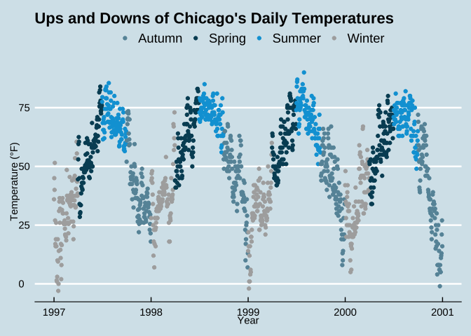
Here is how to use theme_economist() and scale_color_economist() example of copying drawing styles from The Economist magazine:
library(ggthemes)

ggplot(chic, aes(x = date, y = temp, color = season)) +
  geom_point() +
  labs(x = "Year" , y = "Temperature (°F)") +
  ggtitle("Ups and Downs of Chicago's Daily Temperatures") +
  theme_economist() +
  scale_color_economist(name = NULL)
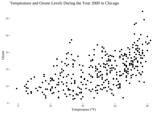
Another example is Tufte's drawing style, which is very popular because of its pure theme style.
chic_2000 <- filter(chic, year == 2000)

ggplot(chic_2000, aes(x = temp, y = o3)) +
  geom_point() +
  labs(x = "Temperature (°F)", y = "Ozone") +
  ggtitle("Temperature and Ozone Levels During the Year 2000 in Chicago") +
  theme_tufte()
- hrbrthemes
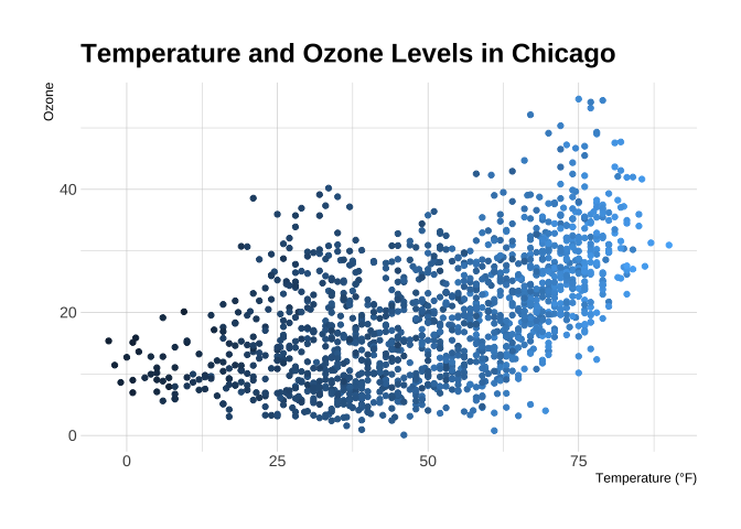
Another package with modern themes and non default font presets is the hrbrthemes package, which has several light and dark themes:
library(hrbrthemes)

ggplot(chic, aes(x = temp, y = o3)) +
  geom_point(aes(color = dewpoint), show.legend = FALSE) +
  labs(x = "Temperature (°F)", y = "Ozone") +
  ggtitle("Temperature and Ozone Levels in Chicago") +
  theme_ipsum_pub()
- ggsci
Ggsci () provides a series of high-quality color palettes inspired by colors used in scientific journals, data visualization libraries, science fiction movies and TV programs. The palette in ggsci can be used as a ggplot2 scale. For all palettes, the corresponding scale is named:
- scale_color_palname()
- scale_fill_palname()
Refer to this for details file
library(ggsci)

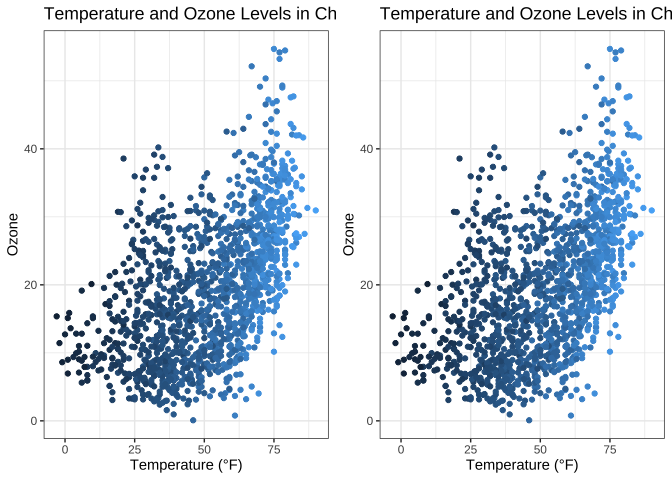
g = ggplot(chic, aes(x = temp, y = o3)) +
  geom_point(aes(color = dewpoint), show.legend = FALSE) +
  labs(x = "Temperature (°F)", y = "Ozone") +
  ggtitle("Temperature and Ozone Levels in Chicago")

library(gridExtra)

grid.arrange(g, (g+scale_fill_material()), nrow=1)
12.2 change the font of all text elements
It's easy to change the settings of all text elements at once. All topics have a name called base_family parameters:
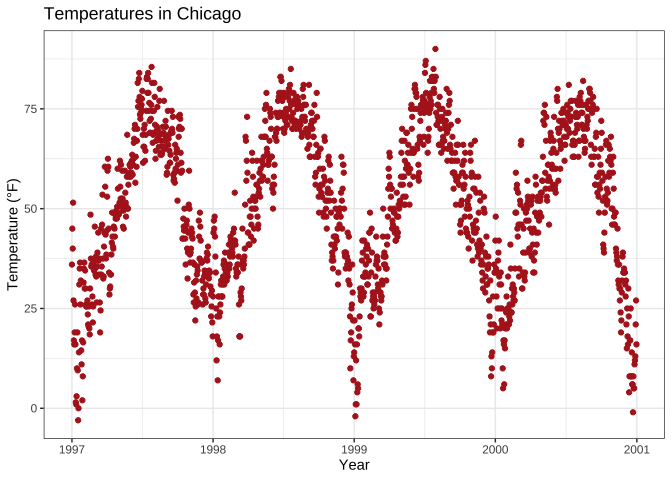
g <- ggplot(chic, aes(x = date, y = temp)) +
  geom_point(color = "firebrick") +
  labs(x = "Year", y = "Temperature (°F)",
       title = "Temperatures in Chicago")

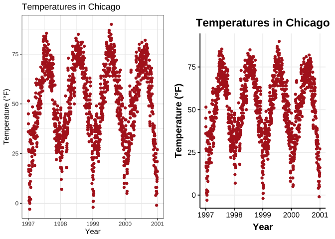
g + theme_bw(base_family = "Hack") # Note that the font here must be in your computer, otherwise an error will be reported
12.3 change the size of all text
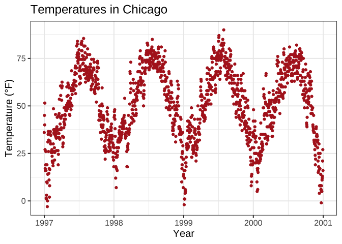
theme_\* The () function comes with several other bases_* Parameters. If you take a closer look at the default theme, you'll notice that the size of all elements is relative to base_size. Therefore, if you want to improve the readability of the drawing, you can simply change the base_size:
g + theme_bw(base_size = 15, base_family = "Hack")
12.4 change the size of all Line and Rect elements
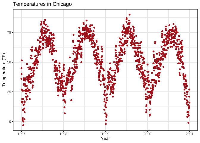
g + theme_bw(base_line_size = 1, base_rect_size = 1)
12.5 create your own theme
If you want to change the theme of the whole session, you can change it as in theme_ Use theme as in set (theme_bw())_ set. The default value is called theme_ Gray (or theme_gray). If you want to create your own custom theme, you can extract the code directly from the gray theme and modify it. Note that the rel() function changes the relative base_size.
Now, let's modify the default theme function and see the results:
theme_custom <- function (base_size = 12, base_family = "Arial") {
  half_line <- base_size/2
  theme(
    line = element_line(color = "black", size = .5,
                        linetype = 1, lineend = "butt"),
    rect = element_rect(fill = "white", color = "black",
                        size = .5, linetype = 1),
    text = element_text(family = base_family, face = "plain",
                        color = "black", size = base_size,
                        lineheight = .9, hjust = .5, vjust = .5,
                        angle = 0, margin = margin(), debug = FALSE),
    axis.line = element_blank(),
    axis.line.x = NULL,
    axis.line.y = NULL,
    axis.text = element_text(size = base_size * 1.1, color = "gray30"),
    axis.text.x = element_text(margin = margin(t = .8 * half_line/2),
                               vjust = 1),
    axis.text.x.top = element_text(margin = margin(b = .8 * half_line/2),
                                   vjust = 0),
    axis.text.y = element_text(margin = margin(r = .8 * half_line/2),
                               hjust = 1),
    axis.text.y.right = element_text(margin = margin(l = .8 * half_line/2),
                                     hjust = 0),
    axis.ticks = element_line(color = "gray30", size = .7),
    axis.ticks.length = unit(half_line / 1.5, "pt"),
    axis.ticks.length.x = NULL,
    axis.ticks.length.x.top = NULL,
    axis.ticks.length.x.bottom = NULL,
    axis.ticks.length.y = NULL,
    axis.ticks.length.y.left = NULL,
    axis.ticks.length.y.right = NULL,
    axis.title.x = element_text(margin = margin(t = half_line),
                                vjust = 1, size = base_size * 1.3,
                                face = "bold"),
    axis.title.x.top = element_text(margin = margin(b = half_line),
                                    vjust = 0),
    axis.title.y = element_text(angle = 90, vjust = 1,
                                margin = margin(r = half_line),
                                size = base_size * 1.3, face = "bold"),
    axis.title.y.right = element_text(angle = -90, vjust = 0,
                                      margin = margin(l = half_line)),
    legend.background = element_rect(color = NA),
    legend.spacing = unit(.4, "cm"),
    legend.spacing.x = NULL,
    legend.spacing.y = NULL,
    legend.margin = margin(.2, .2, .2, .2, "cm"),
    legend.key = element_rect(fill = "gray95", color = "white"),
    legend.key.size = unit(1.2, "lines"),
    legend.key.height = NULL,
    legend.key.width = NULL,
    legend.text = element_text(size = rel(.8)),
    legend.text.align = NULL,
    legend.title = element_text(hjust = 0),
    legend.title.align = NULL,
    legend.position = "right",
    legend.direction = NULL,
    legend.justification = "center",
    legend.box = NULL,
    legend.box.margin = margin(0, 0, 0, 0, "cm"),
    legend.box.background = element_blank(),
    legend.box.spacing = unit(.4, "cm"),
    panel.background = element_rect(fill = "white", color = NA),
    panel.border = element_rect(color = "gray30",
                                fill = NA, size = .7),
    panel.grid.major = element_line(color = "gray90", size = 1),
    panel.grid.minor = element_line(color = "gray90", size = .5,
                                    linetype = "dashed"),
    panel.spacing = unit(base_size, "pt"),
    panel.spacing.x = NULL,
    panel.spacing.y = NULL,
    panel.ontop = FALSE,
    strip.background = element_rect(fill = "white", color = "gray30"),
    strip.text = element_text(color = "black", size = base_size),
    strip.text.x = element_text(margin = margin(t = half_line,
                                                b = half_line)),
    strip.text.y = element_text(angle = -90,
                                margin = margin(l = half_line,
                                                r = half_line)),
    strip.text.y.left = element_text(angle = 90),
    strip.placement = "inside",
    strip.placement.x = NULL,
    strip.placement.y = NULL,
    strip.switch.pad.grid = unit(0.1, "cm"),
    strip.switch.pad.wrap = unit(0.1, "cm"),
    plot.background = element_rect(color = NA),
    plot.title = element_text(size = base_size * 1.8, hjust = .5,
                              vjust = 1, face = "bold",
                              margin = margin(b = half_line * 1.2)),
    plot.title.position = "panel",
    plot.subtitle = element_text(size = base_size * 1.3,
                                 hjust = .5, vjust = 1,
                                 margin = margin(b = half_line * .9)),
    plot.caption = element_text(size = rel(0.9), hjust = 1, vjust = 1,
                                margin = margin(t = half_line * .9)),
    plot.caption.position = "panel",
    plot.tag = element_text(size = rel(1.2), hjust = .5, vjust = .5),
    plot.tag.position = "topleft",
    plot.margin = margin(base_size, base_size, base_size, base_size),
    complete = TRUE
  )
}
View the modified aesthetics through the new look of panels and gridlines, as well as axis scales, text, and Titles:
theme_set(theme_custom())

ggplot(chic, aes(x = date, y = temp, color = season)) +
  geom_point() + labs(x = "Year", y = "Temperature (°F)") + guides(color = FALSE)
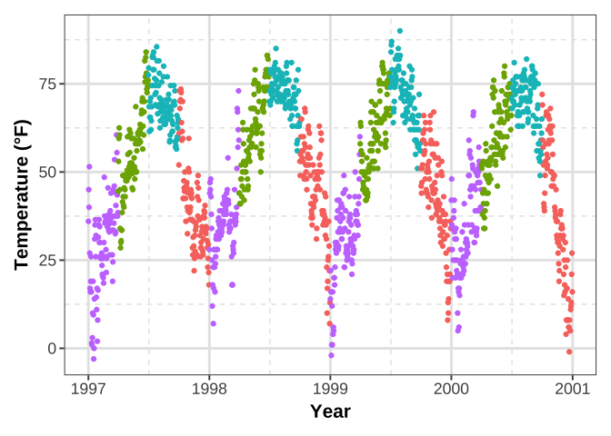
Strongly recommend this way to change the plot design! It allows you to quickly change any element of the drawing by changing it once. You can draw all results in a consistent style in seconds and adapt them to other needs (for example, presentations with larger fonts or journal requirements).
12.6 updating existing entities
theme_custom <- theme_update(panel.background = element_rect(fill = "white"),
                             panel.grid.major = element_line(size = .5),
                             panel.grid.minor = element_blank())

ggplot(chic, aes(x = date, y = temp, color = season)) +
  geom_point() + labs(x = "Year", y = "Temperature (°F)") + guides(color = FALSE)

12.7 the theme setting I use now is for your reference
theme_Publication <- function(base_size=14, base_family="Helvetica") {
      library(grid)
      library(ggthemes)
      (theme_foundation(base_size=base_size, base_family=base_family)
       + theme(plot.title = element_text(face = "bold",
                                         size = rel(1.2), hjust = 0.5),
               text = element_text(),
               panel.background = element_rect(colour = NA),
               plot.background = element_rect(colour = NA),
               panel.border = element_rect(colour = NA),
               axis.title = element_text(face = "bold",size = rel(1)),
               axis.title.y = element_text(angle=90,vjust =2),
               axis.title.x = element_text(vjust = -0.2),
               axis.text = element_text(),
               axis.line = element_line(colour="black"),
               axis.ticks = element_line(),
               panel.grid.major = element_line(colour="#f0f0f0"),
               panel.grid.minor = element_blank(),
               legend.key = element_rect(colour = NA),
               legend.position = "bottom",
               legend.direction = "horizontal",
               legend.key.size= unit(0.2, "cm"),
               legend.margin = unit(0, "cm"),
               legend.title = element_text(face="italic"),
               plot.margin=unit(c(10,5,5,5),"mm"),
               strip.background=element_rect(colour="#f0f0f0",fill="#f0f0f0"),
               strip.text = element_text(face="bold")
          ))

}

scale_fill_Publication <- function(...){
      library(scales)
      discrete_scale("fill","Publication",manual_pal(values = c("#386cb0","#fdb462","#7fc97f","#ef3b2c","#662506","#a6cee3","#fb9a99","#984ea3","#ffff33")), ...)

}

scale_colour_Publication <- function(...){
      library(scales)
      discrete_scale("colour","Publication",manual_pal(values = c("#386cb0","#fdb462","#7fc97f","#ef3b2c","#662506","#a6cee3","#fb9a99","#984ea3","#ffff33")), ...)

}

library(patchwork)

grid.arrange((g+ theme_bw()), (g + scale_colour_Publication() + theme_Publication()), nrow = 1)
