T-test is juxtaposed with f-test and chi square test, which is widely used in statistical analysis. T-test uses t-distribution theory to infer the probability of difference, so as to compare whether the difference between two averages is significant.
The following compendium briefly shares the steps of realizing T-test in R and how to display the difference visualization results.
1. Read the data file (select the two groups of data to compare: group1 and group2, and check whether there are significant differences between the two groups of data) and integrate them together;
#Read in file, merge grouping information, data rearrangement
alpha <- read.table('alpha.txt', sep = '\t', header = TRUE, stringsAsFactors = FALSE)
group  <- read.table('group.txt', sep = '\t', header = TRUE, stringsAsFactors = FALSE)
alpha <- melt(merge(alpha, group, by = 'sample'), id = c('sample', 'group'))

#View observed for group1 and group2_ Is there a significant difference in the species index
#Select groups to compare
richness_12 <- subset(alpha, variable == 'observed_species' & group %in% c('1', '2'))
richness_12$group <- factor(richness_12$group)
2. Check the data distribution, and use the qqPlot() command in R's car package to draw the QQ diagram to verify the normality of the data;
library(car)

#QQ-plot
qqPlot(lm(value~group, data = richness_12), simulate = TRUE, main = 'QQ Plot', labels = FALSE)
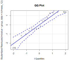
The abscissa is the standard normal distribution value and the ordinate is the value of the test data. If they are basically equal, or if all points are close to the straight line and fall within the confidence interval (the dotted line in the figure shows the 95% confidence interval by default), it indicates that the normality assumption is in good agreement.
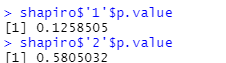
3. Carry out Shapiro Wilk test, test its residual in the regression curve, and call Shapiro in R Test() function;
##Shapiro Wilk test, if and only if both p values are greater than 0.05, it indicates that the data conforms to the normal distribution
shapiro <- tapply(richness_12$value, richness_12$group, shapiro.test)
shapiro
shapiro$'1'$p.value
shapiro$'2'$p.value
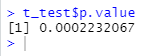
4. Conduct t-test for independent samples (compare independent samples, and the variance of the two groups of data in R is not equal by default). The original assumption is that there is no difference between the two groups. If the p value in the figure below is less than 0.05, it indicates that the original assumption is not tenable, that is, observed of group1 and group2_ There are significant differences between species indexes.
t_test <- t.test(value~group, richness_12, paired = FALSE, alternative = 'two.sided')
t_test
t_test$p.value
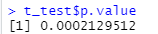
5. Conduct t-test for non independent samples (compare the non independent samples, and the variance of the two groups of data is not equal by default in R). The original assumption is that there is no difference between the two groups, and the p value is less than 0.05, which indicates that the original assumption is not tenable, that is, observed of group1 and group2_ There are significant differences between species indexes.
t_test <- t.test(value~group, richness_12, paired = TRUE, alternative = 'two.sided')
t_test
t_test$p.value
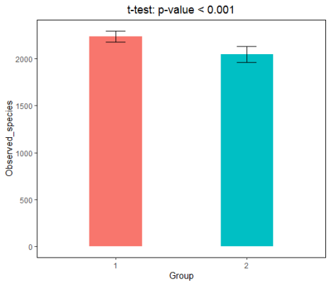
6. Draw a histogram with ggplot2 package to show the difference visualization results;
#ggplot2 column chart example
#Calculate the mean and standard deviation of each group respectively, and display the column chart style of mean ± standard deviation

library(doBy)	#Use summaryBy() to facilitate calculation by group
library(ggplot2)	#ggplot2 mapping

dat <- summaryBy(value~group, richness_12, FUN = c(mean, sd))

ggplot(dat, aes(group, value.mean, fill = group)) +
  geom_col(width = 0.4, show.legend = FALSE) +
  geom_errorbar(aes(ymin = value.mean - value.sd, ymax = value.mean + value.sd), width = 0.15, size = 0.5) +
  theme(panel.grid = element_blank(), panel.background = element_rect(color = 'black', fill = 'transparent'), plot.title = element_text(hjust = 0.5)) +
  labs(x = 'Group', y = 'Observed_species', title = 't-test: p-value < 0.001')
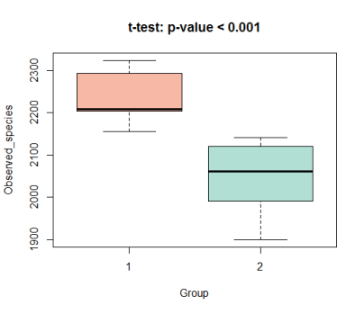
7. Or display the differentiation results with box diagram;
boxplot(value~group, data = richness_12, col = c("#F39B7FB2","#91D1C2B2"), ylab = 'Observed_species', xlab = 'Group', main = 't-test: p-value < 0.001')
Pay attention to "mapping help" official account, and dry cargo for the first time.