Author: a bowl week This document has been authorized to be reproduced at: https://juejin.cn/post/7028962991345254407
The mastery of CSS layout determines your page development speed in Web development. With the continuous innovation of Web technology, there are countless ways to realize various layouts.
This article summarizes 42 common CSS layouts, which can be divided into the following categories:
- horizontally
- Vertical center
- Horizontal vertical center
- Two column layout
- Three column layout
- Bisection layout
- Sticky Footer layout
- Full screen layout
These contents are also the contents of this article.
horizontally
Horizontal layout is relatively simple and has many methods. Here are seven common layout methods. The common CSS code is as follows:
.parent { background: #ff8787; }
.child { height: 300px; width: 300px; background: #e599f7; }
Its HTML structure is also fixed. It is a parent. Its width inherits the width of < body >, and there is a child. Here is a fixed 300px*300px. The code is as follows:
<div class="parent">
  <div class="child"></div>
</div>
The final results are as follows:
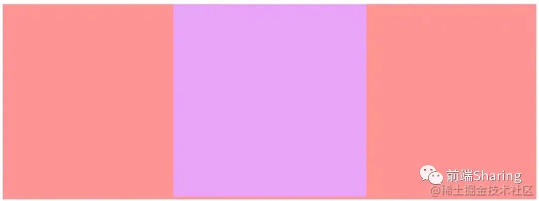
The rose colored block in the above figure is the parent, which increases with the page width; Lavender is the child, centered relative to the parent.
1. Use the text align attribute
If the element is an inline block element, that is, the element of display: inline block, you can set t ext align: Center for its parent element to achieve horizontal centering. The CSS code implemented is as follows:
.parent {
  /* Display: inline block for children; You can use text align: Center; Achieve horizontal centering */
  text-align: center;
}

.child {
  display: inline-block;
}
2. Fixed width block level elements are horizontally centered (method 1)
For fixed width block level elements, the simplest way to achieve horizontal centering is margin: 0 auto;, However, it should be noted that the width must be set. The CSS implementation code is as follows:
.child {
  /* For fixed width child elements, directly margin:0 auto; Horizontal centering can be achieved */
  margin: 0 auto;
}
3. Fixed width block level elements are horizontally centered (method 2)
For the element with positioning enabled, it can be implemented through the left attribute and margin. The CSS implementation code is as follows:
.child {
  /* Open positioning */
  position: relative;
  left: 50%;
  /* margin-left Is half the width of the negative */
  margin-left: -150px;
}
4. Fixed width block level elements are horizontally centered (method 3)
When the element is turned on to determine positioning or fixed positioning, setting the left attribute and right attribute together will stretch the width of the element, and the horizontal centering can be realized by combining the width attribute and margin attribute.
The CSS implementation code is as follows:
.parent {
  position: relative;
  height: 300px;
}

.child {
  /* Enable positioning of parent phase and child phase */
  position: absolute;
  /* Horizontal full screen */
  left: 0;
  right: 0;
  width: 300px;
  /* After the screen is full, set the width, and finally center horizontally through margin */
  margin: auto;
}
5. Fixed width block level elements are horizontally centered (method 4)
When the element is turned on to determine positioning or fixed positioning, the left attribute and transform attribute can realize horizontal centering.
The CSS implementation code is as follows:
.parent {
  position: relative;
}

.child {
  /* Open positioning */
  position: absolute;
  /* This method is similar to the use of left margin, but it does not need to calculate the width manually. */
  left: 50%;
  transform: translateX(-50%);
}
6. Flex solution
There are many ways to achieve the effect of this centered layout through Flex.
The CSS code is as follows
.parent {
  height: 300px;
  /* Open Flex layout */
  display: flex;
  /* Centering is achieved through the justify content attribute */
  justify-content: center;
}

.child {
  /* Or sub element margin: auto*/
  margin: auto;
}
7. Grid scheme
There are more ways to realize the central layout through Grid than through Flex.
The CSS implementation code is as follows:
.parent {
  height: 300px;
  /* Open Grid layout */
  display: grid;
  /* Method 1 */
  justify-items: center;
  /* Method 2 */
  justify-content: center;
}

.child {
  /* Method three sub elements margin: auto*/
  margin: auto;
}
The above are the common methods of horizontal center layout.
Vertical center
Vertical layout is also relatively simple, and there are many methods. Here are six common layout methods, and their common CSS codes are as follows:
.parent {
  height: 500px;
  width: 300px;
  margin: 0 auto;
  background-color: #ff8787;
}
.child {
  width: 300px;
  height: 300px;
  background-color: #91a7ff;
}
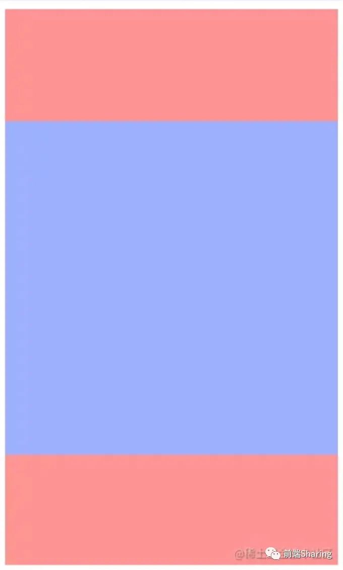
Its HTML structure is also fixed, that is, a parent wraps a child. The child here is fixed 300px*300px, and the code is as follows:
<div class="parent">
  <div class="child"></div>
</div>
The final results are as follows:
1. In line block level elements are vertically centered
If the element is an inline block level element, the basic idea is that the child element uses display: inline block, vertical align: middle; And make the row height of the parent element equal to the height.
The CSS implementation code is as follows:
.parent {
  /* Set row height for parent container */
  line-height: 500px;
}

.child {
  /* Set the child element to an inline block element */
  display: inline-block;
  /* Through vertical align: middle; Achieve centering */
  vertical-align: middle;
}
2. Realization of positioning mode (method 1)
The first method is relatively simple through positioning. In fact, it is through top: 50%; Margin top: equal to half the negative height to achieve vertical centering.
The CSS implementation code is as follows:
.parent {
  /* Open relative positioning for parent container */
  position: relative;
}

.child {
  position: absolute;
  top: 50%;
  /* margin-top: Equal to half the negative height */
  margin-top: -150px;
}
3. Realization of positioning mode (method 2)
The second method is realized by positioning: top and bottom stretch the child elements to 100%, set the specified height, and use margin:auto; Vertical centering can be achieved.
The CSS implementation code is as follows:
.parent {
  /* Open relative positioning for parent container */
  position: relative;
}

.child {
  height: 300px;
  position: absolute;
  /* Vertical full */
  top: 0;
  bottom: 0;
  /* margin: auto Can be achieved */
  margin: auto;
}
4. Realization of positioning mode (method 3)
The third way is more flexible through positioning, which is suitable for a variety of occasions. You can use top with tansform.
The CSS implementation code is as follows:
.parent {
  /* Open relative positioning for parent container */
  position: relative;
}

.child {
  position: absolute;
  top: 50%;
  transform: translateY(-50%);
}
5. Flex solution
There are many ways to achieve the effect of this vertical center layout through Flex.
The CSS implementation code is as follows:
.parent {
  /* Open flex layout */
  display: flex;
  /* Method 1 */
  /* align-items: center; */
}

.child {
  /* Method 2 */
  margin: auto;
}
The above two methods are not only implemented through Flex layout, but only the simplest method is introduced here.
6. Grid scheme
There are more ways to realize the central layout through Grid than through Flex.
The CSS implementation code is as follows:
.parent {
  display: grid;
  /* Method 1 */
  /* align-items: center; */
  /* Method 2 */
  /* align-content: center; */
}

.child {
  /* Method 3 */
  /* margin: auto; */
  /* Method 4 */
  align-self: center;
}
The above are the common methods of vertical center layout.
Horizontal vertical center
To realize horizontal and vertical layout is basically to combine the above methods. Here are seven common layout methods, and their common CSS codes are as follows:
body {
  margin: 0;
}
.parent {
  height: 500px;
  width: 500px;
  background-color: #eebefa;
  margin: 0 auto;
}
.child {
  height: 300px;
  width: 300px;
  background-color: #f783ac;
}
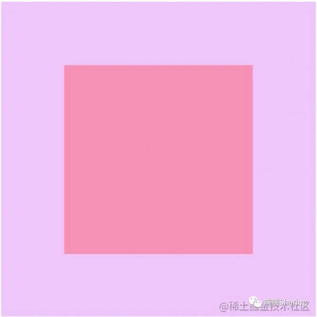
Its HTML structure is also fixed, that is, a parent wraps a child. The child here is fixed 300px*300px, and the code is as follows:
<div class="parent">
  <div class="child"></div>
</div>
The final results are as follows:
1. In line block level horizontal and vertical centering scheme
The steps are as follows:
- The container element row height is equal to the container height
- Through text align: Center; Achieve horizontal centering
- Sets the child element to a horizontal block level element
- Through vertical align: middle; Achieve vertical centering
The CSS implementation code is as follows:
.parent {
  /* 1. Set row height equal to container height */
  line-height: 500px;
  /* Through text align: Center; Achieve horizontal centering */
  text-align: center;
}
.child {
  /* Sets the child element to a horizontal block level element */
  display: inline-block;
  /* Through vertical align: middle; Achieve vertical centering */
  vertical-align: middle;
}
2. Horizontal and vertical centering scheme for positioning (I)
The steps are as follows:
- Position the child element relative to the container element
- Child element turns on absolute positioning
- Set the offset of the element to 50% minus half the width / height
The CSS implementation code is as follows:
.parent {
  /* 1. Position the child element relative to this element */
  position: relative;
}
.child {
  /* 2. Turn on absolute positioning */
  position: absolute;
  /* 3. Set the offset of the element to 50% minus half the width / height */
  left: calc(50% - 150px);
  top: calc(50% - 150px);
}
3. Horizontal and vertical centering scheme for positioning (II)
The steps are as follows:
- Position the child element relative to the container element
- Child element turns on absolute positioning
- Set the offset of the element to 50%
- Move the element back by outer margin value
The CSS implementation code is as follows:
.parent {
  /* 1. Position the child element relative to this element */
  position: relative;
}
.child {
  /* 2. Turn on absolute positioning */
  position: absolute;
  /* 3. Set the offset of the element to 50% */
  left: 50%;
  top: 50%;
  margin-left: -150px;
  margin-top: -150px;
}
4. Horizontal and vertical centering scheme for positioning (III)
The steps are as follows:
- Position the child element relative to the container element
- Child element turns on absolute positioning
- Fill the container with child elements
- Achieve horizontal and vertical centering through margin:auto
The CSS implementation code is as follows:
.parent {
  /* 1. Position the child element relative to this element */
  position: relative;
}
.child {
  /* 2. Turn on absolute positioning */
  position: absolute;
  /* 3. Fill the container with child elements */
  top: 0;
  left: 0;
  right: 0;
  bottom: 0;
  /* 4. Achieve horizontal and vertical centering through margin:auto */
  margin: auto;
}
5. Horizontal and vertical centering scheme for positioning (IV)
The steps are as follows:
- Position the child element relative to the container element
- Child element turns on absolute positioning
- Set the offset of the element to 50%
- The center is realized by translating the reverse offset
The CSS implementation code is as follows:
.parent {
  /* 1. Position the child element relative to this element */
  position: relative;
}
.child {
  /* 2. Turn on absolute positioning */
  position: absolute;
  /* 3. Set the offset of the element to 50%*/
  left: 50%;
  top: 50%;
  /* The center is realized by translating the reverse offset */
  transform: translate(-50%, -50%);
}
6. Flex solution
The steps are as follows:
- Set element to Flex layout
- Implement through justify content: Center and align items: center or margin: auto; realization.
The CSS implementation code is as follows:
.parent {
  /* 1. Set element to Flex layout */
  display: flex;
  /* 2. It is implemented through justify content and align items: Center */
  /* justify-content: center;
  align-items: center; */
}
.child {
  /* Or through margin auto */
  margin: auto;
}
7. Grid scheme
The implementation of Grid scheme is relatively simple and there are many ways.
The CSS implementation code is as follows:
.parent {
  /* 1. Element is set to Grid element */
  display: grid;
  /* Implemented through the items attribute*/
  /* align-items: center; */
  /* justify-items: center; */
  /* items Abbreviation of */
  /* place-items: center; */

  /* Or through the content attribute */
  /* align-content: center; */
  /* justify-content: center; */
  /* content Abbreviation of */
  /* place-content: center; */
}
.child {
  /* Or through margin auto */
  /* margin: auto; */
  /* Or through the self attribute */
  /* align-self: center;
  justify-self: center; */
  /* self Abbreviation of */
  place-self: center;
}
Most of the ways to realize the horizontal and vertical center layout are the combination of the above two layouts.
Two column layout
The so-called two column layout is a fixed width column (or the width may be determined by sub elements) and an adaptive layout column. The final effect is as follows:
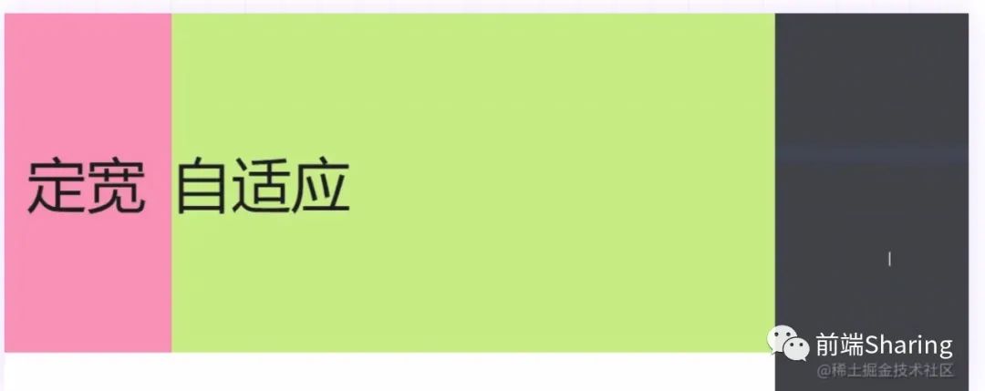
The HTML structure used here is as follows:
<!-- Solve high collapse -->
<div class="container clearfix">
  <div class="left">Fixed width</div>
  <div class="right">self-adaption</div>
</div>
The common CSS code is as follows:
body {
  margin: 0;
}
.container {
  height: 400px;
  background-color: #eebefa;
}
.left {
  height: 400px;
  width: 200px;
  background-color: #f783ac;
  font-size: 70px;
  line-height: 400px;
  text-align: center;
}
.right {
  height: 400px;
  background-color: #c0eb75;
  font-size: 70px;
  line-height: 400px;
}
/* Clear float */
.clearfix:after {
  content: '';
  display: block;
  height: 0;
  clear: both;
  visibility: hidden;
}
1. The float + calc() function completes the left column fixed width and the right column adaptive
The steps are as follows:
- Left column open float
- The right column enables floating
- The width of the right column is 100% of the parent minus the width of the left column
The CSS implementation code is as follows:
.left {
  /* Left column open float */
  float: left;
}
.right {
  /* The right column enables floating */
  float: left;
  /* Width minus the width of the left column */
  width: calc(100% - 200px);
}
2. Float + margin left completes left column fixed width and right column adaptation
The steps are as follows:
- Left column open float
- Make the left side of the container have the outer margin of the width of the left column container through the outer margin
The CSS implementation code is as follows:
.left {
  /* Left column open float */
  float: left;
}
.right {
  /* Make 200px on the left side of the container through the outer margin */
  margin-left: 200px;
}
3. Absolute + margin left completes left column fixed width and right column adaptation
The steps are as follows:
- Open and locate document flow
- Make the left side of the container have the outer margin of the width of the left column container through the outer margin
The CSS implementation code is as follows:
.left {
  /* Open and locate document flow */
  position: absolute;
}
.right {
  /* Make 200px on the left side of the container through the outer margin */
  margin-left: 200px;
}
It should be noted that the left column of the above schemes must be fixed in width before they can be realized. The left column of the following schemes can be supported by children.
4. float+overflow completes left column fixed width and right column adaptation
The steps are as follows:
- The left element begins to float
- Setting overflow on the right adaptive element will create a BFC to complete the adaptation
The CSS implementation code is as follows:
.left {
  /* 1. The left element begins to float */
  float: left;
}
.right {
  /* 2. Setting overflow on the right adaptive element will create a BFC to complete the adaptation */
  overflow: hidden;
}
5. Flex solution
This function is realized through flex layout, mainly through flex attribute. The example code is as follows:
.container {
  display: flex;
}
.right {
  flex: 1;
  /* flex: 1; Indicates flex growth: 1; That is, the item occupies all the remaining space */
}
6. Grid scheme
This function is realized through the Grid layout, mainly through the template attribute. The specific code is as follows:
.container {
  display: grid;
  /* It is divided into two rows, one column is determined by its own width, and the other column accounts for the remaining width*/
  grid-template-columns: auto 1fr;
}
Three column layout
The three column layout is mainly divided into two types:
- The first one is to fix the width of the first two columns and the last one is adaptive. This one is essentially no different from the two column layout, which can be implemented by referring to the two column layout.
- The second is to fix the width of the front and rear columns and adapt to the middle. The final effect diagram is as follows

The public CSS is as follows:
body {
  margin: 0;
}
.container {
  height: 400px;
  background-color: #eebefa;
}
.left {
  height: 400px;
  width: 200px;
  background-color: #f783ac;
}
.content {
  height: 400px;
  background-color: #d9480f;
}
.right {
  height: 400px;
  width: 200px;
  background-color: #c0eb75;
}
.left,
.content,
.right {
  font-size: 70px;
  line-height: 400px;
  text-align: center;
}
/* Clear float */
.clearfix:after {
  content: '';
  display: block;
  height: 0;
  clear: both;
  visibility: hidden;
}
The HTML structure is as follows:
<!-- Solve high collapse -->
<div class="container clearfix">
  <div class="left">Left</div>
  <div class="content">content</div>
  <div class="right">right</div>
</div>
1. Realized by float (I)
Implementation steps:
- 1 in order to complete the effect, the HTML structure needs to be adjusted as follows:
<!-- Solve high collapse -->
<div class="container clearfix">
  <div class="left">Left</div>
  <div class="right">right</div>
  <div class="content">content</div>
</div>
- 2. The left column container is opened and floated
- 3 right column container open right floating
- 4. The adaptive element setting overflow will create a BFC to complete the adaptation
The CSS code is as follows
.left {
  /* 1. Left column container open floating */
  float: left;
}
.content {
  /* The adaptive element setting overflow will create a BFC to complete the adaptation */
  overflow: hidden;
}
.right {
  /* 2. Right column container open right float */
  float: right;
}
2. Realized by float (II)
Implementation steps:
- In order to complete the effect, the HTML structure needs to be adjusted as follows:
<!-- Solve high collapse -->
<div class="container clearfix">
  <div class="left">Left</div>
  <div class="right">right</div>
  <div class="content">content</div>
</div>
- Left column container open floating
- Right column container open right float
- Make the width of the middle adaptive as the parent container minus two fixed width columns
The CSS implementation code is as follows:
.left {
  /* 1. Left column container open floating */
  float: left;
}
.content {
  /* 3. Make the width of the middle adaptive as the parent container minus two fixed width columns */
  width: calc(100%-400px);
}
.right {
  /* 2. Right column container open right float */
  float: right;
}
3. Realized by position
Implementation steps
- The left and right columns break away from the document flow and arrive at their own area by offset
- Make the width of the middle adaptive as the parent container minus two fixed width columns
- Shrink the container inward through the outer margin
The CSS implementation code is as follows:
.left {
  /* 1. The left and right columns break away from the document flow and arrive at their own area by offset */
  position: absolute;
  left: 0;
  top: 0;
}
.content {
  /* 2. Make the width of the middle adaptive as the parent container minus two fixed width columns */
  width: calc(100%-400px);
  /* 3. Shrink the container inward through the outer margin */
  margin-right: 200px;
  margin-left: 200px;
}
.right {
  position: absolute;
  right: 0;
  top: 0;
}
4. Flex solution
This function is realized through flex layout, mainly through flex attribute.
The CSS implementation code is as follows:
.container {
  display: flex;
}
.right {
  flex: 1;
  /* flex: 1; Indicates flex growth: 1; That is, the item occupies all the remaining space */
}
5. Grid scheme
This function is realized through the Grid layout, mainly through the template attribute.
The CSS implementation code is as follows:
.container {
  display: grid;
  /* It is divided into two rows, one column is determined by its own width, and the other column accounts for the remaining width*/
  grid-template-columns: auto 1fr auto;
}
Bisection layout
Bisection layout is to divide a container into several equal parts. Here, taking 4 bisections as an example, four methods are mainly introduced.
The common CSS part is as follows:
body {
  margin: 0;
}
.container {
  height: 400px;
  background-color: #eebefa;
}
.item {
  height: 100%;
}
.item1 {
  background-color: #eccc68;
}
.item2 {
  background-color: #a6c1fa;
}
.item3 {
  background-color: #fa7d90;
}
.item4 {
  background-color: #b0ff70;
}
/* Clear float */
.clearfix:after {
  content: '';
  display: block;
  height: 0;
  clear: both;
  visibility: hidden;
}
The common HTML code is as follows:
<!-- Parent element clear float -->
<div class="container clearfix">
  <div class="item item1"></div>
  <div class="item item2"></div>
  <div class="item item3"></div>
  <div class="item item4"></div>
</div>
The final effect is shown in the figure below:
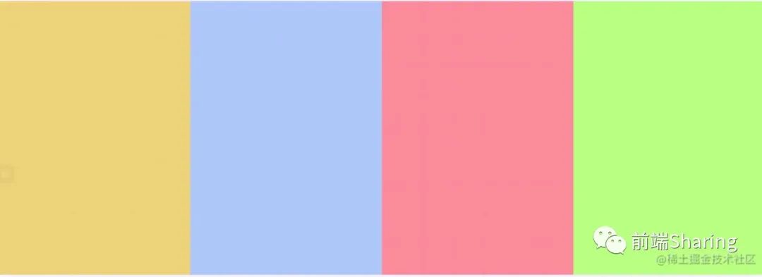
1. Floating + percentage method
This method is relatively simple. Open floating so that each element accounts for 25% of the width.
The CSS implementation code is as follows:
.item {
  /* Turn on floating, and each element accounts for 25% of the width */
  width: 25%;
  float: left;
}
2. Intra row block level + percentage method
This method is similar to the above method, but it should be noted that the block level elements in the row have several pixels similar to the margin, resulting in 25% exceeding the container.
The CSS implementation code is as follows:
.item {
  /* Set each element as an inline block level element, and each element accounts for 24.5% of the width */
  width: 24.5%;
  /* Because the block level elements in the row have several pixels similar to the margin, each accounting for 25 will exceed the container */
  display: inline-block;
}
3. Flex solution
This function is realized through flex layout, mainly through flex attribute.
The CSS implementation code is as follows:
.container {
  /* Open flex layout */
  display: flex;
}
.item {
  /* Each element occupies the same width */
  flex: 1;
}
4. Grid scheme
This function is realized through the Grid layout, mainly through the template attribute.
The CSS code is as follows
.container {
  /* Open grid layout */
  display: grid;
  grid-template-columns: repeat(4, 1fr);
  /* Use the repeat function to generate the following code */
  /* grid-template-columns: 1fr 1fr 1fr 1fr; */
}
Sticky Footer layout
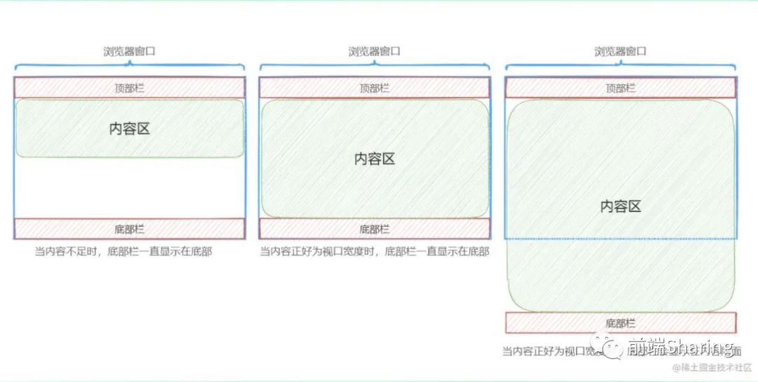
The so-called Sticky Footer layout is not a new front-end technology and concept, it is a web page layout. If the page content is not long enough, the bottom bar will be fixed to the bottom of the browser; If long enough, the bottom bar follows the content. As shown in the figure below:
Here are four ways to implement this layout
The common CSS code is as follows:
body {
    margin: 0;
}
.container {
    height: 400px;
    display: flex;
}
.left {
    height: 400px;
    width: 200px;
    background-color: #f759ab;
}
.content {
    height: 400px;
    background-color: #52c41a;
    flex: 1;
}
.right {
    height: 400px;
    width: 200px;
    background-color: #f759ab;
}
.left,
.content,
.right {
    font-size: 70px;
    line-height: 400px;
    text-align: center;
}
.header {
    height: 100px;
    background-color: #70a1ff;
}
.footer {
    height: 100px;
    background-color: #ff7a45;
}
.header,
.footer {
    line-height: 100px;
    font-size: 52px;
    text-align: center;
}
The public HTML is as follows:
<div class="main">
    <div class="header">header</div>
    <div class="container">
        <div class="left">left</div>
        <div class="content">content</div>
        <div class="right">right</div>
    </div>
    <div class="footer">footer</div>
</div>
1. Absolute positioning mode
The steps to realize Sticky Footer layout by absolute positioning are as follows:
- Set the height of the outermost container to 100%;
- Position the child element relative to the container element, and set the minimum height of the container element to 100%;
- Set padding bottom as the height of footer in the middle area;
- The bottom bar is absolutely positioned and can be adsorbed at the bottom all the time.
The CSS implementation code is as follows:
/* 1. Set the outermost container to 100% */
html,
body {
    height: 100%;
}
/* 2. Position the child element relative to the container element and set the minimum height of the container element to 100% */
.main {
    position: relative;
    min-height: 100%;
}
/* 3. Set padding bottom to the height of footer in the middle area */
.container {
    padding-bottom: 100px;
}
/* Since absolute positioning is turned on, the width becomes adaptive and is set to 100% bottom:0 to always keep the bottom */
.footer {
    position: absolute;
    width: 100%;
    bottom: 0;
}
2. Using calc function
The method of using calc function will be relatively simple. The minimum height of the container in the middle is 100% of the width of the viewport - the height of the head and bottom.
The CSS implementation code is as follows:
.container {
    /* Here, the container in the middle part is at least 100% of the width of the viewport - the height of the head and bottom parts can complete this function */
    min-height: calc(100vh - 200px);
}
3. Flex solution
The implementation steps are as follows
- Open flex layout
- Change the layout direction of child elements to be arranged vertically
- Set the minimum height to the current viewport so that it stays at the bottom no matter how high the middle is
- Set the middle container height to adaptive
The CSS implementation code is as follows:
.main {
    /* Open flex layout */
    display: flex;
    /* Change the layout direction of child elements to be arranged vertically */
    flex-flow: column;
    /* Set the minimum height to the current viewport so that it stays at the bottom no matter how high the middle is */
    min-height: 100vh;
}
.container {
    /* Set middle part adaptation */
    flex: 1;
}
4. Grid scheme
The implementation steps are as follows
- Open grid layout
- Set the minimum height to the current viewport so that it remains at the bottom no matter how high the middle part is
The CSS implementation code is as follows:
.main {
    /* Open grid layout */
    display: grid;
    grid-template-rows: auto 1fr auto;
    /* Set the minimum height to the current viewport so that it stays at the bottom no matter how high the middle is */
    min-height: 100vh;
}
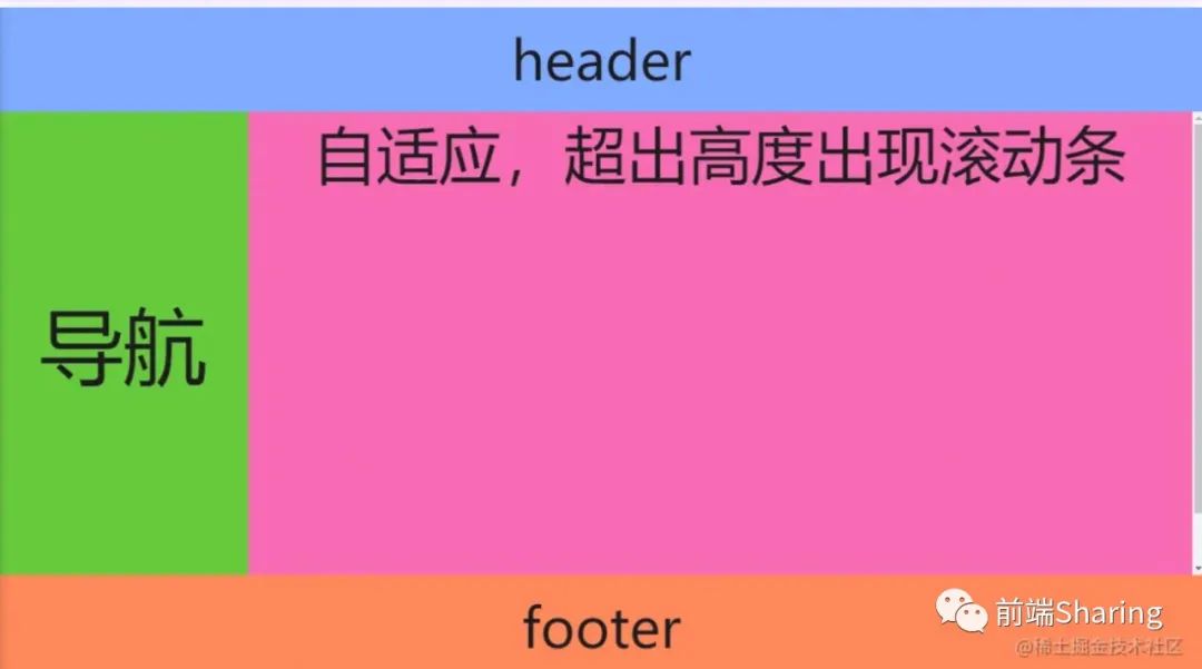
Full screen layout
All layouts are mainly used in the background, and the main effects are as follows:
Here are three implementation methods of full screen layout.
The common CSS code is as follows:
body {
  margin: 0;
}
body,
html,
.container {
  height: 100vh;
  box-sizing: border-box;
  text-align: center;
  overflow: hidden;
}
.content {
  background-color: #52c41a;
  /* * The layout of intermediate departments can refer to the layout of two columns and three columns */
  display: grid;
  grid-template-columns: auto 1fr;
}
.left {
  width: 240px;
  background-color: #52c41a;
  font-size: 80px;
  line-height: calc(100vh - 200px);
}
.right {
  background-color: #f759ab;
  font-size: 60px;
}
.header {
  height: 100px;
  background-color: #70a1ff;
}
.footer {
  height: 100px;
  background-color: #ff7a45;
}
.header,
.footer {
  line-height: 100px;
  font-size: 52px;
}
The HTML structure is as follows:
<div class="container">
    <div class="header">header</div>
    <div class="content">
        <div class="left">Navigation</div>
        <div class="right">
            <div class="right-in">Adaptive, scroll bar appears when height is exceeded</div>
        </div>
    </div>
    <div class="footer">footer</div>
</div>
1. Using calc function
The implementation steps are as follows:
- Calculate the height of the intermediate container through the calc function.
- The container with scroll bars in the middle is set to overflow: auto, that is, the scroll bar appears when the scroll bar appears.
The CSS implementation code is as follows:
.content {
    overflow: hidden;
    /* Calculate the height of the container through calc */
    height: calc(100vh - 200px);
}
.left {
    height: 100%;
}
.right {
    /* If it exceeds, a scroll bar appears */
    overflow: auto;
    height: 100%;
}
.right-in {
    /* Suppose there are 500px elements in the container */
    height: 500px;
}
2. Flex solution
It is easy to implement the layout in Flex.
The CSS code is as follows
.container {
    /* Open flex layout */
    display: flex;
    /* Change the layout direction of child elements to be arranged vertically */
    flex-flow: column;
}
.content {
    /* If it exceeds, a scroll bar appears */
    overflow: auto;
    /* Set middle part adaptation */
    flex: 1;
}
.right-in {
    /* Suppose there are 500px elements in the container */
    height: 500px;
}
3. Grid scheme
grid layout is very handy for this layout, which can be implemented through the template attribute.
The CSS code is as follows
.container {
    /* Open grid layout */
    display: grid;
    grid-template-rows: auto 1fr auto;
}
.content {
    /* If it exceeds, a scroll bar appears */
    overflow: auto;
}
.right-in {
    /* Suppose there are 500px elements in the container */
    height: 500px;
}
Write at the end
If you see this, I feel very honored. If you love this article, you can pay attention to the official account: front-end Sharing, and share the front end hard text.