Success leads to resentment, and power is a crisis—— Reading biographies of generals crossing the river by Wang Mai
preface
In experience article 02, some common sense of controls are introduced. This book continues from the above, from easy to difficult, and then introduces the basic knowledge of common controls: common subclasses of composite button: radio button, check box and Switch; Progress display controls: progress bar, drag bar, SeekBar and rating bar; Then it introduces the customization of edit box EditText and the usage of Menu; Finally, it gives a preliminary understanding of the adapter view and the use of the drop-down box Spinner. The description method of the control in this paper is: default appearance display - > analysis of class structure - > function and use method of the control.
1, Common subclasses of compound button
Check the development documentation, first understand Compound buttoncompoundbutton Class structure of:
Analysis of class structure:
public abstract class CompoundButton
extends Button implements Checkable
Known direct subclasses:
CheckBox, RadioButton, Switch, SwitchCompat, ToggleButton
Secondly, there are two important XML attributes of composundbutton:
Button: Specifies the Drawable used for the button shape. If not specified, the system default icon will be used. You can use void setbuttondrrawable (Drawable drawable) to set this property in your code.
checked: Specifies the selected status of the button. true means selected and false means unchecked. Available in Code:
① Use void setChecked (boolean checked) to set this property.
② Use void toggle() to flip the selected state.
③ Use boolean isChecked() to query whether the status is selected.
④ Use void setoncheckedchangelistener (composundbutton. Oncheckedchangelistener listener) to register a callback method for the button, which is triggered when the selected state of the button changes.
It can be seen that composundbutton is an abstract class and cannot be used directly, so it can use five subclasses with actual shapes.
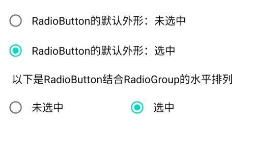
1. Radio button
consult Radio button Development documentation for:
Default shape display:
Analysis of class structure:
public class RadioButton
extends CompoundButton
Known direct subclasses:
AppCompatRadioButton
public class RadioGroup
extends LinearLayout
Function and usage of control:
Radio button is a double status button that can be selected or unchecked. It is unchecked by default. When the radio button is not selected, the user can click it to select it. However, after the user selects the button, he can't cancel the selected status by clicking it again.
Radio buttons are usually used in conjunction with RadioGroup, RadioGroup It is a container used to manage and combine multiple radio buttons. Users can only select one of them in a RadioGroup, and cannot select more than one. The property orientation of RadioGroup can specify the arrangement direction of lower level controls, which are horizontal and vertical respectively. In fact, it is equivalent to a special linear layout. There are three common methods:
① int getCheckedRadioButtonId() returns the id of the radio button selected in this combination. If none is selected, - 1 is returned.
② void check (int id) select the radio button of the specified id.
③ void setOnCheckedChangeListener (RadioGroup.OnCheckedChangeListener listener) registers the status change listener.
Generally, the selected event of radio button is not handled by itself, but responded by the parent control RadioGroup. Therefore, after laying out the location of the control, you need to register the status listener for RadioGroup in the code. Example:
@Override
    protected void onCreate(Bundle savedInstanceState) {
        super.onCreate(savedInstanceState);
        setContentView(R.layout.activity_radio);
        // Get the radio group named rg from the layout file
        RadioGroup rg = findViewById(R.id.rg);
        // Set radio listener for rg
        rg.setOnCheckedChangeListener(new RadioListener());
    }
    // Define a radio listener that implements the interface radiogroup OnCheckedChangeListener
    class RadioListener implements RadioGroup.OnCheckedChangeListener{
        // Triggered when the user clicks a radio button within a group
        public void onCheckedChanged(RadioGroup group, int checkedId) {
            Toast.makeText(RadioActivity.this, "Control selected"+checkedId, Toast.LENGTH_LONG).show();
        }
    }
If you want to change the default shape of the radio button, you can set its button or drawableLeft attribute as the status graph to display a specific shape according to the selected state.
2. Check box
consult Check box Development documentation for:
Default shape display:

Analysis of class structure:
public class CheckBox
extends CompoundButton
Known direct subclasses:
AppCompatCheckBox
Function and usage of control:
Check box is a super simple two-state button. Click Check and click Cancel check again.
After laying out the control, use void setoncheckedchangelistener (composundbutton. Oncheckedchangelistener listener) to set the state change listener in the code. Example:
@Override
    protected void onCreate(Bundle savedInstanceState) {
        super.onCreate(savedInstanceState);
        setContentView(R.layout.activity_checkbox);
        // Get the check box named ck from the layout file
        CheckBox ck = findViewById(R.id.ck);
        // Check the listener for ck settings. Once the user clicks the check box, the onCheckedChanged method of the listener will be triggered
        ck.setOnCheckedChangeListener(new CheckListener());
    }

    // Define a tick listener, which implements the interface compoundbutton OnCheckedChangeListener
    private class CheckListener implements CompoundButton.OnCheckedChangeListener{
        // Triggered when the user clicks the check box
        public void onCheckedChanged(CompoundButton buttonView, boolean isChecked) {
            String desc = String.format("You checked the control%d,Status is%b", buttonView.getId(), isChecked);
            Toast.makeText(CheckboxActivity.this, desc, Toast.LENGTH_LONG).show();
        }
    }
Similarly, if you want to change the default shape of the check box, you can set its button attribute as status graphics to display a specific shape according to the selected state.
3. Switch
consult Switch Development documentation for:
Default shape display:

Analysis of class structure:
public class Switch
extends CompoundButton
Function and usage of control:
The functions of Switch and check box are the same. They both register status listeners to realize function callback, but their shapes are a little different, which leads to several XML attributes of Switch need to be set separately.
① switchPadding: set the distance between the switch icon and the left and right text,
② textOff: the text to be displayed when the switch is not selected, that is, the text to the left of the icon.
③ textOn: the text displayed when selected, that is, the text on the right.
④ thumb: sets the background of the switch icon
⑤ track: set the slide of the switch, that is, the foreground of the icon.
⑥ thumbTextPadding: sets the distance between the icon background and the text on the left and right sides, which is mutually exclusive with the switchPadding property.
By setting the button attribute to @ null and the background attribute to the status graph, you can get a personalized switch shape.

2, Progress display control
1. Progress bar
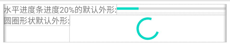
consult Progress bar Development documentation for:
Default shape display:
Analysis of class structure:
public class ProgressBar
extends View
Known direct subclasses
AbsSeekBar, ContentLoadingProgressBar
Known indirect subclasses
AppCompatRatingBar, AppCompatSeekBar, RatingBar, SeekBar
Function and usage of control:
The progress bar is used to visually indicate the operation progress to the user. The progress bar can be set to "compare style =" / Android "or" horizontal style = "/ Android" in this file. Obviously, the circle style is used when the specific progress is uncertain. The circle style progress bar will display circular animation, which can be a rotating wheel or a horizontal bar. If a specific numerical progress is displayed, a horizontal bar must be used.
Common properties of progress bar are as follows:
① max: defines the maximum value that the progress can reach. It must be an integer value, such as "100". Code usage:
int getMax() and void setMax (int max)
② Progress: defines the progress value between 0 and max, which is an integer value. Code usage:
void setProgress (int progress) and int getProgress()
void incrementProgressBy (int diff) is used to set the increment of the current progress. A positive value of diff is an increase and a negative value is a decrease.
Obviously, these two properties can only be applied to horizontal progress bars with specific values, and will be invalid for circle shapes.
③ secondaryProgress: defines the progress value of the second level between 0 and max, which is applicable to media scenes, such as displaying buffer progress, while the value of the first level represents playback progress, which is an integer value. Code usage:
int getSecondaryProgress() and void setSecondaryProgress (int secondaryProgress)
void incrementSecondaryProgressBy (int diff) is used to set the increment of the second progress. A positive value of diff is an increase and a negative value is a decrease.
④ progressDrawable: Specifies the LayerDrawable of the hierarchical graph filled by the progress bar (normal graph cannot be used). Used in Code:
void setProgressDrawable (Drawable d)
The hierarchical graph LayerDrawable is defined in XML. The root node is layer list, in which the foreground picture (progress bar layer) and background picture are specified respectively. Examples are as follows:
<layer-list xmlns:android="http://schemas.android.com/apk/res/android" >
    <!-- The background layer defines a shape graphic -->
    <item android:id="@android:id/background">
        <shape>
            <solid android:color="#ffff00" />
        </shape>
    </item>
    <!-- This is the progress bar layer, which defines a.9 graphical -->
    <item android:id="@android:id/progress">
        <clip>
            <nine-patch android:src="@drawable/green" />
        </clip>
    </item>
</layer-list>
Note that the form of control ID is android:id="@android:id/xxx", which is the predefined ID of the system. Please distinguish it carefully.
2. Drag the SeekBar bar
consult Drag bar SeekBar Development documentation for:
Default shape display:

It can be seen from the figure that the appearance is different from the progress bar of the progress bar. There is an icon that can be dragged.
Analysis of class structure:
public class SeekBar
extends AbsSeekBar
Known direct subclasses
AppCompatSeekBar
Function and usage of control:
SeekBar is an extension of ProgressBar. ProgressBar can only modify the progress in the code, and the drag bar adds a drag feature. Users can drag on the screen to change the progress. Four additional methods are introduced:
① void setThumb (Drawable thumb) sets the current progress icon in SeekBar.
② void setThumbOffset (int thumbOffset) sets the display offset of the progress icon, which is generally set to 0 or not.
③ void setKeyProgressIncrement (int increment) drag the changed progress value.
④ void setOnSeekBarChangeListener (SeekBar.OnSeekBarChangeListener l) sets the listener for drag change events. The listener needs to implement the following methods:
    // Triggered when the progress changes. The third parameter is true, which means the user drags, and false indicates the progress of code setting
    public void onProgressChanged(SeekBar seekBar, int progress, boolean fromUser) {}
    // Triggered when drag progress starts
    public void onStartTrackingTouch(SeekBar seekBar) {}
    // Triggered when the drag progress is stopped
    public void onStopTrackingTouch(SeekBar seekBar) {}
3. Rating bar
consult Rating bar Development documentation for:
Default shape display:

It can be seen from the figure that the scoring bar is just dragging the SeekBar to change its shape. Its substantive functions are the same.
Analysis of class structure:
public class RatingBar
extends AbsSeekBar
Known direct subclasses
AppCompatRatingBar
Function and usage of control:
The scoring bar has all the methods of dragging the SeekBar bar, and changes the progress to a five pointed star display. Therefore, additional XML attributes and related setting methods are required as follows:
① isIndicator: whether to act as an indicator. If it is an indicator, the rating cannot be modified by touch. Use void setIsIndicator(boolean isIndicator) in code
② numStars: set the total number of pentagonal stars to:
void setNumStars(int numStars)
③ rating: set to light up several five pointed stars. In the code:
void setRating(float rating)
④ stepSize: sets the size of each increase or decrease. The default is one tenth of the total number. For example, the total number of stars is 5, and the default value is 0.5. In the code:
void setStepSize(float stepSize)
⑤ void setOnRatingBarChangeListener(RatingBar.OnRatingBarChangeListener listener) to set the scoring listener, you need to implement the onRatingChanged method of the interface OnRatingBarChangeListener.
⑥ style: RatingBar provides three star styles for rating display in different business scenarios.
style="?android:attr/ratingBarStyle", the default value of star size, which can be changed by touch.
style="?android:attr/ratingBarStyleIndicator", the stars are medium-sized and cannot be changed by touch.
style="?android:attr/ratingBarStyleSmall", stars are small and cannot be changed by touch.

3, Customization of edit box EditText and usage of Menu
1. Customized use of edit box EditText
In the previous article, we have introduced the basic properties of the edit box EditText. Here are its customization methods: replace the cursor and border, automatically hide the input method after editing, and automatically wrap the line after entering.
① Replace cursor: EditText has two main attributes related to the cursor: cursorVisible and textCursorDrawable, which respectively set whether the cursor is visible and specify the graphics of the cursor.
② Replace border: set its background property, hide the border and set it to @ null. If customization is needed, set it to the specified figure. If set as a shape figure:
<?xml version="1.0" encoding="utf-8"?>
<shape xmlns:android="http://schemas.android.com/apk/res/android" >
    <solid android:color="#ffffff" />
    <stroke
        android:width="1dp"
        android:color="#ffaaaaaa" />
    <corners
        android:bottomLeftRadius="5dp"
        android:bottomRightRadius="5dp"
        android:topLeftRadius="5dp"
        android:topRightRadius="5dp" />
    <padding
        android:bottom="2dp"
        android:left="2dp"
        android:right="2dp"
        android:top="2dp" />
</shape>
③ Auto hide IME
First, when you open a page with an edit box, the edit box automatically gets the focus and starts the input method immediately. To avoid this situation, you need to set the properties focusable and focusableInTouchMode of the root node of this page to true to force the root node to obtain focus.
Secondly, when the specified text length is entered in the edit box, the input method needs to be automatically turned off. This function requires two parameters: the length allowed in the edit box and the currently entered length. Next, take the input of 6-digit and 11 digit numbers as an example.
(1) Since the maxLength attribute of the edit box can only be set through the XML file, and the value cannot be obtained directly in the code, its value needs to be obtained through reflection:
    // Get the maximum length of the edit box and call the hidden method through the reflection mechanism
    public static int getMaxLength(EditText et) {
        int length = 0;
        try {
            InputFilter[] inputFilters = et.getFilters();
            for (InputFilter filter : inputFilters) {
                Class<?> c = filter.getClass();
                if (c.getName().equals("android.text.InputFilter$LengthFilter")) {
                    Field[] f = c.getDeclaredFields();
                    for (Field field : f) {
                        if (field.getName().equals("mMax")) {
                            field.setAccessible(true);
                            length = (Integer) field.get(filter);
                        }
                    }
                }
            }
        } catch (Exception e) {
            e.printStackTrace();
        }
        return length;
    }
(2) To monitor the currently entered text, you need to implement a text monitoring interface TextWatcher, implement its three methods, and then call the addTextChangedListener method on the EditText object to register the listener:
    // When the edit listener reaches the specified length
    private class HideTextWatcher implements TextWatcher {
        private EditText mView; // Declare an edit box object
        private int mMaxLength; // Declare a maximum length variable
        private CharSequence mStr; // Declare a text string

        public HideTextWatcher(EditText v) {
            super();
            mView = v;
            // Get the maximum length of the edit box through the reflection mechanism
            mMaxLength = ViewUtil.getMaxLength(v);
        }

        // Triggered before the input text of the edit box changes
        public void beforeTextChanged(CharSequence s, int start, int count, int after) {}

        // Triggered when the input text of the edit box changes
        public void onTextChanged(CharSequence s, int start, int before, int count) {
            mStr = s;
        }

        // Triggered when the input text of the edit box changes
        public void afterTextChanged(Editable s) {
            if (mStr == null || mStr.length() == 0)
                return;
            // Turn off the input method when the input text reaches 11 digits (such as mobile phone number)
            if (mStr.length() == 11 && mMaxLength == 11) {
                ViewUtil.hideAllInputMethod(EditHideActivity.this);
            }
            // Turn off the input method when the input text reaches 6 digits (such as login password)
            if (mStr.length() == 6 && mMaxLength == 6) {
                ViewUtil.hideOneInputMethod(EditHideActivity.this, mView);
            }
        }
    }
(3) The input method is managed by the input method manager InputMethodManager. There are two ways to close the input method:
    public static void hideAllInputMethod(Activity act) {
        // Get input method manager from system service
        InputMethodManager imm = (InputMethodManager) act.getSystemService(Context.INPUT_METHOD_SERVICE);
        if (imm.isActive()) { // If it is already open, close it
            imm.toggleSoftInput(0, InputMethodManager.HIDE_NOT_ALWAYS);
        }
    }

    public static void hideOneInputMethod(Activity act, View v) {
        // Get input method manager from system service
        InputMethodManager imm = (InputMethodManager) act.getSystemService(Context.INPUT_METHOD_SERVICE);
        // Turn off the on-screen input method
        imm.hideSoftInputFromWindow(v.getWindowToken(), 0);
    }
④ Enter auto line feed means that after pressing the enter symbol in the current edit box, the cursor of the input method will automatically jump to the next edit box to continue editing. Similarly, this function also needs to implement the text monitoring interface to judge the carriage return:
// Define an edit box listener that automatically jumps to the next control when entering a carriage return
    private class JumpTextWatcher implements TextWatcher {
        private EditText mThisView;  // Declare the current edit box object
        private View mNextView; // Declare the next view object

        public JumpTextWatcher(EditText vThis, View vNext) {
            super();
            mThisView = vThis;
            if (vNext != null) {
                mNextView = vNext;
            }
        }

        // Triggered before the input text of the edit box changes
        public void beforeTextChanged(CharSequence s, int start, int count, int after) {}

        // Triggered when the input text of the edit box changes
        public void onTextChanged(CharSequence s, int start, int before, int count) {}

        // Triggered when the input text of the edit box changes
        public void afterTextChanged(Editable s) {
            String str = s.toString();
            // Carriage return or line feed found
            if (str.contains("\r") || str.contains("\n")) {
                // Remove carriage returns and line breaks
                mThisView.setText(str.replace("\r", "").replace("\n", ""));
                if (mNextView != null) {
                    // Let the next view get the focus, that is, move the cursor to the next view
                    mNextView.requestFocus();
                    // If the next view is an edit box, the cursor is automatically moved to the end of the text in the edit box
                    if (mNextView instanceof EditText) {
                        EditText et = (EditText) mNextView;
                        // Automatically move the cursor to the end of the text inside the edit box
                        // Method 1: directly call setSelection method of EditText
                        et.setSelection(et.getText().length());
                        // Method 2: call the setSelection method of the Selection class
                        //Editable edit = et.getText();
                        //Selection.setSelection(edit, edit.length());
                    }
                }
            }
        }
    }
2. Menu
consult Menu menu Development documentation for:
Analysis of class structure:
public interface Menu
Function and usage of control:
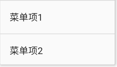
As an interface, Menu has no actual shape and cannot be used directly. There are mainly two kinds of Android menus, one is the options Menu OptionsMenu and the other is the context Menu ContextMenu. The use methods are similar: set the layout for the Menu and set the relevant callback methods for the Menu items. The Menu layout file should be placed in the res/menu directory. An example of a Menu layout file is as follows:
<menu xmlns:android="http://schemas.android.com/apk/res/android" >
    <item
        android:id="@+id/item1"
        android:orderInCategory="1"
        android:title="Menu item 1"/>
    <item
        android:id="@+id/item2"
        android:orderInCategory="1"
        android:title="Menu item 2"/>
</menu>
Default shape display:
① Use Context menu The following methods are required to override the Activity:
void onCreateContextMenu(ContextMenu, View, ContextMenu.ContextMenuInfo) specifies the XML menu layout file.
boolean onContextItemSelected(MenuItem item) responds to different menu items being clicked, that is, the function function of the menu item.
Next, you need to call registerForContextMenu to register the context menu for the required control in the onResume method of the Activity, and call unregisterForContextMenu to cancel the menu in onPause. Examples of usage:
    // Called when the menu interface of the context menu is created
    @Override
    public void onCreateContextMenu(ContextMenu menu, View v, ContextMenuInfo menuInfo) {
        // From menu_ option. Constructing menu interface layout in XML
        getMenuInflater().inflate(R.menu.menu, menu);
    }

    // Called when the menu item of the context menu is selected
    @Override
    public boolean onContextItemSelected(MenuItem item) {
        int id = item.getItemId(); // Gets the number of the menu item
        //TODO: process different menu items according to id
        Toast.makeText(this, "Selected menu item id For:"+id, Toast.LENGTH_SHORT).show();
        return true;
    }
So you can call up the context menu page by long pressing the component. Of course, you can also call public void openContextMenu(View view) to open it.
② The option menu OptionsMenu is not a class or interface, but implements the menu function by overriding the two methods of Activity. The option menu is divided into two ways: press the menu key of the mobile phone (now the mobile phone should not have this key), call public void openOptionsMenu() in the code, manually open, and call public void closeOptionsMenu() to manually close. The two methods that Activity needs to rewrite: public Boolean oncreateoptions menu (menu menu) and public Boolean eoptions itemselected (MenuItem item) respectively set the menu layout and register the listener of the menu item. The use method is the same as the context menu, so it will not be repeated.

4, Preliminary understanding of adapter view and the use of drop-down box Spinner
1. Preliminary understanding of adapter view
In daily life, we will deal with a large number of list or grid data. Their feature is that there are many data items, and the format of each displayed data item is the same, but the specific content of each data item is different. Based on the above characteristics, we need a method that can display multiple data with small memory occupation, fast display speed and unified display format.
Adapter view AdapterView It is a subclass of the view group ViewGroup. Its indirect subclasses include: AdapterViewFlipper, AppCompatSpinner, ExpandableListView, Gallery, GridView, ListView, Spinner and StackView. These views can meet the above requirements for unified format and different data.
The contents of these views are displayed by Adapter Its indirect subclasses include arrayadapter, baseadapter, cursoradapter, headerviewlistadapter, listadapter, resourcecursoradapter, simpleadapter, simplecursoradapter, spinneradapter, themedspinneradapter and wrapperlistadapter.
The adapter object acts as a bridge between the AdapterView and the original data. The adapter provides access to unprocessed raw data, and the adapter is also responsible for wrapping a specific appearance for each raw data through an XML layout file.
Here are three adapters:
①Array adapter ArrayAdapter
public class ArrayAdapter
extends BaseAdapter implements Filterable, ThemedSpinnerAdapter
The array adapter is only suitable for the case where the data item has only text. Its use method is very simple. The commonly used constructor is:
Arrayadapter (context, int resource, t [] objects) context is context; Resource is the layout file id of the selected data item. There is only one text view TextView in the layout; Objects are generally data of type String [].
②Simple adapter
public class SimpleAdapter
extends BaseAdapter implements Filterable, ThemedSpinnerAdapter
The simple adapter is suitable for displaying pictures and text together. The constructor is:
SimpleAdapter(Context context, List<? extends Map
<String, ?>> Data, int resource, string [] from, int [] to), 5 parameters in total:
Context is the context.
data can be an ArrayList object. Each entry in the ArrayList corresponds to a line in the list, which is used to save the pairing information of pictures and text.
resource is an XML file id that displays the view of each item.
from is a list of column names added to the mapping associated with each item.
to is the view in which the column should be displayed in the "from" parameter.
③Basic adapter BaseAdapter
public abstract class BaseAdapter
extends Object implements ListAdapter, SpinnerAdapter
Adapter general base class, which can be used for ListView (by implementing special ListAdapter interface) and Spinner (by implementing special SpinnerAdapter interface). The class derived from it needs to implement three main methods:
Constructor: Specifies the raw data that the adapter needs to process.
getCount: get the total number of data items.
getView: the display view of the data item is wrapped by the XML layout file, and the internal controls of the data item are processed.
The specific use methods of the above three adapters will be displayed through the drop-down box Spinner.
2. Drop down box Spinner
consult Drop down box Spinner Development documentation for:
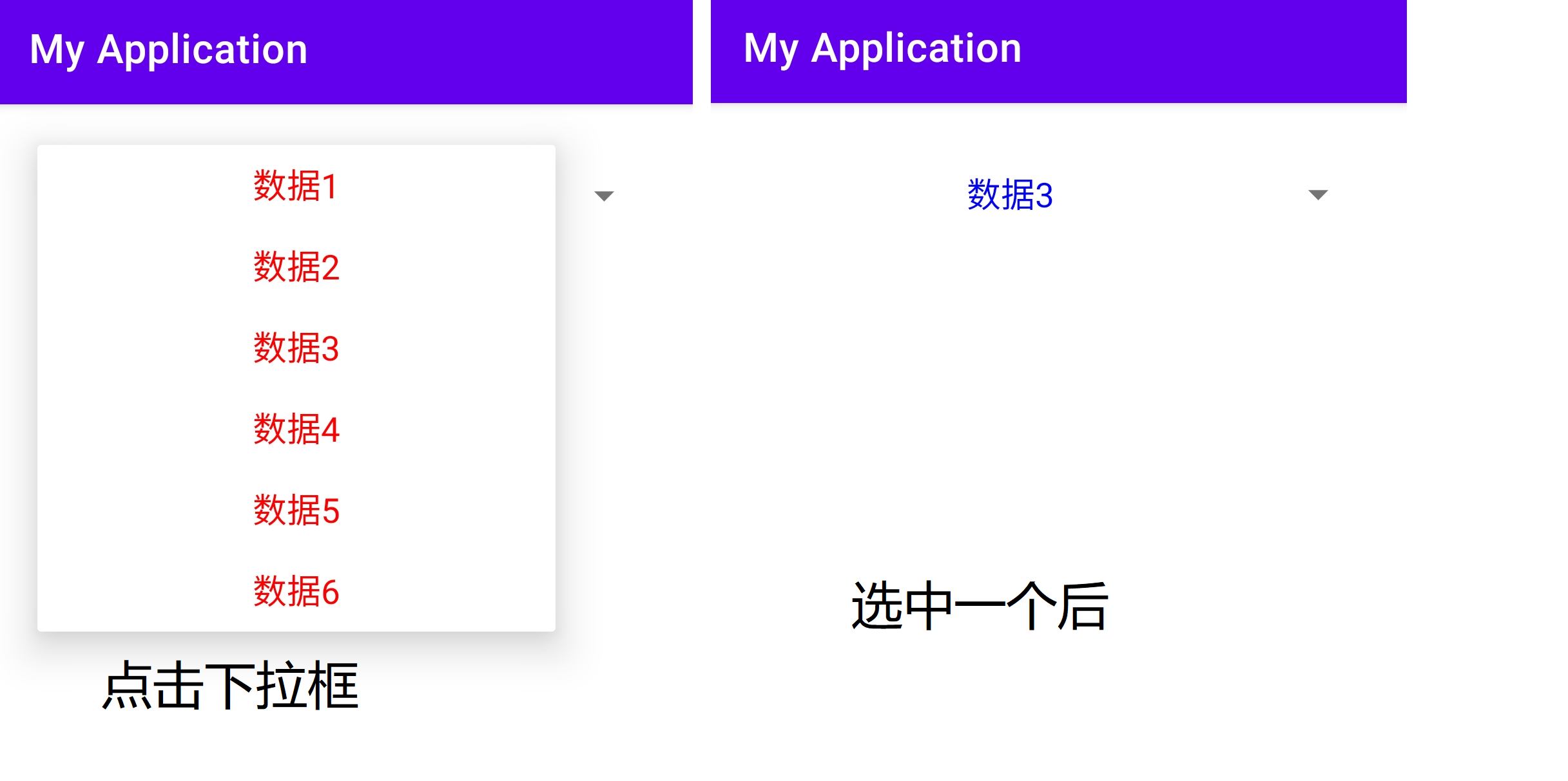
Default shape display:
Spinner can be displayed in two ways, which are set through the property spinnerMode:
android:spinnerMode = "dialog" is displayed in the form of a dialog box
android:spinnerMode = "dropdown" is displayed in a drop-down list
Analysis of class structure:
public class Spinner
extends AbsSpinner implements DialogInterface.OnClickListener
Known direct subclasses
AppCompatSpinner
Function and usage of control:
The drop-down box Spinner displays multiple options according to the layout file, from which users can select, and then trigger the callback method of options. Its function and usage are similar to that of the menu.
The following describes the specific usage of the three adapters:
Array adapter:
public class MainActivity extends AppCompatActivity {

    @Override
    protected void onCreate(Bundle savedInstanceState) {
        super.onCreate(savedInstanceState);
        setContentView(R.layout.activity_main);
        initSpinner();
    }
         // Initialize drop-down box
    private void initSpinner() {
        // Declare an array adapter with a drop-down box (item_select is in blue font)
        ArrayAdapter<String> dataAdapter = new ArrayAdapter<>(this,
                R.layout.item_select, dataArray);
        // Set the layout style of each item of data in the drop-down list (item_dropdown is in red font)
        dataAdapter.setDropDownViewResource(R.layout.item_dropdown);
        // Get drop-down box from layout file
        Spinner sp = findViewById(R.id.sp_dropdown);
        // Set the title of the drop-down box
        sp.setPrompt("Please select data");
        // Set the array adapter of the drop-down box
        sp.setAdapter(dataAdapter);
        // The setting drop-down box displays the first item by default
        sp.setSelection(0);
        // Set the selection listener for the drop-down box. Once the user selects an item, the onItemSelected method of the listener will be triggered
        sp.setOnItemSelectedListener(new MySelectedListener());
    }

    // Define the text array to be displayed in the drop-down list
    private String[] dataArray = {"Data 1", "Data 2", "Data 3", "Data 4", "Data 5", "Data 6"};
    // Define a selection listener that implements the interface OnItemSelectedListener
    class MySelectedListener implements AdapterView.OnItemSelectedListener {
        // Select the processing method of the event, where arg2 represents the sequence number of the selected item
        public void onItemSelected(AdapterView<?> arg0, View arg1, int arg2, long arg3) {
            Toast.makeText(MainActivity.this, "You have chosen" + dataArray[arg2], Toast.LENGTH_LONG).show();
        }

        // Processing method when not selected, usually no processing is required
        public void onNothingSelected(AdapterView<?> arg0) {}
    }
}
design sketch:
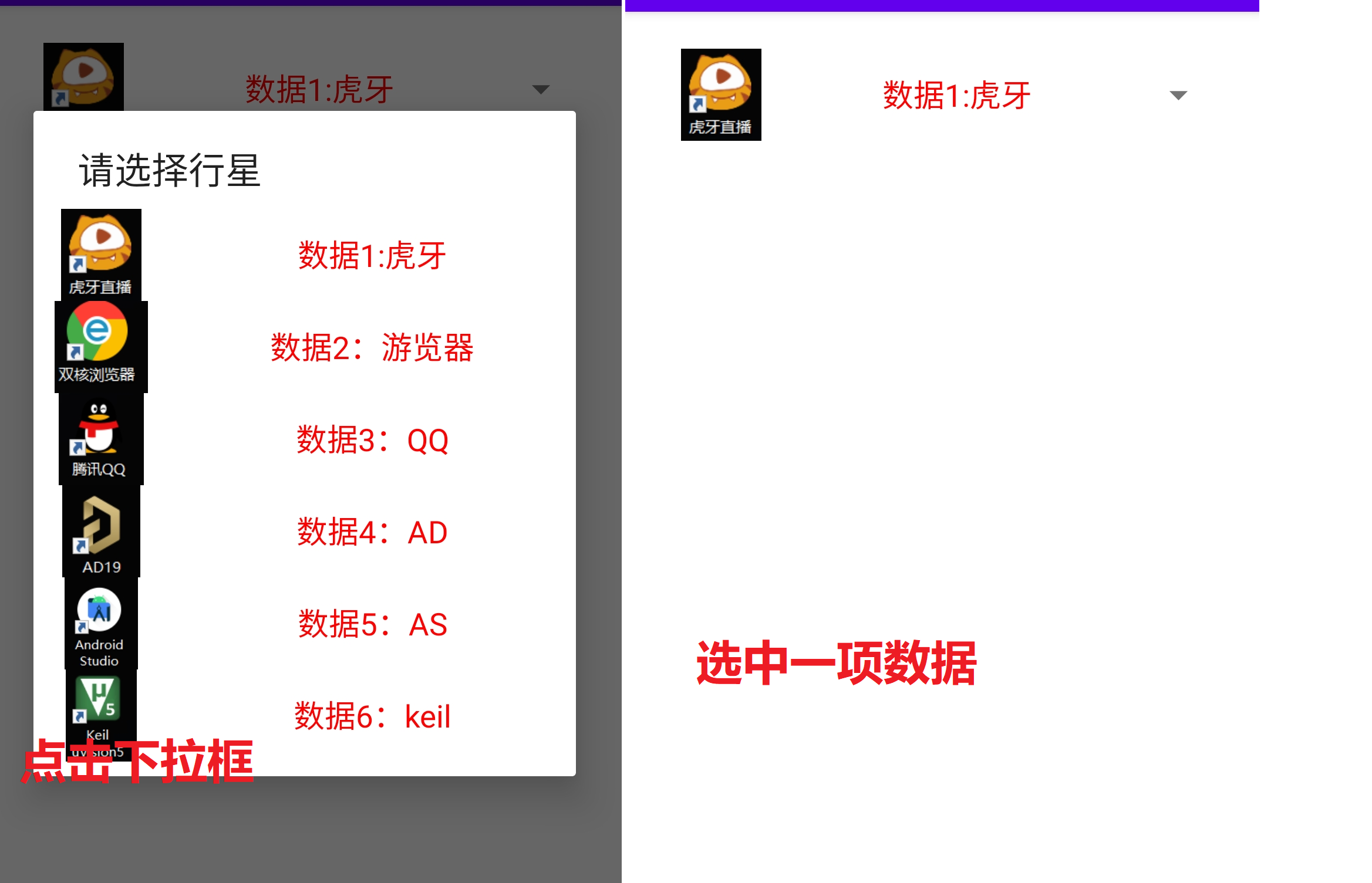
Simple adapter:
public class MainActivity extends AppCompatActivity {

    @Override
    protected void onCreate(Bundle savedInstanceState) {
        super.onCreate(savedInstanceState);
        setContentView(R.layout.activity_main);
        initSpinnerForSimpleAdapter();
    }


    // Define the text array to be displayed in the drop-down list
    private String[] dataArray = {"Data 1:Tiger teeth", "Data 2: tour guide", "Data 3: QQ",
            "Data 4: AD", "Data 5: AS", "Data 6: keil"};
    // Define the icon array to be displayed in the drop-down list
    private int[] iconArray = {R.drawable.data1, R.drawable.data2, R.drawable.data3,
            R.drawable.data4, R.drawable.data5, R.drawable.data6};
    // Initialize the drop-down box to demonstrate a simple adapter
    private void initSpinnerForSimpleAdapter() {
        // Declare a queue of mapping objects for saving icon and name pairing information
        List<Map<String, Object>> list = new ArrayList<Map<String, Object>>();
        // iconArray is an icon array and starArray is a name array
        for (int i = 0; i < iconArray.length; i++) {
            Map<String, Object> item = new HashMap<String, Object>();
            item.put("icon", iconArray[i]);
            item.put("name", dataArray[i]);
            // Add a pairing mapping of icon and name to the queue
            list.add(item);
        }
        // Declare a simple adapter with a drop-down list, which specifies two sets of data: icon and text
        SimpleAdapter starAdapter = new SimpleAdapter(this, list,
                R.layout.item_simple, new String[]{"icon", "name"},
                new int[]{R.id.iv_icon, R.id.tv_name});
        // Set the layout style of the simple adapter
        starAdapter.setDropDownViewResource(R.layout.item_simple);
        // Get SP from layout file_ Drop down box of Icon
        Spinner sp = findViewById(R.id.sp_icon);
        // Set the title of the drop-down box
        sp.setPrompt("Please select data");
        // Set a simple adapter for the drop-down box
        sp.setAdapter(starAdapter);
        // The setting drop-down box displays the first item by default
        sp.setSelection(0);
        // Set the selection listener for the drop-down box. Once the user selects an item, the onItemSelected method of the listener will be triggered
        sp.setOnItemSelectedListener(new MySelectedListener());
    }
    // Define a selection listener that implements the interface OnItemSelectedListener
    class MySelectedListener implements AdapterView.OnItemSelectedListener {
        // Select the processing method of the event, where arg2 represents the sequence number of the selected item
        public void onItemSelected(AdapterView<?> arg0, View arg1, int arg2, long arg3) {
            Toast.makeText(MainActivity.this, "You have chosen" + dataArray[arg2], Toast.LENGTH_LONG).show();
        }

        // Processing method when not selected, usually no processing is required
        public void onNothingSelected(AdapterView<?> arg0) {}
    }
}
design sketch:
Basic adapter: limited to space, it will be shown in later articles: common controls (advanced articles).

summary
This paper summarizes the basic knowledge of common controls: common subclasses of compound button; Progress display control; Customization of edit box EditText and usage of Menu; Finally, it gives a preliminary understanding of the adapter view and the use of the drop-down box Spinner. The next article will summarize the remaining two components to get started with Android.
Finally, I started to work, but the salary, in euphemism, still has a lot of room to rise 🤣. . . Finally, let me ask you a question: do you like listening to old songs five years ago or new songs now?