Vue shopping mall project
preface
1. It contains a lot of my personal understanding and views;
2. This is a shopping mall project. At present, it involves routing, slots, axios data request, data storage and use;
3. This article only involves routing configuration and component slots;
4. Now a small part of the project has been completed, but I still intend to record all the documents written above;
1, Cli4 build project
Slightly;
Using vue-cli4 5x quick build project
Head iron, all with the latest version;
| plug-in unit | edition |
|---|---|
| Vue | ^3.0.0 |
| vue-router | ^4.0.0-0 |
| axios | ^0.21.1 |
| css-loader | ^3.6.0 |
| style-loader | ^1.1.3 |
The article is phased synchronization, which is used in the plug-in part at present;
2, Routing configuration
After thinking for a while, I decided to go back and write the route first, because TabBarItem needs to use the route origin to judge whether it is highlighted or not;
//This is in index JS;
import { createRouter, createWebHistory } from 'vue-router'
//cli4 really only need to introduce these two;
const routes = [
  {
    path: '/',
    name: 'home',
    component: () => import('../views/home/Home.vue')
  },
  {
    path: '/classify',
    name: 'classify',
    component: () => import('../views/classify/classify.vue')
  },
  {
    path: '/shoppingcar',
    name: 'shoppingcar',
    component: () => import('../views/shoppingcar/shoppingcar.vue')
  },
  {
    path: '/my',
    name: 'my',
    component: () => import('../views/my/my.vue')
  }
]
/*We have four pages and need four routes; */
const router = createRouter({
  history: createWebHistory(process.env.BASE_URL),
  routes
  /*
  Put the routing table (the array containing objects above) here,
  Export together below for component use
 */
})

export default router
/* Export routing table */
Cli4.x routing configuration details
3, tabBar production
I think you've probably seen the bottom bar with fixed positioning that doesn't scroll with the page?
This part includes three components;
- TabBar
- TabBarItem
- MainTabBar
TabBar and TabBarItem have a slot relationship. TabBar has a slot. All (4) TabBarItem can be passed in at the main TabBar;
Each TabBarItem has three slots. The contents of each TabBarItem can be passed in at the main tabbar;
Let's look at TabBar and TabBarItem first. After encapsulating these two, we can encapsulate MainTabBar;
1.TabBar component
TabBar has only one slot and some styles. This slot needs to be passed in four tabbaritems (four bottom bar options);
//This is in Src / components / common / tabbar / tabbar Vue;
<template>
  <div id="tab-bar">
    <slot></slot>//Slot;
  </div>
</template>

<script>
</script>
//You can choose not to see the following style;
<style scoped>
#tab-bar {
  position: fixed;
  right: 0;
  left: 0;
  bottom: 0;
  display: flex;
  background-color: #f6f6f6;
  box-shadow: 0px -2px 1px rgba(100, 100, 100, 0.2);
}
</style>
2.TabBarItem component
Considering that it is difficult for me to map the description to the code location, the following descriptions are basically written in the code comments. If you want to see the description of a piece of code, please look under this piece of code;
The template tag is used to write component templates. In Cli4, there can no longer be only one root element. You can write multiple root elements in it (but only one tab bar item is written in the following one);
//This is in Src / components / common / tabbar / tabbaritem Vue;
<template>
  <div class="tab-bar-item">
    <div><slot name="item-icon"></slot></div>
    <div><slot name="item-icon-active"></slot></div>
    <div><slot name="item-text"></slot></div>
    /*
     VER2.0 is used here Named slot after 6.0,
     Prevent the failure of incoming due to incoming confusion;
   */
  </div>
</template>
  /*
   Each of our TabBarItem consists of three slots:
   item-icon The icon that needs to be passed in when it is not clicked
   item-icon-active The highlighted icon that needs to be passed in when clicked
   item-text It needs to be passed in a div with text;
 */
<script>
/* In order not to affect browsing, the code to control the switching between non triggered icon and highlighted icon is written below */
</script>

<style scoped>
.tab-bar-item {
  flex: 1;
  margin-left: 23px;
  text-align: center;
}
</style>
Now let's complete the function of clicking and highlighting the TabBarItem icon. Although the icon has not been passed in, we can't see the effect;
3.TabBarItem icon is active and highlighted
The idea is to control the Boolean value of the variable isActive according to whether the route of the page corresponding to the TabBarItem is active. v-if and v-else decide whether to adopt a new text style and highlight icons according to the Boolean value of isActive (after all, I'll pull it up to supplement the route table);
//This is also in Src / components / common / tabbar / tabbaritem Vue;
<template>
  <div class="tab-bar-item">
    <div v-if="!isActive">
    <slot name="item-icon"></slot>
    </div>

    <div v-else>
    <slot name="item-icon-active"></slot>
    </div>

    <div :style="activeStyle">
    <slot name="item-text"></slot>
    </div>
    /*
     This div has bound the style attribute to the activeStyle() method,
     Now the value returned by activeStyle will be directly added to its style attribute;
   */
  </div>
</template>

<script>
export default {
  name: "TabBarItem",
  props: {
    path: String,
    activeColor: {
      type: String,
      default: "red",
    },
     /*
      MainTabBar Value transfer limit:
      Incoming value type: String;
      Default value: red;
    */
  },
  computed: {
    isActive() {
      return this.$route.path.indexOf(this.path) !== -1;
    },
     /*
      Retrieve $route. For tabbaritem Path attribute,
      Whether the path of the page corresponding to this tabbaritem is the same as the corresponding path on the routing table,
      If they are the same, it means that the user is now on the page corresponding to the tabbaritem,
      You should return true to let activeStyle() return the highlight color to the slot item text;
    */
     /*
       indexOf: Retrieve the string to be retrieved,
      The first parameter is the target string,
      The second is the location where the retrieval starts (integer, if omitted, the retrieval starts from the beginning)
    */
    activeStyle() {
      return this.isActive ? { color: this.activeColor } : {};
    },
      /*
       Retrieve whether the current tab bar item is active according to the return value of isActive(),
      If yes, {color: this.activeColor} is returned; otherwise, an empty object is returned
     */
     /*
      activeColor Is an attribute registered in props,
      Receive the color from MainTabBar and send it here. Assuming that the received color is sky blue,
      Then activeStyle() returns: {color: skyblue}
    */
  },
};
</script>

<style scoped>
.tab-bar-item {
  flex: 1;
  margin-left: 23px;
  text-align: center;
}

.active {
  color: rgba(20, 97, 241, 0.788);
}
</style>
4, MainTabBar component
If you don't plan to introduce TabBar and TabBarItem into the project, you can encapsulate them thoroughly. At that time, just introduce MainTabBar;
//This is in Src / components / content / maintabbar / maintabbar Vue;
//The ~ assets here is because the alias is defined. If the alias is not defined, it should be written in a regular manner
//The four slots for tabbaritem are passed in. Because the structures are the same, the comments are only in the first two;
<template>
  <tab-bar>
  /*From here down to < / tab bar >, the content is transmitted to the slot of TabBar */
    <router-link to="/">
      <tab-bar-item activeColor="rgba(4, 39, 238, 0.856)">
      /*
        tab-bar-item:From here to the first < / tab bar item >,
        Is the content passed in to the slot of the first tabbaritem;
     */
      /*
        activeColor:Its value is passed to props in the TabBarItem component,
        Must be a color value;
     */
        <template v-slot:item-icon>
          <img src="~assets/img/icon/Brightness.png" />
        </template>
        <template v-slot:item-icon-active>
          <img src="~assets/img/icon/Brightness2.png" />
        </template>
        <template v-slot:item-text>
          <div>home page</div>
        </template>
      </tab-bar-item>
    </router-link>

 /* We need to send content to the four tabbaritem slots respectively */

    <router-link to="/classify">
      <tab-bar-item activeColor="rgba(4, 39, 238, 0.856)">
        <template v-slot:item-icon>
          <img src="~assets/img/icon/Gear.png" />
        </template>
        /*
         Remember the named slot when making TabBarItem?
         Here you can specify which slot the html in the template will be transferred to,
         Well, use v-slot to correspond to the name attribute;
        */
        <template v-slot:item-icon-active>
          <img src="~assets/img/icon/Gear2.png" />
        </template>
        <template v-slot:item-text>
          <div>classification</div>
        </template>
      </tab-bar-item>
    </router-link>

    <router-link to="/shoppingcar">
      <tab-bar-item activeColor="rgba(4, 39, 238, 0.856)">
        <template v-slot:item-icon>
          <img src="~assets/img/icon/unlock.png" />
        </template>
        <template v-slot:item-icon-active>
          <img src="~assets/img/icon/Lock.png" />
        </template>
        <template v-slot:item-text>
          <div>Shopping Cart</div>
        </template>
      </tab-bar-item>
    </router-link>

    <router-link to="/my">
      <tab-bar-item activeColor="rgba(4, 39, 238, 0.856)">
        <template v-slot:item-icon>
          <img src="~assets/img/icon/Task.png" />
        </template>
        <template v-slot:item-icon-active>
          <img src="~assets/img/icon/Task2.png" />
        </template>
        <template v-slot:item-text>
          <div>my</div>
        </template>
      </tab-bar-item>
    </router-link>
  </tab-bar>
  <router-view />
  /*
   Write router view in template,
   Or wait for tabbar to run to the top
 */
</template>

<script>
import TabBar from "components/common/tabbar/TabBar";
import TabBarItem from "components/common/tabbar/TabBarItem";
export default {
  name: "App",
  components: {
    TabBar,
    TabBarItem,
  },
};
  /*
   Introduce TabBar and TabBarItem and register them for use;
 */
</script>

<style>
/*
You can write the style of text here,
router-link Labels will be rendered as < a > labels by default;
*/
</style>
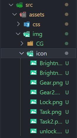
5, Icon path
summary
Tough exam week
I received the "good news" yesterday. I want to stay in school for training to No. 30 (pain mask) X eye