preface
In the past few months, the customer team and I have been optimizing a design system. On the surface, this optimization work includes two parts: performance optimization and structure reorganization. However, after refactoring more than a dozen components in recent months, we find that these two parts of work are largely two aspects of the same thing: good design can often bring better performance, and vice versa.
This is a very interesting discovery. When we discuss performance optimization, a factor that is often ignored is the design of the software itself. We will pay attention to the file size, whether there will be multiple rendering, and even some details, such as the priority of CSS selector, but we rarely review the code design for performance. On the other hand, if a component is not written in accordance with S.O.L.I.D In principle, we will think that its scalability is not good enough, or it becomes difficult to maintain due to the large volume of files and unclear responsibilities, but we often don't think that bad design will affect the performance (or it may be that the performance is always noticed after the implementation has been completed).
In order to better illustrate this problem and how to modify our design in practice to make the code more likely to have better performance, we can discuss several typical examples together.
Avatar assembly
In an earlier version of this design system, the Avatar Avatar The component has a convenient function: if the name attribute is passed to Avatar, a Tooltip will be displayed under the Avatar when the mouse hovers over the Avatar, with the content of the corresponding name.
In the implementation, Avatar uses another component Tooltip to complete this function:
import Tooltip from "@atlaskit/tooltip";

const Avatar = (props) => {
  if (props.name) {
    return (
      <Tooltip content={props.name}>
        <Circle>
          <img src={props.url} />
        </Circle>
      </Tooltip>
    );
  }

  return (
    <Circle>
      <img src={props.url} />
    </Circle>
  );
};
There is no problem with this function itself, but when users put forward more requirements, we began to lose control of Avatar. For example, when user A wants the mouse to hover, the Tooltip can be displayed above the Avatar. User B wants to customize the background color / font / font size of the Tooltip.
Of course, we can open some new parameters to Avatar to meet these requirements, such as:
<Avatar
  tooltipPosition="top"
  tooltipBackgroundColor="blue"
  tooltipColor="whitesmoke"
/>;
Or further, open an option object:
<Avatar
  tooltipProps={{
    position: "top",
    backgroundColor: "blue",
    color: "whitesmoke",
  }}
/>;
Then in the implementation, we pass it through to the Tooltip component. However, we will soon find that this approach will bring some problems:
- Because Avatar relies on tooltips, the file size will increase after packaging
- If the user needs to customize the Tooltip in a new way, the Avatar interface also needs to be updated accordingly
- Due to this dependency, Avatar needs to be repackaged when the API of Tooltip changes
If we look at the Avatar component, we will find that Tooltip plays a more auxiliary role than an indispensable role in its core function (displaying user avatars). For example, assuming that the Tooltip component is not used, we can simplify Avatar to:
const Avatar = (props) => (
  <Circle>
    <img src={props.url} title={props.name || ""} />
  </Circle>
);
In addition to the inconsistency of user experience, it does not affect the use. At this time, we should consider whether we can completely separate the two components of Tooltip and Avatar. The end user will decide whether to use the Tooltip. In other words, Avatar removes the Tooltip from the dependency in a more composable way, and the final code becomes:
import Avatar from "@atlaskit/avatar";
import Tooltip from "@atlaskit/tooltip";

const MyAvatar = (props) => (
  <Tooltip
    content="Juntao Qiu"
    position="top"
    css={{ color: "whitesmoke", backgroundColor: "blue" }}
  >
    <Avatar
      name="Juntao Qiu"
      url="https://avatars.githubusercontent.com/u/122324"
    />
  </Tooltip>
);
At first glance, it seems that this code is not much different from the original code, but note that the code fragment here is written by Avatar consumers, that is, the Avatar component itself no longer knows (nor needs to know) the existence of Tooltip. If necessary, the above code can also be modified to:
import Avatar from "@atlaskit/avatar";
import Tooltip from "@material-ui/core/Tooltip";

const MyAvatar = (props) => (
  <Tooltip title="Juntao Qiu" placement="top" classes={...}>
    <Avatar
      name="Juntao Qiu"
      url="https://avatars.githubusercontent.com/u/122324"
    />
  </Tooltip>
);
In other words, for consumers, Tooltip is no longer a black box bound in Avatar. This more composable approach has some advantages:
- Smaller for a single library
- For consumers, it is easier to customize on demand (for example, you can choose not to introduce Tooltip by default)
- It is no longer bound to the specific implementation of a Tooltip, but can be replaced by other libraries (such as the Tooltip in the material UI above)
In fact, this kind of scene has encountered a lot in our rectification. For example, we will look at another similar example: the invalid dialog in the inline editor inline < wbr > - edit.
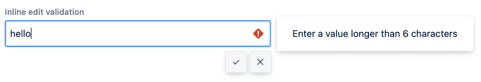
Inline editor
Inline editor( inline edit )It is another component used in many products. Through it, you can edit and save the content on the page in real time. Basically, it is equivalent to a form with only one field. In previous versions, this component provided such a function: if the validate function is provided, the validate function will be triggered every time the user enters. If vali < wbr > date returns false, an error message pop-up box will appear on the right side of the editor.
The implementation logic is approximately as follows:
import InlineDialog from "@atlaskit/inline-dialog";

const InlineEdit = (props) => {
  const { validate, editView } = props;
  return (
    <Field>
      {({ fieldProps, error }) => (
        <div>
          {editView(fieldProps)}
          {validate && (
            <InlineDialog
              isOpen={fieldProps.isInvalid}
              placement="right"
              content={<span>{error}</span>}
            />
          )}
        </div>
      )}
    </Field>
  );
};
Note that the editView here is a function that returns a ReactNode. Users can customize the editView here. Similar to the example of Avatar, the use of the InlineDialog component here actually blocks the possibility of using other components.
If we reconstruct inlineed < wbr > it in a way similar to the transformation of Avatar, we will find that this method does not work here: unlike the loose relationship between Avatar and Tooltip, inline < wbr > Edit is closely related to InlineDialog: inlined < wbr > ialog needs to be displayed only when InlineEdit is invalid, but not by default.
In other words, we cannot simply reconstruct it into:
import InlineDialog from "@atlaskit/inline-dialog";

const MyEdit = () => {
  return (
      <InlineDialog content={} isOpen={} placement="top">
      <InlineEdit
          editView={(fieldProps) => <Textfield {...fieldProps} />}
        validate={(value) => {
          return false;
        }}
      />
    </InlineDialog>
  );
};
As a parent node, InlineDialog cannot know the status of its child nodes (of course, the status can be passed through context, but it will lose the generality of components). Although the association relationship cannot be ignored, we can eliminate the specific InlineDialog and replace it with an abstract operation on what to do if an error occurs.
Option 1
In fact, what we are concerned about here is that if a check function is defined, and if the check fails, a behavior is triggered. This behavior can be either printing an error statement on the console, using the browser's alert, or any other user-defined component.
Let's define this behavior as a function called invalidView, which accepts the status of isInvalid (check failed) and an error (error message) string. Her signature reads as follows:
invalidView: (isInvalid: boolean, error: string) => React.ReactNode;
In this way, we can eliminate the direct use of inlinedia < wbr > log in InlineEdit:
const InlineEdit = (props) => {
  const { validate, editView, invalidView } = props;

  return (
    <Field>
      {({ fieldProps, error }) => (
        <div>
          {editView(fieldProps)}
          {validate && invalidView(isInvalid, error)}
        </div>
      )}
    </Field>
  );
};
The final consumer can choose which components to use for error handling:
import InlineDialog from "@atlaskit/inline-dialog"; // Note that inlinedialog is introduced for the end consumer
const MyEdit = () => {
  return (
    <InlineEdit
        editView={(fieldProps) => <Textfield {...fieldProps} />}
      validate={(value) => {
        return false;
      }}
      invalidView={(isInvalid, error) => (
        <InlineDialog isOpen={isInvalid} content={error} placement="top" />
      )}
    />
  );
};
Since the invalidView can theoretically be any component, there are infinite possibilities for the verification failure pop-up (or other UI).
Option 2
In addition, we can eliminate the direct reference to inlinedial < wbr > og in other ways. In the above InlineEdit code, we can see that the < wbr > editview function itself is a very common view function:
editView: (fieldProps: FieldProps) => React.ReactNode;
If we can extend it slightly: pass isInvalid and error to the function editView:
const InlineEdit = (props) => {
  const { validate, editView } = props;

  return (
    <Field>
      {({ fieldProps, isInvalid, error }) => (
        <div>
          {editView(fieldProps, isInvalid, error)}
        </div>
      )}
    </Field>
  );
};
In this way, when you pass in editView, you only need to wrap an inline < wbr > dialog (or other UI components):
import InlineDialog from "@atlaskit/inline-dialog";
const MyEdit = () => {
  return (
    <InlineEdit
      editView={(fieldProps, isInvalid, error) => (
        <InlineDialog isOpen={isInvalid} content={error} placement="top">
          <Textfield {...fieldProps} />
        </InlineDialog>
      )}
      validate={(value) => {
        return false;
      }}
    />
  );
};
Of course, the InlineDialog here can be completely replaced by Popover in the material ui:
import InlineDialog from "@atlaskit/inline-dialog";
import Popover from "@material-ui/core/Popover";
import Typography from "@material-ui/core/Typography";
const MyEdit = () => {
  return (
    <InlineEdit
      editView={(fieldProps, isInvalid, error) => (
        <Popover open={isInvalid}>
          <Typography>{error}</Typography>
          <Textfield {...fieldProps} />
        </Popover>
      )}
      validate={(value) => {
        return false;
      }}
    />
  );
};
Alternatively, the user can consume the error message here in other ways:
const MyEdit = () => {
  return (
    <InlineEdit
      editView={(fieldProps, isInvalid, error) => {
        if (isInvalid) {
          console.log(error);
        }

        return (<Textfield {...fieldProps} />);
      }}
      validate={(value) => {
        return false;
      }}
    />
  );
};
No matter in scheme 1 or scheme 2, what we do is to make the component not aware of error handling / response as much as possible, and return this decision to the component consumers. The advantage of this is to make the component more open to error handling (instead of turning off other options by introducing a specific implementation). Objectively, since we do not introduce an additional component, the size of the component itself will be reduced, and with the simplification of the code, the probability of errors in the logic itself will be reduced.
summary
From the above two examples, we can roughly draw the conclusion that * once you select a concrete (an abstract concrete implementation) in the code, you inevitably turn off the possibility of using other alternatives* For example, if @ atlaskit/tooltip is used in Avatar, the final consumer cannot use other Tooltip components, and inl < wbr > ineedit uses @ atlaskit / inline - < wbr > dialog, which also turns off the possibility of using Popover.
In fact, once we identify the problem, the solution is actually very simple. When auxiliary functions can be completely stripped (such as Tooltip to Avatar), we only need to remove them from this component. If the components to be removed are associated with this component, we need to modify the code to make it * * * depend on the abstract * * * rather than the specific implementation. Only in this way can we minimize dependence and improve flexibility.
Text / Thoughtworks Qiu Juntao
Original link: https://insights.thoughtworks.cn/component-design-performance/
For more brilliant insights, please pay attention to WeChat official account: Thoughtworks insight