1, Responsive layout of mobile WEB development
1.0 principles of responsive development
Media query is used to set the layout and style for devices with different widths, so as to adapt to different devices.
Division of equipment:
- Those less than 768 are ultra small screens (mobile phones)
- The between 768 and 992 is a small screen device (flat panel)
- 992 ~ 1200 medium screen (desktop display)
- Widescreen devices larger than 1200 (large desktop display)
1.1 responsive layout container
The response requires a parent as the layout container to match the child elements to achieve the change effect.
The principle is to change the size of the layout container through media query on different screens, and then change the arrangement and size of sub elements inside, so as to see different page layout and style changes on different screens.
Size division of parent container layout Center
- Ultra small screen (mobile phone, less than 768px): set the width to 100%
- Small screen (flat panel, 768px or more): set the width to 750px
- Medium screen (desktop display, greater than or equal to 992px): the width is set to 970px
- Large screen (large desktop display, greater than or equal to 1200px): the width is set to 1170px
However, we can also define the division according to the actual situation
2, Introduction to bootstrap
2.1 bootstrap introduction
Bootstrap, from Twitter, is currently the most popular front-end framework. Bootstrap is based on HTML, CSS and JAVASCRIPT. It is simple and flexible, making Web development faster.
Official website of Chinese website Recommended website
Framework: as the name suggests, it is a set of architecture. It has a relatively complete web page function solution, and the control is in the framework itself, including prefabricated style libraries, components and plug-ins. Users should develop according to some specification specified in the framework.
2.2 advantages of bootstrap
- Standardized html+css coding specification
- It provides a set of simple, intuitive and powerful components
- It has its own ecosystem and is constantly updated and iterated
- It makes the development easier and improves the efficiency of development
2.3 version introduction
2.x.x: the maintenance is stopped, the compatibility is good, the code is not concise enough, and the function is not perfect enough.
3.x.x: it is currently used most and stable, but IE6-IE7 is abandoned. It supports IE8, but the interface effect is not good. It is used to develop WEB projects with responsive layout and mobile device priority.
4.x.x: the latest version, which is not very popular at present
2.4 basic use of bootstrap
At this stage, we haven't contacted JS related courses, so we only consider using its style library.
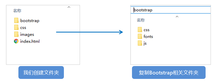
Bootstrap uses four steps:
-
Create folder structure
-
Create html skeleton structure
<!DOCTYPE html> <html lang="zh-CN"> <head> <meta charset="utf-8"> <meta http-equiv="X-UA-Compatible" content="IE=edge"> <meta name="viewport" content="width=device-width, initial-scale=1"> <!-- Above 3 meta label*must*Put it first, anything else*must*Follow! --> <title>Bootstrap 101 Template</title> <!-- Bootstrap --> <link href="css/bootstrap.min.css" rel="stylesheet"> <!-- HTML5 shim and Respond.js for IE8 support of HTML5 elements and media queries --> <!-- WARNING: Respond.js doesn't work if you view the page via file:// --> <!--[if lt IE 9]> <script src="//cdn.bootcss.com/html5shiv/3.7.2/html5shiv.min.js"></script> <script src="//cdn.bootcss.com/respond.js/1.4.2/respond.min.js"></script> <![endif]--> </head> <body> <h1>Hello, world!</h1> <!-- jQuery (necessary for Bootstrap's JavaScript plugins) --> <script src="//cdn.bootcss.com/jquery/1.11.3/jquery.min.js"></script> <!-- Include all compiled plugins (below), or include individual files as needed --> <script src="js/bootstrap.min.js"></script> </body> </html> -
Import related style files
<!-- Bootstrap Core style-->
<link rel="stylesheet" href="bootstrap/css/bootstrap.min.css">
-
Writing content
Directly use the predefined style of Bootstrap
Modify the original Bootstrap style and pay attention to the weight
The key to learning Bootstrap well is to know what styles it defines and what effects these styles can achieve
2.5 bootstrap layout container
Bootstrap needs to wrap a. Container or. Container fluid container for page content and grid system, which provides two classes for this purpose.
.container
- Container fixed width for responsive layout
- The width of large screen (> = 1200px) is 1170px
- The width of the middle screen (> = 992px) is set to 970px
- The width of small screen (> = 768px) is set as 750px
- Ultra small screen (100%)
.container-fluid
- Flow layout container 100% width
- A container that occupies all viewport s.
2.6 bootstrap grid system
Bootstrap provides a responsive, mobile device first streaming grid system. With the increase of screen or viewport size, the system will be automatically divided into up to 12 columns.
The grid system is used to create a page layout by combining a series of row s and column s, and your content can be put into these created layouts.
 Divided into 1 according to different screens~12 equal division
 OK( row) You can remove the parent container effect 15 px Margin of
 xs-extra small: Ultra small; sm-small: Small;  md-medium: Medium; lg-large: Large;
 Column( column)More than 12, extra columns( column)"The elements will be arranged in another row as a whole
 Each column has about 15 pixels by default padding
 You can specify the class names of multiple devices for a column at the same time to divide the number of copies. For example class="col-md-4 col-sm-6"
Grid nesting
The built-in grid system of the grid system will nest the content again. The simple understanding is that a column is divided into several small columns. We can add a new. row element and a series of. Col SM - * elements to the existing. Col SM-*
Within the element.
<!-- Column nesting -->
 <div class="col-sm-4">
    <div class="row">
         <div class="col-sm-6">Small column</div>
         <div class="col-sm-6">Small column</div>
    </div>
</div>
Column offset
Use the. Col MD offset - * class to offset the column to the right. These classes actually increase the left margin for the current element by using the * selector.
 <!-- Column offset -->
  <div class="row">
      <div class="col-lg-4">1</div>
      <div class="col-lg-4 col-lg-offset-4">2</div>
  </div>
Column sorting
You can easily change the order of columns by using the. column MD push - * and. column MD pull - * classes.
 <!-- Column sorting -->
  <div class="row">
      <div class="col-lg-4 col-lg-push-8">left</div>
      <div class="col-lg-8 col-lg-pull-4">right</div>
  </div>
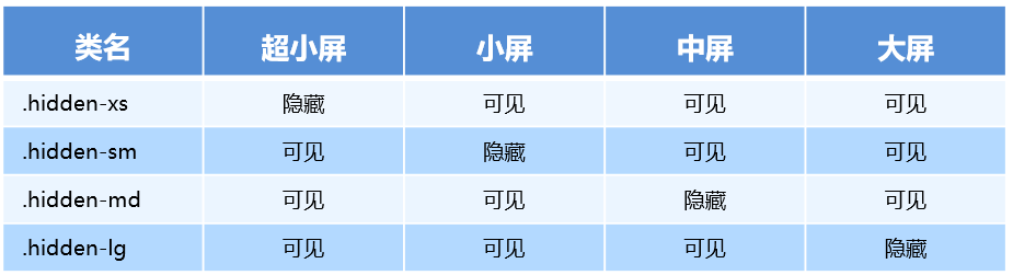
Responsive tools
In order to speed up the development of mobile device friendly pages, we can easily display or hide page content for different devices by using media query function and these tools.