1. Load different pages
When the screen size is larger than 600, load index2
If the screen size is less than 600, load index1
 $(function() {
        //Determine screen width
        var winWide = window.screen.width;  //Get current screen resolution
        alert(winWide);
        var wideScreen = false;
        if (winWide <=600) {  //Resolution of 600 and below
            window.location = "index1.html";//Load index1.html
        } else {  //Resolution greater than 600
            window.location = "index2.html";//Load index2.html
        }
    });
2. Load different css
1. Add a line of viewport meta tags at the head of the web page code
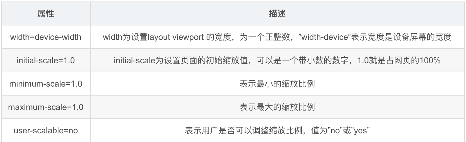
Add the following sentence to the of the web page to make the width of the web page automatically adapt to the width of the mobile phone screen. The following is the explanation of these attributes:
<meta name="viewport" content="width=device-width,initial-scale=1.0,maximum-scale=1.0,minimum-scale=1.0,user-scalable=no">
2. Do not use absolute width
Use width: Auto/ width:XX%;
3. The font size is 100% of the default size of the page, i.e. 16 pixels. Do not use the absolute size "px", but the relative size "rem"
html{font-size:62.5%;}
body {font:normal 100% Arial,sans-serif;font-size:14px; font-size:1.4rem; }
The font size of html is set to font size: 62.5%. Reason: the default font size of the browser is 16px, and the relationship between REM and PX is: 1rem = 10px, 10 / 16 = 0.625 = 62.5%. This is the most appropriate way to calculate the relevant size of sub elements.
4. Flow layout means that the position of each block is floating, not fixed
.left{ width:30%; float:left}
.right{ width:70%; float:right;}
Like this, the advantage of using left and right floating is that if the width is too small to fit two elements, the subsequent elements will automatically scroll below the previous elements and will not overflow in the horizontal direction, avoiding the emergence of horizontal scroll bars
5. Select Load CSS
The core of "adaptive web design" is the Media Query module introduced by CSS3. Automatically detect the screen width, and then load the corresponding CSS file
<link rel="stylesheet" type="text/css" media="screen and (max-device-width: 600px)" href="style/css/css600.css" />
This code means that if the screen width is less than 600 pixels (max device width: 600px), the css600.css file will be loaded.
If the screen width is between 600 pixels and 980 pixels, the css600-980.css file is loaded
<link rel="stylesheet" type="text/css" media="screen and (min-width: 600px) and (max-device-width: 980px)" href="css600-980.css" />
Also (not recommended): in addition to loading CSS files with html tags, you can also load them in existing CSS files
@import url("css600.css") screen and (max-device-width: 600px);
6. @ media and @ media screen of CSS, media query / matching
The function of media query is to set different css styles for different media. The "media" here includes page size, device screen size, etc.
-
First, let's talk about the difference between @ media and @ media screen
@There is no difference between media and @ media screen on mobile devices, but the css of @ media screen is invalid in the printing device, while @ media is valid in the printing device. If css needs to be used in the printing device, use @ media[ There are examples on Alibaba cloud~~ -
grammar
Start with @ media or @ media screen and to indicate that this is a media query statement@ Media is followed by one or more expressions. If the expression is true, the style is applied. -
@media
@media (max-width: 600px) {
  .mainner {
    display: none;
  }
}
The above code will affect the contents in braces when the screen width is less than 600px.
Note: max width is the width of the target display area, for example, the width of the browser.
Media query can be used in link tag with media attribute or css file. Specific examples will not be given.
- @media screen
The following example is to cancel floating when the screen width is less than 400px
@media screen and (max-device-width: 400px)
{  .left {
	 float:none;
   }
 }
Note: Max device width is the width of the entire display area of the device, for example, the real device screen width.
Knowledge expansion
@media only screen and
Only (limit a device)
screen is one of the media types
And is called a keyword, and other keywords include not
Not specifies a specific media type that can be used to exclude browsers that do not support media queries:
For example, if the browser window is smaller than 500px, the background will change to light blue:
@media only screen and (max-width: 500px) {
    body {
        background-color: lightblue;
    }
}
7. Image adaptation, "adaptive web design" must also realize the automatic scaling of images.
img {width: 100%;}
- Image distortion may occur when scaling pictures on windows platform. At this point, you can try to use IE's proprietary commands
img { width:100%; -ms-interpolation-mode: bicubic;}
- Or use js – imgSizer.js
addLoadEvent(function() {
  var imgs = document.getElementById("content").getElementsByTagName("img");
  imgSizer.collate(imgs);
});