Scss, elementUI introduction, transition animation - learning notes
What is Sass?
Official website: https://www.sass.hk/guide/
Sass is a mature, stable and powerful CSS preprocessor, while SCSS is a new syntax feature introduced in Sass3. It is fully compatible with CSS3 and inherits sass' powerful dynamic functions.
Features Overview
When writing large-scale Web applications with CSS code, it is easy to cause too high complexity of selector and cascade. Therefore, it is recommended to develop CSS through SASS preprocessor. The variables, nesting, mixing, inheritance and other features provided by SASS make the writing of CSS more interesting and stylized.
The difference between Scss and Sass
Sass and Scss are actually the same thing. We usually call them sass. The main differences between them are as follows:
1. The file extension is different. sass takes ". sass" suffix as the extension, while scss takes ". scss" suffix as the extension.
2. The grammar writing method is different. Sass is written in strict indented grammar rules without braces ({}) and semicolons;, The syntax writing of Scss is very similar to our CSS syntax writing.
install
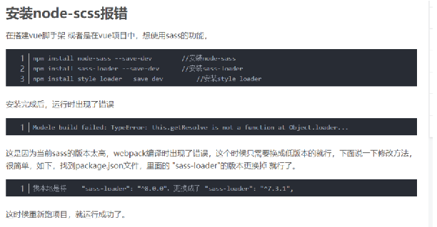
npm install node-sass -save-dev
npm install sass-loader@^7.3.1 --save-dev
npm install style-loader --save-dev

– save -dev difference
– save: save the configuration information to the package The dependencies node of JSON.
– save dev: save the configuration information to the package In the devDependencies node of JSON.
Dependencies: runtime dependencies, which are modules that need to be used in the production environment after publishing
Dev dependencies: dependencies at development time. The module inside is used during development, but it is not used during release.
Variable declaration
$highlight-color: #F90;
$lightColor: #ffffff;
$darkColor: #000000;
$redColor : #f00;
$blue-color: blue;
Variable reference:
border:1px solid $darkColor;
Nested CSS rules
Repeatedly writing selectors in css is very annoying. If you want to write a large string of styles pointing to the same block in the page, you often need to write the same ID again and again:
#content article h1 { color: #333 }
#content article p { margin-bottom: 1.4em }
#content aside { background-color: #EEE }
In this case, sass allows you to write only once and makes the style more readable. Sass will help you handle these nested rules when outputting css to avoid your repeated writing.
#content {
  article {
    h1 { color: #333 }
    p { margin-bottom: 1.4em }
  }
  aside { background-color: #EEE }
}
Identifier of the parent selector&
article a { color: blue }
article a:hover { color: red }

article a {
  color: blue;
  &:hover { color: red }
}
Nesting of group selectors
.container h1, .container h2, .container h3
 { margin-bottom: .8em }

.container {
  h1, h2, h3 {margin-bottom: .8em}
}
Sub combination selector and same layer combination selector: >, + and~
Selector > select the immediate child of an element.
article section { margin: 5px }
article > section { border: 1px solid #ccc }
Adjacent combination selectors on the same layer + p elements immediately after selecting header elements
header + p { font-size: 1.1em }
Select the same layer all combination selector ~, and select all the same layer article elements following the article, no matter how many other elements are separated between them:
article ~ article { border-top: 1px dashed #ccc }
.div1 {
  color:$blue-color;
  .div2 {
    border:1px solid $darkColor;
    .div3{
      font-size:14px;
      color:lighten($darkColor,70%);
      &>a {
        color:lighten($darkColor,70%);
      }
    }
  }
}
article {
  ~ article { border-top: 1px dashed #ccc }
  > section { background: #eee }
  dl > {
    dt { color: #333 }
    dd { color: #555 }
  }
  nav + & { margin-top: 0 }
}
Nested Attributes
nav {
  border-style: solid;
  border-width: 1px;
  border-color: #ccc;
}

nav {
  border: 1px solid #ccc {
  left: 0px;
  right: 0px;
  }
}
mixer
The mixer is defined using the @ mixin identifier
@mixin rounded-corners {
  -moz-border-radius: 5px;
  -webkit-border-radius: 5px;
  border-radius: 5px;
}
Use @ include to use this mixer anywhere you want
notice {
  background-color: green;
  border: 2px solid #00aa00;
  @include rounded-corners;
}
elementUI
Official website: https://element.eleme.cn/#/zh-CN
install
npm i element-ui -S
main.js
import Vue from 'vue';
import ElementUI from 'element-ui';
import 'element-ui/lib/theme-chalk/index.css';
import App from './App.vue';

Vue.use(ElementUI);
transition animation
Official website: https://cn.vuejs.org/v2/guide/transitions.html
Vue provides application transition effects in many different ways when inserting, updating or removing DOM.
Includes the following tools:
Automatically apply class in CSS transitions and animations
You can use third-party CSS animation libraries, such as animate css
Use JavaScript in the transition hook function to directly manipulate DOM
You can use third-party JavaScript animation libraries, such as velocity js
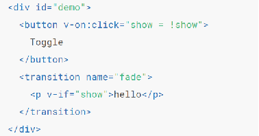
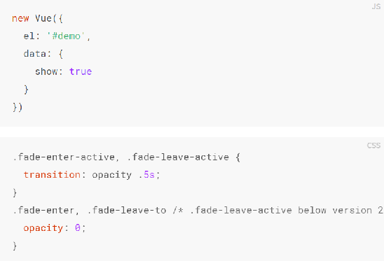
example:


Animation processing
When inserting or deleting elements contained in the transition component, Vue will do the following:
Automatically sniff whether CSS transition or animation is applied to the target element. If so, add / delete CSS class names at the appropriate time.
If the transition component provides JavaScript hook functions, these hook functions will be called at the right time.
If no JavaScript hook is found and no CSS transition / animation is detected, the DOM operation (insert / delete) is performed immediately in the next frame. (Note: This refers to the browser frame by frame animation mechanism, which is different from Vue's nextTick concept)
Transition class name
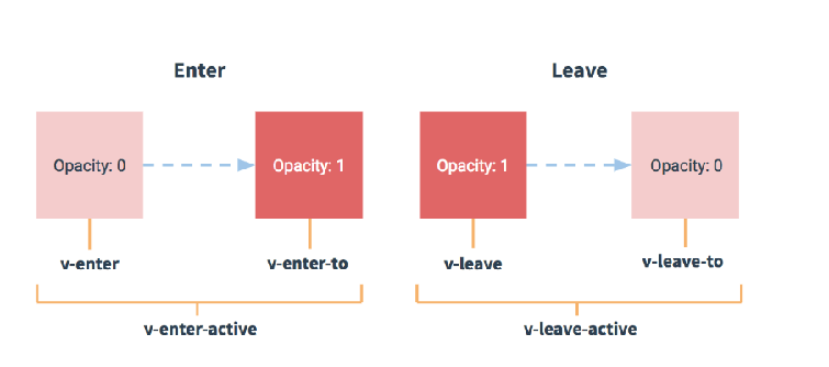
In the transition of entry / exit, there will be 6 class switches.
v-enter: defines the start state of the transition. Takes effect before the element is inserted and is removed at the next frame after the element is inserted.
v-enter-active: defines the state when the transition becomes effective. Applied throughout the transition phase, it takes effect before the element is inserted and removed after the transition / animation is completed. This class can be used to define the transition process time, delay and curve functions.
V-enter-to: version 2.1.8 and above define the end state of transition. After the element is inserted, the next frame takes effect (at the same time, the v-enter is removed) and is removed after the transition / animation is completed.
v-leave: defines the start state of leaving the transition. Takes effect immediately when the exit transition is triggered and the next frame is removed.
v-leave-active: defines the state when the exit transition takes effect. Applied throughout the exit transition phase, it takes effect immediately when the exit transition is triggered and is removed after the transition / animation is completed. This class can be used to define exit transition process time, delay and curve functions.
V-leave-to: version 2.1.8 and above define the end state of leaving the transition. After the departure transition is triggered, the next frame takes effect (at the same time, v-leave is deleted) and is removed after the transition / animation is completed.

<template>
  <div>
    <button @click="flag=!flag">click</button>
    <transition name="abc">
      <p v-if="flag">hello</p>
    </transition>
  </div>
</template>

<script>
export default {
  data(){
    return {
      flag:true
    }
  }
}
</script>
<style lang="scss">
.abc-enter-active,.abc-leave-active{
  transition:opacity 1s ease;
}
.abc-enter,.abc-leave-to{
  opacity:0
}
</style>