While you should make use of the flexibility afforded by scatterplot( ) and relplot( ), always try to keep in mind that several simple plots are usually more effective than one complex plot.
When you take advantage of the flexibility provided by scatterplot() and relplot(), you should remember some simple graphics as much as possible, which is often more effective than remembering only one complex graphic. -- Seaborn documentation
- Import the necessary libraries:
import numpy as np
import pandas as pd
import matplotlib.pyplot as plt
import seaborn as sns
- All data sets required for drawing can be found in this GitHub blogger's open source project Seaborn data Find it on without downloading the code; In addition, some random data will be generated.
Relating variables with scatter plots
Simple scatter diagram
-
In Seaborn, scatterplot() and relplot() can be plotted; The logic used is that the * * * parameter data * * * corresponds to the data set, the * * * parameter x * * * and * * * parameter y * * * correspond to the horizontal axis variable and the vertical axis variable respectively, and all the column names corresponding to the numerical data in the data set are passed in, that is, the so-called variables. For the latter, which will only be introduced next, when its * * * parameter kind * is set to 'line' instead of 'scatter' by default, it will draw a broken line diagram. Using dataset tips 1.
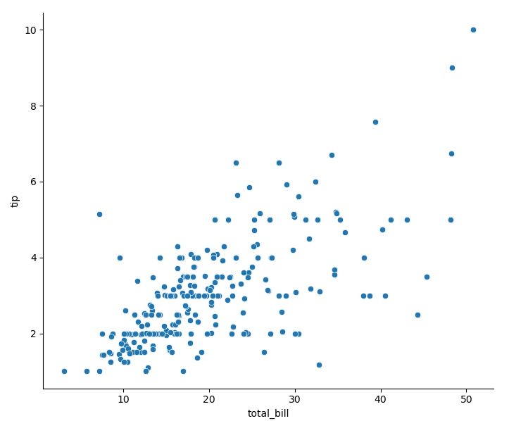
tips = pd.read_csv('tips.csv')                   # Read data
sns.relplot(x='total_bill', y='tip', data=tips)  # Default parameter kind='scatter '
Scatter diagram using semantics
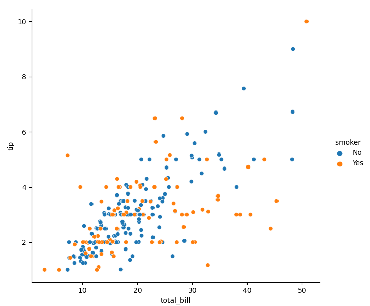
- I think Seaborn is most praised for using different semantics by setting parameters in the code, that is, changing points, so as to simply add more dimensions to the two-dimensional image. It should be noted that the use logic of this method is also the column name passed to the semantic parameter, that is, the so-called variable, and the data corresponding to the column name should be the data representing the classification meaning - this is very important. Hue semantics is the color of the change point, corresponding to * * * parameter hue * * *:
sns.relplot(data=tips, x='total_bill', y='tip', hue='smoker', data=tips)
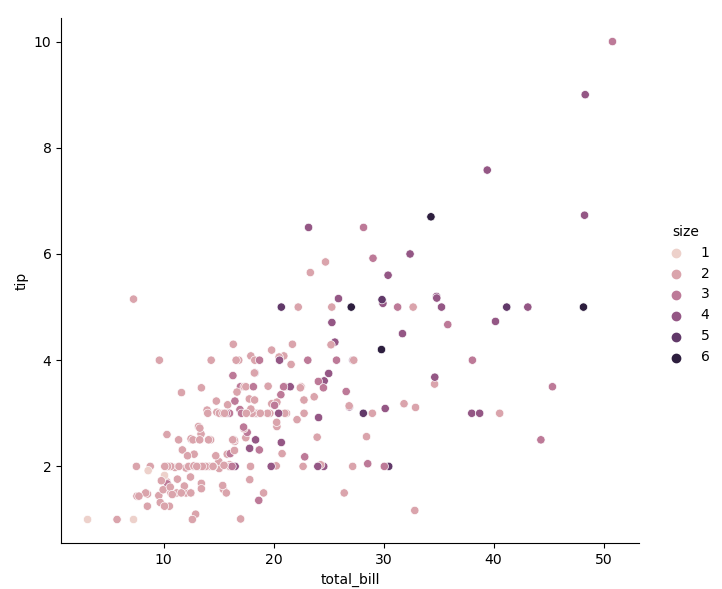
- When the classification data passed in to the parameter hue is a numerical value, the coloring of points will show a gradual change:
sns.relplot(data=tips, x='total_bill', y='tip', hue='size')
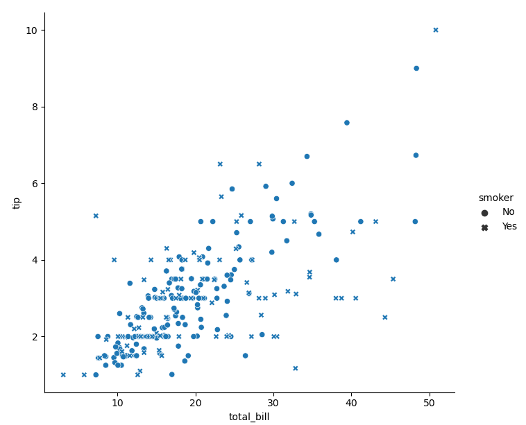
- Style semantics refers to the style (shape) of the change point. The corresponding parameter style:
sns.relplot(data=tips, x='total_bill', y='tip', style='smoker')
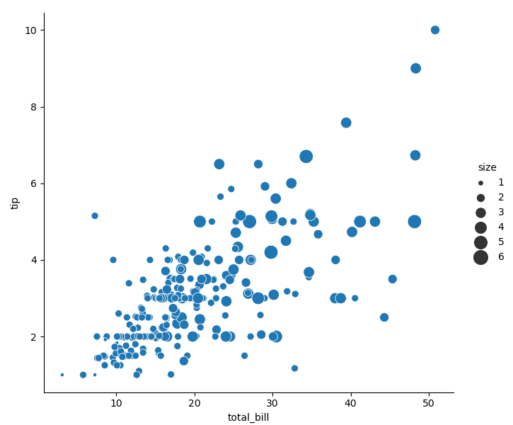
- Dimension semantics refers to the size (area) of the change point, corresponding to the parameter size. Unlike the scattergraph function scatter() in matplotlib, the relative size between points can be controlled by the range passed to the parameter sizes, rather than depending on the size of the value itself.
sns.relplot(data=tips, x='total_bill', y='tip', hue='size',  size='size', sizes=(15, 200))
                                                                        # Pass in the column name size of the dataset tips to the parameter size
Two semantics correspond to a variable
- If tone semantics and style semantics are used at the same time, and different variables are passed in, the generated two-dimensional image contains four variables:
sns.relplot(data=tips, x='total_bill', y='tip', hue='smoker', style='time')
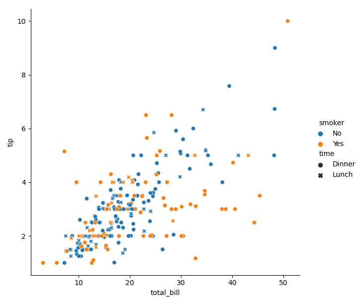
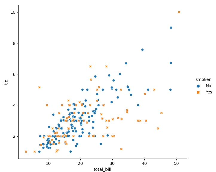
- Obviously, because our eyes are much less sensitive to shape than to color, dots and forks are not easy to distinguish from blue dots and orange dots. Therefore, I suggest that two semantics should be used for a variable to achieve a more intuitive effect:
sns.relplot(data=tips, x='total_bill', y='tip', hue='smoker', style='smoker') # Change the color and style of points
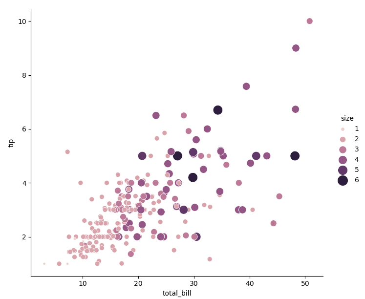
sns.relplot(data=tips, x='total_bill', y='tip', hue='size', size='size', sizes=(15, 200))# Change the color and size of points
Emphasizing continuity with line plots
Simple line chart
-
Generate some data for drawing a line graph: 500 rows and 2 columns, and the first column time is sequentially from 0 to 499, and the second column value is composed of 500 random numbers that obey the standard normal distribution (by np.random.randn()) 2 After accumulation (by np.cumsum()) 3 Achieved).
np.random.seed(2021)                                              # With this sentence, the generated random array can be fixed
df = pd.DataFrame(dict(time=np.arange(500), value=np.random.randn(500).cumsum()))
- In Seaborn, you can draw a line chart. You can directly use the function lineplot() or set the parameter kind in the function relplot() to 'line', and its use logic is no different from the drawing of scatter chart.
sns.relplot(x='time', y='value', data=df, kind='line')

- By default, the function relplot() sorts the data corresponding to the horizontal axis variable before using it, that is, you want the variable to be continuous. Of course, you can cancel this step, but the diagram drawn in this way can not find the relationship between the two variables:
df = pd.DataFrame(np.random.randn(500, 2).cumsum(axis=0), columns=['x', 'y'])  # When axis=0, the two-dimensional array is vertically accumulated
sns.relplot(data=df, x='x', y='y', kind='line', sort=False)                    # Set the parameter sort to False

Uncertainty is represented by aggregation
- For more complex data, the same value of the horizontal axis variable may correspond to multiple different values of the vertical axis variable (repeated values of the horizontal axis variable). At this time, Seaborn's mapping function relplot() will calculate the mean of the corresponding vertical axis variables and the confidence interval with a confidence level of 0.95 to achieve an aggregation - nothing is drawn in matplotlib (can't I use it?). Using dataset fmri 4.
fmri = pd.read_csv('fmri.csv')
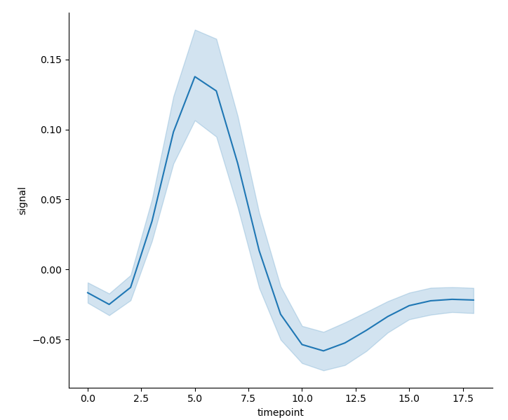
sns.relplot(x='timepoint', y='signal', kind='line', data=fmri)
- When the data set is large, it may take a long time to calculate the confidence interval. There are two alternative methods - both use the parameter ci, that is, directly choose not to calculate the confidence interval but only the mean:
sns.relplot(x='timepoint', y='signal', kind='line', data=fmri, ci=None) # Set the parameter ci to None
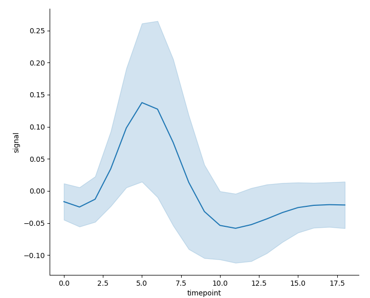
- Or calculate the standard deviation of the data to replace the confidence interval; Logically speaking, if the length of the interval is less than the length of the confidence interval, the calculation of the standard deviation will not be an alternative:
sns.relplot(x='timepoint', y='signal', kind='line', ci='sd', data=fmri) # Set the parameter ci to sd
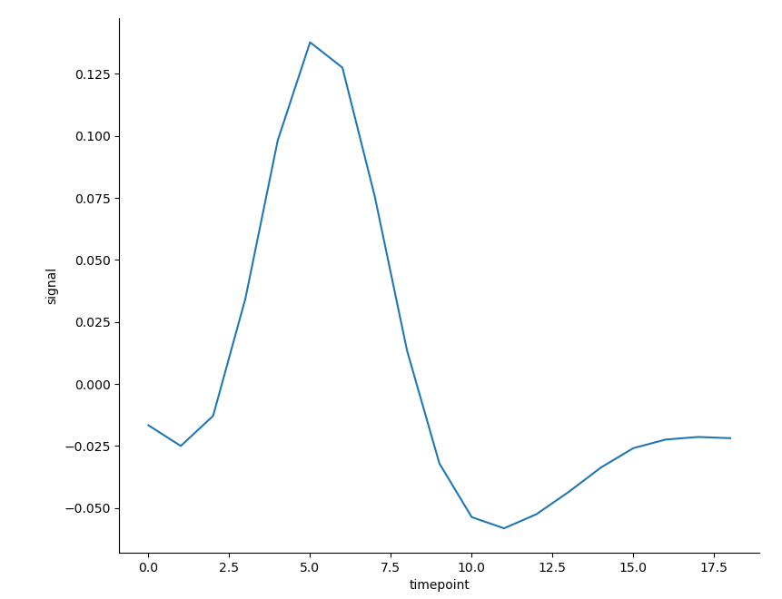
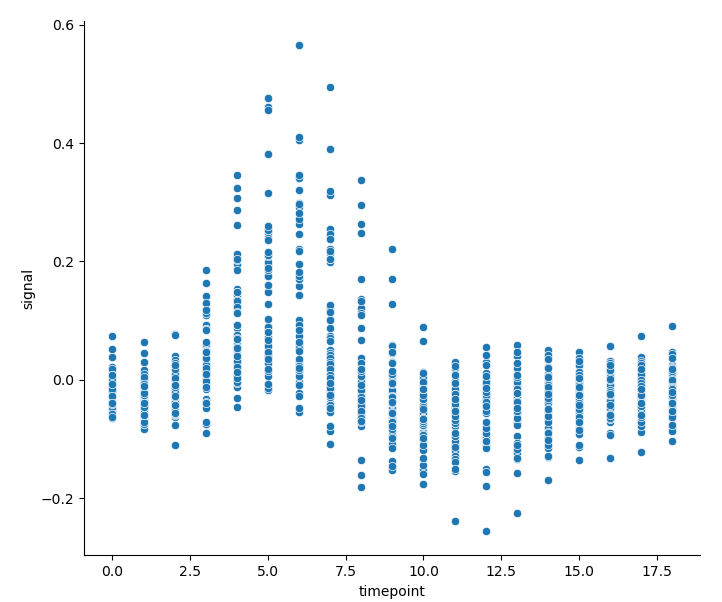
- If aggregation is not carried out, the line chart drawn in this way is of little significance. However, we can also understand what aggregation is doing through its and the corresponding scatter diagram:
sns.relplot(x='timepoint', y='signal', estimator=None, kind='line', data=fmri)
                                                                   # The parameter estimator=None needs to be set to turn off aggregation
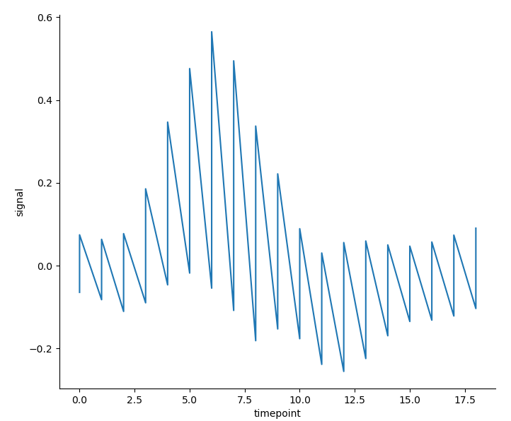
sns.relplot(x='timepoint', y='signal', kind='scatter', data=fmri)
Drawing data subsets with semantic mapping
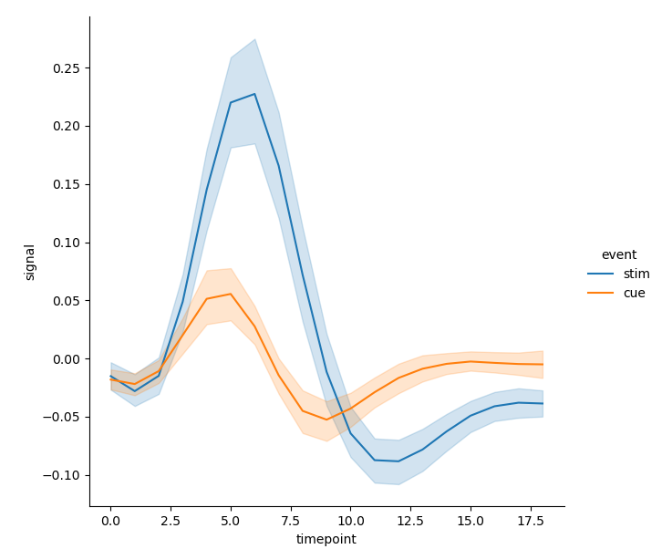
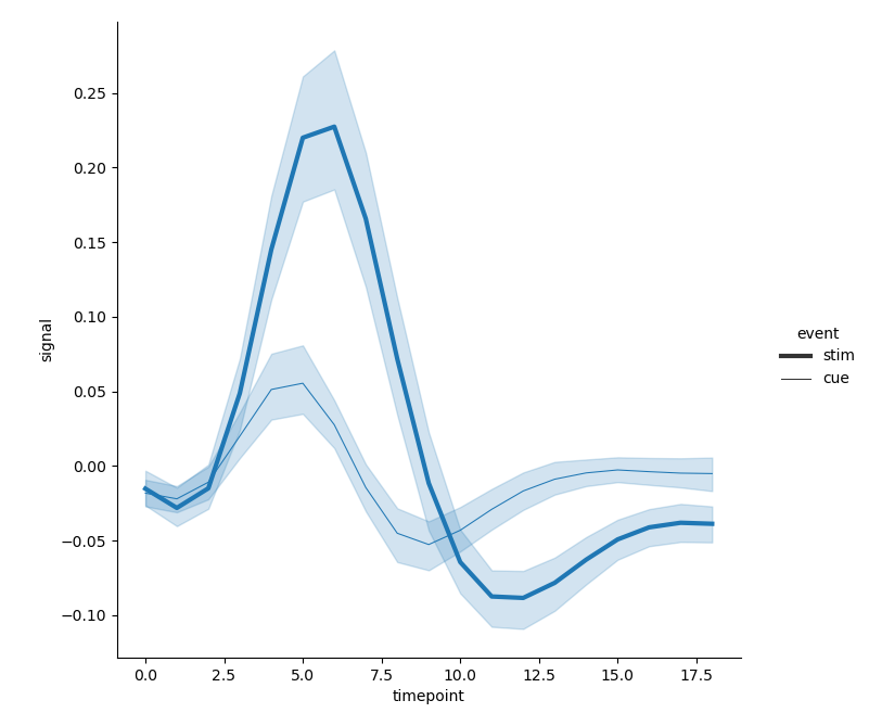
- In line drawing, you can also set semantic parameters in the drawing functions * relplot() and lineplot() * to add more variables, so as to expand the dimension of the image. Hue semantics will change the color of lines and error band s:
sns.relplot(x='timepoint', y='signal', hue='event', kind='line', data=fmri)
-
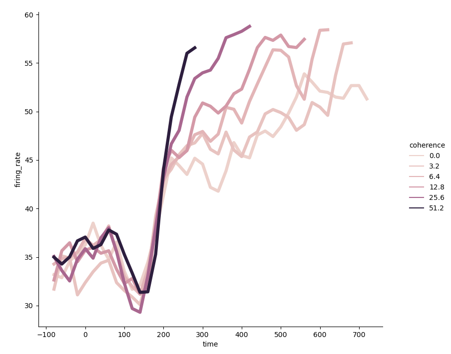
When the classification data passed to the parameter hue is numeric, the coloring of the line will also show a gradual change. The data set dots is used here 5 . In the case of drawing purpose, the requirements for data will be relatively high, so that some additional operations will be used - using * PD Query() * function 6
dots = pd.read_csv('dots.csv').query('align == "dots"')
sns.relplot(x='time', y='firing_rate', hue='coherence', linewidth=4.5,                   # Sets the width of all lines
                              ci=None, kind='line', data=dots.query('choice == "T1"'))   # Confidence intervals are not calculated
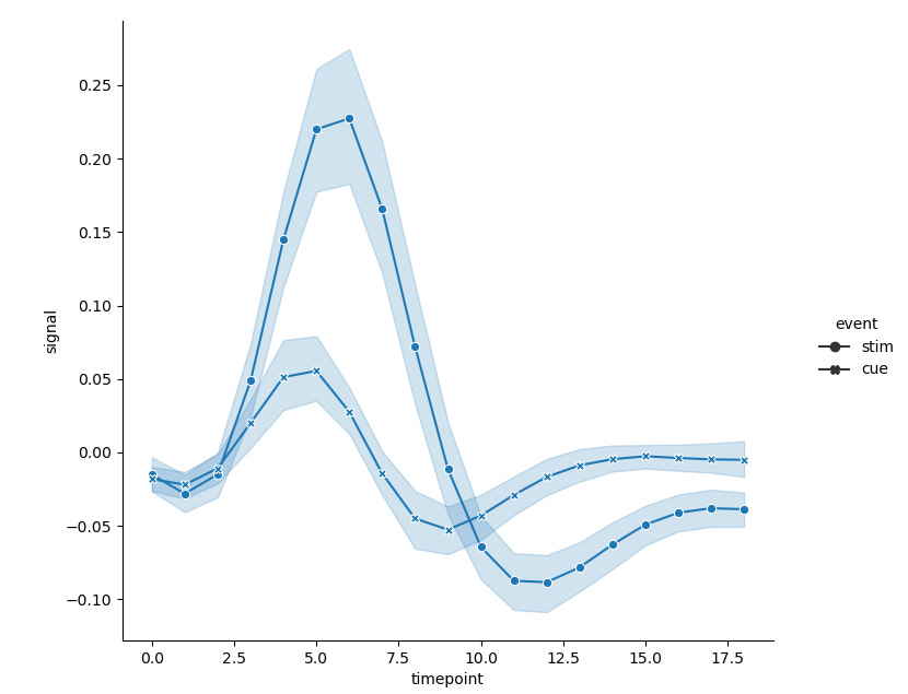
- When using style semantics, there are more choices - distinguished by the style of the line itself:
sns.relplot(x='timepoint', y='signal', style='event', kind='line', data=fmri) # By default

- Or set the parameters dashes and markers additionally, that is, change the shape of the point at the data node:
sns.relplot(x='timepoint', y='signal', style='event',
            dashes=False, markers=True, kind='line', data=fmri)    # It can be considered as closing the dotted line and opening the marked point
- Using dimension semantics is actually changing the width (thickness) of lines, that is, the widths of different types of lines are different, so as to increase the dimension of the image:
sns.relplot(x='timepoint', y='signal', size='event', kind='line', data=fmri)
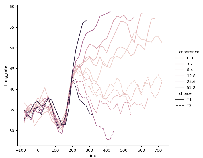
- In the above examples, I deliberately avoided using two semantics at the same time, let alone containing four variables. On the one hand, I think we should refer to the most basic content, even if it is almost without any difficulty. On the other hand, I still suggest using two semantics for a variable, so as to increase the visual intuition of the image, which will be mentioned later. For practice and comparison, we might as well experience the convenience and flexibility brought by the drawing function in Seaborn while using two semantics and adding two variables. Use tone semantics and Style Semantics:
sns.relplot(x='time', y='firing_rate', hue='coherence', style='choice', kind='line', data=dots)
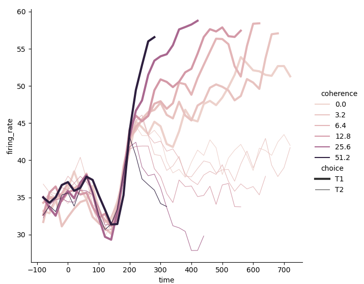
- When using tone semantics and dimension semantics at the same time, it seems that the thickness of the line is more prominent than the real and virtual of the line:
sns.relplot(x='time', y='firing_rate', hue='coherence', size='choice', kind='line', data=dots)
Showing multiple relationships with facets
Why faceting
- When introducing the line chart for drawing duplicate data, we use the data set fmri. Here we might as well take a further look at the content of each column:
| Listing | data |
|---|---|
| subject | s0,s2,s3,s4,s5,s6,s7,s8,s9,s10,s11,s12,s13 |
| timepoint | 0,1,2,3,4,5,6,7,8,9,10,11,12,13,14,15,16,17,18 |
| event | cue,stim |
| region | parietal,frontal |
| signal | -0.25549 ~ 0.564985 |
- More specifically:
| subject | timepoint | event | region | signal |
|---|---|---|---|---|
| s0 | 1 | cue | parietal | 0.0003 |
| s0 | 2 | cue | frontal | 0.024296 |
| s0 | 2 | stim | parietal | 0.009642 |
| s0 | 17 | stim | frontal | -0.03932 |
| s7 | 2 | cue | parietal | -0.07661 |
| s8 | 7 | stim | parietal | 0.312811 |
| s13 | 9 | stim | frontal | -0.06805 |
-
Try to explain this data set: from the column 'subject', there are 14 sampling units. Each unit is divided into 'cue' and 'stim' by the column 'event', and into 'parietal' and 'frontal' by the column 'region'. Its' signal 'value is measured on 19 time units (0, 1,..., 18); And the occurrence of repeated values is because there are fourteen sampling units in each time unit, and each unit is divided into four categories (2) × 2) , i.e. repeat 56 observations - it is not difficult to obtain the analysis results through observation.
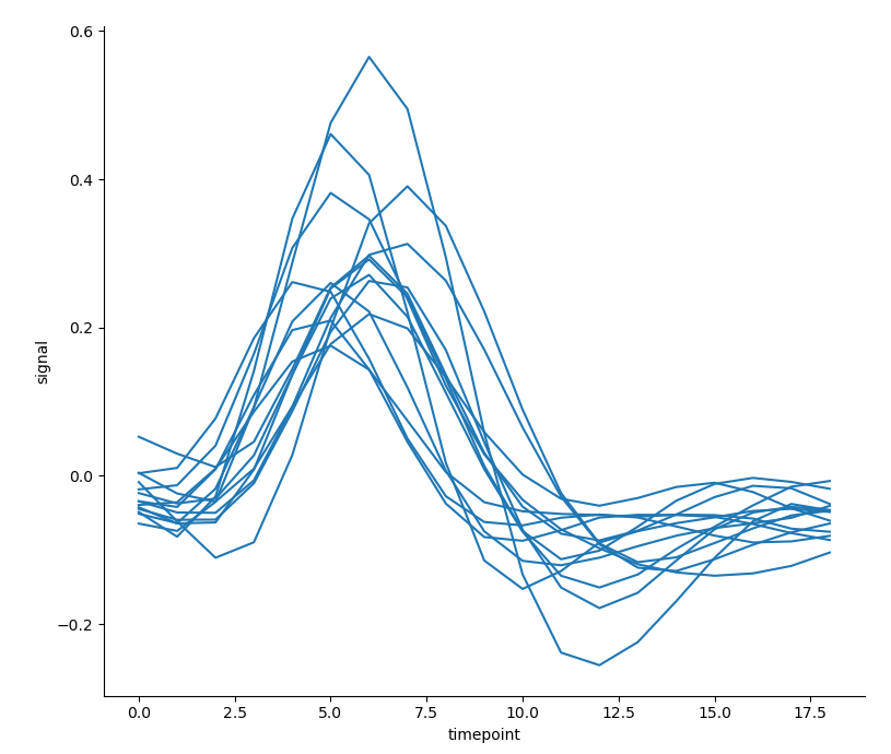
Then, with a certain understanding of the data set, there is another option to deal with the drawing of duplicate values, that is, pass in the column name 'subject' to the * * * parameter units * * *, and draw each sampling unit of the column. Next, select one of the four categories to draw:
sns.relplot(x='timepoint', y='signal',
  units='subject', estimator=None,                                        # The setting of parameter estimator seems to be indispensable
  kind='line', data=fmri.query('event == "stim" & region == "parietal"')) # Use PD Query() function to select a class
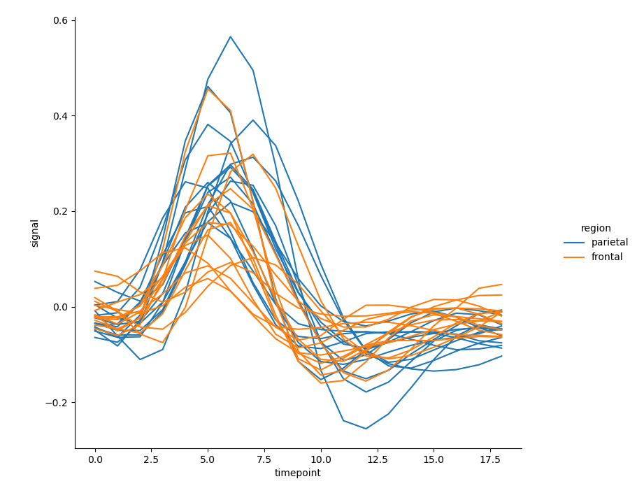
- There are 14 lines in the above figure. If the tone semantics is used to consider the influence of the variable 'region' on the relationship between the horizontal axis variable 'timepoint' and the vertical axis variable * 'signal' *, 28 lines will appear densely in one figure, which is not easy to observe:
sns.relplot(x='timepoint', y='signal', hue='region',                                        # Set semantic parameter hue
            units='subject', estimator=None,
            kind='line', data=fmri.query('event == "stim"'))
Give solutions
-
The above question can be summarized as: how to understand how the relationship between two variables depends on at least one other variable? (But what about when you do want to understand how a relationship between two variables depends on more than one other variable?)
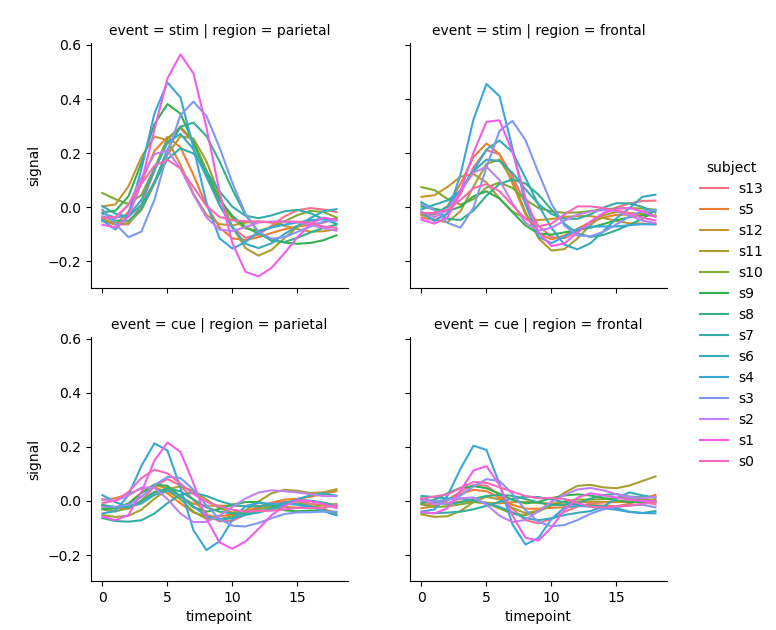
In Seaborn, the best way is to draw multiple graphs. For parameters col and row, like semantic parameters, they are the column names of incoming category data, and corresponding subgraphs will be generated on rows and columns. Each subgraph represents the relationship between horizontal axis variables and vertical axis variables under this category. If the four categories of each sampling unit are drawn into four subgraphs, the drawing effect may be improved:
sns.relplot(x='timepoint', y='signal', hue='subject',
            col='region', row='event', estimator=None,
            height=2.5, kind='line', data=fmri)   # The parameter height sets the height of each subgraph
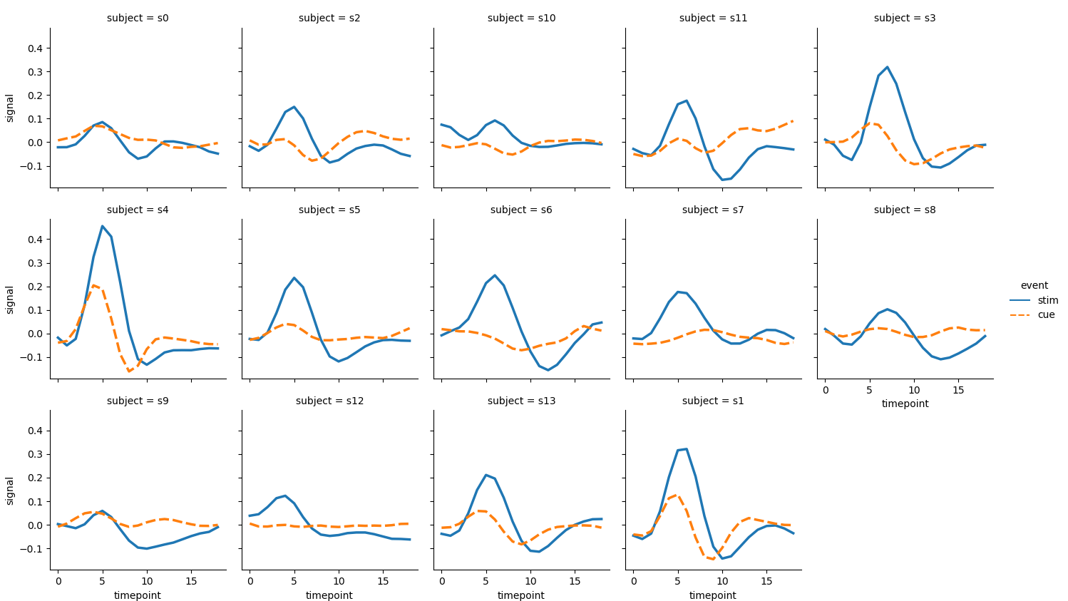
- If 14 sampling units are drawn independently and only two categories are considered, the resulting image will become very effective because it is small and many:
sns.relplot(x='timepoint', y='signal', kind='line',
    hue='event', style='event',               # One variable, two semantics
    col='subject', col_wrap=5, linewidth=2.5, # Parameter col_wrap represents the number of subgraphs in a row
    height=2.5, aspect=1.0,                   # The parameter aspect represents the ratio of height to width of the subgraph
    data=fmri.query('region == "frontal"'))
The column names of the dataset tips are: Index(['total_bill', 'tip', 'sex', 'smoker', 'day', 'time', 'size'], dtype = 'object'), and the corresponding data types are: float64, float64, object, object, object, object, int64 ↩︎
The generated random number obeys the standard normal distribution and is introduced into the shape of the generated data; Here is a one-dimensional array of size 500. You can refer to this article Articles on generating random numbers. ↩︎
Simple operation: for array arr_1 = [1, 1, 1, 1, 1], arr_1.cumsum( ) = [1, 2, 3, 4, 5]; For array arr_2 = [1, 2, 3, 4], arr_2.cumsum( ) = [1, 3, 6, 10]. ↩︎
The column names of the dataset fmri are: Index(['subject', 'timepoint', 'event', 'region', 'signal], dtype =' object '), and the corresponding data types are: object, int64, object, object, float64. For more details, refer to the third part: representing the beginning of multiple relationships by faceting. ↩︎
The column names of the data set dots are: Index(['align', 'choice', 'time', 'coherence', 'firing_rate'], dtype = 'object'), and the corresponding data types are: object, object, object, int64, float64, float64 ↩︎
It can be said that this function is used to select rows (samples) in the data frame (data set); Here, in the data set dots, select the row (sample) with column "align" (variable) as "dots", and then select the row (sample) with column "choice" (variable) as "T1". ↩︎