seaborn visualization (I)
-
Matplotlib tries to make simple things easier and difficult things possible, while Seaborn makes difficult things easier.
-
seaborn is for statistical mapping. Generally speaking, seaborn can meet 90% of the mapping needs of data analysis.
-
Seaborn is actually a higher-level API package based on matplotlib, which makes drawing easier. In most cases, Seaborn can make attractive drawings. Seaborn should be regarded as a supplement to matplotlib rather than a substitute.
-
The biggest difficulty with matplotlib is its default parameters, which Seaborn completely avoids.
-
The knowledge points of this chapter are as follows:
- Import related libraries
- Loading seaborn's own dataset: load_dataset()
- Canvas theme: set_style()
- Relational chart: relplot()
- Scatter plot: scatterplot()
- Line chart: lineplot()
- Classification chart: catplot()
- Classified scatter plot: stripplot() and swarm plot()
- Box diagram and enhanced box diagram: boxplot() and boxplot()
- Violin picture: violinplot()
- Point plot: pointplot()
- Bar chart: barplot()
- Count chart: countlot ()
-
Small tasks:
- Question 1: draw a scatter diagram of multiple classifications
- Question 2: drawing the pyramid of population age structure in 2010
- Question 3: draw a line diagram of the difference in the proportion of Men VS women of all ages
1. Import related libraries
import numpy as np
import pandas as pd
import matplotlib.pyplot as plt
import seaborn as sns
import warnings
warnings.filterwarnings('ignore')
%matplotlib inline
2. Load seaborn's own dataset
#If you report an error, you can go https://github.com/mwaskom/seaborn-data , download the dataset to the local, set the cache parameter to True, and set the data_home put local path;
#tip = sns.load_dataset('tips')
#tip

#filepath = '/home/mw/input/data1329'
filepath = 'D:\ProgramData\Anaconda3\Lib\site-packages\seaborn\seaborn-data'
tips = sns.load_dataset("tips", cache=True, data_home=filepath)
fmri = sns.load_dataset("fmri", cache=True, data_home=filepath)
exercise = sns.load_dataset("exercise", cache=True, data_home=filepath)
titanic =  sns.load_dataset("titanic", cache=True, data_home=filepath)
data=sns.load_dataset('tips')
data
3. Canvas theme
- As for how to adjust the image style, if the degree of freedom is too high, I will not introduce it in detail. I will briefly introduce a function of modifying the background. There are five types of canvas themes:
- darkgrid: gray grid
- whitegrid: white grid
- dark: gray
- White: white
- ticks: this topic has more tick marks than the white topic;
- Using set_style(), but this modification is global and will affect all subsequent images.
3.1 draw three sin function curves
def sinplot(flip = 1):
    x = np.linspace(0, 10, 100)
    for i in range(1, 4):
        plt.plot(x, np.sin(x + i * 0.5) * (4 - i) * flip)
sinplot()
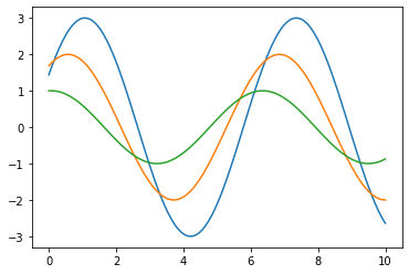
3.2 setting the background as the default theme
sns.set() # Default theme: gray grid; The modification is global
sinplot()
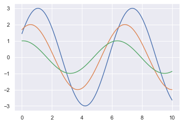
3.3 modify the background to white grid theme
sns.set_style('whitegrid')
sinplot()

#Note: topics with grids are easy to read
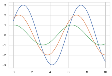
3.4 remove unnecessary borders: SNS despine()
sns.set_style("ticks")
sinplot() # This theme has more tick marks than the white theme
sns.despine() #Remove unnecessary borders
- The top and right borders are removed, and there are other parameters in despine(). For example, the offset parameter is used to set the axis offset. For more parameters, you can search relevant data by yourself;
3.5 setting temporary theme: internal white grid, external gray theme
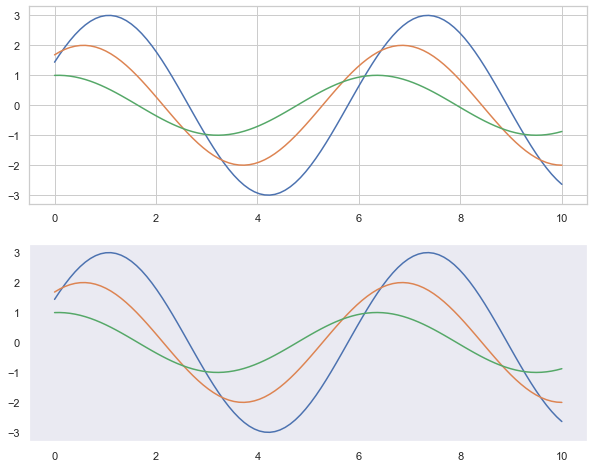
plt.figure(figsize = (10, 8))
sns.set_style('dark')
with sns.axes_style('whitegrid'): # The inside of with is a white grid theme, and the outside is not affected
    plt.subplot(2, 1, 1) #Draw multi graph function, the first sub graph in two rows and one column
    sinplot()
plt.subplot(2, 1, 2) # The second subgraph with two rows and one column
sinplot()
3.6 label and graphic thickness adjustment: set_context()
- When the chart needs to be saved, the scale value or label on the chart saved by the default parameters may be too small and fuzzy, which can be set_ The context () method sets parameters. Make the saved chart easy to read.
- There are four preset contexts, sorted by relative size:
- paper
- notebook # default
- talk
- poster
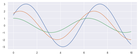
sns.set()
plt.figure(figsize=(8,3))
sns.set_context("paper")
sinplot()

#Try other parameters yourself:
4. Relationship chart: relplot()
- The interface of relaplot() relational graph is actually the integration of the following two graphs. The following two graphs can be drawn by specifying the kind parameter:
- Scatterplot
- Lineplot
4.1 basic scatter diagram
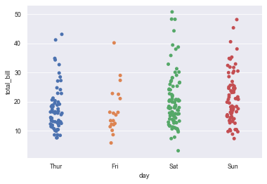
sns.relplot(x="total_bill", y="tip", hue='day', data=tips)

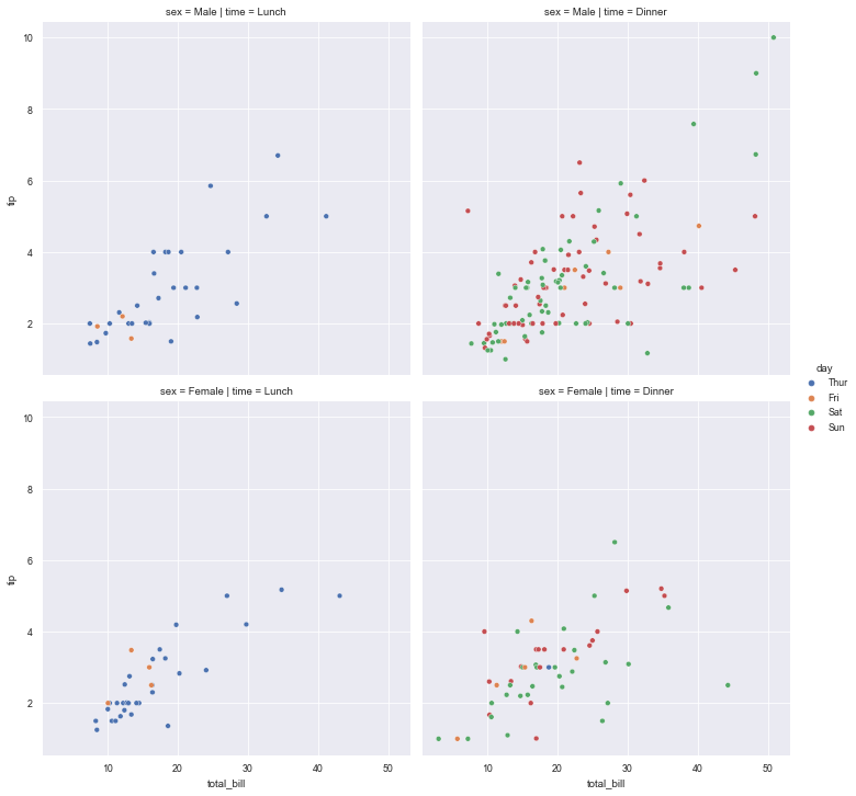
4.2 set the name of col = column to display the data according to the category of the column (the number of values of this column will be displayed in how many columns)
sns.relplot(x="total_bill", y="tip", hue="day", col="time", data=tips)

#If row = column name is set, the data will be displayed according to the category of the column (the number of values of the column and the number of rows of the graph will be displayed)

4.3 layout: if Col and row are set at the same time, the same row is in the same row and the same col is in the same column
sns.relplot(x="total_bill", y="tip", hue="day", col="time", row="sex", data=tips)
5. Scatter plot: scatterplot()
- You can display the relationship between data by adjusting parameters such as color, size, and style
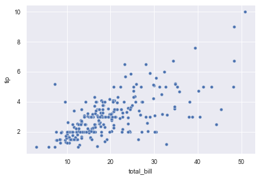
5.1 draw basic scatter diagram
sns.scatterplot(x="total_bill", y="tip", data=tips)
5.2 set hue to generate scatter diagram of points with different colors according to the set category
sns.scatterplot(x="total_bill", y="tip", hue="time", data=tips)

5.3 set hue, generate scatter diagram of points with different colors according to the set category, and set style to generate points with different marks
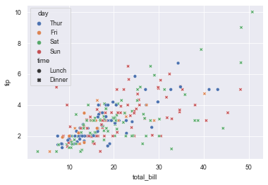
sns.scatterplot(x="total_bill", y="tip", hue="day", style="time", data=tips)
5.4 set the size to generate a scatter diagram of points with different sizes according to the set category
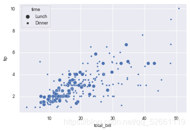
sns.scatterplot(x="total_bill", y="tip", size="time", data=tips)
5.5 use designated marks
markers = {"Lunch": "s", "Dinner": "X"}
sns.scatterplot(x="total_bill", y="tip", style="time",
                markers=markers,
                data=tips)

6. Line plot ()
6.1 draw a single line diagram with error band to display the confidence interval
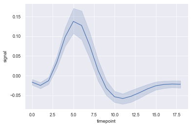
#seaborn has its own fmri dataset. See Part II for loading dataset;
sns.lineplot(x='timepoint', y='signal', data=fmri)
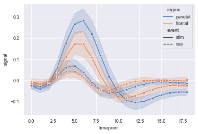
6.2 displaying grouped variables using color and linetype
sns.lineplot(x='timepoint', y="signal",
             # Group lines that will generate different colors
             hue="region",
             #Group variables that will be generated with different dashes, or other tags
             style="event",
             #Dot annotation
             marker='o',
             #data set
             data=fmri)
6.3 display error bar instead of error band
sns.lineplot(x='timepoint', y="signal", hue="region", err_style="bars", ci=68, data=fmri)

7. Classification chart: catplot()
- The interface of catplot() classification chart is actually the integration of the following eight charts. The following eight charts can be drawn by specifying the kind parameter:
- stripplot() classified scatter diagram
- Swarm plot () can display the classified scatter diagram of distribution density
- Boxplot
- violinplot() violin diagram
- boxenplot() enhancement box diagram
- Pointplot
- Bar plot
- Countplot
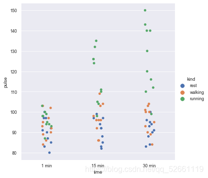
7.1 basic classification diagram
#seaborn has its own exercise dataset. See Part II for loading;
sns.catplot(x="time", y="pulse", hue="kind", data=exercise)
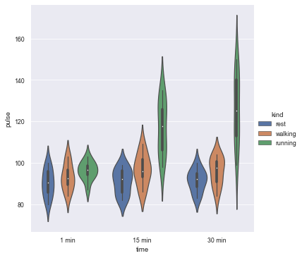
7.2 specify the drawing type by setting kind
# kind="violin" means drawing violin diagram
sns.catplot(x="time", y="pulse", hue="kind", data=exercise, kind="violin")
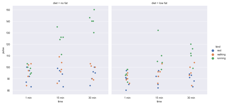
7.3 draw a multi column diagram with column layout according to col classification
- Set Col and display it in the form of column according to the variable name of the specified col (eg.col = 'diet', it will be displayed in the direction of the column, and the number of display graphs is the number of de duplicated values in the diet column)
sns.catplot(x="time", y="pulse", hue="kind", col="diet", data=exercise)
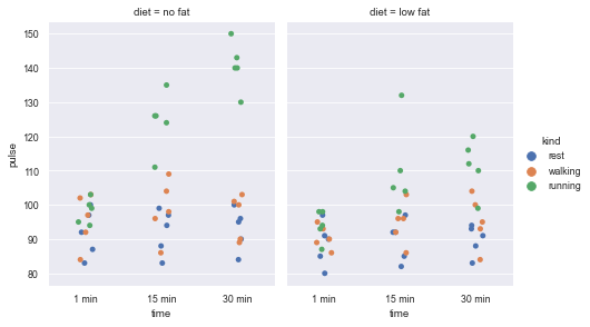
7.4 when drawing, set the height and width ratio of the drawing
sns.catplot(x="time", y="pulse", hue="kind",col="diet", data=exercise, height=4, aspect=.8)
7.5 use catplot() to draw the histogram kind = "count"
- Set col_wrap a value, so that each row of the graph displays only the columns with the number of this value, and the redundant columns are displayed in another row
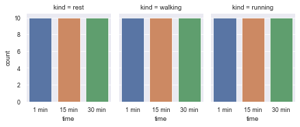
sns.catplot(x="time", col="kind", col_wrap=3, data=exercise, kind="count", height=2.5, aspect=.8)
8. Classified scatter diagram: stripplot() and swarm plot()
8.1 classified scatter diagram: stripplpt()
- stripplot() can display the data classification by itself, or it can be used as a supplement to box graph or violin graph to display all results and basic distribution.
sns.stripplot(x='day', y='total_bill', data=tips, jitter=True)
# jitter=False data will overlap a lot
8.2 cluster scatter diagram: swarm plot ()
- Clustering scattergram can be understood as a classified scattergram with non overlapping data points.
- This function is similar to stripplot(), but it can adjust the points so that the data points do not overlap.
- Swarm plot () can display the data classification by itself, or it can be used as a supplement to box graph or violin graph to display all results and basic distribution.
sns.swarmplot(x='day', y='total_bill', data=tips)
# The data will not overlap

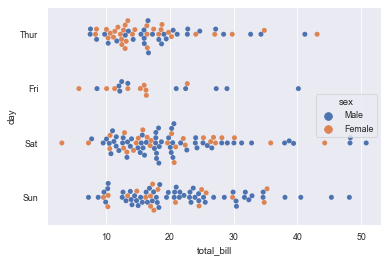
#hue classifies the data
sns.swarmplot(x='total_bill', y='day', data=tips, hue='sex')
9. Box diagram and enhanced box diagram: boxplot() and boxplot()
9.1 box drawing: boxplot()
- Box chart, also known as box chart, is mainly used to display the data distribution related to categories.
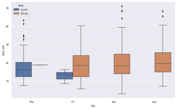
#Use the tips dataset provided by seaborn. See Part II for loading;
plt.figure(figsize=(10,6))
sns.boxplot(x='day', y='total_bill', hue='time', data=tips)
9.2 combination diagram of box type and classification scatter points
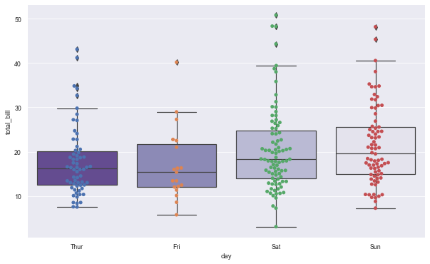
plt.figure(figsize=(10,6))
sns.boxplot(x='day', y='total_bill', data=tips, palette='Purples_r')
sns.swarmplot(x='day', y='total_bill', data=tips)
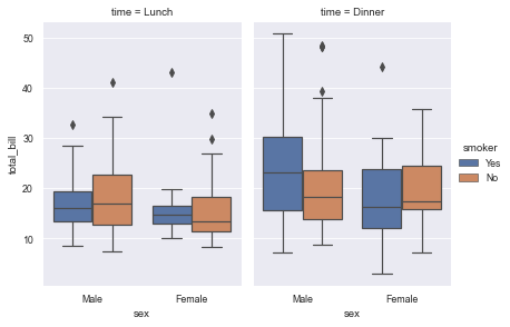
9.3 use catplot() to achieve the effect of boxplot() (by specifying kind = "box")
sns.catplot(x="sex", y="total_bill",
            hue="smoker",
            col="time",
            data=tips,
            kind="box",
            height=4,
            aspect=.7);
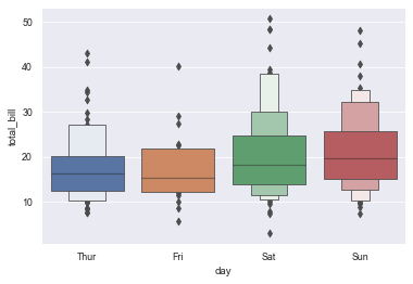
9.4 diagram of enhancement box: boxenplot()
- Enhanced box graph, also known as enhanced box graph, can draw enhanced box graph for large data sets.
- The enhanced box graph provides information about data distribution by drawing more quantiles.
sns.boxenplot(x="day", y="total_bill", data=tips)
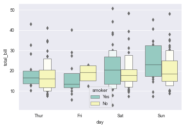
#Classify the grouped data for the second time by setting hue
#Note: in the enhanced box diagram, the effect of the second classification after hue setting is separation
sns.boxenplot(x="day", y="total_bill", hue="smoker",
              data=tips, palette="Set3")
9.5 use catplot() to achieve the effect of boxenplot() (by specifying kind = "boxen")
# Use catplot() to achieve the effect of boxenplot() (by specifying kind="boxen")
sns.catplot(x="sex", y="total_bill",
            hue="smoker",
            col="time",
            data=tips,
            kind="boxen",
            height=4,
            aspect=.7);

10. Violin drawing: violinplot()
- Violin diagrams allow visualization of the distribution of digital variables in one or more groups. It is very close to the box diagram, but you can get a deeper understanding of density. Violin diagram is especially suitable for the situation where there is a large amount of data and individual observations cannot be displayed.
- The corresponding parameters of each position of violin chart, the middle one is the box line chart data, 25%, 50%, 75% positions, and the thin line interval is 95% confidence interval.
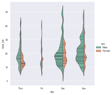
10.1 draw violin diagram classified by sex
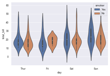
sns.violinplot(x='day', y='total_bill', hue='smoker', data=tips)
# The violin is symmetrical
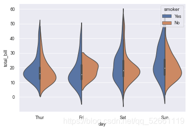
10.2 add the split parameter to make the left and right of the violin represent different attributes
sns.violinplot(x='day', y='total_bill', hue='smoker', data=tips, split=True)
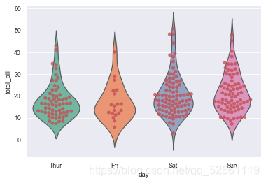
10.3 violin classification and scatter combination diagram
sns.violinplot(x='day', y='total_bill', data=tips, inner=None, palette='Set2')
sns.swarmplot(x='day', y='total_bill', data=tips, color='r', alpha=0.8)
10.4 when catplot() is used to achieve the statistical effect of violinplot(), kind = "violin" must be set
sns.catplot(x="day", y="total_bill",
               hue="sex",
               data=tips,
               palette="Set2",
               split=True,
               scale="count",
               inner="stick",
               scale_hue=False,
               kind='violin',
               bw=.2)
11. Point plot ()
-
pointplot, as its name implies, is a point graph. The plot represents the central trend estimation of the numerical variable at the position of the scatter plot, and uses error bars to provide some indication of the uncertainty of the estimation.
-
Point charts are more useful than bar charts in focusing on comparisons between different levels of one or more classification variables. Point diagrams are especially good at showing interaction: how the relationship between the levels of one classification variable changes between the levels of the second classification variable.
-
It is important that the plot only shows the average (or other estimates), but in many cases, the distribution of values showing each level of categorical variables may have more information. In this case, other drawing methods, such as box diagram or violin diagram, may be more appropriate.
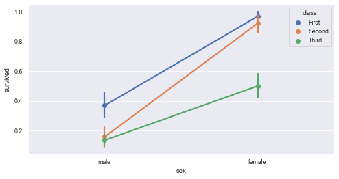
11.1 draw a dot chart to show the difference in the number of survival between men and women
plt.figure(figsize=(8,4))
sns.pointplot(x='sex', y='survived', hue='class', data=titanic)
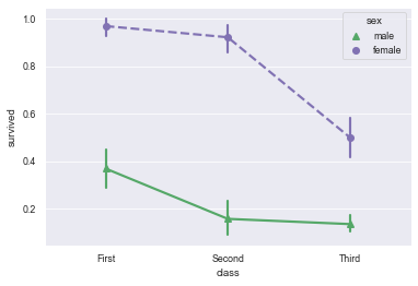
10.2 add some styles to the dot chart to make it more beautiful
sns.pointplot(x='class', y='survived', hue='sex', data=titanic,
              palette={'male':'g', 'female': 'm'},        # Customize colors for male and female
              markers=["^", "o"],     # Sets the shape of the point
              linestyles=["-", "--"]) # Sets the type of line
10.3 use catplot() to achieve the effect of pointplot() (by setting kind = "point")
sns.catplot(x="sex", y="total_bill",
            hue="smoker", col="time",
            data=tips, kind="point",
            dodge=True,
            height=4, aspect=.7)

11. Bar chart: barplot()
- The bar chart mainly shows the estimation of the central trend of the numerical variable of each rectangular height.
- The bar chart displays only the average (or other estimates). However, in many cases, the distribution of values displayed at each classification variable level may provide more information. At this time, many other methods, such as a box or violin diagram, may be more appropriate.
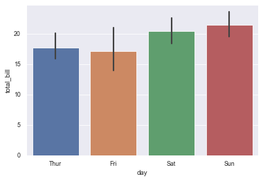
11.1 specify x classification variables for grouping, y is data distribution, and draw a vertical bar graph
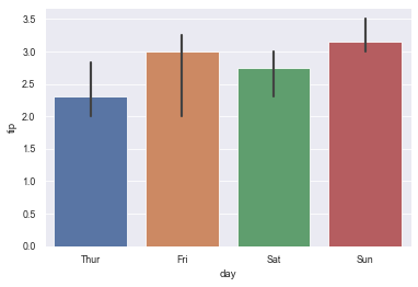
sns.barplot(x="day", y="total_bill", data=tips)
11.2 specify hue to nest the grouped data (the second grouping) and draw a bar chart
sns.barplot(x="day", y="total_bill", hue="sex", data=tips)

11.3 specify y as classification variable for grouping and x as data distribution (this effect is equivalent to horizontal bar chart)
sns.barplot(x="tip", y="day", data=tips)

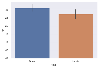
11.4 set order = ["variable name 1", "variable name 2",...] to display the specified classification order
sns.barplot(x="time", y="tip", data=tips,
            order=["Dinner", "Lunch"])
11.5 use the median as the estimation of the concentration trend: estimator=median
sns.barplot(x="day", y="tip", data=tips, estimator=np.median)
11.6 use error bars to show the standard deviation of the mean
sns.barplot(x="day", y="tip", data=tips, ci=68)

11.7 use different color palette: palette = "Blues_d"
sns.barplot("size", y="total_bill", data=tips,
            palette="Blues_d")

11.8 use catplot() to achieve the effect of barplot() (by specifying kind=bar)
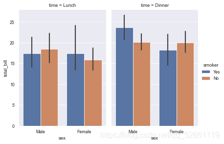
sns.catplot(x="sex", y="total_bill",
            hue="smoker", col="time",
            data=tips, kind="bar",
            height=4, aspect=.7)
12. Count chart: countlot ()
- seaborn.countplot() can draw count chart and histogram
- Function: use bar chart (histogram) to display quantity statistics in each classification data
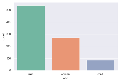
12.1 display the value statistics of a single category variable
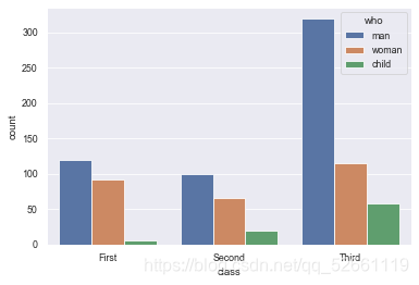
sns.countplot(x="who", data=titanic)

12.2 display the value statistics of multiple classification variables
sns.countplot(x="class", hue="who", data=titanic)
12.3 horizontal and horizontal bar chart
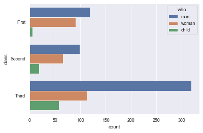
sns.countplot(y="class", hue="who", data=titanic)
12.4 using different palettes
sns.countplot(x="who", data=titanic, palette="Set2")
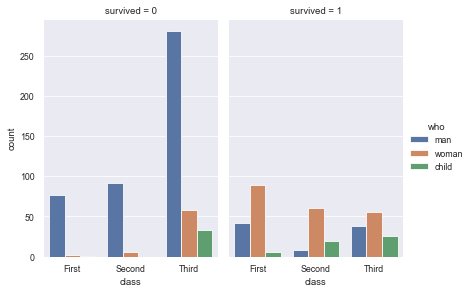
12.5 using catplot() to achieve the statistical effect of countplot(), kind = "count" must be set
sns.catplot(x="class", hue="who", col="survived",
            data=titanic, kind="count",
            height=4, aspect=.7);
Quotations
The process of learning may require a lot of effort, but persistence is a process that must be experienced to become an excellent data analyst.
The learning road of data analysis is not to learn as much as possible, but to clarify the learning direction and make the right force, so that we can do the right thing in the right direction.
The code word is not easy. Ask for a zanha,