Preface
The text and pictures of this article are from the Internet, only for learning and communication, not for any commercial purpose. The copyright belongs to the original author. If you have any questions, please contact us in time for handling.
Don't talk too much, go straight to dry goods
1 waffle
waffle can use the pywaffle package to create the chart and display the composition of groups in a larger population.
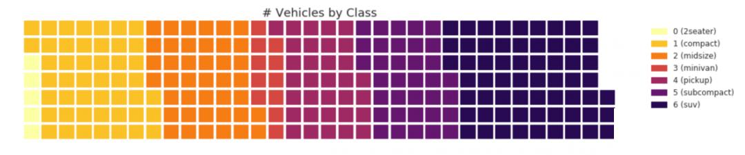
#! pip install pywaffle
# Reference: https://stackoverflow.com/questions/41400136/how-to-do-waffle-charts-in-python-square-piechart
from pywaffle import Waffle

# Import
df_raw = pd.read_csv("data/mpg_ggplot2.csv")

# Prepare Data
df = df_raw.groupby('class').size().reset_index(name='counts')
n_categories = df.shape[0]
colors = [plt.cm.inferno_r(i/float(n_categories)) for i in range(n_categories)]

# Draw Plot and Decorate
fig = plt.figure(
    FigureClass=Waffle,
    plots={
        '111': {
            'values': df['counts'],
            'labels': ["{0} ({1})".format(n[0], n[1]) for n in df[['class', 'counts']].itertuples()],
            'legend': {'loc': 'upper left', 'bbox_to_anchor': (1.05, 1), 'fontsize': 12},
            'title': {'label': '# Vehicles by Class', 'loc': 'center', 'fontsize':18}
        },
    },
    rows=7,
    colors=colors,
    figsize=(16, 9)
)
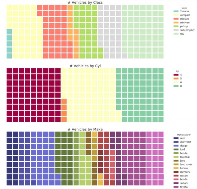
#! pip install pywaffle
from pywaffle import Waffle

# Import
# df_raw = pd.read_csv("data/mpg_ggplot2.csv")

# Prepare Data
# By Class Data
df_class = df_raw.groupby('class').size().reset_index(name='counts_class')
n_categories = df_class.shape[0]
colors_class = [plt.cm.Set3(i/float(n_categories)) for i in range(n_categories)]

# By Cylinders Data
df_cyl = df_raw.groupby('cyl').size().reset_index(name='counts_cyl')
n_categories = df_cyl.shape[0]
colors_cyl = [plt.cm.Spectral(i/float(n_categories)) for i in range(n_categories)]

# By Make Data
df_make = df_raw.groupby('manufacturer').size().reset_index(name='counts_make')
n_categories = df_make.shape[0]
colors_make = [plt.cm.tab20b(i/float(n_categories)) for i in range(n_categories)]


# Draw Plot and Decorate
fig = plt.figure(
    FigureClass=Waffle,
    plots={
        '311': {
            'values': df_class['counts_class'],
            'labels': ["{1}".format(n[0], n[1]) for n in df_class[['class', 'counts_class']].itertuples()],
            'legend': {'loc': 'upper left', 'bbox_to_anchor': (1.05, 1), 'fontsize': 12, 'title':'Class'},
            'title': {'label': '# Vehicles by Class', 'loc': 'center', 'fontsize':18},
            'colors': colors_class
        },
        '312': {
            'values': df_cyl['counts_cyl'],
            'labels': ["{1}".format(n[0], n[1]) for n in df_cyl[['cyl', 'counts_cyl']].itertuples()],
            'legend': {'loc': 'upper left', 'bbox_to_anchor': (1.05, 1), 'fontsize': 12, 'title':'Cyl'},
            'title': {'label': '# Vehicles by Cyl', 'loc': 'center', 'fontsize':18},
            'colors': colors_cyl
        },
        '313': {
            'values': df_make['counts_make'],
            'labels': ["{1}".format(n[0], n[1]) for n in df_make[['manufacturer', 'counts_make']].itertuples()],
            'legend': {'loc': 'upper left', 'bbox_to_anchor': (1.05, 1), 'fontsize': 12, 'title':'Manufacturer'},
            'title': {'label': '# Vehicles by Make', 'loc': 'center', 'fontsize':18},
            'colors': colors_make
        }
    },
    rows=9,
    figsize=(16, 14)
)
2 pie chart
Pie chart is a classic way to display group composition. However, it is generally not recommended today because the area of the pie section can sometimes be misleading. Therefore, if you want to use a pie chart, it is strongly recommended that you write down the percentages or numbers for each part of the pie chart.
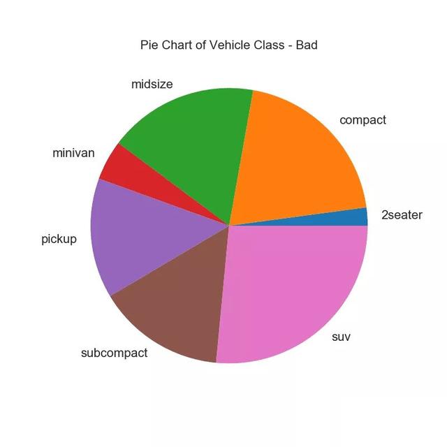
# Import
df_raw = pd.read_csv("data/mpg_ggplot2.csv")

# Prepare Data
df = df_raw.groupby('class').size()

# Make the plot with pandas
df.plot(kind='pie', subplots=True, figsize=(8, 8), dpi= 80)
plt.title("Pie Chart of Vehicle Class - Bad")
plt.ylabel("")
plt.show()
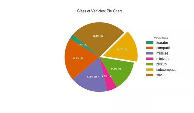
# Import
df_raw = pd.read_csv("data/mpg_ggplot2.csv")

# Prepare Data
df = df_raw.groupby('class').size().reset_index(name='counts')

# Draw Plot
fig, ax = plt.subplots(figsize=(12, 7), subplot_kw=dict(aspect="equal"), dpi= 80)

data = df['counts']
categories = df['class']
explode = [0,0,0,0,0,0.1,0]

def func(pct, allvals):
    absolute = int(pct/100.*np.sum(allvals))
    return "{:.1f}% ({:d} )".format(pct, absolute)

wedges, texts, autotexts = ax.pie(data,
                                  autopct=lambda pct: func(pct, data),
                                  textprops=dict(color="w"),
                                  colors=plt.cm.Dark2.colors,
                                 startangle=140,
                                 explode=explode)

# Decoration
ax.legend(wedges, categories, title="Vehicle Class", loc="center left", bbox_to_anchor=(1, 0, 0.5, 1))
plt.setp(autotexts, size=10, weight=700)
ax.set_title("Class of Vehicles: Pie Chart")
plt.show()
3 tree view
The tree chart is similar to the pie chart, and can do the work better without misleading the contribution of each group.
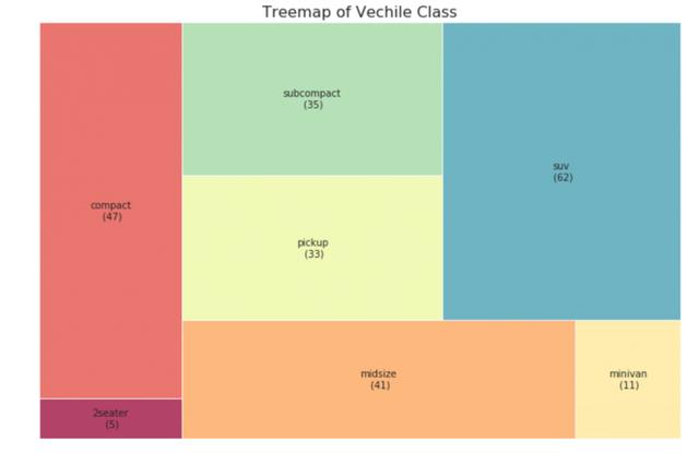
# pip install squarify
import squarify

# Import Data
df_raw = pd.read_csv("data/mpg_ggplot2.csv")

# Prepare Data
df = df_raw.groupby('class').size().reset_index(name='counts')
labels = df.apply(lambda x: str(x[0]) + "\n (" + str(x[1]) + ")", axis=1)
sizes = df['counts'].values.tolist()
colors = [plt.cm.Spectral(i/float(len(labels))) for i in range(len(labels))]

# Draw Plot
plt.figure(figsize=(12,8), dpi= 80)
squarify.plot(sizes=sizes, label=labels, color=colors, alpha=.8)

# Decorate
plt.title('Treemap of Vechile Class')
plt.axis('off')
plt.show()
4 bar chart
A bar chart is a classic method of visualizing items based on counts or any given metric. In the chart below, I use different colors for each item, but you may want to choose a color for all items unless you color them by group. The color name is stored in the code under all colors. You can change the color of the bar by setting the color parameter in.
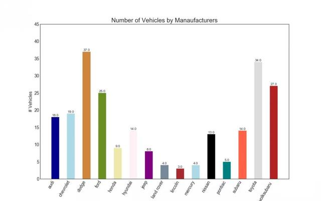
import random

# Import Data
df_raw = pd.read_csv("data/mpg_ggplot2.csv")

# Prepare Data
df = df_raw.groupby('manufacturer').size().reset_index(name='counts')
n = df['manufacturer'].unique().__len__()+1
all_colors = list(plt.cm.colors.cnames.keys())
random.seed(100)
c = random.choices(all_colors, k=n)

# Plot Bars
plt.figure(figsize=(16,10), dpi= 80)
plt.bar(df['manufacturer'], df['counts'], color=c, width=.5)
for i, val in enumerate(df['counts'].values):
    plt.text(i, val, float(val), horizontalalignment='center', verticalalignment='bottom', fontdict={'fontweight':500, 'size':12})

# Decoration
plt.gca().set_xticklabels(df['manufacturer'], rotation=60, horizontalalignment= 'right')
plt.title("Number of Vehicles by Manaufacturers", fontsize=22)
plt.ylabel('# Vehicles')
plt.ylim(0, 45)
plt.show()
No matter you are zero foundation or have foundation, you can get the corresponding study gift pack! It includes Python software tools and 2020's latest introduction to actual combat. Add 695185429 for free.