Fancy components is a cool front-end component library
What component library does everyone use in the front end?
I just found a nice and cool component library on the front end recently. That's fancy components. It's really "cool". If you don't want to write complex styles, let me take you to understand this component library.
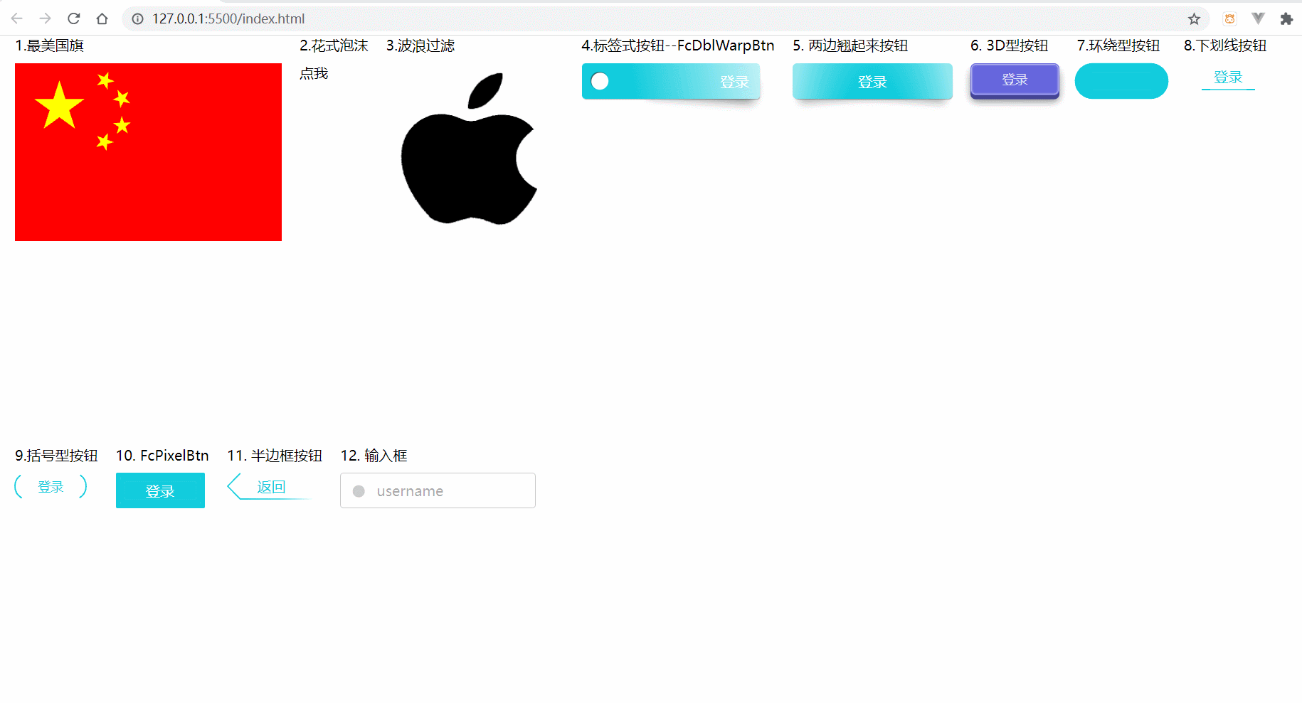
1, Component display
Translated into Chinese is fancy components, which means fancy. It's really a little fancy.
Let's take a look at the most basic style.
2, Usage and detailed properties of components
Using this component library is very simple.
In general html
You only need to import type = "moudle" into the script, and then import the required components and create a new component. As shown in the figure.
Note: when it is introduced, it can be used as a label, but the hump naming method must be split into lowercase on the page, or an alias can be taken when new. If there is no alias, it must be completely written
<!-- <fc-typing-input placeholder="usermane"></fc-typing-input> -->
<body>
    <fc-input placeholder="usermane"></fc-input>
</body>
<script type="module">
import { FcTypingInput } from 'https://Unpkg. COM / fancy components' / / five star red flag
new FcTypingInput('fc-input')
</script>
Use in Vue 2.0
First install the component library
npm i fancy-components
Then import the instance in the component and use it. If you want to use it globally, you can import it in main.js and instantiate it.
<template>
<div>
    <!-- Use components -->
    <fc-china></fc-china>
</div>
</template>

<script>
import { FcChina } from 'fancy-components'//Import components
new FcChina() //Instance component
export default {

}
</script>

<style>

</style>
1. FcChina

This is a beautiful animation of the national flag of the motherland. I like this animation best and my country better. A red nation. Get to the point.
<body>
<fc-china></fc-china>
</body>
<script type="module">
 import { FcChina} from 'https://unpkg.com/fancy-components'
  new FcChina()
 </script>
Related css properties
| css properties | describe | Default value |
|---|---|---|
| –width | Width of component | 300px |
| –height | Height of components | 200px |
| –star-stroke-color | Stroke color of five five pointed stars when performing stroke animation | red |
| –star-fill-color | The fill color of the five five pointed stars when performing the fill animation | red |
| –flag-stroke-color | The stroke color when the flag performs stroke animation | red |
| –delay | Delay execution animation | 0s |
| –dur | Execution time of the whole animation | 6.6s |
2. FcBubbles
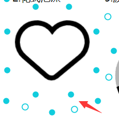
This is a bubble effect that adds a sense of dispersion to the child elements. You can also make your own kind of love, activate active to true when clicking, and then fill in the color. Click again to cancel the color.
<body>
<fc-bubbles click>
    <img src="./aixin.png">
</fc-bubbles>
</body>
<script type="module">
 import { FcBubbles } from 'https://unpkg.com/fancy-components'
  new FcBubbles()
 </script>
| css properties | describe | Default value |
|---|---|---|
| –width | Width of component | fit-content |
| –height | Height of components | fit-content |
| –color | fill color | #1cd |
| Label properties | describe | Default value |
|---|---|---|
| active | Use the active attribute to control the display and concealment of bubble dynamic effect ('true ',' false ') | false |
| click | Click the mouse to control the display and hiding of bubble dynamic effect | null |
3. FcWaveFilter

This can be used as page loading. I think it's very nice, or it's a scene where resources can't be obtained.
<body>
 <fc-wave-filter>
    <img src="./apple.png">
</fc-wave-filter>
</body>
<script type="module">
 import { FcWaveFilter} from 'https://unpkg.com/fancy-components'
  new FcWaveFilter()
 </script>
css properties
| css properties | describe | Default value |
|---|---|---|
| –width | Width of component | fit-content |
| –height | Height of components | fit-content |
| –color | The color of the fill wave | blaack |
| Label properties | describe | Default value |
|---|---|---|
| color | The color of the fill wave | blaack |
| amplitude | Wave amplitude (number (multiple of original wave amplitude)) | 1 |
| flag-stroke-color | Stroke color when performing stroke animation | red |
| delay | Duration after filling | 0s |
| dur | Execution time of the whole animation | 6.6s |
| mode | Animation mode ('alpha ',' luminance ',' img '(picture),' slideshow '(slide)) | alpha |
| interval | Switch every few seconds (suitable for slide mode) | 0 |
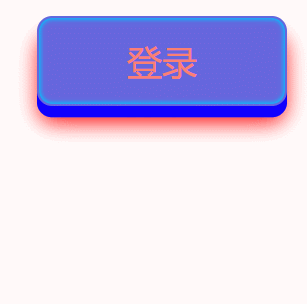
4. FcWarpBtn
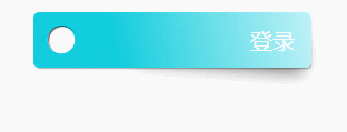
This one is tilted on one side. I think it can be used as a label button, which is still very nice.
<body>
<fc-warp-btn>
    Sign in
</fc-warp-btn>
</body>
<script type="module">
 import { FcWarpBtn} from 'https://unpkg.com/fancy-components'
  new FcWarpBtn()
 </script>
| css properties | describe | Default value |
|---|---|---|
| –width | Width of component | 200px |
| –height | Height of components | 40px |
| –color | The background color of the component | #1cd |
| –shadow-color | Component shadow color | rgba(0, 0, 0, .5) |
| Label properties | describe | Default value |
|---|---|---|
| text-align | Text arrangement ('left ',' center ',' right ') | right |
5.FcDblWarpBtn
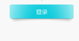
The style of this button has no holes compared with the front one, and both ends are tilted up. You can adjust the shadow and background color by yourself. It looks good to replace most buttons.
<body>
<fc-dbl-warp-btn>
  Sign in
</fc-dbl-warp-btn>
</body>
<script type="module">
 import { FcDblWarpBtn} from 'https://unpkg.com/fancy-components'
  new FcDblWarpBtn()
 </script>
| css properties | describe | Default value |
|---|---|---|
| –width | Width of component | 180px |
| –height | Height of components | 40px |
| –color | The background color of the component | #1cd |
| –shadow-color | Component color | rgba(0, 0, 0, .5) |
6.Fc3DBtn
This button looks very three-dimensional. You can color according to your preference.
<body>
    <fc-3D-btn>
            Sign in
     </fc-3D-btn>
</body>
<style>
    fc-3D-btn{
        color: salmon;
        --cover-color:rgb(17, 0, 255);
        --shadow-color:red;
        --inset-shadow-color:rgb(0, 195, 255);
    }
</style>
<script type="module">
 import { FcDblWarpBtn} from 'https://unpkg.com/fancy-components'
  new FcDblWarpBtn()
 </script>
| css properties | describe | Default value |
|---|---|---|
| –width | Width of component | 100px |
| –height | Height of components | 36px |
| –color | The color of the font within the component | #a69 |
| –shadow-color | The shadow color of the component | #0008 |
| –cover-color | The color of the raised part of the component | #0005 |
| –inset-shadow-color | Shadow color in component | #fffc |
| –inset-shadow-color | The color of the shadow in the component when the button is clicked | var(–inset-shadow-color) |
7. FcRoundBtn
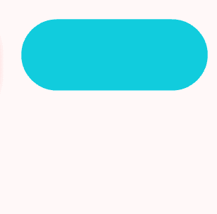
This is an animated button around the shape. It looks very comfortable.
<body>
 <fc-round-btn>
            Sign in
</fc-round-btn>
</body>
<script type="module">
 import { FcRoundBtn} from 'https://unpkg.com/fancy-components'
  new FcRoundBtn()
 </script>
| css properties | describe | Default value |
|---|---|---|
| –width | Width of component | 100px |
| –height | Height of components | 40px |
| –color | Component color | #1cd |
8. FcUnderlineBtn

This is an underlined button, but cool animation will appear when you hover over the mouse.
<body>
<fc-underline-btn>
     Sign in
 </fc-underline-btn>
</body>
<script type="module">
 import { FcUnderlineBtn} from 'https://unpkg.com/fancy-components'
  new FcUnderlineBtn()
 </script>
| css properties | describe | Default value |
|---|---|---|
| –width | Width of component | 100px |
| –height | Height of components | 30px |
| –color | Component color | #1cd |
9. FcParenthesesBtn

<body>
<fc-parentheses-btn>
            Sign in
</fc-parentheses-btn>
</body>
<script type="module">
 import { FcParenthesesBtn} from 'https://unpkg.com/fancy-components'
  new FcParenthesesBtn()
 </script>
| css properties | describe | Default value |
|---|---|---|
| –width | Width of component | 80px |
| –height | Height of components | 30px |
| –color | Component color | #1cd |
10.FcPixelBtn

This is a bit like FcRoundBtn buttons, but the animation effects are different.
<body>
<fc-pixel-btn>
            Sign in
</fc-pixel-btn>
</body>
<script type="module">
 import { FcPixelBtn} from 'https://unpkg.com/fancy-components'
  new FcPixelBtn()
 </script>
| css properties | describe | Default value |
|---|---|---|
| –width | Width of component | 100px |
| –height | Height of components | 40px |
| –color | Component color | #1cd |
11. FcArrowBtn
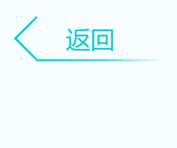
I think this button is the most used. There is enough B space to return, ha ha.
<body>
 <fc-arrow-btn>
    return
</fc-arrow-btn>
</body>
<script type="module">
 import { FcArrowBtn} from 'https://unpkg.com/fancy-components'
  new FcArrowBtn()
 </script>
| css properties | describe | Default value |
|---|---|---|
| –width | Width of component | 100px |
| –height | Height of components | 30px |
| –color | Component color | #1cd |
12. FcTypingInput
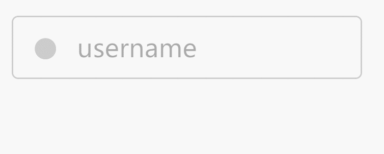
This is my favorite input box. I feel that the high-end domineering is on the grade in an instant. I can't put it down.
<body>
<fc-typing-input placeholder="username"></fc-typing-input>
</body>
<script type="module">
 import { FcTypingInput} from 'https://unpkg.com/fancy-components'
  new FcTypingInput()
 </script>
| css properties | describe | Default value |
|---|---|---|
| –width | Width of component | 220px |
| –height | Height of components | 40px |
| –color | Overall color | #caf |
| –border-color | Border color | #caf |
| –border-color-hover | Border color in hover state | var(–color) |
| –border-color-focus | Border color in focus state | var(–border-color-hover) |
| –border-radius | fillet | 4px |
| –box-shadow-focus | input box shadow in focus state | 0 0 6px var(–border-color-focus) |
| –circle-color | The color of the small dot in the input box when it has no value and is not in the focus state | #0003 |
| –circle-color-hover | The color of the small dot in the input box when it has no value and is in the hover state | var(–circle-color) |
| –placeholder-color | The color of the placeholder | #0005 |
| –placeholder-color-focus | The color of the placeholder when the input box is in the focus state | var(–border-color-focus) |
| –placeholder-animate-color | The color of the placeholder when performing animation in the input box | red |
| –placeholder-animate-title-color | The color of the placeholder when performing animation on the head of the input box | #00ff6b |
| –placeholder-shadow | Text shadow of placeholder | none |
| –stripe-color | The stripe color generated when the input box is in the disabled state | #0003 |
| –stripe-deg | The fringe angle generated by the input box in the disabled state | 45 |
| –disabled-filter | Filter when the input box is disabled | opacity(80%) grayscale(100%) |
| Label properties | describe | Default value |
|---|---|---|
| white | The theme color of the input box is white (for a dark background) | None (optional) |
| red | The theme color of the input box is red (applicable when the verification fails) | None (optional) |
Write at the end
The above is the component library. I still feel very cool, and it is very simple and convenient to use. It is suitable for the most basic html and all front-end frameworks. Let's go and use it.
The warehouse address and documents are given here Fancy components document
This blog reference Do you have any fancy component libraries for me to refer to?
I wish you all a happy holiday.