Scrollable component
When the component content exceeds the current display viewport, if there is no special treatment, the flyer will prompt the Overflow error. Therefore, the flyer provides a variety of scrollable components to display the list and long layout;
Scrollable components directly or indirectly contain a scrollable component, so they all contain some common attributes:
Scrollable({
  ...
  this.axisDirection = AxisDirection.down,
  this.controller,
  this.physics,
  @required this.viewportBuilder, //Later
})
Copy code- axisDirection: scroll direction
- physics: this attribute accepts an object of ScrollPhysics type. How does it feel that the scrollable component responds to the user's operation? For example, after the user lifts his finger after sliding, he continues to execute the animation; Or how to display after sliding to the boundary. By default, Flutter will use different ScrollPhysics objects and apply different display effects according to the specific platform. There will be elastic effect on IOS and low light effect on android. If you want to use the same effect on all platforms, you can explicitly specify a fixed ScrollPhysics. The fluent SDK contains two subclasses of ScrollPhysics, which can be used directly
- Clappingscrollphysics: shimmer effect under Android
- Bouncing scrollphysics: elastic effect under IOS
- controller: this property accepts a ScrollController object. The main function of this object is to control the scroll position and listen for scroll events By default, there will be a default PrimaryScrollController in the Widget tree. If the scrolling component in the subtree is not specified, it will be used. The advantage of this mechanism is that the parent component can control the scrolling behavior of scrollable components in the subtree. For example, Scaffold uses this mechanism to realize the function of clicking the navigation bar to return to the top on IOS
Scrollbar
Scrollbar is a Material style scroll indicator (scroll bar). If you want to add a scroll bar to a scrollable component, you only need to use the scrollbar as any parent component of the scrollable component, such as:
Scrollbar(
  child: SingleChildScrollView(
    ...
  ),
);
Copy code
Scrollbar and Cupertino scrollbar both determine the position of the scroll bar by listening for scroll notifications
CupertinoScrollbar
CupertinoScrollbar is an IOS style scroll bar. If you use Scrollbar, it will automatically switch to CupertinoScrollbar on the IOS platform
ViewPort
There is the concept of ViewPort in many layouts. In shutter, the term ViewPort refers to the actual display area of a Widget unless otherwise specified;
For example, the height of the display area of a ListView is 800 pixels. Although the total height of its list items may far exceed 800 pixels, the ViewPort is still 800 pixels
Delay construction based on Sliver
Usually, there are many scrollable components and the total height occupied will be very large; If you build all the sub components at one time, it will be very expensive!
Therefore, a concept of sliver (slice) is proposed in Flutter. Sliver will be built only when it appears in the viewport. This model is also known as the delay construction model based on sliver. Many scrollable components support sliver's delay construction model, such as ListView and GridView, but there are also SingleChildScrollView that does not support model modification
Spindle and longitudinal axis
In the coordinate description of rolling components, the rolling direction is usually called the spindle, and the non rolling direction is called the longitudinal axis. Since the default direction of scrollable components is generally along the vertical direction, the spindle refers to the vertical direction by default, and the same is true for the horizontal direction
SingleChildScrollView
SingleChildScrollView is similar to ScrollView in Android. It can only accept one sub component, which is defined as follows:
SingleChildScrollView({
  this.scrollDirection = Axis.vertical, //Scroll direction. The default is vertical
  this.reverse = false,
  this.padding,
  bool primary,
  this.physics,
  this.controller,
  this.child,
})
Copy code
In addition to the above, let's focus on the Reverse and primary attributes
- Reverse: the explanation of the official document is: whether Anzhou reads sliding in the opposite direction. For example, the scrollDirection value is axis Horizontal, if the reading direction is from right to left (depending on the language environment, Arabic is from right to left). When reverse is true, the sliding direction is from right to left. In fact, the essence of this attribute is to determine whether the initial rolling position of the scrollable component is at the head or at the tail. If false, the initial position is at the head, otherwise it is at the tail
- Primary: indicates whether to use the default PrimaryScrollController in the widget tree. When the sliding direction is vertical (the ScrollDirection value is Axis.vertical) and no controller is specified, primary defaults to true. It should be noted that SingleChildScrollView is usually used only when the expected content does not exceed the screen too much. This is because SingleChildScrollView does not support the delayed instance initialization model of Sliver. Therefore, if it is expected that the viewport may contain too much content beyond the screen size, using SingleChildScrollView will be very expensive (poor performance), At this time, you should use some scrollable components that support Sliver delay loading, such as ListView
Chestnuts
class SingleChildScrollViewTest extends StatelessWidget {
  @override
  Widget build(BuildContext context) {
    String str = "ABCDEFGHIJKLMNOPQRSTUVWXYZ";
    return Scrollbar(
      child: SingleChildScrollView(
        padding: EdgeInsets.all(16),
        child: Column(
          children: str.split("").map((e) => Text(e,textScaleFactor: 2,)).toList(),
        ),
      ),
    );
  }
}
Copy code
ListView
ListView is one of the most commonly used scrollable components. It can arrange all sub components linearly in one direction, and it also supports the delay construction model based on Sliver. The definition of ListView is as follows:
ListView({
  ...
  //Public parameters of scrollable widget
  Axis scrollDirection = Axis.vertical,
  bool reverse = false,
  ScrollController controller,
  bool primary,
  ScrollPhysics physics,
  EdgeInsetsGeometry padding,

  //Common parameters of ListView constructors
  double itemExtent,
  bool shrinkWrap = false,
  bool addAutomaticKeepAlives = true,
  bool addRepaintBoundaries = true,
  double cacheExtent,

  //List of child widget s
  List<Widget> children = const <Widget>[],
})
Copy code
The above parameters are divided into two groups: the first group is the public parameters of scrollable components, as mentioned above; The second group is the common parameters of ListView constructors (ListView has multiple constructors). We need to focus on these parameters:
- itemExtent: if this parameter is not null, the length of children will be forced to be the value of itemExtent; The length here refers to the length of the sub component in the direction, that is, the rolling direction is vertical, and itemextend represents the height of the sub component; If horizontal, the width of the subcomponent. Specifying itemExtent in the ListView is more effective than letting the sub component decide the length of the squeak itself, because after specifying, the scrolling system can know the length of the list in advance without calculating it every time the sub component is built, especially when the scrolling position changes frequently (the scrolling system needs to calculate the height of the list frequently)
- shrinkWrap: whether to set the length of the ListView according to the total length of the sub components. The default value is false. By default, the ListView will occupy as much space as possible in the direction of scrolling. shrinkWrap must be true when the ListView is in an unbounded container (in the scroll direction)
- addAutomaticKeepAlives: this attribute indicates whether to wrap the list item (sub component) in the AutomaticKeepAlive component; Typically, in a lazily loaded list, if the list is wrapped in automatic KeepAlive, it will not be recycled by GC (garbage collection) when it is changed to draw out the viewport. It will use KeepAliveNotification to save its state. If the list item maintains its KeepAlive state, this parameter must be false
- addRepaintBoundaries: indicates whether to wrap the sub components in the RepaintBoundary component. When the scrollable component rolls, the wrapped components can avoid list redrawing, but when the cost of list redrawing is very small (such as a color block or a short text), it will be more efficient not to add RepaintBoundary. Like addAutomaticKeepAlive, if the list item fund maintains its status, this parameter must be set to false
Note: the above parameters are not unique to ListView. They may also be available in some scrolling components. Their meanings are the same
Default constructor
The default constructor has a children parameter that accepts a list of widgets. This method is only suitable for the case with a small number of sub components, because it requires all children to be created in advance (which requires a lot of work), rather than waiting for the sub widget to be created when it is actually displayed, that is, the ListView built by the default constructor does not apply the lazy loading model based on Sliver
In fact, there is no essential difference between the ListView created through the default constructor and the way of using SingleChildScrolLView + Column. Here is a chestnut:
ListView(
  shrinkWrap: true,
  padding: const EdgeInsets.all(20.0),
  children: <Widget>[
    const Text('I \'m dedicating every day to you'),
    const Text('Domestic life was never quite my style'),
    const Text('When you smile, you knock me out, I fall apart'),
    const Text('And I thought I was so smart'),
  ],
);
Copy code
When a scrollable component uses an ist as the children attribute, it is only applicable to the case where there are few components. This is a general rule, not a characteristic of ListView itself. I think the same is true of GridView
ListView.builder
This is suitable for the case where there are many (or infinite) list items, because the sub components will be created only when they are actually displayed, that is, the constructor modification supports the lazy loading model based on Sliver; Let's take a look at the core parameters:
ListView.builder({
  // ListView public parameter omitted
  ...
  @required IndexedWidgetBuilder itemBuilder,
  int itemCount,
  ...
})
Copy code- itemBuilder: the builder of the list. The type is IndexedWidgetBuilder and the return value is a widget. When the list scrolls to the specific index position, the build list item is called.
- itemCount: the number of list items. If null, it represents an infinite list
If the constructor of a scrollable component requires a list item Builder, the constructor usually supports the lazy loading model of Sliver, but it does not support it anyway. This is a general rule.
Chestnuts:
class ListTest extends StatelessWidget {
  @override
  Widget build(BuildContext context) {
    return ListView.builder(
      itemCount: 100, //The list item is 100
      itemExtent: 50, //The forced height is 50
      itemBuilder: (BuildContext context, int index) {
        return ListTile(
          title:
              Text("$index", style: TextStyle(fontSize: 25, color: Colors.red)),
        );
      },
    );
  }
}
Copy code
ListView.separated
ListView.separated can add a separate component between the generated list items, which is better than listview The builder has more than one sparatorBuilder parameter, which is a split component generator
Chestnuts: add a red underline under the base number and a blue split line under the even number
class ListTest extends StatelessWidget {
  @override
  Widget build(BuildContext context) {
    Widget divider1 = Divider(
      color: Colors.blue,
    );
    Widget divider2 = Divider(
      color: Colors.red,
    );
    return getListViewSeparated(divider1,divider2);
  }

  Widget getListViewSeparated(Widget divider1, Widget divider2) {
    return ListView.separated(
      itemCount: 100,
      itemBuilder: (BuildContext context, int index) {
        return ListTile(
          title: Text("$index"),
        );
      },
      separatorBuilder: (BuildContext context, int index) {
        return index % 2 == 0 ? divider1 : divider2;
      },
    );
  }
}
Copy code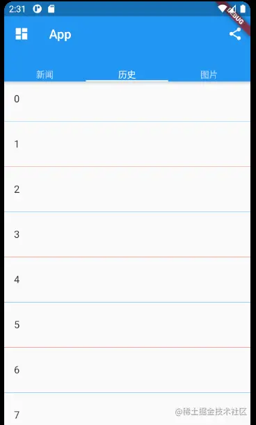
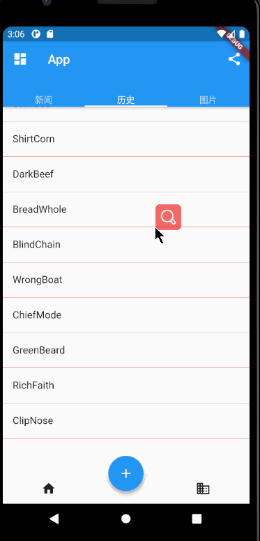
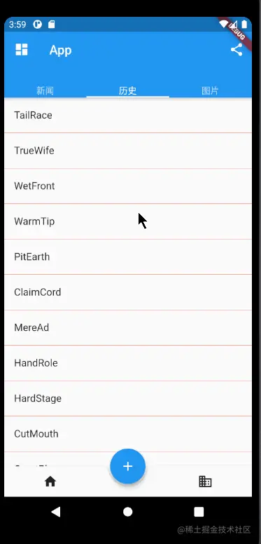
Infinite load list
The first is to simulate obtaining data asynchronously. English is used here_ The generateWordPairs method of the words package generates words; When the list slides to the end, judge whether there is a next page. If so, asynchronously obtain and display loading. If not, display no more.
class InfiniteListView extends StatefulWidget {
  @override
  State<StatefulWidget> createState() => _InfiniteListViewState();
}

class _InfiniteListViewState extends State<InfiniteListView> {
  static const loadingTag = "##loading##";
  var _words = <String>[loadingTag];

  @override
  Widget build(BuildContext context) {
    return ListView.separated(
      itemCount: _words.length,
      itemBuilder: (BuildContext context, int index) {
        //If it comes to the end
        if (_words[index] == loadingTag) {
          //Less than 100, continue to obtain data
          if (_words.length - 1 < 100) {
            _retrieveData();
            return Container(
              padding: EdgeInsets.all(16),
              alignment: Alignment.center,
              child: SizedBox(
                width: 24,
                height: 24,
                child: CircularProgressIndicator(
                  strokeWidth: 2,
                ),
              ),
            );
          } else {
            return Container(
              alignment: Alignment.center,
              padding: EdgeInsets.all(16),
              child: Text(
                "No more",
                style: TextStyle(color: Colors.grey),
              ),
            );
          }
        }
        return ListTile(
          title: Text(_words[index]),
        );
      },
      separatorBuilder: (BuildContext context, int index) {
        return Divider(
          height: .0,
          color: Colors.red,
        );
      },
    );
  }

  void _retrieveData() {
    Future.delayed(Duration(seconds: 2)).then((value) => {
          setState(() {
            //Rebuild list
            _words.insertAll(
                _words.length - 1,
                //Generate 20 words
                generateWordPairs()
                    .take(20)
                    .map((e) => e.asPascalCase)
                    .toList());
          })
        });
  }
}
Copy code
The effect is as follows:
Pull down refresh
 RefreshIndicator(
  onRefresh: _onRefresh,
  child: ListView.separated(
    itemCount: _words.length,
    itemBuilder://.....
  ),
)

Future<void> _onRefresh() async {
     return await Future.delayed(Duration(seconds: 3)).then((value) => {
         setState(() {
             _words.removeRange(0, _words.length - 1);
             _words.insertAll(
                 _words.length - 1,
                 //Generate 20 words
                 generateWordPairs()
                 .take(20)
                 .map((e) => e.asPascalCase)
                 .toList());
         })
     });
 }
Copy code
onRefresh receives a function whose return value is Future,
async means that this function is a part of the keyword, and the function using this keyword must return a Future object
await must be followed by a Fluture, indicating that the execution will not continue until the asynchronous execution is completed. then is the callback after the asynchronous execution is completed
If you have any questions, please refer to this article
The final effect is as follows:
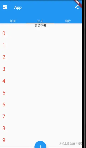
Add fixed list header
Many times, we need to add a fixed header to the list. For example, to implement a commodity list, we need to add a commodity list title to the list
Past experience tells me that I can directly use a linear component, the first is the header of the title, and the second is listView, as follows:
Column(
  children: [
    Text("Product list"),
    ListView.builder(
      itemCount: 100, //The list item is 100
      itemExtent: 50, //The forced height is 50
      itemBuilder: (BuildContext context, int index) {
        return ListTile(
          title: Text("$index",
              style: TextStyle(fontSize: 25, color: Colors.red)),
        );
      },
    )
  ],
);
Copy code
The results are as follows:
The following assertion was thrown during performResize():
Vertical viewport was given unbounded height.
Copy code
It means that the height of the ListView cannot be determined, so the solution is to set the boundary for the ListView. We can use SizedBox to specify the specific height:
children: [
  Text("Product list"),
  SizedBox(
    height: 400,
    child: ListView.builder(
      itemCount: 100, //The list item is 100
      itemBuilder: (BuildContext context, int index) {
        return ListTile(
          title: Text("$index",
              style: TextStyle(fontSize: 25, color: Colors.red)),
        );
      },
    ),
  )
]
Copy code
This method can be implemented, but because the height of listView is fixed, the bottom will be left blank. In this case, the height of screen can be used to subtract the height of status class, navigation bar and head. If other components are useful, subtract their height
SizedBox(
  //In Material, the heights of status class, navigation bar and ListTile are 24, 56 and 5 respectively
  height: MediaQuery.of(context).size.height - 24 - 56 - 56,
Copy code
Using this method can achieve results, but the implementation method is not good. If someone changes any height, it is necessary to modify the code
So is there any way to automatically stretch the ListView to fill the remaining space on the screen?
You can use Fix to complete it. In elastic layout, you can use Expanded to automatically stretch the size of components, and the Column is inherited from Fix, so you can directly use Column + Expanded to realize it
Column(
  children: [
    Text("Product list"),
    Expanded(
      child: ListView.builder(
        itemCount: 100, //The list item is 100
        itemBuilder: (BuildContext context, int index) {
          return ListTile(
            title: Text("$index",
                style: TextStyle(fontSize: 25, color: Colors.red)),
          );
        },
      ),
    )
  ],
);
Copy code
Using this method, you can realize the automatic stretching of ListView. The effects are as follows:
summary
The above mainly introduces the public parameters and constructors of ListView. Different structures correspond to different list generation models. If you need to customize the list generation model, you can use ListView Custom, which needs to implement a SliverChildDelegate to generate list item components for ListView; It also realizes common styles such as pull-up refresh, pull-down loading, list header and so on.
GridView
GridView can build a two-dimensional grid layout, and its default constructor is defined as follows:
GridView({
  Axis scrollDirection = Axis.vertical,
  bool reverse = false,
  ScrollController controller,
  bool primary,
  ScrollPhysics physics,
  bool shrinkWrap = false,
  EdgeInsetsGeometry padding,
  @required SliverGridDelegate gridDelegate, //Delegate to control child widget layout
  bool addAutomaticKeepAlives = true,
  bool addRepaintBoundaries = true,
  double cacheExtent,
  List<Widget> children = const <Widget>[],
})
Copy code
Most of the parameters of GridView and ListView are the same, and their meanings are the same. If you have questions, you can turn to the above to check
- gridDelegate: the type is slicergriddelegate. Its function is to control how the GridView is arranged Slicergriddelegate is an abstract class that defines the relevant interfaces of the class GridView Layout. Subclasses need to implement them to implement specific layout algorithms Flutter provides two subclasses of SliverGridDelegateWithFixedCrossAxisCount and slivergriddelegatewithmaxcrossaxisextend of SliverGridView, which we can use directly
SliverGridDelegateWithFixedCrossAxisCount
This subclass implements the layout algorithm of a fixed number of sub elements of the horizontal axis Wie, and its constructor is:
SliverGridDelegateWithFixedCrossAxisCount({
  @required double crossAxisCount,
  double mainAxisSpacing = 0.0,
  double crossAxisSpacing = 0.0,
  double childAspectRatio = 1.0,
})
Copy code- crossAxisCount: the number of child elements of the horizontal axis. After this attribute value is determined, the length of the child element on the horizontal axis is determined, that is, the quotient of the horizontal axis length of the ViewPort divided by the corssAxisCount
- mainAxisSpacing: spacing in spindle direction
- Crossaxisspacing: sub element spacing in the horizontal axis direction
- childAspectRatio: the ratio of child elements in the length of the horizontal axis to the length of the main axis. After crossAxisCount is specified, the horizontal axis length of the child element will be determined, and then the length of the child element on the spindle can be determined through this parameter value
You can see that the size of the child element is determined by the two parameters crossAxisCount and childAspectRatio. The sub element here refers to the maximum display space of the sub component. Pay attention to ensure that the actual size of the sub component does not exceed the space of the sub element
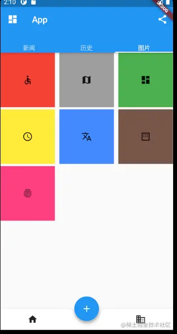
Chestnuts:
class GridViewTest extends StatelessWidget {
  @override
  Widget build(BuildContext context) {
    return Scaffold(
      body: Container(
        alignment: Alignment.center,
        child: GridView(
          gridDelegate: SliverGridDelegateWithFixedCrossAxisCount(
            crossAxisCount: 3, //Horizontal axis three sub widgets
            childAspectRatio: 1.0, // Sub assembly aspect ratio
            mainAxisSpacing: 5, //Spindle direction spacing
            crossAxisSpacing: 10, //Horizontal axis spacing
          ),
          children: [
            Container(
              color: Colors.red,
              child: Icon(Icons.accessible),
            ),
            Container(
              color: Colors.grey,
              child: Icon(Icons.map),
            ),
            Container(
              color: Colors.green,
              child: Icon(Icons.dashboard),
            ),
            Container(
              color: Colors.yellow,
              child: Icon(Icons.schedule),
            ),
            Container(
              color: Colors.blueAccent,
              child: Icon(Icons.translate),
            ),
            Container(
              color: Colors.brown,
              child: Icon(Icons.margin),
            ),
            Container(
              color: Colors.pinkAccent,
              child: Icon(Icons.fingerprint),
            )
          ],
        ),
      ),
    );
  }
}
Copy code
The effect is as follows:
GridView.count
GridView. The count constructor internally uses slicergriddelegatewithfixedcrossaxiscount. Through this construction method, you can create a GridView with a fixed number of sub elements on the horizontal axis. The above code is equivalent to:
GridView.count(
crossAxisCount: 3,
childAspectRatio: 1,
mainAxisSpacing: 5,
crossAxisSpacing: 10,
children: [
//..........
],
)
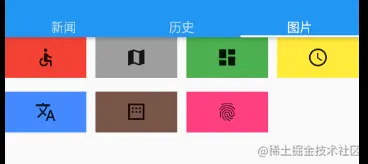
Copy codeSliverGridDelegateWithMaxCrossAxisExtent
This subclass implements a layout algorithm with a fixed maximum length of horizontal axis sub elements, and its constructor is:
SliverGridDelegateWithMaxCrossAxisExtent({
  double maxCrossAxisExtent,
  double mainAxisSpacing = 0.0,
  double crossAxisSpacing = 0.0,
  double childAspectRatio = 1.0,
})
Copy code
Maxcrossaxisextend is the maximum length of the child element on the horizontal axis. The reason why it is the maximum length is that the length of each child element in the horizontal axis direction is still equal.
childAspectRatio: the length ratio between the horizontal axis and the main axis of the child element is the final length ratio
Other parameters are the same as those above
GridView(
  gridDelegate: SliverGridDelegateWithMaxCrossAxisExtent(
      maxCrossAxisExtent: 120, //Maximum length cannot exceed 120
      childAspectRatio: 2,
      mainAxisSpacing: 15,
      crossAxisSpacing: 10),
  children: [
    //.....
  ],
)
Copy code
The effect is as follows:
GridView.extent
GridView. The extension constructor uses the slicergriddelegatewithmaxcrossaxisextend internally. Through it, we can quickly create a GridView whose vertical axis sub element is a fixed maximum length. The above code is equivalent to:
GridView.extent(
   maxCrossAxisExtent: 120, //The maximum length cannot exceed 120
   childAspectRatio: 2,
   mainAxisSpacing: 15,
   crossAxisSpacing: 10
   children: <Widget>[
    //.....
   ],
 );
Copy code
GridView.builder
All the above methods need a sub widget array as its sub elements. These methods will create widgets in advance. They are only applicable to a small number of widgets. When there are many widgets, you can use GridView Builder to dynamically create child widgets. GridView. The builder must specify two construction parameters:
GridView.builder(
 ...
 @required SliverGridDelegate gridDelegate,
 @required IndexedWidgetBuilder itemBuilder,
)
Copy code
Where itemBuilder is the builder of the child Widget
Chestnuts
Simulate obtaining data from the network, and then use GridView to display it
class InfiniteGridView extends StatefulWidget {
  @override
  State<StatefulWidget> createState() => _InfiniteGridViewState();
}

class _InfiniteGridViewState extends State<InfiniteGridView> {
  List<Widget> _widgets = [];

  @override
  void initState() {
    super.initState();
    _retrieveIcons();
  }

  @override
  Widget build(BuildContext context) {
    return Scaffold(
      body: GridView.builder(
        gridDelegate: SliverGridDelegateWithFixedCrossAxisCount(
            crossAxisCount: 3, //Three per line
            childAspectRatio: 1, //Equal width and height
            mainAxisSpacing: 15,
            crossAxisSpacing: 15),
        itemCount: _widgets.length,
        itemBuilder: (context, index) {
          if (index == _widgets.length - 1 && _widgets.length < 200) {
            _retrieveIcons();
          }
          return _widgets[index];
        },
      ),
    );
  }

  void _retrieveIcons() {
    Future.delayed(Duration(seconds: 1)).then((value) => {
          setState(() {
            _widgets.addAll([
              Container(
                color: Colors.yellow,
                child: Icon(Icons.schedule),
              ),
              Container(
                color: Colors.blueAccent,
                child: Icon(Icons.translate),
              ),
              Container(
                color: Colors.brown,
                child: Icon(Icons.margin),
              ),
            ]);
          })
        });
  }
}
Copy code
In_ The retrieveIcons() method simulates asynchronism and obtains data. After successful, the data is saved, and then called setState to rebuild it.
In itemBuilder, if it is the last one and is less than 200, the data will be loaded; if it is greater than 200, the data will not be loaded
There is a flitter on the Pub_ staggered_ grid_ View package, which implements a staggered GridView layout model, which can be understood by yourself
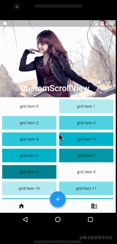
CustomScrollView
CustomScrollView is a component that can use Sliver to customize the rolling model. It can contain a variety of rolling models
For example, for a page, there is a GridView at the top and a ListView at the bottom. The requirement is that the sliding effect of the whole page is unified, that is, they seem to be a whole. If you only use GrdView + ListView to realize the unified sliding effect, you can use CustomScrollView at this time, which is equivalent to a glue, Stick these independent scrollable components together.
Sliver for scrollable components
Sliver usually refers to a child element of a scrollable component. However, in Custom, the component that needs to be glued and scrollable is the sliver of CustomScrollView. If ListView or GridView is used as CustomScrollView, it will not work, because they are scrollable components, not slivers.
Therefore, in order to enable Scrollable components to be used with CustomScrollView, fluent provides the Sliver version of Scrollable components, such as slivers list, slivers grid, etc. in fact, the biggest difference between the Sliver version of Scrollable components and the non Sliver version of components is that the former does not contain the rolling model (it cannot roll itself), while the latter contains the rolling model., Because of this, CustomScrollView can stick multiple slivers together. These slivers share the Scrollable of CustomScrollView, so the unified sliding effect is finally realized
There are a lot of widgets in Sliver series, but there is no more introduction here. We just need to remember its characteristics and check the documents when necessary Most of the slivers mentioned above correspond to scrollable components, because some, such as SliverPadding and SliverAppBar, have nothing to do with scrollable components. They are mainly used together with CustomScrollView, because the sub components of CustomScrollView must be slivers
Thinking: at the beginning, it was said that sliver is a delayed initialization model. It will be built only when sliver appears in the viewport. However, the sliver version of slivelist and SliverGrid itself cannot scroll, so their children will lose the function of delayed initialization However, because slivers such as slivers list support slivers, they should support slivers instead of their corresponding children
Chestnuts:
class CustomScrollViewTest extends StatelessWidget {
  @override
  Widget build(BuildContext context) {
    return Material(
      child: CustomScrollView(
        slivers: [
          SliverAppBar(
            pinned: true,
            expandedHeight: 250, //Deployment height
            flexibleSpace: FlexibleSpaceBar(
              title: Text("CustomScrollView"),
              background: Image.network(
                "https://gimg2.baidu.com/image_search/src=http%3A%2F%2F2e.zol-img.com.cn%2Fproduct%2F52%2F870%2FceFrX1n7iWFk6.jpg&refer=http%3A%2F%2F2e.zol-img.com.cn&app=2002&size=f9999,10000&q=a80&n=0&g=0n&fmt=jpeg?sec=1617810598&t=4b684cd92d7163552d610afba335282c",
                fit: BoxFit.cover,
              ),
            ),
          ),
          SliverPadding(
            padding: EdgeInsets.all(8),
            sliver: SliverGrid(
              gridDelegate: SliverGridDelegateWithFixedCrossAxisCount(
                  crossAxisCount: 2,
                  mainAxisSpacing: 10,
                  crossAxisSpacing: 10,
                  childAspectRatio: 4),
              delegate: SliverChildBuilderDelegate(
                (BuildContext context, int index) {
                  return Container(
                    alignment: Alignment.center,
                    color: Colors.cyan[100 * (index % 9)],
                    child: Text("grid item $index"),
                  );
                },
                childCount: 20,
              ),
            ),
          ),
          SliverFixedExtentList(
            itemExtent: 50,
            delegate:
                SliverChildBuilderDelegate((BuildContext context, int index) {
              return Container(
                alignment: Alignment.center,
                color: Colors.blue[100 * (index % 9)],
                child: Text("list item $index"),
              );
            }, childCount: 50),
          )
        ],
      ),
    );
  }
}
Copy code
The code is divided into three parts
1. Slivereappbar: slivereappbar corresponds to AppBar. The difference between the two is that slivereappbar can be integrated into CustomScrollView, and slivereappbar can realize the head telescopic model in Material Design in combination with flexible spacebar
2. SliverGrid: wrapped by SliverPadding, add inner margin
3. Sliverfieldextendlist at the bottom: it is a list with all elements of 50 pixels
The operation effect is shown in the figure: