I don't want to talk much, but I still like the picture above
The amount of code is not large, there is slight animation effect, it does not support left and right sliding, and the switching is smooth. The specific code is as follows:
-
HTML:
<div class="nav-box">
<div class="nav-tap">
<a class="nav-tap-item" onclick="tabChange(0)">Pie list</a>
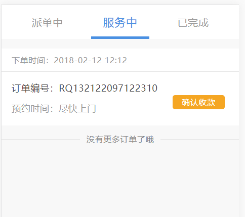
<a class="nav-tap-item nav-tap-item-on" onclick="tabChange(1)">In service</a>
<a class="nav-tap-item" onclick="tabChange(2)">Completed</a>
</div>
<div class="nav-body">
<div id="tap1" class="nav-body-item" hidden>
/* First page content */
</div>
<div id="tap2" class="nav-body-item">
/* Second page content */
</div>
<div id="tap3" class="nav-body-item" hidden>
/* Third page content */
</div>
</div>
</div>The middle page is displayed by default and hidden. click events are set in all three navigation bars, functions in js files are called, and fixed parameters are passed in.
-
CSS:
.nav-box{
    width: 100%;
    height: 100%;
    position: relative;
}
.nav-tap{
    width: 100%;
    display: flex;
    flex-direction: row;
    align-items: center;
    position: absolute;
    top: 0;
    font-size: 1rem;
    background-color: #fff;
    padding: 0 4%;
    box-sizing: border-box;
}
.nav-tap-item{
    width: 100%;
    display: block;
    color:#9a9a9a;
    font-size: 1rem;
    padding: .8rem 0;
    text-align: center;
    transition: .3s;
}
.nav-tap-item-on{
    font-size: 1.1rem;
    color: #4a90e2;
    position: relative;
}
.nav-tap-item-on:after{
    content: '';
    width: 80%;
    height: 4px;
    background-color: #4a90e2;
    position: absolute;
    bottom: 0;
    left:10%;
}
.nav-body{
    margin-top: 14%;
}
The animation effect is controlled by the transition attribute. The font unit here is rem. please query the REM layout of the mobile terminal for details.
-
JavaScript:
/**
 * Control click the top navigation bar to change
 * @param tabNum
 */
function tabChange(tabNum){
    $(".nav-tap-item").eq(tabNum).addClass('nav-tap-item-on').siblings('.nav-tap-item').removeClass('nav-tap-item-on');
    $(".nav-body-item").eq(tabNum).show().siblings().hide();
}
The jQuery library is used. eq selects the elements with the same class name, adds the class name for them, and changes to the selected state. siblings selects other elements with the same name except the currently selected elements, and removes the class name in the selected state. The following uses the same method to control the display of the page.