Today, let's talk about several map drawing methods I often use in my daily work and life. Next, I will introduce the map drawing methods of these visual libraries. Of course, there are many excellent class libraries for drawing beautiful visual maps. There is no way to list them one by one
pyecharts,plotly,folium,bokeh,basemap,geopandas,cartopy
Boken
Firstly, we introduce Boken's method of drawing map
Bokeh supports the creation of basic map visualization and map visualization based on processing geographic data
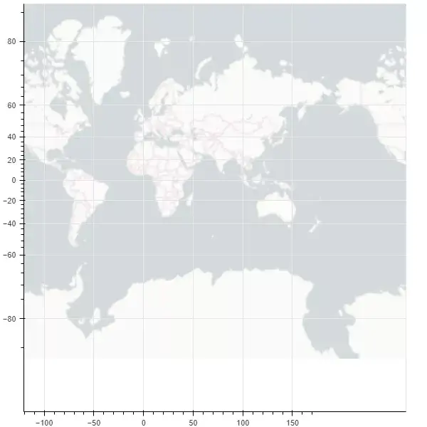
Draw a map of the world
from bokeh.plotting import figure, show
from bokeh.tile_providers import CARTODBPOSITRON, get_provider
from bokeh.io import output_notebook


output_notebook()
tile_provider = get_provider(CARTODBPOSITRON)

p = figure(x_range=(-2000000, 6000000), y_range=(-1000000, 7000000),
           x_axis_type="mercator", y_axis_type="mercator")
p.add_tile(tile_provider)

show(p)
Draw another map of China
from bokeh.plotting import curdoc, figure
from bokeh.models import GeoJSONDataSource
from bokeh.io import show

#Read the map data of China and send it to GeoJSONDataSource
with open("china.json", encoding="utf8") as f:
    geo_source = GeoJSONDataSource(geojson=f.read())
#Set a canvas
p = figure(width=500, height=500)
#Using the patches function and geo_source draw map
p.patches(xs='xs', ys='ys', source=geo_source)
show(p)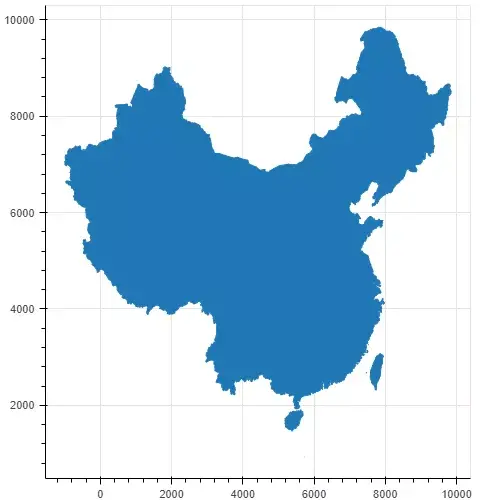
It is also very convenient for us to draw the map through GEO geographic data, but the map looks monotonous. We draw different provinces into different colors to see
with open("china.json", encoding="utf8") as f:
    data = json.loads(f.read())
#Judge whether it is Beijing data
def isBeijing(district):
    if 'beijing' in district['properties']['woe-name'].lower():
        return True
    return False
# data['features'] = list(filter(isInLondon, data['features']))
#Filter data
#Add a color attribute for each region
for i in range(len(data['features'])):
    data['features'][i]['properties']['color'] = ['red', 'blue', 'yellow', 'orange', 'gray', 'purple'][i % 6]
    data['features'][i]['properties']['number'] = random.randint(0, 20_000)
geo_source = GeoJSONDataSource(geojson=json.dumps(data))
p = figure(width=500, height=500, tooltips="@name, number: @number")
p.patches(xs='xs', ys='ys', fill_alpha=0.7,
        line_color='white',
        line_width=0.5,
        color="color",   #Add a color attribute, where "color" corresponds to the color attribute of each region
        source=geo_source)
p.axis.axis_label = None
p.axis.visible = False
p.grid.grid_line_color = None

show(p)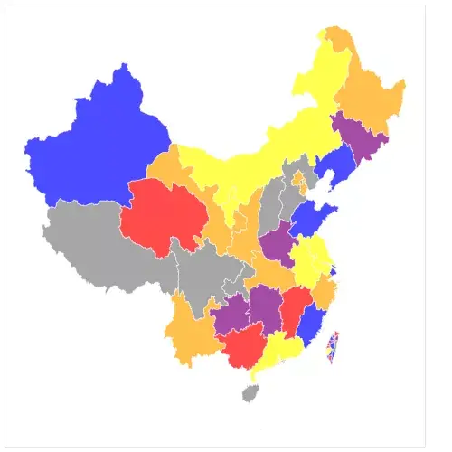
It can be seen that there is already an internal flavor. The only drawback is that the 13th segment of the South China Sea is not displayed
geopandas
GeoPandas is a map visualization tool based on Pandas. Its data structure is completely inherited from Pandas. It is very friendly to students familiar with master pan
Or draw a map of the world first
import pandas as pd
import geopandas
import matplotlib.pyplot as plt
%matplotlib inline

world = geopandas.read_file(geopandas.datasets.get_path('naturalearth_lowres'))
world.plot()
plt.show()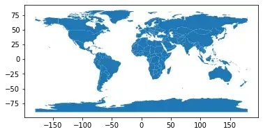
This is also a classic picture on the official website of geopandas. You can see that it is very simple. Except for the import code, the map is drawn in only three lines
Now let's continue to draw the map of China. This time, we add the information of Jiuduan line
china_nine = geopandas.read_file(r"geojson/Nine segment line GS(2019)1719 number.geojson")
china = geopandas.read_file('china-new.json')
fig, ax = plt.subplots(figsize=(12, 8),dpi=80)
ax = china.plot(ax=ax, column='number')
ax = china_nine.plot(ax=ax)
plt.show()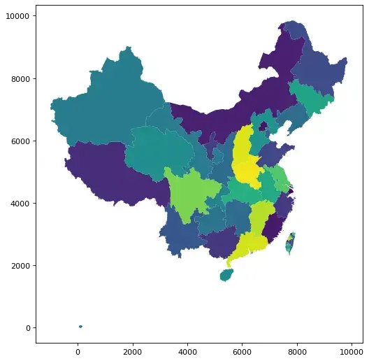
We reused the previously processed China JSON data, in which the number field is randomly generated test data, and the effect is comparable to that of Bokeh
plotly
Next, let's introduce plot, which is also a very useful Python visualization tool. If we want to draw map information, we need to install the following dependencies
!pip install geopandas==0.3.0
!pip install pyshp==1.2.10
!pip install shapely==1.6.3
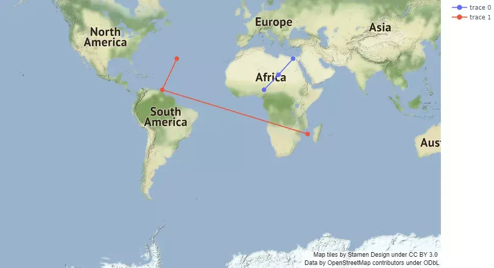
Next, let's draw a world map
import plotly.graph_objects as go

fig = go.Figure(go.Scattermapbox(
    mode = "markers+lines",
    lon = [10, 20, 30],
    lat = [10, 20,30],
    marker = {'size': 10}))

fig.add_trace(go.Scattermapbox(
    mode = "markers+lines",
    lon = [-50, -60,40],
    lat = [30, 10, -20],
    marker = {'size': 10}))

fig.update_layout(
    margin ={'l':0,'t':0,'b':0,'r':0},
    mapbox = {
        'center': {'lon': 113.65000, 'lat': 34.76667},
        'style': "stamen-terrain",
        'center': {'lon': -20, 'lat': -20},
        'zoom': 1})

fig.show()
Here we use the underlying API} plot graph_ objects. Choroplethmapbox +
Next, let's continue to draw a map of China using an advanced API {plot express. choropleth_ mapbox