📋 Personal profile
- 💖 About the author: Hello, I'm Daniel 😜
- 📝 Personal homepage: Hall owner a Niu🔥
- 🎉 Support me: like 👍+ Collection ⭐ Email + message 📝
- 📣 Series column: css🍁
- 💬 Maxim: so far, all life is written with failure, but it doesn't prevent me from moving forward! 🔥
Previous portal:
👉Selectors in css
👉css box model and its practical cases (Part 1)
👉css box model and its practical cases (Part 2)
👉Floating of css web page layout and its practical case (super detailed)
👉Detailed explanation of positioning in css
👉Displaying and hiding elements in css
👉I spliced my English name with css sprite map. No one doesn't know sprite map technology
👉The practice and case of css triangle
👉css layout skills - clever use of css triangle
👉css layout skills - clever use of text around floating elements
👉css layout skills - clever use of negative margin
👉css layout skills - clever use of inline block elements
👉Application and case of vertical align attribute in css
👉css set text overflow ellipsis display
👉css3 has added a selector. Doesn't anyone know?
preface
css3 has several important new features. Today I'll list them for you. Pick up a small notebook and remember it
css3 box model
In css3, you can specify the box model through box sizing. There are two values: content box and border box. In this way, the way we calculate the size of the box has changed.
It can be divided into two cases:
- Box - sizing: content - box the box size is width + padding + border (previously the default)
- Box - sizing: Border - the box size is width
When we learn the box model, we know that padding and border will support the larger box. If we change the box model to box - sizing: Border - box, padding and border will not support the larger box (provided that padding and border will not exceed the width)
Examples
<!DOCTYPE html>
<html lang="en">
<head>
    <meta charset="UTF-8">
    <meta http-equiv="X-UA-Compatible" content="IE=edge">
    <meta name="viewport" content="width=device-width, initial-scale=1.0">
    <title>Document</title>
    <style>
        div{
            box-sizing: border-box;
            border: 2px solid red;
            padding: 3px;
            width: 200px;
            height: 200px;
        }

    </style>
</head>
<body>
    <div></div>

</body>
</html>
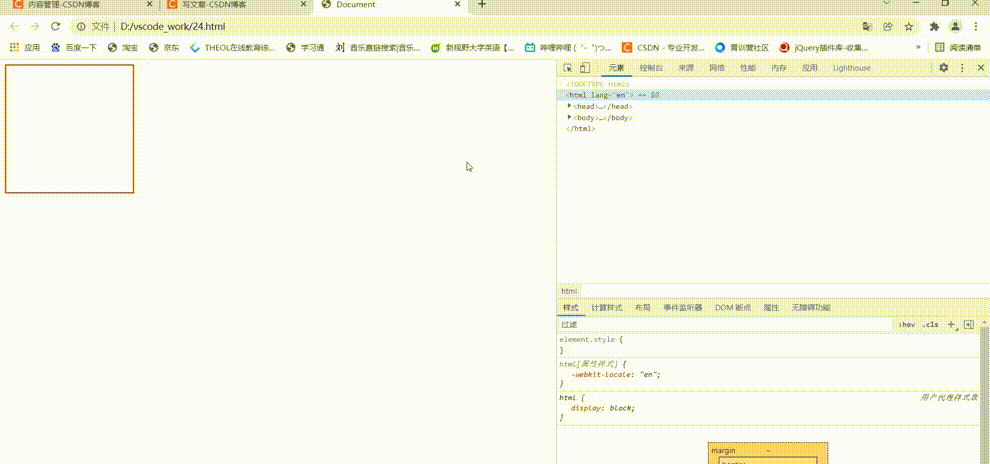
As can be seen from the figure, when I remove box - sizing: Border - box; After, the width and height of the box will become 210px, plus padding and border.
css3 filter (for image blur processing)
The filter css property applies graphic effects such as blur or color offset to the element.
Filter: function (); For example: filter: blur (5px); Blur fuzzy processing, the larger the value, the more fuzzy
(just remember the function blur() for now)
Examples
<!DOCTYPE html>
<html lang="en">
<head>
    <meta charset="UTF-8">
    <meta http-equiv="X-UA-Compatible" content="IE=edge">
    <meta name="viewport" content="width=device-width, initial-scale=1.0">
    <title>Document</title>
    <style>
        div{
            width: 200px;
        }
        div img{
            width: 100%;
            vertical-align: bottom;
            filter: blur(5px); /*The unit px must be added*/
        }

    </style>
</head>
<body>
    <div>
        <img src="123.jpg" alt="">
    </div>

</body>
</html>
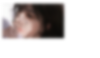
You can see that the picture is blurred.
css3 calc function
css3 calc function:
calc() this css function allows you to perform some calculations when declaring the css attribute value.
width :calc(100%-80px);
+ - * / can be used in brackets for calculation.
Examples
There are two boxes. No matter how the width of the parent box changes, the width of the child box is always 30px smaller than that of the parent box.
<!DOCTYPE html>
<html lang="en">
<head>
    <meta charset="UTF-8">
    <meta http-equiv="X-UA-Compatible" content="IE=edge">
    <meta name="viewport" content="width=device-width, initial-scale=1.0">
    <title>Document</title>
    <style>
        .father{
            width: 200px;
            height: 100px;
            background-color: pink;
        }
        .son{
            width: calc(100% - 30px);
            height: 50px;
            background-color: blue;
        }
    </style>
</head>
<body>
    <div class="father">
        <div class="son">
        </div>
    </div>

</body>
</html>
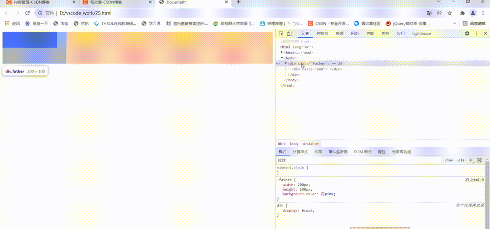
As can be seen from the above figure, the width of the child box will change with the width of the parent box.
css3 transition (important)
transition is one of the subversive features in CSS3. We can add effects to elements when they change from one style to another without using Flash animation or JavaScript.
Transition Animation: it is a gradual transition from one state to another, which can make our pages more beautiful and dynamic. Although the lower version browsers do not support (ie9 or below), it will not affect the page layout.
We often use it with: hover now.
transition: the attribute to be transitioned takes time, and when the motion curve starts;
1. Attribute: the css attribute you want to change, width, height, background color, inner and outer margins. If you want all attributes to change, write an all.
2. Time spent: the unit is seconds (the unit must be written), such as 0.5s
3. Motion curve: the default is ease (can be omitted)
4. When to start: the unit is seconds (the unit must be written). The delay trigger time can be set. The default is 0s (can be omitted)
Motion curve
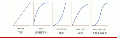
Transitional use of the formula: who makes the transition to whom to add
Examples
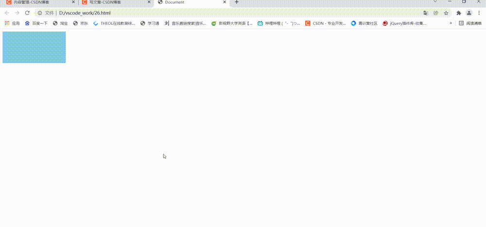
<!DOCTYPE html>
<html lang="en">
<head>
    <meta charset="UTF-8">
    <meta http-equiv="X-UA-Compatible" content="IE=edge">
    <meta name="viewport" content="width=device-width, initial-scale=1.0">
    <title>Document</title>
    <style>
        div{
            width: 200px;
            height: 100px;
            background-color: skyblue;
            /* transition : The attribute to transition takes time, and when the motion curve starts; */

            /* 1. Add transition to width */
            /* transition: width 0.5s ease 0s; */
            /* 2. Add a transition to the width and height, and separate multiple attributes with commas */
            /* transition: width 0.5s , height 0.5s; */
            /* 3. Right: add transition to all attributes in hover. Just use all */
            transition: all 0.5s;
        }
        div:hover{
            width: 400px;
            height: 200px;
            background-color: pink;
        }

    </style>
</head>
<body>
    <div></div>

</body>
</html>
Case - progress bar
<!DOCTYPE html>
<html lang="en">
<head>
    <meta charset="UTF-8">
    <meta http-equiv="X-UA-Compatible" content="IE=edge">
    <meta name="viewport" content="width=device-width, initial-scale=1.0">
    <title>Document</title>
    <style>
        .bar{
            width: 150px;
            height: 15px;
            border: 1px solid red;
            border-radius: 7px;
            padding: 1px;
        }
        .bar_in{
            width: 50%;
            height: 100%;
            background-color: red;
            transition: width .5s;
        }
        .bar:hover .bar_in{
            width: 100%;
        }
    </style>
</head>
<body>
    <div class="bar">
        <div class="bar_in"></div>
    </div>
</body>
</html>
epilogue
The update of css series is almost complete. Later, we will go to the mobile terminal layout and javascript column. Interested friends can continue to pay attention 💖💖💖!!!