1, Transceiver card
demand
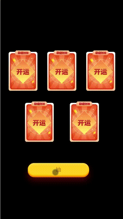
5 cards, 3 up and 2 down. After the page button needs to be triggered, all cards are recovered to the button, and then sent out, which is similar to the effect of shuffling.
thinking
Recently, it is required to realize a similar dynamic effect similar to spider card sending and receiving. After consulting the data, it is found that if the snowball is satisfied, the number of cards (hereinafter "cards" are replaced by "cards") is small, which can be realized by translate3d of css.
design sketch
*H5
The card is composed of an outer div and an inner img. After clicking the button to trigger the animation, the outer div moves through translate3d and the inner img is scaled.
The key point is that in the animation, the animation time of img scaling and div translation is the same. Div first translates to the button. At this time, IMG shrinks and is just obscured by the button, eliminating the logic that we need to hide img. Through the timer, the animation execution time of each card is a little later than the previous one, which will form the effect that the cards are put away one by one and sent out one by one. The effect of 20% - 80% is the same, that is, let the IMG shrink. When you pan to the bottom of the button, stay for a while, and send out the cards in sequence after all the cards are put away.
.blindimgan{
    animation: blindimgcla 2s linear 1;
}
@keyframes blindimgcla {
    0% {
        transform: scale(1);
    }
    20% {
        transform: scale(0.1);
    }
    40% {
        transform: scale(0.1);
    }
    60% {
        transform: scale(0.1);
    }
    80% {
        transform: scale(0.1);
    }
    100% {
        transform: scale(1);
    }
}
.blindboxlian1{
    animation: blindboxlicla1 2s linear 1;
}
@keyframes blindboxlicla1 {
    0% {
        transform: translate3d(0,0,0);
    }
    20% {
        transform: translate3d(2rem,6rem,0);
    }
    40% {
        transform: translate3d(2rem,6rem,0);
    }
    60% {
        transform: translate3d(2rem,6rem,0);
    }
    80% {
        transform: translate3d(2rem,6rem,0);
    }
    100% {
        transform: translate3d(0,0,0);
    }
}
.blindboxlian2{
    animation: blindboxlicla2 2s linear 1;
}
@keyframes blindboxlicla2 {
    0% {
        transform: translate3d(0,0,0);
    }
    20% {
        transform: translate3d(0,6rem,0);
    }
    40% {
        transform: translate3d(0,6rem,0);
    }
    60% {
        transform: translate3d(0,6rem,0);
    }
    80% {
        transform: translate3d(0,6rem,0);
    }
    100% {
        transform: translate3d(0,0,0);
    }
}
.blindboxlian3{
    animation: blindboxlicla3 2s linear 1;
}
@keyframes blindboxlicla3 {
    0% {
        transform: translate3d(0,0,0);
    }
    20% {
        transform: translate3d(-2rem,6rem,0);
    }
    40% {
        transform: translate3d(-2rem,6rem,0);
    }
    60% {
        transform: translate3d(-2rem,6rem,0);
    }
    80% {
        transform: translate3d(-2rem,6rem,0);
    }
    100% {
        transform: translate3d(0,0,0);
    }
}
.blindboxlian4{
    animation: blindboxlicla4 2s linear 1;
}
@keyframes blindboxlicla4 {
    0% {
        transform: translate3d(0,0,0);
    }
    20% {
        transform: translate3d(1rem,3rem,0);
    }
    40% {
        transform: translate3d(1rem,3rem,0);
    }
    60% {
        transform: translate3d(1rem,3rem,0);
    }
    80% {
        transform: translate3d(1rem,3rem,0);
    }
    100% {
        transform: translate3d(0,0,0);
    }
}
.blindboxlian5{
    animation: blindboxlicla5 2s linear 1;
}
@keyframes blindboxlicla5 {
    0% {
        transform: translate3d(0,0,0);
    }
    20% {
        transform: translate3d(-1rem,3rem,0);
    }
    40% {
        transform: translate3d(-1rem,3rem,0);
    }
    60% {
        transform: translate3d(-1rem,3rem,0);
    }
    80% {
        transform: translate3d(-1rem,3rem,0);
    }
    100% {
        transform: translate3d(0,0,0);
    }
}
Don't ask me why I use so many timers (I'm happy). In fact, you can also use the delay of css animation. The effect is the same.
//Start animation
setTimeout(function(){
  $(".blindboxli1").addClass("blindboxlian1");
  $(".blindboxli1>.blindimg0").addClass("blindimgan");
  setTimeout(function(){
    $(".blindboxli2").addClass("blindboxlian2");
    $(".blindboxli2>.blindimg0").addClass("blindimgan");
    setTimeout(function(){
      $(".blindboxli3").addClass("blindboxlian3");
      $(".blindboxli3>.blindimg0").addClass("blindimgan");
      setTimeout(function(){
        $(".blindboxli4").addClass("blindboxlian4");
        $(".blindboxli4>.blindimg0").addClass("blindimgan");
        setTimeout(function(){
          $(".blindboxli5").addClass("blindboxlian5");
          $(".blindboxli5>.blindimg0").addClass("blindimgan");
          setTimeout(function(){
            //Button hidden
            $(".blindboxbtndiv").hide();
            //After receiving and issuing animation, relevant processing shall be carried out
          },2000);
        },100);
      },100);
    },100);
  },100);
},100);
translate3d
*Applet
The implementation idea of the applet is the same as that of H5. The difference is that the animation is realized by using the animation provided by the applet.
// Card receiving and issuing effect
onClickBlindBox:function(){
  var that = this;
  var blindBoxList = that.data.blindBoxList;
  var list1 = [
    {translate3d: [0,0,0]},
    {translate3d: [110,300,0]},
  ];
  var listNo1 = [
    {translate3d: [110,300,0]},
    {translate3d: [0,0,0]},
  ];
  that.blindBoxAn(1,list1,listNo1);
  var list2 = [
    {translate3d: [0,0,0]},
    {translate3d: [0,300,0]},
  ];
  var listNo2 = [
    {translate3d: [0,300,0]},
    {translate3d: [0,0,0]},
  ];
  setTimeout(function(){
    that.blindBoxAn(2,list2,listNo2);
  },100)
  var list3 = [
    {translate3d: [0,0,0]},
    {translate3d: [-110,300,0]},
  ];
  var listNo3 = [
    {translate3d: [-110,300,0]},
    {translate3d: [0,0,0]},
  ];
  setTimeout(function(){
    that.blindBoxAn(3,list3,listNo3);
  },200)
  var list4 = [
    {translate3d: [0,0,0]},
    {translate3d: [55,150,0]},
  ];
  var listNo4 = [
    {translate3d: [55,150,0]},
    {translate3d: [0,0,0]},
  ];
  setTimeout(function(){
    that.blindBoxAn(4,list4,listNo4);
  },300)
  var list5 = [
    {translate3d: [0,0,0]},
    {translate3d: [-55,150,0]},
  ];
  var listNo5 = [
    {translate3d: [-55,150,0]},
    {translate3d: [0,0,0]},
  ];
  setTimeout(function(){
    that.blindBoxAn(5,list5,listNo5);
    setTimeout(function(){
      that.setData({
        isBlindBoxBtn: 2
      })
    },2000);
  },400);
},
  //Specific animation implementation
  blindBoxAn:function(str,list,listNo){
    var that = this;
    var cla = ".blindboxli" + str;
    var cla1 = ".blindboxli" + str + ">.blindimg0";
    that.animate(cla, list, 800, function() {
      that.clearAnimation(cla, {}, null)
      if(listNo){
        setTimeout(function(){
          that.animate(cla, listNo, 800, function() {
            that.clearAnimation(cla, {}, null)
          }.bind(that));
          that.animate(cla1, [
            {scale: [0.1, 0.1]},
            {scale: [1,1]},
          ], 800, function() {
            that.clearAnimation(cla1, {}, null)
          }.bind(that));
        },500);
      }
    }.bind(that));
    that.animate(cla1, [
      {scale: [1,1]},
      {scale: [0.1, 0.1]},
    ], 800, function() {
      that.clearAnimation(cla1, {}, null)
    }.bind(that));
  },
In onClickBlindBox function, data is mainly required for animation execution, and blindBoxAn is an animation call.
The animation effect and logic are consistent with those of H5, but the applet animate is not easy to execute the effect that the animation has been waiting for in one place (not so smooth and good-looking). Therefore, the animation here is divided into two times. For the first time, the view (the same as div) is translated, IMG is reduced, and the timer is used. After all cards are recovered, the secondary animation is executed, the view is translated to the original position, and img is enlarged.
2, Flop / card
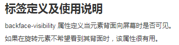
Since there is the effect of sending and receiving cards, there must be the effect of turning cards. Turn the card and you'll use it backface-visibility.
thinking
Locate the two IMGs before (card 1) and after (card 2) to the same position, and set backface visibility: hidden; Adding to card 2
transform: rotateY(-180deg); In this way, using the backface visibility feature, the img back of card 2 is not visible to the screen.
When card 1 is clicked, card 2 sets visibility: visible, and card 1transform: rotateY(180deg); Card 2transform: rotateY(0);
Realize the effect of turning the card and then turning it into another card.
design sketch