explain
In this step, we will use custom controls to extend the functions of SAPUI5. We want to rate the products displayed on the detail page, so we use SAPUI5 extension mechanism to create a combination of multiple standard controls and add some glue code to make them work well together. In this way, we can reuse controls throughout the application and save all related functions in one module.
preview
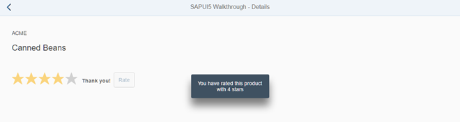
Add a custom product rating control to the details page
code
You can Walkthrough - step 34 View and download all files.
webapp/control/ProductRating.js (New)
sap.ui.define([
	"sap/ui/core/Control"
], function (Control) {
	"use strict";
	return Control.extend("sap.ui.demo.walkthrough.control.ProductRating", {
		metadata : {
		},
		init : function () {
		},
		renderer : function (oRM, oControl) {
		}
	});
});
We created a new folder control and a productrating JS file, which will save our new control. Like our controllers and views, custom controls inherit public control functions from the SAPUI5 base object. For controls, this is done by extending the base class sap ui. core. Control implementation.
Custom controls are small reusable components that can be easily created in an application. Because of their characteristics, they are sometimes called "notepad" or "on the fly" controls. A custom control is a JavaScript object. It has two special parts (metadata and renderer) and many methods to realize the function of the control.
The metadata section defines the data structure to define the API of the control. Using the attributes, events and aggregated meta information of the control, SAPUI5 automatically creates setter and getter methods and other convenient functions that can be invoked in the application.
The renderer defines an HTML structure that will be added to the DOM tree of the application when the control is instantiated in the view. It is usually initially called by the core of SAPUI5 and is called whenever the properties of the control are changed. The parameter oRM of the rendering function is the SAPUI5 rendering manager, which can be used to write strings and control properties to HTML pages.
The init method is a special function. Whenever a control is instantiated, the SAPUI5 core will call it. It can be used to set up a control and prepare its contents for display.
be careful
Control always extends sap ui. core. Control and render themselves. If you want to reuse the life cycle features of SAPUI5, including the data binding of non rendered objects, you can also directly extend sap ui. core. Element or sap ui. base. ManagedObject. Refer to the API reference for more information about the control inheritance hierarchy.
webapp/control/ProductRating.js
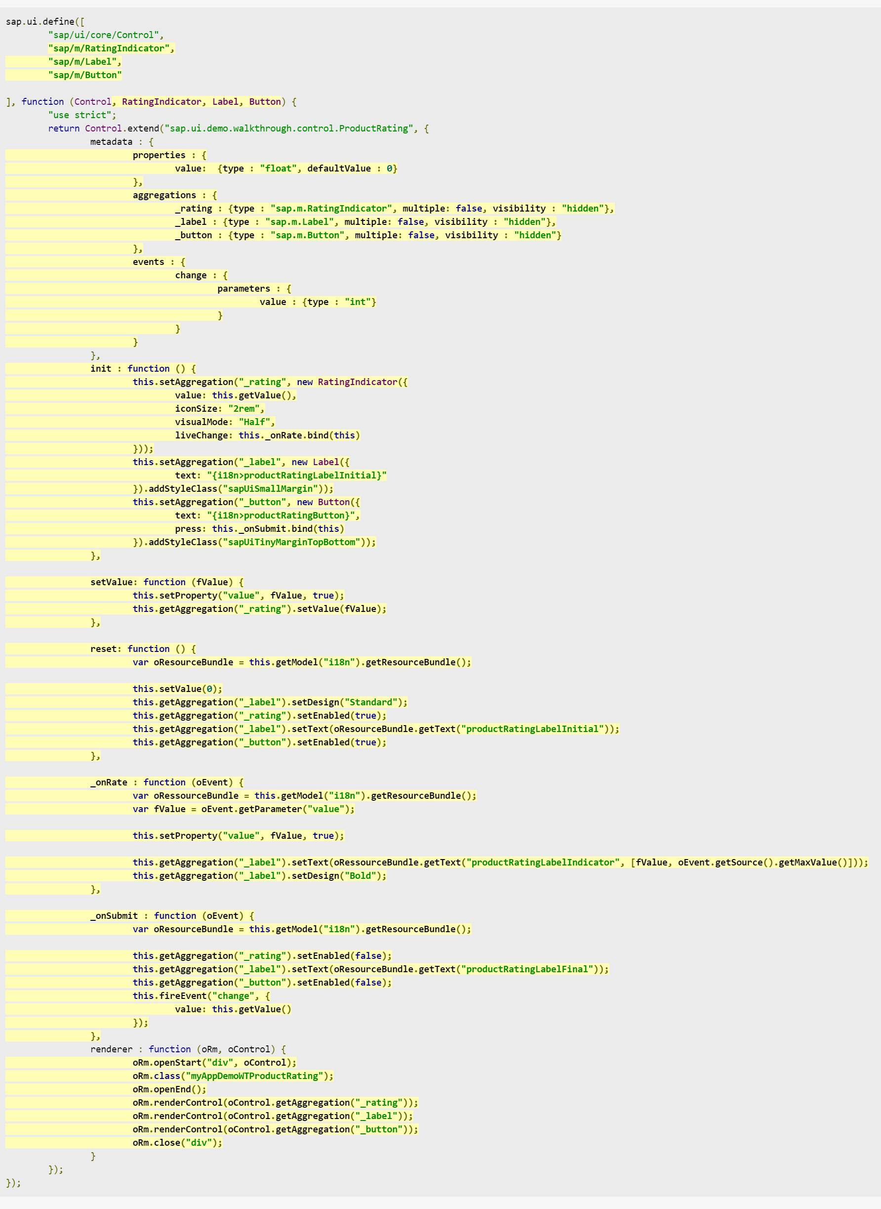
sap.ui.define([
	"sap/ui/core/Control",
	"sap/m/RatingIndicator",
	"sap/m/Label",
	"sap/m/Button"

], function (Control, RatingIndicator, Label, Button) {
	"use strict";
	return Control.extend("sap.ui.demo.walkthrough.control.ProductRating", {
		metadata : {
			properties : {
				value: 	{type : "float", defaultValue : 0}
			},
			aggregations : {
				_rating : {type : "sap.m.RatingIndicator", multiple: false, visibility : "hidden"},
				_label : {type : "sap.m.Label", multiple: false, visibility : "hidden"},
				_button : {type : "sap.m.Button", multiple: false, visibility : "hidden"}
			},
			events : {
				change : {
					parameters : {
						value : {type : "int"}
					}
				}
			}
		},
		init : function () {
			this.setAggregation("_rating", new RatingIndicator({
				value: this.getValue(),
				iconSize: "2rem",
				visualMode: "Half",
				liveChange: this._onRate.bind(this)
			}));
			this.setAggregation("_label", new Label({
				text: "{i18n>productRatingLabelInitial}"
			}).addStyleClass("sapUiSmallMargin"));
			this.setAggregation("_button", new Button({
				text: "{i18n>productRatingButton}",
				press: this._onSubmit.bind(this)
			}).addStyleClass("sapUiTinyMarginTopBottom"));
		},

		setValue: function (fValue) {
			this.setProperty("value", fValue, true);
			this.getAggregation("_rating").setValue(fValue);
		},

		reset: function () {
			var oResourceBundle = this.getModel("i18n").getResourceBundle();

			this.setValue(0);
			this.getAggregation("_label").setDesign("Standard");
			this.getAggregation("_rating").setEnabled(true);
			this.getAggregation("_label").setText(oResourceBundle.getText("productRatingLabelInitial"));
			this.getAggregation("_button").setEnabled(true);
		},

		_onRate : function (oEvent) {
			var oRessourceBundle = this.getModel("i18n").getResourceBundle();
			var fValue = oEvent.getParameter("value");

			this.setProperty("value", fValue, true);

			this.getAggregation("_label").setText(oRessourceBundle.getText("productRatingLabelIndicator", [fValue, oEvent.getSource().getMaxValue()]));
			this.getAggregation("_label").setDesign("Bold");
		},

		_onSubmit : function (oEvent) {
			var oResourceBundle = this.getModel("i18n").getResourceBundle();

			this.getAggregation("_rating").setEnabled(false);
			this.getAggregation("_label").setText(oResourceBundle.getText("productRatingLabelFinal"));
			this.getAggregation("_button").setEnabled(false);
			this.fireEvent("change", {
				value: this.getValue()
			});
		},
		renderer : function (oRm, oControl) {
			oRm.openStart("div", oControl);
			oRm.class("myAppDemoWTProductRating");
			oRm.openEnd();
			oRm.renderControl(oControl.getAggregation("_rating"));
			oRm.renderControl(oControl.getAggregation("_label"));
			oRm.renderControl(oControl.getAggregation("_button"));
			oRm.close("div");
		}
	});
});
Now let's enhance the new custom control with the required customization capabilities. In our example, we want to create an interactive product rating, so we define a value and use three internal controls, which will automatically update and display them. The RatingIndicator control is used to collect user input on the product, the label displays further information, and the button submits the rating to the application to store it.
Therefore, in the metadata section, we define several properties used in the implementation:
-
Properties
- Value
We define a control property value that will hold the value selected by the user in the rating. The Getter and setter functions of this property will be created automatically, and we can bind it to the data model field in the XML view if we like.
- Value
-
Aggregations
As mentioned in the first paragraph, we need three internal controls to achieve our rating function. Therefore, we create three "hidden aggregations" by setting the visibility property to hidden. In this way, we can use the model set on the view in the internal controls. SAPUI5 will be responsible for life cycle management and destroy the controls when they are no longer needed. Aggregation can also be used to save the control array, but we only want one control in each aggregation, so we need to adjust the cardinality by setting the attribute multiple to false.- _ rating: a sap for user input m. Ratingindicator control
- _ label: SAP for displaying additional information m. label control
- _ Button: a sap to submit ratings m. T button control
be careful
You can define aggregations and associations for controls. The difference lies in the relationship between parent controls and related controls:- aggregation is a strong relationship that also manages the life cycle of related controls. For example, when the parent control is destroyed, the related control will also be destroyed. In addition, a control can only be assigned to a single aggregate. If it is assigned to a second aggregate, it will be automatically deleted from the previous aggregate.
- Association is a weak relationship that does not manage the life cycle and can be defined multiple times. For clarity, associations store only ID S, while aggregations store direct references to controls. In this case, we do not specify an association because we want the parent node to manage internal control.
-
Events
- Change
We specify a change event that will trigger the control when the rating is submitted. It contains the current value as an event parameter.
The application can register to this event and process the results in a way similar to "normal" SAPUI5 controls. In fact, these controls are built in a way similar to custom controls.
- Change
Whenever a new instance of the control is instantiated, SAPUI5 will automatically call the init function, in which we set the internal control. We instantiate these three controls and inherit them from SAP by calling ui. core. Control's framework method setAggregation stores them in an internal aggregation. We pass the name of the internal aggregate specified above and the new control instance. We specify some control properties to make our custom control look better, and register a liveChange event to the rating and a press event to the button. The initial text of the labels and buttons is referenced from our i18n model.
Now let's ignore other internal helper functions and event handlers and define our renderer. With the help of SAPUI5 rendering manager and control instances passed as references, we can now render the HTML structure of the control. We render the beginning of the outer < div > tag as < div, and call the auxiliary method writeControlData to render the ID and other basic properties of the control in the div tag. Next, we add a custom CSS class to define the style rules for the custom controls later in the CSS file. This CSS class and other CSS classes that have been added to the view are then rendered by calling writeClasses on the renderer instance. Then we close the surrounding div tag and render the three internal controls by passing the internally aggregated content to the render manager renderControl function. This invokes the control's renderer and adds their HTML to the page. Finally, close the surrounding < div > tab.
setValue is the overridden of a setter. SAPUI5 will generate a setter to update the attribute value when it is invoked in the controller or defined in the XML view, but we also need to update the internal rating control in the hidden aggregation to correctly reflect the state. In addition, by calling the setProperty method to update the control property with true as the third parameter, we can skip the re rendering of sapui5, which is usually triggered when the property on the control changes.
Now we define event handlers for internal rating control. It is called every time the user changes the rating. The current value of rating control can be obtained from SAP m. Reading of event parameter values controlled by ratingindicator. Using this value, we call overridden's setter to update the control state, and then we update the label next to the rating to display the value currently selected by the user and the maximum value. Strings with placeholder values are read from the i18n model that is automatically assigned to the control.
Next, we have the press process of the rating button to submit the rating. We assume that rating a product is a one-time operation. First, disable the rating and button, so that users are not allowed to submit another rating. We also update the label to show "Thank you for your rating!" Message, and then we trigger the change event of the control and pass the current value as a parameter so that the application listening for the event can respond to the rating interaction.
We defined the reset method to restore the control state on the UI to the initial state so that the user can submit the rating again.
webapp/view/Detail.view.xml
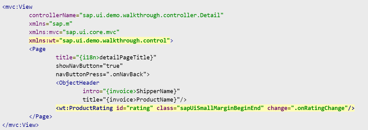
<mvc:View
	controllerName="sap.ui.demo.walkthrough.controller.Detail"
	xmlns="sap.m"
	xmlns:mvc="sap.ui.core.mvc"
	xmlns:wt="sap.ui.demo.walkthrough.control">
	<Page
		title="{i18n>detailPageTitle}"
		showNavButton="true"
		navButtonPress=".onNavBack">
		<ObjectHeader
			intro="{invoice>ShipperName}"
			title="{invoice>ProductName}"/>
		<wt:ProductRating id="rating" class="sapUiSmallMarginBeginEnd" change=".onRatingChange"/>
	</Page>
</mvc:View>
A new namespace wt is defined on the detail view so that we can easily reference custom controls in the view. We then add an instance of the ProductRating control to the details page and register an event handler for the change event. In order to have a correct layout, we also added a margin style class.
webapp/controller/Detail.controller.js

sap.ui.define([
	"sap/ui/core/mvc/Controller",
	"sap/ui/core/routing/History",
	"sap/m/MessageToast"

], function (Controller, History, MessageToast) {
	"use strict";

	return Controller.extend("sap.ui.demo.walkthrough.controller.Detail", {
		...
		_onObjectMatched: function (oEvent) {
			this.byId("rating").reset();
			this.getView().bindElement({
				path: "/" + window.decodeURIComponent(oEvent.getParameter("arguments").invoicePath),
				model: "invoice"
			});
		},

		onNavBack: function () {
			var oHistory = History.getInstance();
			var sPreviousHash = oHistory.getPreviousHash();

			if (sPreviousHash !== undefined) {
				window.history.go(-1);
			} else {
				var oRouter = this.getOwnerComponent().getRouter();
				oRouter.navTo("overview", {}, true);
			}
		},

		onRatingChange: function (oEvent) {
			var fValue = oEvent.getParameter("value");
			var oResourceBundle = this.getView().getModel("i18n").getResourceBundle();

			MessageToast.show(oResourceBundle.getText("ratingConfirmation", [fValue]));
		}
	});
});
In the Detail controller, we load the dependency into SAP m. MessageToast, because we will simply display a message instead of sending the rating to the back end to keep the example simple. The event handler onRatingChange reads the value of the custom change event triggered when the rating is submitted. A confirmation message with a value is then displayed in the MessageToast control.
In the onObjectMatched private method, we call the reset method to submit the rating when displaying a detailed view of another different line item.
webapp/css/style.css
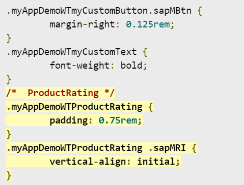
.myAppDemoWTmyCustomButton.sapMBtn {
	margin-right: 0.125rem;
}
.myAppDemoWTmyCustomText {
	font-weight: bold;
}
/*  ProductRating */
.myAppDemoWTProductRating {
	padding: 0.75rem;
}
.myAppDemoWTProductRating .sapMRI {
	vertical-align: initial;
}
In order to layout the control, we added some padding in the root class to make some space around the three internal controls, and we overridden the alignment of the RatingIndicator control so that it is aligned on a line with the label and button.
We can also use more HTML in the renderer to achieve this, but this is the simplest method, which will only be applied to our custom controls. However, please note that custom controls in your application may need to be adjusted when internal controls in future versions of SAPUI5 are changed.
webapp/i18n/i18n.properties
...
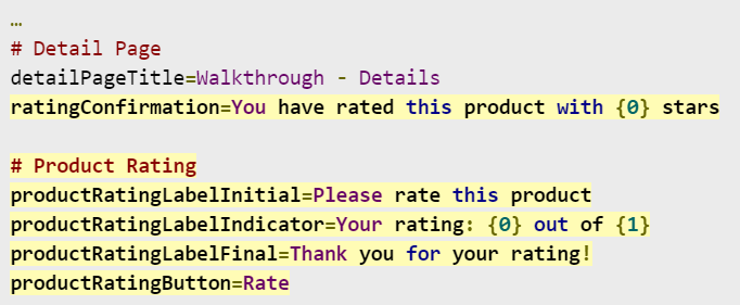
# Detail Page
detailPageTitle=Walkthrough - Details
ratingConfirmation=You have rated this product with {0} stars
# Product Rating
productRatingLabelInitial=Please rate this product
productRatingLabelIndicator=Your rating: {0} out of {1}
productRatingLabelFinal=Thank you for your rating!
productRatingButton=Rate
The resource string of our custom message control and confirm are referenced in the package. We can now evaluate the product with our new controls on the details page.
appointment
- Place the custom control in the control folder of the application.