Spinner is a drop-down selection component. The system's own spinner is very convenient to use. First, define an array (strings.xml), as follows:
<array name="grade">
    <item>first grade</item>
    <item>second grade</item>
    <item>Third grade</item>
    <item>fourth grade</item>
    <item>fifth grade</item>
    <item>Sixth grade</item>
</array>
When in use, the code is as follows:
Spinner spinner = (Spinner) findViewById(R.id.spinner);
ArrayAdapter adapter = ArrayAdapter.createFromResource(this, R.array.grade, android.R.layout.simple_spinner_item);
spinner.setAdapter(adapter);
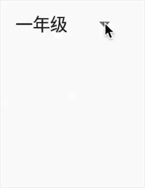
In this way, a simple spinner is implemented, as shown below:
Change initial layout
That is, the style in front of the pop-up window. First customize a layout as follows:
spinner_layout.xml
<?xml version="1.0" encoding="utf-8"?>
<TextView xmlns:android="http://schemas.android.com/apk/res/android"
    android:layout_width="wrap_content"
    android:layout_height="wrap_content"
    xmlns:tools="http://schemas.android.com/tools"
    android:textColor="#6d6d6d"
    android:textSize="15sp"
    android:drawableRight="@drawable/arrow"
    android:drawablePadding="5dp"
    tools:text="first grade">

</TextView>
Then replace the in createFromResource as follows:
ArrayAdapter adapter = ArrayAdapter.createFromResource(this, R.array.grade, R.layout.spinner_layout);
This is not enough, because there is also a background with arrows. Set the background to transparent, as follows:
spinner.setBackgroundColor(0x0);
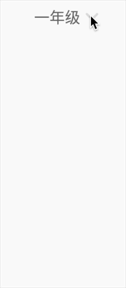
In this way, the display of the initial layout is the same as that of the spinner_layout is the same.
Change the layout of the drop-down list Item
After the above modifications, it is found that the layout of the item list in the pop-up window has also become a spinner_layout. By looking at the constructor of ArrayAdapter, we can see that there are two variables: mResource and mDropDownResource, where mResource is the initial layout and mDropDownResource is the layout of the list item.
In the createFromResource function, mResource and mDropDownResource are assigned the same value. However, the ArrayAdapter also has a setDropDownViewResource function.
First define a layout as follows:
spinner_item.xml
<?xml version="1.0" encoding="utf-8"?>
<TextView xmlns:android="http://schemas.android.com/apk/res/android"
    android:layout_width="match_parent"
    android:layout_height="wrap_content"
    xmlns:tools="http://schemas.android.com/tools"
    android:textColor="#6d6d6d"
    android:textSize="15sp"
    android:padding="8dp"
    android:gravity="center_horizontal"
    tools:text="first grade">

</TextView>
Then use the setDropDownViewResource function, as follows:
adapter.setDropDownViewResource(R.layout.spinner_item);
Change pop-up background and position
In the initial animation, we can see that the pop-up window will be blocked. We want the pop-up window to be below, and the pop-up window is rounded with arrows.
This requires the use of spinner's two functions, setPopupBackgroundResource and setDropDownVerticalOffset.
But note that both functions need to be in Android 4 1 or above. Since there are few versions below 4.1, we only consider versions above 4.1. The code is as follows:
if (Build.VERSION.SDK_INT >= Build.VERSION_CODES.JELLY_BEAN) {
    spinner.setPopupBackgroundResource(R.drawable.bg_spinner);
    spinner.setDropDownVerticalOffset(dip2px(20));
}
Add selected effect
After the above processing, we have obtained the desired style. However, the selected style is missing from the pop-up list. For example, I currently select "grade 2". In the pop-up window, the corresponding item font should be deepened and bold. I searched the spinner source code and found that there is no corresponding function and solution, so let's do it ourselves.
In fact, spinner uses an adapter to load the list, and we use the createFromResource function to automatically create an adapter. We can customize an adapter as follows:
public class SpinnerAdapter<T> extends ArrayAdapter<T> {

    private int selectedPostion;

    public void setSelectedPostion(int selectedPostion) {
        this.selectedPostion = selectedPostion;
    }

    public SpinnerAdapter(@NonNull Context context, int resource, @NonNull T[] objects) {
        super(context, resource, objects);
    }

    @Override
    public View getDropDownView(int position, @Nullable View convertView, @NonNull ViewGroup parent) {
        View view = super.getDropDownView(position, convertView, parent);
        TextView textView = (TextView)view;
        if(selectedPostion == position){
            textView.setTextColor(0xff373741);
            textView.getPaint().setFakeBoldText(true);
        }
        else{
            textView.setTextColor(0xff6d6d6d);
            textView.getPaint().setFakeBoldText(false);
        }
        return view;
    }

    public static @NonNull SpinnerAdapter<CharSequence> createFromResource(@NonNull Context context,
                                                                      @ArrayRes int textArrayResId, @LayoutRes int textViewResId) {
        final CharSequence[] strings = context.getResources().getTextArray(textArrayResId);
        return new SpinnerAdapter<>(context, textViewResId, strings);
    }
}
Note that the getDropDownView function in the ArrayAdapter obtains the view used by the pop-up item, not the getView function.
At the same time, we need to rewrite a createFromResource function.
Replace the previously used adapter with a custom one, and set listening for the spinner. The complete code after the change is as follows:
Spinner spinner = (Spinner) findViewById(R.id.spinner);
adapter = SpinnerAdapter.createFromResource(this, R.array.grade, R.layout.spinner_layout);
adapter.setDropDownViewResource(R.layout.spinner_item);
spinner.setBackgroundColor(0x0);
if (Build.VERSION.SDK_INT >= Build.VERSION_CODES.JELLY_BEAN) {
    spinner.setPopupBackgroundResource(R.drawable.bg_spinner);
    spinner.setDropDownVerticalOffset(dip2px(20));
}
spinner.setAdapter(adapter);
spinner.setOnItemSelectedListener(new AdapterView.OnItemSelectedListener() {
    @Override
    public void onItemSelected(AdapterView<?> parent, View view, int position, long id) {
        adapter.setSelectedPostion(position);
    }

    @Override
    public void onNothingSelected(AdapterView<?> parent) {

    }
});
The final effect is as follows:
We can achieve more complex effects and styles by defining our own adapter. We'll discuss it again when we have time.