This paper makes a visual data analysis of stock data. (tushare ID: 452043)
- Introduction to tushare
- Data crawling
- Data visualization analysis
3.1. Trend in recent three years
3.2. Maximum range of stock points
3.3. Daily low point analysis
3.4. High and low point analysis - summary
Code part
1. Introduction to tushare
Tushare is a free and open source python financial data interface package. It mainly realizes the process of stock and other financial data from data collection, cleaning and processing to data storage, which can provide financial analysts with fast, clean and diverse data convenient for analysis, greatly reduce their workload in data acquisition, and make them pay more attention to the research and implementation of strategies and models. Considering the advantages of Python pandas package in financial quantitative analysis, most of the data formats returned by tushare are pandas DataFrame type, which is very convenient for data analysis and visualization with pandas/NumPy/Matplotlib. Of course, if you are used to using Excel or relational database for analysis, you can also save all the data locally for analysis through tushare's data storage function.
2. Data crawling
Using python's financial data package tushare, you can directly download the data you want to obtain. It also has interfaces. Different interfaces can be used to obtain different data.
3. Data visualization analysis
3.1. Trend in recent three years
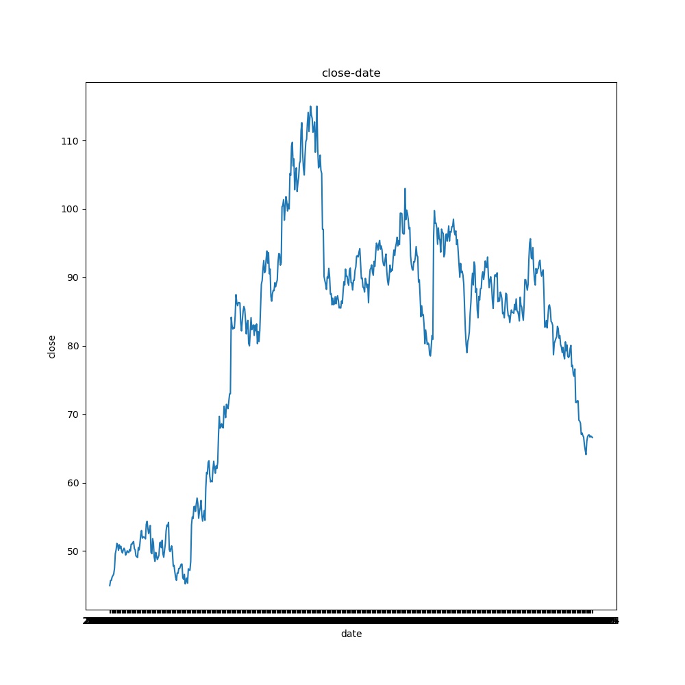
According to the chart, the stock is still relatively unstable, and the rising process is more rapid. It shows that the market is good and has risen sharply in a certain period. The excessive increase reflects the possibility of a certain bubble in the market, and the influence factors of the industry are also falling rapidly, which shows that the stock is vulnerable to market fluctuations. However, the overall trend is still upward.
3.2. Maximum range of stock points
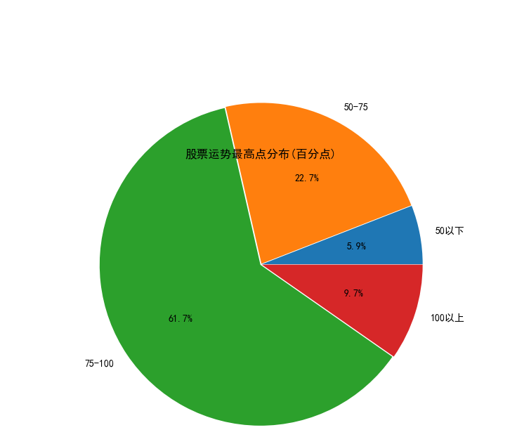
It can be seen from the figure that the maximum value of the stock is distributed every day, and the position with the most points is between 75-100. The points of 50-75 are more, the points above 100 are less, and the points below 50 are the least.
3.3. Daily low point analysis
We use the scatter chart to analyze the daily low to see how big the daily decline can be.
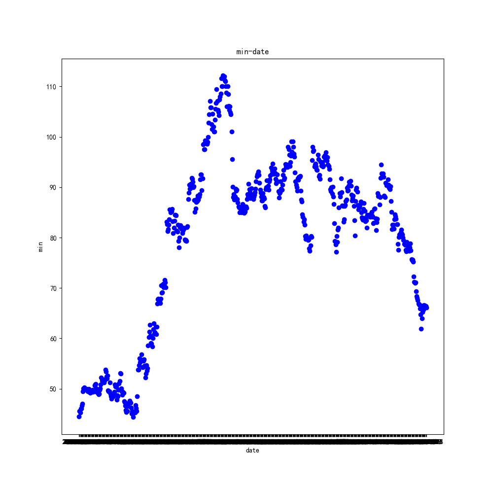
It can be seen from the scatter chart that the trend of its daily low is roughly the same as that of the end. The high points are 110, and the focus is concentrated in the rising process, at the higher point, and at the lower point in the downward trend. It shows that the trend of the stock on that day is relatively stable.
3.4. High and low point analysis
We analyze the initial value of the stock to determine whether it is open low or open low.
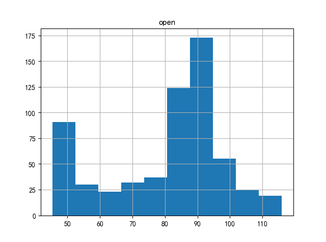
It can be seen from the figure that the stock opens slightly higher.
4. Summary
It can be seen from the above four analyses that Hengrui Pharmaceutical (code 600276) is in a low position at this time, but it is temporarily in a dilemma due to the recent influence of its industry. It is impossible to judge whether it can get out of the dilemma and when.
Finally, there are risks in investment, so we need to be cautious when entering the market. Please make a reasonable investment distribution, and point out any misunderstandings.
Code part:
import tushare as ts
import pandas as pd
stock_data = ts.get_hist_data('600276')
stock_data.to_csv(r'stock_data.csv')

import numpy as np
import matplotlib.pyplot as plt
df = pd.read_csv(r'stock_data.csv')
x = df['date']
y = df['close']
plt.figure(figsize=(10,10))
plt.plot(x, y)
plt.title('close-date')
plt.xlabel('date')
plt.ylabel('close')
plt.savefig(r'1.jpg')
plt.show()

import pandas as pd
import matplotlib.pyplot as plt
df = pd.read_csv(r'stock_data.csv')
plt.title('Distribution of the highest points of stock fortune(Percentage point)')#Draw title
plt.rcParams['font.sans-serif']='SimHei'#Set Chinese display
label=['50 following','50-75','75-100','100 above']#Define the label of the pie chart. The label is a list
explode=[0.01,0.01,0.01,0.01]#Set n radii from the center of the circle
values=[len(df[df['high']<=50]),len(df[(df['high'] >50) & (df['high'] <=75)]),len(df[(df['high'] >75 ) & (df['high'] <=100)]),len(df[df['high'] > 100])]
plt.pie(values,explode=explode,labels=label,autopct='%1.1f%%',radius=2)#Draw pie chart
plt.savefig(r'2.jpg')
plt.show()

df = pd.read_csv(r'stock_data.csv')
x = df['date']
y = df['low']
plt.figure(figsize=(10,10))
plt.title("min-date")
plt.xlabel("date")
plt.ylabel("min")
plt.plot(x,y,"ob")
plt.savefig(r'6.jpg')
plt.show()

import numpy as np
import matplotlib.pyplot as plt
import pandas as pd
df = pd.read_csv(r'stock_data.csv')
plt.savefig(r'8.jpg')
df.hist('open')
plt.show()