By establishing a web app for SCADA data analysis, this paper briefly introduces the use and deployment of streamlit.
See the code in the text for details GitHub:
https://github.com/SooHooLee/test
Project web app See:
https://share.streamlit.io/soohoolee/test/data_analysis.py
1. What is Streamlit
Streamlit: an application development framework for machine learning and data science teams. It is the fastest way to build and share data applications. Without front-end experience, it can quickly build a shareable user-friendly web app in python in a few minutes.
2. Installation and operation of streamlit
Installation: open Anaconda Prompt and directly install pip in command line mode.
$ pip install streamlit
Run: in the file directory, run the streamlit file
$ streamlit run file name.py
3. SCADA data analysis practice
Import Streamlit: import streamlit as st
The main interface of streamlit can only be divided into left and right sides. Although it is not as good-looking as HTML/CSS, the good thing is that it is concise and clear. In this project, the left side is used for operation and the right side is displayed in real time. Add in the statement of streamlit sidebar. You can put it on the left interface.
3.1 guide library
import numpy as np
import pandas as pd
import matplotlib.pyplot as plt
import seaborn as sns
import warnings
import streamlit as st
from windrose import WindroseAxes
warnings.filterwarnings("ignore")
plt.rcParams['font.sans-serif'] = ['SimHei'] #Display Chinese labels normally
plt.rcParams['axes.unicode_minus'] = False #The negative sign is displayed normally
from statsmodels.tsa.stattools import acf
from statsmodels.graphics.tsaplots import plot_acf
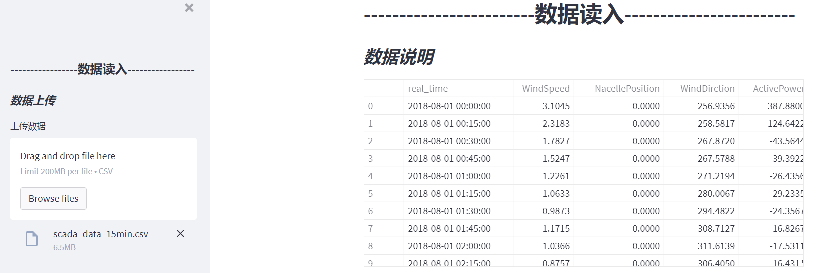
3.2 data reading
(1) Title: st.header('This is a header ')
(2) Subtitle: st.subheader('This is a subheader ')
(3) Import file: st.file_uploader(label, type=None, accept_multiple_files=False, key=None, help=None, on_change=None, args=None, kwargs=None)
Parameter details:
label (str): a short label that prompts the user about the purpose of the uploader;
type (str/list/str/None): an array of allowed extensions. ['png', 'jpg'] defaults to None, indicating that all extensions are allowed;
accept_multiple_files (bool): if True, users are allowed to upload multiple files at the same time. In this case, the return value will be the file list. Default: False;
key (str/int): an optional string or integer used as the unique key of the widget;
help (str): a tooltip displayed next to the file uploader.
on_change (callable): file_ The value of uploader is an optional callback.
args (tuple): tuple of optional parameters passed to the callback.
kwargs (dict): an optional Dictionary of kwargs passed to the callback.
(4) Display the data frame as an interactive table: st.dataframe(data)
st.sidebar.subheader('* Data upload *')
st.subheader('* Data description *')
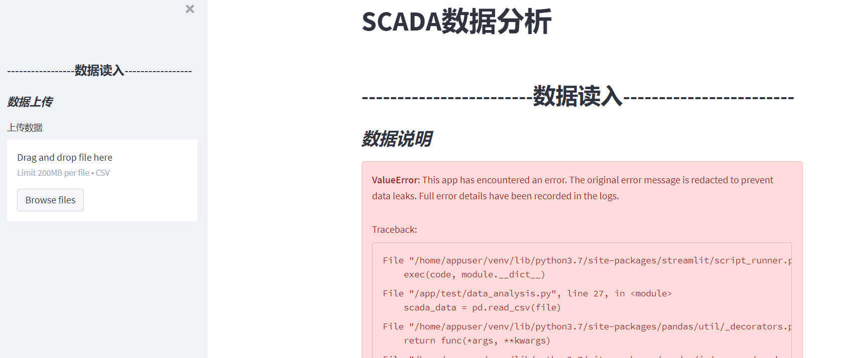
file = st.sidebar.file_uploader('Upload data', type=['csv'], key=None)
scada_data = pd.read_csv(file)
st.dataframe(scada_data)
3.3 selecting time series
(5) Slider: st.slider(label, min_value=None, max_value=None, value=None, step=None, format=None, key=None, help=None, on_change=None, args=None, kwargs=None)
Parameter details:
label (str): a short label that prompts the user about the purpose of the slider;
min_value: minimum allowable value. If the value is int, it defaults to 0; if it is a floating point number, it is 0.0; if it is a date / datetime, it is value - timedelta(days=14); if it is a time, it is time min;
max_value: maximum allowable value. If the value is int, it defaults to 100; if it is a floating point number, it is 1.0; if it is a date / datetime, it is value + timedelta(days=14); if it is a time, it is time max;
Value: the value of the slider when it is first rendered. If a tuple / list containing two values is passed here, a range slider with these lower and upper limits is rendered. For example, if set to (1, 10), the slider will have an optional range between 1 and 10. The default is min_value.
step(int/float/timedelta/None): step interval. If the value is an integer, it defaults to 1; if it is a floating point number, it defaults to 0.01; if it is a date / date time, it defaults to 0.01; if it is a date / date time, it defaults to timedelta(minutes=15) (or if max_value - min_value < 1 day);
format (str/None): the format string of printf style, which controls how the interface should display numbers. This does not affect the return value. int/float formatter support:% d% e% F% g% I date / time / date time formatter use Moment.js Symbol
(6) Write: st.write(*args, **kwargs)
write () is a treasure chest. You can display the corresponding contents according to the commands in (), such as:
write(string): print the formatted Markdown string, using short code that supports LaTeX expressions and emoticons.
write(data_frame): displays the DataFrame as a table.
write(error): print exceptions specifically.
write(func): displays information about the function.
write(module): displays information about the module.
write(dict): displays the dict in the interactive widget.
write(mpl_fig): displays the Matplotlib diagram.
write(altair): displays the Altair chart.
write(keras): displays the Keras model.
write(graphviz): displays the Graphviz graph.
Write (plot_fig): displays the plot diagram.
write(bokeh_fig): displays a scatter chart.
write(sympy_expr): use LaTeX to print SymPy expressions.
write(htmlable): if available, print the repr for the object_ html() .
write(obj): print str(obj) if others are unknown
Wait, wait
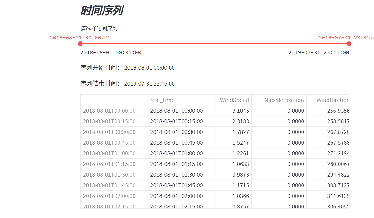
  # ---------------------------Select time series-----------------------
    st.sidebar.subheader('* time series *')
    st.subheader('* time series *')
    options = np.array(scada_data['real_time']).tolist()
    (start_time, end_time) = st.select_slider("Please select a time series:", options=options,value=(options[0], options[len(options) - 1]))
    # setting index as date
    scada_data['real_time'] = pd.to_datetime(scada_data['real_time'], format='%Y-%m-%d')
    scada_data.index = scada_data['real_time']
    st.write("Sequence start time:", start_time)
    st.write("Sequence end time:", end_time)
    scada_data = scada_data[start_time:end_time]
    st.dataframe(scada_data)
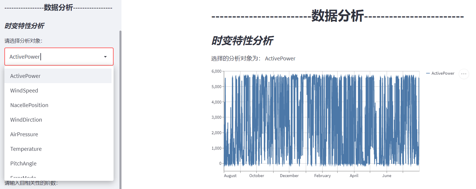
3.4 time varying characteristic analysis
(7) Selection box: st.selectbox(label, options, index=0, format_func=special_internal_function, key=None, help=None, on_change=None, args=None, kwargs=None)
Note: # the elements in the selection box are labels in SCADA data, which can be modified according to the actual labels;
(8) Line chart: st.line_chart(data)
# ---------------------------Data analysis-----------------------
    st.header('------------------------Data analysis------------------------')
    st.sidebar.header('-----------------Data analysis-----------------')
    # -----------Time varying characteristic analysis-----------------
    st.sidebar.subheader('* Time varying characteristic analysis *')
    st.subheader('* Time varying characteristic analysis *')
    type = st.sidebar.selectbox('Please select the analysis object:',
                                ('ActivePower', 'WindSpeed', 'NacellePosition', 'WindDirction', 'AirPressure',
                                 'Temperature', 'PitchAngle', 'ErrorMode', 'OperationMode', 'GeratorSpeed', 'RotorSpeed',
                                 'AirDensity'))
    st.write("The selected analysis objects are:", type)
    st.line_chart(scada_data[type])
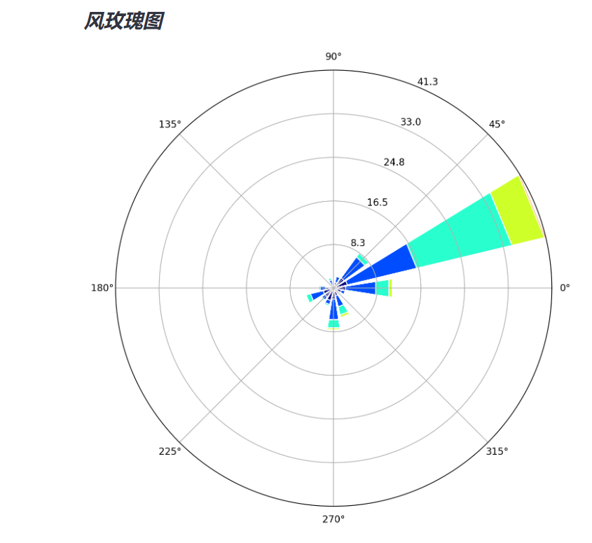
3.5 wind rose chart
You can use the windrose library to draw rose charts in python.
Install first: $pip install windrose
from windrose import WindroseAxes
For specific usage, see Official documents.
Official examples:
from windrose import WindroseAxes
from matplotlib import pyplot as plt
import matplotlib.cm as cm
import numpy as np
# Create wind speed and direction variables
ws = np.random.random(500) * 6
wd = np.random.random(500) * 360
ax = WindroseAxes.from_ax()
ax.bar(wd, ws, normed=True, opening=0.8, edgecolor='white')
ax.set_legend()

Then draw a gourd and ladle according to the gourd, draw a rose picture first, and then display the picture.
(9) Figure showing matplotlib.pyplot: st.pyplot(fig)
   # -----------Wind rose-----------------
    st.sidebar.subheader('* Wind rose *')
    st.subheader('* Wind rose *')
    ws = scada_data['WindSpeed']
    wd = scada_data['WindDirction']
    ax = WindroseAxes.from_ax()
    fig = ax.bar(wd, ws, normed=True, opening=0.8, edgecolor='white')
    st.set_option('deprecation.showPyplotGlobalUse', False)
    st.pyplot(fig)
3.6 correlation analysis
3.6.1 Pearson correlation
# -----------Correlation analysis-----------------
    st.sidebar.subheader('* correlation analysis  *')
    st.subheader('* correlation analysis  *')
    # data.corr() calculates the correlation coefficient
    # Pearson correlation
    st.sidebar.subheader(" (1) Pearson correlation coefficient")
    st.subheader(" (1) Pearson correlation coefficient")
    corr = scada_data.corr()
    st.write("Correlation coefficient:", corr)
    fig, ax = plt.subplots(figsize=(8, 8))  # Canvas Size
    ax = sns.heatmap(corr, vmax=.8, square=True, annot=True)  # Draw thermal diagram annot=True display coefficient
    st.pyplot(fig)

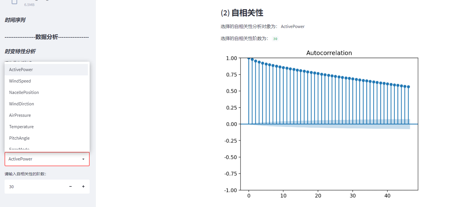
3.6. 2 autocorrelation
   # Autocorrelation acf
    st.sidebar.subheader(" (2) Autocorrelation")
    st.subheader(" (2) Autocorrelation")

    type_acf = st.sidebar.selectbox('Please select the autocorrelation analysis object:',
                                    (
                                        'ActivePower', 'WindSpeed', 'NacellePosition', 'WindDirction', 'AirPressure',
                                        'Temperature',
                                        'PitchAngle', 'ErrorMode', 'OperationMode', 'GeratorSpeed', 'RotorSpeed',
                                        'AirDensity'))
    st.write("The selected autocorrelation analysis objects are:", type_acf)
    lags = st.sidebar.number_input("Please enter the order of autocorrelation:", min_value=1, max_value=200, value=30, step=1)
    st.write("The selected autocorrelation order is:", lags)
    data_acf = acf(scada_data[type_acf], unbiased=False, nlags=lags, qstat=False, fft=None, alpha=None, missing='none')
    st.write("Autocorrelation coefficient:", data_acf)
    plot_acf(scada_data[type_acf])
    st.pyplot()
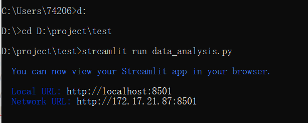
4. Local operation
Step 1: open CMD and enter the folder path in command line mode
My file location is D:\project\test\data_analysis.py
Step 2: run the streamlit file streamlit run file name py
Step 3: the URL will be displayed. Open the URL in the browser and you can open it locally.
Another way is to open the streamlit run file name in pycharm's terminal py, so you don't have to enter the folder location in cmd.
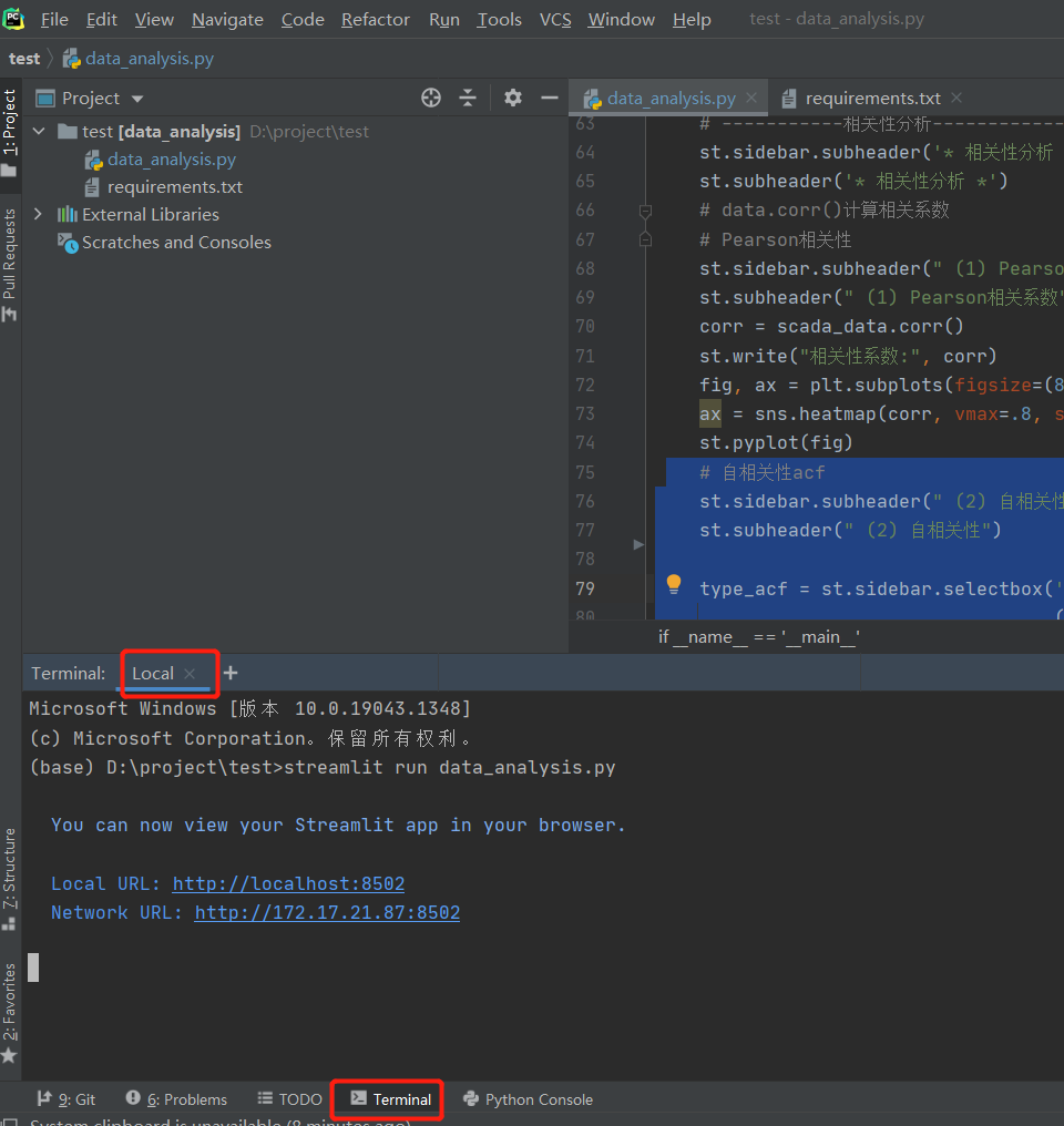
We can see that the url of local deployment is port 8502. If you need to show it, you can't close the program. Keep the program open and the url can be opened. Isn't this very inconvenient? Next, we will deploy quickly and open the link without local.

5. Streamlit rapid deployment
First, let's take a look Official documents How to deploy:
Step 1: add your App to GitHub;
Step 2: deploy your App on streamlit cloud
Step 3: advanced settings for deployment;
Step 4: waiting for deployment
About the rapid deployment of Streamlit, the official document gives the above four steps. Is it very simple! A lot. Let's take it step by step.
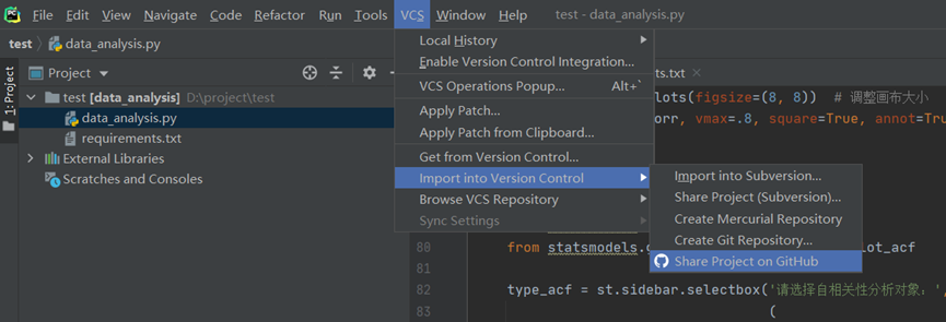
5.1 add App to GitHub
First, you have to have a GitHub account, which is omitted.. Here is to upload the whole folder with pychar. Pychar associates GitHub and Git, and HA is also omitted here.
The test folder contains two files, data_analysis.py is the code for the above data analysis, requirements Txt is the dependency that APP needs to install.
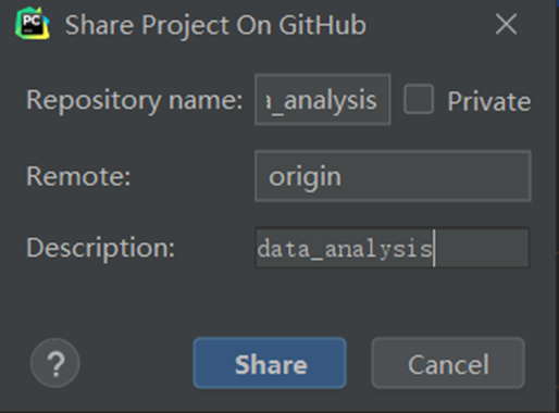
Step1: VCS --> Import into Version Control -->Share Project on GitHub
Step 2: fill in project information
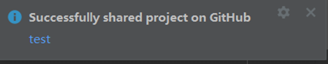
Step 3: documents submitted for the first time

Step4: upload succeeded

5.2 deploying apps on streamlit cloud
Step 1: Enter streamlit cloud Associate GitHub account and click "New app"

Step 3: configure APP. Either fill in it yourself or copy the GitHub URL for one click deployment.
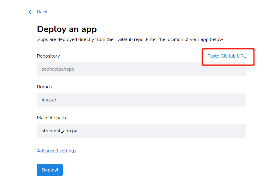
Just copy the GitHub URL: https://github.com/SooHooLee/test/blob/master/data_analysis.py

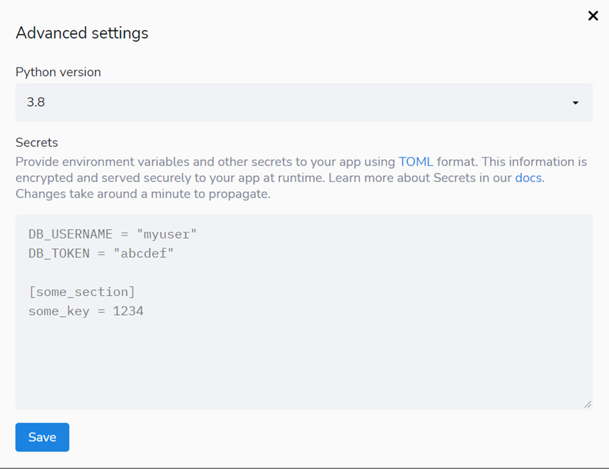
5.3 advanced settings for deployment
You can select the python version, etc,
Step 4: waiting for deployment
App is being deployed, most of which can be deployed in a few minutes, but if there are many dependencies, the first deployment may take some time. After initial deployment, any changes that do not involve dependencies should be displayed immediately.

After the balloon is deployed, the standard structure of web app URL:
https://share.streamlit.io/[user name]/[repo name]/[branch name]/[app path]
For example: http://share.streamlit.io/streamlit/demo-self-driving/master/streamlit_app.py
See the code in the text for details GitHub:
https://github.com/SooHooLee/test
Project web app See:
https://share.streamlit.io/soohoolee/test/data_analysis.py
Thoughts on some questions:
1. If no data is uploaded, a ValueError will appear. Just upload the data (because streamlit is executed from top to bottom. If no data is uploaded, no data can be found later, so an error is reported).
2. About the data format: the attribute name of the data needs to be selected according to the given. Otherwise, the corresponding data content cannot be found after selecting time series analysis. Are general labels for SCADA data.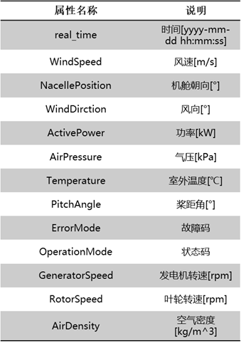
It's inconvenient to give data. You can upload your own data to try, or create data to test.
3. Other methods are also used for deployment, such as docker + Alibaba server, heroku, etc,
reference resources:
1,Streamlit
2,Streamlit Deployment Guide (wiki)