Preface to this section
Before I talk about this section, I will talk about the layout of Drawable xml. Why should I talk about this first? Because I found that this is used in many of the layout of Ui in the following explanation, for fear that you will not understand it, so today we will talk about Drawable's knowledge points first.
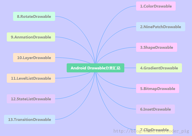
Android offers us up to 13 Drawable s, so let's go through them one by one in this section.
Notes for Drawable Resource Use
(1)Drawable is divided into two kinds: one is our common image resources, in Android Studio, we usually put them in the res/mipmap directory, which is different from the previous Eclipse! In addition, if we switch the project to Android project mode, we can drop pictures directly into the mipmap directory, AS will automatically divide into hdpi, xhdpi...! The other is the Drawable resource we write in the form of XML. We usually put them in the res/drawable directory, such as the most common button to click on the background switch Server!
(2) In XML, we can set Drawable directly through @mipmap or @drawable, such as: android: background ="@mipmap/iv_icon_zhu"/ "@drawable/btn_back_selector", while in Java code we can get Drawable through Resource's getwable.( R.mipmap.xxx ) You can get drawable resources. If you set a background for a control, such as ImageView, you can call the control directly. getDrawale() can also get drawable objects!
(3) The resource names in drawable in Android are constrained, and must be: [a-z0-9_] (i.e., only alphanumeric sum) and not begin with digits, otherwise the compilation will be wrong: Invalid file name: must contain only [a-z0-9]! Write in lowercase!!! A lowercase letter!!! A lowercase letter! —— Say important things three times~
Okay, that's about it. Let's learn about the 13 Drawable s that Android offers us!
1.ColorDrawable
The simplest kind of Drawable, when we draw ColorDrawable on Canvas, we fill Paint with a fixed color, and then draw a monochrome area on the canvas!
1. Define ColorDrawable in Java:
ColorDrawable drawable = new ColorDrawable(0xffff2200);
txtShow.setBackground(drawable);
Define ColorDrawable in xml:
<?xml version="1.0" encoding="utf-8"?>
<color
    xmlns:android="http://schemas.android.com/apk/res/android"
    android:color="#FF0000"/>
Of course, the above usage is not very useful. More often, we create a color.xml file in the res/values directory, and then write the color value to it. When needed, we get the corresponding value through @color, such as:
3. Create a color.xml file
For example:
<?xml version="1.0" encoding="utf-8"?>
<resources>
    <color name="material_grey_100">#fff5f5f5</color>
    <color name="material_grey_300">#ffe0e0e0</color>
    <color name="material_grey_50">#fffafafa</color>
    <color name="material_grey_600">#ff757575</color>
    <color name="material_grey_800">#ff424242</color>
    <color name="material_grey_850">#ff303030</color>
    <color name="material_grey_900">#ff212121</color>
</resources>
Then if it's in an xml file, we can get the corresponding color value through @color/xxx if it's in Java:
int mycolor = getResources().getColor(R.color.mycolor);
btn.setBackgroundColor(mycolor);
ps: Another thing to note is that if we define color values directly in Java, we need to add 0x, and we can't omit transparency:
int mycolor = 0xff123456;
btn.setBackgroundColor(mycolor);
2. NiewPatch Drawable
As the name implies, Android FrameWork uses an efficient graphics optimization algorithm when displaying point nine pictures. We can achieve image stretching adaptation without special processing. In addition, we should pay attention to the following points when using AS:
Point 9 can not be placed in the mipmap directory, but need to be placed in the drawable directory!
3.ShapeDrawable
Drawable s of shapes define basic geometric shapes, such as rectangles, circles, lines, etc. The root element is < shape. /> with more nodes, and the related nodes are as follows:
① <shape>:
Visible: Set whether visible
shape: shape, optional: rectangle (rectangle, including square), oval (ellipse, including circle), line (line segment), ring (ring)
InnerRadius Ratio: When shape is ring, it is valid to indicate the ratio of radius to radius in the ring. If innerRadius is set, it will be ignored.
innerRadius: When shape is ring, it is valid to indicate the size of the inner radius of the ring.
thicknessRatio: When shape is ring, the ratio of ring thickness to radius
Thickness: When shape is ring, it is valid to denote the thickness of the ring, i.e. the difference between the outer radius and the inner radius.
useLevel: When shape is ring, it is valid to indicate whether it is allowed to display part of the loop according to level.
②<size>:
width: Shape width of Graphics
height: Graphic Shape height
(3) < gradient >: Gradient Drawable~
④<solid>
Color: Background fill color, setting solid will cover all effects of gradient settings!!!!!
⑤<stroke>
Width: The width of the border
Color: The color of the border
dashWidth: Length of dashed line segment of border
dashGap: Spacing between dashed lines of borders
⑥<conner>
~ radius: Round radius, suitable for upper, lower, left and right corners
~ Top Left Radius, Top RightRadius, Bottom Left Radius, tBottom RightRadius: Top Left Radius, Top Left Radius: Top Left Radius, Top Right Radius, Top Left Radius, Top Left Radius: Top Left Radius, Top Left Radius, Top Left Radius: Top Left Radius, Top Le
⑦<padding>
left,top,right,bottm: The upper left, the lower right, and the upper left.
Use examples: (TextView will cover later)
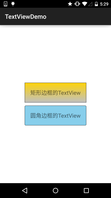
<?xml version="1.0" encoding="utf-8"?>
<shape xmlns:android="http://schemas.android.com/apk/res/android" >

    <!-- Set a black border -->
    <stroke android:width="2px" android:color="#000000"/>
    <!-- Gradual change -->
    <gradient
        android:angle="270"
        android:endColor="#C0C0C0"
        android:startColor="#FCD209" />
    <!-- Set the margin,Make the space bigger -->
    <padding
        android:left="5dp"
        android:top="5dp"
        android:right="5dp"
        android:bottom="5dp"/>

</shape>
4.GradientDrawable
A Drawable with gradient region can realize linear gradient, divergent gradient and flat gradient effect core node: <gradient/>, with the following optional attributes:
startColor: Start color for gradients
Center Color: Gradient Intermediate Color
endColor: The end color of the gradient
Type: Gradient type, optional (linear,radial,sweep), linear gradient (gradient angle can be set), divergent gradient (mid-to-periphery divergence), flat gradient
CentX: The x-coordinate of the intermediate Arthur in the gradient range: 0-1
CentY: The Y coordinate of the gradient middle color, ranging from 0 to 1
Angle: Only a linear gradient is valid. It means a gradient angle, which must be a multiple of 45.
gradientRadius: Only radial and sweep gradients are valid. Radil must be set to indicate the radius of the gradient effect.
useLevel: Determine whether to draw gradients based on level
Code Example: (Demonstration of Three Gradient Effects):
Operation effect diagram:
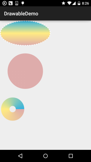
First create three gradient xml files under drawable:
(Linear gradient_linear.xml):
<?xml version="1.0" encoding="utf-8"?>
<shape
    xmlns:android="http://schemas.android.com/apk/res/android"
    android:shape="oval" >
    <gradient
        android:angle="90"
        android:centerColor="#FFEB82"
        android:endColor="#35B2DE"
        android:startColor="#DEACAB" />

    <stroke
        android:dashGap="5dip"
        android:dashWidth="4dip"
        android:width="3dip"
        android:color="#fff" />
</shape>
gradient_radial.xml:
<?xml version="1.0" encoding="utf-8"?>
<shape xmlns:android="http://schemas.android.com/apk/res/android"
    android:innerRadius="0dip"
    android:shape="ring"
    android:thickness="70dip"
    android:useLevel="false" >

    <gradient
        android:centerColor="#FFEB82"
        android:endColor="#35B2DE"
        android:gradientRadius="70"
        android:startColor="#DEACAB"
        android:type="radial"
        android:useLevel="false" />

</shape>
gradient_sweep.xml:
<?xml version="1.0" encoding="utf-8"?>
<shape xmlns:android="http://schemas.android.com/apk/res/android"
    android:innerRadiusRatio="8"
    android:shape="ring"
    android:thicknessRatio="3"
    android:useLevel="false" >

    <gradient
        android:centerColor="#FFEB82"
        android:endColor="#35B2DE"
        android:startColor="#DEACAB"
        android:type="sweep"
        android:useLevel="false" />

</shape>
5.BitmapDrawable
For a Bitmap encapsulation, you can set the way the bitmap wrapped in it is drawn in the Bitmap Drawable area, such as: tiling filling, stretching filling or keeping the original size of the picture! Take < bitmap > as the root node! The optional attributes are as follows:
src: Picture Resources~
antialias: Supports anti-aliasing
filter: Does it support bitmap filtering? If so, it can be smoother when graphics are critically displayed.
dither: Does the bitmap jitter?
gravity: If the bitmap is smaller than the container, you can set the relative position of the bitmap in the container.
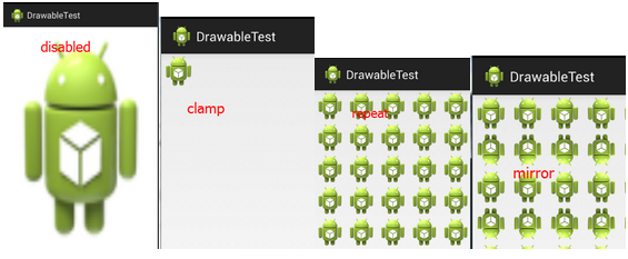
Tile Mode: Specify the pattern of the image tiling filling container. If this is set, gravity attribute will be ignored. There are the following optional values: disabled (whole pattern stretching tiling), clamp (original size), repeat (tiling), mirror (mirror tiling).
The corresponding effect map:
(1) XML defines BitmapDrawable:
<?xml version="1.0" encoding="utf-8"?>
<bitmap xmlns:android="http://schemas.android.com/apk/res/android"
    android:dither="true"
    android:src="@drawable/ic_launcher"
    android:tileMode="mirror" />
(2) Java code that achieves the same effect:
BitmapDrawable bitDrawable = new BitmapDrawable(bitmap);
bitDrawable.setDither(true);
bitDrawable.setTileModeXY(TileMode.MIRROR,TileMode.MIRROR);
6.InsetDrawable
Represents embedding a Drawable into the interior of another Drawable and leaving some spacing inside, similar to the padding property of Drawable, but padding represents the margin between the content of Drawable and Drawable itself! InsetDrable represents the margin between two Drawables and containers. When the background of the control is smaller than the actual margin, InsetDrab is more suitable for use. For example, using this can solve the problem of a distance between our custom Dialog and the screen. I believe all my friends know that even if we set layout_margin, it's useless. We can use this InsetDrawable at this time! Just set an insetXxx for InsetDrawable to set different directions of margin, and then set it to the background of Dialog!
The relevant attributes are as follows:
- Draable: Referenced Drawable, if null, must have a Drawable type of child node!
- 2.visible: Set whether Drawable is a forehead space
- 3.insetLeft,insetRight,insetTop,insetBottm: Set the left and right margins
(1) Use in XML:
<?xml version="1.0" encoding="utf-8"?>
<inset xmlns:android="http://schemas.android.com/apk/res/android"
    android:drawable="@drawable/test1"
    android:insetBottom="10dp"
    android:insetLeft="10dp"
    android:insetRight="10dp"
    android:insetTop="10dp" />
Use in Java code:
InsetDrawable insetDrawable = new InsetDrawable(getResources() .getDrawable(R.drawable.test1), 10, 10, 10, 10);
Use effect chart:
7.ClipDrawable
Clip can be translated as clipping, we can understand ClipDrawable as clipping a part from the bitmap; the progress bar in Android is implemented using ClipDrawable, which determines the size of the clipping area by setting the value of level, and the root node is < clip>.
The relevant attributes are as follows:
- ClipOrietting: Set the direction of the shear, you can set the horizontal and vertical directions.
- gravity: Cut from that location
- Draable: Referenced drawable resources, if empty, need to have a Drawable type of sub-node ps: This Drawable type of sub-node: is in < clip > add such a statement: so...
Use examples:
Core: Modify the level value of ClipDrawable through code! Level is 0 to 10,000!
Operation effect diagram:
Code implementation:
Define a ClipDrawable resource xml:
<?xml version="1.0" encoding="utf-8"?>
<clip xmlns:android="http://schemas.android.com/apk/res/android"
    android:clipOrientation="horizontal"
    android:drawable="@mipmap/ic_bg_meizi"
    android:gravity="left" />
(2) Set up an ImageView in the main layout file of activity_main, and set SRC to clipDrawable! Remember src, if you write as blackground you will report the null pointer!!!!
<LinearLayout xmlns:android="http://schemas.android.com/apk/res/android"
    xmlns:tools="http://schemas.android.com/tools"
    android:layout_width="match_parent"
    android:layout_height="match_parent"
    android:orientation="vertical">

    <ImageView
        android:id="@+id/img_show"
        android:layout_width="match_parent"
        android:layout_height="match_parent"
        android:src="@drawable/clip_bg" />

</LinearLayout>
(3) MainActivity.java sets the size of the interception area through setLevel:
public class MainActivity extends AppCompatActivity {

    private ImageView img_show;
    private ClipDrawable cd;
    private Handler handler = new Handler() {
        @Override
        public void handleMessage(Message msg) {
            if (msg.what == 0x123) {
                cd.setLevel(cd.getLevel() + 500);
            }
        }
    };

    @Override
    protected void onCreate(Bundle savedInstanceState) {
        super.onCreate(savedInstanceState);
        setContentView(R.layout.activity_main);
        img_show = (ImageView) findViewById(R.id.img_show);
        // Core Implementation Code
        cd = (ClipDrawable) img_show.getDrawable();
        final Timer timer = new Timer();
        timer.schedule(new TimerTask() {
            @Override
            public void run() {
                handler.sendEmptyMessage(0x123);
                if (cd.getLevel() >= 10000) {
                    timer.cancel();
                }
            }
        }, 0, 300);
    }
}
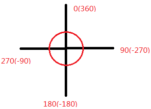
8.RotateDrawable
It is also used to rotate Drawable and to control the rotation through setLevel. The maximum value is 10,000.
The relevant attributes are as follows:
fromDegrees: The starting angle, corresponding to the lowest level value, defaults to 0
toDegrees: End Angle, corresponding to the highest level value, default 360
pivotX: Set the x-coordinate of the reference point, 0-1, default is 50%, that is, 0.5
pivotY: Set the Y coordinate of the reference point, take the value of 0-1, the default is 50%, that is, 0.5 ps: If the rotation picture display is incomplete, you can modify the above two values to solve!
drawable: Setting bitmap resources
Visible: Set whether drawable is visible!
The angle chart is as follows:
Use examples:
Operation effect diagram:
Code implementation:
Make a little change on clipDrawable at the third point!
Define a rotateDrawable resource file:
<?xml version="1.0" encoding="utf-8"?>
<rotate xmlns:android="http://schemas.android.com/apk/res/android"
    android:drawable="@mipmap/ic_launcher"
    android:fromDegrees="-180"
    android:pivotX="50%"
    android:pivotY="50%" />
(2) Modify the src in activity_main.xml to point to the drawable above. MainActivity only needs to change ClipDrawable to rotate Drawable!
public class MainActivity extends AppCompatActivity {

    private ImageView img_show;
    private RotateDrawable cd;
    private Handler handler = new Handler() {
        @Override
        public void handleMessage(Message msg) {
            if (msg.what == 0x123) {
                if (cd.getLevel() >= 10000)
                    Toast.makeText(MainActivity.this, "Finished~",
                            Toast.LENGTH_LONG).show();
                cd.setLevel(cd.getLevel() + 400);
            }
        }
    };

    @Override
    protected void onCreate(Bundle savedInstanceState) {
        super.onCreate(savedInstanceState);
        setContentView(R.layout.activity_main);
        img_show = (ImageView) findViewById(R.id.img_show);
        // Core Implementation Code
        cd = (RotateDrawable) img_show.getDrawable();
        final Timer timer = new Timer();
        timer.schedule(new TimerTask() {
            @Override
            public void run() {
                handler.sendEmptyMessage(0x123);
                if (cd.getLevel() >= 10000) {
                    timer.cancel();
                }
            }
        }, 0, 100);
    }
}
9. Animation Drawable
Animation Drawable is used to achieve frame animation in Android, that is, to play a series of Drawables in a certain order frame by frame; Android animation is rich, there are traditional interpolation animation, translation, zooming and other effects, but here we only introduce this Animation Drawable to achieve frame animation, about alpha,scale, translate,rotate, etc., and then in the animation chapter to be detailed. Detailed introduction~
Here we use < animation-list > as the root node
Relevant attribute methods:
oneshot: Set whether or not to play in a loop, and false to play in a loop!!!
duration: Frame interval, usually set to 300 milliseconds
After we get the AniamtionDrawable instance, we need to call its start() method to play the animation, and note that the call in OnCreate() method has no effect, because View has not been initialized yet, we can use simple handler to delay the animation! Of course, there are other methods!
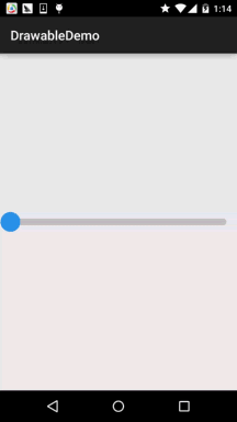
10.LayerDrawable
Layer graphics objects, including a Drawable array, and then draw them in the order corresponding to the array, the Drawable with the largest index value will be drawn at the top level! Although these Drawables will have overlapping or overlapping areas, they are located in different layers, so they will not interact with each other, with < layer-list > as the root node!
The relevant attributes are as follows:
Drawable: Referenced bitmap resources, if null, require a Drawable type of child node
left: left margin of the layer relative to the container
Right: The right margin of the layer relative to the container
top: The upper margin of the layer relative to the container
bottom: The lower margin of the layer relative to the container
ID of id: layer
Use examples:
Operation effect diagram:
Code implementation:
Very simple, combined with the shapeDrawable and lipDrawable learned earlier:
layerList_one.xml
<?xml version="1.0" encoding="utf-8"?>
<layer-list xmlns:android="http://schemas.android.com/apk/res/android">
    <item android:id="@android:id/background">
        <shape android:shape="rectangle">
            <solid android:color="#C2C2C1" />
            <corners android:radius="50dp" />
        </shape>
    </item>
    <item android:id="@android:id/progress">
        <clip>
            <shape android:shape="rectangle">
                <solid android:color="#BCDA73" />
                <corners android:radius="50dp" />
            </shape>
        </clip>
    </item>
</layer-list>
Then add a Seekbar to the layout file, which reads as follows:
<SeekBar
        android:layout_width="match_parent"
        android:layout_height="wrap_content"
        android:indeterminateDrawable="@android:drawable/progress_indeterminate_horizontal"
        android:indeterminateOnly="false"
        android:maxHeight="10dp"
        android:minHeight="5dp"
        android:progressDrawable="@drawable/layerlist_one"
        android:thumb="@drawable/shape_slider" />
We can also get a cascade effect:
Operation effect diagram:
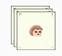
Implementation code:
layerlist_two.xml:
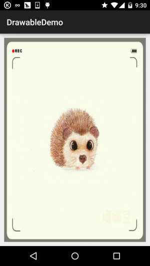
<?xml version="1.0" encoding="utf-8"?>
<layer-list xmlns:android="http://schemas.android.com/apk/res/android">
    <item>
        <bitmap
            android:gravity="center"
            android:src="@mipmap/ic_bg_ciwei" />
    </item>
    <item
        android:left="25dp"
        android:top="25dp">
        <bitmap
            android:gravity="center"
            android:src="@mipmap/ic_bg_ciwei" />
    </item>
    <item
        android:left="50dp"
        android:top="50dp">
        <bitmap
            android:gravity="center"
            android:src="@mipmap/ic_bg_ciwei" />
    </item>
</layer-list>
Then add an ImageView in activity_main.xml, which reads as follows:
<ImageView
        android:layout_width="wrap_content"
        android:layout_height="wrap_content"
        android:src="@drawable/layerlist_two"/>
11.TransitionDrawable
A subclass of LayerDrawable, TransitionDrawable manages only two levels of Drawable! The two level! The two level! It also provides animation of transparency change, which can control the animation effect from one layer of Drawable to another layer of Drawable. The root node is <transition>, remember that only two Items are available, and more Items are useless. The attributes are similar to Layer Drawable. We need to call the startTransition method to start the switching animation between the two layers. We can also call the reverseTransition() method to play back:
Use examples:
Operation effect diagram:
Implementation code:
Create an xml file for TransitionDrawable in res/drawable
<?xml version="1.0" encoding="utf-8"?>
<transition xmlns:android="http://schemas.android.com/apk/res/android" >
    <item android:drawable="@mipmap/ic_bg_meizi1"/>
    <item android:drawable="@mipmap/ic_bg_meizi2"/>
</transition>
Then add an ImageView to the layout file, set src to the drawable above, and MainActivity.java reads as follows:
public class MainActivity extends AppCompatActivity {
    private ImageView img_show;
    @Override
    protected void onCreate(Bundle savedInstanceState) {
        super.onCreate(savedInstanceState);
        setContentView(R.layout.activity_main);
        img_show = (ImageView) findViewById(R.id.img_show);
        TransitionDrawable td = (TransitionDrawable) img_show.getDrawable();
        td.startTransition(3000);
        //You can play it back, using reverse transition.~
        //td.reverseTransition(3000);
    }
}
12.LevelListDrawable
To manage a group of Drawables, we can set different levels for the drawables inside. When they draw, they will draw the corresponding drawables on the canvas according to the level attribute value. The root node is: <level-list> He has no attributes that can be set. All we can do is to set the attributes of each <item>.
The properties that item can set are as follows:
Drawable: Referenced bitmap resources, if null, require a Drawable type of child node
Minimum value corresponding to minlevel:level
Maxlevel: maximum corresponding to level
Use examples:
Operation effect diagram:
Code implementation:
Draw a circle in five copies by shape Drawable and change the width to the height.
shape_cir1.xml:
<?xml version="1.0" encoding="utf-8"?>
<shape xmlns:android="http://schemas.android.com/apk/res/android"
    android:shape="oval">
    <solid android:color="#2C96ED"/>
    <size android:height="20dp" android:width="20dp"/>
</shape>
Then we go to Level List Drawable, where we set up five layers:
level_cir.xml:
<?xml version="1.0" encoding="utf-8"?>
<level-list xmlns:android="http://schemas.android.com/apk/res/android" >
    <item android:drawable="@drawable/shape_cir1" android:maxLevel="2000"/>
    <item android:drawable="@drawable/shape_cir2" android:maxLevel="4000"/>
    <item android:drawable="@drawable/shape_cir3" android:maxLevel="6000"/>
    <item android:drawable="@drawable/shape_cir4" android:maxLevel="8000"/>
    <item android:drawable="@drawable/shape_cir5" android:maxLevel="10000"/>
</level-list>
Finally, MainActivity writes the following code:
public class MainActivity extends AppCompatActivity {

    private ImageView img_show;

    private LevelListDrawable ld;
    private Handler handler = new Handler() {
        public void handleMessage(Message msg) {
            if (msg.what == 0x123) {
                if (ld.getLevel() > 10000) ld.setLevel(0);
                img_show.setImageLevel(ld.getLevel() + 2000);
            }
        }
    };

    @Override
    protected void onCreate(Bundle savedInstanceState) {
        super.onCreate(savedInstanceState);
        setContentView(R.layout.activity_main);
        img_show = (ImageView) findViewById(R.id.img_show);
        ld = (LevelListDrawable) img_show.getDrawable();
        img_show.setImageLevel(0);
        new Timer().schedule(new TimerTask() {
            @Override
            public void run() {
                handler.sendEmptyMessage(0x123);
            }
        }, 0, 100);
    }
}
13.StateListDrawable
Well, finally we have the last drawable: StateList Drawable. The name looks like a pattern, but we used it before. Do you remember the <selctor> of setting different drawable states for buttons? Yes, that's the StateList Drawable!
The properties that can be set are as follows:
Draable: The reference Drawable bitmap, which we can put at the front, indicates the normal state of the component.~
State_focus: Get Focus
State_window_focus: Get window focus
state_enabled: Is the Control Available
state_checkable: Can the control be checked, eg:checkbox
state_checked: Is the control checked?
state_selected: Whether the control is selected, for the case of rollers
state_pressed: Is the control pressed
state_active: Is the control active, eg:slidingTab
state_single: When a control contains multiple child controls, determine whether only one child control is displayed
state_first: When a control contains multiple child controls, determine whether the first child control is in the display state
state_middle: When a control contains more than one child control, determine whether the middle child control is in the display state.
state_last: When a control contains more than one child control, determine whether the last child control is in the display state.
Use examples:
Let's write a simple round button.
Operation effect diagram:
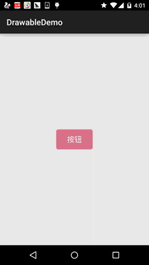
Code implementation:
First, draw two rounded rectangles through shape Drawable, just with different colors:
shape_btn_normal.xml:
<?xml version="1.0" encoding="utf-8"?>
<shape xmlns:android="http://schemas.android.com/apk/res/android"
    android:shape="rectangle">
    <solid android:color="#DD788A"/>
    <corners android:radius="5dp"/>
    <padding android:top="2dp" android:bottom="2dp"/>
</shape>
Then let's write a selctor: selctor_btn.xml:
<?xml version="1.0" encoding="utf-8"?>
<selector xmlns:android="http://schemas.android.com/apk/res/android">
    <item android:state_pressed="true" android:drawable="@drawable/shape_btn_pressed"/>
    <item android:drawable="@drawable/shape_btn_normal"/>
</selector>
Then the button sets android:background="@drawable/selctor_btn" and you can change it to rectangle or ellipse, circle and so on according to your needs.