When using css to write web pages, we need layout to make the web pages look beautiful and attract more attention. Therefore, there are four layout methods: box layout, floating layout, positioning layout and elastic box layout
1. Box layout
The box layout generally uses div tag, which is a block level element, which can set the width and height, and monopolize one line
Here is an example of a box model:
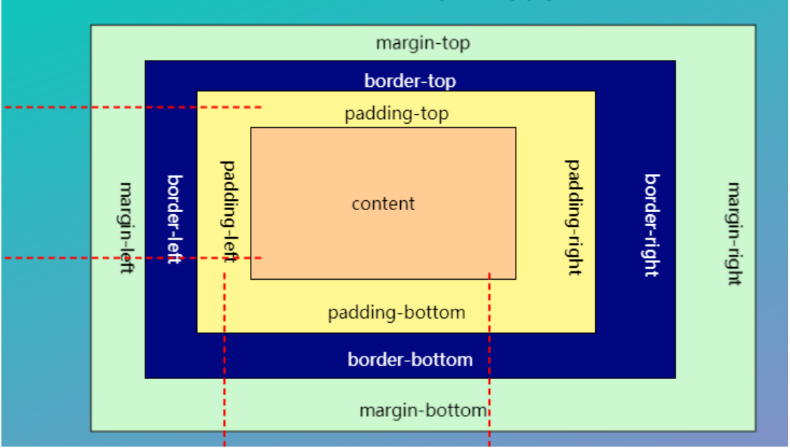
padding indicates its inner margin, which is the distance between the content and the outer border of the box.
Margin indicates its outer margin, which is the distance between the outer border of the box and the page.
If the "margin" attribute has four values: margin:25px,15px,20px,30px; Indicates that the upper outer margin is 25px and the right outer margin is 15px; The lower outer margin is 20px; The left outer margin is 30px;
If the margin attribute has three values: Margin: 25px, 15px, 20px; Indicates that the upper outer margin is 25px, the right and left outer margins are 15px, and the lower outer margin is 20px,
If the margin attribute has two values: Margin: 25px,5px; Indicates that the upper and lower outer margins are 25px, and the left and right outer margins are 5px;
If the margin attribute has a value: Margin: 25px; Indicates that the upper, lower, left and right outer margins are 25px;
Similarly, the padding attribute is the same
2. Floating layout
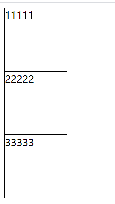
When using the layout such as box, because it is a block level element and monopolizes one line, it often can not achieve the desired effect when using, so there is a floating layout.
The float} property can be set to one of the following values:
- Left - the element floats to the left of its container
- Right - the element floats to the right of its container
- none - the element does not float (it will appear where it just appeared in the text). Default value.
- inherit - the element inherits the float value of its parent
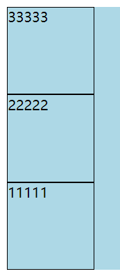
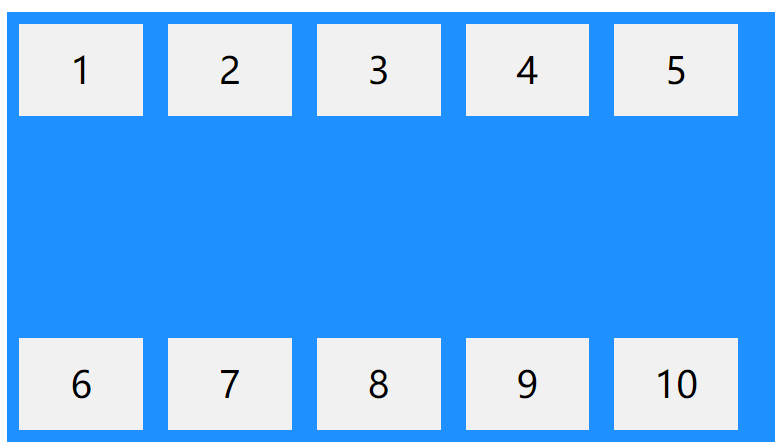
When floating is not used, the layout of the box is as follows:
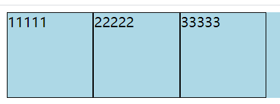
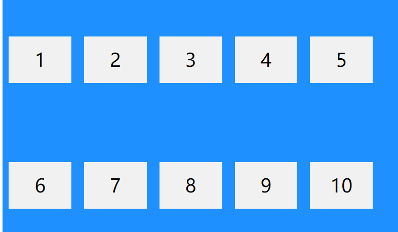
Effect after using left float: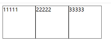
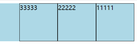
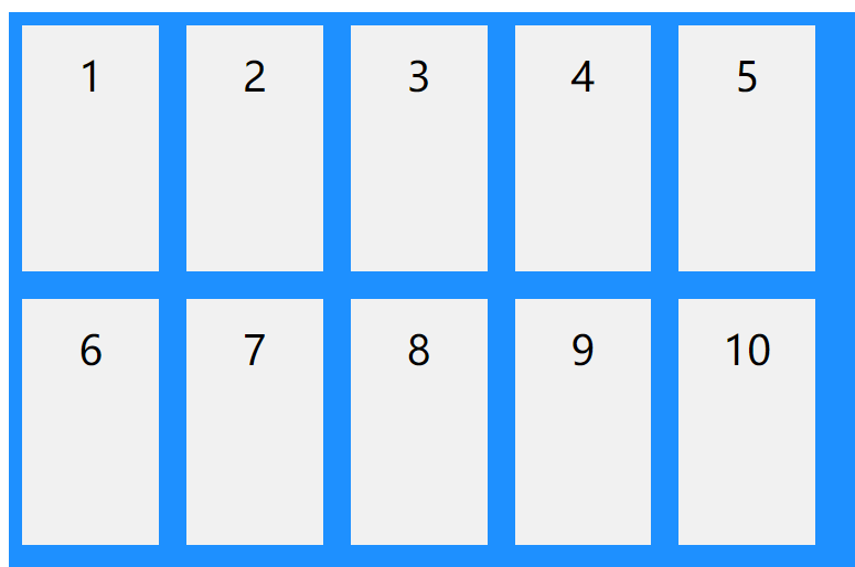
Effect after using right float: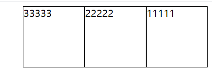
After using the left float, the layout of the following elements may be disordered. At this time, you can use the clear attribute to clear the float effect to solve this problem:
The clear attribute can be set to one of the following values:
- none - Allows floating elements on both sides. Default value
- Left - floating elements are not allowed on the left
- Right - floating elements are not allowed on the right
- both - floating elements are not allowed on the left or right
- inherit - the element inherits the clear value of its parent
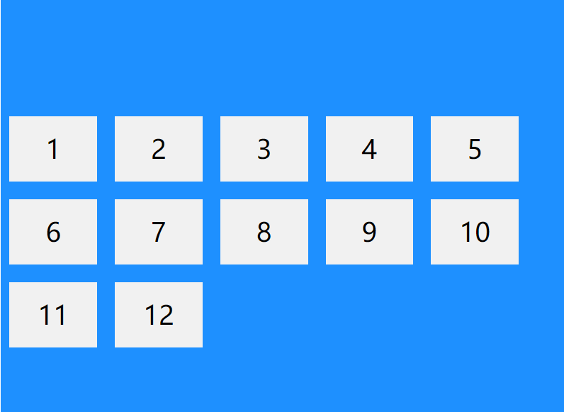
After using left floating for the first box, the following elements may appear: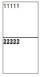
Using the clear attribute to clear the left float of the element behind it will restore the previous style.
<!DOCTYPE html>
<html lang="en">
<head>
	<meta charset="UTF-8">
	<title>Floating layout</title>
	<style type="text/css">
		#one{
			width: 100px;
			height: 100px;
			border:1px solid black;
			float: left;/*Left float*/
			/*float:right;Right float*/
		}
		#two{
			width: 100px;
			height: 100px;
			border:1px solid black;
			float: left;/*Left float*/
			/*float:right;Right float*/
			/*clear: left;The first box is set with left floating, which is the solution when the elements behind are disordered*/
		}
		#three{
			width: 100px;
			height: 100px;
			border:1px solid black;
			float: left;/*Left float*/
			/*float:right;Right float*/
			/*clear: left;*/
		}
	</style>
</head>
<body>
	<div id="one">11111</div>
	<div id="two">22222</div>
	<div id="three">33333</div>
</body>
</html>
3. Positioning layout
The position attribute specifies the type of positioning method applied to the element.
| attribute | describe |
|---|---|
| static (default) | Statically positioned elements are not affected by the top, bottom, left, and right attributes. Will not be positioned in any special way; It is always positioned according to the normal flow of the page |
|
absolute
| Relative to the nearest locating ancestor element, however, if the absolutely located element has no ancestor, it uses the document body and moves with the page scrolling. |
|
relative
| Position relative to its normal position. Setting the top, right, bottom, and left attributes of a relatively positioned element will cause it to deviate from its normal position for adjustment. The rest of the content will not be adjusted to accommodate any space left by the element. |
<!DOCTYPE html>
<html lang="en">
<head>
	<meta charset="UTF-8">
	<title>location</title>
	<style type="text/css">
		*{
			margin: 0px;
			padding: 0px;
		}
		.main{
			position: relative;
			border:1px solid black;
			width: 600px;
			height: 600px;
			margin: 200px;
		}
		.box{
			width: 200px;
			height: 200px;
			border:1px solid black;
			background: red;
			position:absolute;
			top:100px;
			left:100px;
		}
		.box1{
			width: 200px;
			height: 200px;
			border:1px solid black;
			background: red;
			/*position:relative;
			top:100px;
			left:100px;*/
		}
		.box2{
			width: 200px;
			height: 200px;
			border:1px solid black;
			background: red;
			/*position:absolute;
			top:100px;
			left:100px;*/
		}
	</style>
</head>
<body>
	<div class="main">
		<div class="box">this is a div</div>
		<div class="box1">this is a div</div>
		<div class="box2">this is a div</div>
	</div>
</body>
</html>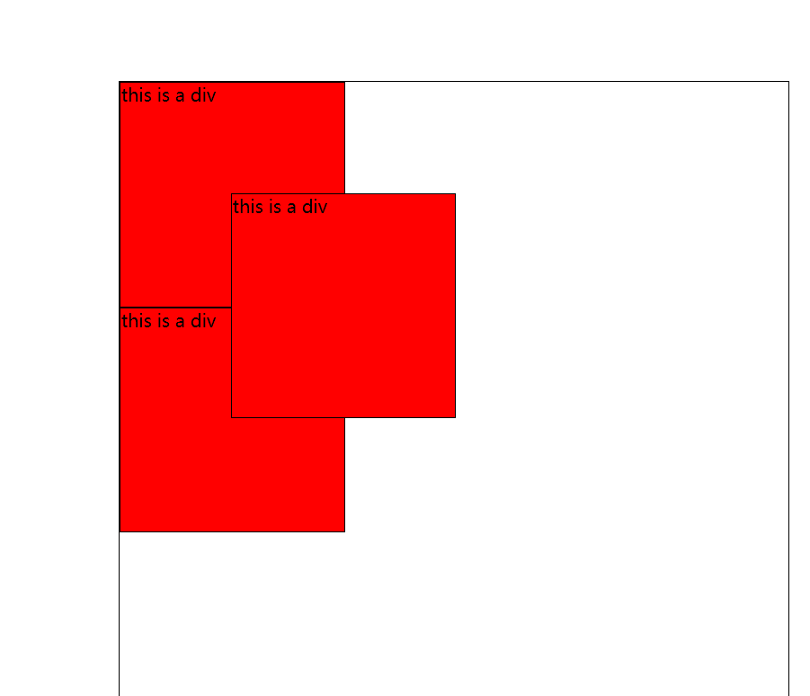
4. Elastic box layout
The elastic frame layout module makes it easier to design a flexible and responsive layout structure without floating or positioning.
If you need to use flexbox, first use display: flex to set it as an elastic box, and use its other attributes to set the layout in this parent element.
4.1flex-direction
Specifies the arrangement of sub elements in the elastic box.
There are several values as follows:
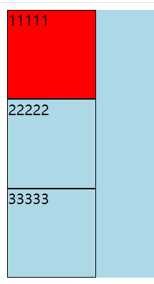
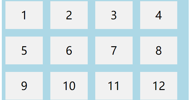
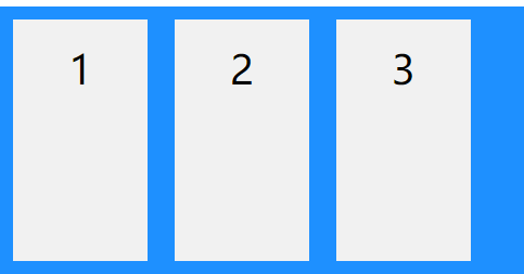
1.flex-direction: column; Arrange the boxes from top to bottom
		.main{
			display: flex;
			flex-direction:column;
			background: lightblue;
		}
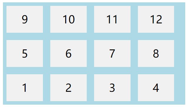
2.flex-direction: column-reverse; Make the box from bottom to top
		.main{
			display: flex;
			flex-direction:column-reverse;
			background: lightblue;
		}
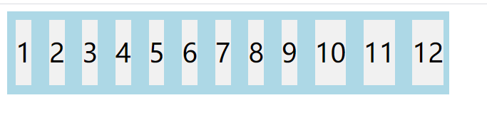
3.flex-direction: row; Arranging boxes from left to right is also the default value of this property
		.main{
			display: flex;
			flex-direction:row;
			background: lightblue;
		}
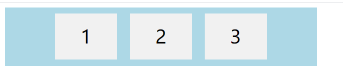
4.flex-direction: row-reverse; Make the box from right to left
		.main{
			display: flex;
			flex-direction:row-reverse;
			background: lightblue;
		}
4.2 flex-wrap
The flex wrap attribute specifies whether a flex item should be wrapped
There are the following values:
1.flex-wrap: wrap; Wrap lines when necessary
		.main{
			width: 500px;
			display: flex;
			flex-wrap:wrap;
			background: lightblue;
		}
2.flex-wrap: nowrap; nowrap
		.main{
			width: 500px;
			display: flex;
			flex-wrap:nowrap;
			background: lightblue;
		}
3.flex-wrap: wrap-reverse; Wrap lines in the opposite way when necessary
		.main{
			width: 500px;
			display: flex;
			flex-wrap:wrap-reverse;
			background: lightblue;
		}
4.3 flex flow attribute
Is a shorthand property used to set both flex direction and flex wrap properties.
		.main{
			width: 500px;
			display: flex;
  			flex-flow: row wrap;
			background: lightblue;
		}
4.4justify content attribute
Property is used to align flex items
The values are as follows:
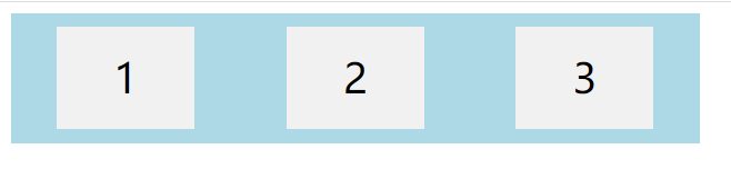
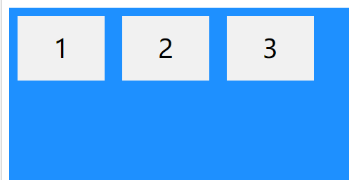
1.justify-content: center; Align elastic items in the center of the container
		.main{
			width: 500px;
			display: flex;
  			justify-content: center;
			background: lightblue;
		}
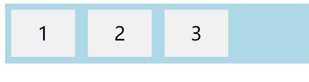
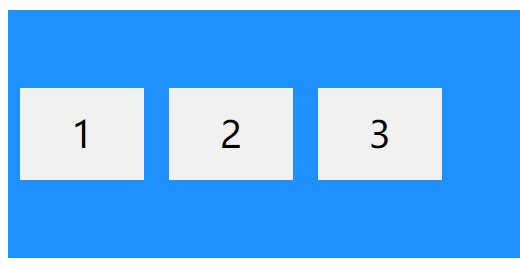
2."justify-content: flex-start;" Align elastic items at the beginning of the container (default)
		.main{
			width: 500px;
			display: flex;
  			justify-content: flex-start;
			background: lightblue;
		}
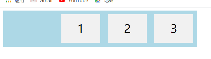
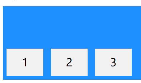
3."justify-content: flex-end;" Align elastic items at the end of the container
		.main{
			width: 500px;
			display: flex;
  			justify-content: flex-end;
			background: lightblue;
		}
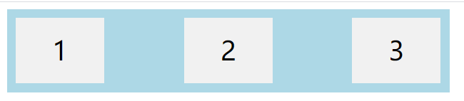
4.justify-content: space-around; "Displays flex items with spaces before, between, and after lines
		.main{
			width: 500px;
			display: flex;
  			justify-content: space-around;
			background: lightblue;
		}
5.justify-content: space-between; "Displays flex items with spaces between lines
		.main{
			width: 500px;
			display: flex;
  			justify-content: space-between;
			background: lightblue;
		}
4.5 align items attribute
Used to align flex items vertically
1.align-items: center; Align flex items in the middle of the container
2.align-items: flex-start; "Align flex items on top of container
3.align-items: flex-end; Align elastic items at the bottom of the container
4.align-items: stretch; "Stretch flex items to fill containers (default), word elements do not have to be set to height
4.6 align content attribute
Used to align elastic lines
1.align-content: space-between; "The displayed elastic lines are equally spaced
2.align-content: space-around; Show elastic lines with spaces before, between, and after them
3.align-content: center; Show elastic lines in the middle of the container
4.align-content: stretch; Stretch elastic lines to take up the remaining space (default)
5.align-content: flex-start; Show elastic lines at the beginning of the container
6.align-content: flex-end; Show elastic lines at the end of the container
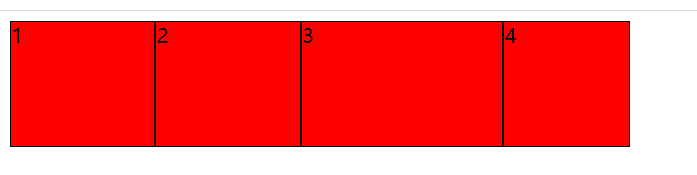
4.7 some other uncommon attributes
<!DOCTYPE html>
<html lang="en">
<head>
<meta charset="UTF-8">
<title>Document</title>
<style type="text/css">
.main{
display: flex;
}
.main>div{
width: 100px;
height: 100px;
border: 1px solid black;
background: red
}
</style>
</head>
<body>
<div class="main">
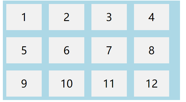
<div style="flex-grow:1">1</div>
<div style="flex-grow:1">2</div>
<div style="flex-grow:4">3</div>
<div style="flex-shrink:2">4</div>
</div>
</body>
</html>