Today, Xiaobian takes you to draw an academic chart with high "self-worth". At first, the reason is that the little friends in the group asked how to draw it. You know, I love the readers very much ~ ~ absolute arrangement! The pictures given by the readers are as follows:
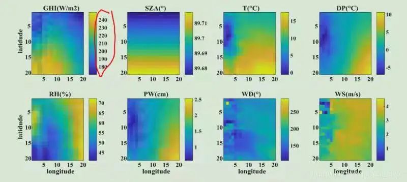
Pictures asked by readers
Xiaobian was also attracted by this work at first sight, but immediately thought that it might be drawn using MATLAB, and the data is also a graph related to geographic information specialty. To reproduce this work perfectly, we need to solve the following two problems:
- How to find alternative data?
- How does Python/R use MATLAB's colormap?
To solve the above problems, we solve them step by step. The specific contents are as follows:
How to find alternative data and processing?
After consulting the relevant professional leaders in the communication group, it is concluded that this data may be NC grid data, and the data of different dimensions can be drawn. Xiaobian has processed sunflower satellite NC grid data during his graduate study. Some time ago, other students asked Python to process NC data. Let's talk about it briefly this time. The contents are as follows:
Python netcdf4 library processing nc data
After selecting to use sunflower satellite nc data for rendering, we use Python netcdf4 library to process nc format data (only reading and data dimension selection are introduced here).
import numpy as np
import pandas as pd
from netCDF4  import Dataset

nc_file = "NC_H08_20191111_0300_R21_FLDK.06001_06001.nc"
nc_data = Dataset(nc_file)
You can use the Dataset() function to read, and the reading results are as follows:
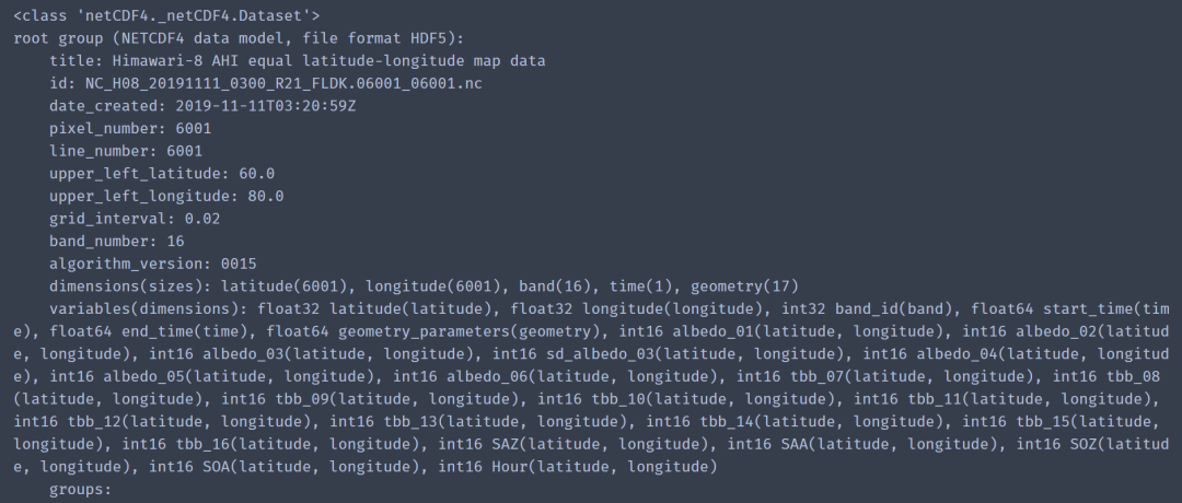
Dataset() reads data results
The processing codes involved in the examples in this issue are as follows:
data_list = ['albedo_01','albedo_02','albedo_03','albedo_04','tbb_11','tbb_12','tbb_13',"SAZ"]
lat = 39.933
lon = 116.317

Xi = int(np.floor((60-lat)/ 0.02))
Yi = int(np.floor((lon-80)/ 0.02))

dicData = {key: value[:].data for key, value in nc_data.variables.items() if key in data_list}
data = {key: value[Xi,Yi] for key, value in dicData.items() if key in data_list}
# Get 40x40 grid data
data_tif = {key: value[Xi-20:Xi+20,Yi-20:Yi+20] for key, value in dicData.items()}
band1 = data_tif.get('albedo_01')
The above can obtain the data we need to draw. Note: Here we give the longitude and latitude information to obtain the 40x40 data around this longitude and latitude point.
The above has solved the problem of our data source, and also mentioned the python reading method of nc data. More about Python processing nc format data, you can introduce it in detail during my live broadcast or refer to: Python netcdf4 official website [1]
How does Python/R use MATLAB's colormap?
Gets the parula color system
Here, we first use Python Matplotlib for chart drawing. The first thing to solve is to design the default colormap parula of MATLAB. You can design your own color here, or share your colormaps through Xiaobian Py file (see the end of the text for the acquisition method).
First, we use the default Matplotlib and the default colormap to draw, as follows:
import matplotlib.pyplot as plt
max_v = band1.max()
min_v = band1.min()

fig,ax = plt.subplots(figsize=(5,4),dpi=100,facecolor="w")
ax.imshow(band1)
pcm = ax.imshow(band1)
fig.colorbar(pcm,ax=ax,aspect=10)
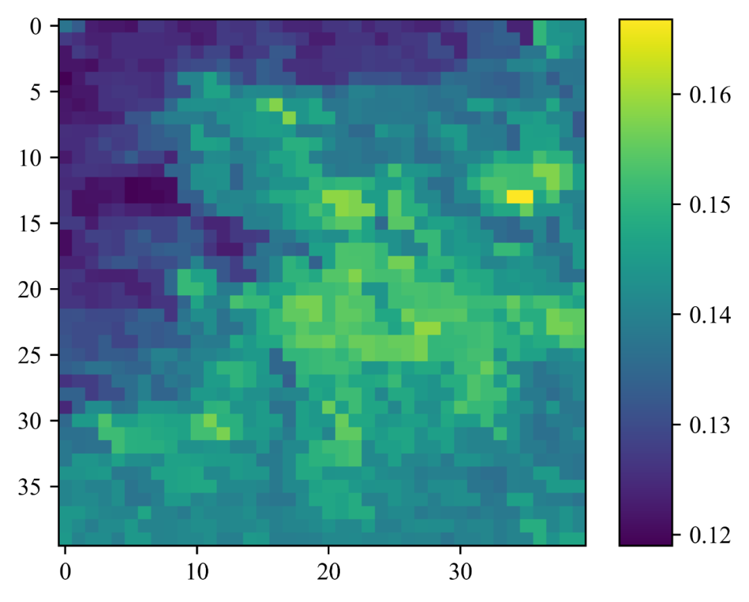
Python Matplotlib default colormap
Next, we use colormaps The parula color system in the PY file is drawn as follows:
import matplotlib.pyplot as plt
from colormaps import parula
cmap = parula
fig,ax = plt.subplots(figsize=(5,4),dpi=100,facecolor="w")
pcm = ax.imshow(band1,cmap=cmap,)
fig.colorbar(pcm,ax=ax,aspect=10)
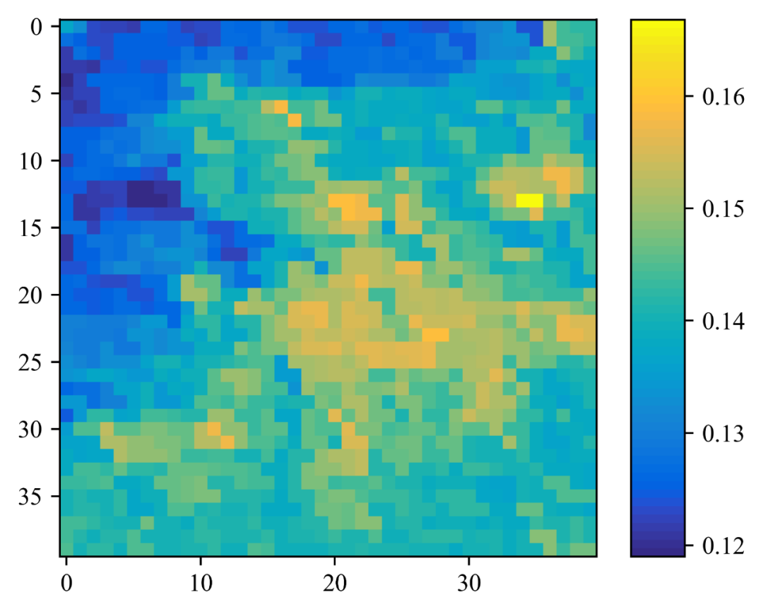
Python-matplotlib parula colormap
Note: you may find that ax is used here Imshow () method to draw, because the data we get is in two-dimensional array format. In the next issue, we will use data in (X,Y,Z) format for rendering.
Chart beautification
Next, we will optimize the chart results we have drawn. The methods we have used have been described many times in the previous live broadcast. The specific drawing methods are as follows:
import matplotlib.pyplot as plt
from colormaps import parula

plt.rcParams["font.family"] = "Times New Roman"
cmap = parula

fig,ax = plt.subplots(figsize=(5,4),dpi=100,facecolor="w")
pcm = ax.imshow(band1,cmap=cmap,vmax=max_v,vmin=min_v)
ax.tick_params(labelsize=20)
ax.set_xticks(np.arange(0, 40, step=10))
ax.set_yticklabels(labels = [-10, 40, 30, 20, 10])
for text in ax.get_xticklabels()+ax.get_yticklabels():
    text.set_fontweight("bold")
ax.set_xlabel("longitude",fontsize=22,fontweight="bold")
ax.set_ylabel("latitude",fontsize=22,fontweight="bold")
print(ax.get_yticks())
print(ax.get_xticks())

cb = fig.colorbar(pcm,ax=ax,aspect=10)
#cb.outline.set_visible(False)
cb.ax.tick_params(direction="in",labelsize=15)
for t in cb.ax.get_yticklabels():
     t.set_fontweight("bold")
# Add text information
ax.text(.5,1.04,"Albedo01",transform = ax.transAxes,fontsize=20,fontweight="bold",ha="center",va="center")
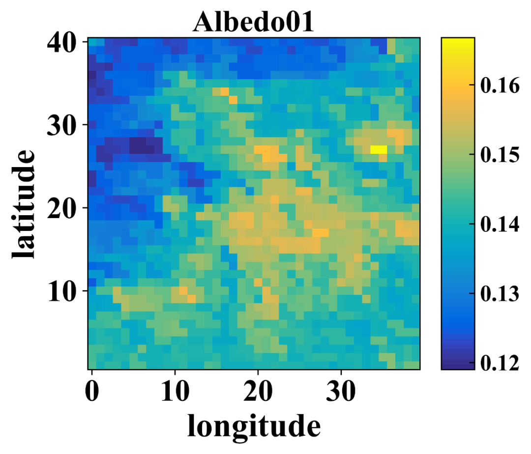
Albedo01
Note: the longitude and latitude data here only counts the points. Use:
ax.set_yticklabels(labels = [-10, 40, 30, 20, 10])
Customize the Chart scale. Let's take a look at the visualization results of other dimension data:

Tbb_11
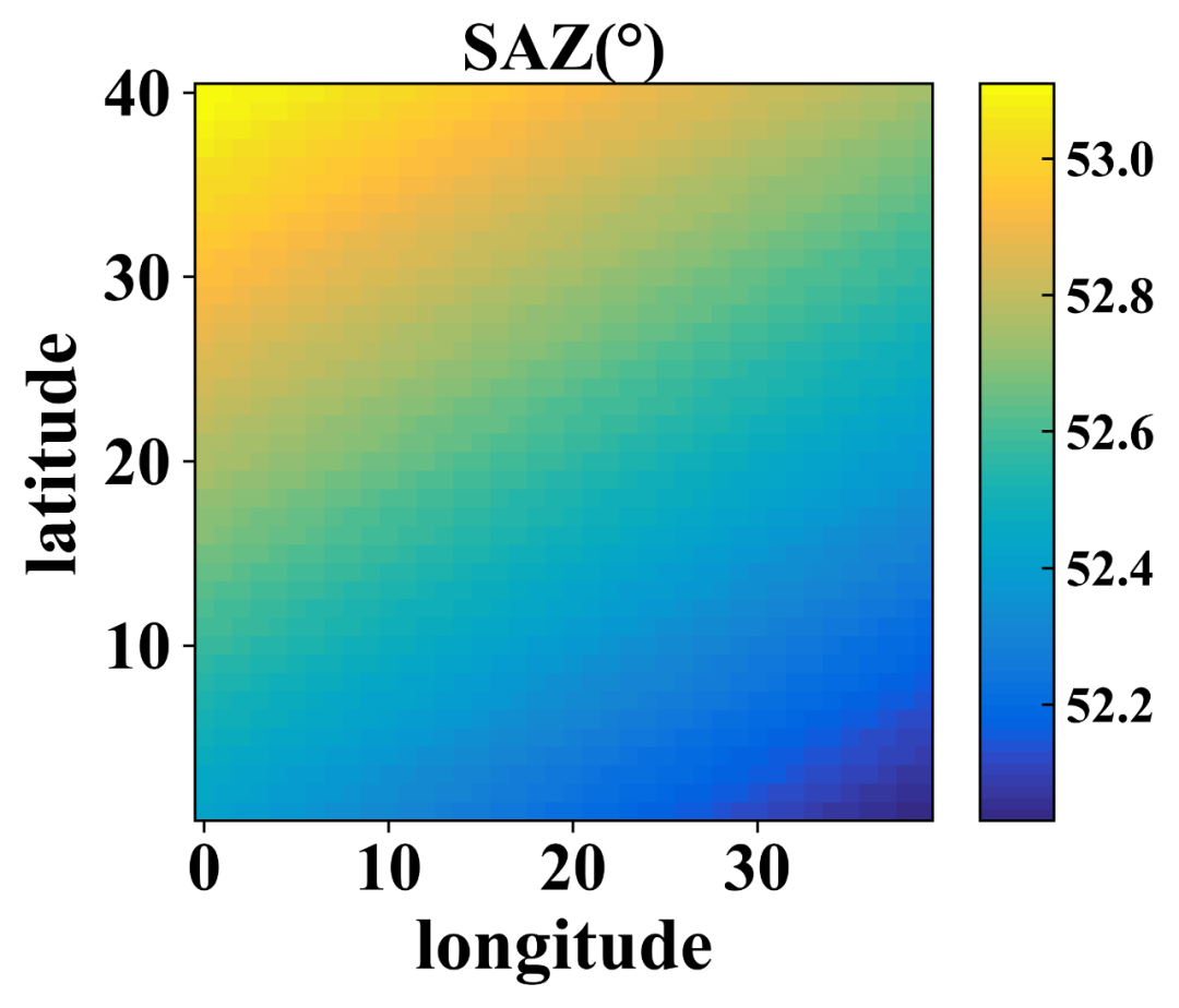
SAZ
In addition, we also used spectral of Matplotlib_ R color system, and the results are as follows:
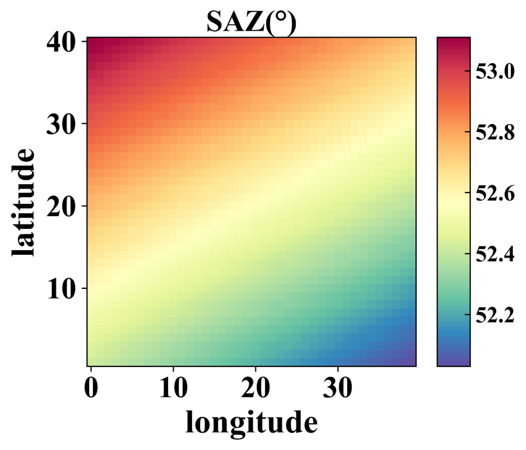
SOA with Spectral_r
summary
Today's tweet series mainly introduces:
- Reading of NC grid data;
- Matplotlib drawing of MATLAB default parula color system;
- Customized rendering of Matplotlib's colorbar.
In the following tweets, Xiaobian will use pcolormesh() and contour() methods to draw spatial (X,Y,Z) academic charts.
reference material
[1]
Python netcdf4 official website: http://unidata.github.io/netcdf4-python/ .
Just order one if you like 👇