preface
recently, due to the needs of work, I began to learn the svg drawing method in JavaScript. Since I have never used svg, I began to learn from scratch.
SVG basic graphics
- rectangle
<rect x="10" y="10" width="30" height="30"/>
in the above code, X and Y represent the abscissa and ordinate of the upper left corner of the rectangle, and width and height represent the width and height.
- circular
<circle cx="25" cy="75" r="20"/>
in the above code, cx and cy respectively represent the position of the x-axis and y-axis of the center of the circle, and r represents the radius.
- straight line
<line x1="10" x2="50" y1="110" y2="150"/>
in the above code, x1 represents the x position of the starting point, y1 represents the y position of the starting point, x2 represents the x position of the ending point, and y2 represents the y position of the ending point.
- broken line
<polyline points="60 110, 65 120, 85 140, 90 135, 95 150, 100 145"/>
in the above code, all points are included in the point set points. It should be noted that each number is separated by blank, comma, termination command or line feed. Each point must contain 2 numbers, one x coordinate and one y coordinate. Therefore, the point lists (0,0), (1,1) and (2,2) can be written as follows: "0, 0, 1, 1, 2, 2".
- polygon
<polygon points="60 110, 65 120, 85 140, 90 135, 95 150, 100 145"/>
the polygon is basically the same as the polyline, except that the last point of the polygon will be automatically connected with the first point.
- route
I haven't learned it yet. I'll add it later
deformation
All the methods used next can be summarized by transform, which only needs to be connected with spaces
1. Translation: translate()
<svg width="40" height="50" style="background-color:#bff;">
    <rect x="0" y="0" width="10" height="10" transform="translate(30,40)" />
</svg>
allow the figure to be translated for a certain distance. For the above code, the position of the rectangle will be (30,40) instead of the previously specified (0,0), that is, translate 30 to the X axis and 40 to the y axis.
2. Rotate:
<svg width="40" height="50" style="background-color:#bff;">
    <rect x="0" y="0" width="10" height="10" transform="rotate(30)" />
</svg>
the figure is allowed to rotate by a certain angle. The example shows a square rotated by 45 degrees. The value of rotate() is specified in degrees.
3. Oblique cutting: skewX() skewY()
<svg width="40" height="50" style="background-color:#bff;">
    <rect x="0" y="0" width="10" height="10" transform="rotate(30)" />
</svg>
miter the graph. X is to miter the x-axis direction, and Y is to miter the y-axis. Both functions need an angle parameter to represent the angle that needs to be mitered. Miter cutting has not been touched before. From the style after miter cutting, the whole graph should be translated gradually from top to bottom (skewX). skewY is the same.
4. Zoom: scale()
<svg width="40" height="50" style="background-color:#bff;">
    <rect x="0" y="0" width="10" height="10" transform="scale(0.5)" />
</svg>
scale() to change the size of the image requires two parameters (magnification or reduction in the X-axis and Y-axis directions). If the second number is ignored, it is equal to the second value by default.
Clipping and masking
1. Cutting: clipping
clipping means to remove part of the content of the created element. Here, any translucent effect is not available. It can only be displayed or not displayed.
<svg height="1000" width="800">
    <defs>
        <clipPath id="as">
            <rect x="0" y="0" width="200" height="100"/>
        </clipPath>
    </defs>

    <circle cx="100" cy="100" r="100" id="az" clip-path='url(#as)' stroke="red" />
</svg>
the above code will generate a semicircle. The first half of the code is wrapped in a defs tag (the defs tag represents reusable elements. It should be noted that clipPath is usually contained in a defs tag) to create a rectangle, and the second half of the code creates a circle.
the implementation logic of the code here is to create a circle with a radius of 100 at (100100), which references a clipPath element with a single rect element. The rectangle inside it will blacken the upper part of the canvas. Therefore, the actual display is the truncated semicircle below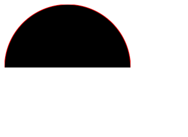
2. masking
the most impressive effect of masking is that it appears as a gradient. If you want to fade out an element, you can use the masking effect to achieve this.
<svg>
    <linearGradient id="Gradient">
        <stop offset="0" stop-color="white" stop-opacity="1" />
        <stop offset="1" stop-color="white" stop-opacity="0" />
    </linearGradient>
    <mask id="Mask">
        <rect x="0" y="0" width="200" height="200" fill="url(#Gradient)"/>
    </mask>
    <rect x="0" y="0" width="200" height="200" fill="green"/>
    <rect x="0" y="0" width="200" height="200" fill="red" mask="url(#Mask)"/>
</svg>
</svg>